This document provides an overview of key concepts in statistics including:
- Statistics involves collecting, organizing, analyzing, and interpreting numerical data.
- There are two main types of statistics: descriptive and inferential.
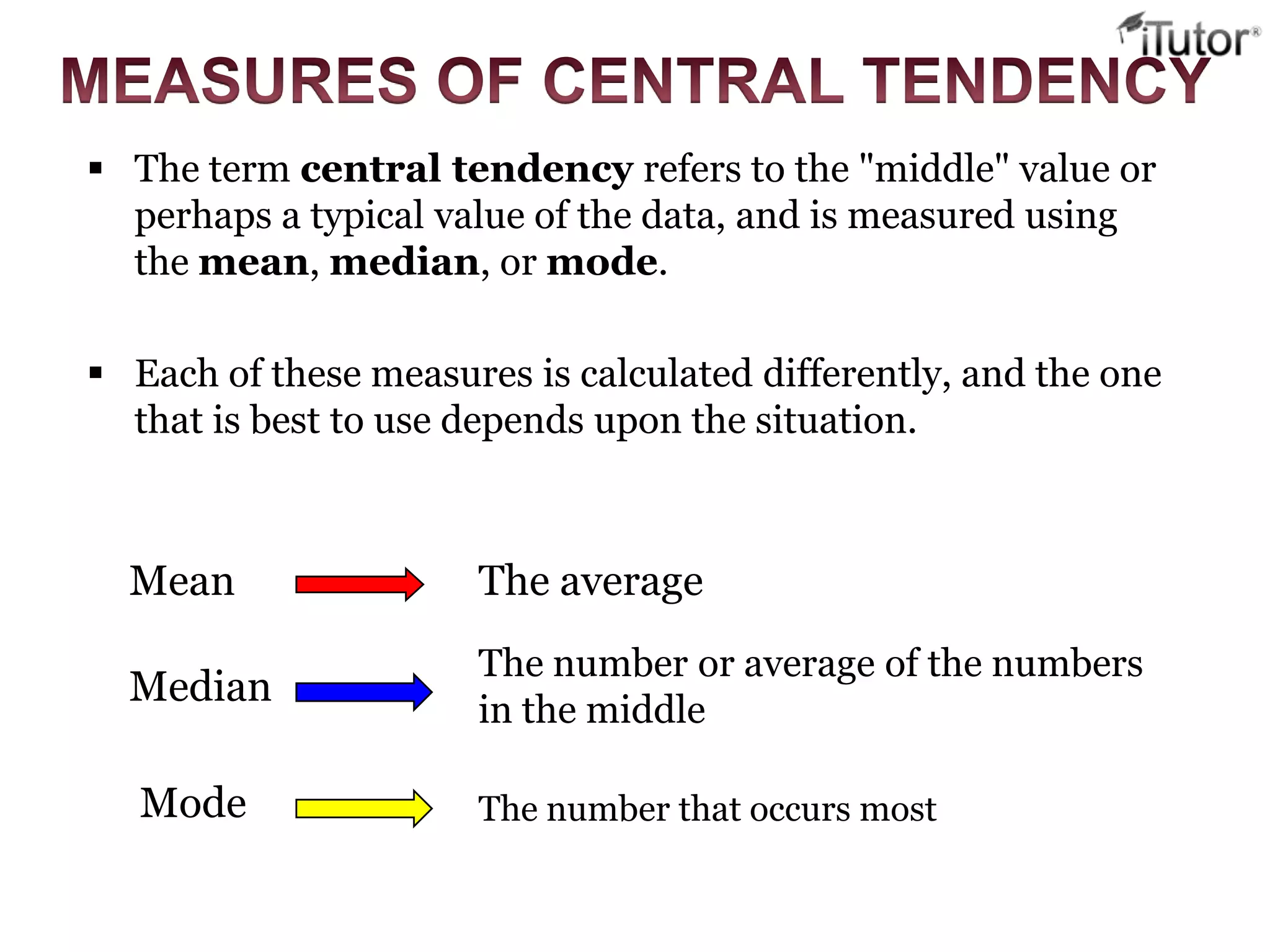
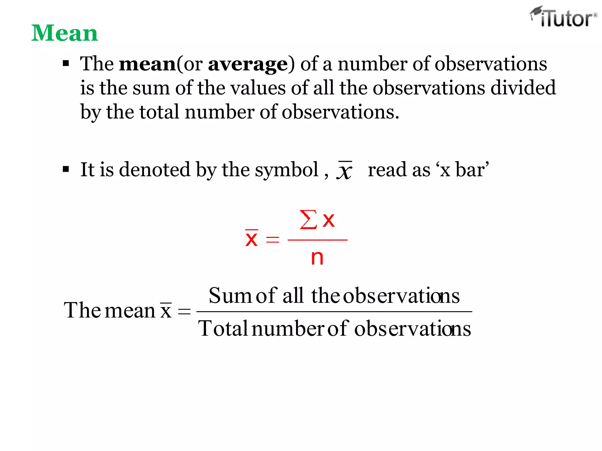
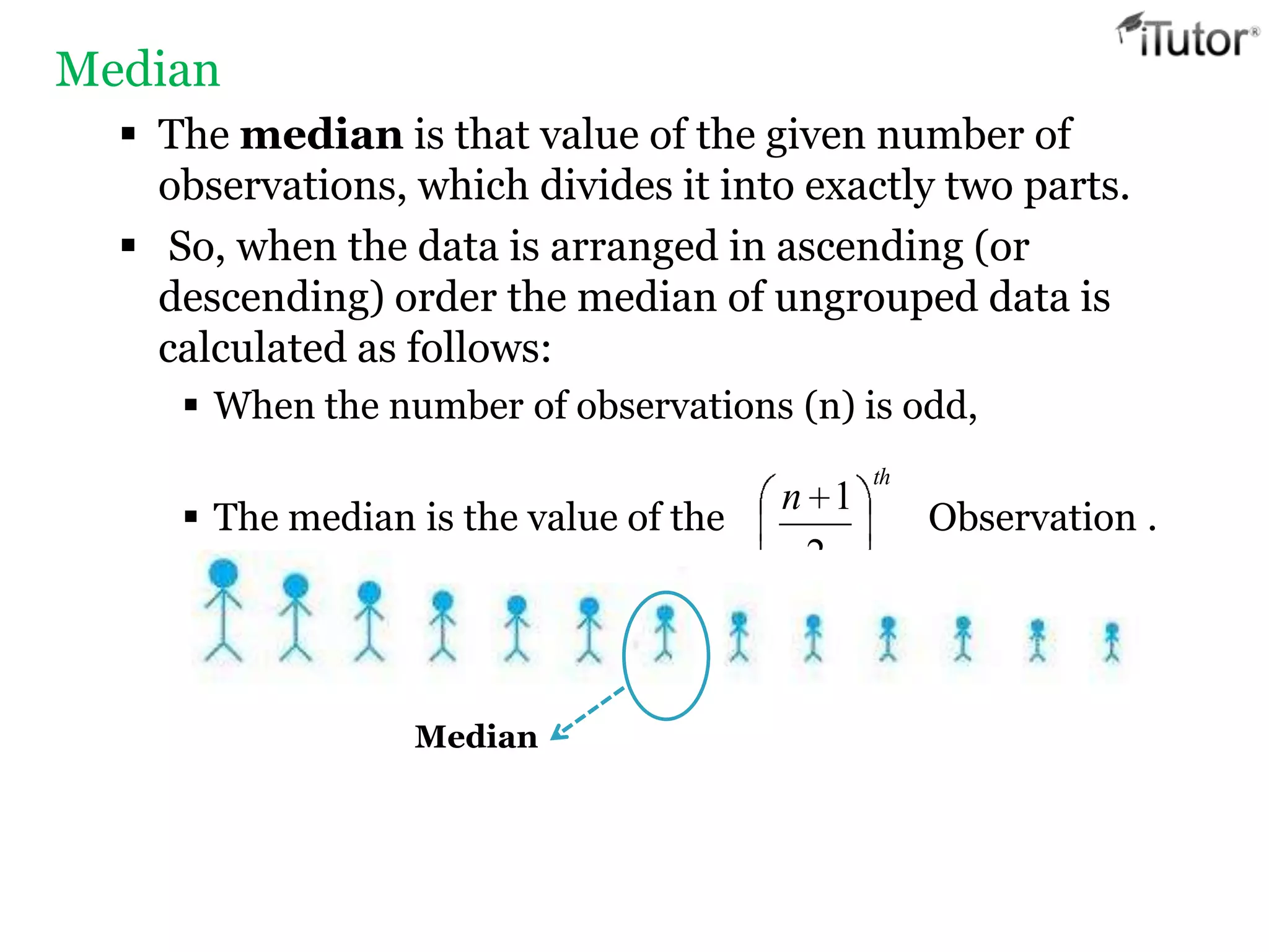
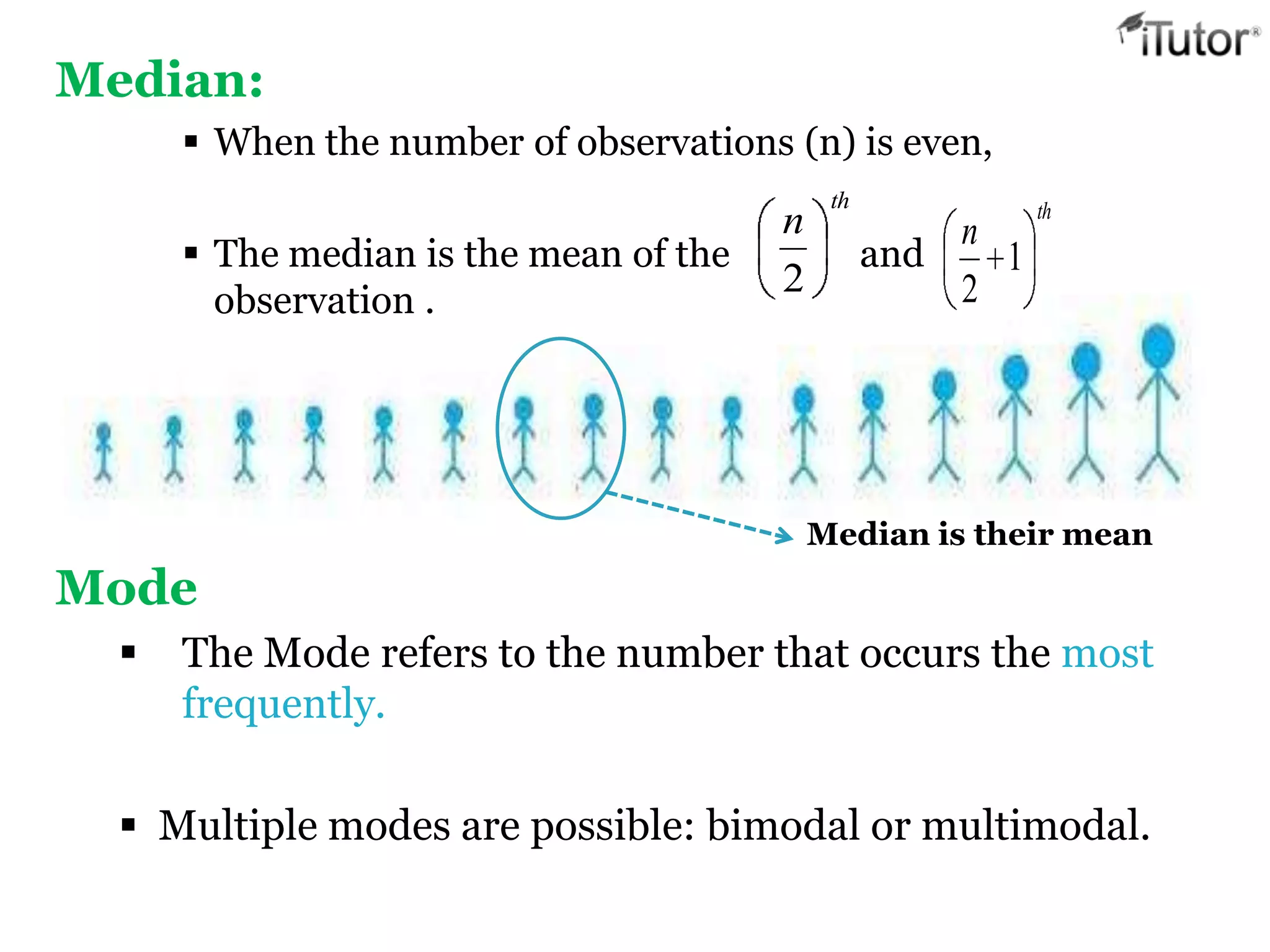
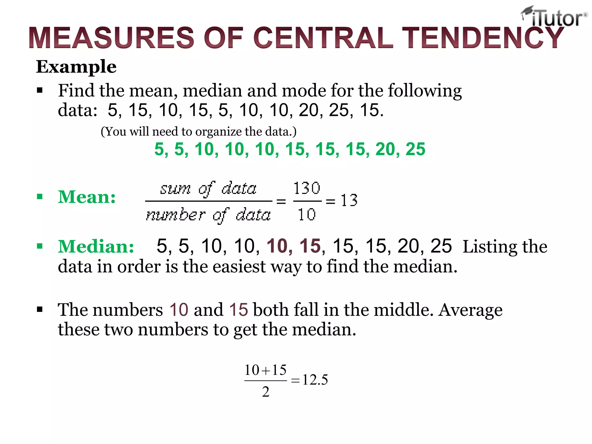
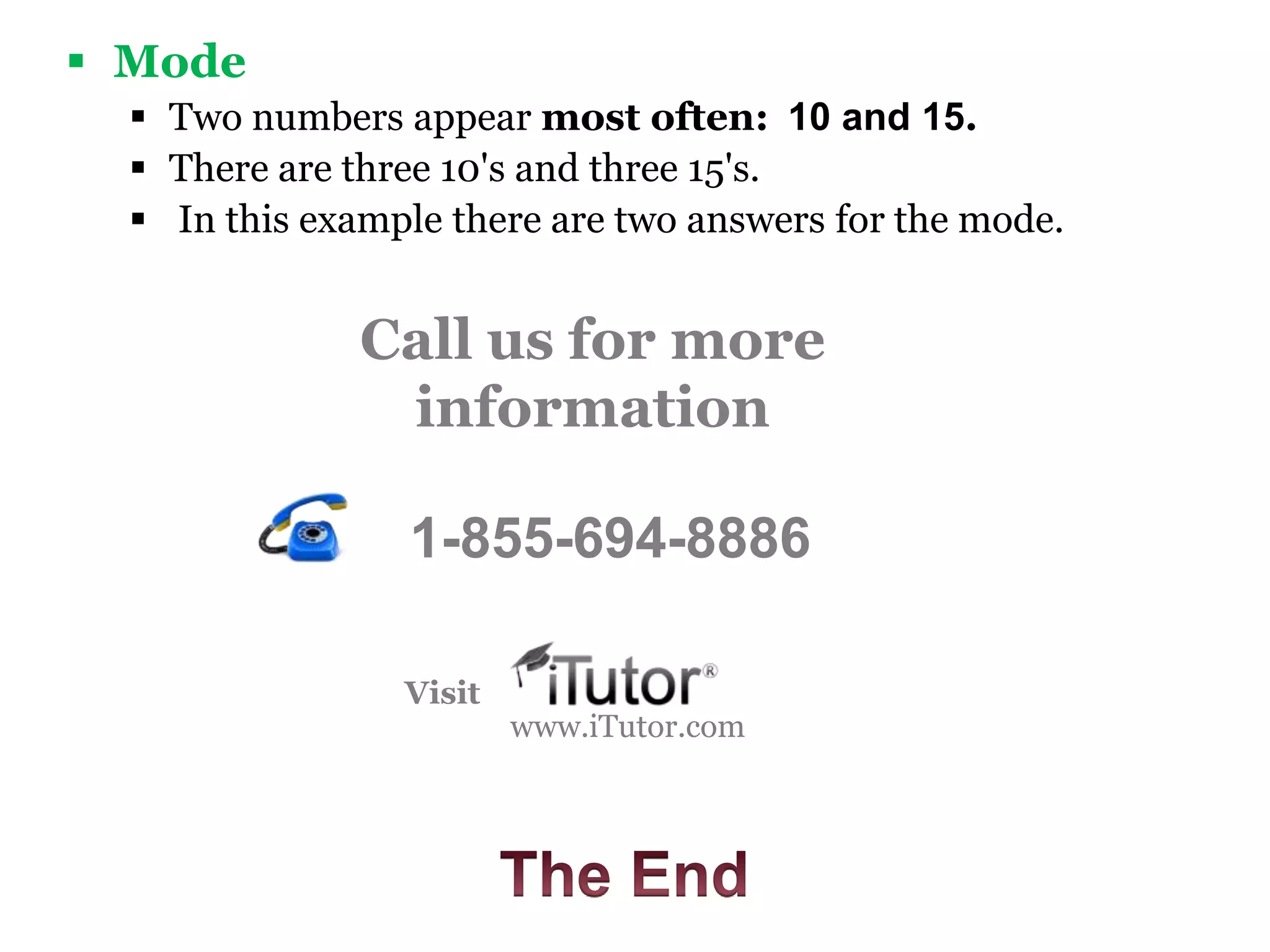
- Data can be categorical or quantitative. Common measures of central tendency are the mean, median, and mode.
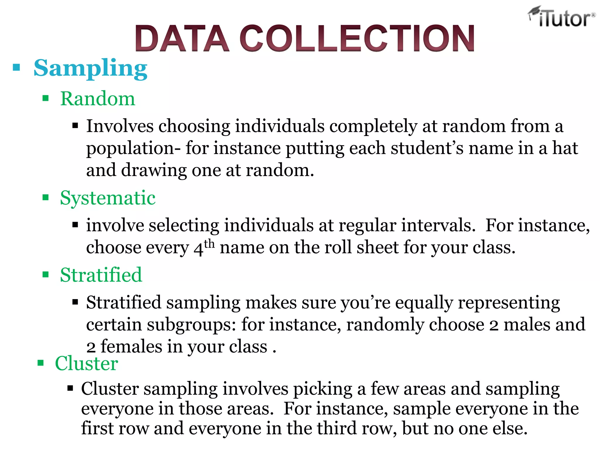
- There are different sampling methods like random, stratified, and cluster sampling.
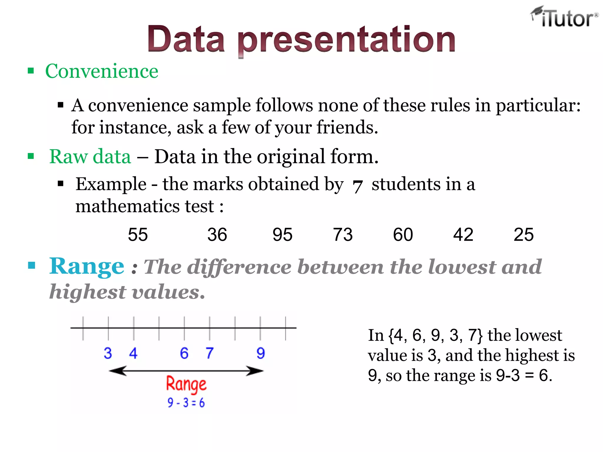
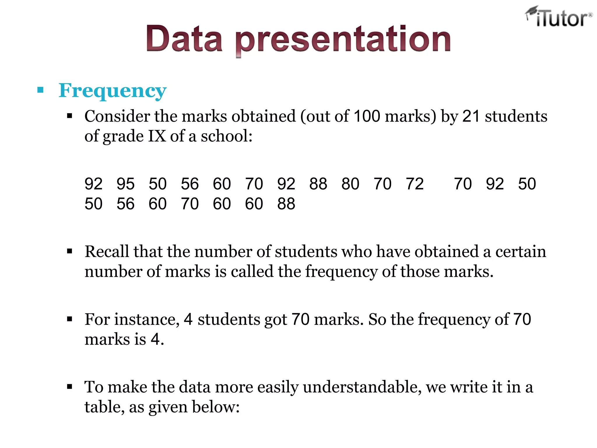
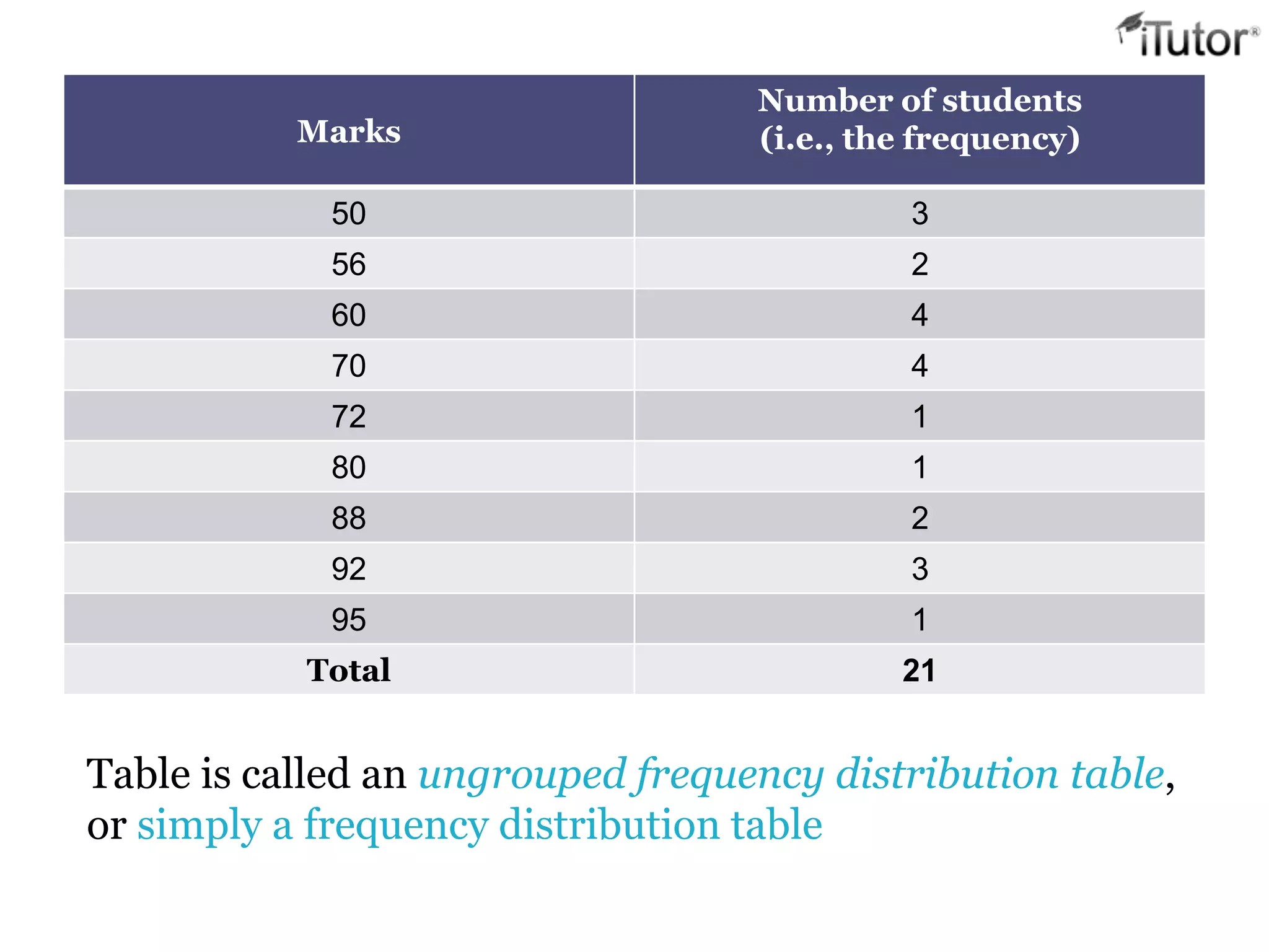
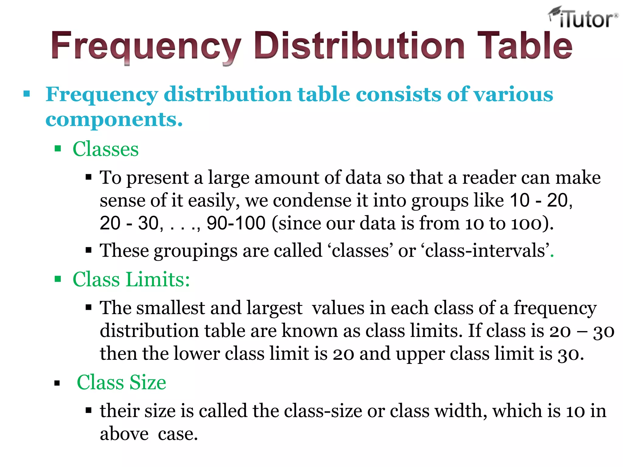
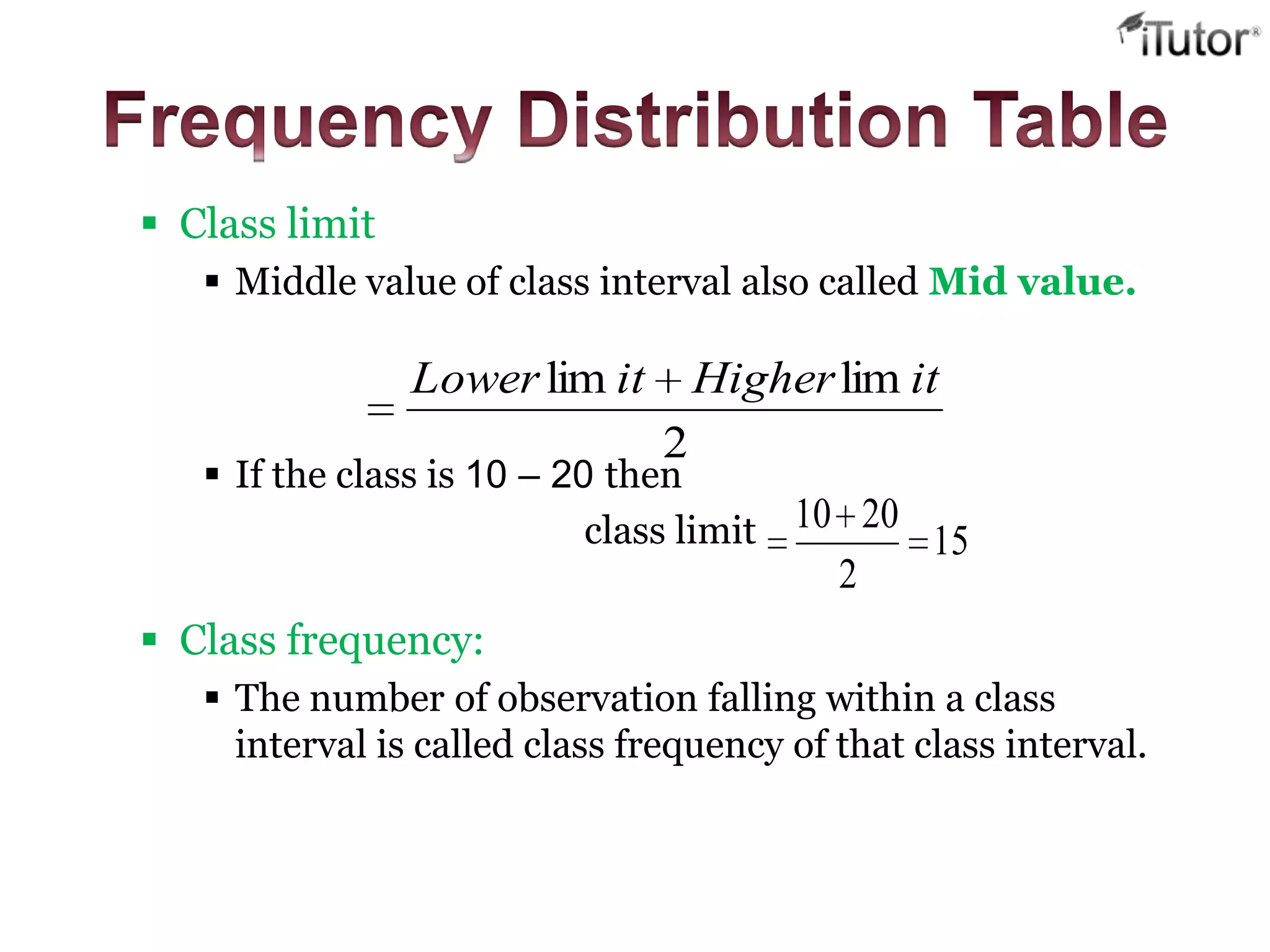
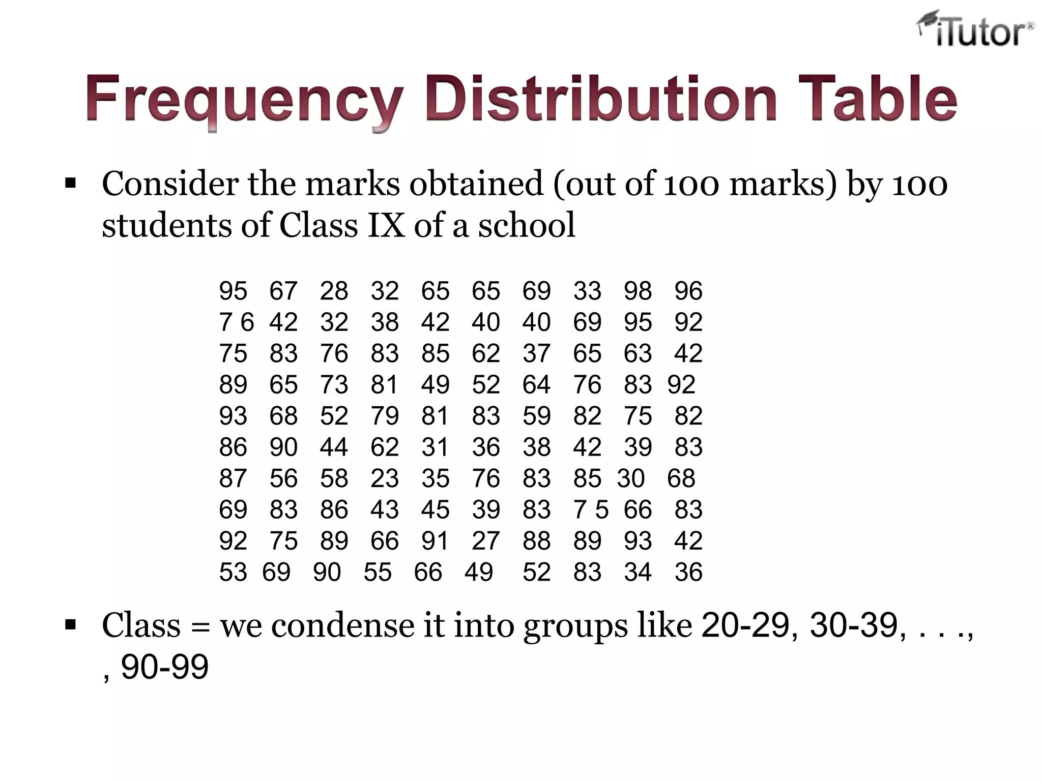
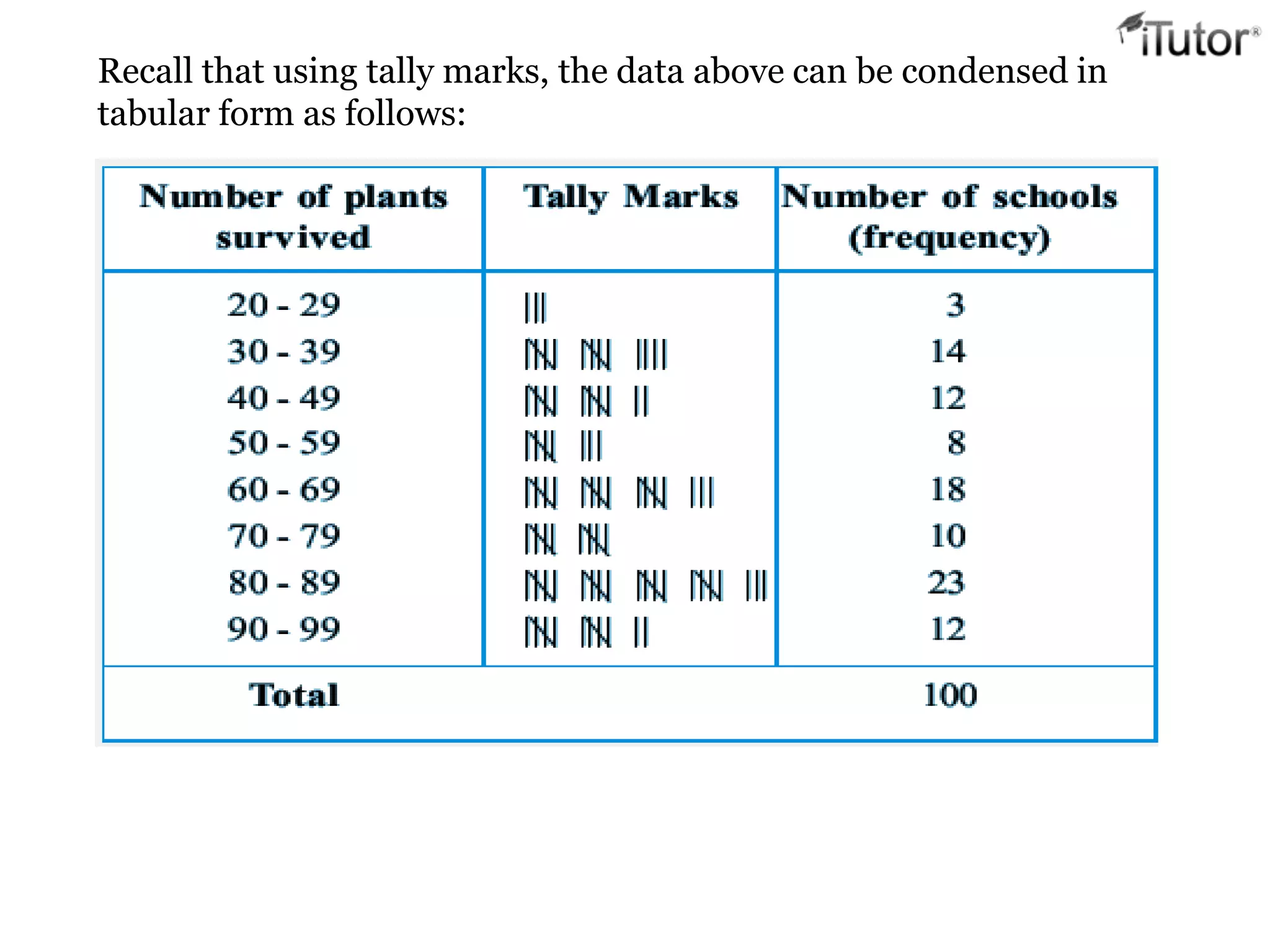
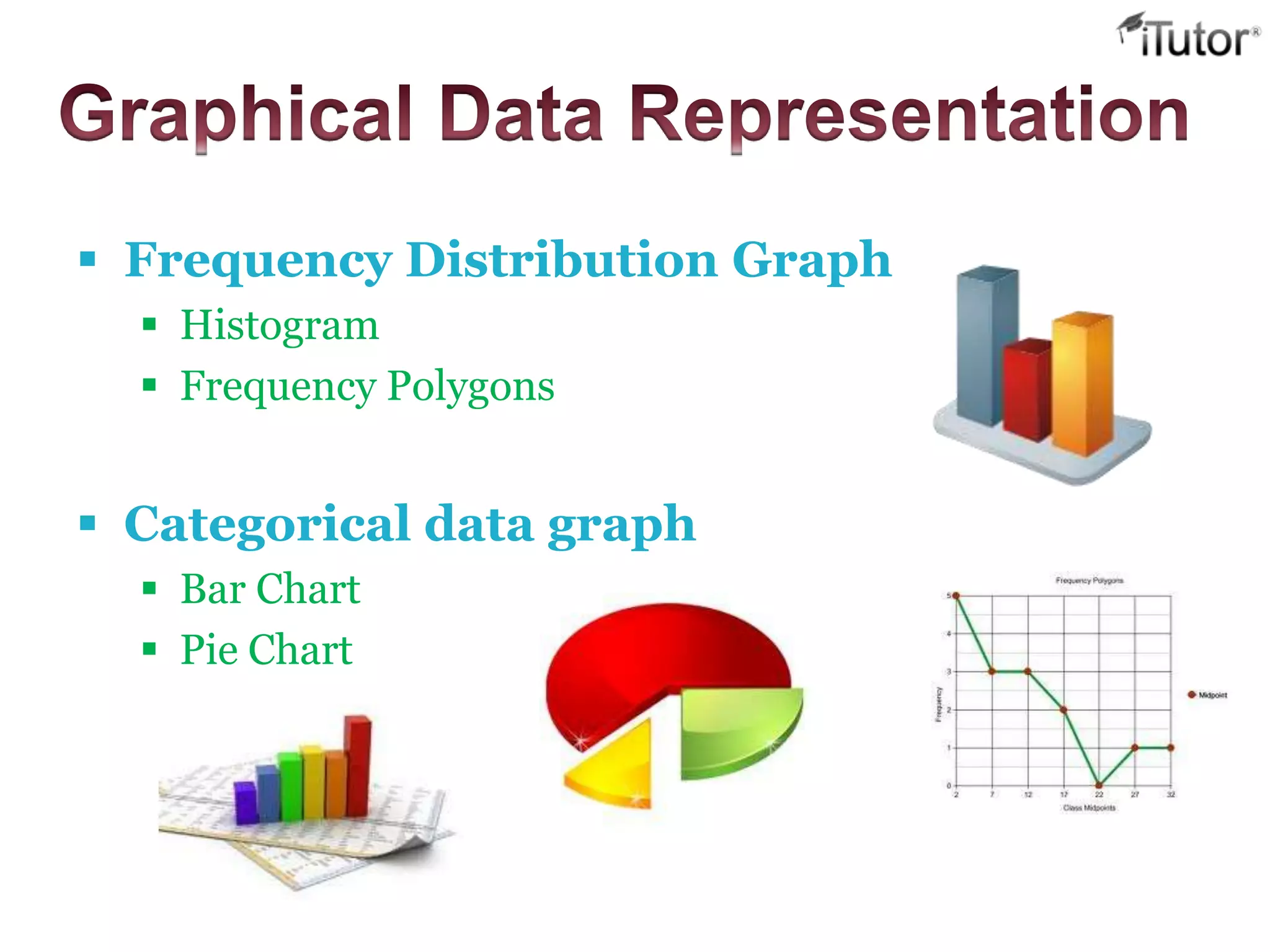
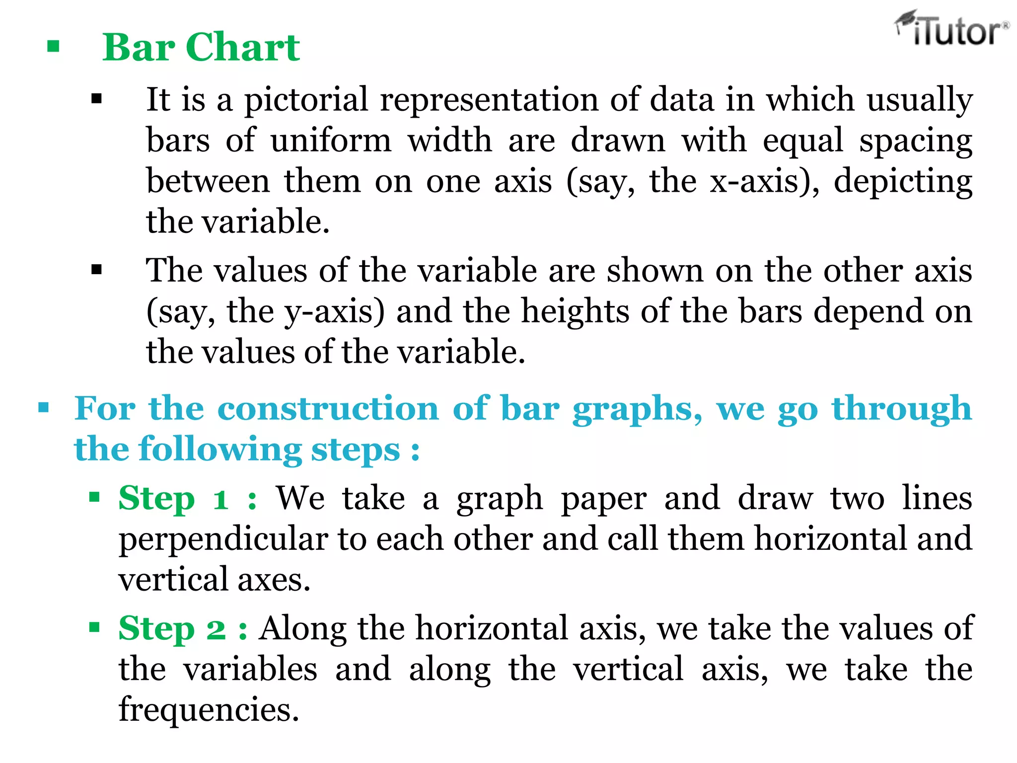
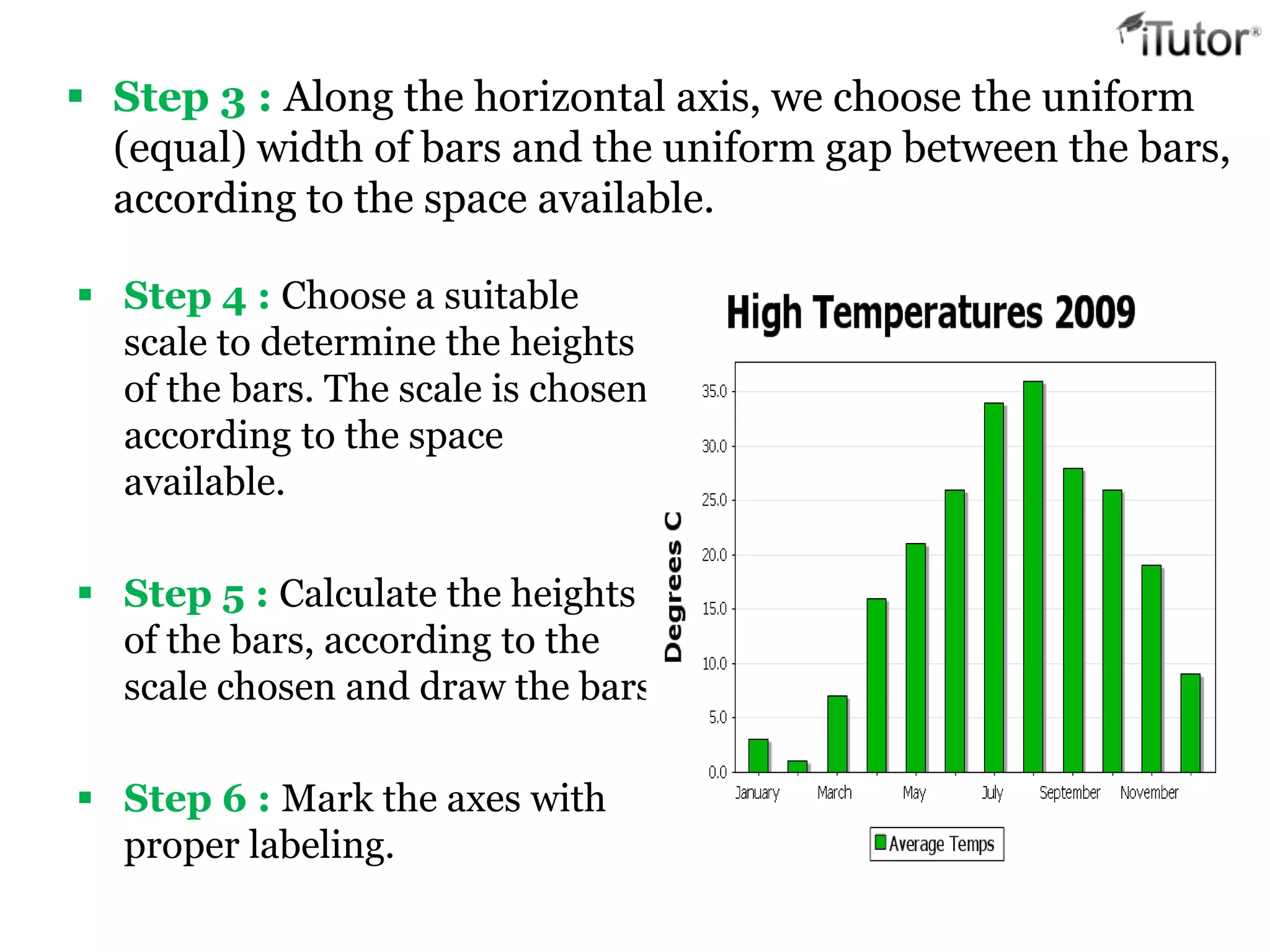
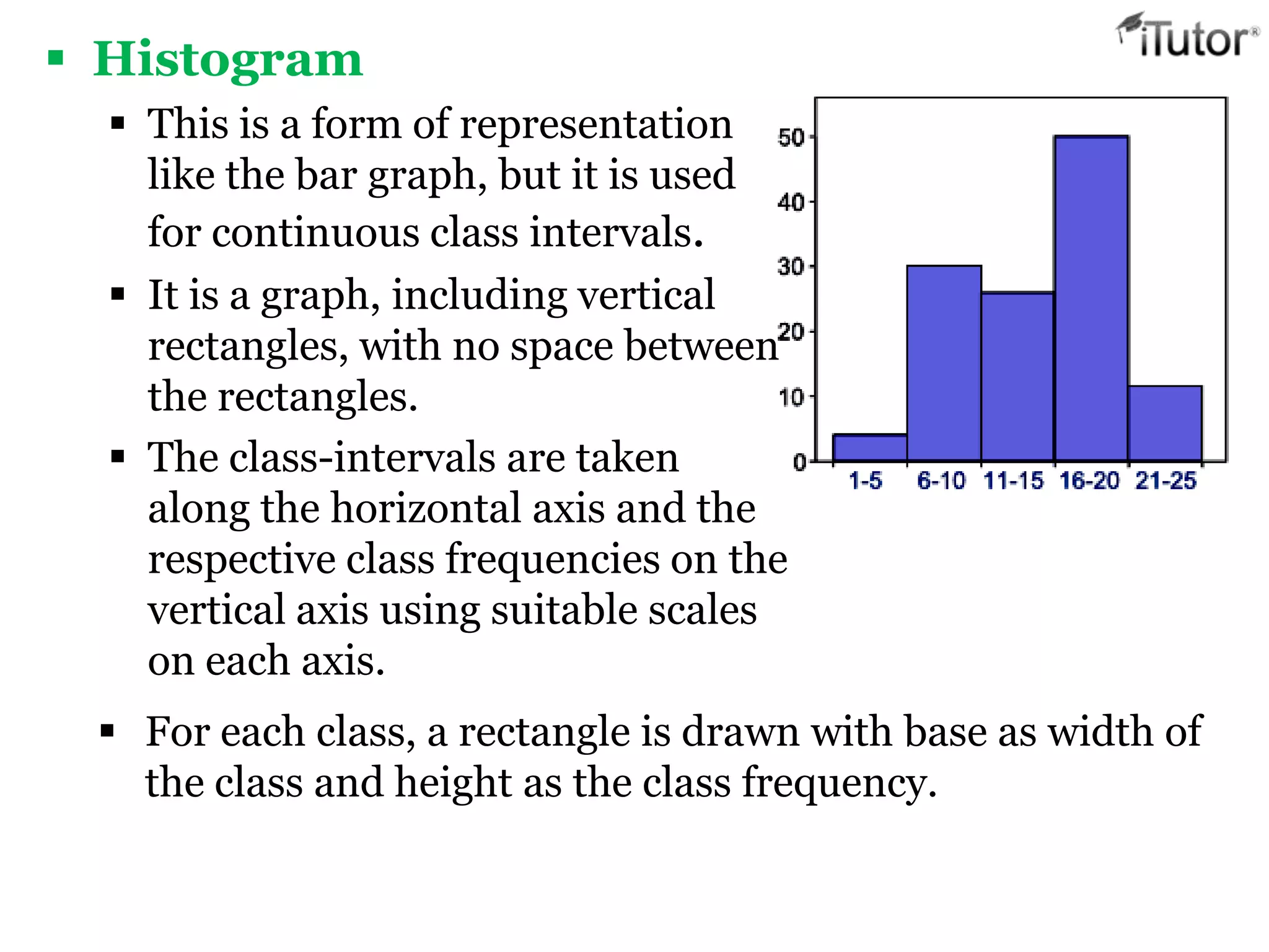
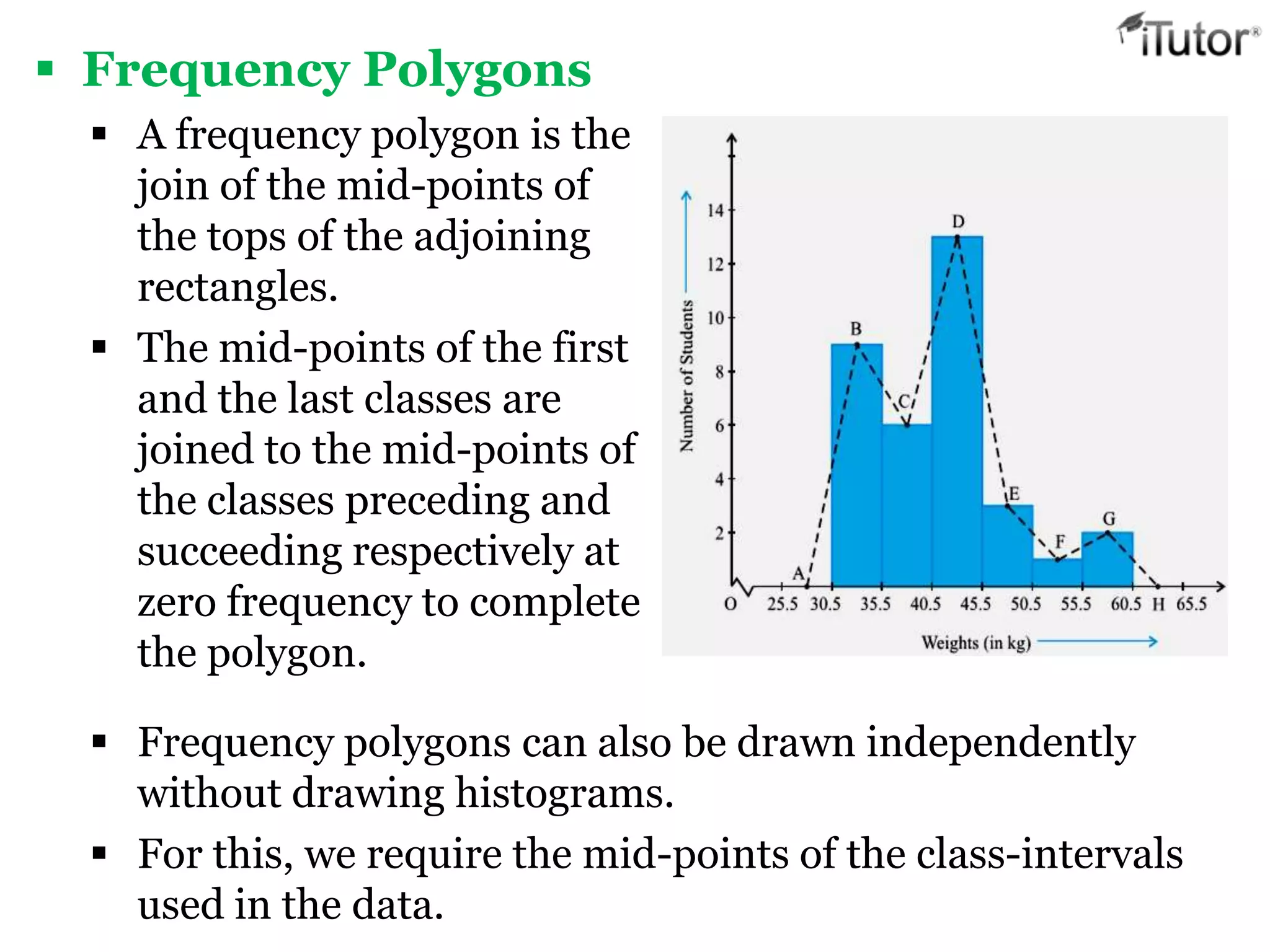
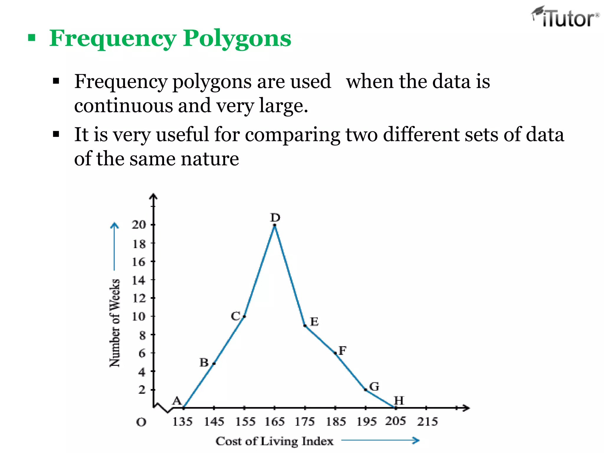
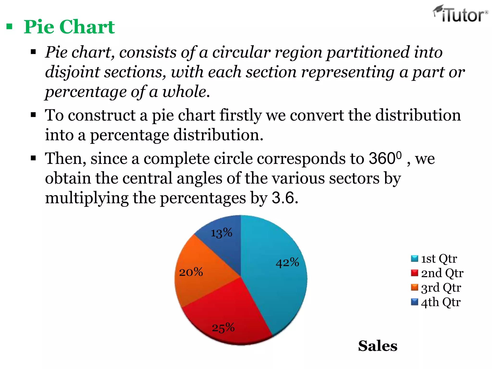
- Data is often organized and displayed using tables, graphs like histograms, bar charts and pie charts.