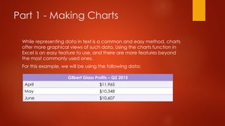
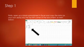
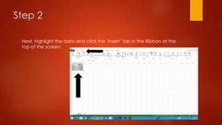
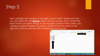
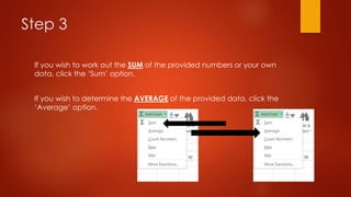
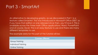
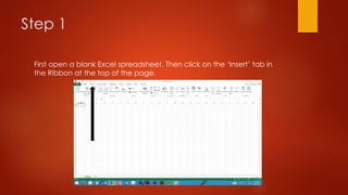
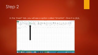
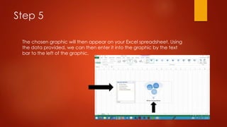
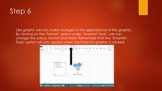
Microsoft Excel 101
Š L. HONEYMAN 1999-2015
NOTE
This presentation is based on information and experiences in Microsoft
Excel 2013. If you are using an earlier version of Excel, such as 2010 or
2007, you may see some differences in the general interface or the
available features. The functionality in all these versions however is
virtually the same.
The difference in versions may explain why you are seeing something
on this presentation that you cannot experience yourself with your
version of Microsoft Office.
In this presentation…
In this presentation we will be looking at:
- Making charts
- Calculating sums and averages
- SmartArt
Hope you enjoy learning about the common features of Microsoft
Excel  
Part 1 - Making Charts
While representing data in text is a common and easy method, charts
offer more graphical views of such data. Using the charts function in
Excel is an easy feature to use, and there are more features beyond
the most commonly used ones.
For this example, we will be using the following data:
Gilbert Glass Profits – Q2 2015
April $11,965
May $10,348
June $10,607
Step 1
Firstly, open up a blank spreadsheet in Excel and copy the data (or
your own data) into the top left corner of the document, as seen
below:
Step 2
Next, highlight the data and click the ‘Insert’ tab in the Ribbon at the
top of the screen.
Step 3
You will see that next to the option ‘Recommended Charts’ there are a
number of charts that you can choose from. For this type of data, the
bar graph is the best way of representing the data in a graphical way.
By clicking on this icon, it will bring up a number of different options.
These different options are mainly visual changes, but all have the
same functionality and appearance. I’m going to click on the first
option, as you can see below.
Step 4
Now you can see that a chart has appeared on the document. But if
the appearance doesn’t move you, go to the ‘Design’ tab under
‘Chart Options’ on the Ribbon and choose between the different
colours and formats that are available.
When you are satisfied with the presentation of your chart, you can
either save it in Excel or copy it into a Word, Publisher or PowerPoint
document, or attach it to a message on Outlook or another mail
server.
NOTE: The ‘Chart Options’
tool will only appear when
the chart itself is clicked on.
Part 2 - Calculating Sums And
Averages
Everyone should have a good understanding of math equations and
methods. But Excel takes the hassle of calculating data over and over
again with a feature known as ‘AutoSum’. We will be looking at its
different features over the course of Part 2.
The data we will be using is the following:
Kilometers Travelled per Day
Monday 356
Tuesday 412
Wednesday 737
Thursday 292
Friday 836
Saturday 526
Step 1
As it was in Part 1, the first thing you need to do is go to Excel and open
a blank spreadsheet, the input your data or the example provided in
this course.
Step 2
Next, highlight the numbers in the right column ONLY. Make sure that
you also label the cell directly below the last number. This is where the
result of the sum given will go. In the top-right corner of the screen, you
will see an option labeled ‘AutoSum’. Click on the tiny arrow to the
right of it, and you will see a list of options for you to use.
Step 3
If you wish to work out the SUM of the provided numbers or your own
data, click the ‘Sum’ option.
If you wish to determine the AVERAGE of the provided data, click the
‘Average’ option.
Part 3 - SmartArt
An alternative to developing graphs, as we discovered in Part 1 is a
feature called SmartArt. This was introduced in Microsoft Office 2007, so
if you have that edition or one released since then, you’ll have it. This is
available across the three main Office applications; Word, PowerPoint
and of course, Excel. This is an easy feature to use and there are many
different templates to use.
The example data for this part of the tutorial will be:
Courses Offered
Group Training
Individual Training
Online Training
Step 1
First open a blank Excel spreadsheet. Then click on the ‘Insert’ tab in
the Ribbon at the top of the page.
Step 2
In the ‘Insert’ tab, you will see a option called ‘SmartArt’. Give it a click.
Step 3
When you click this option, you will see this dialogue box, with all
different templates separated into different sections located on the
left.
Step 4
To best represent the data provided, click on the ‘Relationship’ option
and click on the following graphical template.
Step 5
The chosen graphic will then appear on your Excel spreadsheet. Using
the data provided, we can then enter it into the graphic by the text
bar to the left of the graphic.
Step 6
Like graphs, we can make changes to the appearance of the graphic.
By clicking on the ‘Format’ option under ‘SmartArt Tools’, we can
change the colour, format and more. Remember that the ‘SmartArt
Tools’ option will only appear when the SmartArt graphic is clicked.
Conclusion
Thank you for watching this tutorial course on Microsoft Excel. I hope
you have learned something out of watching and understanding the
different features involved. If you want to let me know of any
discrepancies or you have any comments, send them here:
lahoneyman@bigpond.com
Once again, thanks for watching!

Microsoft Excel 101

  • 1.
    Microsoft Excel 101 ŠL. HONEYMAN 1999-2015
  • 2.
    NOTE This presentation isbased on information and experiences in Microsoft Excel 2013. If you are using an earlier version of Excel, such as 2010 or 2007, you may see some differences in the general interface or the available features. The functionality in all these versions however is virtually the same. The difference in versions may explain why you are seeing something on this presentation that you cannot experience yourself with your version of Microsoft Office.
  • 3.
    In this presentation… Inthis presentation we will be looking at: - Making charts - Calculating sums and averages - SmartArt Hope you enjoy learning about the common features of Microsoft Excel  
  • 4.
    Part 1 -Making Charts While representing data in text is a common and easy method, charts offer more graphical views of such data. Using the charts function in Excel is an easy feature to use, and there are more features beyond the most commonly used ones. For this example, we will be using the following data: Gilbert Glass Profits – Q2 2015 April $11,965 May $10,348 June $10,607
  • 5.
    Step 1 Firstly, openup a blank spreadsheet in Excel and copy the data (or your own data) into the top left corner of the document, as seen below:
  • 6.
    Step 2 Next, highlightthe data and click the ‘Insert’ tab in the Ribbon at the top of the screen.
  • 7.
    Step 3 You willsee that next to the option ‘Recommended Charts’ there are a number of charts that you can choose from. For this type of data, the bar graph is the best way of representing the data in a graphical way. By clicking on this icon, it will bring up a number of different options. These different options are mainly visual changes, but all have the same functionality and appearance. I’m going to click on the first option, as you can see below.
  • 8.
    Step 4 Now youcan see that a chart has appeared on the document. But if the appearance doesn’t move you, go to the ‘Design’ tab under ‘Chart Options’ on the Ribbon and choose between the different colours and formats that are available. When you are satisfied with the presentation of your chart, you can either save it in Excel or copy it into a Word, Publisher or PowerPoint document, or attach it to a message on Outlook or another mail server. NOTE: The ‘Chart Options’ tool will only appear when the chart itself is clicked on.
  • 9.
    Part 2 -Calculating Sums And Averages Everyone should have a good understanding of math equations and methods. But Excel takes the hassle of calculating data over and over again with a feature known as ‘AutoSum’. We will be looking at its different features over the course of Part 2. The data we will be using is the following: Kilometers Travelled per Day Monday 356 Tuesday 412 Wednesday 737 Thursday 292 Friday 836 Saturday 526
  • 10.
    Step 1 As itwas in Part 1, the first thing you need to do is go to Excel and open a blank spreadsheet, the input your data or the example provided in this course.
  • 11.
    Step 2 Next, highlightthe numbers in the right column ONLY. Make sure that you also label the cell directly below the last number. This is where the result of the sum given will go. In the top-right corner of the screen, you will see an option labeled ‘AutoSum’. Click on the tiny arrow to the right of it, and you will see a list of options for you to use.
  • 12.
    Step 3 If youwish to work out the SUM of the provided numbers or your own data, click the ‘Sum’ option. If you wish to determine the AVERAGE of the provided data, click the ‘Average’ option.
  • 13.
    Part 3 -SmartArt An alternative to developing graphs, as we discovered in Part 1 is a feature called SmartArt. This was introduced in Microsoft Office 2007, so if you have that edition or one released since then, you’ll have it. This is available across the three main Office applications; Word, PowerPoint and of course, Excel. This is an easy feature to use and there are many different templates to use. The example data for this part of the tutorial will be: Courses Offered Group Training Individual Training Online Training
  • 14.
    Step 1 First opena blank Excel spreadsheet. Then click on the ‘Insert’ tab in the Ribbon at the top of the page.
  • 15.
    Step 2 In the‘Insert’ tab, you will see a option called ‘SmartArt’. Give it a click.
  • 16.
    Step 3 When youclick this option, you will see this dialogue box, with all different templates separated into different sections located on the left.
  • 17.
    Step 4 To bestrepresent the data provided, click on the ‘Relationship’ option and click on the following graphical template.
  • 18.
    Step 5 The chosengraphic will then appear on your Excel spreadsheet. Using the data provided, we can then enter it into the graphic by the text bar to the left of the graphic.
  • 19.
    Step 6 Like graphs,we can make changes to the appearance of the graphic. By clicking on the ‘Format’ option under ‘SmartArt Tools’, we can change the colour, format and more. Remember that the ‘SmartArt Tools’ option will only appear when the SmartArt graphic is clicked.
  • 20.
    Conclusion Thank you forwatching this tutorial course on Microsoft Excel. I hope you have learned something out of watching and understanding the different features involved. If you want to let me know of any discrepancies or you have any comments, send them here: lahoneyman@bigpond.com Once again, thanks for watching!