Download to read offline
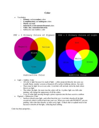

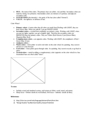

Color has three main properties: hue, saturation, and value. Hue refers to the name of the color, such as red, yellow, or blue. Saturation refers to the purity of the hue, while value refers to the lightness or darkness of the hue. There are primary colors of red, yellow, and blue that can be mixed to create secondary colors. Color is created through either additive or subtractive mixing. Additive color involves light, while subtractive color involves pigments that absorb some light and reflect the rest. Texture includes actual textures as well as simulated textures found in materials like fabric, wood, and nature.