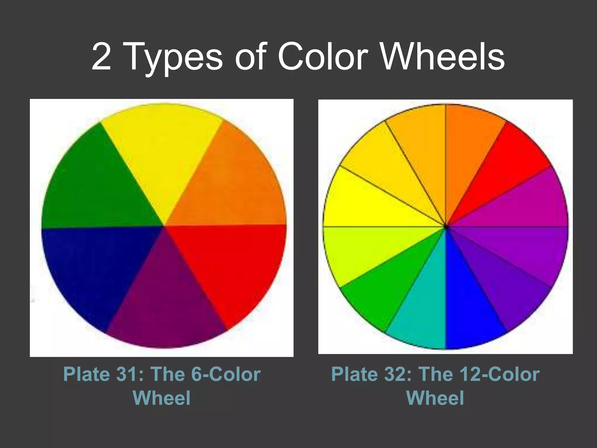
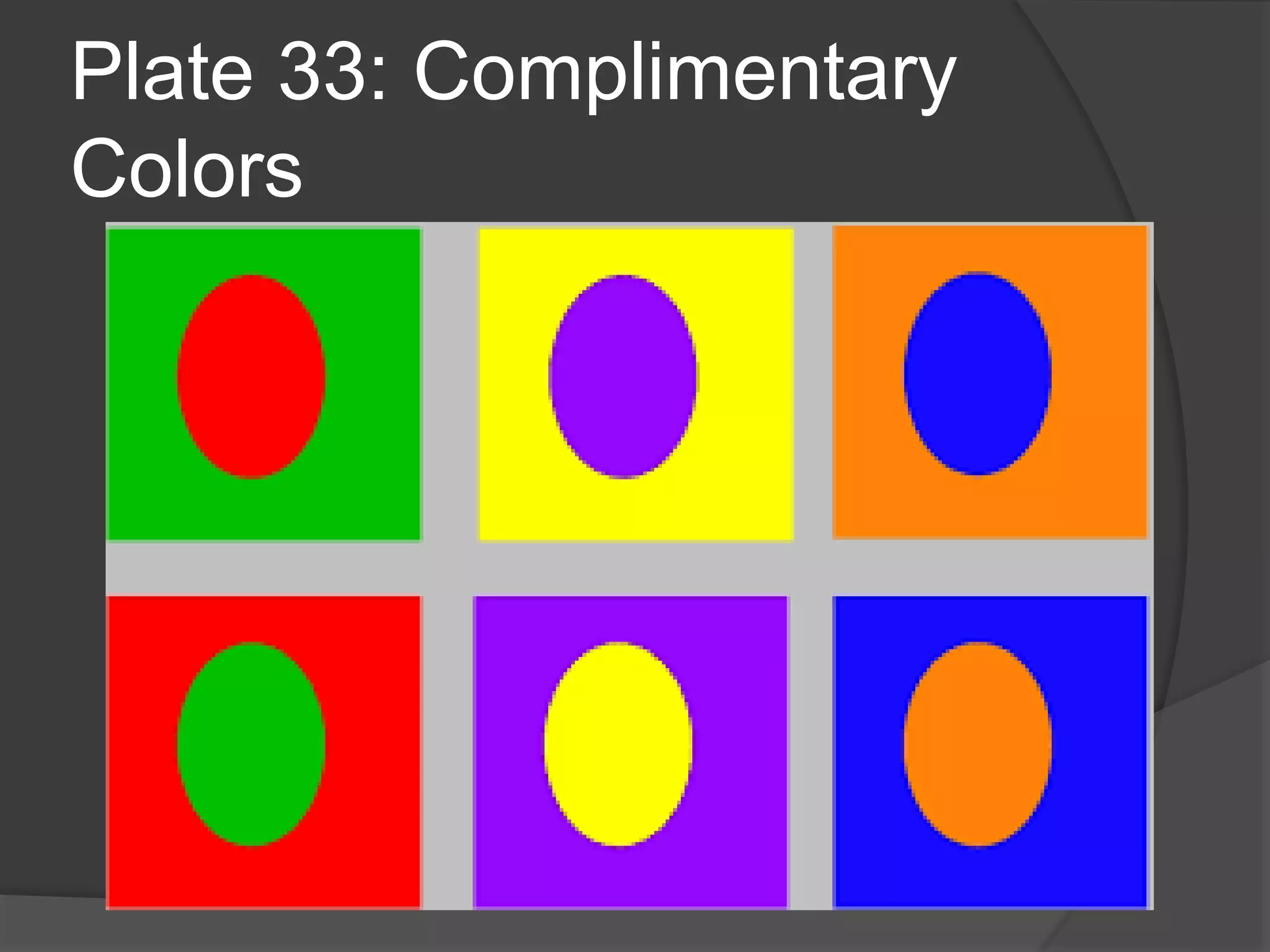
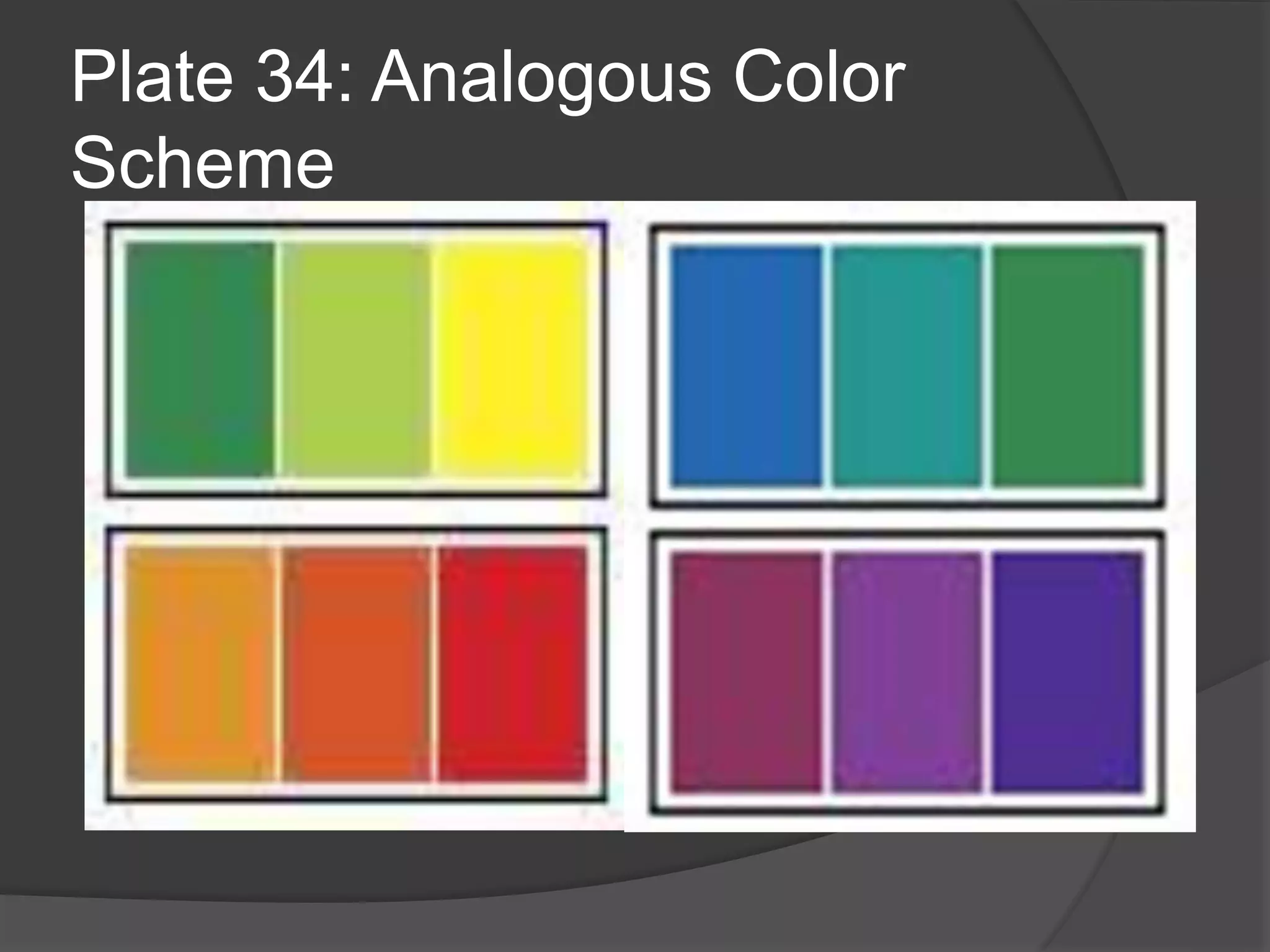
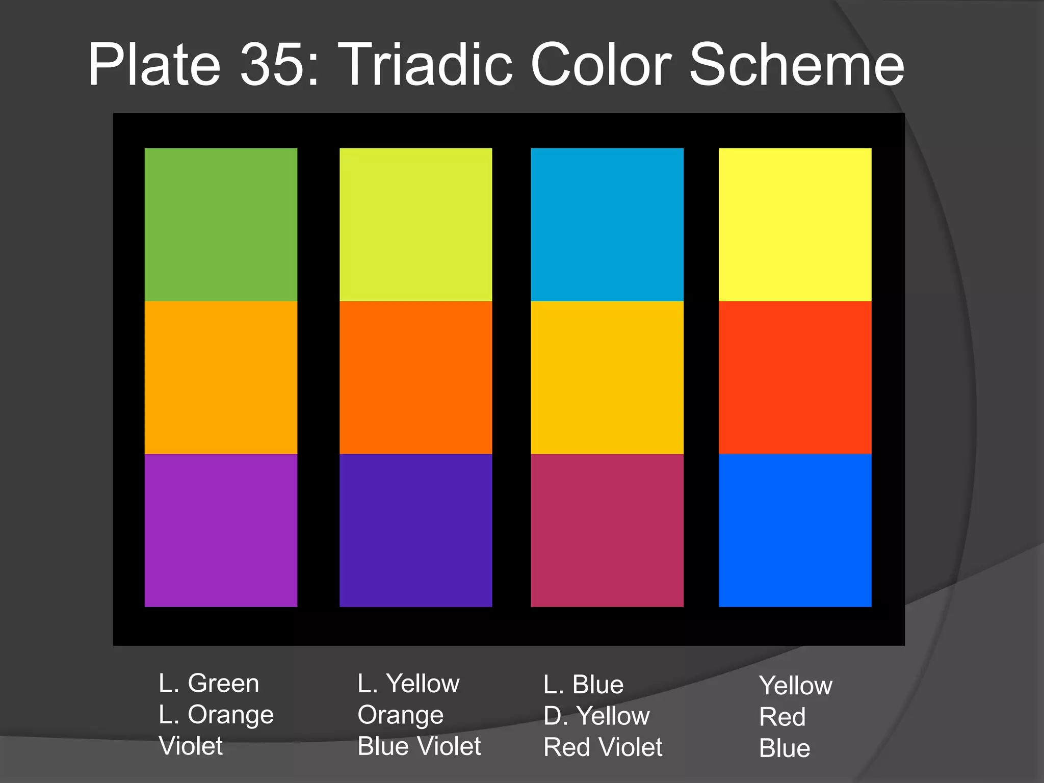
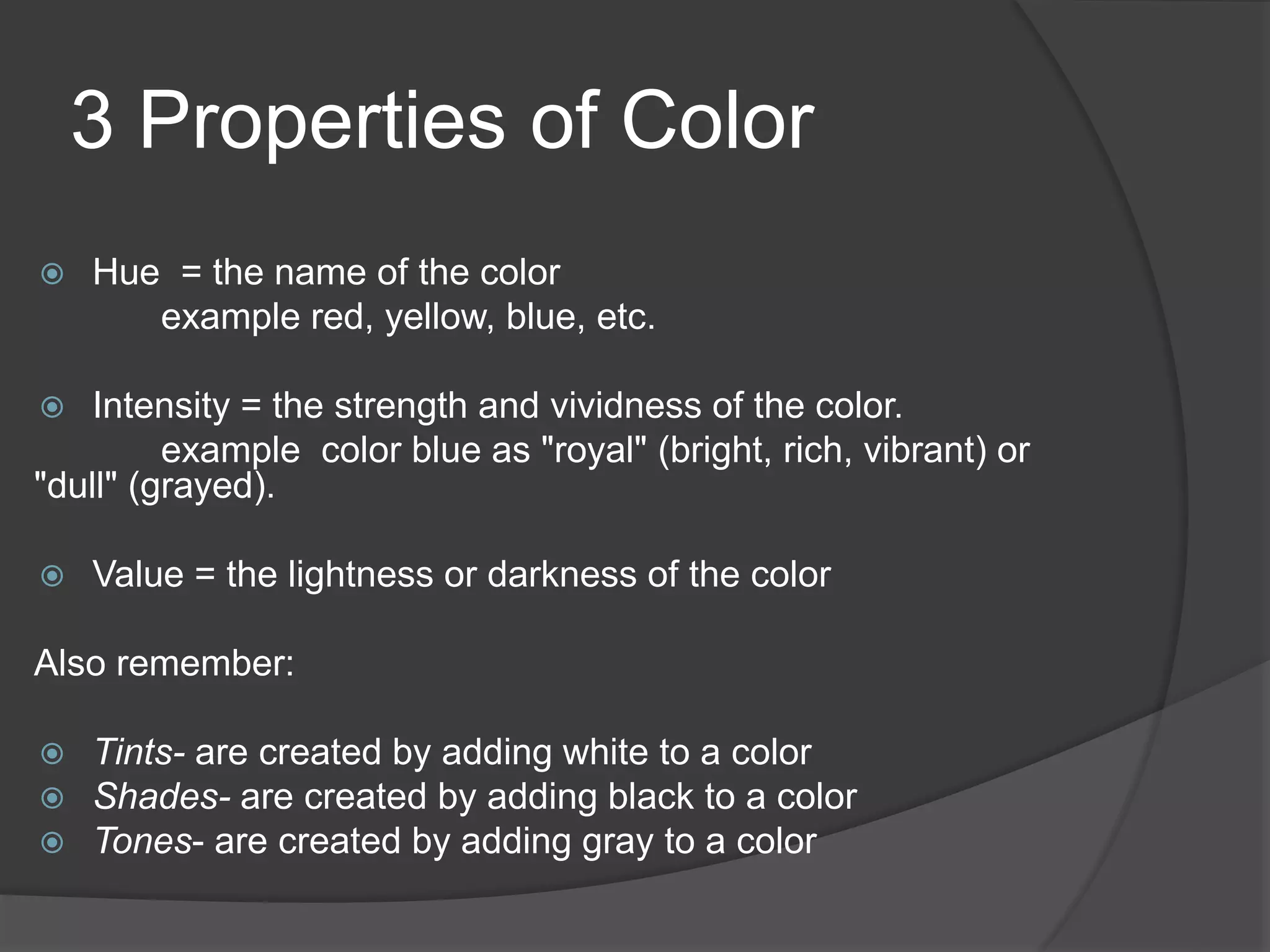
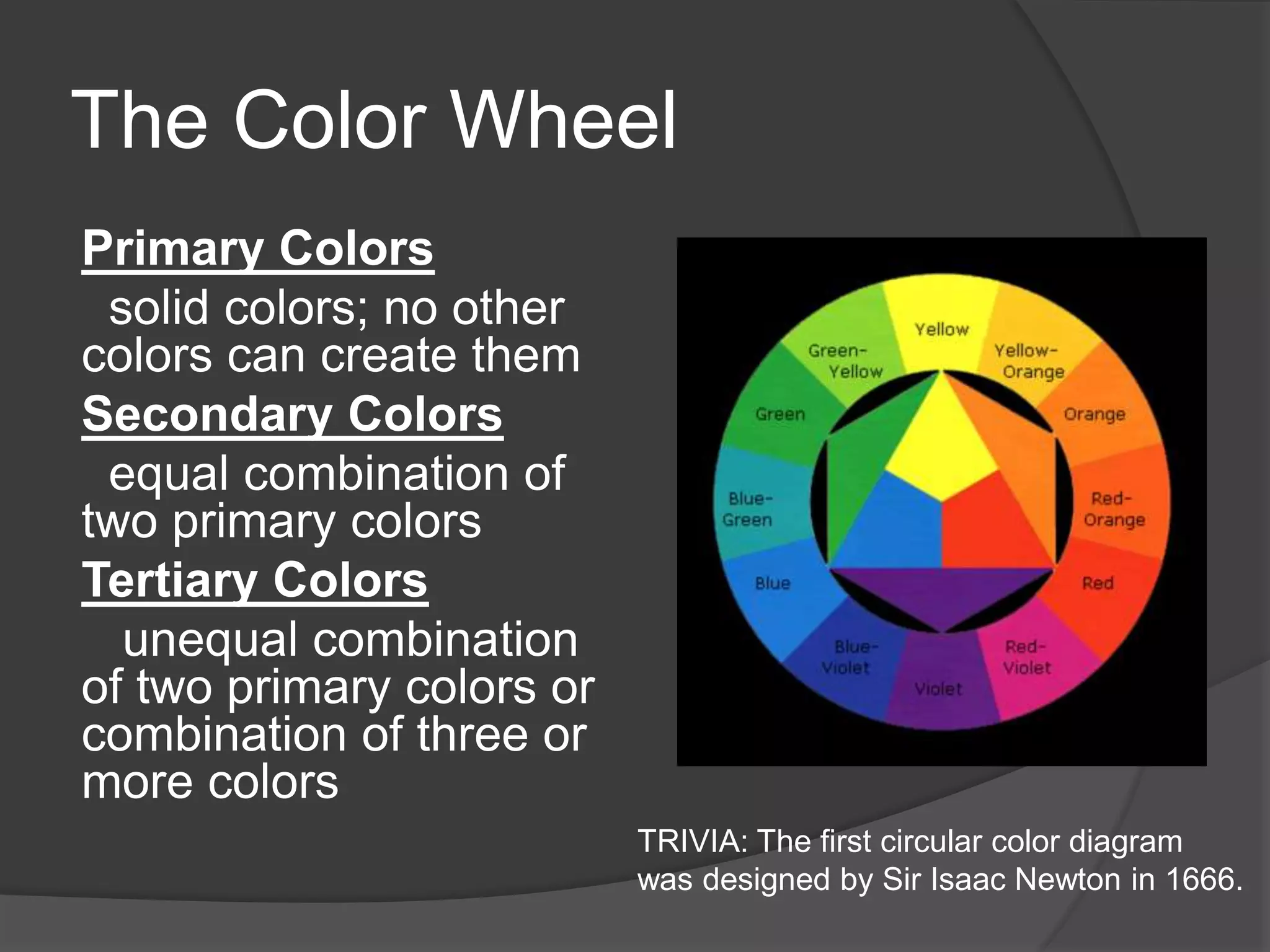
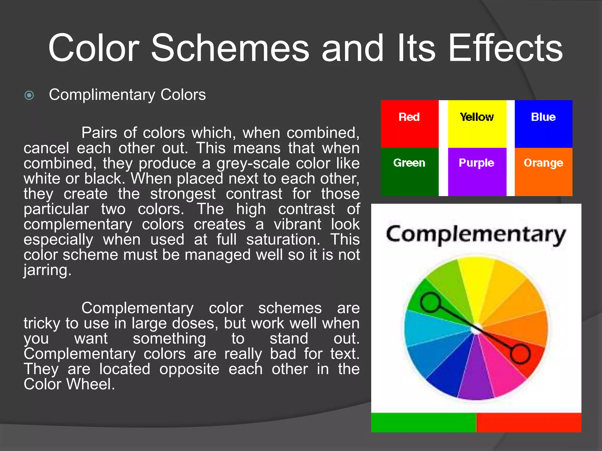
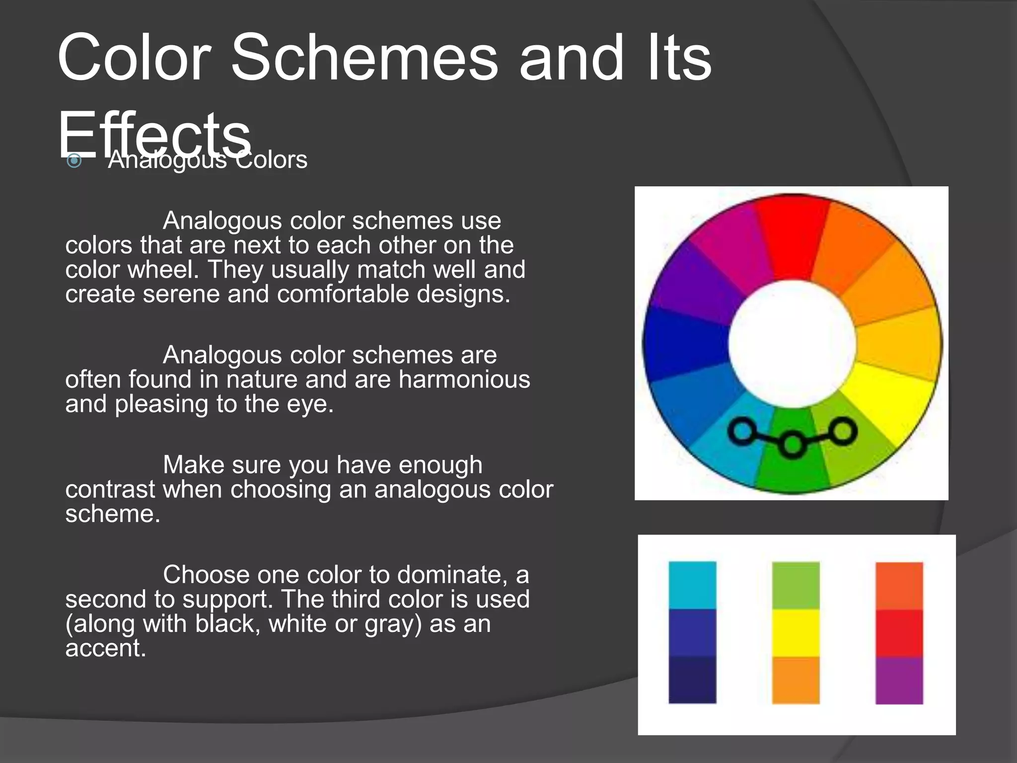
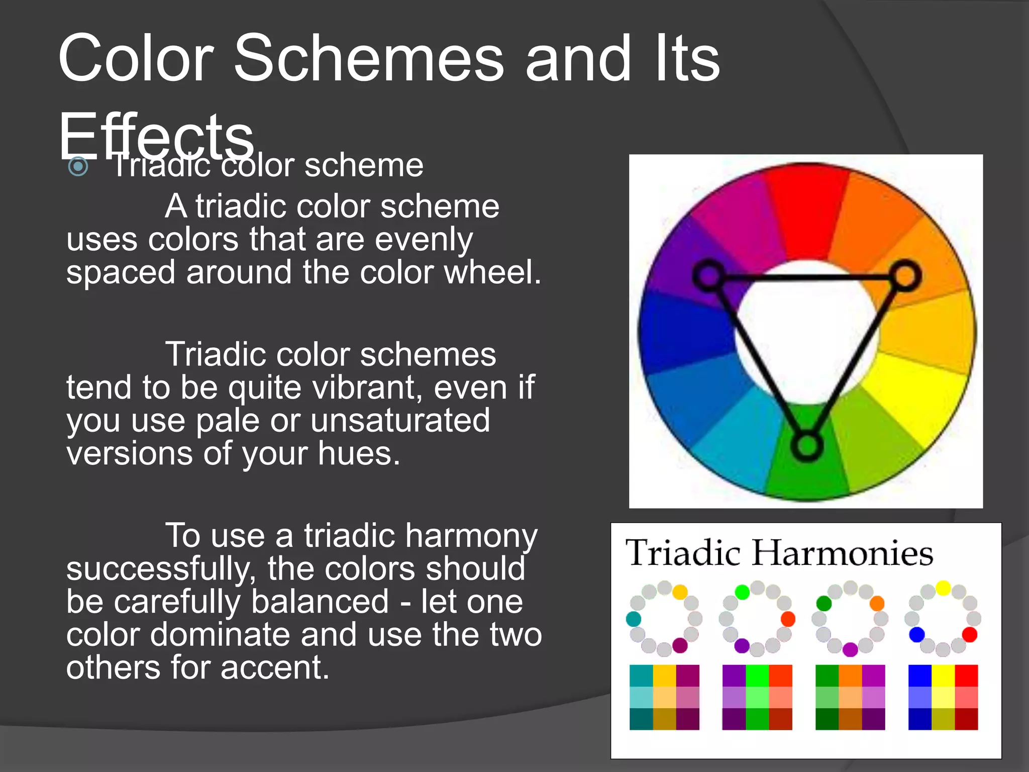
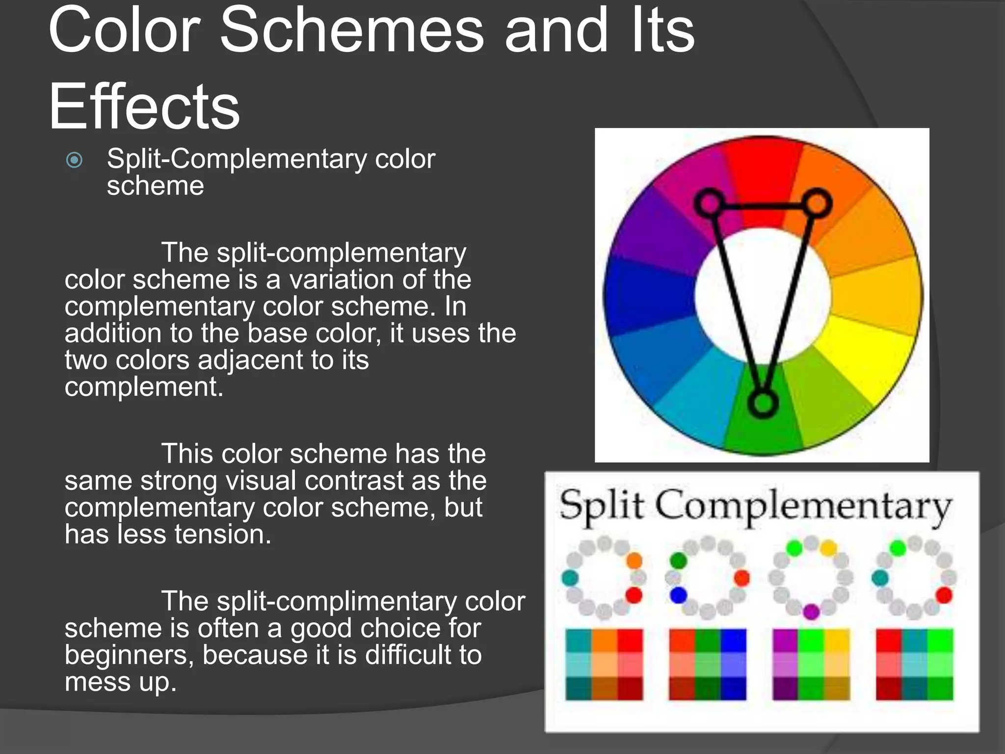
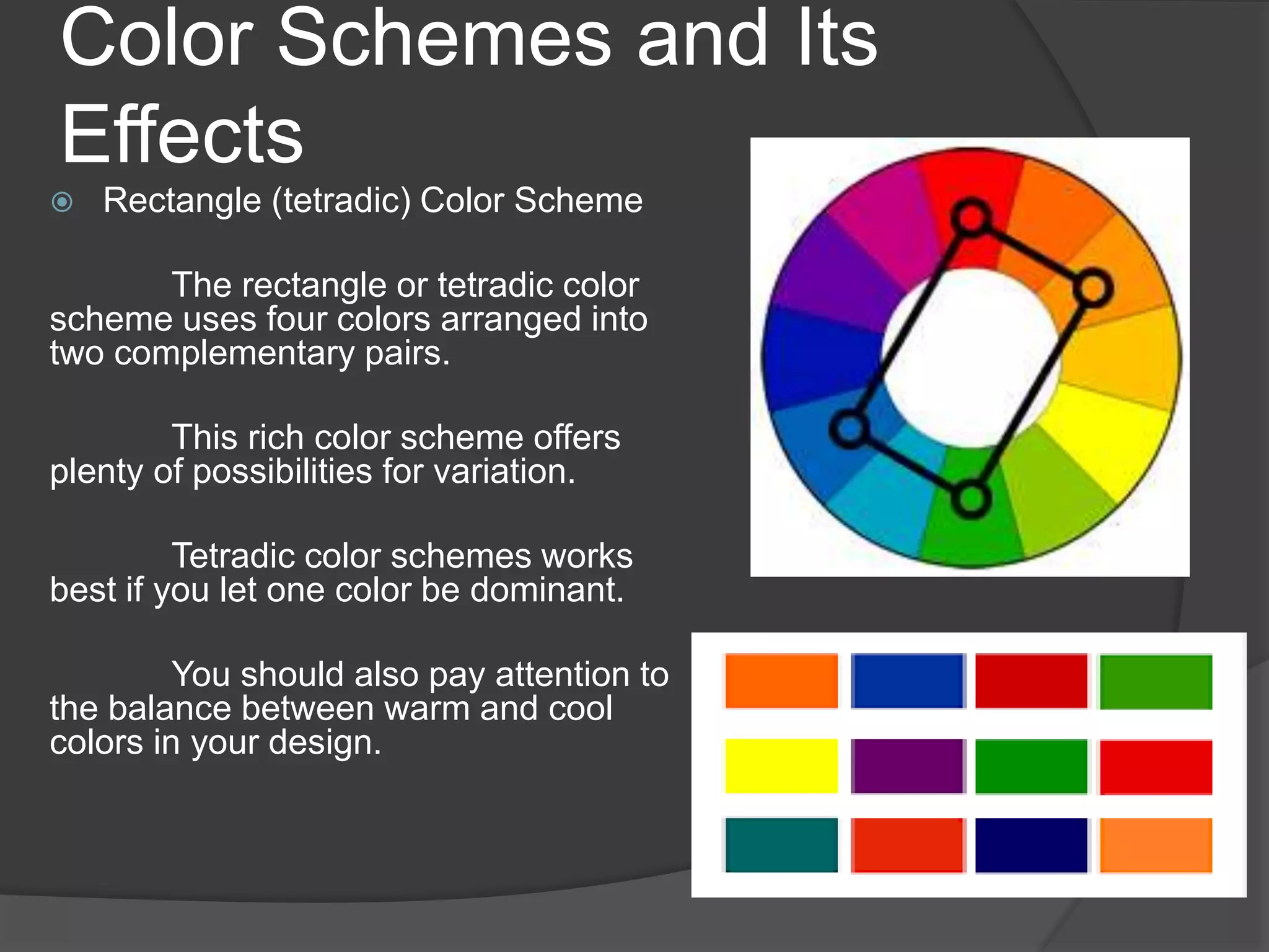
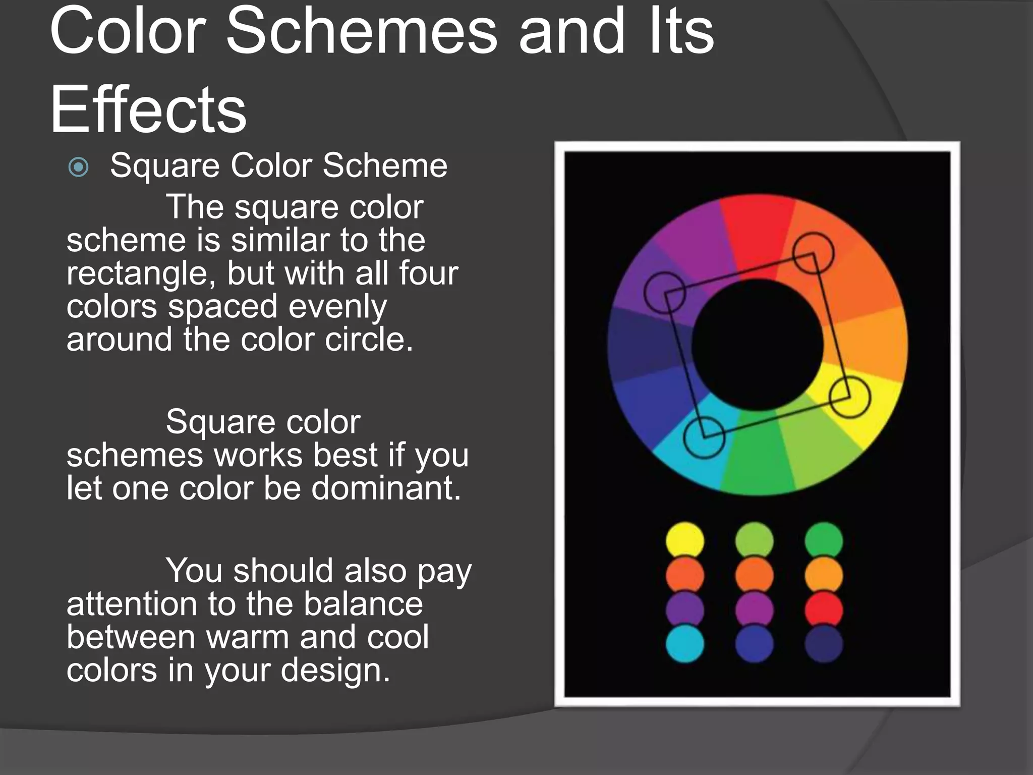
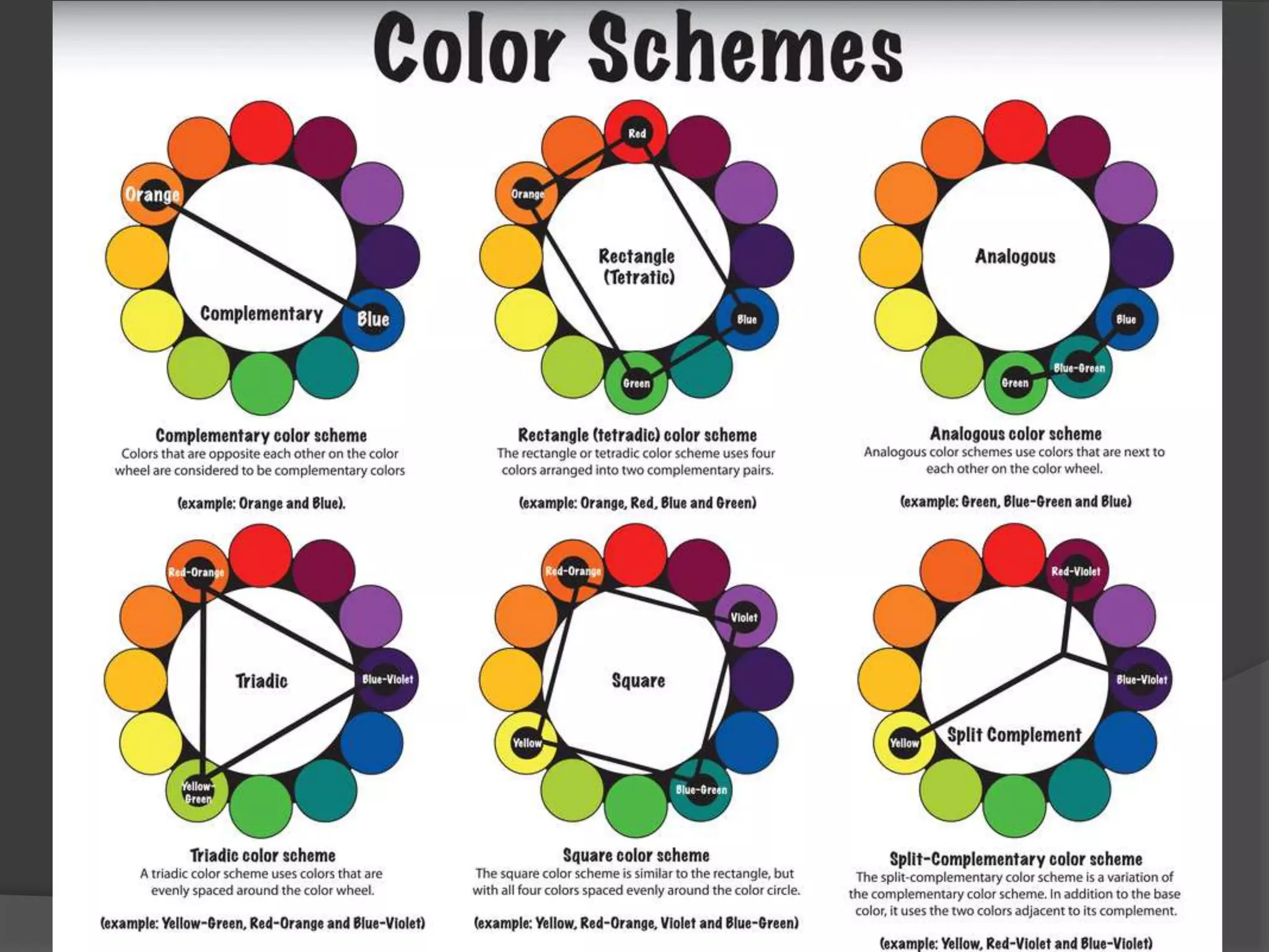
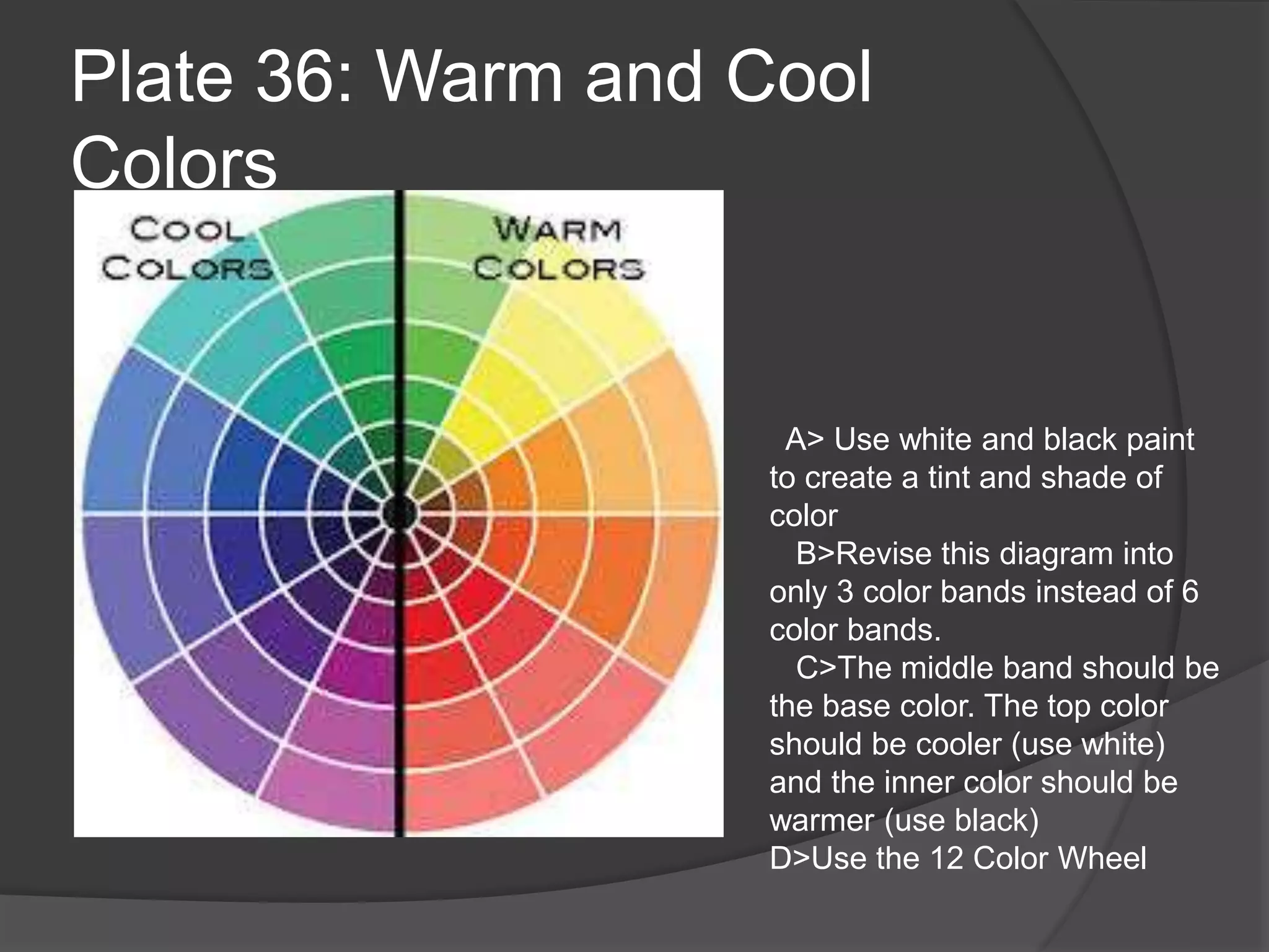
Definition
Properties of Color
The Color Wheel
Understanding Color
Color Schemes
Definition
 refers to reflected light on an object as
seen by the human eye.
3 Properties of Color
 Hue = the name of the color
example red, yellow, blue, etc.
 Intensity = the strength and vividness of the color.
example color blue as "royal" (bright, rich, vibrant) or
"dull" (grayed).
 Value = the lightness or darkness of the color
Also remember:
 Tints- are created by adding white to a color
 Shades- are created by adding black to a color
 Tones- are created by adding gray to a color
The Color Wheel
Primary Colors
solid colors; no other
colors can create them
Secondary Colors
equal combination of
two primary colors
Tertiary Colors
unequal combination
of two primary colors or
combination of three or
more colors
TRIVIA: The first circular color diagram
was designed by Sir Isaac Newton in 1666.
Understanding Color
Color Schemes and Its Effects
 Complimentary Colors
Pairs of colors which, when combined,
cancel each other out. This means that when
combined, they produce a grey-scale color like
white or black. When placed next to each other,
they create the strongest contrast for those
particular two colors. The high contrast of
complementary colors creates a vibrant look
especially when used at full saturation. This
color scheme must be managed well so it is not
jarring.
Complementary color schemes are
tricky to use in large doses, but work well when
you want something to stand out.
Complementary colors are really bad for text.
They are located opposite each other in the
Color Wheel.
Color Schemes and Its
Effects Analogous Colors
Analogous color schemes use
colors that are next to each other on the
color wheel. They usually match well and
create serene and comfortable designs.
Analogous color schemes are
often found in nature and are harmonious
and pleasing to the eye.
Make sure you have enough
contrast when choosing an analogous color
scheme.
Choose one color to dominate, a
second to support. The third color is used
(along with black, white or gray) as an
accent.
Color Schemes and Its
Effects Triadic color scheme
A triadic color scheme
uses colors that are evenly
spaced around the color wheel.
Triadic color schemes
tend to be quite vibrant, even if
you use pale or unsaturated
versions of your hues.
To use a triadic harmony
successfully, the colors should
be carefully balanced - let one
color dominate and use the two
others for accent.
Color Schemes and Its
Effects
 Split-Complementary color
scheme
The split-complementary
color scheme is a variation of the
complementary color scheme. In
addition to the base color, it uses the
two colors adjacent to its
complement.
This color scheme has the
same strong visual contrast as the
complementary color scheme, but
has less tension.
The split-complimentary color
scheme is often a good choice for
beginners, because it is difficult to
mess up.
Color Schemes and Its
Effects
 Rectangle (tetradic) Color Scheme
The rectangle or tetradic color
scheme uses four colors arranged into
two complementary pairs.
This rich color scheme offers
plenty of possibilities for variation.
Tetradic color schemes works
best if you let one color be dominant.
You should also pay attention to
the balance between warm and cool
colors in your design.
Color Schemes and Its
Effects
 Square Color Scheme
The square color
scheme is similar to the
rectangle, but with all four
colors spaced evenly
around the color circle.
Square color
schemes works best if you
let one color be dominant.
You should also pay
attention to the balance
between warm and cool
colors in your design.
Color Temperature in
Painting
 Color temperature described the overall
color range in a composition, can
compare the relationship between two
colors, or describe the difference
between two similar hues.
 Color temperature can be used for
emotional effect, or set up the lighting of
environment of a scene.
Understanding Color Temperature
Temperature within a Color
Color temperature is not always
used to describe the relationship
between different colors as it is
sometimes applied to the difference
between two variants of the same color.
Looking at the two versions of green on
the right, we can see one appears
cooler than the other.
The same is true looking at two
versions of orange. We can see that one
orange appears warmer than the other.
This is true of any comparison
between two similar colors. Besides
value or saturation differences we will
find temperature differences as well.
Color Temperature in Painting
Warm Colors Cool Colors
Such as red, yellow and
orange – can spark a
variety of emotions ranging
from comfort and warmth to
hostility and anger.
A warm color is one that
gives the viewer a sense of
warmth, energy, or heat,
such as the colors of the
sun.
Such as green, blue and
purple – often spark
feelings of calmness as well
as sadness.
A cool color is a color that
gives a sense of coolness,
cold, or stillness, such as
the colors of the ocean.
Plates for Color (Final Submission Sept. 8,
2016)
 Plate 31: The Basic Color Wheel
 Plate 32: The 12-Color Wheel
 Plate 33: Complimentary Colors
 Plate 34: Analogous Color Scheme
 Plate 35: Triadic Color Scheme
 Plate 36: Warm and Cool Colors
Materials: Compass, Pencil, Brush, Acrylic Paint
2 Types of Color Wheels
Plate 31: The 6-Color
Wheel
Plate 32: The 12-Color
Wheel
Plate 33: Complimentary
Colors
Plate 34: Analogous Color
Scheme
Plate 35: Triadic Color Scheme
L. Green
L. Orange
Violet
L. Yellow
Orange
Blue Violet
L. Blue
D. Yellow
Red Violet
Yellow
Red
Blue
Plate 36: Warm and Cool
Colors
A> Use white and black paint
to create a tint and shade of
color
B>Revise this diagram into
only 3 color bands instead of 6
color bands.
C>The middle band should be
the base color. The top color
should be cooler (use white)
and the inner color should be
warmer (use black)
D>Use the 12 Color Wheel
Sources:
http://www.tigercolor.com/color-lab/color-
theory/color-theory-intro.htm
http://www.paintdrawpaint.com/2011/04/col
or-basics-color-temperature-in.html

Lesson 10 a understanding color

  • 1.
    Definition Properties of Color TheColor Wheel Understanding Color Color Schemes
  • 2.
    Definition  refers toreflected light on an object as seen by the human eye.
  • 3.
    3 Properties ofColor  Hue = the name of the color example red, yellow, blue, etc.  Intensity = the strength and vividness of the color. example color blue as "royal" (bright, rich, vibrant) or "dull" (grayed).  Value = the lightness or darkness of the color Also remember:  Tints- are created by adding white to a color  Shades- are created by adding black to a color  Tones- are created by adding gray to a color
  • 4.
    The Color Wheel PrimaryColors solid colors; no other colors can create them Secondary Colors equal combination of two primary colors Tertiary Colors unequal combination of two primary colors or combination of three or more colors TRIVIA: The first circular color diagram was designed by Sir Isaac Newton in 1666.
  • 5.
  • 6.
    Color Schemes andIts Effects  Complimentary Colors Pairs of colors which, when combined, cancel each other out. This means that when combined, they produce a grey-scale color like white or black. When placed next to each other, they create the strongest contrast for those particular two colors. The high contrast of complementary colors creates a vibrant look especially when used at full saturation. This color scheme must be managed well so it is not jarring. Complementary color schemes are tricky to use in large doses, but work well when you want something to stand out. Complementary colors are really bad for text. They are located opposite each other in the Color Wheel.
  • 7.
    Color Schemes andIts Effects Analogous Colors Analogous color schemes use colors that are next to each other on the color wheel. They usually match well and create serene and comfortable designs. Analogous color schemes are often found in nature and are harmonious and pleasing to the eye. Make sure you have enough contrast when choosing an analogous color scheme. Choose one color to dominate, a second to support. The third color is used (along with black, white or gray) as an accent.
  • 8.
    Color Schemes andIts Effects Triadic color scheme A triadic color scheme uses colors that are evenly spaced around the color wheel. Triadic color schemes tend to be quite vibrant, even if you use pale or unsaturated versions of your hues. To use a triadic harmony successfully, the colors should be carefully balanced - let one color dominate and use the two others for accent.
  • 9.
    Color Schemes andIts Effects  Split-Complementary color scheme The split-complementary color scheme is a variation of the complementary color scheme. In addition to the base color, it uses the two colors adjacent to its complement. This color scheme has the same strong visual contrast as the complementary color scheme, but has less tension. The split-complimentary color scheme is often a good choice for beginners, because it is difficult to mess up.
  • 10.
    Color Schemes andIts Effects  Rectangle (tetradic) Color Scheme The rectangle or tetradic color scheme uses four colors arranged into two complementary pairs. This rich color scheme offers plenty of possibilities for variation. Tetradic color schemes works best if you let one color be dominant. You should also pay attention to the balance between warm and cool colors in your design.
  • 11.
    Color Schemes andIts Effects  Square Color Scheme The square color scheme is similar to the rectangle, but with all four colors spaced evenly around the color circle. Square color schemes works best if you let one color be dominant. You should also pay attention to the balance between warm and cool colors in your design.
  • 13.
    Color Temperature in Painting Color temperature described the overall color range in a composition, can compare the relationship between two colors, or describe the difference between two similar hues.  Color temperature can be used for emotional effect, or set up the lighting of environment of a scene.
  • 14.
    Understanding Color Temperature Temperaturewithin a Color Color temperature is not always used to describe the relationship between different colors as it is sometimes applied to the difference between two variants of the same color. Looking at the two versions of green on the right, we can see one appears cooler than the other. The same is true looking at two versions of orange. We can see that one orange appears warmer than the other. This is true of any comparison between two similar colors. Besides value or saturation differences we will find temperature differences as well.
  • 15.
    Color Temperature inPainting Warm Colors Cool Colors Such as red, yellow and orange – can spark a variety of emotions ranging from comfort and warmth to hostility and anger. A warm color is one that gives the viewer a sense of warmth, energy, or heat, such as the colors of the sun. Such as green, blue and purple – often spark feelings of calmness as well as sadness. A cool color is a color that gives a sense of coolness, cold, or stillness, such as the colors of the ocean.
  • 16.
    Plates for Color(Final Submission Sept. 8, 2016)  Plate 31: The Basic Color Wheel  Plate 32: The 12-Color Wheel  Plate 33: Complimentary Colors  Plate 34: Analogous Color Scheme  Plate 35: Triadic Color Scheme  Plate 36: Warm and Cool Colors Materials: Compass, Pencil, Brush, Acrylic Paint
  • 17.
    2 Types ofColor Wheels Plate 31: The 6-Color Wheel Plate 32: The 12-Color Wheel
  • 18.
  • 19.
    Plate 34: AnalogousColor Scheme
  • 20.
    Plate 35: TriadicColor Scheme L. Green L. Orange Violet L. Yellow Orange Blue Violet L. Blue D. Yellow Red Violet Yellow Red Blue
  • 21.
    Plate 36: Warmand Cool Colors A> Use white and black paint to create a tint and shade of color B>Revise this diagram into only 3 color bands instead of 6 color bands. C>The middle band should be the base color. The top color should be cooler (use white) and the inner color should be warmer (use black) D>Use the 12 Color Wheel
  • 22.