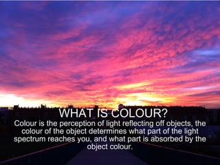
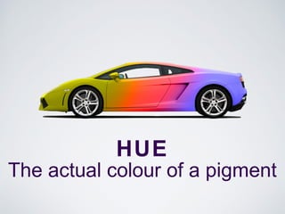
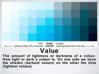
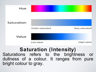
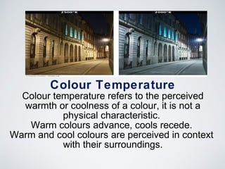
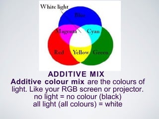
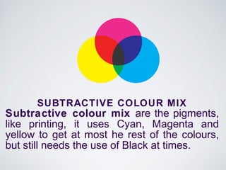
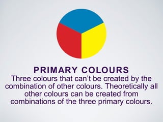
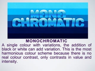
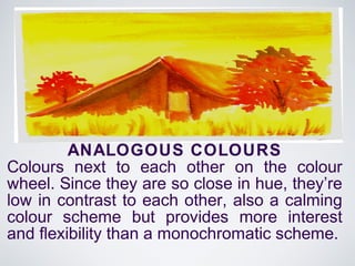
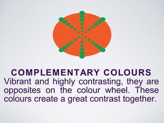
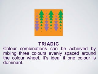
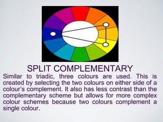
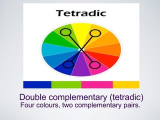
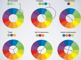
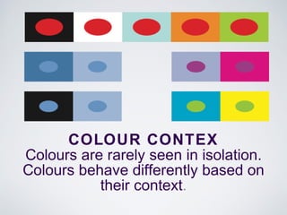
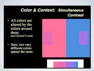
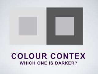
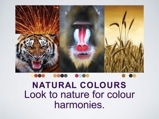
COLOUR THEORY
WHAT IS COLOUR?
Colour is the perception of light reflecting off objects, the
colour of the object determines what part of the light
spectrum reaches you, and what part is absorbed by the
object colour.
HUE
The actual colour of a pigment
Value
The amount of lightness or darkness of a colour.
How light or dark a colour is. On one side we have
the shades (darkest values) on the other the tints
(lightest values)
Saturation (Intensity)
Saturations refers to the brightness or
dullness of a colour. It ranges from pure
bright colour to gray.
Colour Temperature
Colour temperature refers to the perceived
warmth or coolness of a colour, it is not a
physical characteristic.
Warm colours advance, cools recede.
Warm and cool colours are perceived in context
with their surroundings.
Colour temperature
WARM COOL
ADDITIVE MIX
Additive colour mix are the colours of
light. Like your RGB screen or projector.
no light = no colour (black)
all light (all colours) = white
SUBTRACTIVE COLOUR MIX
Subtractive colour mix are the pigments,
like printing, it uses Cyan, Magenta and
yellow to get at most he rest of the colours,
but still needs the use of Black at times.
PRIMARY COLOURS
Three colours that can’t be created by the
combination of other colours. Theoretically all
other colours can be created from
combinations of the three primary colours.
SECONDARY COLOURS
Secondary colours are formed by mixing
two primaries. For example, mixing cyan
and yellow creates green.
TERTIARY COLOURS
Are created by mixing a primary colour with a
secondary colour. For example, yellow plus
orange makes yellow-orange.These colours
are the visual midpoint between a primary
and a secondary.
A colour harmony is created with colours that look like they
belong together. Just like with a balanced design, a
harmonious colour palette is pleasing to the viewer. It is
important to be have an awaareness o insting for colour
harmony when designing.
MONOCHROMATIC
A single colour with variations, the addition of
black or white can add variation. This is the most
harmonious colour scheme because there is no
real colour contrast, only contrasts in value and
intensity.
ANALOGOUS COLOURS
Colours next to each other on the colour
wheel. Since they are so close in hue, they’re
low in contrast to each other, also a calming
colour scheme but provides more interest
and flexibility than a monochromatic scheme.
COMPLEMENTARY COLOURS
Vibrant and highly contrasting, they are
opposites on the colour wheel. These
colours create a great contrast together.
TRIADIC
Colour combinations can be achieved by
mixing three colours evenly spaced around
the colour wheel. It’s ideal if one colour is
dominant.
SPLIT COMPLEMENTARY
Similar to triadic, three colours are used. This is
created by selecting the two colours on either side of a
colour’s complement. It also has less contrast than the
complementary scheme but allows for more complex
colour schemes because two colours complement a
single colour.
Double complementary (tetradic)
Four colours, two complementary pairs.
COLOUR CONTEX
Colours are rarely seen in isolation.
Colours behave differently based on
their context.
COLOUR CONTEX
WHICH ONE IS DARKER?
NATURAL COLOURS
Look to nature for colour
harmonies.

Colour theory

  • 1.
  • 2.
    WHAT IS COLOUR? Colouris the perception of light reflecting off objects, the colour of the object determines what part of the light spectrum reaches you, and what part is absorbed by the object colour.
  • 3.
  • 4.
    Value The amount oflightness or darkness of a colour. How light or dark a colour is. On one side we have the shades (darkest values) on the other the tints (lightest values)
  • 5.
    Saturation (Intensity) Saturations refersto the brightness or dullness of a colour. It ranges from pure bright colour to gray.
  • 6.
    Colour Temperature Colour temperaturerefers to the perceived warmth or coolness of a colour, it is not a physical characteristic. Warm colours advance, cools recede. Warm and cool colours are perceived in context with their surroundings.
  • 7.
  • 8.
    ADDITIVE MIX Additive colourmix are the colours of light. Like your RGB screen or projector. no light = no colour (black) all light (all colours) = white
  • 9.
    SUBTRACTIVE COLOUR MIX Subtractivecolour mix are the pigments, like printing, it uses Cyan, Magenta and yellow to get at most he rest of the colours, but still needs the use of Black at times.
  • 10.
    PRIMARY COLOURS Three coloursthat can’t be created by the combination of other colours. Theoretically all other colours can be created from combinations of the three primary colours.
  • 11.
    SECONDARY COLOURS Secondary coloursare formed by mixing two primaries. For example, mixing cyan and yellow creates green.
  • 12.
    TERTIARY COLOURS Are createdby mixing a primary colour with a secondary colour. For example, yellow plus orange makes yellow-orange.These colours are the visual midpoint between a primary and a secondary.
  • 14.
    A colour harmonyis created with colours that look like they belong together. Just like with a balanced design, a harmonious colour palette is pleasing to the viewer. It is important to be have an awaareness o insting for colour harmony when designing.
  • 15.
    MONOCHROMATIC A single colourwith variations, the addition of black or white can add variation. This is the most harmonious colour scheme because there is no real colour contrast, only contrasts in value and intensity.
  • 16.
    ANALOGOUS COLOURS Colours nextto each other on the colour wheel. Since they are so close in hue, they’re low in contrast to each other, also a calming colour scheme but provides more interest and flexibility than a monochromatic scheme.
  • 17.
    COMPLEMENTARY COLOURS Vibrant andhighly contrasting, they are opposites on the colour wheel. These colours create a great contrast together.
  • 18.
    TRIADIC Colour combinations canbe achieved by mixing three colours evenly spaced around the colour wheel. It’s ideal if one colour is dominant.
  • 19.
    SPLIT COMPLEMENTARY Similar totriadic, three colours are used. This is created by selecting the two colours on either side of a colour’s complement. It also has less contrast than the complementary scheme but allows for more complex colour schemes because two colours complement a single colour.
  • 20.
    Double complementary (tetradic) Fourcolours, two complementary pairs.
  • 22.
    COLOUR CONTEX Colours arerarely seen in isolation. Colours behave differently based on their context.
  • 24.
  • 25.
    NATURAL COLOURS Look tonature for colour harmonies.