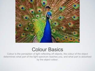
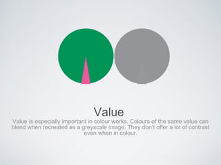
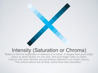
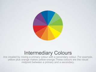
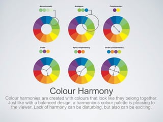
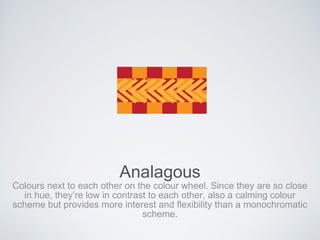
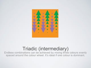
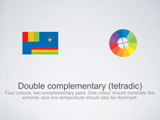
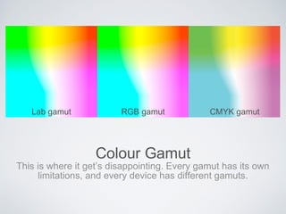
COLOUR
designing with colour
Š2010 Guy Parsons
Colour Basics
Colour is the perception of light reflecting off objects, the colour of the object
determines what part of the light spectrum reaches you, and what part is absorbed
by the object colour.
Hue
The actual colour of a pigment, light colour or object colour.
Value
The inherent lightness or darkness of a colour. It’s how light or dark a colour
is. For example, yellow is a lighter value than violet. Think of looking at your
image as a black and white photo. Value is contextual, a light value appears
lighter on a dark ground.
Value
Value is especially important in colour works. Colours of the same value can
blend when recreated as a greyscale image. They don’t offer a lot of contrast
even when in colour.
Intensity (Saturation or Chroma)
Refers to the the brightness or dullness of a colour. It ranges from pure bright
colour to white dilution on one end, and pure bright colour to black.
Colours with less intensity are sometimes referred to as muted colours.
The colours above are all blue, some have less saturation.
Colour Temperature
Colour temperature refers to the perceived warmth or coolness of a colour, it
is not a physical characteristic. Warm colours advance, cools recede.
Warm and cool colours are perceived in context
with their surroundings.
Primary Colours
Three colours that can’t be created by the combination of other colours.
Theoretically all other colours can be created from combinations of the three
primary colours.
Secondary Colours
Secondary colours are formed by mixing two primaries.
For example, mixing red and yellow creates orange.
Intermediary Colours
Are created by mixing a primary colour with a secondary colour. For example,
yellow plus orange makes yellow-orange.These colours are the visual
midpoint between a primary and a secondary.
Colour Harmony
Colour harmonies are created with colours that look like they belong together.
Just like with a balanced design, a harmonious colour palette is pleasing to
the viewer. Lack of harmony can be disturbing, but also can be exciting.
Monochromatic
A single colour with variations in hue, the addition of black or white can add
variation. This is the most harmonious colour scheme because there is no real
colour contrast, only contrasts in value and intensity. Subtle and calm, almost
boring.
Analagous
Colours next to each other on the colour wheel. Since they are so close
in hue, they’re low in contrast to each other, also a calming colour
scheme but provides more interest and flexibility than a monochromatic
scheme.
Complimentary
Vibrant and highly contrasting, they are opposites on the colour wheel.
This type of colour scheme can also be discordant if the two colours are
equally balanced.
Triadic (intermediary)
Endless combinations can be achieved by mixing three colours evenly
spaced around the colour wheel. It’s ideal if one colour is dominant.
Split complementary
Similar to triadic, three colours are used. This is created by selecting the
two colours on either side of a colour’s complement. It also has less
contrast than the complementary scheme but allows for more complex
colour schemes because two colours complement a single colour.
Double complementary (tetradic)
Four colours, two complementary pairs. One colour should dominate this
scheme, and one temperature should also be dominant.
Colour Context
Colours are rarely seen in isolation. Colours behave differently
based on their context.
Natural Colour
Look to nature for colour harmonies.
Using colour
Additive colour like your RGB screen or projector.
no light = no colour (black), all light (all colours) = white
Using colour
Subtractive colour like printing, uses Cyan, Magenta and
yellow to arrive at most colours, but still needs the use of Black
at times.
Colour Gamut
This is where it get’s disappointing. Every gamut has its own
limitations, and every device has different gamuts.
Lab gamut RGB gamut CMYK gamut
COLOUR
designing with colour

Colour Theory

  • 1.
  • 2.
    Colour Basics Colour isthe perception of light reflecting off objects, the colour of the object determines what part of the light spectrum reaches you, and what part is absorbed by the object colour.
  • 3.
    Hue The actual colourof a pigment, light colour or object colour.
  • 4.
    Value The inherent lightnessor darkness of a colour. It’s how light or dark a colour is. For example, yellow is a lighter value than violet. Think of looking at your image as a black and white photo. Value is contextual, a light value appears lighter on a dark ground.
  • 5.
    Value Value is especiallyimportant in colour works. Colours of the same value can blend when recreated as a greyscale image. They don’t offer a lot of contrast even when in colour.
  • 6.
    Intensity (Saturation orChroma) Refers to the the brightness or dullness of a colour. It ranges from pure bright colour to white dilution on one end, and pure bright colour to black. Colours with less intensity are sometimes referred to as muted colours. The colours above are all blue, some have less saturation.
  • 7.
    Colour Temperature Colour temperaturerefers to the perceived warmth or coolness of a colour, it is not a physical characteristic. Warm colours advance, cools recede. Warm and cool colours are perceived in context with their surroundings.
  • 8.
    Primary Colours Three coloursthat can’t be created by the combination of other colours. Theoretically all other colours can be created from combinations of the three primary colours.
  • 9.
    Secondary Colours Secondary coloursare formed by mixing two primaries. For example, mixing red and yellow creates orange.
  • 10.
    Intermediary Colours Are createdby mixing a primary colour with a secondary colour. For example, yellow plus orange makes yellow-orange.These colours are the visual midpoint between a primary and a secondary.
  • 11.
    Colour Harmony Colour harmoniesare created with colours that look like they belong together. Just like with a balanced design, a harmonious colour palette is pleasing to the viewer. Lack of harmony can be disturbing, but also can be exciting.
  • 12.
    Monochromatic A single colourwith variations in hue, the addition of black or white can add variation. This is the most harmonious colour scheme because there is no real colour contrast, only contrasts in value and intensity. Subtle and calm, almost boring.
  • 13.
    Analagous Colours next toeach other on the colour wheel. Since they are so close in hue, they’re low in contrast to each other, also a calming colour scheme but provides more interest and flexibility than a monochromatic scheme.
  • 14.
    Complimentary Vibrant and highlycontrasting, they are opposites on the colour wheel. This type of colour scheme can also be discordant if the two colours are equally balanced.
  • 15.
    Triadic (intermediary) Endless combinationscan be achieved by mixing three colours evenly spaced around the colour wheel. It’s ideal if one colour is dominant.
  • 16.
    Split complementary Similar totriadic, three colours are used. This is created by selecting the two colours on either side of a colour’s complement. It also has less contrast than the complementary scheme but allows for more complex colour schemes because two colours complement a single colour.
  • 17.
    Double complementary (tetradic) Fourcolours, two complementary pairs. One colour should dominate this scheme, and one temperature should also be dominant.
  • 18.
    Colour Context Colours arerarely seen in isolation. Colours behave differently based on their context.
  • 19.
    Natural Colour Look tonature for colour harmonies.
  • 20.
    Using colour Additive colourlike your RGB screen or projector. no light = no colour (black), all light (all colours) = white
  • 21.
    Using colour Subtractive colourlike printing, uses Cyan, Magenta and yellow to arrive at most colours, but still needs the use of Black at times.
  • 22.
    Colour Gamut This iswhere it get’s disappointing. Every gamut has its own limitations, and every device has different gamuts. Lab gamut RGB gamut CMYK gamut
  • 23.