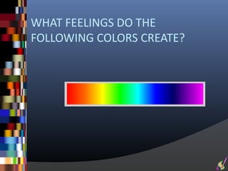
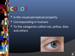
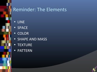
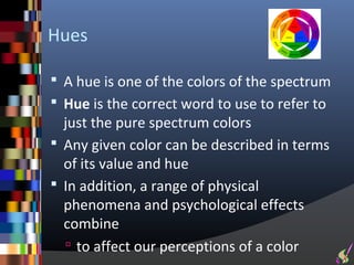
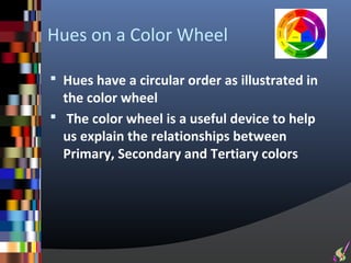
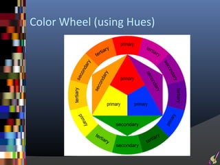
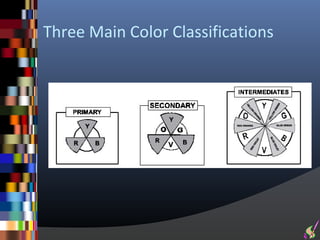
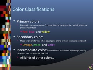
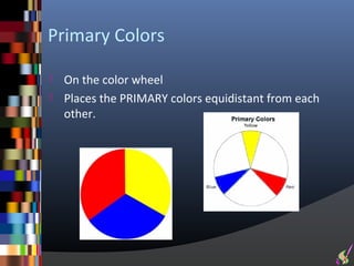
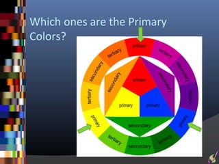
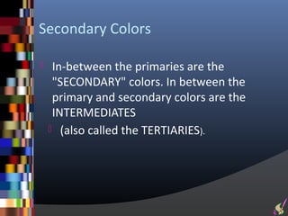
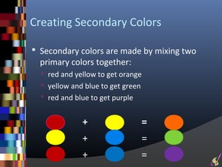
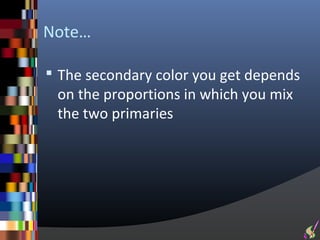
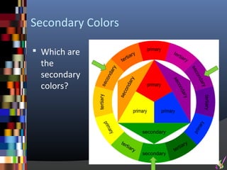
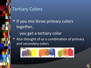
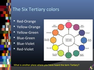
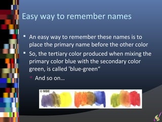
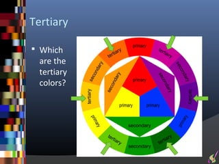
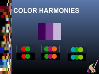
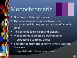
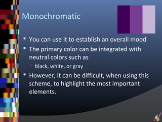
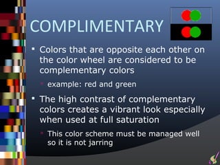
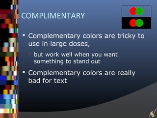
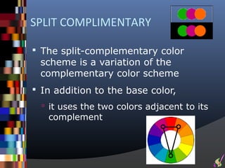
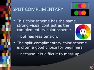
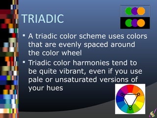
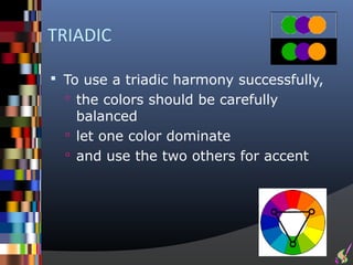
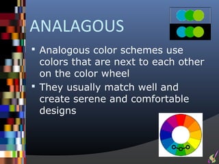
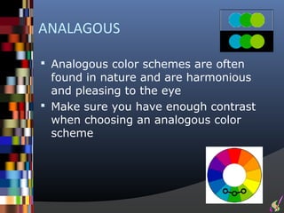
LIFE’S RAINBOW…


             Photo by L. E. Denyer
ARTISTIC ELEMENTS:
COLOR


                     2
“COLOR in a picture is like enthusiasm
in life”
  --by Pablo Picasso
WHAT FEELINGS DO THE
FOLLOWING COLORS CREATE?
Jane Anybody   2nd
                                     Course Name

Take out your Whiteboards


 For each of the following color slides,
   Write one or two words that relate to
    the emotions created by the following
    colors
   Then hold up your whiteboards for the
    teacher to see
COLOR
 Is the visual perceptual property
 Corresponding in humans
 To the categories called red, yellow, blue
  and others
COLOR
 Color derives from the spectrum of light
   (distribution of light energy versus
    wavelength)
 Interacting in the eye
   with the spectral sensitivities of the
    light receptors
COLOR
 Color categories and physical
 specifications of color are also associated
 with
  objects, materials, light sources, etc.
 Based on their physical properties such
  as
    light absorption
    Reflection
    or emission spectra
COLOR
 Color is one of the most powerful of the
  artistic elements
   It has tremendous expressive qualities.
   Understanding the uses of color is
    crucial to effective composition in
    design
 A knowledge of color terms helps us
  to appreciate the different ways that
  color may be used in art and design
Reminder: The Elements

• LINE
• SPACE
• COLOR
• SHAPE AND MASS
• TEXTURE
• PATTERN
Remember this picture?
 An example of lines
 Also an excellent
  illustration of vibrant
  color


                            21
Color Systems

 Color classification "systems" have been
  devised to organize and identify color
  relationships
 A most familiar one is the 12 hue "Color
  Wheel"
   introduced by Johannes Itten (1888-1967)
Light Spectrum
Light Spectrum
 The spectrum is the colors of the
  rainbow
   arranged in their natural order:
     Red - Orange - Yellow - Green - Blue -
      Indigo - Violet.
      The mnemonic for this is ROY G BIV
       Or RGB
Hues

 A hue is one of the colors of the spectrum
 Hue is the correct word to use to refer to
  just the pure spectrum colors
 Any given color can be described in terms
  of its value and hue
 In addition, a range of physical
  phenomena and psychological effects
  combine
   to affect our perceptions of a color
Hues on a Color Wheel

 Hues have a circular order as illustrated in
  the color wheel
 The color wheel is a useful device to help
  us explain the relationships between
  Primary, Secondary and Tertiary colors
Color Wheel (using Hues)
Three Main Color Classifications
Color Classifications

 Primary colors
      These colors are pure-you can’t create them from other colors and all others are
       created from them.
        Red, blue, and yellow
 Secondary colors
      These colors are formed when equal parts of two primary colors are combined.
        Orange, green, and violet
 Intermediate colors-These colors are formed by mixing a primary
   color with a secondary color next to it.

    All kinds of other colors….
Primary Colors

 On the color wheel
 Places the PRIMARY colors equidistant from each
  other.
Which ones are the Primary
Colors?
Secondary Colors

    In-between the primaries are the
     "SECONDARY" colors. In between the
     primary and secondary colors are the
     INTERMEDIATES
     (also called the TERTIARIES).
Creating Secondary Colors

 Secondary colors are made by mixing two
  primary colors together:
   red and yellow to get orange
   yellow and blue to get green
   red and blue to get purple


              +                  =
              +                  =
              +                  =
Note…

 The secondary color you get depends
 on the proportions in which you mix
 the two primaries
Secondary Colors

 Which are
 the
 secondary
 colors?
Tertiary Colors

 If you mix three primary colors
  together,
   you get a tertiary color
 Also thought of as a combination of primary
  and secondary colors
The Six Tertiary colors

 Red-Orange
 Yellow-Orange
 Yellow-Green
 Blue-Green
 Blue-Violet
 Red-Violet


What is another place where you have heard the term Tertiary?
Easy way to remember names

 An easy way to remember these names is to
  place the primary name before the other color
 So, the tertiary color produced when mixing the
  primary color blue with the secondary color
  green, is called 'blue-green“
   And so on…
Tertiary

 Which
  are the
  tertiary
  colors?
COLOR HARMONIES


                  40
Harmonies

 In decoration, harmony refers to a
 combination of colors that is
 pleasing to the eye
The Color Harmonies

 Monochromatic
 Complimentary
 Split Complimentary
 Triadic
 Analogous
Monochromatic
 One Color – Different shades
 The monochromatic color scheme uses
  variations in lightness and saturation of a single
  color
 This scheme looks clean and elegant
 Monochromatic colors go well together
   producing a soothing effect
 The monochromatic scheme is very easy on
  the eyes,
   especially with blue or green hues
Monochromatic

 You can use it to establish an overall mood
 The primary color can be integrated with
  neutral colors such as
   black, white, or gray
 However, it can be difficult, when using this
  scheme, to highlight the most important
  elements.
COMPLIMENTARY
 Colors that are opposite each other on
 the color wheel are considered to be
 complementary colors
   example: red and green

 The high contrast of complementary
 colors creates a vibrant look especially
 when used at full saturation
   This color scheme must be managed well
   so it is not jarring
COMPLIMENTARY

 Complementary colors are tricky to
 use in large doses,
  but work well when you want
   something to stand out
 Complementary colors are really
 bad for text
SPLIT COMPLIMENTARY

 The split-complementary color
 scheme is a variation of the
 complementary color scheme
 In addition to the base color,
   it uses the two colors adjacent to its
   complement
SPLIT COMPLIMENTARY

 This color scheme has the same
 strong visual contrast as the
 complementary color scheme
   but has less tension.

 The split-complimentary color scheme
 is often a good choice for beginners
   because it is difficult to mess up
TRIADIC
 A triadic color scheme uses colors
  that are evenly spaced around
  the color wheel
 Triadic color harmonies tend to
  be quite vibrant, even if you use
  pale or unsaturated versions of
  your hues
TRIADIC

 To use a triadic harmony successfully,
   the colors should be carefully
    balanced
   let one color dominate
   and use the two others for accent
ANALAGOUS
 Analogous color schemes use
  colors that are next to each other
  on the color wheel
 They usually match well and
  create serene and comfortable
  designs
ANALAGOUS

 Analogous color schemes are often
  found in nature and are harmonious
  and pleasing to the eye
 Make sure you have enough contrast
  when choosing an analogous color
  scheme
ANALAGOUS

 Choose one color to dominate
 A second to support
 The third color is used
  along with black, white or gray
  as an accent
What were the Color Harmonies
Again?
 Monochromatic
 Complimentary
 Split Complimentary
 Triadic
 Analogous

Elements intro-color

  • 1.
    LIFE’S RAINBOW… Photo by L. E. Denyer
  • 2.
  • 4.
    “COLOR in apicture is like enthusiasm in life”  --by Pablo Picasso
  • 5.
    WHAT FEELINGS DOTHE FOLLOWING COLORS CREATE?
  • 6.
    Jane Anybody 2nd Course Name Take out your Whiteboards  For each of the following color slides,  Write one or two words that relate to the emotions created by the following colors  Then hold up your whiteboards for the teacher to see
  • 16.
    COLOR  Is thevisual perceptual property  Corresponding in humans  To the categories called red, yellow, blue and others
  • 17.
    COLOR  Color derivesfrom the spectrum of light  (distribution of light energy versus wavelength)  Interacting in the eye  with the spectral sensitivities of the light receptors
  • 18.
    COLOR  Color categoriesand physical specifications of color are also associated with  objects, materials, light sources, etc.  Based on their physical properties such as  light absorption  Reflection  or emission spectra
  • 19.
    COLOR  Color isone of the most powerful of the artistic elements  It has tremendous expressive qualities.  Understanding the uses of color is crucial to effective composition in design  A knowledge of color terms helps us to appreciate the different ways that color may be used in art and design
  • 20.
    Reminder: The Elements •LINE • SPACE • COLOR • SHAPE AND MASS • TEXTURE • PATTERN
  • 21.
    Remember this picture? An example of lines  Also an excellent illustration of vibrant color 21
  • 22.
    Color Systems  Colorclassification "systems" have been devised to organize and identify color relationships  A most familiar one is the 12 hue "Color Wheel"  introduced by Johannes Itten (1888-1967)
  • 23.
  • 24.
    Light Spectrum  Thespectrum is the colors of the rainbow  arranged in their natural order:  Red - Orange - Yellow - Green - Blue - Indigo - Violet. The mnemonic for this is ROY G BIV  Or RGB
  • 25.
    Hues  A hueis one of the colors of the spectrum  Hue is the correct word to use to refer to just the pure spectrum colors  Any given color can be described in terms of its value and hue  In addition, a range of physical phenomena and psychological effects combine  to affect our perceptions of a color
  • 26.
    Hues on aColor Wheel  Hues have a circular order as illustrated in the color wheel  The color wheel is a useful device to help us explain the relationships between Primary, Secondary and Tertiary colors
  • 27.
  • 28.
    Three Main ColorClassifications
  • 29.
    Color Classifications  Primarycolors  These colors are pure-you can’t create them from other colors and all others are created from them.  Red, blue, and yellow  Secondary colors  These colors are formed when equal parts of two primary colors are combined.  Orange, green, and violet  Intermediate colors-These colors are formed by mixing a primary color with a secondary color next to it.  All kinds of other colors….
  • 30.
    Primary Colors  Onthe color wheel  Places the PRIMARY colors equidistant from each other.
  • 31.
    Which ones arethe Primary Colors?
  • 32.
    Secondary Colors  In-between the primaries are the "SECONDARY" colors. In between the primary and secondary colors are the INTERMEDIATES  (also called the TERTIARIES).
  • 33.
    Creating Secondary Colors Secondary colors are made by mixing two primary colors together:  red and yellow to get orange  yellow and blue to get green  red and blue to get purple + = + = + =
  • 34.
    Note…  The secondarycolor you get depends on the proportions in which you mix the two primaries
  • 35.
    Secondary Colors  Whichare the secondary colors?
  • 36.
    Tertiary Colors  Ifyou mix three primary colors together,  you get a tertiary color  Also thought of as a combination of primary and secondary colors
  • 37.
    The Six Tertiarycolors  Red-Orange  Yellow-Orange  Yellow-Green  Blue-Green  Blue-Violet  Red-Violet What is another place where you have heard the term Tertiary?
  • 38.
    Easy way toremember names  An easy way to remember these names is to place the primary name before the other color  So, the tertiary color produced when mixing the primary color blue with the secondary color green, is called 'blue-green“  And so on…
  • 39.
    Tertiary  Which are the tertiary colors?
  • 40.
  • 41.
    Harmonies  In decoration,harmony refers to a combination of colors that is pleasing to the eye
  • 42.
    The Color Harmonies Monochromatic  Complimentary  Split Complimentary  Triadic  Analogous
  • 43.
    Monochromatic  One Color– Different shades  The monochromatic color scheme uses variations in lightness and saturation of a single color  This scheme looks clean and elegant  Monochromatic colors go well together  producing a soothing effect  The monochromatic scheme is very easy on the eyes,  especially with blue or green hues
  • 44.
    Monochromatic  You canuse it to establish an overall mood  The primary color can be integrated with neutral colors such as  black, white, or gray  However, it can be difficult, when using this scheme, to highlight the most important elements.
  • 45.
    COMPLIMENTARY  Colors thatare opposite each other on the color wheel are considered to be complementary colors  example: red and green  The high contrast of complementary colors creates a vibrant look especially when used at full saturation  This color scheme must be managed well so it is not jarring
  • 46.
    COMPLIMENTARY  Complementary colorsare tricky to use in large doses,  but work well when you want something to stand out  Complementary colors are really bad for text
  • 47.
    SPLIT COMPLIMENTARY  Thesplit-complementary color scheme is a variation of the complementary color scheme  In addition to the base color,  it uses the two colors adjacent to its complement
  • 48.
    SPLIT COMPLIMENTARY  Thiscolor scheme has the same strong visual contrast as the complementary color scheme  but has less tension.  The split-complimentary color scheme is often a good choice for beginners  because it is difficult to mess up
  • 49.
    TRIADIC  A triadiccolor scheme uses colors that are evenly spaced around the color wheel  Triadic color harmonies tend to be quite vibrant, even if you use pale or unsaturated versions of your hues
  • 50.
    TRIADIC  To usea triadic harmony successfully,  the colors should be carefully balanced  let one color dominate  and use the two others for accent
  • 51.
    ANALAGOUS  Analogous colorschemes use colors that are next to each other on the color wheel  They usually match well and create serene and comfortable designs
  • 52.
    ANALAGOUS  Analogous colorschemes are often found in nature and are harmonious and pleasing to the eye  Make sure you have enough contrast when choosing an analogous color scheme
  • 53.
    ANALAGOUS  Choose onecolor to dominate  A second to support  The third color is used  along with black, white or gray  as an accent
  • 54.
    What were theColor Harmonies Again?  Monochromatic  Complimentary  Split Complimentary  Triadic  Analogous