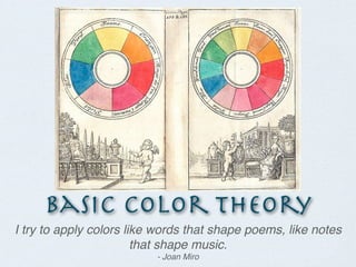
The document provides an overview of basic color theory, including:
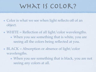
1) It defines color as the reflection of light wavelengths and describes white as reflecting all wavelengths and black as absorbing all wavelengths.
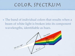
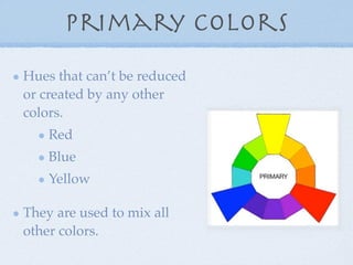
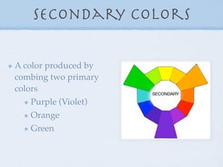
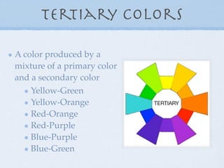
2) It explains that the color spectrum results from breaking white light into its component wavelengths and describes primary, secondary, and tertiary colors.
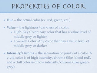
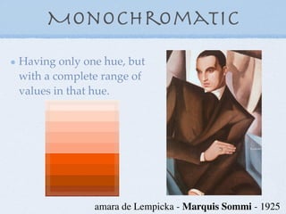
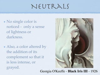
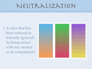
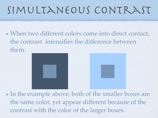
3) It outlines properties of color like hue, value, and intensity, and describes how to create and mix colors using pigments.
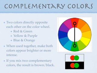
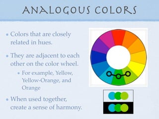
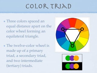
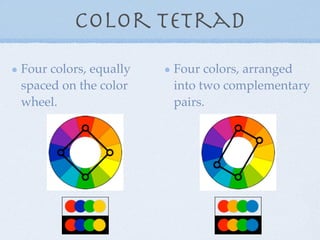
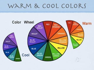
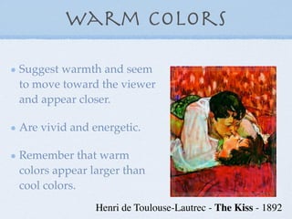
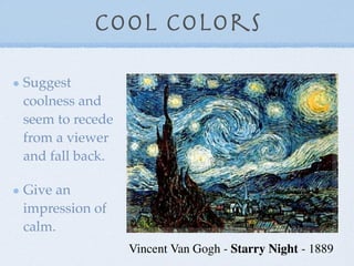
4) It discusses color schemes and relationships between colors on the color wheel like complementary, analogous, split-complementary, and warm/cool colors.