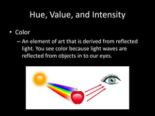
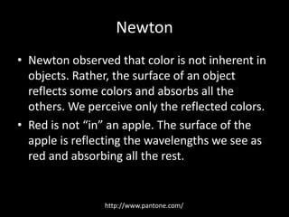
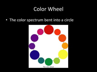
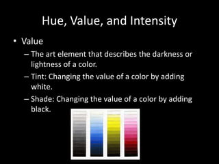
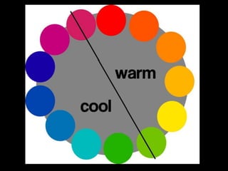
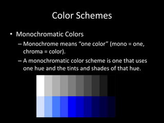
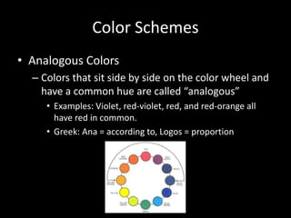
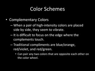
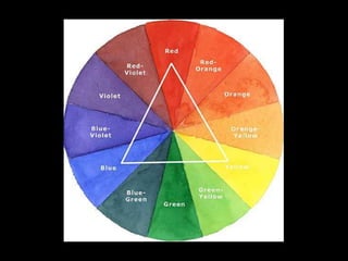
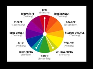
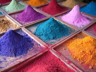
Understanding 
Color and Color Schemes
Essential Questions 
• What effect does context have on our 
perception of color? 
• How do artists use color as an expressive 
element in works of art? 
• How has the nature and use of color in works 
of art changed over time?
Hue, Value, and Intensity 
• Color 
– An element of art that is derived from reflected 
light. You see color because light waves are 
reflected from objects in to our eyes.
Newton 
• Newton observed that color is not inherent in 
objects. Rather, the surface of an object 
reflects some colors and absorbs all the 
others. We perceive only the reflected colors. 
• Red is not “in” an apple. The surface of the 
apple is reflecting the wavelengths we see as 
red and absorbing all the rest. 
http://www.pantone.com/
Hue, Value, and Intensity 
• Hue 
– The name of a color in the color spectrum, such as 
red, blue, or yellow. 
• Primary Hues: Red, Blue, Yellow 
• Secondary Hues: Green, Orange, Violet 
• Intermediate Hues: Six colors made by mixing primary 
and secondary hues 
– Example: Red-Violet, Blue-Green, Yellow-Orange
Color Wheel 
• The color spectrum bent into a circle
Hue, Value, and Intensity 
• Value 
– The art element that describes the darkness or 
lightness of a color. 
– Tint: Changing the value of a color by adding 
white. 
– Shade: Changing the value of a color by adding 
black.
Hue, Value, and Intensity 
• Intensity 
– The brightness or dullness of a hue. Bright hues 
are called high intensity while dull hues are called 
low intensity colors. 
– Complementary Colors: The colors opposite each 
other on the color wheel. The compliment, or 
opposite, of a hue absorbs all of the light waves 
that the hue reflects.
• Compliments are opposite each other on the 
color wheel:
Color Schemes 
• A color scheme is a system of organizing 
colors. 
• A color scheme deals with pairing colors in 
order to create a specific mood or 
atmosphere. 
• What is an example of a a time that color 
schemes are considered in every-day life?
Color Schemes 
• Warm and Cool Colors 
– Cool colors: Blue, Green, Violet 
• Cool colors seem to recede or move into the distance 
– Warm colors: Red, Yellow, Orange 
• Warm colors seem to move toward the viewer
Color Schemes 
• Monochromatic Colors 
– Monochrome means “one color” (mono = one, 
chroma = color). 
– A monochromatic color scheme is one that uses 
one hue and the tints and shades of that hue.
Color Schemes 
• Analogous Colors 
– Colors that sit side by side on the color wheel and 
have a common hue are called “analogous” 
• Examples: Violet, red-violet, red, and red-orange all 
have red in common. 
• Greek: Ana = according to, Logos = proportion
Color Schemes 
• Complementary Colors 
– When a pair of high-intensity colors are placed 
side by side, they seem to vibrate. 
– It is difficult to focus on the edge where the 
complements touch. 
– Traditional compliments are blue/orange, 
red/violet, and red/green. 
• Can pair any two colors that are opposite each other on 
the color wheel.
Color Schemes 
• Color Triads 
– A color triad is composed of three colors spaced 
an equal distance apart on the color wheel. 
– The contrast between the triad colors is not as 
strong as that between complements.
Color Schemes 
• Split Complements 
– The pairing of one hue with the hues on each side 
of its complement 
• Example: Red is paired with blue-green and 
yellow-green
Understanding the Nature and Uses 
of Color 
• Paint 
– All paints are made of three things: pigment, 
binder, solvent 
• Pigment: Finely ground, colored powders that form 
paint when mixed with a binder. 
• Binder: A material that holds together the grains of 
pigment in a form that can be spread over a surface. 
• Solvent: The liquid that controls the viscosity of the 
paint.
Expressive Effects of Color 
• Local Color 
– The color an object appears to be (green grass, 
blue sky, yellow sun). 
• Optical Color 
– The color that results when a true color is affected 
by unusual lighting or it’s surroundings (context). 
– This is the color that our eyes actually perceive 
and is much more complex than local color.

Hue value-intensity

  • 1.
  • 2.
    Essential Questions •What effect does context have on our perception of color? • How do artists use color as an expressive element in works of art? • How has the nature and use of color in works of art changed over time?
  • 3.
    Hue, Value, andIntensity • Color – An element of art that is derived from reflected light. You see color because light waves are reflected from objects in to our eyes.
  • 4.
    Newton • Newtonobserved that color is not inherent in objects. Rather, the surface of an object reflects some colors and absorbs all the others. We perceive only the reflected colors. • Red is not “in” an apple. The surface of the apple is reflecting the wavelengths we see as red and absorbing all the rest. http://www.pantone.com/
  • 5.
    Hue, Value, andIntensity • Hue – The name of a color in the color spectrum, such as red, blue, or yellow. • Primary Hues: Red, Blue, Yellow • Secondary Hues: Green, Orange, Violet • Intermediate Hues: Six colors made by mixing primary and secondary hues – Example: Red-Violet, Blue-Green, Yellow-Orange
  • 6.
    Color Wheel •The color spectrum bent into a circle
  • 7.
    Hue, Value, andIntensity • Value – The art element that describes the darkness or lightness of a color. – Tint: Changing the value of a color by adding white. – Shade: Changing the value of a color by adding black.
  • 8.
    Hue, Value, andIntensity • Intensity – The brightness or dullness of a hue. Bright hues are called high intensity while dull hues are called low intensity colors. – Complementary Colors: The colors opposite each other on the color wheel. The compliment, or opposite, of a hue absorbs all of the light waves that the hue reflects.
  • 9.
    • Compliments areopposite each other on the color wheel:
  • 10.
    Color Schemes •A color scheme is a system of organizing colors. • A color scheme deals with pairing colors in order to create a specific mood or atmosphere. • What is an example of a a time that color schemes are considered in every-day life?
  • 11.
    Color Schemes •Warm and Cool Colors – Cool colors: Blue, Green, Violet • Cool colors seem to recede or move into the distance – Warm colors: Red, Yellow, Orange • Warm colors seem to move toward the viewer
  • 13.
    Color Schemes •Monochromatic Colors – Monochrome means “one color” (mono = one, chroma = color). – A monochromatic color scheme is one that uses one hue and the tints and shades of that hue.
  • 14.
    Color Schemes •Analogous Colors – Colors that sit side by side on the color wheel and have a common hue are called “analogous” • Examples: Violet, red-violet, red, and red-orange all have red in common. • Greek: Ana = according to, Logos = proportion
  • 15.
    Color Schemes •Complementary Colors – When a pair of high-intensity colors are placed side by side, they seem to vibrate. – It is difficult to focus on the edge where the complements touch. – Traditional compliments are blue/orange, red/violet, and red/green. • Can pair any two colors that are opposite each other on the color wheel.
  • 17.
    Color Schemes •Color Triads – A color triad is composed of three colors spaced an equal distance apart on the color wheel. – The contrast between the triad colors is not as strong as that between complements.
  • 19.
    Color Schemes •Split Complements – The pairing of one hue with the hues on each side of its complement • Example: Red is paired with blue-green and yellow-green
  • 21.
    Understanding the Natureand Uses of Color • Paint – All paints are made of three things: pigment, binder, solvent • Pigment: Finely ground, colored powders that form paint when mixed with a binder. • Binder: A material that holds together the grains of pigment in a form that can be spread over a surface. • Solvent: The liquid that controls the viscosity of the paint.
  • 23.
    Expressive Effects ofColor • Local Color – The color an object appears to be (green grass, blue sky, yellow sun). • Optical Color – The color that results when a true color is affected by unusual lighting or it’s surroundings (context). – This is the color that our eyes actually perceive and is much more complex than local color.