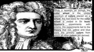
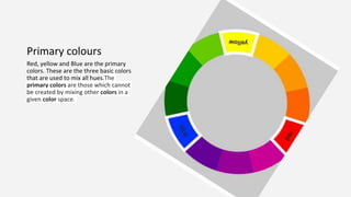
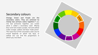
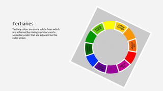
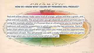
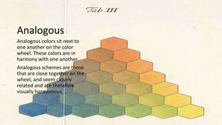
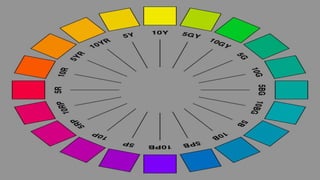
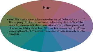
Colour terminology
Part 1
While it appears as though the
color wheel is the visible
spectrum of colors placed on a
wheel, the real basis for the color
wheel is rooted in Sir Isaac
Newton's experiments with
prisms. His experiments led to the
theory that red, yellow and blue
were the primary colors from
which all other colors are derived.
The spectrum
The spectrum is the colors of the
rainbow arranged in their natural
order: Red - Orange - Yellow - Green
- Blue - Indigo - Violet.
Primary colours
Red, yellow and Blue are the primary
colors. These are the three basic colors
that are used to mix all hues.The
primary colors are those which cannot
be created by mixing other colors in a
given color space.
Secondary colours
Orange, Green and Purple are the
secondary colors. They are achieved by
mixing two primary colors together.If you
mix two primaries together, you create
what is called a secondary color. Mixing
blue and red creates purple; red and yellow
make orange; yellow and blue make green.
The exact hue of the secondary color you've
mixed depends on which red, blue, or
yellow you use and the proportions in
which you mix them.
Tertiaries
Tertiary colors are more subtle hues which
are achieved by mixing a primary and a
secondary color that are adjacent on the
color wheel.
HOW DO I KNOW WHAT COLORS MY PRIMARIES WILL PRODUCE?
Red and yellow always make some kind of orange, yellow and blue a green, and
blue and red a purple. The actual color you get depends on which primary you're
using (for example whether it's Prussian blue or ultramarine you're mixing with
cadmium red) and the proportions in which you mix the two primaries. Paint a
color chart where you record which two colors you mixed and the (approximate)
proportions of each. This will provide you with a ready reference until you get to
the stage when you instinctively know what you'll get.
The terminology of colours
• Before we go any further, it is important to remember that achieving
the right colour balance is base for any successful scheme.
• The schemes here in require a thought and time at the planning stage
to match colour swatches and samples, checking compatibility.
Monochromatic
As the name suggests, a monochromatic scheme is based on
one colour and uses different tones of that color to create
contrast. Ideally the tonal mix should include light, medium
and dark tones to create the right and it is a scheme that
requires special attention, so that it doesn’t become too
boring.
In this type of scheme the contrasts between the various
tones creates a subtle design, so creating visual interest by
using the combination of lines and textures and pattern can
be very important.
Analogous
Analogous colors sit next to
one another on the color
wheel. These colors are in
harmony with one another.
Analogous schemes are those
that are close together on the
wheel, and seem closely
related and are therefore
visually harmonious
Triad
Choosing three colours from the colour
wheel that are of equal distance from each
other is the accurate definition of a triad
colour scheme. When used in their pure hue,
this makes for a very sticking contrast.
However, we can use colours that are of
equal distance throughout the wheel, using a
secondary combination or a tertiary one.
Complementary
Opposite colors are diagonally opposite
one another on the color wheel.
Opposite colors create the maximum
contrast with one another. You can
work out the opposite color to any
primary color by taking the other two
primaries and mixing them together.
The result will be its opposite or
‘complementary’ color.
Warm colours
Warm colors are said to be visually and
emotionally exciting, while cool colors have a
more calming effect. The red / yellow side of
the color wheel is said to be warm, similar to
the colors of fire. These colors appear to
advance towards you and stand out more
than other colors when viewed from a
distance..
Cool colours
The green / blue side of the color wheel is
said to be cool, similar to the colors of ice.
These colors appear to recede and fade into
the distance. A knowledge of how warm and
cool colors work is useful to create the
illusion of distance
https://www.pinterest.com/pin/343329171574903392/
Split Complementary
This is a variation on a complementary
contrast where a hue is used in addition
to two colours that are next to the
complementary. This scheme is a little
more flexible than the complementary
combination. The base color is main,
while the secondary colors should be
used only for highlights and accents.
Achromatic
Achromatic schemes are the use of
Black, white and greys
The most noticeable contrast is
obviously that between black and
white, and this colour combination
can be used in an interior to create
or to achieve dramatic effects.
https://www.pinterest.com/pin/343329171574903392/
Successful Decor
• Whatever your personal preferences,
you should be be able to look at any
colour instantly and tell if it is in
harmony or not.
• Being able to appreciate the
elements of a successful décor
scheme will help you to expand on
your personal preferences. You will
find that your tastes will change,
allowing you to choose from a wider
variety of decorating styles to
express yourself.
Hue
• Hue: This is what we usually mean when we ask "what color is that?"
The property of color that we are actually asking about is "hue". For
example, when we talk about colors that are red, yellow, green, and
blue, we are talking about hue. Different hues are caused by different
wavelengths of light. Therefore, this aspect of color is usually easy to
recognize.
Value
• Value: When we describe a color as "light" or "dark“. This property of
color tells us how light or dark a color is based on how close it is too
white. For instance, canary yellow would be considered lighter than
navy blue which in turn is lighter than black. Therefore, the value of
canary yellow is higher than navy blue and black.

Color terms

  • 1.
  • 2.
    While it appearsas though the color wheel is the visible spectrum of colors placed on a wheel, the real basis for the color wheel is rooted in Sir Isaac Newton's experiments with prisms. His experiments led to the theory that red, yellow and blue were the primary colors from which all other colors are derived.
  • 3.
    The spectrum The spectrumis the colors of the rainbow arranged in their natural order: Red - Orange - Yellow - Green - Blue - Indigo - Violet.
  • 4.
    Primary colours Red, yellowand Blue are the primary colors. These are the three basic colors that are used to mix all hues.The primary colors are those which cannot be created by mixing other colors in a given color space.
  • 5.
    Secondary colours Orange, Greenand Purple are the secondary colors. They are achieved by mixing two primary colors together.If you mix two primaries together, you create what is called a secondary color. Mixing blue and red creates purple; red and yellow make orange; yellow and blue make green. The exact hue of the secondary color you've mixed depends on which red, blue, or yellow you use and the proportions in which you mix them.
  • 6.
    Tertiaries Tertiary colors aremore subtle hues which are achieved by mixing a primary and a secondary color that are adjacent on the color wheel.
  • 7.
    HOW DO IKNOW WHAT COLORS MY PRIMARIES WILL PRODUCE? Red and yellow always make some kind of orange, yellow and blue a green, and blue and red a purple. The actual color you get depends on which primary you're using (for example whether it's Prussian blue or ultramarine you're mixing with cadmium red) and the proportions in which you mix the two primaries. Paint a color chart where you record which two colors you mixed and the (approximate) proportions of each. This will provide you with a ready reference until you get to the stage when you instinctively know what you'll get.
  • 8.
    The terminology ofcolours • Before we go any further, it is important to remember that achieving the right colour balance is base for any successful scheme. • The schemes here in require a thought and time at the planning stage to match colour swatches and samples, checking compatibility.
  • 9.
    Monochromatic As the namesuggests, a monochromatic scheme is based on one colour and uses different tones of that color to create contrast. Ideally the tonal mix should include light, medium and dark tones to create the right and it is a scheme that requires special attention, so that it doesn’t become too boring. In this type of scheme the contrasts between the various tones creates a subtle design, so creating visual interest by using the combination of lines and textures and pattern can be very important.
  • 10.
    Analogous Analogous colors sitnext to one another on the color wheel. These colors are in harmony with one another. Analogous schemes are those that are close together on the wheel, and seem closely related and are therefore visually harmonious
  • 11.
    Triad Choosing three coloursfrom the colour wheel that are of equal distance from each other is the accurate definition of a triad colour scheme. When used in their pure hue, this makes for a very sticking contrast. However, we can use colours that are of equal distance throughout the wheel, using a secondary combination or a tertiary one.
  • 12.
    Complementary Opposite colors arediagonally opposite one another on the color wheel. Opposite colors create the maximum contrast with one another. You can work out the opposite color to any primary color by taking the other two primaries and mixing them together. The result will be its opposite or ‘complementary’ color.
  • 13.
    Warm colours Warm colorsare said to be visually and emotionally exciting, while cool colors have a more calming effect. The red / yellow side of the color wheel is said to be warm, similar to the colors of fire. These colors appear to advance towards you and stand out more than other colors when viewed from a distance..
  • 15.
    Cool colours The green/ blue side of the color wheel is said to be cool, similar to the colors of ice. These colors appear to recede and fade into the distance. A knowledge of how warm and cool colors work is useful to create the illusion of distance https://www.pinterest.com/pin/343329171574903392/
  • 16.
    Split Complementary This isa variation on a complementary contrast where a hue is used in addition to two colours that are next to the complementary. This scheme is a little more flexible than the complementary combination. The base color is main, while the secondary colors should be used only for highlights and accents.
  • 17.
    Achromatic Achromatic schemes arethe use of Black, white and greys The most noticeable contrast is obviously that between black and white, and this colour combination can be used in an interior to create or to achieve dramatic effects. https://www.pinterest.com/pin/343329171574903392/
  • 18.
    Successful Decor • Whateveryour personal preferences, you should be be able to look at any colour instantly and tell if it is in harmony or not. • Being able to appreciate the elements of a successful décor scheme will help you to expand on your personal preferences. You will find that your tastes will change, allowing you to choose from a wider variety of decorating styles to express yourself.
  • 19.
    Hue • Hue: Thisis what we usually mean when we ask "what color is that?" The property of color that we are actually asking about is "hue". For example, when we talk about colors that are red, yellow, green, and blue, we are talking about hue. Different hues are caused by different wavelengths of light. Therefore, this aspect of color is usually easy to recognize.
  • 20.
    Value • Value: Whenwe describe a color as "light" or "dark“. This property of color tells us how light or dark a color is based on how close it is too white. For instance, canary yellow would be considered lighter than navy blue which in turn is lighter than black. Therefore, the value of canary yellow is higher than navy blue and black.