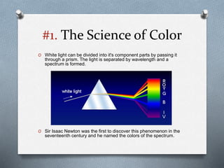
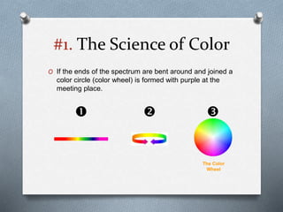
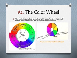
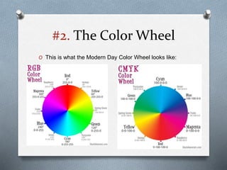
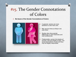
Color Theory
- Kabir Malkani
* This presentation has been compiled from references available from the Internet. This is meant purely
for educational purposes and the presenter does not claim to hold any ownership whatsoever; of the
content (textual or graphical) included in this presentation. The ownership and copyrights of the following
content belong to the respective brands /agencies / artists showcased in this presentation.
Topics Covered
1. The Science of Color
2. The Color Wheel (History)
3. Primary Colors
4. Secondary Colors
5. Tertiary Colors
6. Properties of Color
7. Color Systems
8. Color Schemes
9. Creating a Custom Color Scheme
10. Simultaneous Color contrast.
11. Color Psychology
12. The Social & Cultural Symbolism of Colors
13. Color Coding
14. Perceptual Disabilities
15. The Gender Connotations of Colors
16. Examples of Good Color Schemes
#1. The Science of Color
O Color doesn’t exist!
O Color is created only when
our brain tries to make
sense from light signals it
receives from the outer
world. In other words, it’s all
in your head.
O Without that, our world is a
monochromatic place
bathing in electromagnetic
radiation of varied intensity
and wavelengths. Nothing
fun about that, unless you’re
into physics.
Deprived of color, our world would probably
look like a scene from Matrix.
#1. The Science of Color
O Color is a property of light. Our eyes see only a small
part of the electromagnetic spectrum.
#1. The Science of Color
O White light can be divided into it's component parts by passing it
through a prism. The light is separated by wavelength and a
spectrum is formed.
O Sir Isaac Newton was the first to discover this phenomenon in the
seventeenth century and he named the colors of the spectrum.
#1. The Science of Color
O If the ends of the spectrum are bent around and joined a
color circle (color wheel) is formed with purple at the
meeting place.
  
The Color
Wheel
#2. The Color Wheel
O The original color wheel is credited to Sir Isaac Newton who joined
the red and violet ends of the visual spectrum into a circle.
Do you remember this School Project?
#2. The Color Wheel
O This is what the Modern Day Color Wheel looks like:
#3. Primary Colors
O The primary colors are Red, Yellow and
Blue
These colors cannot be mixed
from any other colors. The triangle
they form on the color wheel is
called the
primary triad.
#4. Secondary Colors
O The three secondary colors (Green, Orange and
Purple) are created by mixing two primary colors.
Red + Yellow =
Orange
Red + Blue = Purple
Yellow + Blue =
Green
#5. Tertiary Colors
O When a primary color is mixed with a secondary color
tertiary colors are made
Yellow + Green = Lime Green
Green + Blue = Turquoise
Blue +Purple = Violet
Purple + Red = Magenta
Red + Orange = Vermillion
Orange + Yellow = Light
Orange
#6. Properties of Color
O Color has three distinct properties: Hue, Value and Saturation. To
understand color you must understand how these three properties relate
to each other.
O Hue: When someone is talking about hue they are talking about the
actual color of an object. Green is a hue as are red, yellow, blue, purple,
etc.
O Value/Brightness: Is a measure of how light or dark a hue is. Adding
white to a hue makes it lighter and increases its value or brightness.
Consequently adding black makes it darker and lowers the value or
brightness.
O Saturation: is the degree of purity of a hue. Pure hues are highly
saturated. When gray is added the color becomes de-saturated.
#5. Properties of Color
Understanding
Hue, Value and
Saturation using
the Adobe
Photoshop Color
Picker
Try this out yourself to understand the difference between Value &
Saturation
Hue
Saturation Value/Brightness
#6. Properties of Color
O Shade: The result of adding black to a hue to
produce a darker hue
Hue
Saturation
Value/Brightness
O Tint: The result of adding white to a hue to
produce a lighter hue
O Tone: A color tone is the result of adding gray
to a hue.
• Decreasing the Brightness of the hue results
in a different “Shade” of the hue
• Increasing the Brightness of the hue results
in a different “Tint” of the hue
• Increasing or Decreasing the Saturation of
the hue results in a different “Tone” of the
hue
#7. Color Systems
O There are two types of Color Systems OR Color Models that are commonly
used for color creation:
O When producing physical colors as in paint a Subtractive System (CMYK) is
used and when producing colors digitally as on a computer an Additive
System (RGB) is used.
#7. Color Systems
O Subtractive Colors (CMYK): When we
see colors in physical objects we’re
seeing reflective light. When we see
red it’s because all the other
wavelengths of light have been
absorbed and only the red is reflected.
This is a subtractive system, because
to produce color we’re removing all the
wavelengths of light who’s color we
don’t want to see.
O Subtractive systems start with white
and continue to add color until the
result is black.
(White = C0+M0+Y0+K0)
#7. Color Systems
O Additive Colors (RGB): To create colors
on a computer screen we have to add
light since the light source comes from
within instead of reflecting the light
coming from outside the system. When
there is no light we see black (Black =
R0+G0+B0) and we as we add more
color we move toward white.
(White = R255+G255+B255)
#7. Color Systems
PMS (PANTONE MATCHING SYSTEM)
O The Pantone Color Matching System is
largely a standardized color reproduction
system. By standardizing the colors, different
manufacturers in different locations can all
refer to the Pantone system to make sure
colors match without direct contact with one
another.
O There is a special subset of Pantone colors
that can be reproduced using CMYK .
However, most of the Pantone system’s 1,114
spot colors cannot be simulated with CMYK
but with 13 base pigments (15 including white
and black) mixed in specified amounts.
O The Pantone system also allows for many
special colors to be produced, such as
metallics and fluorescents.
#8. Color Schemes
Achromatic Color Scheme
O Any color that lacks strong chromatic content is said to be unsaturated,
achromatic, or neutral. Pure achromatic colors include black, white and all
grays.
Adobe Illustrator Color
Window displaying Pure
Achromatic Colors
Jesus preaching, known as The hundred Guilder Print
Rembrandt van Rijn
#8. Color Schemes
Chromatic Grays
O Also known as near neutral colors… these are almost like achromatic
colors with a hint of color and brightness
The Magpie
Claude Monet
Advertising
Interior Design
#8. Color Schemes
Warm Colors
O The colors on the red – orange -
yellow side of the wheel are said
to be warm because they are
associated with warm phenomena.
e.g. Sunlight, Fire etc.
O Warm colors are vivid and
energetic, and tend to advance in
space.
Cool Colors
O The colors on the green - blue –
purple side of the wheel are said
to be cool because they are
associated with cool phenomena.
e.g. Water, Ice, Sky etc.
O Cool colors give an impression of
calm, and are said to recede --
they appear farther from the
observer
Warm & Cool Colors
The color circle can be divided into warm and cool colors
based on the Color Temperature
#8. Color Schemes
Warm & Cool Colors
O Can you tell apart the compositions using Warm or Cool Color Schemes?
A Girl Asleep at Table
Johannes Vermeer
Femme Couchée Lisant
Pablo Picasso
#8. Color Schemes
Monochromatic Colors
O Monochromatic color schemes are made up of different tones, shades and tints within a
specific hue. These are the simplest color schemes to create, as they’re all taken from the
same hue, making it harder to create a jarring or ugly scheme (though both are still possible).
Monochromatic
Schemes can be
represented by a
single spoke of the
color wheel
Interiors following a
Monochromatic Color Scheme
Examples
#8. Color Schemes
Analogous Colors
O Analogous color schemes use colors that are next to each other on the
color wheel. They usually match well and create serene and comfortable
designs.
O Analogous color schemes are often found in nature and are harmonious
and pleasing to the eye.
O Make sure you have enough contrast when choosing an analogous color
scheme.
Interiors following a Analogous Color
Scheme
Examples
#8. Color Schemes
Complementary Colors
O Colors that are opposite each other on the color wheel are considered to be
complementary colors.
O The high contrast of complementary colors creates a vibrant look especially when
used at full saturation. This color scheme must be managed well so it is not jarring.
O Complementary color schemes are tricky to use in large doses, but work well when
you want something to stand out.
O Complementary colors are really bad for text.
Interiors following a Complementary Color
Scheme
Examples
#8. Color Schemes
Split-Complementary Colors
O The split-complementary color scheme is a variation of
the complementary color scheme. In addition to the base
color, it uses the two colors adjacent to its complement.
O This color scheme has the same strong visual contrast
as the complementary color scheme, but has less
tension.
O The split-complimentary color scheme is often a good
choice for beginners, because it is difficult to mess up.
Interiors following a Split-Complementary Scheme Photography
Examples
#8. Color Schemes
Triadic Colors
O A triadic color scheme uses colors that
are evenly spaced around the color
wheel.
O Triadic color schemes tend to be quite
vibrant, even if you use pale or
unsaturated versions of your hues.
O To use a triadic harmony successfully,
the colors should be carefully balanced -
let one color dominate and use the two
others for accent.
Interiors following a Triadic Color
Scheme
A Triadic Color Scheme
can be created by
drawing an Equilateral
Triangle on the Color
Wheel
Examples
#8. Color Schemes
Double Complementary (Tetradic) Colors
O The rectangle or tetradic color scheme uses four colors arranged into two
complementary pairs.
O This rich color scheme offers plenty of possibilities for variation.
O Tetradic color schemes works best if you let one color be dominant.
O You should also pay attention to the balance between warm and cool colors in your
design.
This painting
uses red as the
dominate color
with blue, yellow
and green as
accents.
A Double Complementary
Color Scheme can be
created by drawing a
Rectangle on the Color
Wheel
Examples
#8. Color Schemes
Square
The square color scheme is similar to the
Double Complementary, but with all four
colors spaced evenly around the color circle.
O Square color schemes works best if you
let one color be dominant.
O You should also pay attention to the
balance between warm and cool colors
in your design.
Interiors following a Square Color
Scheme
A Square Tetrad Color
Scheme can be created
by drawing a Square on
the Color Wheel
Example
#8. Color Schemes
O Can you Identify the Color Schemes used in the following visuals?
Use the Color
Wheel
for reference
#9. Creating a Custom Color
Scheme
O Custom color schemes are the hardest to create. Instead of following the
predefined color schemes discussed above, a custom scheme isn’t
based on any formal rules. Keep in mind things like Hue / Chroma, value,
and saturation when creating these kinds of color schemes.
The colors here all have similar Hue and
saturation levels.
There are several online tools available
to create your own custom color
schemes:
Using one color with a high Chroma /
Hue among other colors with lower
chromas is another effective method (the
higher Chroma color can act as an accent).
#10. Simultaneous Color
Contrast
Light colors appear larger
than dark colors on the same
background.
The same color looks clearer
against a dark background than it
does against a light background.
Any color appears more
dynamic when it is displayed
against a background of gray.
#10. Simultaneous Color
Contrast
The purple squares, although identical
seem to vary in color and size on
different colored backgrounds.
A brilliant, vibrant color will not show
much change despite different
surroundings.
The gray sample appears to be
different against different backgrounds
#10. Simultaneous Color
Contrast
The same color will appear to change in
value, depending upon the surrounding
color. Green on white appears to be
brighter than the green on black.
The Green Hue appears to be different
in both these samples.
#11. Color Psychology
O "Warm colors" (yellow, orange, red) evoke pleasant, often dynamic,
reactions.
O "Cool colors" (green, blue, purple) evoke a quieter mood, and are
considered less outgoing than the warm
#11. Color Psychology
O Colors can have different effects on people and can even hold different
cultural meanings beyond what may be naturally intuitive.
#12. The Social & Cultural
Symbolism of Colors
O Understand the Social & Cultural Symbolism of Colors. Colors carry a strong emotional
weight for most people, due to the social connotations that are often associated with them.
By Geography
Australian Aboriginals: Land, Earth
China: Good Luck, Celebration, Summoning
Israel: Sacrifice, Sin
India: Purity
South Africa: Color Of Mourning
Russia: Bolsheviks And Communism
Eastern: Worn By Brides, Happiness And Prosperity
Western: Excitement, Danger, Love, Passion, Stop, Christmas (With Green),
Valentine’s Day
Other Symbolism
Astrology: Gemini
Feng Shui: Yang, Fire, Good Luck, Money, Respect, Recognition, Vitality
Psychology: Stimulates Brain Wave Activity, Increases Heart Rate,
Increases Blood Pressure
Roses: Love, Respect — Red And Yellow Together Means Gaiety, Joviality.
Red
#12. The Social & Cultural
Symbolism of Colors
By Geography
Korea: Trust
Eastern: Marriage
Western: Love, Babies, Especially Female Babies, Valentine’s Day
Other Symbolism
Feng Shui: Yin, Love
Psychology: Used In Diet Therapy As An Appetite Suppressant, Relaxes
Muscles, Soothing
Roses: Gratitude And Appreciation (Deep Pink) Or Admiration & Sympathy (Light
Pink)
Pink
By Geography
Ireland: Religious (Protestants)
Netherlands: House Of Orange
Western: Halloween (With Black), Creativity, Autumn
Other Symbolism
Astrology: Sagittarius
Feng Shui: Yang, Earth, Strengthens Conversation, Purpose, Organization
Psychology: Energizes, Stimulates Appetite
Roses: Enthusiasm, Desire
Orange
#12. The Social & Cultural
Symbolism of Colors
By Geography
Eastern: Wealth, Strength
Western: Wealth
Other Symbolism
Astrology: Leo (Golden Yellow/Orange)
Feng Shui: Yang, Metal, God Consciousness
Gold
By Geography
Thailand: Mourning, Widows
Eastern: Wealth Western: Royalty
Other Symbolism
Astrology: Gemini, Sagittarius, And Pisces
Feng Shui: Yin, Spiritual Awareness, Physical And Mental Healing
Purple
#12. The Social & Cultural
Symbolism of Colors
By Geography
China: Nourishing, Royalty
Egypt: Mourning
India: Merchants
Japan: Courage
Eastern: Proof Against Evil, For The Dead, Sacred, Imperial
Western: Hope, Hazards, Coward, Weakness, Taxis
Other Symbolism
Astrology: Taurus
Feng Shui: Yang, Earth, Auspicious, Sun Beams, Warmth, Motion
Psychology: Energizes, Relieves Depression, Improves Memory, Stimulates
Appetite Roses: Sociability, Friendship, Joy, Gladness
Yellow
By Geography
Western: Babies, Especially Male Babies
Other Symbolism
Astrology: Virgo
Baby
Blue
#12. The Social & Cultural
Symbolism of Colors
By Geography
China: Green Hats Imply A Man’s Wife Is Cheating On Him, Exorcism
India: Islam
Ireland: Symbol Of The Entire Country, Religious (Catholics)
Islam: Perfect Faith
Japan: Life
Eastern: Eternity, Family, Health, Prosperity, Peace
Western: Spring, New Birth, Go, Money, Saint Patrick’s Day, Christmas (With
Red)
Other Symbolism
Astrology: Cancer (Bright Green)
Feng Shui: Yin, Wood, Growing Energy, Nurturing, Balancing, Healing, Health,
Calming Psychology: Soothing, Relaxing Mentally And Physically, Helps With
Depression, Anxiety And Nervousness
Green
By Geography
Eastern: Helpers, Travel
Western: Boring, Dull, Plain, Sad
Other Symbolism
Feng Shui: Yin, Metal, Dead, Dull, Indefinite
Gray
#12. The Social & Cultural
Symbolism of Colors
By Geography
China: Immortality
Iran: Color Of Heaven And Spirituality, Mourning
Eastern: Wealth, Self-cultivation
Western: Depression, Sadness, Conservative, Corporate, "Something Blue"
Bridal Tradition
Other Symbolism
Astrology: Capricorn And Aquarius (Dark Blue)
Feng Shui: Yin, Water, Calm, Love, Healing, Relaxing, Peace, Trust, Adventure,
Exploration
Psychology: Calming, Lowers Blood Pressure, Decreases Respiration
Blue
By Geography
Australian Aboriginals: Color Of The Land
Western: Wholesome, Earthy, Dependable, Steadfast, Health
Other Symbolism
Astrology: Capricorn And Scorpio (Reddish Brown)
Feng Shui: Yang, Earth, Industry, Grounded
Brown
#12. The Social & Cultural
Symbolism of Colors
By Geography
China: Death, Mourning
India: Unhappiness, Mourning, Peace
Japan: White Carnation Symbolizes Death
Eastern: Funerals, Helpful People, Children, Marriage, Mourning, Peace, Travel
Western: Brides, Angels, Good Guys, Hospitals, Doctors, Peace (White Dove)
Other Symbolism
Astrology: Aries And Pisces
Feng Shui: Yang, Metal, Death, Mourning, Spirits, Ghosts, Poise, Confidence
Roses: Reverence, Humility, Truce
White
Other Symbolism
Astrology: Virgo And Libra
Psychology: Suppresses Appetite, Peaceful Environment, Good For Migraines
Violet
#12. The Social & Cultural
Symbolism of Colors
By Geography
Australian Aboriginals: Color Of The People
China: Color For Young Boys
Thailand: Bad Luck, Unhappiness, Evil
Eastern: Career, Evil, Knowledge, Mourning, Penance
Western: Funerals, Death, Halloween (With Orange), Bad Guys, Rebellion
Other Symbolism
Feng Shui: Yin, Water, Money, Income, Career Success, Emotional Protection,
Power, Stability, Bruises, Evil
Psychology: Self-confidence, Strength, Power
Black
Other Symbolism
Western: Stylish, Money
Feng Shui: Yin, Metal, Trust, Romance
Silver
#13. Color Coding
O Use Color Codes to Denote Relationships & Hierarchy
#14. Perceptual Disabilities
O Never Rely on Color Alone. Consider Perceptual Disabilities such as color
blindness. Males are ten times more likely to be color blind than females. The
disability is especially pronounced among male Caucasians: 8% suffer some
form of color blindness.
Ishihara Test for color
vision problems.
Someone with a red-
green color deficiency
may not see the red
number in this example.
Imagine a color blind
person operating
these switches
without the “Start /
Stop” Labels
#15. The Gender Connotations
of Colors
O In general, women are more
sensitive to color than men.
O Men are ten times as likely to be
color blind
O Studies also show gender
differences in color memories and
color preferences.
O Preferentially, women list shades of
red first; men list shades of blue. The
social associations of pink and blue
may be largely responsible.
O Be Aware of the Gender Connotations of Colors
#16. Examples of Good Color
Schemes
Analogous, Warm Analogous, Cool
Traditional Art Interior Decor
#16. Examples of Good Color
Schemes
Triadic
Split
Complementary
Monochromatic
Logo Design Fashion Design Jewelry Design
#16. Examples of Good Color
Schemes
Monochromatic Achromatic
#16. Examples of Good Color
Schemes
Complementary Analogous

Colour theory

  • 1.
    Color Theory - KabirMalkani * This presentation has been compiled from references available from the Internet. This is meant purely for educational purposes and the presenter does not claim to hold any ownership whatsoever; of the content (textual or graphical) included in this presentation. The ownership and copyrights of the following content belong to the respective brands /agencies / artists showcased in this presentation.
  • 2.
    Topics Covered 1. TheScience of Color 2. The Color Wheel (History) 3. Primary Colors 4. Secondary Colors 5. Tertiary Colors 6. Properties of Color 7. Color Systems 8. Color Schemes 9. Creating a Custom Color Scheme 10. Simultaneous Color contrast. 11. Color Psychology 12. The Social & Cultural Symbolism of Colors 13. Color Coding 14. Perceptual Disabilities 15. The Gender Connotations of Colors 16. Examples of Good Color Schemes
  • 3.
    #1. The Scienceof Color O Color doesn’t exist! O Color is created only when our brain tries to make sense from light signals it receives from the outer world. In other words, it’s all in your head. O Without that, our world is a monochromatic place bathing in electromagnetic radiation of varied intensity and wavelengths. Nothing fun about that, unless you’re into physics. Deprived of color, our world would probably look like a scene from Matrix.
  • 4.
    #1. The Scienceof Color O Color is a property of light. Our eyes see only a small part of the electromagnetic spectrum.
  • 5.
    #1. The Scienceof Color O White light can be divided into it's component parts by passing it through a prism. The light is separated by wavelength and a spectrum is formed. O Sir Isaac Newton was the first to discover this phenomenon in the seventeenth century and he named the colors of the spectrum.
  • 6.
    #1. The Scienceof Color O If the ends of the spectrum are bent around and joined a color circle (color wheel) is formed with purple at the meeting place.    The Color Wheel
  • 7.
    #2. The ColorWheel O The original color wheel is credited to Sir Isaac Newton who joined the red and violet ends of the visual spectrum into a circle. Do you remember this School Project?
  • 8.
    #2. The ColorWheel O This is what the Modern Day Color Wheel looks like:
  • 9.
    #3. Primary Colors OThe primary colors are Red, Yellow and Blue These colors cannot be mixed from any other colors. The triangle they form on the color wheel is called the primary triad.
  • 10.
    #4. Secondary Colors OThe three secondary colors (Green, Orange and Purple) are created by mixing two primary colors. Red + Yellow = Orange Red + Blue = Purple Yellow + Blue = Green
  • 11.
    #5. Tertiary Colors OWhen a primary color is mixed with a secondary color tertiary colors are made Yellow + Green = Lime Green Green + Blue = Turquoise Blue +Purple = Violet Purple + Red = Magenta Red + Orange = Vermillion Orange + Yellow = Light Orange
  • 12.
    #6. Properties ofColor O Color has three distinct properties: Hue, Value and Saturation. To understand color you must understand how these three properties relate to each other. O Hue: When someone is talking about hue they are talking about the actual color of an object. Green is a hue as are red, yellow, blue, purple, etc. O Value/Brightness: Is a measure of how light or dark a hue is. Adding white to a hue makes it lighter and increases its value or brightness. Consequently adding black makes it darker and lowers the value or brightness. O Saturation: is the degree of purity of a hue. Pure hues are highly saturated. When gray is added the color becomes de-saturated.
  • 13.
    #5. Properties ofColor Understanding Hue, Value and Saturation using the Adobe Photoshop Color Picker Try this out yourself to understand the difference between Value & Saturation Hue Saturation Value/Brightness
  • 14.
    #6. Properties ofColor O Shade: The result of adding black to a hue to produce a darker hue Hue Saturation Value/Brightness O Tint: The result of adding white to a hue to produce a lighter hue O Tone: A color tone is the result of adding gray to a hue. • Decreasing the Brightness of the hue results in a different “Shade” of the hue • Increasing the Brightness of the hue results in a different “Tint” of the hue • Increasing or Decreasing the Saturation of the hue results in a different “Tone” of the hue
  • 15.
    #7. Color Systems OThere are two types of Color Systems OR Color Models that are commonly used for color creation: O When producing physical colors as in paint a Subtractive System (CMYK) is used and when producing colors digitally as on a computer an Additive System (RGB) is used.
  • 16.
    #7. Color Systems OSubtractive Colors (CMYK): When we see colors in physical objects we’re seeing reflective light. When we see red it’s because all the other wavelengths of light have been absorbed and only the red is reflected. This is a subtractive system, because to produce color we’re removing all the wavelengths of light who’s color we don’t want to see. O Subtractive systems start with white and continue to add color until the result is black. (White = C0+M0+Y0+K0)
  • 17.
    #7. Color Systems OAdditive Colors (RGB): To create colors on a computer screen we have to add light since the light source comes from within instead of reflecting the light coming from outside the system. When there is no light we see black (Black = R0+G0+B0) and we as we add more color we move toward white. (White = R255+G255+B255)
  • 18.
    #7. Color Systems PMS(PANTONE MATCHING SYSTEM) O The Pantone Color Matching System is largely a standardized color reproduction system. By standardizing the colors, different manufacturers in different locations can all refer to the Pantone system to make sure colors match without direct contact with one another. O There is a special subset of Pantone colors that can be reproduced using CMYK . However, most of the Pantone system’s 1,114 spot colors cannot be simulated with CMYK but with 13 base pigments (15 including white and black) mixed in specified amounts. O The Pantone system also allows for many special colors to be produced, such as metallics and fluorescents.
  • 19.
    #8. Color Schemes AchromaticColor Scheme O Any color that lacks strong chromatic content is said to be unsaturated, achromatic, or neutral. Pure achromatic colors include black, white and all grays. Adobe Illustrator Color Window displaying Pure Achromatic Colors Jesus preaching, known as The hundred Guilder Print Rembrandt van Rijn
  • 20.
    #8. Color Schemes ChromaticGrays O Also known as near neutral colors… these are almost like achromatic colors with a hint of color and brightness The Magpie Claude Monet Advertising Interior Design
  • 21.
    #8. Color Schemes WarmColors O The colors on the red – orange - yellow side of the wheel are said to be warm because they are associated with warm phenomena. e.g. Sunlight, Fire etc. O Warm colors are vivid and energetic, and tend to advance in space. Cool Colors O The colors on the green - blue – purple side of the wheel are said to be cool because they are associated with cool phenomena. e.g. Water, Ice, Sky etc. O Cool colors give an impression of calm, and are said to recede -- they appear farther from the observer Warm & Cool Colors The color circle can be divided into warm and cool colors based on the Color Temperature
  • 22.
    #8. Color Schemes Warm& Cool Colors O Can you tell apart the compositions using Warm or Cool Color Schemes? A Girl Asleep at Table Johannes Vermeer Femme Couchée Lisant Pablo Picasso
  • 23.
    #8. Color Schemes MonochromaticColors O Monochromatic color schemes are made up of different tones, shades and tints within a specific hue. These are the simplest color schemes to create, as they’re all taken from the same hue, making it harder to create a jarring or ugly scheme (though both are still possible). Monochromatic Schemes can be represented by a single spoke of the color wheel Interiors following a Monochromatic Color Scheme Examples
  • 24.
    #8. Color Schemes AnalogousColors O Analogous color schemes use colors that are next to each other on the color wheel. They usually match well and create serene and comfortable designs. O Analogous color schemes are often found in nature and are harmonious and pleasing to the eye. O Make sure you have enough contrast when choosing an analogous color scheme. Interiors following a Analogous Color Scheme Examples
  • 25.
    #8. Color Schemes ComplementaryColors O Colors that are opposite each other on the color wheel are considered to be complementary colors. O The high contrast of complementary colors creates a vibrant look especially when used at full saturation. This color scheme must be managed well so it is not jarring. O Complementary color schemes are tricky to use in large doses, but work well when you want something to stand out. O Complementary colors are really bad for text. Interiors following a Complementary Color Scheme Examples
  • 26.
    #8. Color Schemes Split-ComplementaryColors O The split-complementary color scheme is a variation of the complementary color scheme. In addition to the base color, it uses the two colors adjacent to its complement. O This color scheme has the same strong visual contrast as the complementary color scheme, but has less tension. O The split-complimentary color scheme is often a good choice for beginners, because it is difficult to mess up. Interiors following a Split-Complementary Scheme Photography Examples
  • 27.
    #8. Color Schemes TriadicColors O A triadic color scheme uses colors that are evenly spaced around the color wheel. O Triadic color schemes tend to be quite vibrant, even if you use pale or unsaturated versions of your hues. O To use a triadic harmony successfully, the colors should be carefully balanced - let one color dominate and use the two others for accent. Interiors following a Triadic Color Scheme A Triadic Color Scheme can be created by drawing an Equilateral Triangle on the Color Wheel Examples
  • 28.
    #8. Color Schemes DoubleComplementary (Tetradic) Colors O The rectangle or tetradic color scheme uses four colors arranged into two complementary pairs. O This rich color scheme offers plenty of possibilities for variation. O Tetradic color schemes works best if you let one color be dominant. O You should also pay attention to the balance between warm and cool colors in your design. This painting uses red as the dominate color with blue, yellow and green as accents. A Double Complementary Color Scheme can be created by drawing a Rectangle on the Color Wheel Examples
  • 29.
    #8. Color Schemes Square Thesquare color scheme is similar to the Double Complementary, but with all four colors spaced evenly around the color circle. O Square color schemes works best if you let one color be dominant. O You should also pay attention to the balance between warm and cool colors in your design. Interiors following a Square Color Scheme A Square Tetrad Color Scheme can be created by drawing a Square on the Color Wheel Example
  • 30.
    #8. Color Schemes OCan you Identify the Color Schemes used in the following visuals? Use the Color Wheel for reference
  • 31.
    #9. Creating aCustom Color Scheme O Custom color schemes are the hardest to create. Instead of following the predefined color schemes discussed above, a custom scheme isn’t based on any formal rules. Keep in mind things like Hue / Chroma, value, and saturation when creating these kinds of color schemes. The colors here all have similar Hue and saturation levels. There are several online tools available to create your own custom color schemes: Using one color with a high Chroma / Hue among other colors with lower chromas is another effective method (the higher Chroma color can act as an accent).
  • 32.
    #10. Simultaneous Color Contrast Lightcolors appear larger than dark colors on the same background. The same color looks clearer against a dark background than it does against a light background. Any color appears more dynamic when it is displayed against a background of gray.
  • 33.
    #10. Simultaneous Color Contrast Thepurple squares, although identical seem to vary in color and size on different colored backgrounds. A brilliant, vibrant color will not show much change despite different surroundings. The gray sample appears to be different against different backgrounds
  • 34.
    #10. Simultaneous Color Contrast Thesame color will appear to change in value, depending upon the surrounding color. Green on white appears to be brighter than the green on black. The Green Hue appears to be different in both these samples.
  • 35.
    #11. Color Psychology O"Warm colors" (yellow, orange, red) evoke pleasant, often dynamic, reactions. O "Cool colors" (green, blue, purple) evoke a quieter mood, and are considered less outgoing than the warm
  • 36.
    #11. Color Psychology OColors can have different effects on people and can even hold different cultural meanings beyond what may be naturally intuitive.
  • 37.
    #12. The Social& Cultural Symbolism of Colors O Understand the Social & Cultural Symbolism of Colors. Colors carry a strong emotional weight for most people, due to the social connotations that are often associated with them. By Geography Australian Aboriginals: Land, Earth China: Good Luck, Celebration, Summoning Israel: Sacrifice, Sin India: Purity South Africa: Color Of Mourning Russia: Bolsheviks And Communism Eastern: Worn By Brides, Happiness And Prosperity Western: Excitement, Danger, Love, Passion, Stop, Christmas (With Green), Valentine’s Day Other Symbolism Astrology: Gemini Feng Shui: Yang, Fire, Good Luck, Money, Respect, Recognition, Vitality Psychology: Stimulates Brain Wave Activity, Increases Heart Rate, Increases Blood Pressure Roses: Love, Respect — Red And Yellow Together Means Gaiety, Joviality. Red
  • 38.
    #12. The Social& Cultural Symbolism of Colors By Geography Korea: Trust Eastern: Marriage Western: Love, Babies, Especially Female Babies, Valentine’s Day Other Symbolism Feng Shui: Yin, Love Psychology: Used In Diet Therapy As An Appetite Suppressant, Relaxes Muscles, Soothing Roses: Gratitude And Appreciation (Deep Pink) Or Admiration & Sympathy (Light Pink) Pink By Geography Ireland: Religious (Protestants) Netherlands: House Of Orange Western: Halloween (With Black), Creativity, Autumn Other Symbolism Astrology: Sagittarius Feng Shui: Yang, Earth, Strengthens Conversation, Purpose, Organization Psychology: Energizes, Stimulates Appetite Roses: Enthusiasm, Desire Orange
  • 39.
    #12. The Social& Cultural Symbolism of Colors By Geography Eastern: Wealth, Strength Western: Wealth Other Symbolism Astrology: Leo (Golden Yellow/Orange) Feng Shui: Yang, Metal, God Consciousness Gold By Geography Thailand: Mourning, Widows Eastern: Wealth Western: Royalty Other Symbolism Astrology: Gemini, Sagittarius, And Pisces Feng Shui: Yin, Spiritual Awareness, Physical And Mental Healing Purple
  • 40.
    #12. The Social& Cultural Symbolism of Colors By Geography China: Nourishing, Royalty Egypt: Mourning India: Merchants Japan: Courage Eastern: Proof Against Evil, For The Dead, Sacred, Imperial Western: Hope, Hazards, Coward, Weakness, Taxis Other Symbolism Astrology: Taurus Feng Shui: Yang, Earth, Auspicious, Sun Beams, Warmth, Motion Psychology: Energizes, Relieves Depression, Improves Memory, Stimulates Appetite Roses: Sociability, Friendship, Joy, Gladness Yellow By Geography Western: Babies, Especially Male Babies Other Symbolism Astrology: Virgo Baby Blue
  • 41.
    #12. The Social& Cultural Symbolism of Colors By Geography China: Green Hats Imply A Man’s Wife Is Cheating On Him, Exorcism India: Islam Ireland: Symbol Of The Entire Country, Religious (Catholics) Islam: Perfect Faith Japan: Life Eastern: Eternity, Family, Health, Prosperity, Peace Western: Spring, New Birth, Go, Money, Saint Patrick’s Day, Christmas (With Red) Other Symbolism Astrology: Cancer (Bright Green) Feng Shui: Yin, Wood, Growing Energy, Nurturing, Balancing, Healing, Health, Calming Psychology: Soothing, Relaxing Mentally And Physically, Helps With Depression, Anxiety And Nervousness Green By Geography Eastern: Helpers, Travel Western: Boring, Dull, Plain, Sad Other Symbolism Feng Shui: Yin, Metal, Dead, Dull, Indefinite Gray
  • 42.
    #12. The Social& Cultural Symbolism of Colors By Geography China: Immortality Iran: Color Of Heaven And Spirituality, Mourning Eastern: Wealth, Self-cultivation Western: Depression, Sadness, Conservative, Corporate, "Something Blue" Bridal Tradition Other Symbolism Astrology: Capricorn And Aquarius (Dark Blue) Feng Shui: Yin, Water, Calm, Love, Healing, Relaxing, Peace, Trust, Adventure, Exploration Psychology: Calming, Lowers Blood Pressure, Decreases Respiration Blue By Geography Australian Aboriginals: Color Of The Land Western: Wholesome, Earthy, Dependable, Steadfast, Health Other Symbolism Astrology: Capricorn And Scorpio (Reddish Brown) Feng Shui: Yang, Earth, Industry, Grounded Brown
  • 43.
    #12. The Social& Cultural Symbolism of Colors By Geography China: Death, Mourning India: Unhappiness, Mourning, Peace Japan: White Carnation Symbolizes Death Eastern: Funerals, Helpful People, Children, Marriage, Mourning, Peace, Travel Western: Brides, Angels, Good Guys, Hospitals, Doctors, Peace (White Dove) Other Symbolism Astrology: Aries And Pisces Feng Shui: Yang, Metal, Death, Mourning, Spirits, Ghosts, Poise, Confidence Roses: Reverence, Humility, Truce White Other Symbolism Astrology: Virgo And Libra Psychology: Suppresses Appetite, Peaceful Environment, Good For Migraines Violet
  • 44.
    #12. The Social& Cultural Symbolism of Colors By Geography Australian Aboriginals: Color Of The People China: Color For Young Boys Thailand: Bad Luck, Unhappiness, Evil Eastern: Career, Evil, Knowledge, Mourning, Penance Western: Funerals, Death, Halloween (With Orange), Bad Guys, Rebellion Other Symbolism Feng Shui: Yin, Water, Money, Income, Career Success, Emotional Protection, Power, Stability, Bruises, Evil Psychology: Self-confidence, Strength, Power Black Other Symbolism Western: Stylish, Money Feng Shui: Yin, Metal, Trust, Romance Silver
  • 45.
    #13. Color Coding OUse Color Codes to Denote Relationships & Hierarchy
  • 46.
    #14. Perceptual Disabilities ONever Rely on Color Alone. Consider Perceptual Disabilities such as color blindness. Males are ten times more likely to be color blind than females. The disability is especially pronounced among male Caucasians: 8% suffer some form of color blindness. Ishihara Test for color vision problems. Someone with a red- green color deficiency may not see the red number in this example. Imagine a color blind person operating these switches without the “Start / Stop” Labels
  • 47.
    #15. The GenderConnotations of Colors O In general, women are more sensitive to color than men. O Men are ten times as likely to be color blind O Studies also show gender differences in color memories and color preferences. O Preferentially, women list shades of red first; men list shades of blue. The social associations of pink and blue may be largely responsible. O Be Aware of the Gender Connotations of Colors
  • 48.
    #16. Examples ofGood Color Schemes Analogous, Warm Analogous, Cool Traditional Art Interior Decor
  • 49.
    #16. Examples ofGood Color Schemes Triadic Split Complementary Monochromatic Logo Design Fashion Design Jewelry Design
  • 50.
    #16. Examples ofGood Color Schemes Monochromatic Achromatic
  • 51.
    #16. Examples ofGood Color Schemes Complementary Analogous