The document discusses key concepts in color theory, including:
- Color is affected by physics (wavelength), chemistry (pigments), physiology (eye perception), and psychology (emotions).
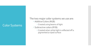
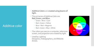
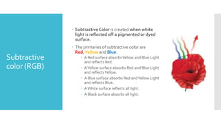
- There are two main color systems - additive RGB used in screens and subtractive CMYK used in printing.
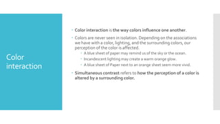
- Color interaction and simultaneous contrast influence how colors are perceived based on their surroundings.
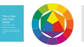
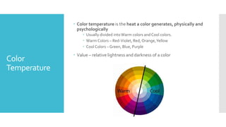
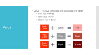
- The color wheel is used to define hues, primary/secondary/tertiary colors, warm/cool temperatures, and tints/tones/shades based on lightness and darkness.