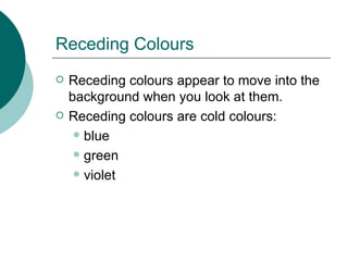
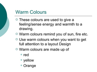
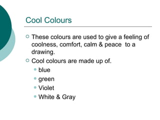
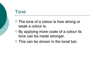
Downloaded 258 times
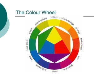
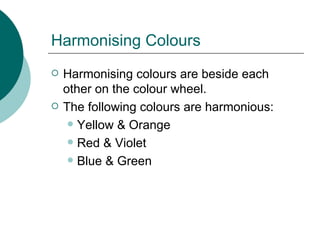
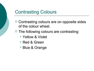
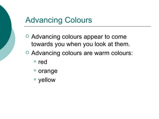
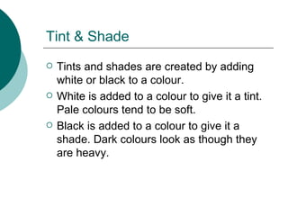
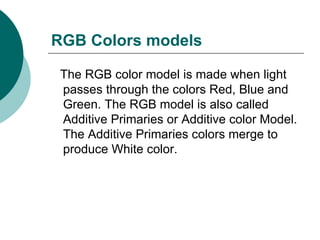
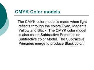
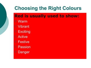


Colour theory involves understanding concepts like the colour wheel, harmonious and contrasting colours, warm and cool colours, and colour models like RGB and CMYK. The colour wheel shows how primary colours are arranged and which colours are adjacent or opposite. Harmonious colours are beside each other on the wheel while contrasting colours are opposite. Warm colours like red, orange and yellow appear to advance while cool colours like blue, green and violet recede. Tone, tint and shade refer to the lightness or darkness of a colour. RGB and CMYK are additive and subtractive colour models used in technology and print. Different colours traditionally convey different meanings and feelings.


