Downloaded 209 times

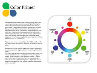
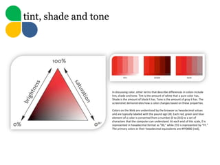
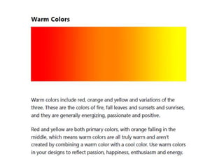


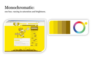
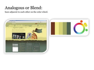

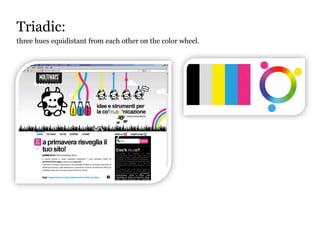

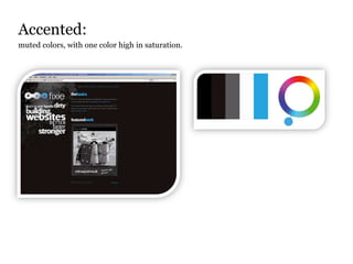

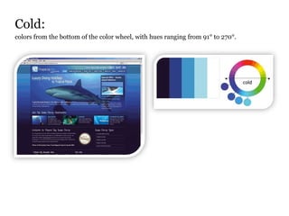


This document discusses color theory and color schemes. It begins by explaining how color receptors in the eye perceive different colors and how colors can be mapped to a color wheel. It then defines terms like hue, saturation, brightness, tint, shade, and tone used to describe colors. Finally, it outlines several common color schemes - monochromatic, analogous, complementary, triadic, square-tetradic, accented, warm, and cold - and provides an example of a double-complementary palette used on a website.


