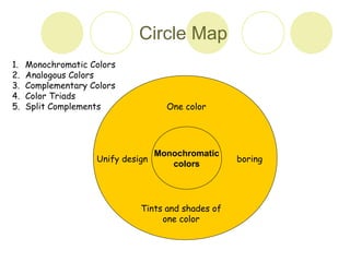
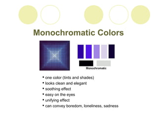
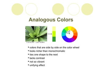
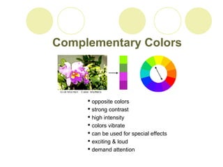
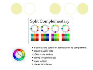
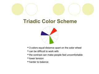
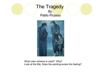
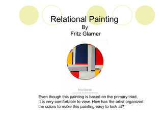
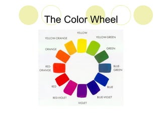
Color Schemes 
Monochromatic Colors 
Analogous Colors 
Complementary Colors 
Split Complements 
Color Triads 
Warm and Cool Colors
Circle Map 
One color 
Monochromatic 
Unify design boring 
colors 
Tints and shades of 
one color 
1. Monochromatic Colors 
2. Analogous Colors 
3. Complementary Colors 
4. Color Triads 
5. Split Complements
Monochromatic Colors 
 one color (tints and shades) 
 looks clean and elegant 
 soothing effect 
 easy on the eyes 
 unifying effect 
 can convey boredom, loneliness, sadness
Analogous Colors 
 colors that are side by side on the color wheel 
 looks richer than monochromatic 
 ties one shape to the next 
 lacks contrast 
 not so vibrant 
 unifying effect
Complementary Colors 
 opposite colors 
 strong contrast 
 high intensity 
 colors vibrate 
 can be used for special effects 
 exciting & loud 
 demand attention
 a color & two colors on each side of its complement 
 easier to work with 
 offers more variety 
 strong visual contrast 
 lower tension 
 harder to balance
Triadic Color Scheme 
 3 colors equal distance apart on the color wheel 
 can be difficult to work with 
 the contrast can make people feel uncomfortable 
 lower tension 
 harder to balance
Warm and Cool Colors 
Cool Warm 
 sunshine 
 fire 
 moves toward 
the viewer 
 ice, snow 
 water, grass 
 moves away 
from the viewer
The Tragedy 
By 
Pablo Picasso 
What color scheme is used? Why? 
Look at the title. Does the painting evoke this feeling?
Relational Painting 
By 
Fritz Glarner 
Even though this painting is based on the primary triad, 
It is very comfortable to view. How has the artist organized 
the colors to make this painting easy to look at?
The Color Wheel
Activity 
• In your sketchbook draw 3 squares. 
• Arrange your initials or the letters of your name in a design in one 
of the squares. 
• The letters must touch the four edges of the square. 
• Do several different designs using the remaining squares. 
• Play with the letters- turn them upside down, twist them out of 
shape, make them fat, or overlap them. 
• They do not have to be readable. 
• Find a design that you like and reproduce it on white paper. 
• Color it using one of the color schemes (colors should be smooth 
and it should complement your design).

Color schemes

  • 1.
    Color Schemes MonochromaticColors Analogous Colors Complementary Colors Split Complements Color Triads Warm and Cool Colors
  • 2.
    Circle Map Onecolor Monochromatic Unify design boring colors Tints and shades of one color 1. Monochromatic Colors 2. Analogous Colors 3. Complementary Colors 4. Color Triads 5. Split Complements
  • 3.
    Monochromatic Colors one color (tints and shades)  looks clean and elegant  soothing effect  easy on the eyes  unifying effect  can convey boredom, loneliness, sadness
  • 4.
    Analogous Colors colors that are side by side on the color wheel  looks richer than monochromatic  ties one shape to the next  lacks contrast  not so vibrant  unifying effect
  • 5.
    Complementary Colors opposite colors  strong contrast  high intensity  colors vibrate  can be used for special effects  exciting & loud  demand attention
  • 6.
     a color& two colors on each side of its complement  easier to work with  offers more variety  strong visual contrast  lower tension  harder to balance
  • 7.
    Triadic Color Scheme  3 colors equal distance apart on the color wheel  can be difficult to work with  the contrast can make people feel uncomfortable  lower tension  harder to balance
  • 8.
    Warm and CoolColors Cool Warm  sunshine  fire  moves toward the viewer  ice, snow  water, grass  moves away from the viewer
  • 9.
    The Tragedy By Pablo Picasso What color scheme is used? Why? Look at the title. Does the painting evoke this feeling?
  • 10.
    Relational Painting By Fritz Glarner Even though this painting is based on the primary triad, It is very comfortable to view. How has the artist organized the colors to make this painting easy to look at?
  • 11.
  • 12.
    Activity • Inyour sketchbook draw 3 squares. • Arrange your initials or the letters of your name in a design in one of the squares. • The letters must touch the four edges of the square. • Do several different designs using the remaining squares. • Play with the letters- turn them upside down, twist them out of shape, make them fat, or overlap them. • They do not have to be readable. • Find a design that you like and reproduce it on white paper. • Color it using one of the color schemes (colors should be smooth and it should complement your design).