Downloaded 183 times

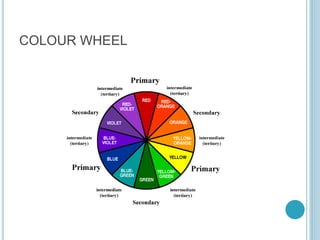
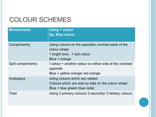
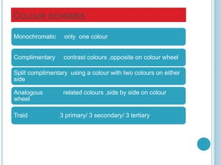
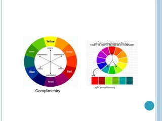
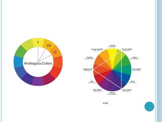
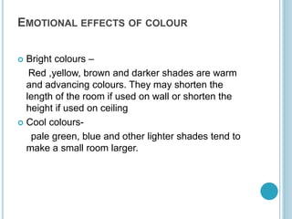
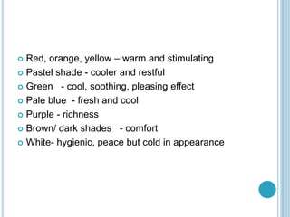


The document discusses various colour schemes for interior decoration, including monochrome, complementary, split-complementary, analogous, and triadic schemes. It outlines the emotional effects of different colours, noting how warm colours can create intimacy while cool colours can make spaces feel larger and more relaxing. Additionally, it suggests colour choices based on room function, emphasizing that light colours promote peace in living spaces, while more vibrant colours can be utilized in restaurants and lobbies.