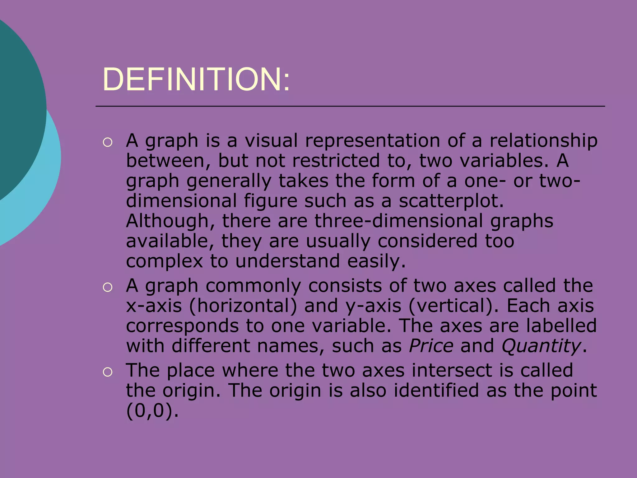
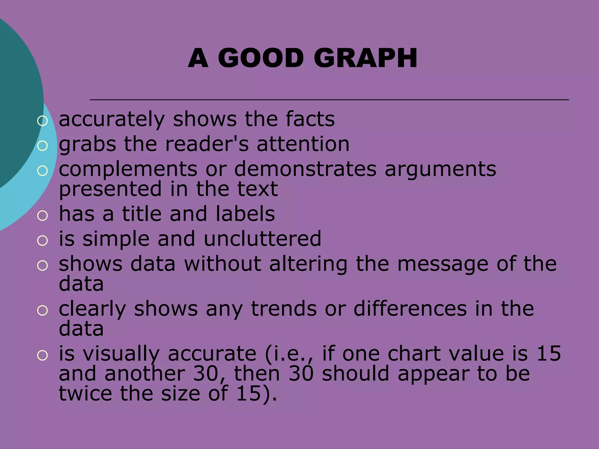
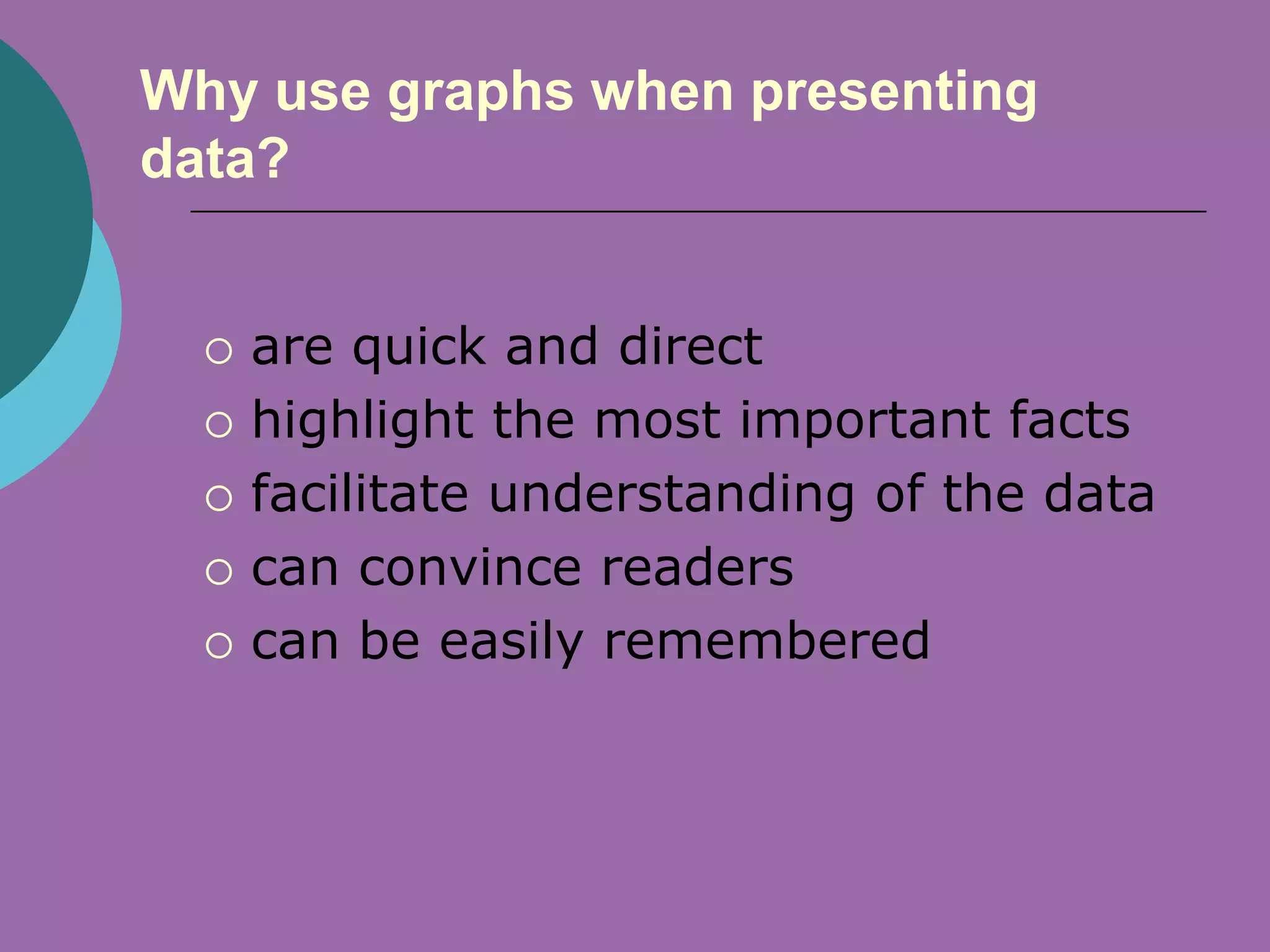
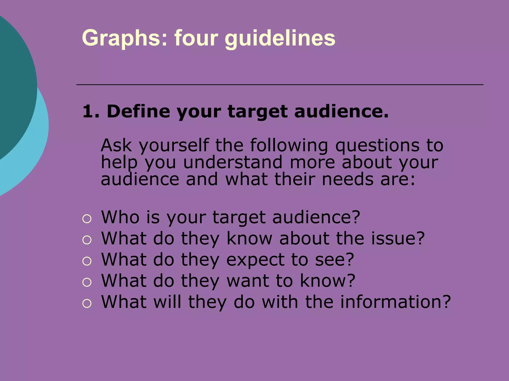
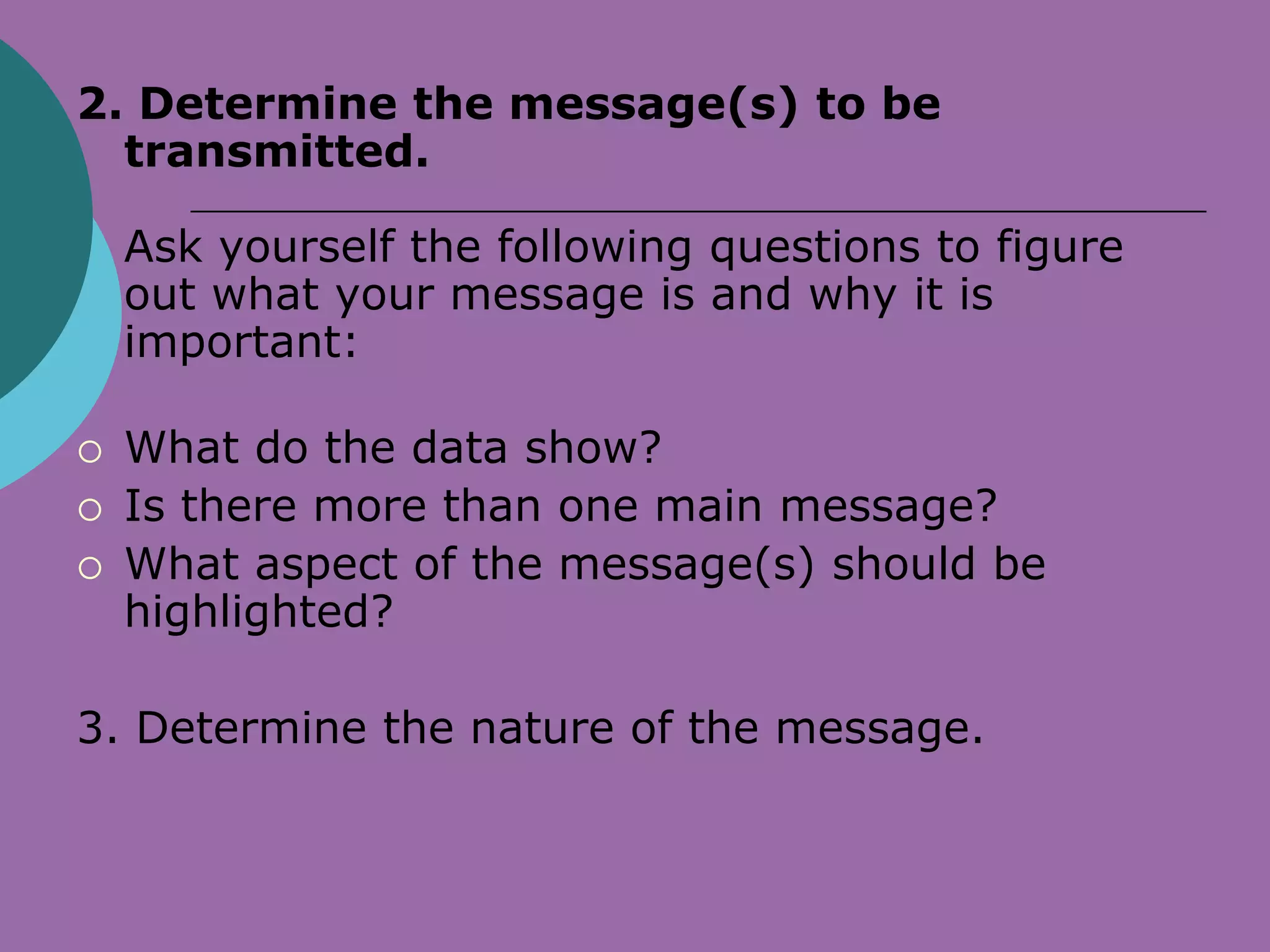
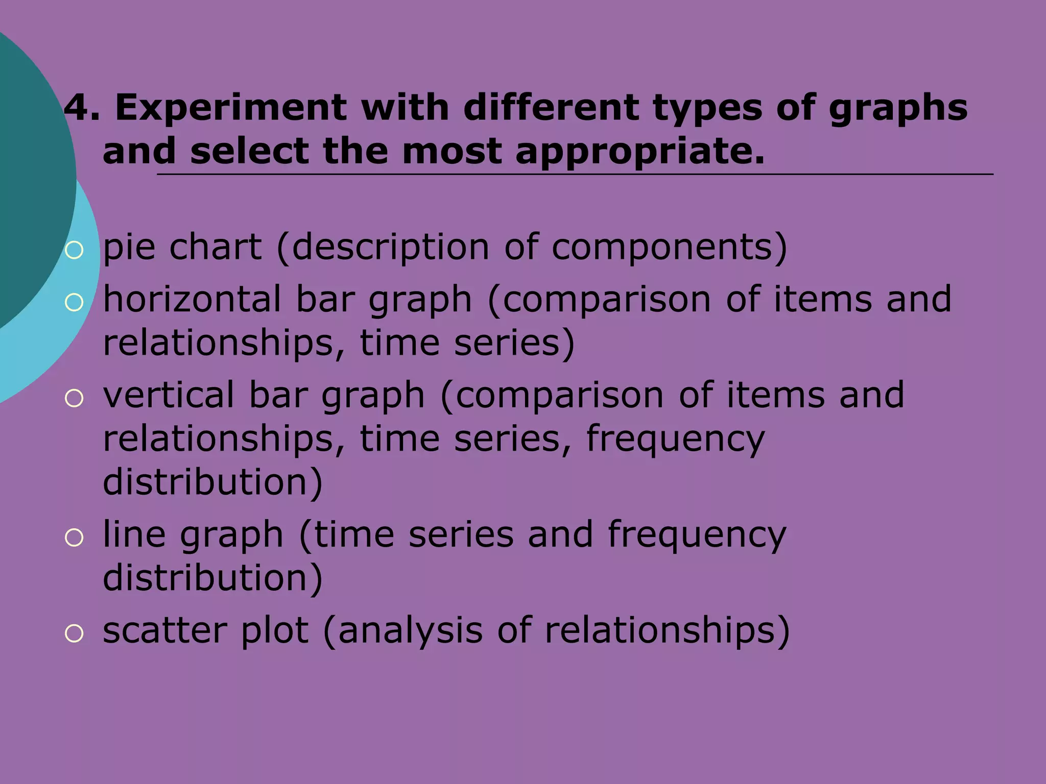
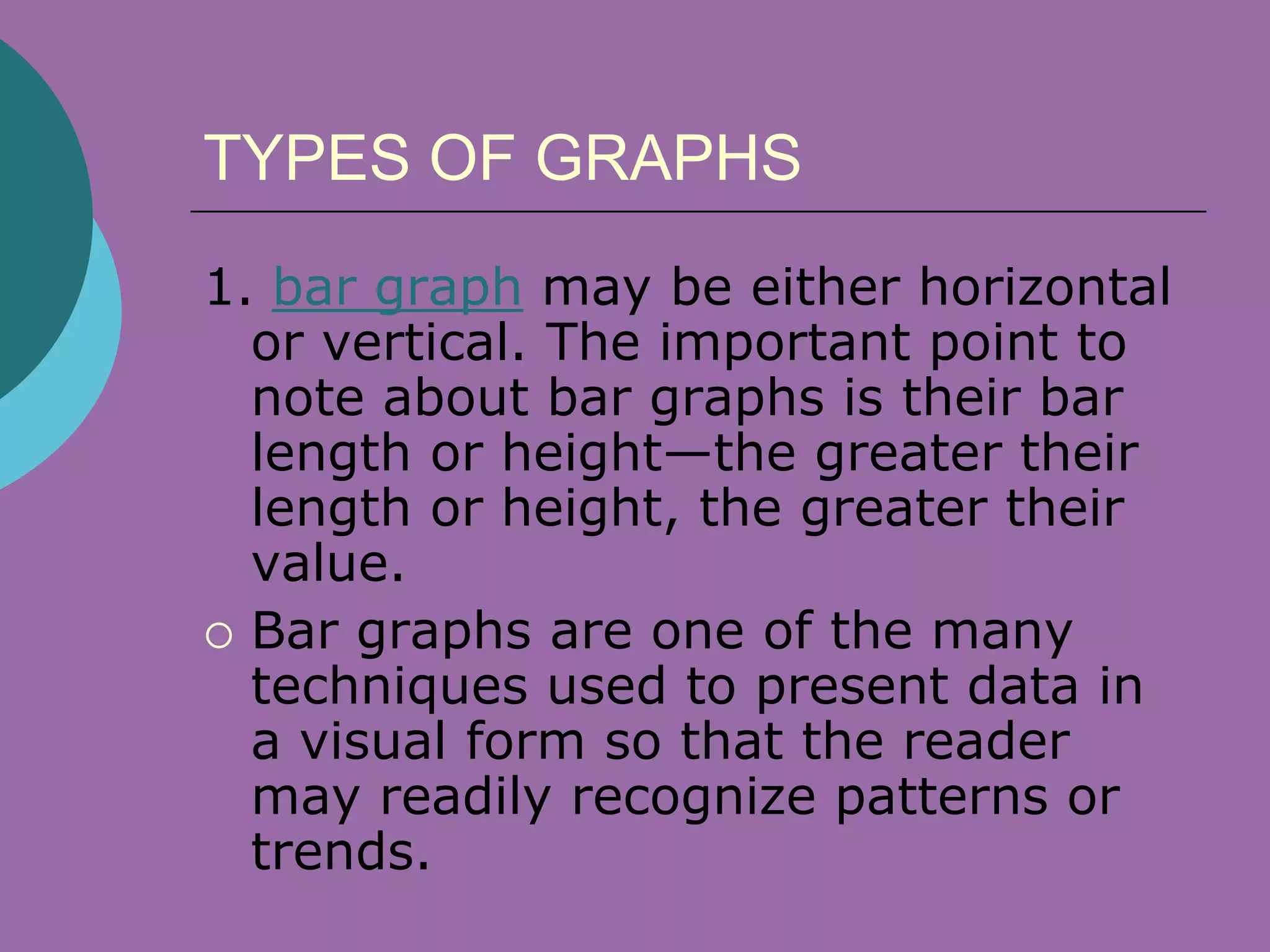
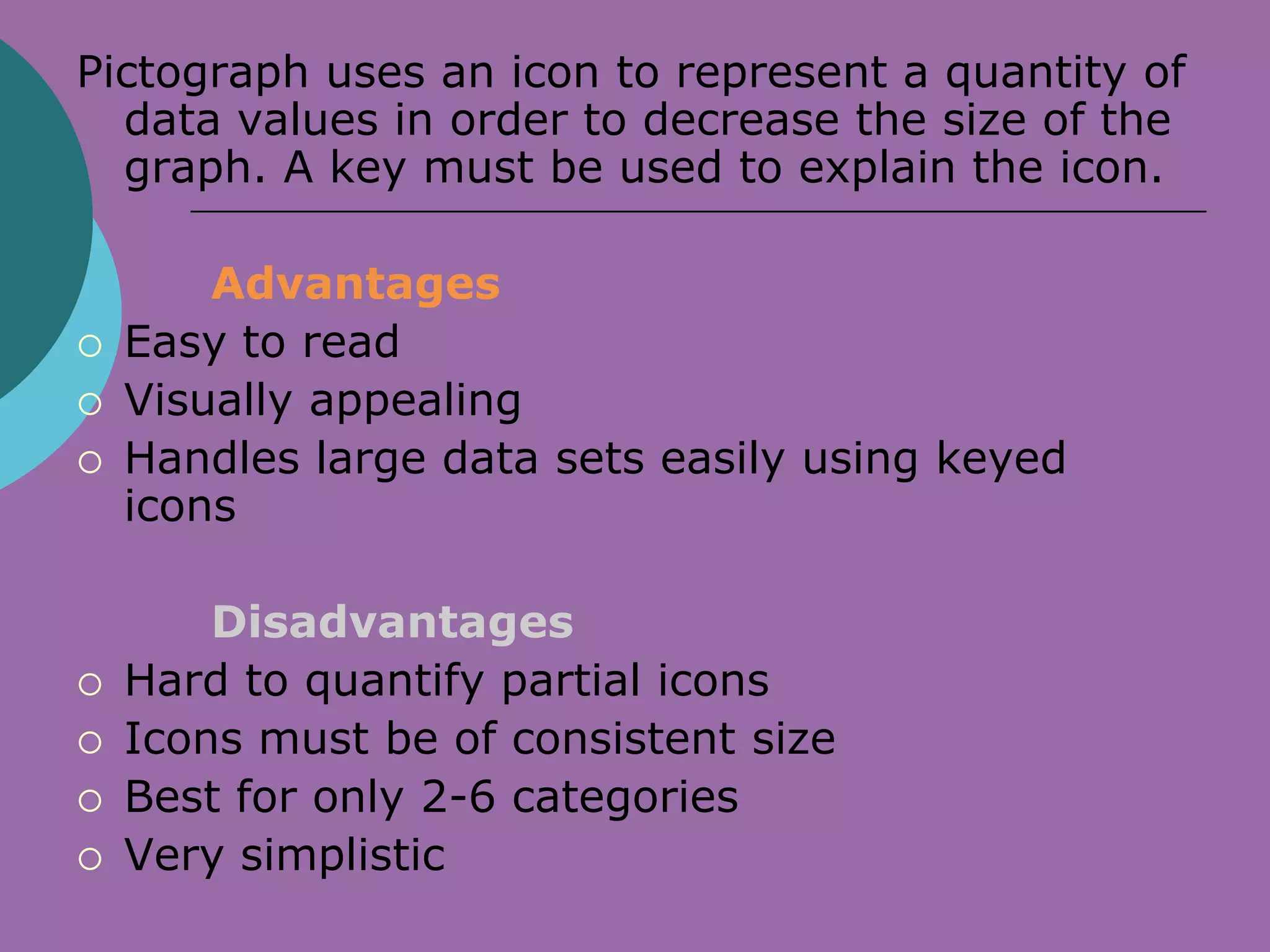
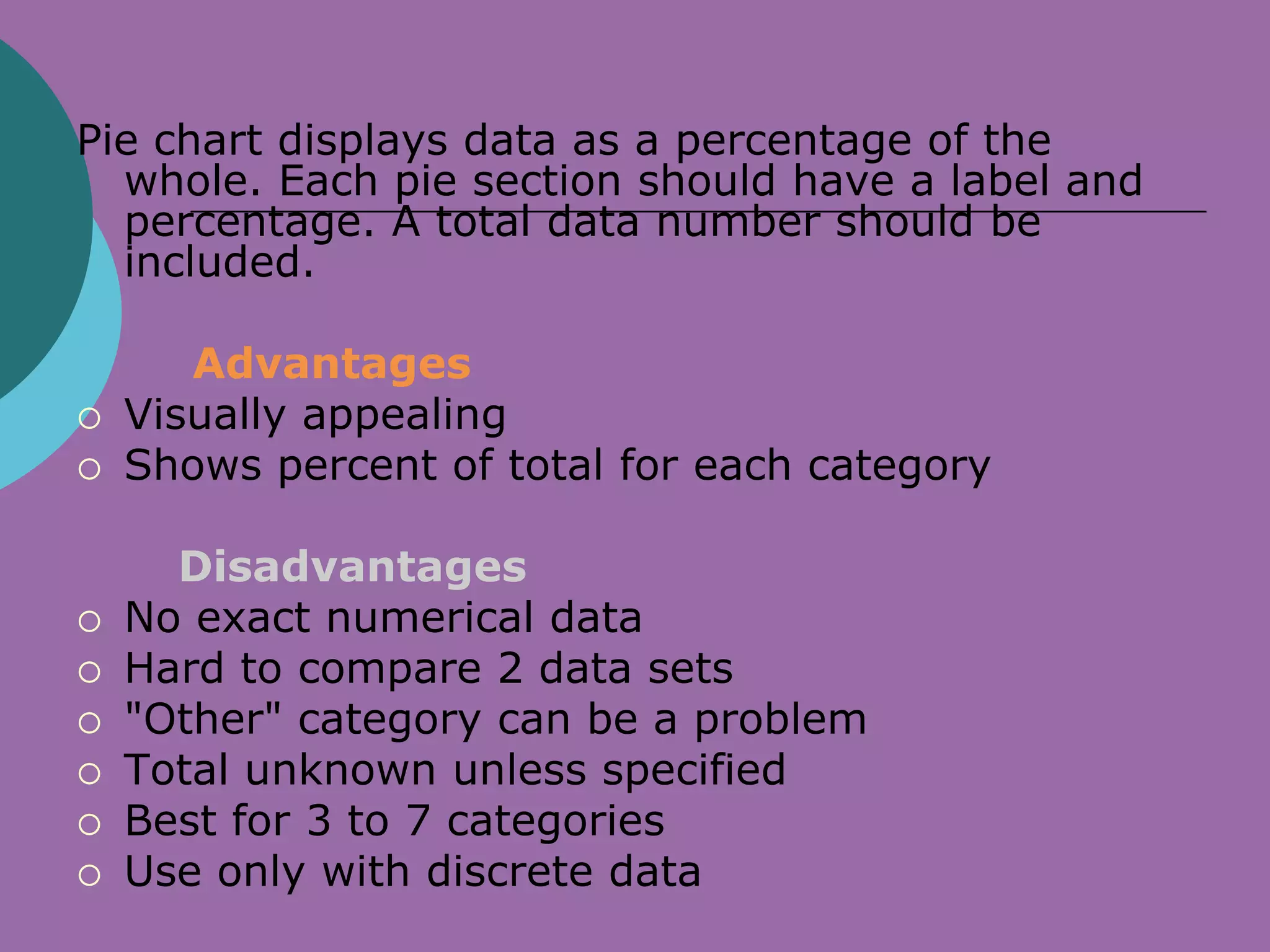
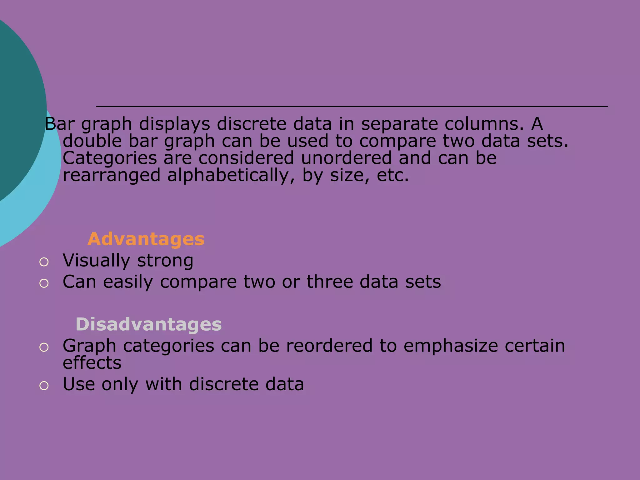
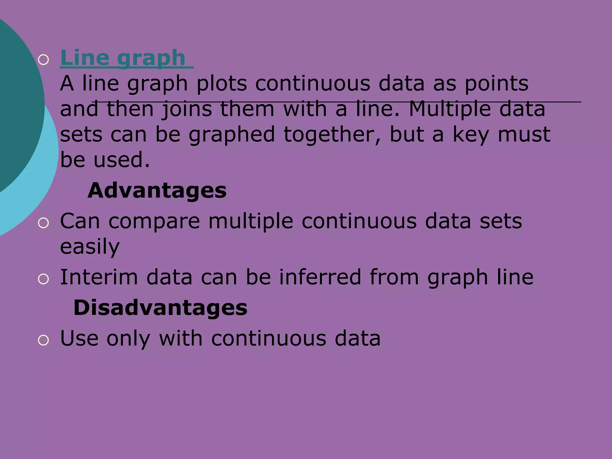
GRAPHS
PREPARED BY: ENAWOID
aims:


   Interpret and analyze graphs to
    determine what information is given.
   Complete exercises by applying data and
    graph concepts.
   Self-assess knowledge and skills
    acquired from this unit.
   Develop problem-solving skills.
DEFINITION:
   A graph is a visual representation of a relationship
    between, but not restricted to, two variables. A
    graph generally takes the form of a one- or two-
    dimensional figure such as a scatterplot.
    Although, there are three-dimensional graphs
    available, they are usually considered too
    complex to understand easily.
   A graph commonly consists of two axes called the
    x-axis (horizontal) and y-axis (vertical). Each axis
    corresponds to one variable. The axes are labelled
    with different names, such as Price and Quantity.
   The place where the two axes intersect is called
    the origin. The origin is also identified as the point
    (0,0).
A GOOD GRAPH

   accurately shows the facts
   grabs the reader's attention
   complements or demonstrates arguments
    presented in the text
   has a title and labels
   is simple and uncluttered
   shows data without altering the message of the
    data
   clearly shows any trends or differences in the
    data
   is visually accurate (i.e., if one chart value is 15
    and another 30, then 30 should appear to be
    twice the size of 15).
Why use graphs when presenting
data?


     are quick and direct
     highlight the most important facts
     facilitate understanding of the data
     can convince readers
     can be easily remembered
Graphs: four guidelines


1. Define your target audience.
    Ask yourself the following questions to
    help you understand more about your
    audience and what their needs are:

   Who is your target audience?
   What do they know about the issue?
   What do they expect to see?
   What do they want to know?
   What will they do with the information?
2. Determine the message(s) to be
  transmitted.

    Ask yourself the following questions to figure
    out what your message is and why it is
    important:

   What do the data show?
   Is there more than one main message?
   What aspect of the message(s) should be
    highlighted?

3. Determine the nature of the message.
4. Experiment with different types of graphs
  and select the most appropriate.

   pie chart (description of components)
   horizontal bar graph (comparison of items and
    relationships, time series)
   vertical bar graph (comparison of items and
    relationships, time series, frequency
    distribution)
   line graph (time series and frequency
    distribution)
   scatter plot (analysis of relationships)
TYPES OF GRAPHS
1. bar graph may be either horizontal
  or vertical. The important point to
  note about bar graphs is their bar
  length or height—the greater their
  length or height, the greater their
  value.
 Bar graphs are one of the many
  techniques used to present data in
  a visual form so that the reader
  may readily recognize patterns or
  trends.
3. Pictograph - uses picture symbols
 to convey the meaning of statistical
 information. Pictographs should be
 used carefully because the graphs
 may, either accidentally or
 deliberately, misrepresent the data.
 This is why a graph should be
 visually accurate.
4. Pie chart is a way of summarizing a set
  of categorical data or displaying the
  different values of a given variable
  (e.g., percentage distribution). This type
  of chart is a circle divided into a series of
  segments. Each segment represents a
  particular category. The area of each
  segment is the same proportion of a
  circle as the category is of the total data
  set.
5. Line graph is a visual comparison of how two
  variables—shown on the x- and y-axes—are
  related or vary with each other. It shows
  related information by drawing a continuous
  line between all the points on a grid.

   Line graphs are more popular than all other
graphs combined because their
visual characteristics reveal data trends
clearly and these graphs are easy to create.
Line graphs, especially useful in the fields of
statistics and science, are one of the most
common tools used to present data.
Pictograph uses an icon to represent a quantity of
  data values in order to decrease the size of the
  graph. A key must be used to explain the icon.

        Advantages
   Easy to read
   Visually appealing
   Handles large data sets easily using keyed
    icons

        Disadvantages
   Hard to quantify partial icons
   Icons must be of consistent size
   Best for only 2-6 categories
   Very simplistic
Pie chart displays data as a percentage of the
  whole. Each pie section should have a label and
  percentage. A total data number should be
  included.

       Advantages
   Visually appealing
   Shows percent of total for each category

      Disadvantages
   No exact numerical data
   Hard to compare 2 data sets
   "Other" category can be a problem
   Total unknown unless specified
   Best for 3 to 7 categories
   Use only with discrete data
Bar graph displays discrete data in separate columns. A
  double bar graph can be used to compare two data sets.
  Categories are considered unordered and can be
  rearranged alphabetically, by size, etc.


       Advantages
   Visually strong
   Can easily compare two or three data sets

     Disadvantages
   Graph categories can be reordered to emphasize certain
    effects
   Use only with discrete data
   Line graph
    A line graph plots continuous data as points
    and then joins them with a line. Multiple data
    sets can be graphed together, but a key must
    be used.
       Advantages
   Can compare multiple continuous data sets
    easily
   Interim data can be inferred from graph line
     Disadvantages
   Use only with continuous data

Diowane2003

  • 1.
  • 2.
    aims:  Interpret and analyze graphs to determine what information is given.  Complete exercises by applying data and graph concepts.  Self-assess knowledge and skills acquired from this unit.  Develop problem-solving skills.
  • 3.
    DEFINITION:  A graph is a visual representation of a relationship between, but not restricted to, two variables. A graph generally takes the form of a one- or two- dimensional figure such as a scatterplot. Although, there are three-dimensional graphs available, they are usually considered too complex to understand easily.  A graph commonly consists of two axes called the x-axis (horizontal) and y-axis (vertical). Each axis corresponds to one variable. The axes are labelled with different names, such as Price and Quantity.  The place where the two axes intersect is called the origin. The origin is also identified as the point (0,0).
  • 4.
    A GOOD GRAPH  accurately shows the facts  grabs the reader's attention  complements or demonstrates arguments presented in the text  has a title and labels  is simple and uncluttered  shows data without altering the message of the data  clearly shows any trends or differences in the data  is visually accurate (i.e., if one chart value is 15 and another 30, then 30 should appear to be twice the size of 15).
  • 5.
    Why use graphswhen presenting data?  are quick and direct  highlight the most important facts  facilitate understanding of the data  can convince readers  can be easily remembered
  • 6.
    Graphs: four guidelines 1.Define your target audience. Ask yourself the following questions to help you understand more about your audience and what their needs are:  Who is your target audience?  What do they know about the issue?  What do they expect to see?  What do they want to know?  What will they do with the information?
  • 7.
    2. Determine themessage(s) to be transmitted. Ask yourself the following questions to figure out what your message is and why it is important:  What do the data show?  Is there more than one main message?  What aspect of the message(s) should be highlighted? 3. Determine the nature of the message.
  • 8.
    4. Experiment withdifferent types of graphs and select the most appropriate.  pie chart (description of components)  horizontal bar graph (comparison of items and relationships, time series)  vertical bar graph (comparison of items and relationships, time series, frequency distribution)  line graph (time series and frequency distribution)  scatter plot (analysis of relationships)
  • 9.
    TYPES OF GRAPHS 1.bar graph may be either horizontal or vertical. The important point to note about bar graphs is their bar length or height—the greater their length or height, the greater their value.  Bar graphs are one of the many techniques used to present data in a visual form so that the reader may readily recognize patterns or trends.
  • 10.
    3. Pictograph -uses picture symbols to convey the meaning of statistical information. Pictographs should be used carefully because the graphs may, either accidentally or deliberately, misrepresent the data. This is why a graph should be visually accurate.
  • 11.
    4. Pie chartis a way of summarizing a set of categorical data or displaying the different values of a given variable (e.g., percentage distribution). This type of chart is a circle divided into a series of segments. Each segment represents a particular category. The area of each segment is the same proportion of a circle as the category is of the total data set.
  • 12.
    5. Line graphis a visual comparison of how two variables—shown on the x- and y-axes—are related or vary with each other. It shows related information by drawing a continuous line between all the points on a grid. Line graphs are more popular than all other graphs combined because their visual characteristics reveal data trends clearly and these graphs are easy to create. Line graphs, especially useful in the fields of statistics and science, are one of the most common tools used to present data.
  • 13.
    Pictograph uses anicon to represent a quantity of data values in order to decrease the size of the graph. A key must be used to explain the icon. Advantages  Easy to read  Visually appealing  Handles large data sets easily using keyed icons Disadvantages  Hard to quantify partial icons  Icons must be of consistent size  Best for only 2-6 categories  Very simplistic
  • 14.
    Pie chart displaysdata as a percentage of the whole. Each pie section should have a label and percentage. A total data number should be included. Advantages  Visually appealing  Shows percent of total for each category Disadvantages  No exact numerical data  Hard to compare 2 data sets  "Other" category can be a problem  Total unknown unless specified  Best for 3 to 7 categories  Use only with discrete data
  • 15.
    Bar graph displaysdiscrete data in separate columns. A double bar graph can be used to compare two data sets. Categories are considered unordered and can be rearranged alphabetically, by size, etc. Advantages  Visually strong  Can easily compare two or three data sets Disadvantages  Graph categories can be reordered to emphasize certain effects  Use only with discrete data
  • 16.
    Line graph A line graph plots continuous data as points and then joins them with a line. Multiple data sets can be graphed together, but a key must be used. Advantages  Can compare multiple continuous data sets easily  Interim data can be inferred from graph line Disadvantages  Use only with continuous data