The document discusses various methods for representing and summarizing geographical data, including:
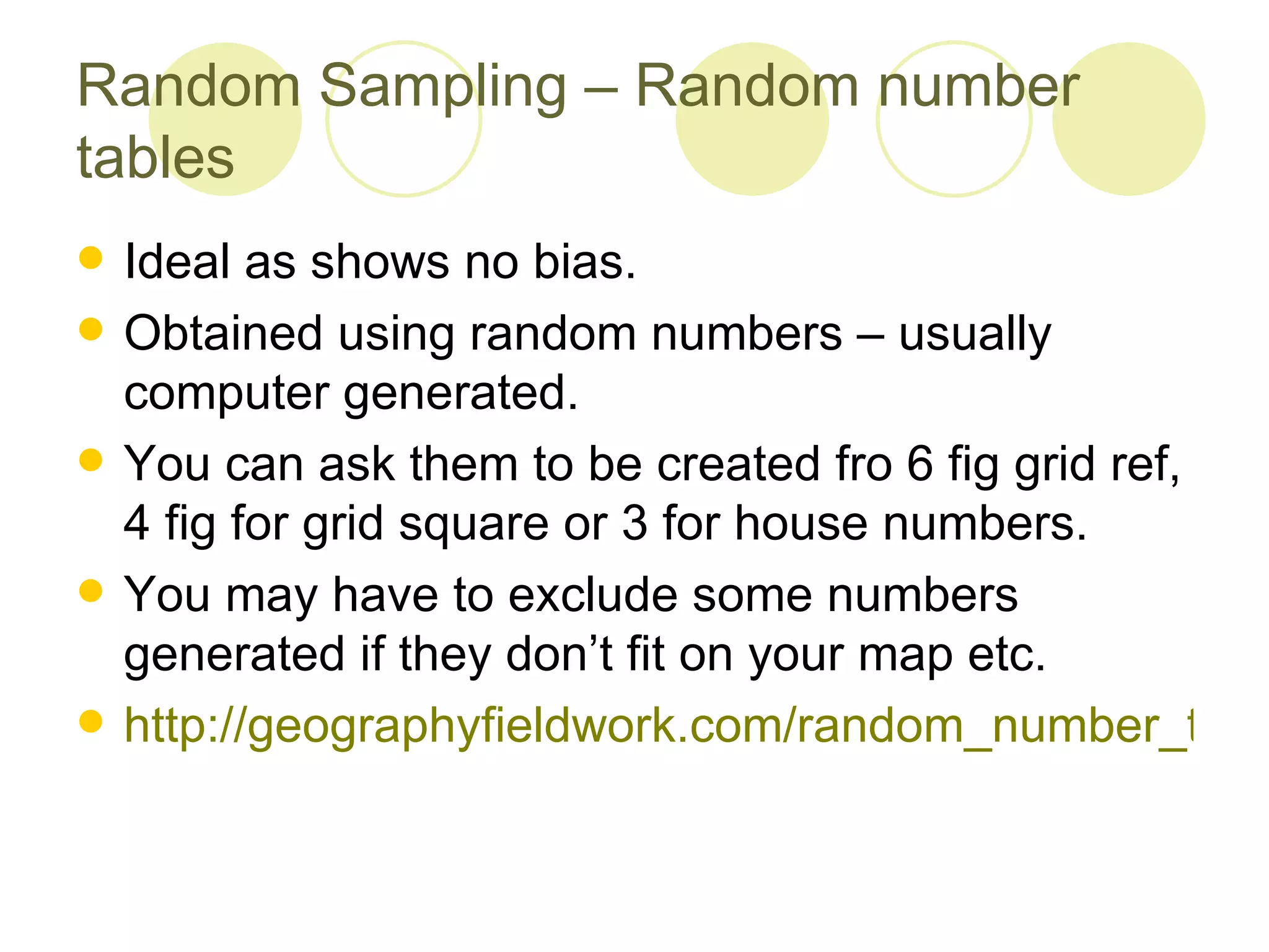
1. Random sampling techniques like random number tables that avoid bias when selecting sample locations.
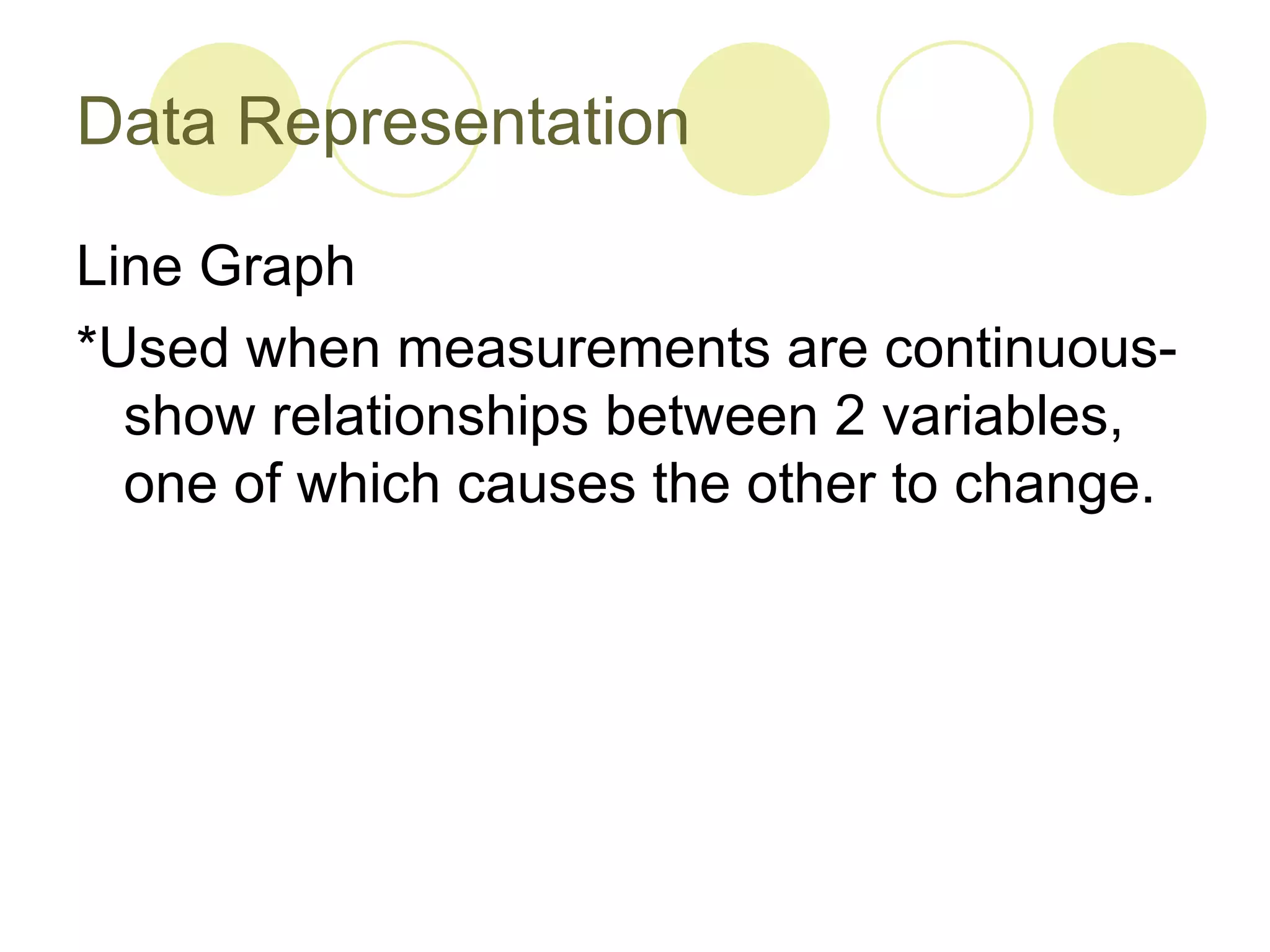
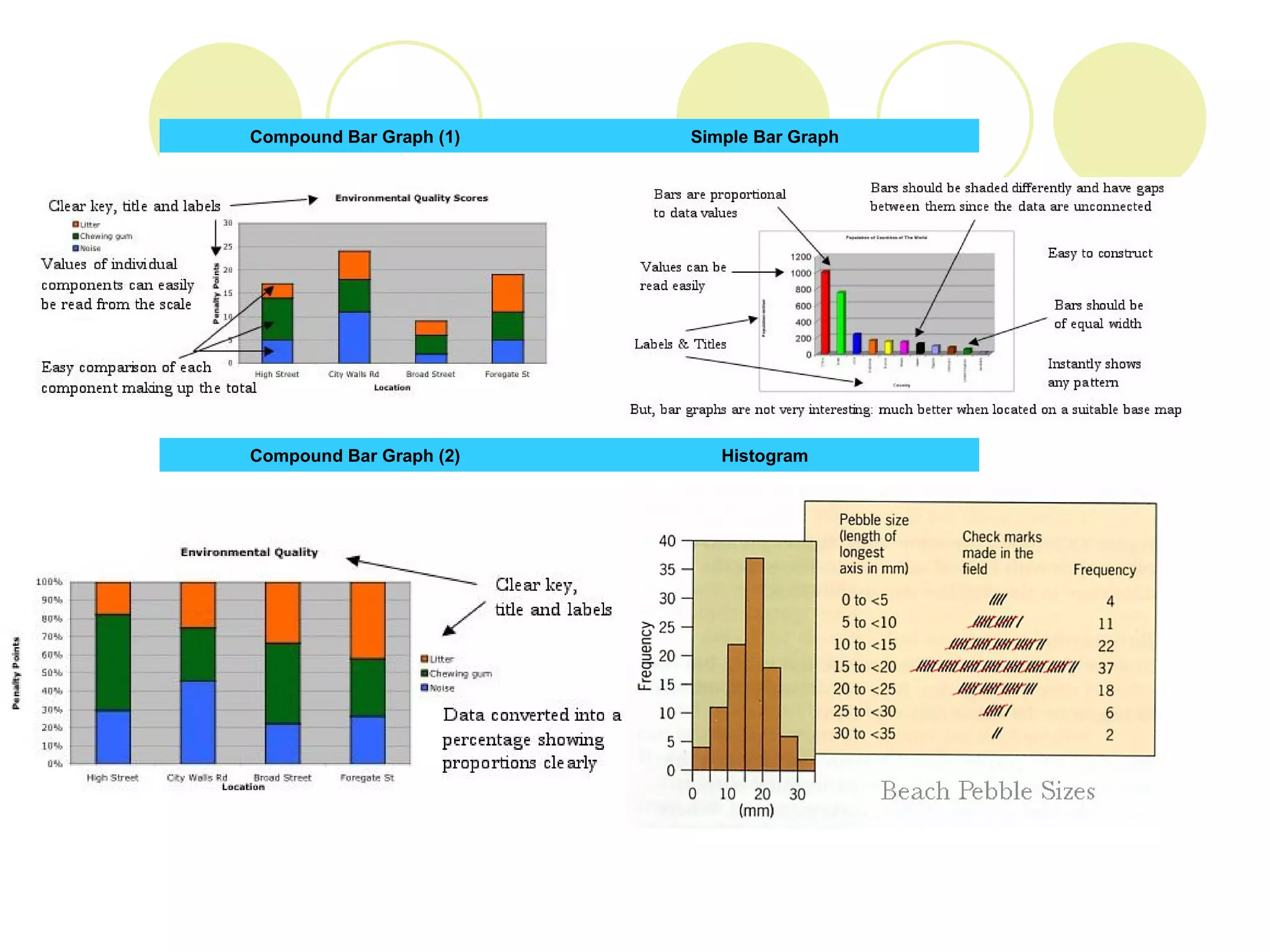
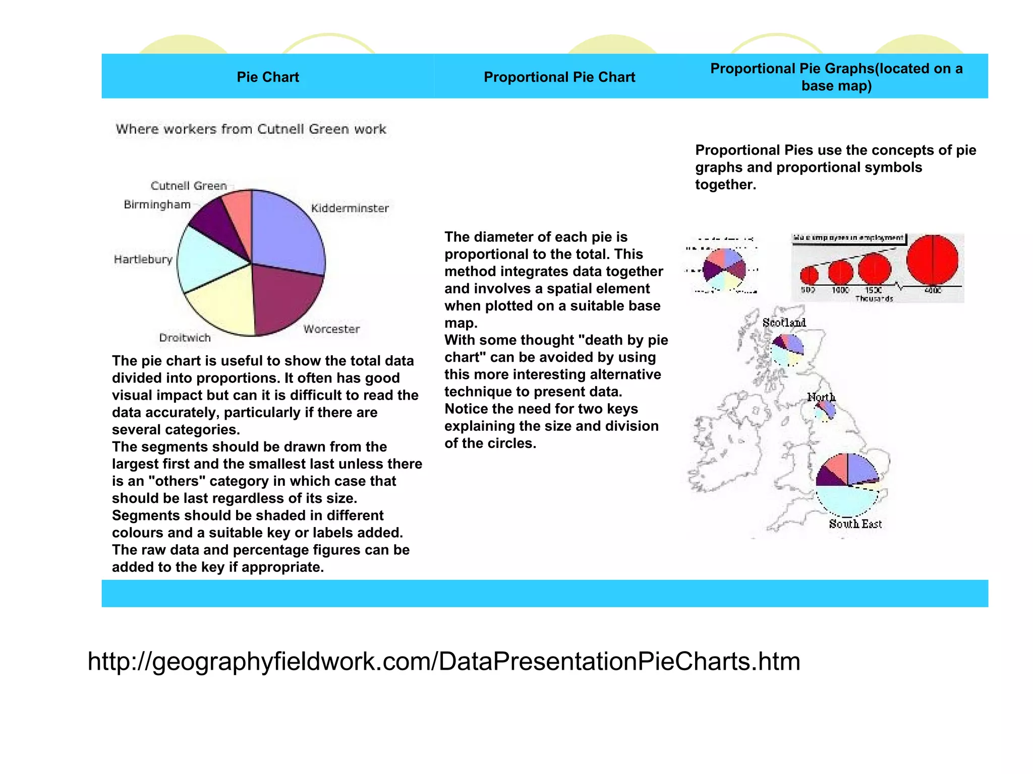
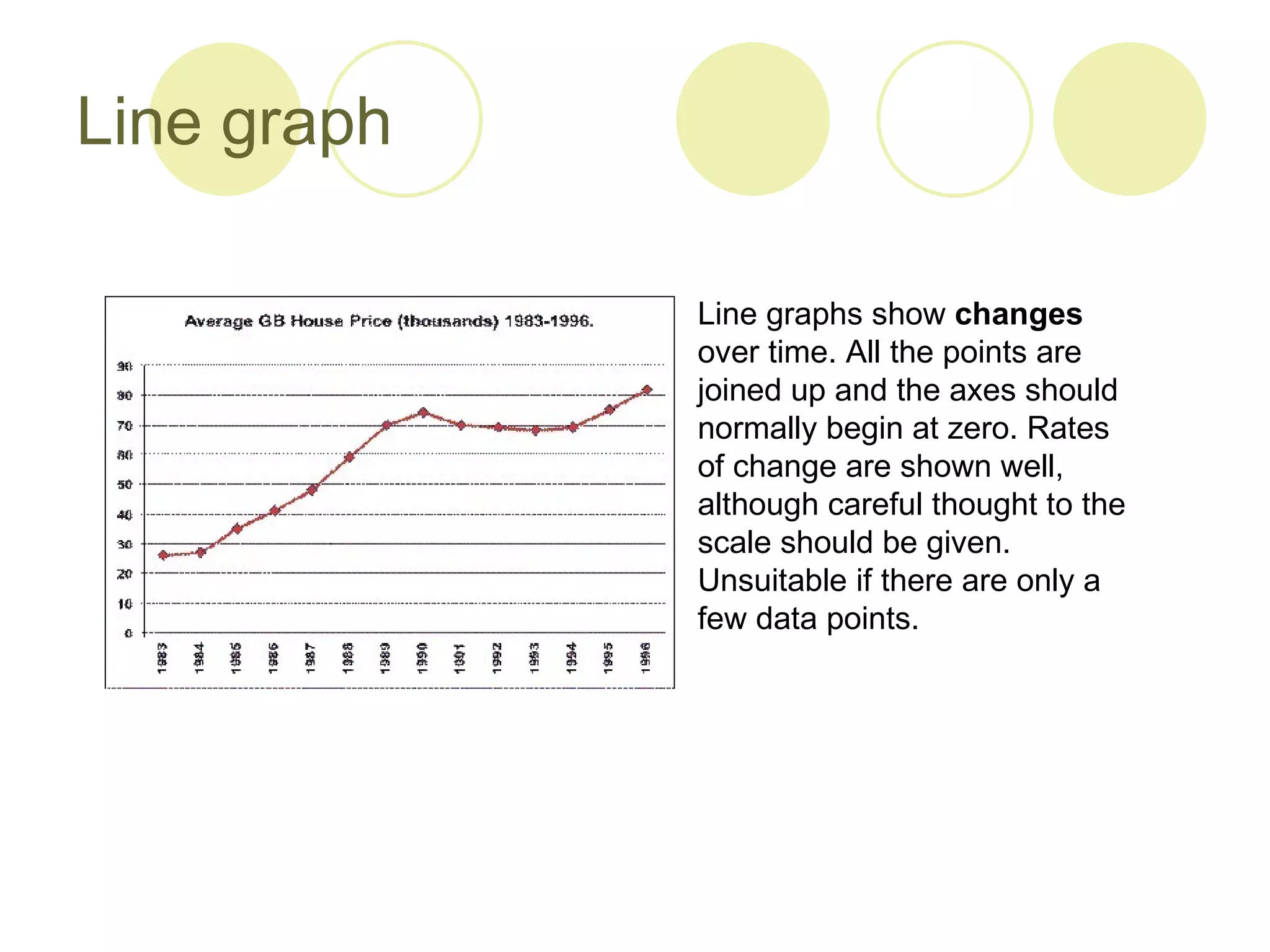
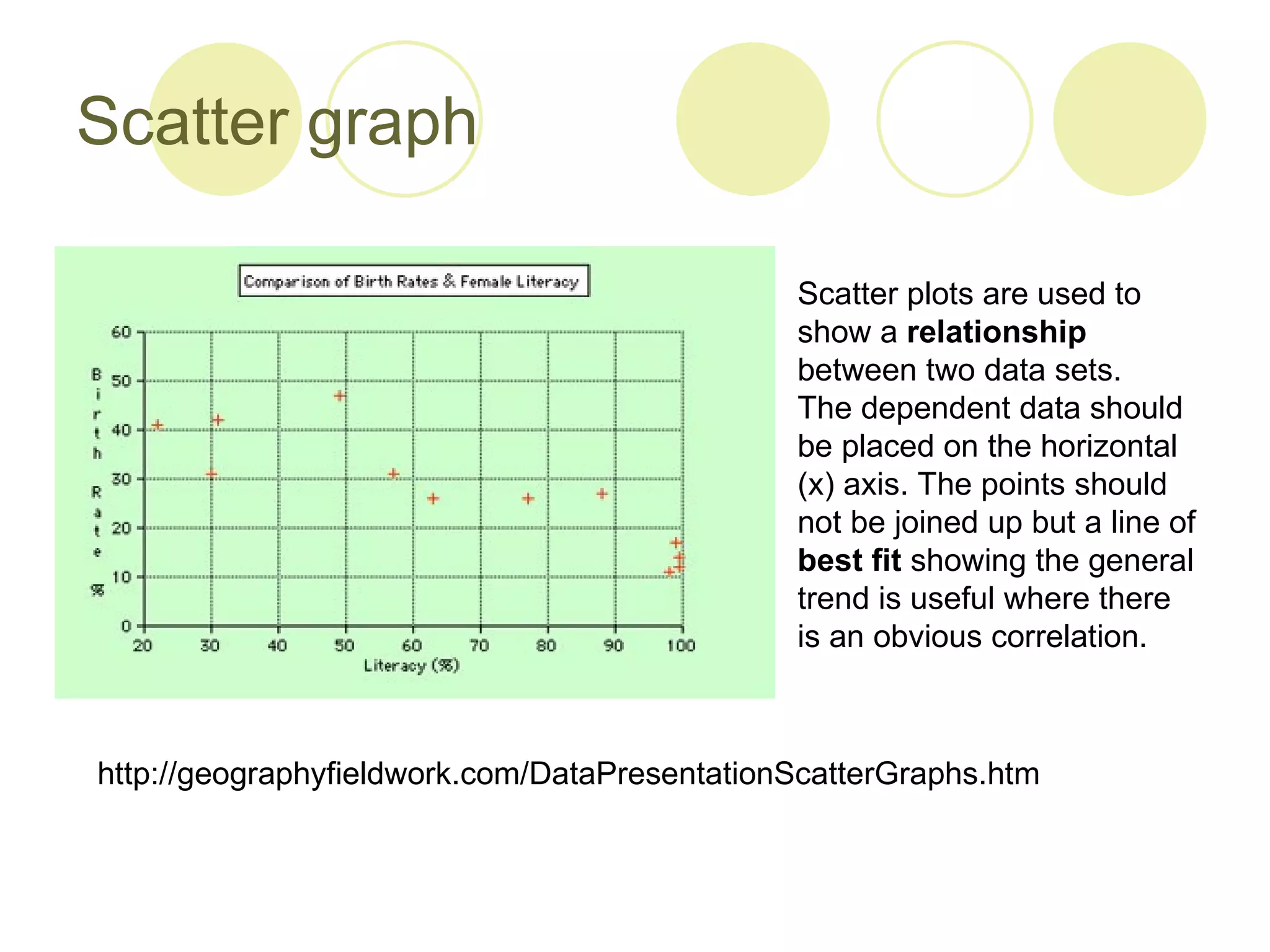
2. Methods for presenting data like line graphs, bar charts, histograms, pie charts and scatter plots, and considerations for each type.
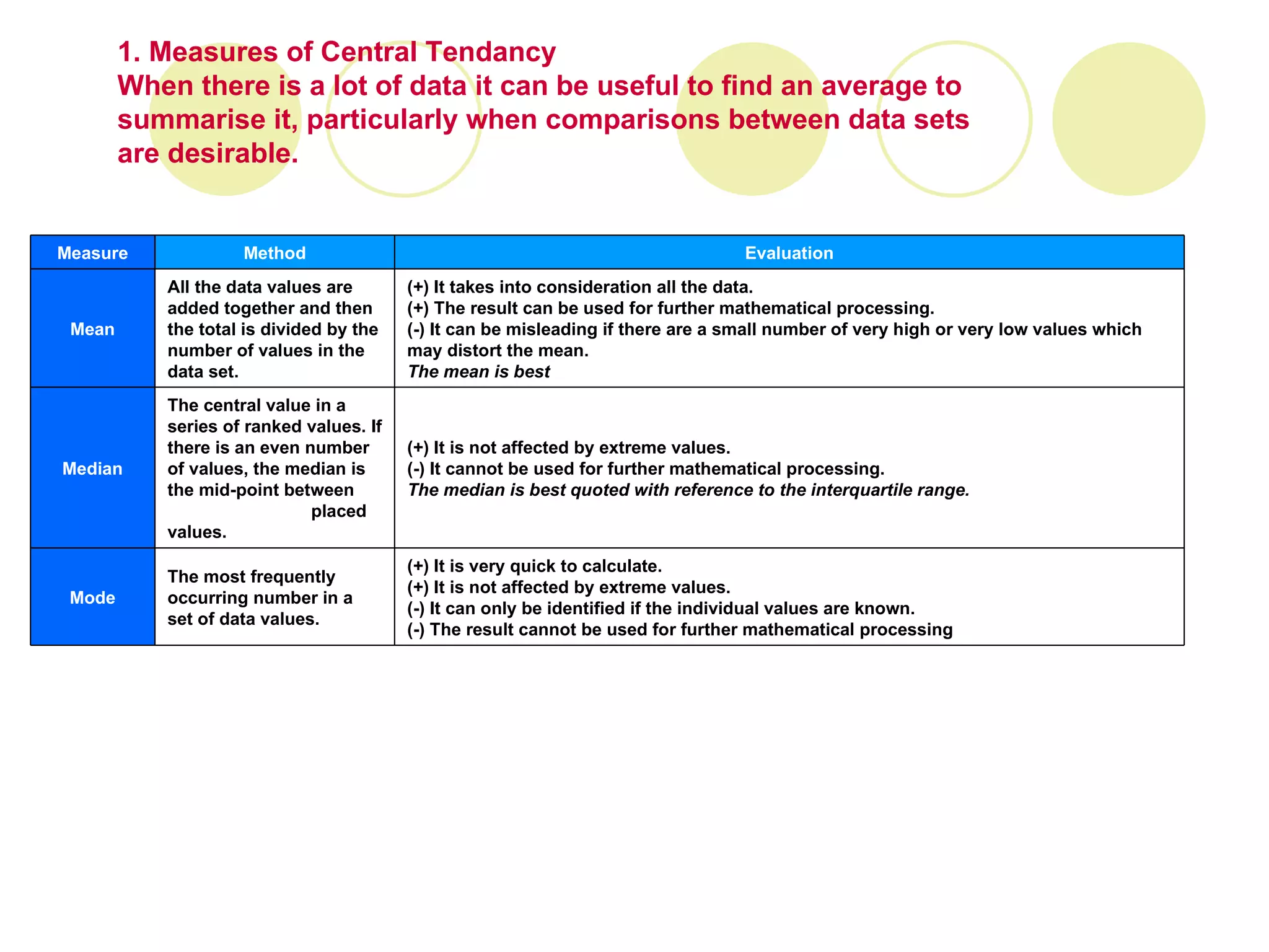
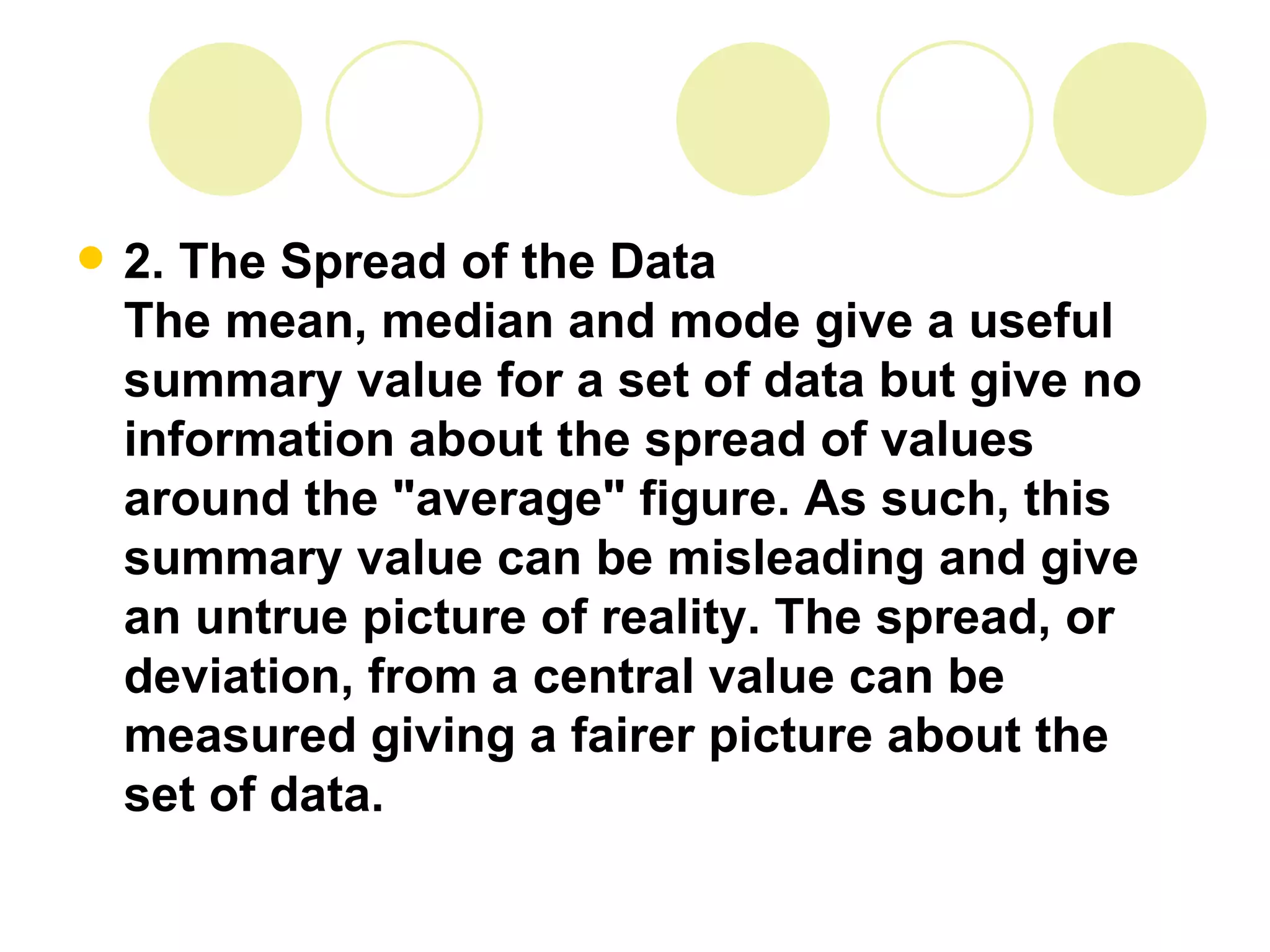
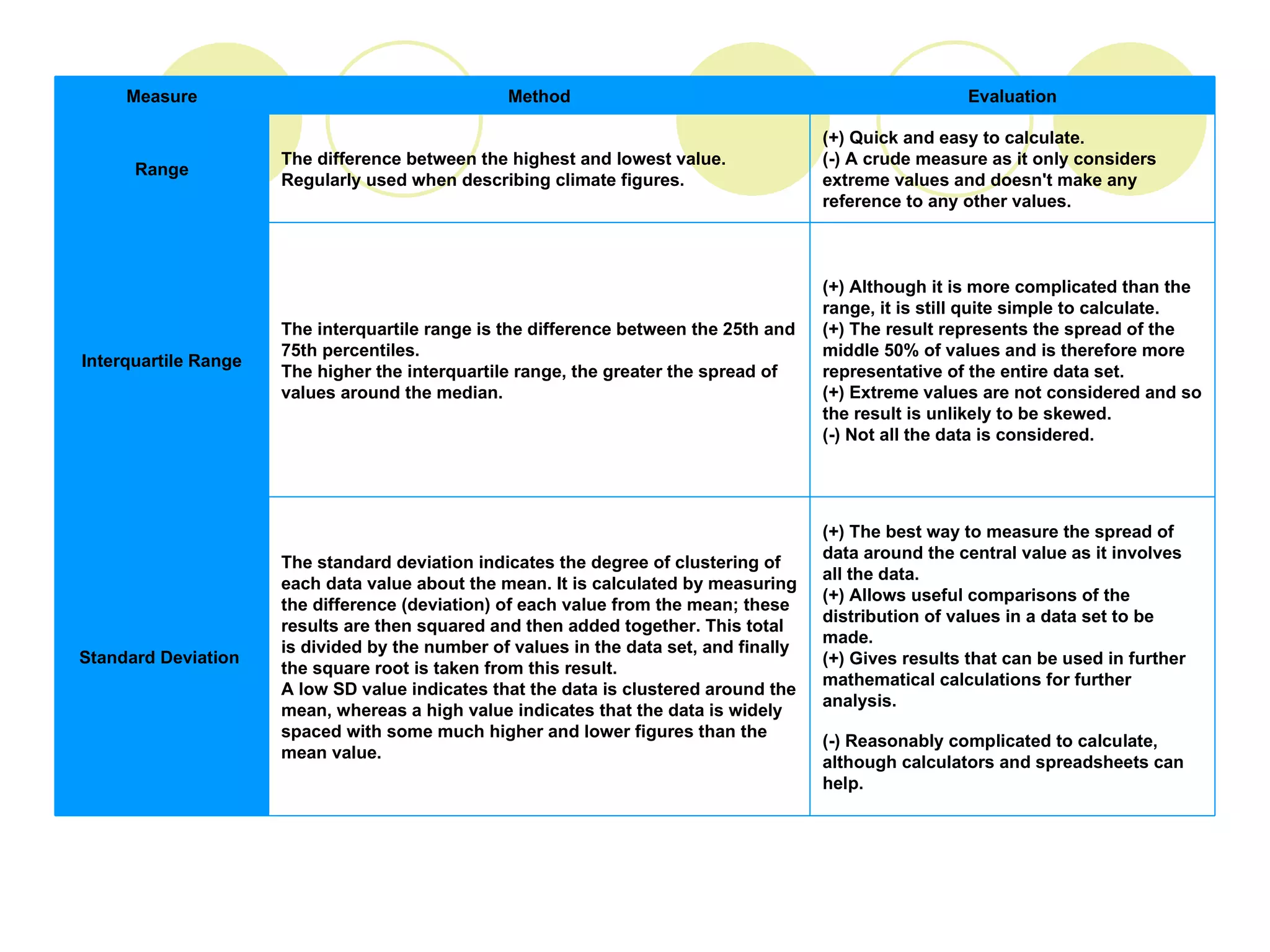
3. Measures of central tendency like the mean, median and mode, and measures of spread like the standard deviation, interquartile range and range, to summarize and describe data sets.


![Coded Agents – with UiPath SDK + LangGraph [Virtual Hands-on Workshop]](https://cdn.slidesharecdn.com/ss_thumbnails/codedagentsdeck-251215155422-5497c599-thumbnail.jpg?width=640&height=640&fit=bounds)


![Vibe Coding vs. Spec-Driven Development [Free Meetup]](https://cdn.slidesharecdn.com/ss_thumbnails/vibecodingvsspecdrivendevelopment-251209105622-43f455e7-thumbnail.jpg?width=640&height=640&fit=bounds)
