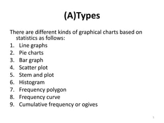
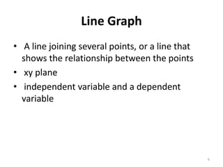
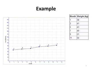
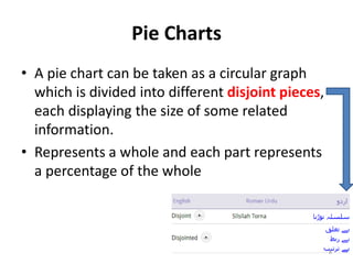
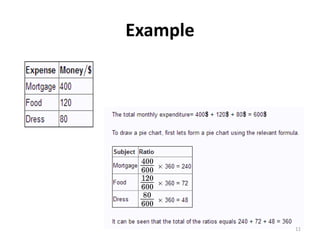
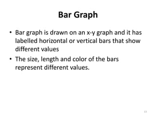
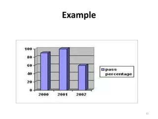
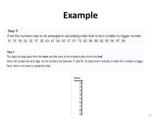
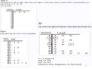
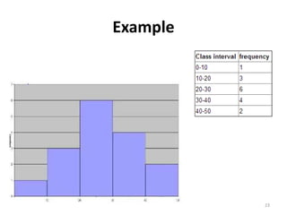
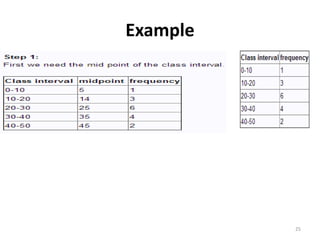
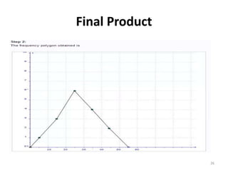
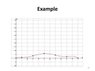
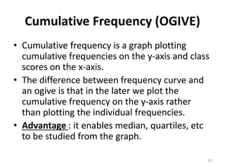
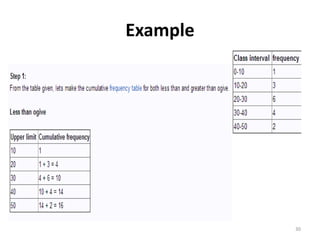
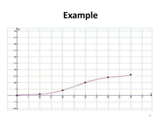
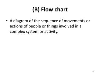
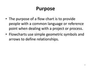
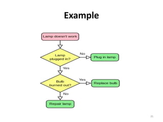
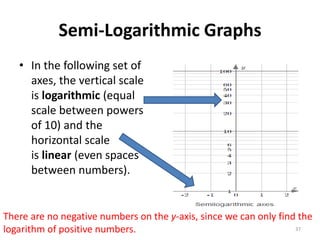
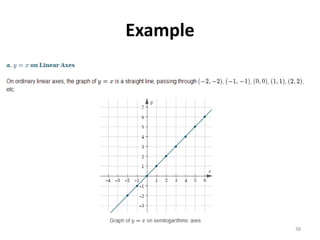
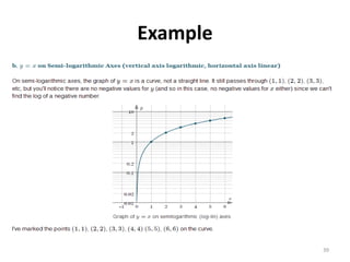
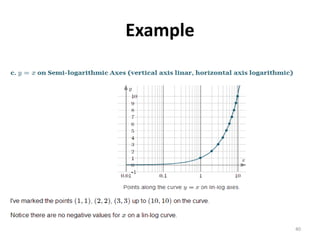
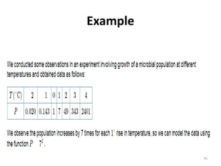
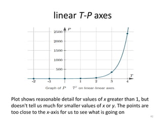
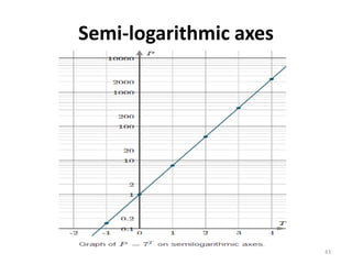
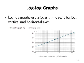
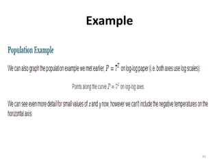
TYPES OF GRAPH AND FLOW
CHART
By M. Waleed Ahsan Khan Tareen
13-arid-1100
DVM 8th evening
Contents
• Prelude
• PART (A) TYPES OF GRAPHS
• PART (B) FLOW CHART
• PART (C) LOG AND SEMI LOG GRAPH
2
Statistics
• Numbers that is concerned with collection,
organization, measurement, and analysis of
the numerical data.
• The graphical demonstration of statistical data
in a chart is normally specified as statistical
graph chart.
3
WHY GRAPHS ?
• To reveal a trend or comparison of a data
• Easily understood
4
(A)Types
There are different kinds of graphical charts based on
statistics as follows:
1. Line graphs
2. Pie charts
3. Bar graph
4. Scatter plot
5. Stem and plot
6. Histogram
7. Frequency polygon
8. Frequency curve
9. Cumulative frequency or ogives
5
Line Graph
• A line joining several points, or a line that
shows the relationship between the points
• xy plane
• independent variable and a dependent
variable
6
Example
7
Pie Charts
• A pie chart can be taken as a circular graph
which is divided into different disjoint pieces,
each displaying the size of some related
information.
• Represents a whole and each part represents
a percentage of the whole
8
Advantages
• Good visual treat
• Percentage value-instantly known
9
Preferred use(Limitation)
• Categorical data - one understand what
percentage each of these category constitute
10
Example
11
Final Product
12
Bar Graph
• Bar graph is drawn on an x-y graph and it has
labelled horizontal or vertical bars that show
different values
• The size, length and color of the bars
represent different values.
13
Preferred use(Limitation)
• Non continuous data
• Comparing or contrasting the size of the
different categories of the data provided.
14
Example
15
Scatter plot
• A scatter plot or scatter graph is a type of graph
which is drawn in Cartesian coordinate to visually
represent the values for two variables for a set of
data. It is a graphical representation that shows
how one variable is affected by the other.
• Data is presented-collection of points-value of a
variable positioned horizontal or x-axis
(Explanatory variable )
• Value of the other variable positioned on the
vertical or y-axis(response variable)
16
Example
Note that these data are not random
17
Stem and Leaf Plot
• Stem and leaf plot also called as stem plot are
connected with quantitative data such that it
helps in
• Displaying shapes of the distributions,
• Organize numbers and
• Set it as comprehensible as possible.
18
Stem and leaf
• Descriptive technique-emphases on the data provided
• It concludes more about the shape of a set of data
• Provides better view about each of the data. The data
is arranged by “place value”.
• In Stem plots each data is taken divide  Two
separate parts  a stem and a leaf.
• A stem is usually the first digit of the number in the
data a vertical column
• a leaf is the last digit of the number in the data the
row to the right side of the corresponding stem
19
Example
20
21
Histogram
• Histogram is the most accurate graph that represents a
frequency distribution.
• In the histogram the scores are spread uniformly over
the entire class interval.
• The class intervals are plotted on the x-axis and the
frequencies on the y-axis. Each interval is represented
by a separate rectangle.
• The area of each rectangle is proportional to the
number of measures within the class- interval. The
entire histogram is proportional to the statistical data
set.
22
Example
23
Frequency Polygon
• The frequency polygon has most of the properties of a
histogram, with an extra feature. Here the mid point of
each class of the x-axis is marked. Then the midpoints
and the frequencies are taken as the plotting point.
These points are connected using line segments.
• We also complete the graph, that is, it's closed by
joining to the x-axis. Frequency polygon gives a less
accurate representation of the distribution, than a
histogram, as it represents the frequency of each class
by a single point not by the whole class interval.
24
Example
25
Final Product
26
Frequency Curve
• The frequency polygon consists of sharp turns, and ups and
downs which are not in conformity with actual conditions.
• To remove these sharp features of a polygon, it becomes
necessary to smooth it. No definite rule for smoothing the
polygon can be laid down.
• It should be understood very clearly that the curve does not,
in any way, sharply deviate from the polygon.
• In order to draw a satisfactory frequency curve, first of all, we
need to draw a frequency histogram  the frequency
polygon and ultimately the frequency curve.
27
Example
28
Cumulative Frequency (OGIVE)
• Cumulative frequency is a graph plotting
cumulative frequencies on the y-axis and class
scores on the x-axis.
• The difference between frequency curve and
an ogive is that in the later we plot the
cumulative frequency on the y-axis rather
than plotting the individual frequencies.
• Advantage : it enables median, quartiles, etc
to be studied from the graph.
29
Example
30
Example
31
32
(B) Flow chart
• A diagram of the sequence of movements or
actions of people or things involved in a
complex system or activity.
33
Purpose
• The purpose of a flow chart is to provide
people with a common language or reference
point when dealing with a project or process.
• Flowcharts use simple geometric symbols and
arrows to define relationships.
34
Example
35
(C) Graphs on Logarithmic and Semi-
Logarithmic Axes
• In a semilogarithmic graph, one axis has a
logarithmic scale and the other axis has a
linear scale.
• In log-log graphs, both axes have a logarithmic
scale.
• The idea here is we use semilog or log-log
graph axes so we can more easily see details
for small values of y as well as large values
of y.
36
Semi-Logarithmic Graphs
• In the following set of
axes, the vertical scale
is logarithmic (equal
scale between powers
of 10) and the
horizontal scale
is linear (even spaces
between numbers).
There are no negative numbers on the y-axis, since we can only find the
logarithm of positive numbers. 37
Example
38
Example
39
Example
40
Example
41
linear T-P axes
Plot shows reasonable detail for values of x greater than 1, but
doesn't tell us much for smaller values of x or y. The points are
too close to the x-axis for us to see what is going on
42
Semi-logarithmic axes
43
Log-log Graphs
• Log-log graphs use a logarithmic scale for both
vertical and horizontal axes.
44
Example
45

TYPES OF GRAPH & FLOW CHART

  • 1.
    TYPES OF GRAPHAND FLOW CHART By M. Waleed Ahsan Khan Tareen 13-arid-1100 DVM 8th evening
  • 2.
    Contents • Prelude • PART(A) TYPES OF GRAPHS • PART (B) FLOW CHART • PART (C) LOG AND SEMI LOG GRAPH 2
  • 3.
    Statistics • Numbers thatis concerned with collection, organization, measurement, and analysis of the numerical data. • The graphical demonstration of statistical data in a chart is normally specified as statistical graph chart. 3
  • 4.
    WHY GRAPHS ? •To reveal a trend or comparison of a data • Easily understood 4
  • 5.
    (A)Types There are differentkinds of graphical charts based on statistics as follows: 1. Line graphs 2. Pie charts 3. Bar graph 4. Scatter plot 5. Stem and plot 6. Histogram 7. Frequency polygon 8. Frequency curve 9. Cumulative frequency or ogives 5
  • 6.
    Line Graph • Aline joining several points, or a line that shows the relationship between the points • xy plane • independent variable and a dependent variable 6
  • 7.
  • 8.
    Pie Charts • Apie chart can be taken as a circular graph which is divided into different disjoint pieces, each displaying the size of some related information. • Represents a whole and each part represents a percentage of the whole 8
  • 9.
    Advantages • Good visualtreat • Percentage value-instantly known 9
  • 10.
    Preferred use(Limitation) • Categoricaldata - one understand what percentage each of these category constitute 10
  • 11.
  • 12.
  • 13.
    Bar Graph • Bargraph is drawn on an x-y graph and it has labelled horizontal or vertical bars that show different values • The size, length and color of the bars represent different values. 13
  • 14.
    Preferred use(Limitation) • Noncontinuous data • Comparing or contrasting the size of the different categories of the data provided. 14
  • 15.
  • 16.
    Scatter plot • Ascatter plot or scatter graph is a type of graph which is drawn in Cartesian coordinate to visually represent the values for two variables for a set of data. It is a graphical representation that shows how one variable is affected by the other. • Data is presented-collection of points-value of a variable positioned horizontal or x-axis (Explanatory variable ) • Value of the other variable positioned on the vertical or y-axis(response variable) 16
  • 17.
    Example Note that thesedata are not random 17
  • 18.
    Stem and LeafPlot • Stem and leaf plot also called as stem plot are connected with quantitative data such that it helps in • Displaying shapes of the distributions, • Organize numbers and • Set it as comprehensible as possible. 18
  • 19.
    Stem and leaf •Descriptive technique-emphases on the data provided • It concludes more about the shape of a set of data • Provides better view about each of the data. The data is arranged by “place value”. • In Stem plots each data is taken divide  Two separate parts  a stem and a leaf. • A stem is usually the first digit of the number in the data a vertical column • a leaf is the last digit of the number in the data the row to the right side of the corresponding stem 19
  • 20.
  • 21.
  • 22.
    Histogram • Histogram isthe most accurate graph that represents a frequency distribution. • In the histogram the scores are spread uniformly over the entire class interval. • The class intervals are plotted on the x-axis and the frequencies on the y-axis. Each interval is represented by a separate rectangle. • The area of each rectangle is proportional to the number of measures within the class- interval. The entire histogram is proportional to the statistical data set. 22
  • 23.
  • 24.
    Frequency Polygon • Thefrequency polygon has most of the properties of a histogram, with an extra feature. Here the mid point of each class of the x-axis is marked. Then the midpoints and the frequencies are taken as the plotting point. These points are connected using line segments. • We also complete the graph, that is, it's closed by joining to the x-axis. Frequency polygon gives a less accurate representation of the distribution, than a histogram, as it represents the frequency of each class by a single point not by the whole class interval. 24
  • 25.
  • 26.
  • 27.
    Frequency Curve • Thefrequency polygon consists of sharp turns, and ups and downs which are not in conformity with actual conditions. • To remove these sharp features of a polygon, it becomes necessary to smooth it. No definite rule for smoothing the polygon can be laid down. • It should be understood very clearly that the curve does not, in any way, sharply deviate from the polygon. • In order to draw a satisfactory frequency curve, first of all, we need to draw a frequency histogram  the frequency polygon and ultimately the frequency curve. 27
  • 28.
  • 29.
    Cumulative Frequency (OGIVE) •Cumulative frequency is a graph plotting cumulative frequencies on the y-axis and class scores on the x-axis. • The difference between frequency curve and an ogive is that in the later we plot the cumulative frequency on the y-axis rather than plotting the individual frequencies. • Advantage : it enables median, quartiles, etc to be studied from the graph. 29
  • 30.
  • 31.
  • 32.
  • 33.
    (B) Flow chart •A diagram of the sequence of movements or actions of people or things involved in a complex system or activity. 33
  • 34.
    Purpose • The purposeof a flow chart is to provide people with a common language or reference point when dealing with a project or process. • Flowcharts use simple geometric symbols and arrows to define relationships. 34
  • 35.
  • 36.
    (C) Graphs onLogarithmic and Semi- Logarithmic Axes • In a semilogarithmic graph, one axis has a logarithmic scale and the other axis has a linear scale. • In log-log graphs, both axes have a logarithmic scale. • The idea here is we use semilog or log-log graph axes so we can more easily see details for small values of y as well as large values of y. 36
  • 37.
    Semi-Logarithmic Graphs • Inthe following set of axes, the vertical scale is logarithmic (equal scale between powers of 10) and the horizontal scale is linear (even spaces between numbers). There are no negative numbers on the y-axis, since we can only find the logarithm of positive numbers. 37
  • 38.
  • 39.
  • 40.
  • 41.
  • 42.
    linear T-P axes Plotshows reasonable detail for values of x greater than 1, but doesn't tell us much for smaller values of x or y. The points are too close to the x-axis for us to see what is going on 42
  • 43.
  • 44.
    Log-log Graphs • Log-loggraphs use a logarithmic scale for both vertical and horizontal axes. 44
  • 45.