This document defines and provides examples of three different types of plots used to represent data distributions: stem and leaf plots, bar graphs, and histograms. It explains that stem and leaf plots organize large data sets by separating values into "stems" and "leaves", bar graphs represent frequencies using bars of equal or varying widths, and histograms use intervals to group continuous data and display frequencies. The document also lists advantages and disadvantages of each type of plot.
This presentation is about Basic Statistics-related to types of Data-Qualitative and Quantitative, and its Examples in everyday life- By: Dr. Farhana Shaheen
Topic: Frequency Polygon
Student Name: Kubra
Class: B.Ed. 2.5
Project Name: “Young Teachers' Professional Development (TPD)"
"Project Founder: Prof. Dr. Amjad Ali Arain
Faculty of Education, University of Sindh, Pakistan
A bar graph is a chart that uses either horizontal ,A Pie Chart (or Pie Graph) is a circular chart divided into sectors,It is also possible to draw bar charts .
Topic: Population And Sample
Student Name: Sidera Saleem
Class: B.Ed. 2.5
Project Name: “Young Teachers' Professional Development (TPD)"
"Project Founder: Prof. Dr. Amjad Ali Arain
Faculty of Education, University of Sindh, Pakistan
Data presentation/ How to present Research outcome dataDr-Jitendra Patel
In this power point viewer will be able to know about how to present data which is the out comes of any sincere research. The way of presentation is very very important because ultimately it should reach to the particular audience in proper and effective way.
In this PPT viewers will be able to know how to present data obtained as a result of any kind of Research. In report writing the information received need to reach to targeted audience and received data need to reflect in impressive and understandable manner therefore data presentation is very important.
portion covered
1. Data presentation
2. Textual data presentation
3. Tabular data presentation
4. Qualitative Tabular data presentation
5. Quantitative tabular data presentation
6. Temporal tabular data presentation
7. Spatial tabular data presentation
According to Wikipedia point estimation involves the use of sample data to calculate a single value (known as a point estimate since it identifies a point in some parameter space) which is to serve as a "best guess" or "best estimate" of an unknown population parameter (for example, the population means).
Binary Logistic Regression Classification makes use of one or more predictor variables that may be either continuous or categorical to predict target variable classes. This technique identifies important factors impacting the target variable and also the nature of the relationship between each of these factors and the dependent variable. It is useful in the analysis of multiple factors influencing an outcome, or other classification where there two possible outcomes.
done by : ( ABCD'S &G )
alaa ba-jafar
abrar alshahranii
sahab filfilan
nada alharbi
shahd rajab
Ghadeer suwaimil
I hope that you enjoy and you benefit❤
Graphs(Biostatistics and Research Methodology) B.pharmacy(8th sem.)Pranjal Saxena
This slides contains the description about the Graphs(Histograms, Pie-Chart, Cubic Graph, Response surface Plot, Counter surface plot ) mainly Histograms with advantages, disadvantages and examples, Pie-chart with advantages, disadvantages and examples, Cubic Graph with examples, Response surface plot and Counter plot with examples and uses.
data structure programing language in c.pptLavkushGupta12
A data structure is a specialized format for organizing, processing, retrieving and storing data. There are several basic and advanced types of data structures, all designed to arrange data to suit a specific purpose
Software Delivery At the Speed of AI: Inflectra Invests In AI-Powered QualityInflectra
In this insightful webinar, Inflectra explores how artificial intelligence (AI) is transforming software development and testing. Discover how AI-powered tools are revolutionizing every stage of the software development lifecycle (SDLC), from design and prototyping to testing, deployment, and monitoring.
Learn about:
• The Future of Testing: How AI is shifting testing towards verification, analysis, and higher-level skills, while reducing repetitive tasks.
• Test Automation: How AI-powered test case generation, optimization, and self-healing tests are making testing more efficient and effective.
• Visual Testing: Explore the emerging capabilities of AI in visual testing and how it's set to revolutionize UI verification.
• Inflectra's AI Solutions: See demonstrations of Inflectra's cutting-edge AI tools like the ChatGPT plugin and Azure Open AI platform, designed to streamline your testing process.
Whether you're a developer, tester, or QA professional, this webinar will give you valuable insights into how AI is shaping the future of software delivery.
Key Trends Shaping the Future of Infrastructure.pdfCheryl Hung
Keynote at DIGIT West Expo, Glasgow on 29 May 2024.
Cheryl Hung, ochery.com
Sr Director, Infrastructure Ecosystem, Arm.
The key trends across hardware, cloud and open-source; exploring how these areas are likely to mature and develop over the short and long-term, and then considering how organisations can position themselves to adapt and thrive.
UiPath Test Automation using UiPath Test Suite series, part 3DianaGray10
Welcome to UiPath Test Automation using UiPath Test Suite series part 3. In this session, we will cover desktop automation along with UI automation.
Topics covered:
UI automation Introduction,
UI automation Sample
Desktop automation flow
Pradeep Chinnala, Senior Consultant Automation Developer @WonderBotz and UiPath MVP
Deepak Rai, Automation Practice Lead, Boundaryless Group and UiPath MVP
Accelerate your Kubernetes clusters with Varnish CachingThijs Feryn
A presentation about the usage and availability of Varnish on Kubernetes. This talk explores the capabilities of Varnish caching and shows how to use the Varnish Helm chart to deploy it to Kubernetes.
This presentation was delivered at K8SUG Singapore. See https://feryn.eu/presentations/accelerate-your-kubernetes-clusters-with-varnish-caching-k8sug-singapore-28-2024 for more details.
Dev Dives: Train smarter, not harder – active learning and UiPath LLMs for do...UiPathCommunity
💥 Speed, accuracy, and scaling – discover the superpowers of GenAI in action with UiPath Document Understanding and Communications Mining™:
See how to accelerate model training and optimize model performance with active learning
Learn about the latest enhancements to out-of-the-box document processing – with little to no training required
Get an exclusive demo of the new family of UiPath LLMs – GenAI models specialized for processing different types of documents and messages
This is a hands-on session specifically designed for automation developers and AI enthusiasts seeking to enhance their knowledge in leveraging the latest intelligent document processing capabilities offered by UiPath.
Speakers:
👨🏫 Andras Palfi, Senior Product Manager, UiPath
👩🏫 Lenka Dulovicova, Product Program Manager, UiPath
LF Energy Webinar: Electrical Grid Modelling and Simulation Through PowSyBl -...DanBrown980551
Do you want to learn how to model and simulate an electrical network from scratch in under an hour?
Then welcome to this PowSyBl workshop, hosted by Rte, the French Transmission System Operator (TSO)!
During the webinar, you will discover the PowSyBl ecosystem as well as handle and study an electrical network through an interactive Python notebook.
PowSyBl is an open source project hosted by LF Energy, which offers a comprehensive set of features for electrical grid modelling and simulation. Among other advanced features, PowSyBl provides:
- A fully editable and extendable library for grid component modelling;
- Visualization tools to display your network;
- Grid simulation tools, such as power flows, security analyses (with or without remedial actions) and sensitivity analyses;
The framework is mostly written in Java, with a Python binding so that Python developers can access PowSyBl functionalities as well.
What you will learn during the webinar:
- For beginners: discover PowSyBl's functionalities through a quick general presentation and the notebook, without needing any expert coding skills;
- For advanced developers: master the skills to efficiently apply PowSyBl functionalities to your real-world scenarios.
Builder.ai Founder Sachin Dev Duggal's Strategic Approach to Create an Innova...Ramesh Iyer
In today's fast-changing business world, Companies that adapt and embrace new ideas often need help to keep up with the competition. However, fostering a culture of innovation takes much work. It takes vision, leadership and willingness to take risks in the right proportion. Sachin Dev Duggal, co-founder of Builder.ai, has perfected the art of this balance, creating a company culture where creativity and growth are nurtured at each stage.
DevOps and Testing slides at DASA ConnectKari Kakkonen
My and Rik Marselis slides at 30.5.2024 DASA Connect conference. We discuss about what is testing, then what is agile testing and finally what is Testing in DevOps. Finally we had lovely workshop with the participants trying to find out different ways to think about quality and testing in different parts of the DevOps infinity loop.
GraphRAG is All You need? LLM & Knowledge GraphGuy Korland
Guy Korland, CEO and Co-founder of FalkorDB, will review two articles on the integration of language models with knowledge graphs.
1. Unifying Large Language Models and Knowledge Graphs: A Roadmap.
https://arxiv.org/abs/2306.08302
2. Microsoft Research's GraphRAG paper and a review paper on various uses of knowledge graphs:
https://www.microsoft.com/en-us/research/blog/graphrag-unlocking-llm-discovery-on-narrative-private-data/
Monitoring Java Application Security with JDK Tools and JFR Events
Stem & leaf, Bar graphs, and Histograms
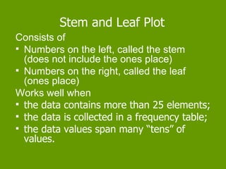
1. Stem and Leaf Plot
Consists of
Numbers on the left, called the stem
(does not include the ones place)
Numbers on the right, called the leaf
(ones place)
Works well when
the data contains more than 25 elements;
the data is collected in a frequency table;
the data values span many “tens” of
values.
3. Advantages of
Stem and Leaf Plots
It can be used to quickly organize a large list of
data values.
It is convenient to use in determining median or
mode of a data set quickly.
Outliers, data clusters, or gaps are easily
visible.
Disadvantages of
Stem and Leaf Plots
A stem and leaf plot is not very informative for a small
set of data.
4. Bar Graph
Consists of
bars of the same width drawn either horizontally
or vertically;
bars whose length (or height) represents the
frequencies of each value in a data set.
Works well when
the data is numerical or categorical;
the data is discrete;
the data is collected using a frequency table.
6. Advantages of Bar Graphs
The mode is easily visible.
A bar graph can be used with numerical or
categorical data.
Disadvantages of Bar Graphs
A bar graph shows only the frequencies of the
elements of a data set.
7. Histogram
Consists of
e q u a l i n t e r v a l s marked on the
horizontal axis;
bars of equal width drawn for each interval
(There is n o s p a c e between the bars.)
Works well when
the data has a really big range
there is one set of data
the data is collected using a frequency table.
9. Advantages of Histograms
A histogram provides a way to display the
frequency of occurrences of data along an
interval.
Disadvantages of Histograms
The use of intervals prevents the calculation of
an exact measure of central tendency.