Downloaded 2,037 times
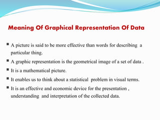
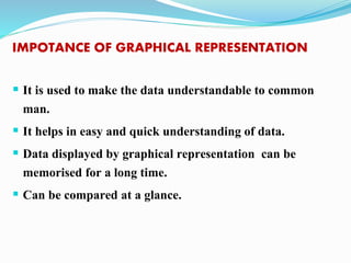
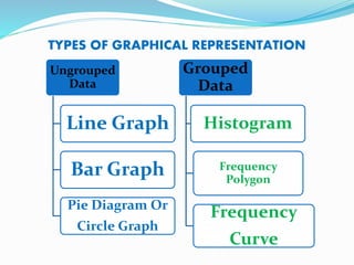
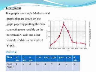
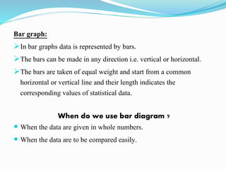

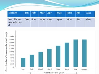
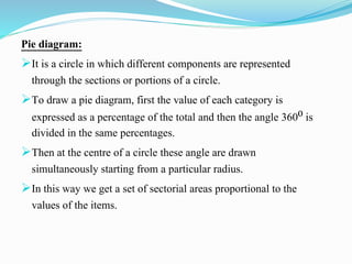
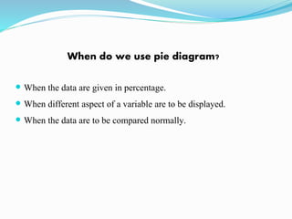

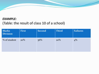
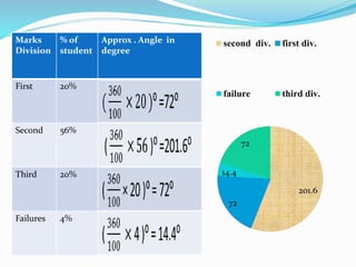
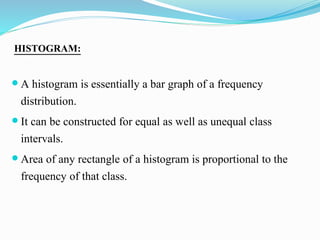


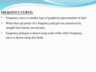

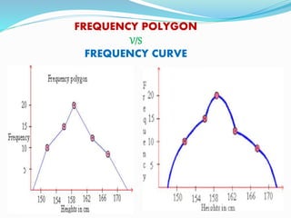


This presentation discusses graphical representations of statistical data. It defines graphical representation as a mathematical picture that enables visual thinking about statistical problems. The key types discussed are line graphs, bar graphs, pie charts, histograms, frequency polygons, and frequency curves. Each type is described in terms of its construction and best uses for presenting different types of data clearly and efficiently. The conclusion emphasizes that graphical representations make statistical data more understandable, memorable, and easy to interpret compared to textual representations alone.