Downloaded 175 times
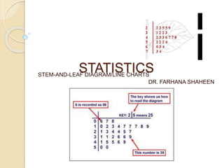

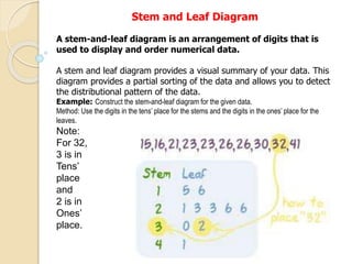

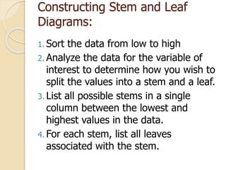

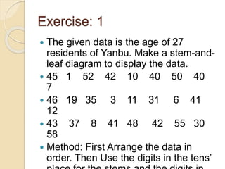
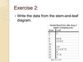
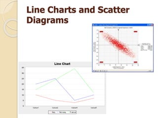


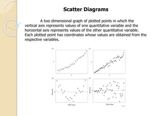

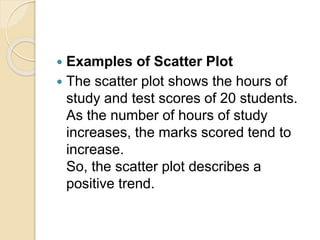

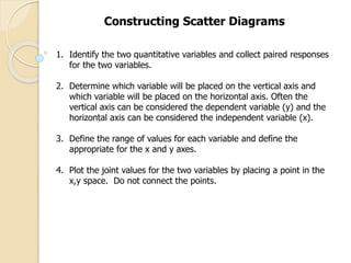

This document discusses stem-and-leaf diagrams, line charts, and scatter diagrams. It provides examples and steps for constructing each type of graph. Stem-and-leaf diagrams display and order numerical data using digits in the tens and ones places. Line charts show the relationship between two quantitative variables over time. Scatter diagrams plot the relationship between two quantitative variables to determine if they are correlated. Examples and steps are given for accurately constructing each graph.