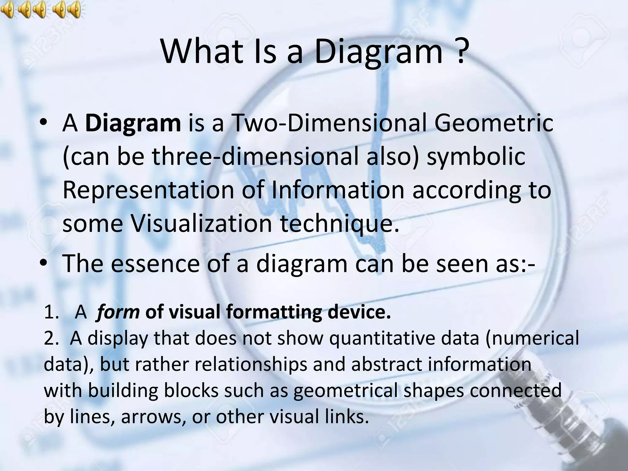
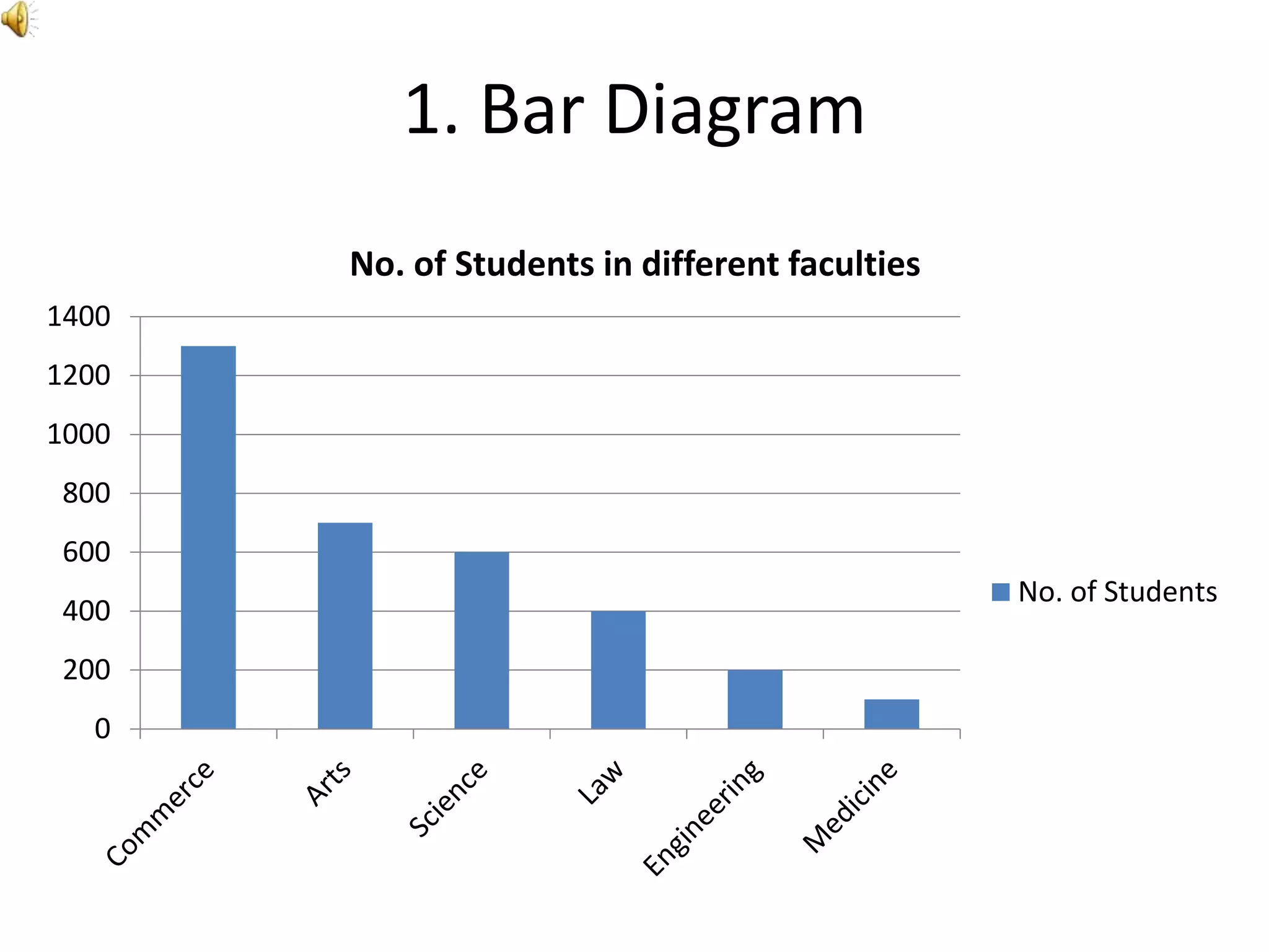
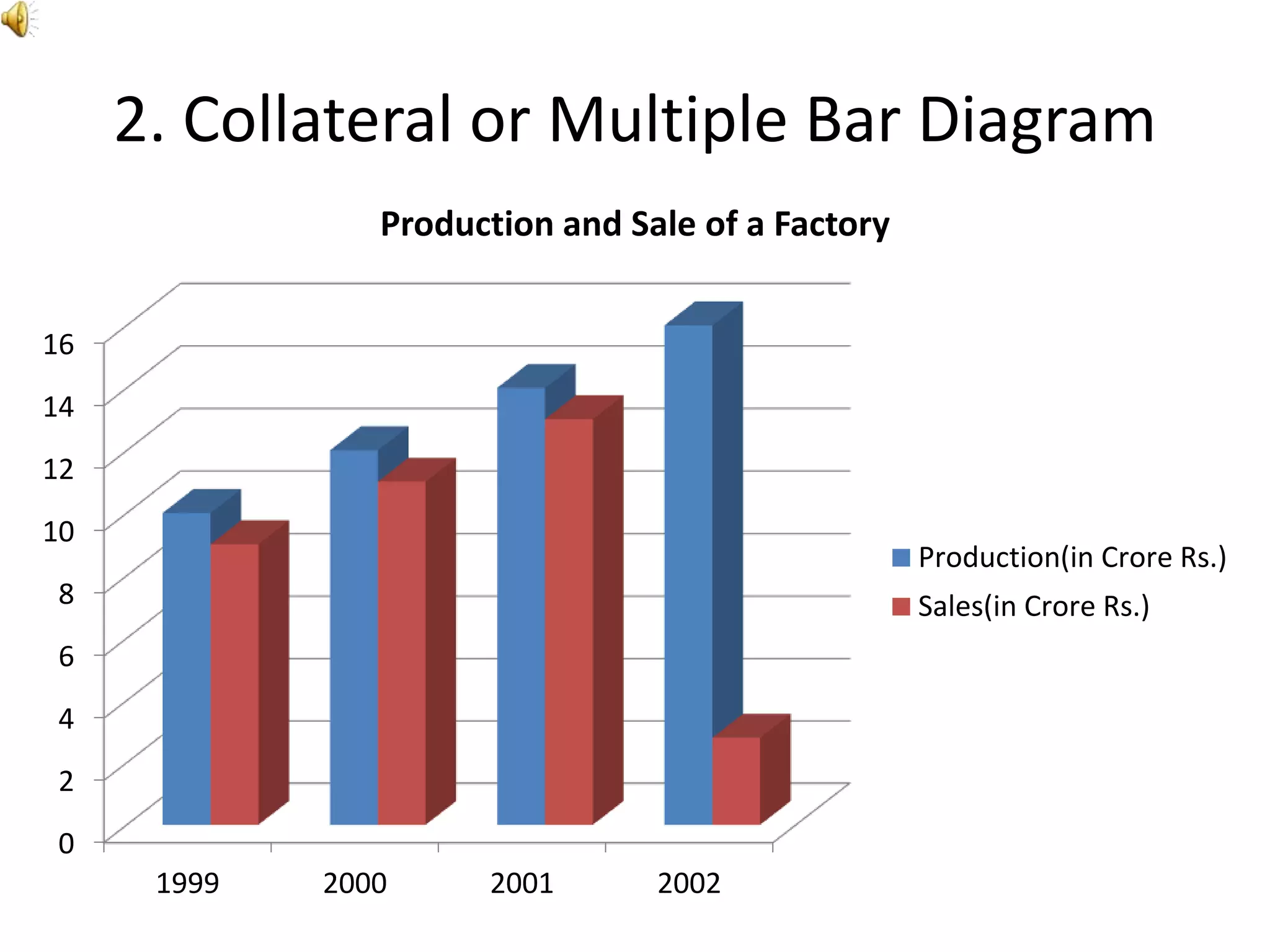
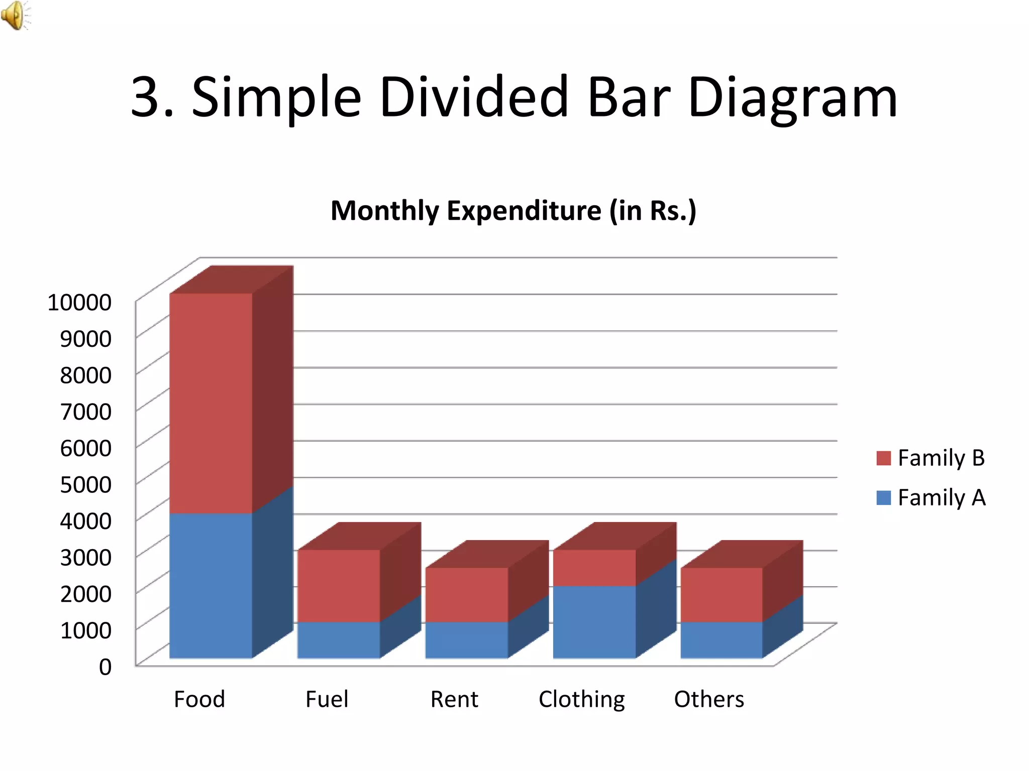
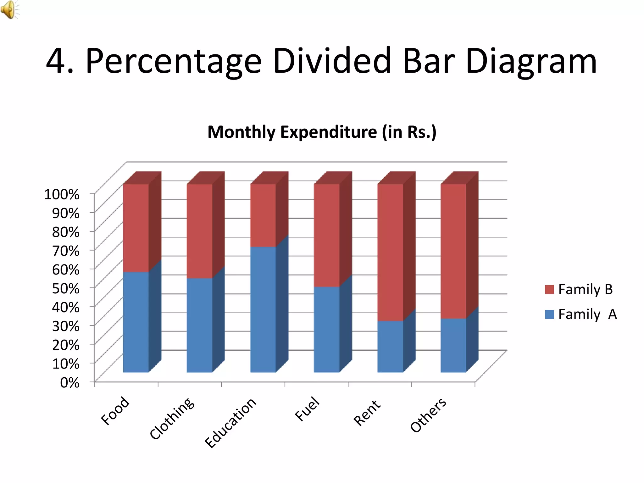
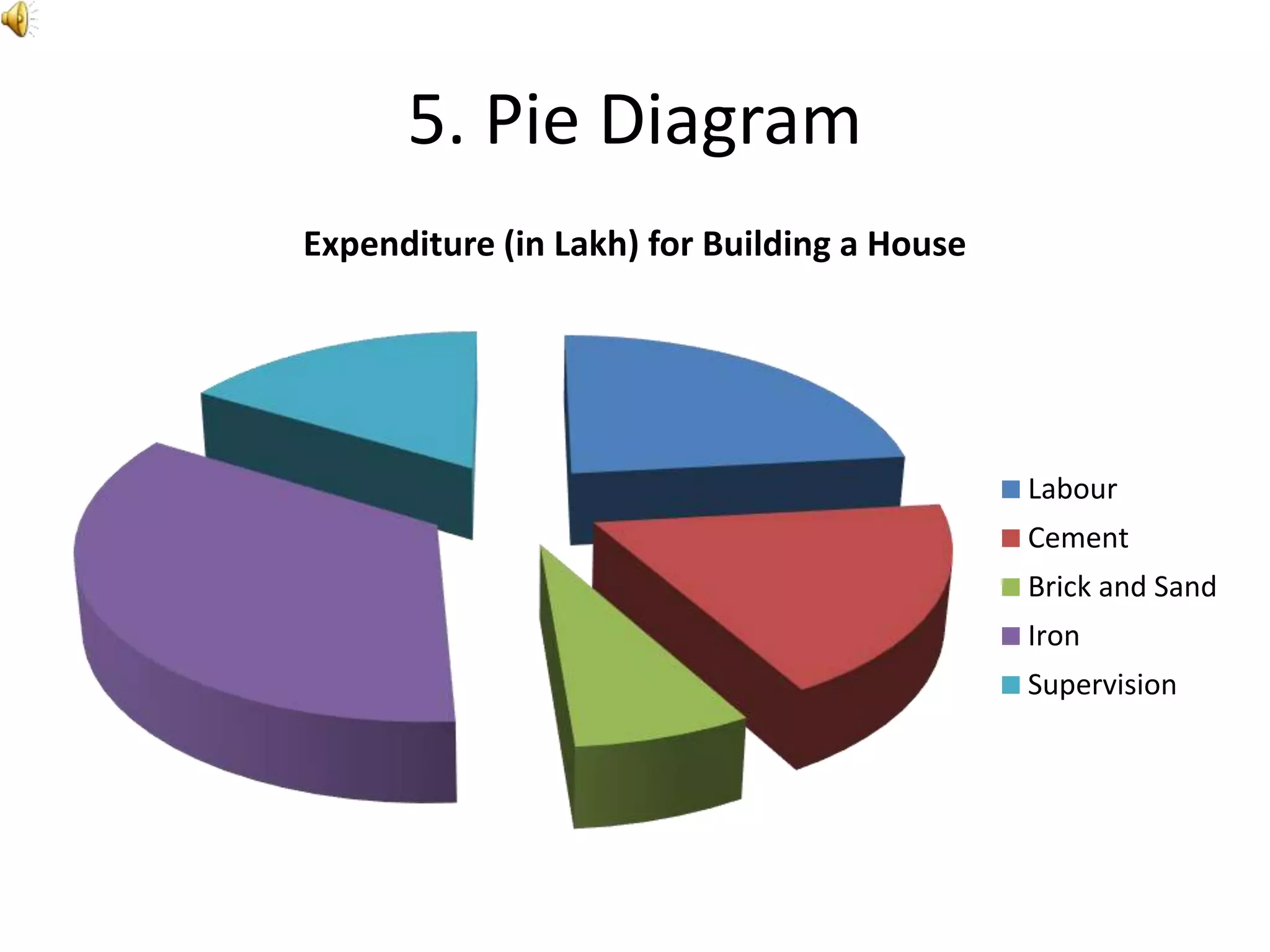
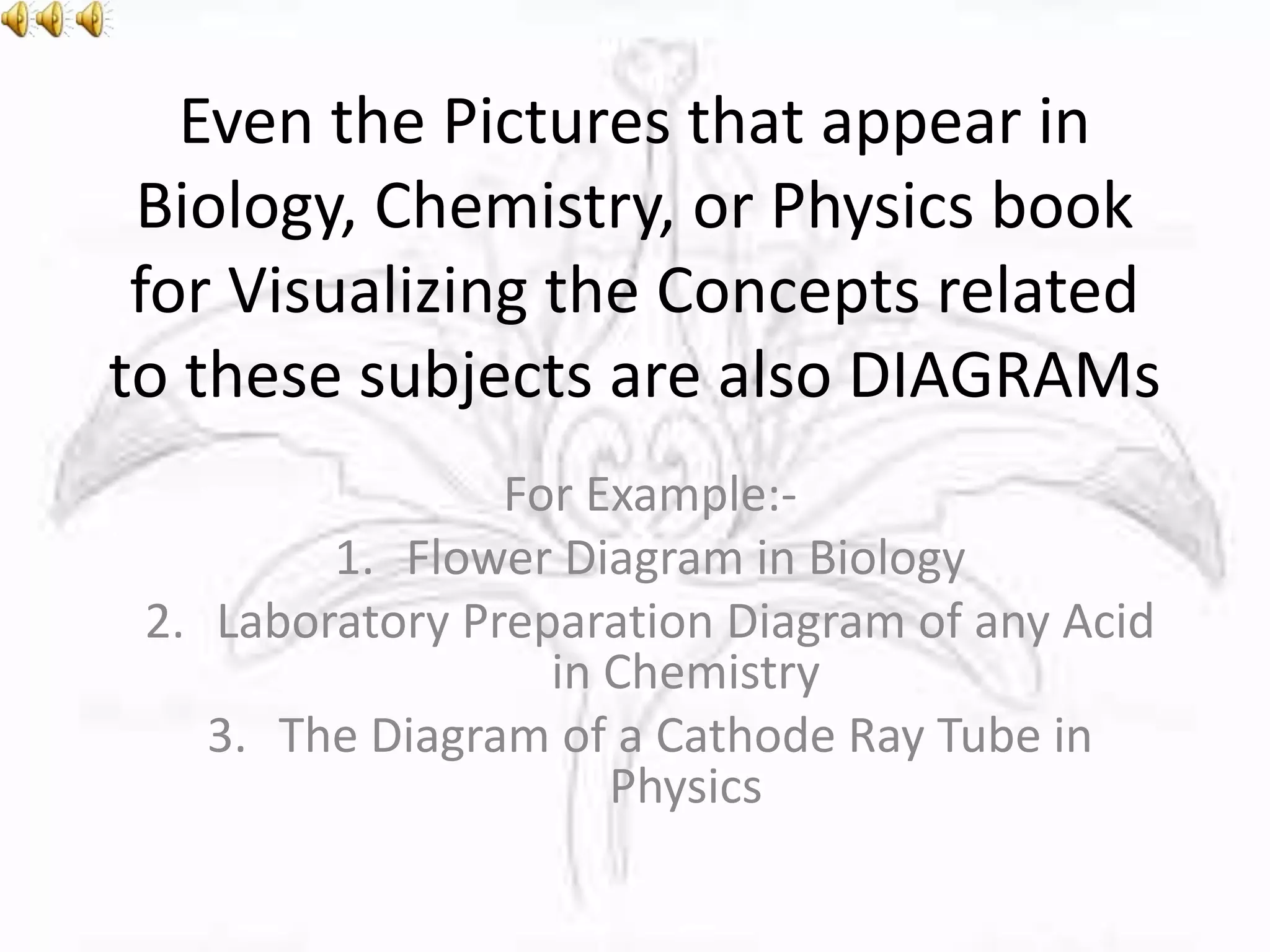
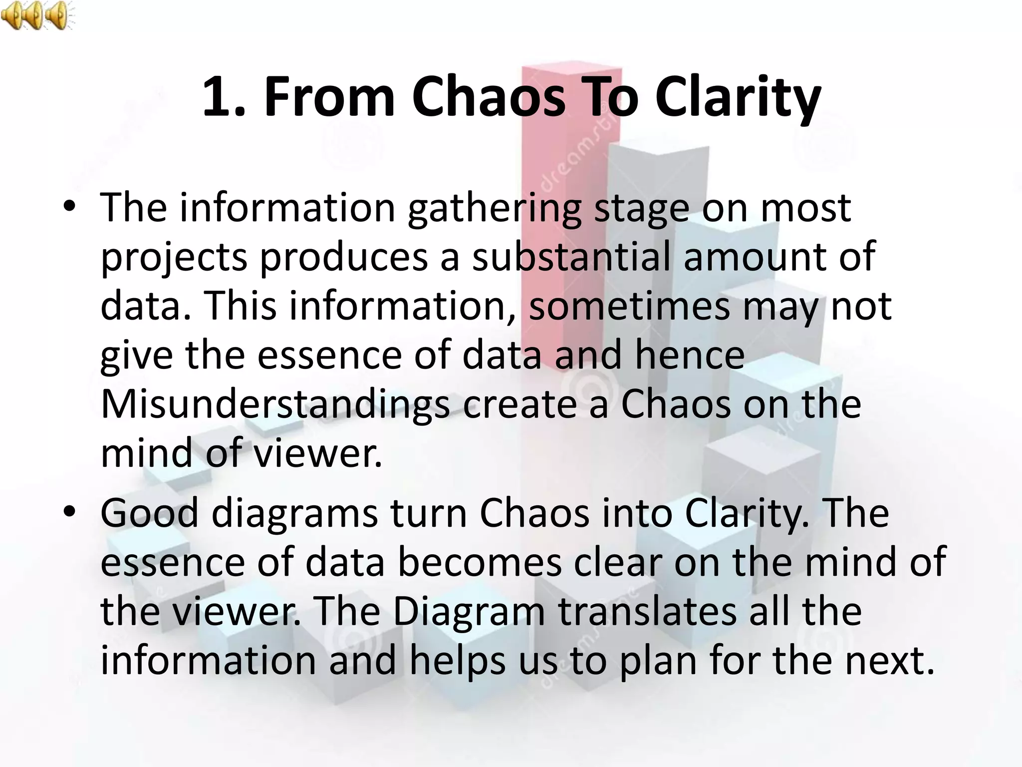
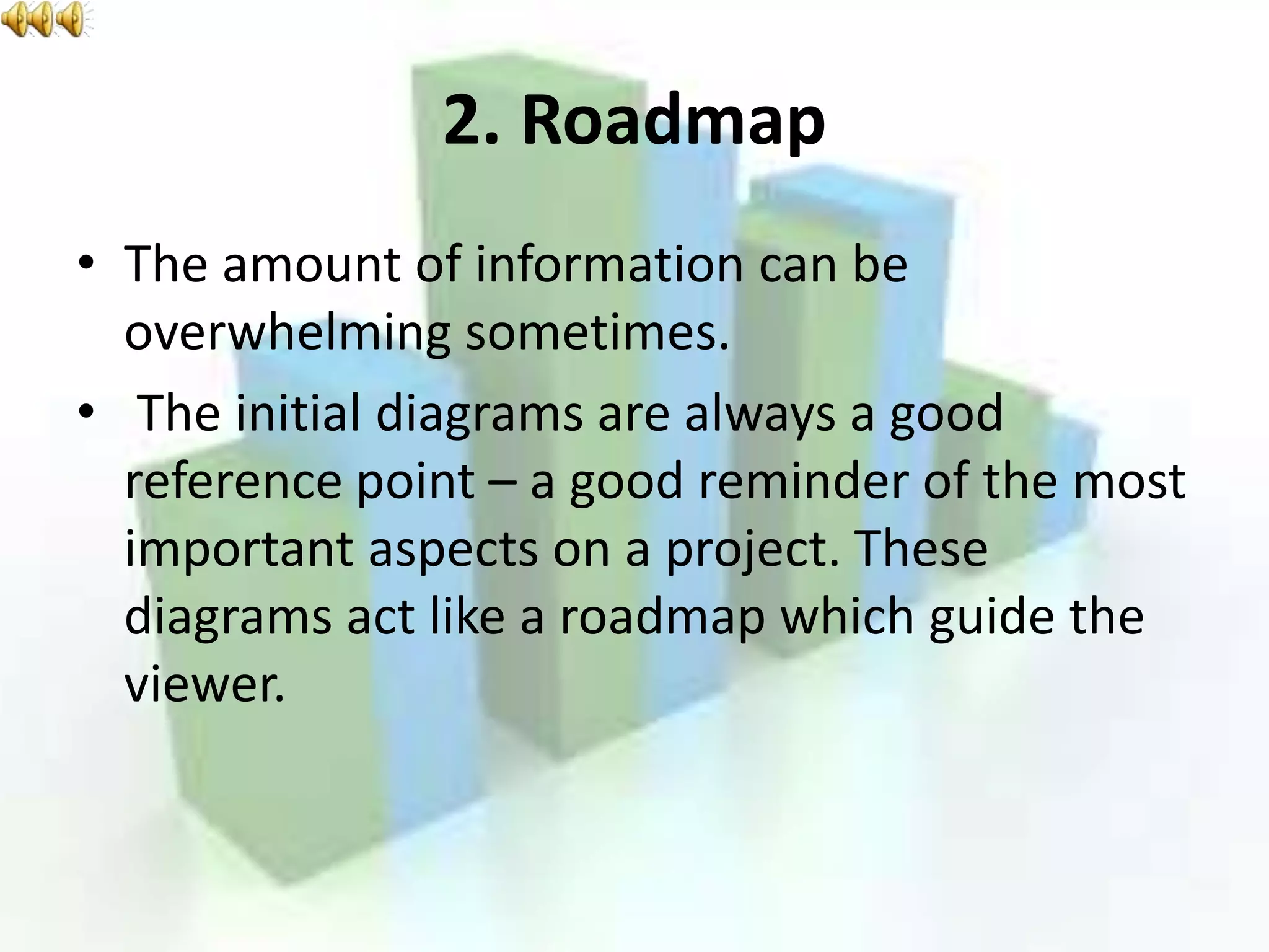
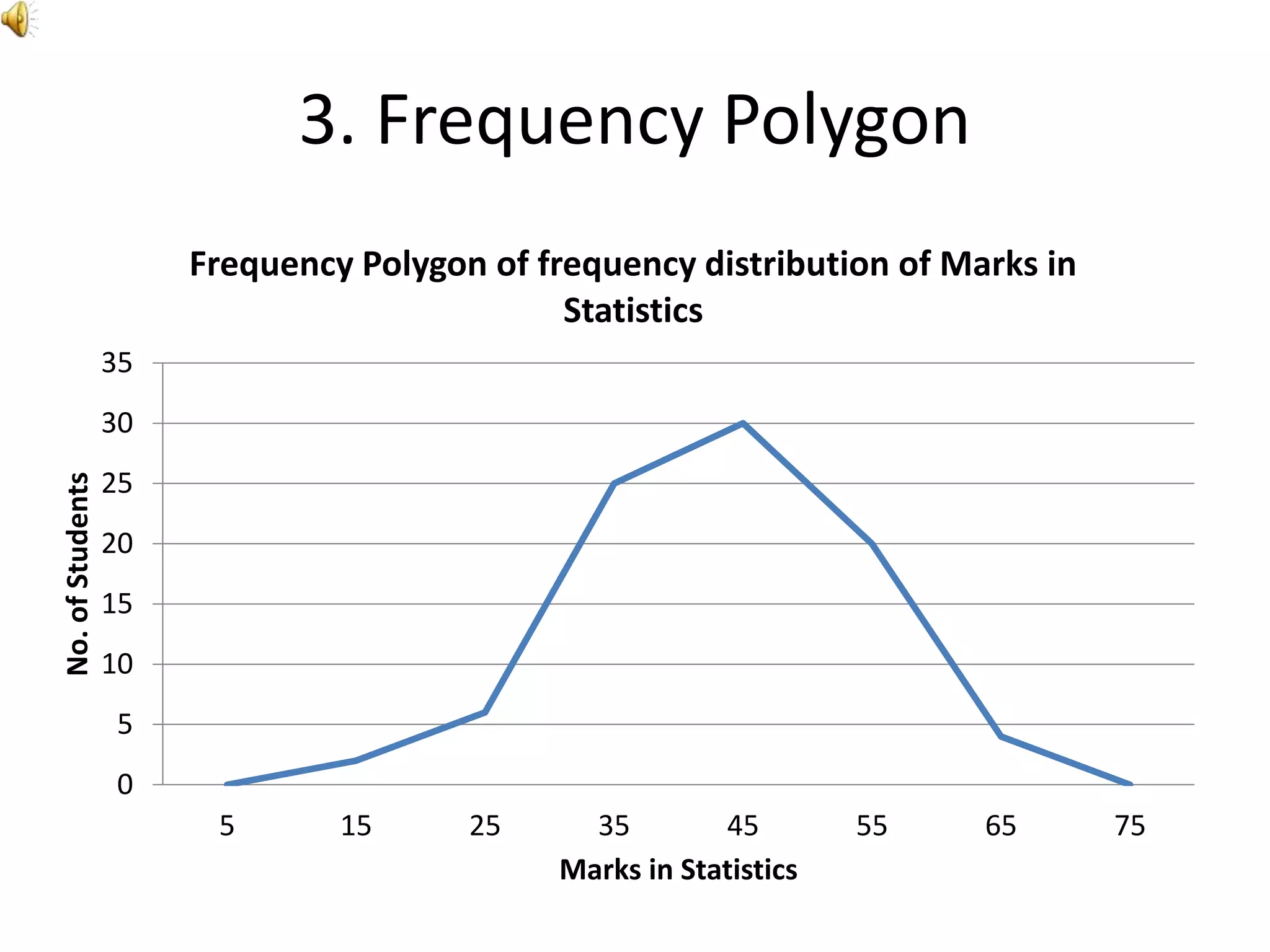
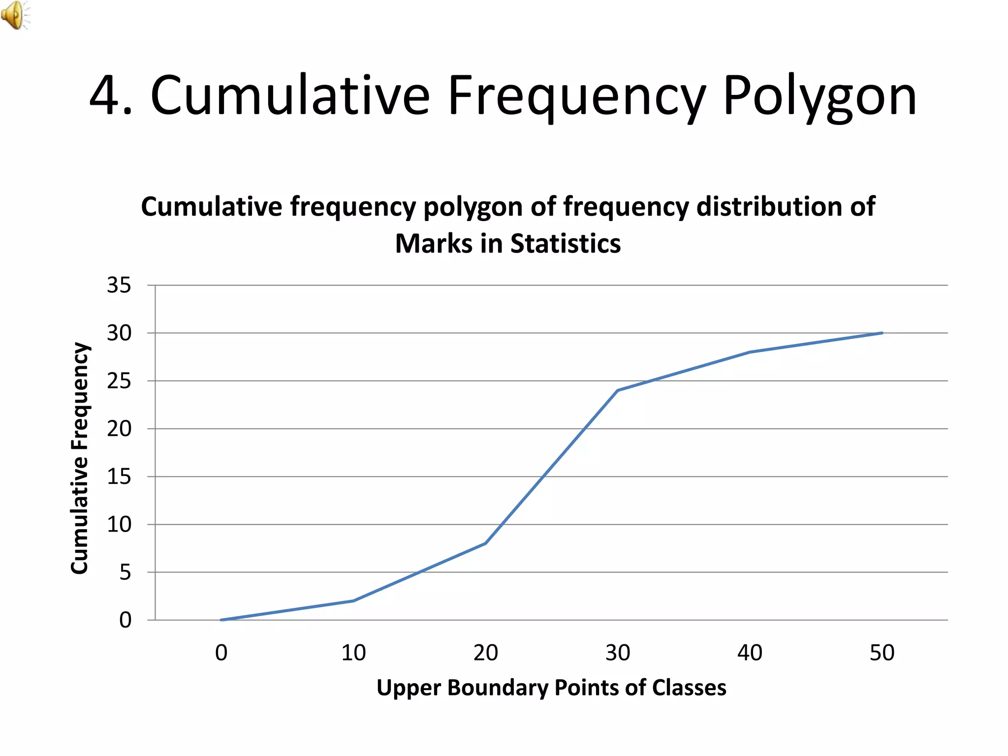
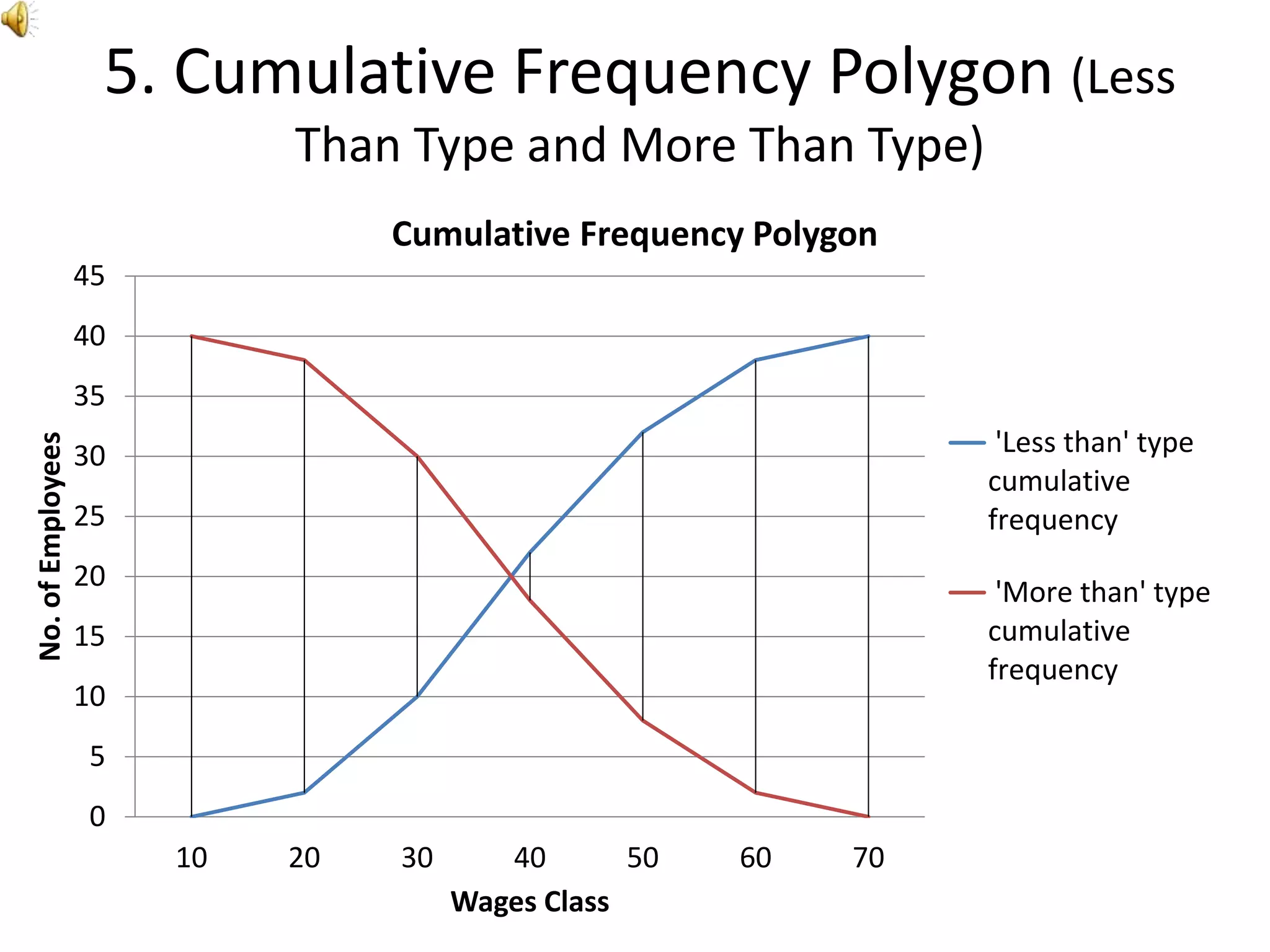
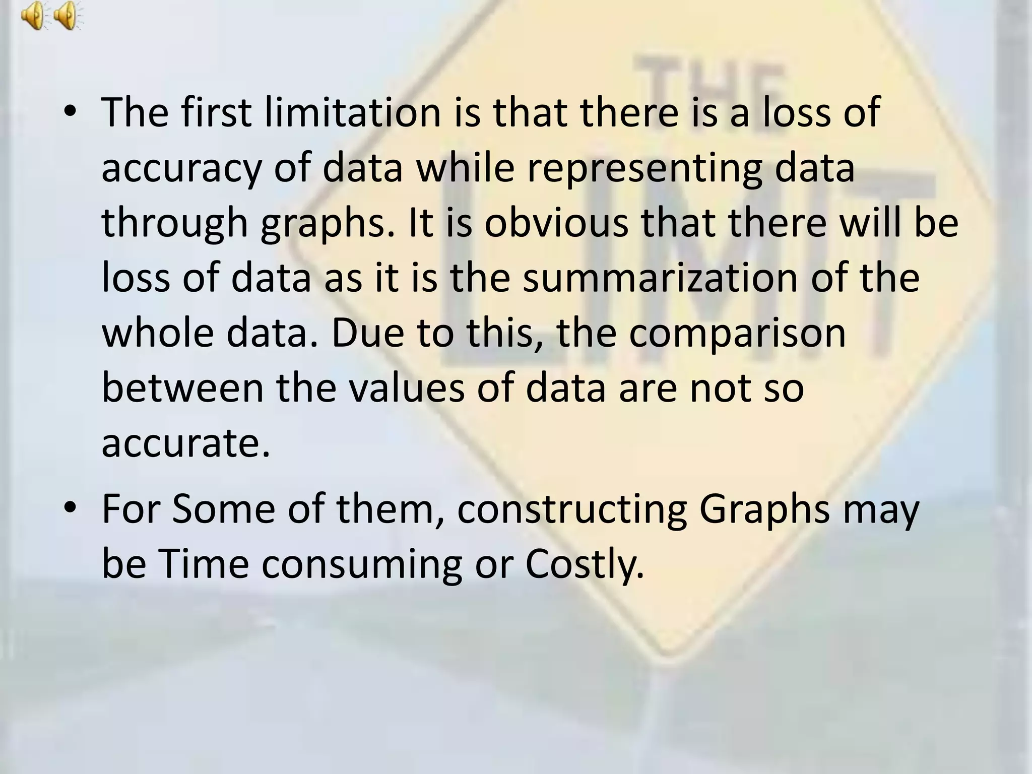
Statistics Project
Advantages and Limitations for
Diagrams and Graphs
A Project By:-
1. Hardik Bhaavani
2. Anmol Khimani
3. Dev Kinger
Now Let’s Just Move Straight to the
Statistics Project Work
What Is a Diagram ?
• A Diagram is a Two-Dimensional Geometric
(can be three-dimensional also) symbolic
Representation of Information according to
some Visualization technique.
• The essence of a diagram can be seen as:-
1. A form of visual formatting device.
2. A display that does not show quantitative data (numerical
data), but rather relationships and abstract information
with building blocks such as geometrical shapes connected
by lines, arrows, or other visual links.
Some Commonly Used Diagrams in
day-to-day life
1. Bar Diagram
0
200
400
600
800
1000
1200
1400
No. of Students in different faculties
No. of Students
2. Collateral or Multiple Bar Diagram
0
2
4
6
8
10
12
14
16
1999 2000 2001 2002
Production and Sale of a Factory
Production(in Crore Rs.)
Sales(in Crore Rs.)
3. Simple Divided Bar Diagram
0
1000
2000
3000
4000
5000
6000
7000
8000
9000
10000
Food Fuel Rent Clothing Others
Monthly Expenditure (in Rs.)
Family B
Family A
4. Percentage Divided Bar Diagram
0%
10%
20%
30%
40%
50%
60%
70%
80%
90%
100%
Monthly Expenditure (in Rs.)
Family B
Family A
5. Pie Diagram
Expenditure (in Lakh) for Building a House
Labour
Cement
Brick and Sand
Iron
Supervision
Even the Pictures that appear in
Biology, Chemistry, or Physics book
for Visualizing the Concepts related
to these subjects are also DIAGRAMs
For Example:-
1. Flower Diagram in Biology
2. Laboratory Preparation Diagram of any Acid
in Chemistry
3. The Diagram of a Cathode Ray Tube in
Physics
Advantages Of Diagrams
1. From Chaos To Clarity
• The information gathering stage on most
projects produces a substantial amount of
data. This information, sometimes may not
give the essence of data and hence
Misunderstandings create a Chaos on the
mind of viewer.
• Good diagrams turn Chaos into Clarity. The
essence of data becomes clear on the mind of
the viewer. The Diagram translates all the
information and helps us to plan for the next.
2. Roadmap
• The amount of information can be
overwhelming sometimes.
• The initial diagrams are always a good
reference point – a good reminder of the most
important aspects on a project. These
diagrams act like a roadmap which guide the
viewer.
3. No One is a Mind-Reader
• The Data collected may require to be
communicated with different persons.These
Persons may come from different castes and
may have different mother tongue. This can
lead to misunderstandings between them as
these different persons are not mind-readers.
• To Remove this misconception, the data can
be communicated with Diagrams and hence, a
common plan of action could be carried out.
4. Saving Time
• The huge amount of data collected may not be grasped in
mind within a short period of time. Also, the
characteristics of the variables of data may not be
revealed easily. To perfectly grasp the data, it may
consume a lot of time.
• This all the difficulties while grasping data can be removed
with diagrams. Diagrams provide an effective way to
summarize the whole data. This summarized data could
be grasped up easily and be remembered for a sufficiently
long time. The characteristics of the variables of data are
easily revealed. Hence, Learning Data Through diagrams
Saves Time.
Limitations of Diagrams
As compared to Advantages of
Diagrams, the Limitations are very
less and can be avoided
• The first limitation is that there is a loss of
accuracy of data while representing data
through diagrams. It is obvious that there will
be loss of data as it is the summarization of
the whole data.
• Sometimes the illusionary effect creates a
wrong impression on the mind of viewer.
What Is a Graph ?
• A graph is a visual representation of a relationship
between, but not restricted to, two variables. A
graph generally takes the form of a one-dimensional
or two-dimensional figure.
• A graph commonly consists of two axes called the x-
axis (horizontal) and y-axis (vertical). Each axis
corresponds to one variable. The place where the
two axes intersect is called the origin. The origin is
also identified as the point (0,0).
• Each point on graph is defined by a pair of numbers
containing two co-ordinates (x and y). This point on
graph represents relationship between the given
variables.
Some Commonly Used Graphs in
day-to-day life
1. Histogram
0
5
10
15
20
25
5 15 25 35 45 55 65 75 85
No.ofWorkers
Wages (in Rs.)
Histogram of frequency distribution of Hourly Wages of
Workers
2. Pro-Rated Histogram
0
2
4
6
8
10
12
14
16
5 15 25 35 45 55 65 75 85 95 105 115 125 135 145 155 165
Pro-RatedFrequency
Classes
Histogram of Frequency Distribution
3. Frequency Polygon
0
5
10
15
20
25
30
35
5 15 25 35 45 55 65 75
No.ofStudents
Marks in Statistics
Frequency Polygon of frequency distribution of Marks in
Statistics
4. Cumulative Frequency Polygon
0
5
10
15
20
25
30
35
0 10 20 30 40 50
CumulativeFrequency
Upper Boundary Points of Classes
Cumulative frequency polygon of frequency distribution of
Marks in Statistics
5. Cumulative Frequency Polygon (Less
Than Type and More Than Type)
0
5
10
15
20
25
30
35
40
45
10 20 30 40 50 60 70
No.ofEmployees
Wages Class
Cumulative Frequency Polygon
'Less than' type
cumulative
frequency
'More than' type
cumulative
frequency
Advantages of Graphs
1. Easy Representation of Data
• A graph represents data, or a set of data, in a
diagrammatical manner.
• Graphs are useful in representing data with distinct
units, such as years and months. They are also valuable
in showing the differences, or making comparisons,
between different variables.
• Graphs are valuable when countable variables, facts and
data are to be demonstrated. Bar graphs show these,
and other comparative values, in a distinct and
comprehensive manner, giving a clearer, more
understandable picture of data distribution.
2. Represents Frequency
• Graphs are the most popular data display
method, breaking down data into the relative
frequency or frequency for each separate
group.
• The comparison between frequency distribution
can be easily made by seeing the graph.
• The Graph of Frequency Distribution helps to
summarise the complicated data in maximum
way. This Graph, therefore, is easy-to-
understand then the complicated data.
3. Easy to Prepare
• A person is assumed to have basic knowledge
of Graph.
• Graphs are easy to prepare, provided
appropriate plotting data has been gathered
and prepared. A complete Graph requires a
title, some labels and a scale appropriate with
data.
• The Preparation of Graph is easy and hence the
data can be presented in an attractive and
beautiful manner to create a long lasting
impression on the mind of viewer.
4. Versatile and Widely Used
• There are numerous types of Graphs, which can
be used for various purposes. Graphs are used
in different fields, all around the world, to show
comparison between values of data.
• The Graphs are having innumerous uses to
represent complicated data in an easy-to-
understand manner as they are very much
versatile (flexible) and can be used by anyone
for showing various relationships in the data.
Limitations of Graphs
As compared to Advantages of
Graphs, the Limitations are very less
and can be avoided
• The first limitation is that there is a loss of
accuracy of data while representing data
through graphs. It is obvious that there will be
loss of data as it is the summarization of the
whole data. Due to this, the comparison
between the values of data are not so
accurate.
• For Some of them, constructing Graphs may
be Time consuming or Costly.
THE END
We are SORRY………………. for Ending.

Advantages and Limitations for Diagrams and Graphs

  • 1.
    Statistics Project Advantages andLimitations for Diagrams and Graphs A Project By:- 1. Hardik Bhaavani 2. Anmol Khimani 3. Dev Kinger
  • 2.
    Now Let’s JustMove Straight to the Statistics Project Work
  • 3.
    What Is aDiagram ? • A Diagram is a Two-Dimensional Geometric (can be three-dimensional also) symbolic Representation of Information according to some Visualization technique. • The essence of a diagram can be seen as:- 1. A form of visual formatting device. 2. A display that does not show quantitative data (numerical data), but rather relationships and abstract information with building blocks such as geometrical shapes connected by lines, arrows, or other visual links.
  • 4.
    Some Commonly UsedDiagrams in day-to-day life
  • 5.
    1. Bar Diagram 0 200 400 600 800 1000 1200 1400 No.of Students in different faculties No. of Students
  • 6.
    2. Collateral orMultiple Bar Diagram 0 2 4 6 8 10 12 14 16 1999 2000 2001 2002 Production and Sale of a Factory Production(in Crore Rs.) Sales(in Crore Rs.)
  • 7.
    3. Simple DividedBar Diagram 0 1000 2000 3000 4000 5000 6000 7000 8000 9000 10000 Food Fuel Rent Clothing Others Monthly Expenditure (in Rs.) Family B Family A
  • 8.
    4. Percentage DividedBar Diagram 0% 10% 20% 30% 40% 50% 60% 70% 80% 90% 100% Monthly Expenditure (in Rs.) Family B Family A
  • 9.
    5. Pie Diagram Expenditure(in Lakh) for Building a House Labour Cement Brick and Sand Iron Supervision
  • 10.
    Even the Picturesthat appear in Biology, Chemistry, or Physics book for Visualizing the Concepts related to these subjects are also DIAGRAMs For Example:- 1. Flower Diagram in Biology 2. Laboratory Preparation Diagram of any Acid in Chemistry 3. The Diagram of a Cathode Ray Tube in Physics
  • 11.
  • 12.
    1. From ChaosTo Clarity • The information gathering stage on most projects produces a substantial amount of data. This information, sometimes may not give the essence of data and hence Misunderstandings create a Chaos on the mind of viewer. • Good diagrams turn Chaos into Clarity. The essence of data becomes clear on the mind of the viewer. The Diagram translates all the information and helps us to plan for the next.
  • 13.
    2. Roadmap • Theamount of information can be overwhelming sometimes. • The initial diagrams are always a good reference point – a good reminder of the most important aspects on a project. These diagrams act like a roadmap which guide the viewer.
  • 14.
    3. No Oneis a Mind-Reader • The Data collected may require to be communicated with different persons.These Persons may come from different castes and may have different mother tongue. This can lead to misunderstandings between them as these different persons are not mind-readers. • To Remove this misconception, the data can be communicated with Diagrams and hence, a common plan of action could be carried out.
  • 15.
    4. Saving Time •The huge amount of data collected may not be grasped in mind within a short period of time. Also, the characteristics of the variables of data may not be revealed easily. To perfectly grasp the data, it may consume a lot of time. • This all the difficulties while grasping data can be removed with diagrams. Diagrams provide an effective way to summarize the whole data. This summarized data could be grasped up easily and be remembered for a sufficiently long time. The characteristics of the variables of data are easily revealed. Hence, Learning Data Through diagrams Saves Time.
  • 16.
    Limitations of Diagrams Ascompared to Advantages of Diagrams, the Limitations are very less and can be avoided
  • 17.
    • The firstlimitation is that there is a loss of accuracy of data while representing data through diagrams. It is obvious that there will be loss of data as it is the summarization of the whole data. • Sometimes the illusionary effect creates a wrong impression on the mind of viewer.
  • 18.
    What Is aGraph ? • A graph is a visual representation of a relationship between, but not restricted to, two variables. A graph generally takes the form of a one-dimensional or two-dimensional figure. • A graph commonly consists of two axes called the x- axis (horizontal) and y-axis (vertical). Each axis corresponds to one variable. The place where the two axes intersect is called the origin. The origin is also identified as the point (0,0). • Each point on graph is defined by a pair of numbers containing two co-ordinates (x and y). This point on graph represents relationship between the given variables.
  • 19.
    Some Commonly UsedGraphs in day-to-day life
  • 20.
    1. Histogram 0 5 10 15 20 25 5 1525 35 45 55 65 75 85 No.ofWorkers Wages (in Rs.) Histogram of frequency distribution of Hourly Wages of Workers
  • 21.
    2. Pro-Rated Histogram 0 2 4 6 8 10 12 14 16 515 25 35 45 55 65 75 85 95 105 115 125 135 145 155 165 Pro-RatedFrequency Classes Histogram of Frequency Distribution
  • 22.
    3. Frequency Polygon 0 5 10 15 20 25 30 35 515 25 35 45 55 65 75 No.ofStudents Marks in Statistics Frequency Polygon of frequency distribution of Marks in Statistics
  • 23.
    4. Cumulative FrequencyPolygon 0 5 10 15 20 25 30 35 0 10 20 30 40 50 CumulativeFrequency Upper Boundary Points of Classes Cumulative frequency polygon of frequency distribution of Marks in Statistics
  • 24.
    5. Cumulative FrequencyPolygon (Less Than Type and More Than Type) 0 5 10 15 20 25 30 35 40 45 10 20 30 40 50 60 70 No.ofEmployees Wages Class Cumulative Frequency Polygon 'Less than' type cumulative frequency 'More than' type cumulative frequency
  • 25.
  • 26.
    1. Easy Representationof Data • A graph represents data, or a set of data, in a diagrammatical manner. • Graphs are useful in representing data with distinct units, such as years and months. They are also valuable in showing the differences, or making comparisons, between different variables. • Graphs are valuable when countable variables, facts and data are to be demonstrated. Bar graphs show these, and other comparative values, in a distinct and comprehensive manner, giving a clearer, more understandable picture of data distribution.
  • 27.
    2. Represents Frequency •Graphs are the most popular data display method, breaking down data into the relative frequency or frequency for each separate group. • The comparison between frequency distribution can be easily made by seeing the graph. • The Graph of Frequency Distribution helps to summarise the complicated data in maximum way. This Graph, therefore, is easy-to- understand then the complicated data.
  • 28.
    3. Easy toPrepare • A person is assumed to have basic knowledge of Graph. • Graphs are easy to prepare, provided appropriate plotting data has been gathered and prepared. A complete Graph requires a title, some labels and a scale appropriate with data. • The Preparation of Graph is easy and hence the data can be presented in an attractive and beautiful manner to create a long lasting impression on the mind of viewer.
  • 29.
    4. Versatile andWidely Used • There are numerous types of Graphs, which can be used for various purposes. Graphs are used in different fields, all around the world, to show comparison between values of data. • The Graphs are having innumerous uses to represent complicated data in an easy-to- understand manner as they are very much versatile (flexible) and can be used by anyone for showing various relationships in the data.
  • 30.
    Limitations of Graphs Ascompared to Advantages of Graphs, the Limitations are very less and can be avoided
  • 31.
    • The firstlimitation is that there is a loss of accuracy of data while representing data through graphs. It is obvious that there will be loss of data as it is the summarization of the whole data. Due to this, the comparison between the values of data are not so accurate. • For Some of them, constructing Graphs may be Time consuming or Costly.
  • 32.
    THE END We areSORRY………………. for Ending.

Editor's Notes

  • #4 Explanation Required
  • #13 Explanation Required
  • #14 Explanation Required
  • #15 Explanation Required
  • #16 Explanation Required
  • #18 Explanation Required
  • #19 Explanation Required
  • #27 Explanation Required Explanation Required
  • #28 Explanation Required
  • #29 Explanation Required
  • #30 Explanation Required
  • #32 Explanation Required