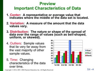
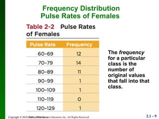
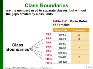
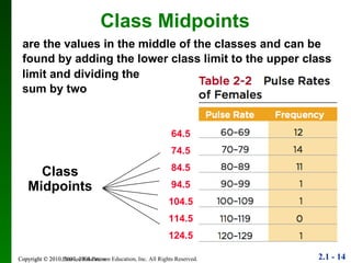
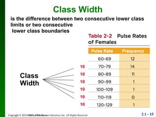
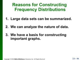
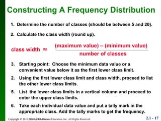
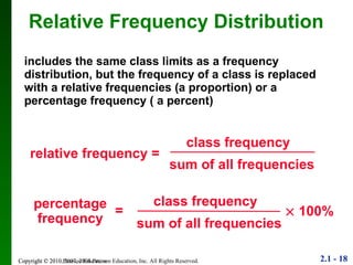
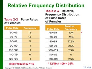
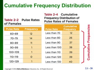
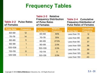
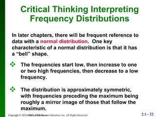
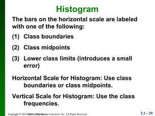
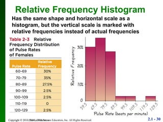
1. The document discusses different methods for summarizing and visualizing data, including frequency distributions, histograms, and other statistical graphs.
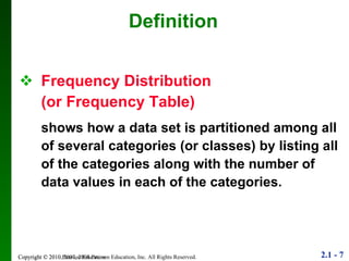
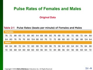
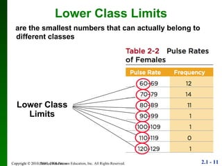
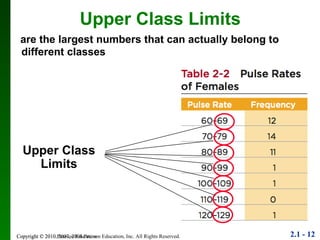
2. Key points include how to construct a frequency distribution and calculate measures like class width and frequency.
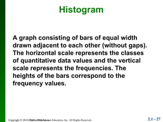
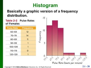
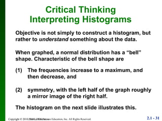
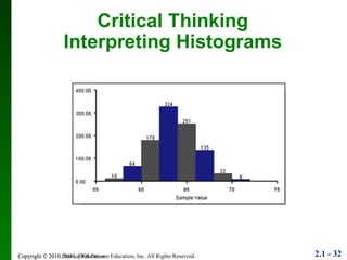
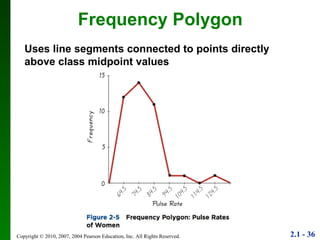
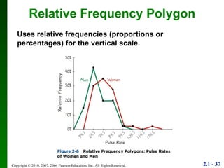
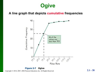
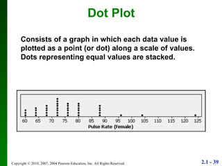
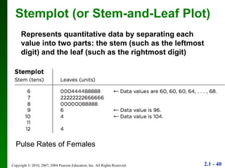
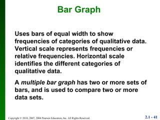
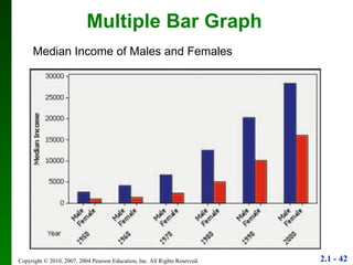
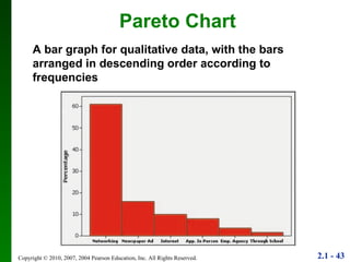
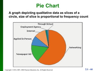
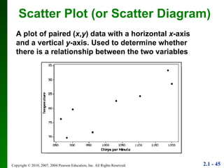
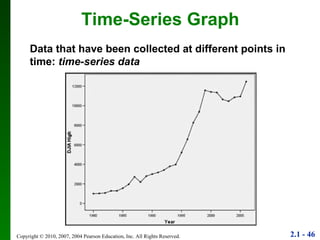
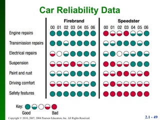
3. Different types of graphs are explained like histograms, dot plots, bar graphs, and more, noting how each can be used to understand patterns in the data.
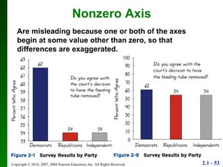
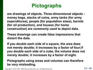
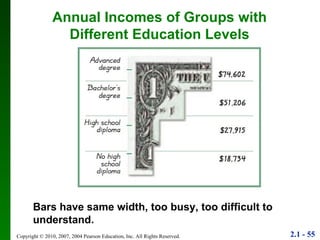
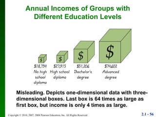
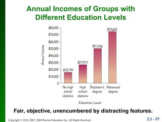
4. Guidelines are provided for determining what makes a good or bad graph, such as using accurate scales and not distorting the data.