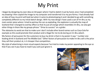
1. My Print
I began by designing my own idea on A4 paper where I had to sketch it out by hand, once I had completed
my drawing I then copied the image to my computer and transferred it to my pro-forma. I had already had
an idea of how my print will look but when it came to photoshoping it and I decided to go with something
completely different to my initial sketch design. With my new design I have used a can of Irn-Bru as my
main center piece where I tried to portray the can as exploding, the explosion is actually the map of
Scotland that I changed to overlay effect so that its just all orange which resembles Irn-Bru, ive also got
other things in there like my groups phrase “ Drive to success” on a girder.
The obstacles to avoid are that to make sure I don’t include other brand names such as Coca Cola for
example as this could promote their product and is illegal for me to do during an Irn-Bru advert.
My factors of persuasion for the customers to buy my drink is that in my poster it says “ number one
leading drink in Scotland and The Middle East.” Other factors of persuasion to make Irn-Bru sell is the price
they sell their product at, is it cheaper than competition.
My style of advertising is more visual aspects because I’ve tried to make my poster appealing to the eye so
that if you see it you have to read it you cant just ignore it.
2. Real Print
• Irn-Bru print posters are designed with a witty sense of humor as you will be able to see in
the photo I’m writing about. An image of a child breastfeeding from its mum has been used
to capture attention of the brand.
• For other drink companies they wouldn’t use this method of advertisement as it could been
seen as bad press for the company however with Irn-Bru they do advertisements like this all
the time so most people have come to accept it.
• They persuade customers to buy their product by charging less money than competition.
• The style of advertising doesn’t really appeal to me and it doesn't make me want to buy their
product and after doing survey’s a lot of people agree with me.
3. Print Comparison
• Similarities between both posters are there uniqueness and that they both promote Irn-Bru
as a product. Also the colour schemes between them both are similar with the orange, grey,
blue and white.
• Both have a different ways of advertising the product, mine is a less offensive way and seeks
to advertise it through visual aspects where as the real print has a more offensive and rude
approach which works because it has a lasting effect.
• Strengths of my print is that it links very well to Scotland and Irn-Bru, it promotes the product
clearly, the colour scheme goes well together.
• Weaknesses of my print would be the layout, I could of put more thought into where I
wanted things to go such.
• To improve my print for next time I would design my layout neater and make it have more of
a minimalistic look to it.
4. My Video
• My video was filmed around the college grounds using a camera, tripod and microphone.
After I gathered all the footage I needed and was happy with it I then uploaded it to my
computer and began to edit it to how I wanted using premier pro. Once completed I
uploaded my video to YouTube. https://youtu.be/T2ogvWi2cGM
• Images that have been used are of Irn-Bru cans, a field, two actors (Jonathan and Randall).
• I have one shot were I use a close up of the Irn-Bru can which fades into to an extreme close
up of Randall’s face. Also when the Actors are running I use cut scenes to allow a shorter
race to fit into the advert but it also looks good.
• Obstacles I have to avoid would be to make sure that there is no copy right in the clip i.e.
music, this is why I made my own on Garage Band, I made these decisions because I didn't’t
want to get copy right and I also wanted to make my own music to fit the suspension within
the advert.
• Factors of persuasion in my advert is that once Randall drinks the drink before the race he
wasn’t ever going to loose, this will imply to the customers that if they drink Irn-Bru they will
beat anyone in their path and be the best.
• Its very successful in making people want to buy the product because it fill them will self
confidence and belief that the can be the best at anything they do.
5. Real Video
• The real video has been put together using a birth of a child. It’s using children again to get
the customers attention.
• Images of family at a birth is used, this is clever marketing for Irn-Bru as this is the one
moment in people’s lives that they will never forget, now when the customers think to the
time when they had their children Irn-Bru will also come into their head.
• They swap shots of the father’s face when he gets told his daughter is going to be called
fanny. It alternates between facial expressions of the Mum, Dad, Nans face and the nurse’s.
Mostly focusing on the Dad as he’s the one drinking the Irn-Bru because “it gets you
through.”
• Obstacles to avoid is that they don’t promote any of brand products especially because they
are in a room that is filled with stuff and something could easily of been misplaced. They also
need to be careful with how they express the product relating it in such a sexual manner.
https://www.youtube.com/watch?v=ibuLgsVcQUY
• Factors of persuasion in this advert is that no matter what the situation is that all you have to
do is drink Irn-Bru and it will clam you down and get you through any situation. It seems
successful in making people buy the product because people often find themselves in
stressful situations through work and other stuff.
6. Video Comparison
• Similarities between both videos are that they both promote Irn-Bru as a drink that will help
you succeed through anything. Both have a catchy way of staying in your mind.
• The technical qualities of the Irn-Bru real advert is that it’s picture quality is a lot better than
mine, also my advert audio quality isn't as clear or as loud as the Irn-Bru advert.
• Strengths of my advert is that the storyline that I have is rather good and it draws the
audience in because they want to see who ends up winning the race. Also the orders the
footage goes forms nicely with a linear sequence that’s clear, start, middle and end.
• Weaknesses of my video is that the audio wasn’t very clear and was more muffled which
ruined the video also were we filming wasn’t good because the camera was picking up wind
which effect my editing music for the video.
• If I could change my advert I would change where It was filmed, also the storyline although it
was successful I wasn’t keen on it.
7. My Advergame
• https://youtu.be/T3fWyrFVP14
• My advergame was put together by me designing a main character which I then created in
Photoshop, to do this a allow my character to move I had to design four different parts of his
body four times the so that when I had rendered it and animated it in premier pro, it looked
like my character was running.
• Images that have been used are a similar to an 8bit design due to it also made it easier to
design as it was my first attempt at making one. I made it a side-scroller and included Irn-Bru
colours. I didn't’t add other brands for copyright purposes.
• Factors of persuasion is that you have to avoid being ran over by the red van which
symbolizes Coca Cola and catch Irn-Bru cans to keep their lives up.
• Advertising through advergames are good because it appeals to loads of customers at mixed
ages, also they would get satisfaction out of drinking the product as well.
8. Real Advergame
• Irn-Bru use colours associated with brand, it has a big Scottish man wearing a kilt as Irn-Bru
originates from Scotland and is the umber one leading drink.
• By making the game fun and addictive it will be more memorable for he customers and will
potentially influence their decisions when purchasing products in Irn-Bru’s market gap.
• The games are meant to be appealing and enjoyable to players and seeing the product when
out in stores and may encourage them to buy it as it will make them remember the game.
• http://www.irn-bru.co.uk/all/bru-land-games
9. Advergame Comparison
• Similarities between my advergame and the real advergame was that we both envisioned our
character have Irn-Bru colours. Also both games has a power up where if you got the Irn-Bru
cans then it would allow your game to last longer by giving your character extra energy.
• Differences in the games was the idea between them both, the real advergame had more of
a physical approach to the games for example throwing girders and pumping irn, mine has
more of a fitness approach where my character had to run and jump over obstacles
• Technical qualities differences was that there game was a lot better developed by mine and
the graphics was a lot stronger and more enhanced giving the real advergame a better visual
standard over mine.
• Strengths of my advergame was that I managed to create a nice running motion among my
character, for example I had different bobbles within his hat when he was running.
• Weaknesses of my advergame was that it was very simple, you would get one run and then
die. I could of developed to allow the players to get multiple chances to run, also I could of
added a energy bar to allow players to see how much energy they had left before dying.
• If I could change my advergame I would add in what I have listed above in my weaknesses.