Unit 18 evaluation - "Yester Lagoon Advertising Campaign
1. Unit 18 evaluation
In this unit we had to create a new advertising company and a new product, we chose a new bottled
water product. In our group we had William, Thomas, Nathan and Luke. The name we choose for
our company was “Parm Incorporated”. I like this name because it was catchy and it sounded like a
topical drink this, was a good idea because it would appeal to sport audiences which were our target
audience. Also what I like about our company name is that it is different to any other water company
that is out there. The name it relates to is a palm tree which suggests that the water is very nice
because it in a natural spring which also appeals to our target audience. When creating our name for
our water bottle we came up with two really good names such as Yester Lagoon and Lagoon. We had
a group discussion about which one was the best one. After the discussion we all thought that Yester
Lagoon was the best because it sounded like “yes to lagoon” we liked this because of the meaning of
name and how it appealed to the audience. Also what we liked about the name was that it was
catchy and simple.
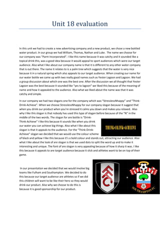
In our company we had two slogans one for the company which was “StresslessNhappy” and “ThinkDrink-Achieve”. When we choose StresslessNhappy for our company slogan because it suggest that
when you drink our product when you’re stressed it calms you down and makes you relaxed. Also
why I like this slogan is that nobody has used this type of slogan before because of the “N” in the
middle of the two words. The slogan for are bottle is “DrinkThink-Achieve” I like this because It sounds like when you drink
our water you can achieve big things. Also what I like about this
slogan is that it appeals to the audience. For the “Think-DrinkAchieve” slogan we decided that we would use the colour scheme
of black and yellow I like this because it’s a bold colour and stands out, attracting our audience. Also
what I like about the look of are slogan is that we used dots to split the word up and to make it
interesting and unique. The font of are slogan is very appealing because of how it sharp it was. I like
this because it appeals to are target audience because it slick and athletes want to be on top of their
game.
In our presentation we decided that we would involve big
teams like Fulham and Southampton. We decided to do
this because our target audience are athletes so if we did
this children will want to be like their hero so they would
drink our product. Also why we choose to do this is
because it is good sponsorship for our product.
2. In our company we decided to have mascots. We decided that
mascots would be good because when people see them they will
remember them so this appeals to the audience because to stick in
people’s mind. We had 3 different mascots firstly we had the
Cowboy who was smart and intelligent who always rides his horse
Jeremy. Then we have the street smart gangster who always
makes easy money for Yester Lagoon. And finally we have the
mighty gladiators who are fearless.
In our presentation we decided to analysis our bottle logo. In our analysis we
told the audience the reason why we chose certain ideas. The first thing we told
the audience that the reason we choose the colour was because it was bold and
stood out, this appeals to our target audience because it looks slick and appeals
to sport people want to drink our water. Then we told the audience about the
“Y” and we told them that it was a “y” and an “L” was connected into one. We
decide to do this because it’s interesting and different to any other logo. We
decided to use this type of font because it sharp and different and it appeal to audiences.
For are company logo we decided that we would relate it to the
Caribbean background. So after a group discussion we decided that a
Palm tree would relate to a Caribbean background the best because
you naturally see palm tree next to springs of water so that’s is why
we chose it. Also that I like about are company logo is the bright
colours which appeals to people also straight away that it a water
company. What I love about is that it sends a calm and relaxing
message to the consumers when buying our product.
3. Adverts
Here we have the magazine print advert. I like this because it is
appealing and catches the audience attention. It does this by the
bold and bright colour with makes it stands out. Also what I like
about this is that it represents the Caribbean surroundings. This
appeals to the consumer because people want to imagine that they
are in the Caribbean as this gives them a feeling of being happy and
relaxed in nice weather of the Caribbean. What I don’t like about
this is that is the font should be bigger so it easier for the customer
to see what on the front of the magazine. Also what I don’t like
about this is that the boarder doesn’t go all the way round the
magazine .
This will be used in Train stations for example and
could be used on a large billboard. What I like
about this poster is that bright colours which
appeals to people when looking at it. What I like
about this is that i like how i have blended the
logo and the sand together this is good because it makes much easier to look at .What i
don’t like about this advert is that some of the images are not detail such as the birds also
what i don’t like about this advert is that logo text is hard to see because it the same colour
as the sand so isn’t easy to read. Also is that the logo looks like the sun rising which suggest
that it a start of a good day when you drink our product. Also the bright colours will stand
out in the dreary (in a train station)
This will be used as a website banner. I like because
the bottle stands out and shows our logo also what I
like about it is that the recycle sign suggests that the
4. company is environmentally friendly. What I also like about this is the font appeals to the
customer, as it is clear to read and gives clear information. What i don’t like about this that
the recycle sign is too big as it takes over the whole website banner. What we should have
done differently is that we should have cropped the background because it doesn’t look
appealing.
This will be used as a bus banner. What i like
about this is that we advertise our bottle well
because we get the name and the bottle in this
poster; this is good because it makes people
remember what our bottle looks like. This is
important because it gains popularity in our product. Also what i like about this is the angle
which the picture is taken of the bottle, this suggests that the sky is the limit for our
company and if you drink our product you can achieve great things. What i don’t like about
this poster is that some of the text has moved into the sky picture when it should be more
central to get the attention of the customer. The slogan at the bottom right corner should
be bigger because our slogan needed to more recognised.
The tools that i have used in order to make my print advert are:
Adobe PhotoShop
Internet for research
1) Firstly to start making my print
production I open Adobe Photoshop and I
used a 4cm to 1cm size frame we knew what
size It had to be from the website
www.cboutdoors.co.uk
5. 2) when creating our poster I
decided to use the a yellow colour as the
sand I made this by using the shape tool
3) Then I did the same for the sky
and then I used the pencil tool to create
the birds that made the poster more
appealing
6. 4) Here I decided to draw cloud I decided to do this because It added detail to the
poster I used the eclipse tool to create the clouds
5) when I added the company logo
which Nathan made. Nathan made this on
Photoshop and then he send to are group
members. We added this to show the people
are company logo so they can remember our
company
6) Here I used the text tool and I placed
in the sand, I regret placing it here because
it’s hard to see
7. 7) here is the final picture of the train poster I like
this because it appealing and i think that i used the right
tool to make the poster look good
Advert analysis
In our advert we decided to have a bully in our trailer we decided to
have this because we wanted people who drank our water to be
confident. We thought that we would include this in our advert
because this is engaging with the audience and is a potential market
that no one has really explored.
In this scene we have an angel coming down from heaven and giving
Yester Lagoon water to the person. We did this because when you
drink our water it gives you confidents we did this by having a angel
which symbioses’ that you are the chosen one and this therefore
gives you confidents.
In this clip we decide to give some information about our
water. We told them that our water had natural electrolytes.
We decided to colour the word “electrolytes” in yellow
because it matches the colour of company also it was bold and
was appealing. The font that i used in this scene was appealing
to look at because it larger than the other writing in this scene
8. and this is one of the first things you will look at when looking at this.
Overall the advert we made for our company was interesting and enjoyable to watch. Also it
advertised our water product well getting our message across we did this by writing text
into the advert. The camera angles that we used in this advert was very good because they
were different to any other camera angle that we had done before such as the beginning
when the camera was focused on one person and then changed to focus to a different
person. What i don’t like about our advert was that angel giving the water the victim
because the angel didn’t look as realist as it could have been.
Overall in a group we worked very well. Our strength was that we were good at discussing
our ideas and how to develop them, when doing this unit we met most of the deadlines and
completed the entire task at a high quality. Another strength that we had when being a
group was that we were all organised and worked to the best of our ability. Our weakness
as a group was that we didn’t create a schedule which would have meant meeting all
deadlines. Plus we could have kept a record of each group member was doing.
Overall i thought that I contributed a lot to the group as i came up with the name “Parm”
which is a play on the word palm. Also what i contributed to the group was that i help
design the costumes for the pitch which went very well. My final strength when i was in my
group was that i was able to listen to ideas that my other group members had. My weakness
when in group was that i was very nervous when doing the pitch but i believe that i did well.
When presenting our pitch to the class we were the only group to dress up and recreate the
mascots we had chosen. This when well as it was funny but we got our point across and the
class remember us as we were different. Our weakness when doing our pitch was that we
didn’t give enough eye contact with the audience this was a problem because we didn’t
have a proper script to read so we had to read of the board which meant that we were not
engaging with the audience.
To improve our grade we did the pitch again, we had wrote a script so we were able to give
good eye contact. When we decided to dress up for our pitch we thought that we should be
able to get the company brand across and i think we did that well because of the comment
that we got.
We found that they thought that the pitch was very good and they thought that we got our
message across; they liked the logo which they believed was different and unique. Another
reason why people liked the pitch was that they agreed with the target audience we
identified - sport people – was correct.
One of our weaknesses of this pitch was that we spoke too fast, this is a problem because it
was hard for the audience to understand what we are saying but we corrected this in the
9. second pitch. Comments from teachers was that we didn’t have enough eye contact with
the audience this was a problem because it is important to look at the people that we are
talking to but again we corrected this in the second pitch. The teacher thought that the
costumes were a great idea and helped make with the presentation memorable. Overall i
think that the pitch went very well because we worked well in our group and we gave a
good presentation that gave a good amount of information about our company and
product.
Overall i am pleased with the results of the print adverts as they show what are company is
about. Also our brand and slogan are easily recognised when looking at all four adverts
which is important when trying to sell a product. The colours that we have used in this are
all appealing and interesting to look also they work well with each over.
In conclusion i think that overall unit 18 went very well because we met the task and we
presented well and worked well in a team, we created a good company that had a good
ideas of how sale a new product to our target audience. We also had a different idea of how
to present our ideas to the audience which was different to other group.