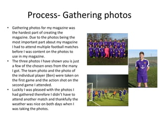
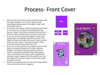
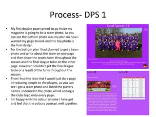
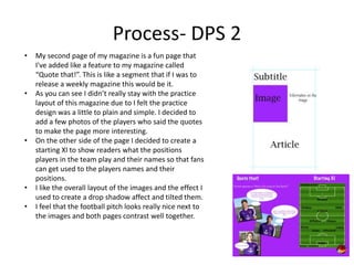
Production Reflection
Aaron Johnson
Process- Gathering photos
• Gathering photos for my magazine was
the hardest part of creating the
magazine. Due to the photos being the
most important part about my magazine
I had to attend multiple football matches
before I was content on the photos to
use in my magazine.
• The three photos I have shown you is just
a few of the chosen ones from the many
I got. The team photo and the photo of
the individual player (Ben) were taken on
the first game and the action shot on the
second game I attended.
• Luckily I was pleased with the photos I
had gathered therefore I didn’t have to
attend another match and thankfully the
weather was nice on both days when I
was taking the photos.
Process- Front Cover
• My front cover process of my work included coming up with
basic layout design. For this I had to figure out how
everything was going placed on the page to make it look
presentable and nice.
• For my front cover design I wanted to keep plain and simple
as I feel that it is a nice way to catch peoples attention
because it doesn’t look like your trying to hard to sell your
product as when company’s do this it starts to look messy.
• As you can see from my practice magazine I stuck to the
layout design I had originally indented to use and I felt it
looked a bit plain and simple, there wasn’t really a contrast
within any of the colours. The purple and white I didn’t
mind but the blue I felt just didn’t work well.
• As you can see my final front cover design was still a similar
layout to my original design but the colours had been
changed. I had chosen to go with a darker purple as it
matches nicely with the football kit Goal Sports play in.
• I got my inspiration for the image inside a football when
looking at a sports magazine from the early 90’s and I was
very happy with how that turned out and how the image
sits behind it clearly.
• Overall I'm very pleased with my front cover design and feel
it may be the best part of my magazine.
Process- DPS 1
• My first double page spread to go inside my
magazine is going to be a team photo. As you
can see the bottom photo was my plan on how I
wanted my page to look and the top photo is
the final design.
• For the bottom plan I had planned to get a team
photo and write about the team on one page
and then show the teams form throughout the
season and the final league table on the other
page. However I couldn’t get the final league
table or a result of the form throughout the
season.
• Then I had the idea that I would just do a page
introducing people to the players, as you can
see I got a team photo and listed the players
names underneath the photo whilst adding a
the clubs logo onto every page.
• I’m happy with the colour scheme I have got
and feel that the colours contrast well together.
Process- DPS 2
• My second page of my magazine is a fun page that
I've added like a feature to my magazine called
“Quote that!”. This is like a segment that if I was to
release a weekly magazine this would be it.
• As you can see I didn’t really stay with the practice
layout of this magazine due to I felt the practice
design was a little to plain and simple. I decided to
add a few photos of the players who said the quotes
to make the page more interesting.
• On the other side of the page I decided to create a
starting XI to show readers what the positions
players in the team play and their names so that fans
can get used to the players names and their
positions.
• I like the overall layout of the images and the effect I
used to create a drop shadow affect and tilted them.
• I feel that the football pitch looks really nice next to
the images and both pages contrast well together.
Process-DPS 3
• For this page of my magazine I had to create my
original design in Photoshop. I Did the layout and
effects of the images in Photoshop because it
was easier to do it this way rather than in
InDesign. I then had to create text boxes and
then important the text from Photoshop into
InDesign.
• I decided to go with a white background and
purple text because this page is a advertisement
page and I feel with the change of colour layout
it will make this page stand out more than other
pages in the magazine.
Back Cover
• The back cover of the magazine is very plain
and simplistic .
• My reason for making the magazine so plain at
the back is that all I wanted to do was place the
clubs logo, make it clear to see who's magazine
it is and praise the top scorer and player of the
year. I also decided to add the social media
sites which Goal Sports are on so that people
who read the magazine can follow the team on
them sites.

6. production reflection

  • 1.
  • 2.
    Process- Gathering photos •Gathering photos for my magazine was the hardest part of creating the magazine. Due to the photos being the most important part about my magazine I had to attend multiple football matches before I was content on the photos to use in my magazine. • The three photos I have shown you is just a few of the chosen ones from the many I got. The team photo and the photo of the individual player (Ben) were taken on the first game and the action shot on the second game I attended. • Luckily I was pleased with the photos I had gathered therefore I didn’t have to attend another match and thankfully the weather was nice on both days when I was taking the photos.
  • 3.
    Process- Front Cover •My front cover process of my work included coming up with basic layout design. For this I had to figure out how everything was going placed on the page to make it look presentable and nice. • For my front cover design I wanted to keep plain and simple as I feel that it is a nice way to catch peoples attention because it doesn’t look like your trying to hard to sell your product as when company’s do this it starts to look messy. • As you can see from my practice magazine I stuck to the layout design I had originally indented to use and I felt it looked a bit plain and simple, there wasn’t really a contrast within any of the colours. The purple and white I didn’t mind but the blue I felt just didn’t work well. • As you can see my final front cover design was still a similar layout to my original design but the colours had been changed. I had chosen to go with a darker purple as it matches nicely with the football kit Goal Sports play in. • I got my inspiration for the image inside a football when looking at a sports magazine from the early 90’s and I was very happy with how that turned out and how the image sits behind it clearly. • Overall I'm very pleased with my front cover design and feel it may be the best part of my magazine.
  • 4.
    Process- DPS 1 •My first double page spread to go inside my magazine is going to be a team photo. As you can see the bottom photo was my plan on how I wanted my page to look and the top photo is the final design. • For the bottom plan I had planned to get a team photo and write about the team on one page and then show the teams form throughout the season and the final league table on the other page. However I couldn’t get the final league table or a result of the form throughout the season. • Then I had the idea that I would just do a page introducing people to the players, as you can see I got a team photo and listed the players names underneath the photo whilst adding a the clubs logo onto every page. • I’m happy with the colour scheme I have got and feel that the colours contrast well together.
  • 5.
    Process- DPS 2 •My second page of my magazine is a fun page that I've added like a feature to my magazine called “Quote that!”. This is like a segment that if I was to release a weekly magazine this would be it. • As you can see I didn’t really stay with the practice layout of this magazine due to I felt the practice design was a little to plain and simple. I decided to add a few photos of the players who said the quotes to make the page more interesting. • On the other side of the page I decided to create a starting XI to show readers what the positions players in the team play and their names so that fans can get used to the players names and their positions. • I like the overall layout of the images and the effect I used to create a drop shadow affect and tilted them. • I feel that the football pitch looks really nice next to the images and both pages contrast well together.
  • 6.
    Process-DPS 3 • Forthis page of my magazine I had to create my original design in Photoshop. I Did the layout and effects of the images in Photoshop because it was easier to do it this way rather than in InDesign. I then had to create text boxes and then important the text from Photoshop into InDesign. • I decided to go with a white background and purple text because this page is a advertisement page and I feel with the change of colour layout it will make this page stand out more than other pages in the magazine.
  • 7.
    Back Cover • Theback cover of the magazine is very plain and simplistic . • My reason for making the magazine so plain at the back is that all I wanted to do was place the clubs logo, make it clear to see who's magazine it is and praise the top scorer and player of the year. I also decided to add the social media sites which Goal Sports are on so that people who read the magazine can follow the team on them sites.

Editor's Notes

  • #3 Discuss the tools and processes used in your production. Log your thoughts and feelings about your work.
  • #4 Discuss the tools and processes used in your production. Log your thoughts and feelings about your work.
  • #5 Discuss the tools and processes used in your production. Log your thoughts and feelings about your work.
  • #7 Discuss the tools and processes used in your production. Log your thoughts and feelings about your work.