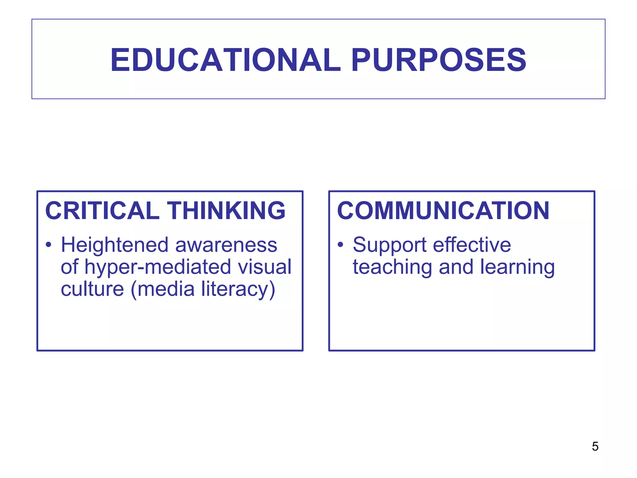
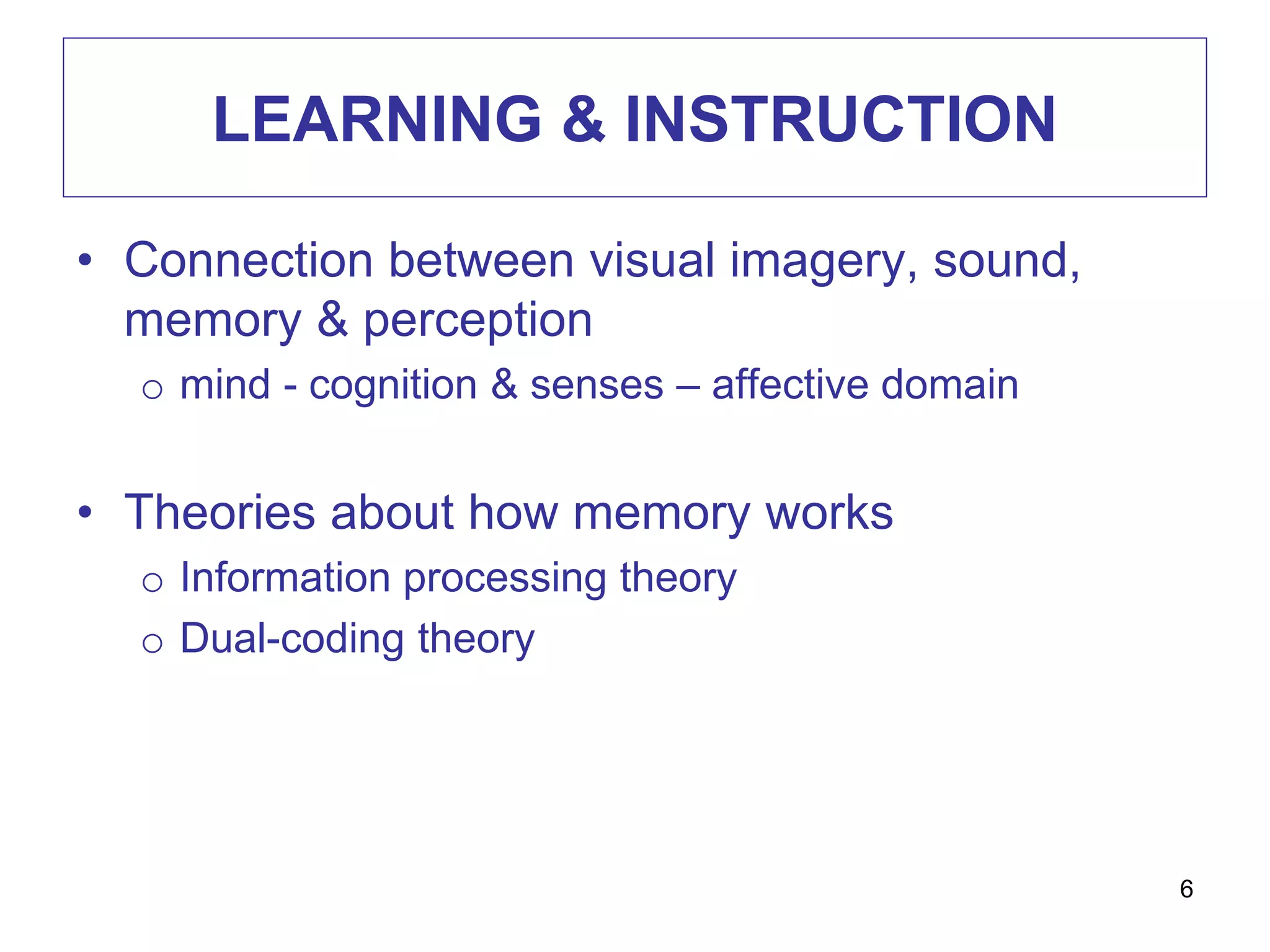
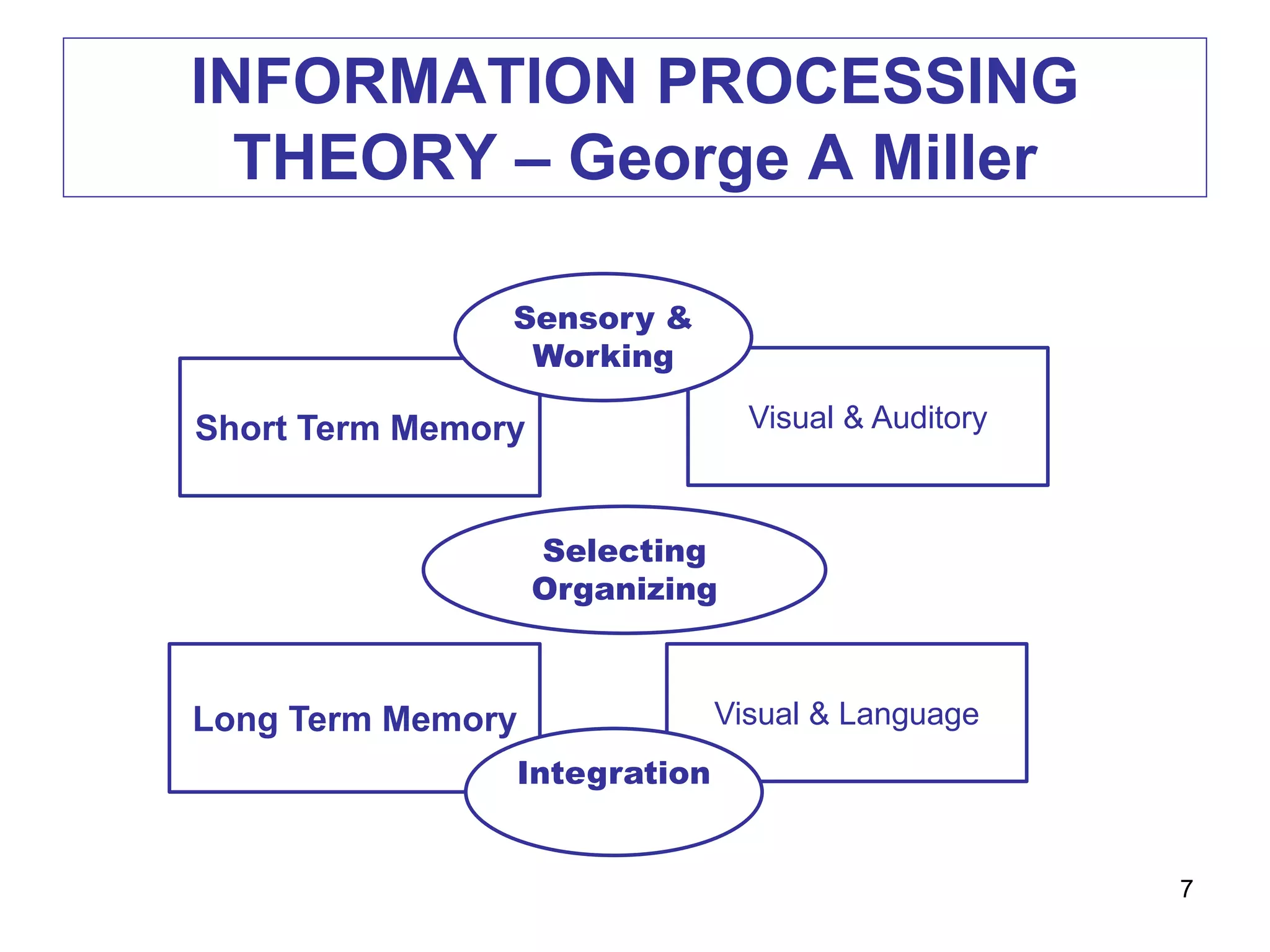
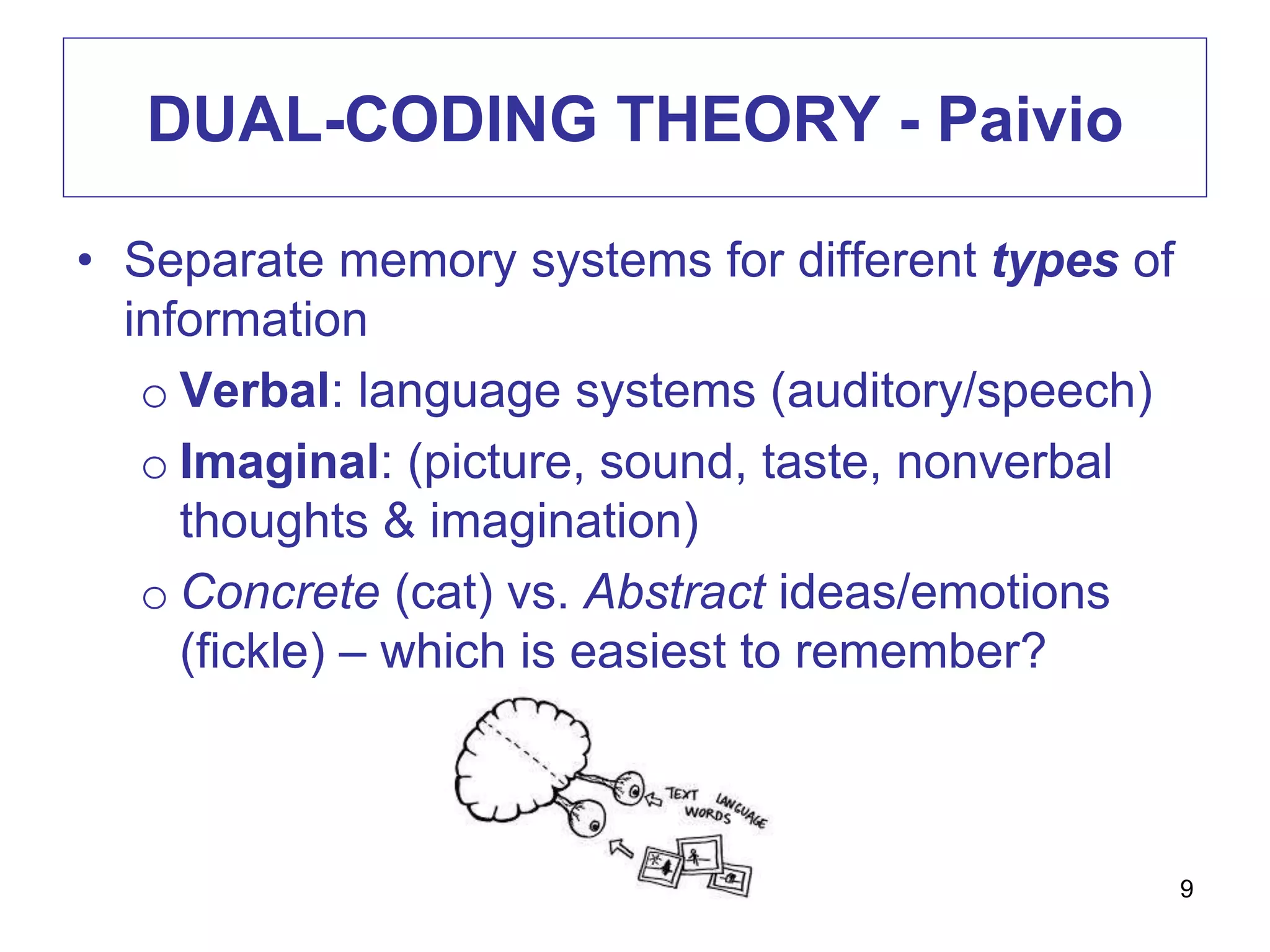
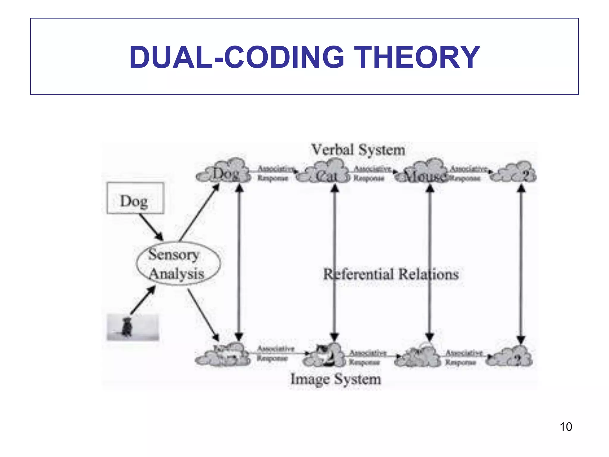
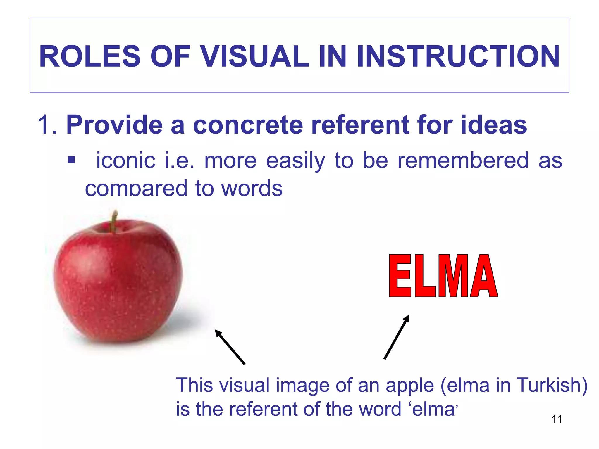
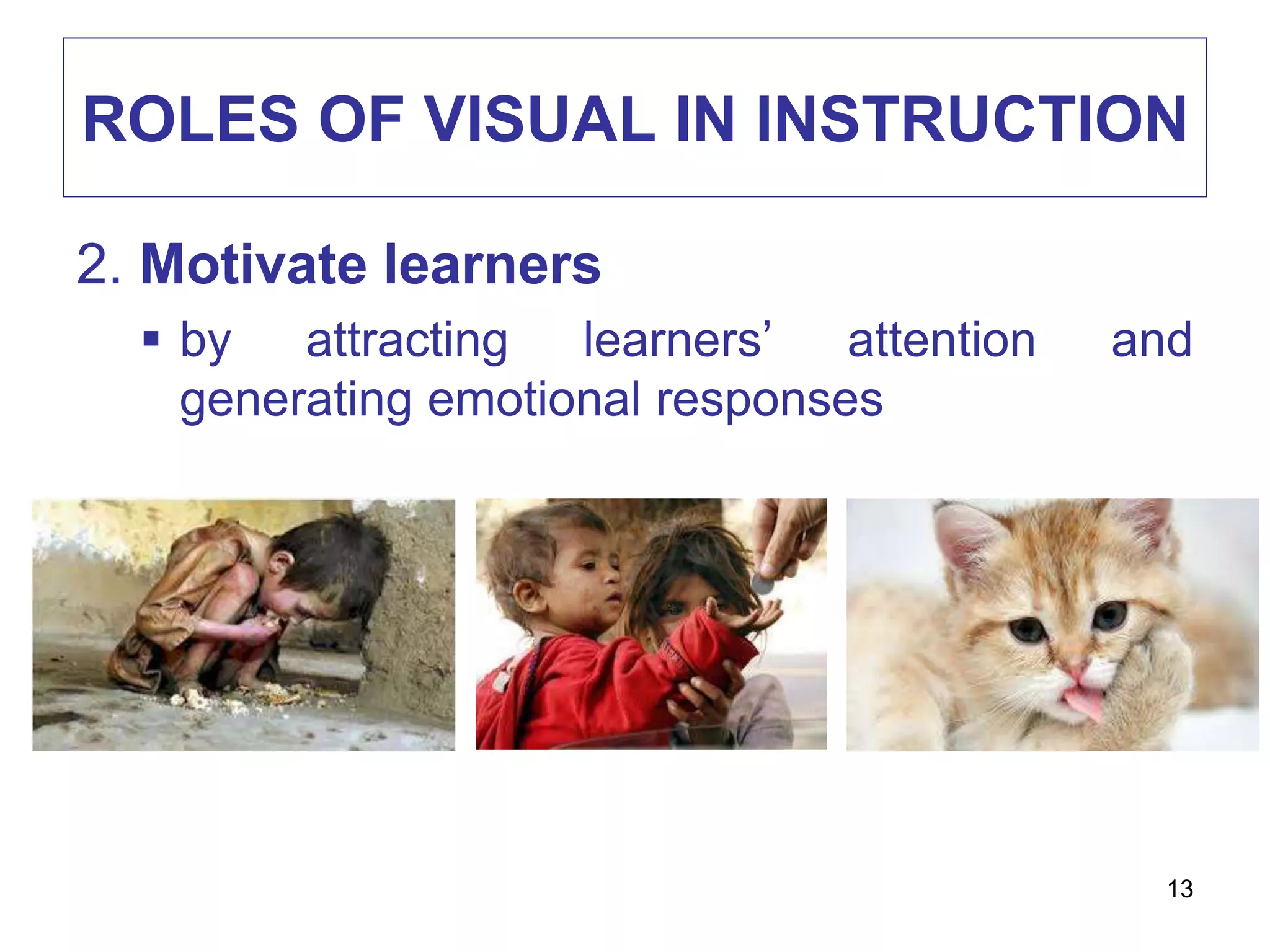
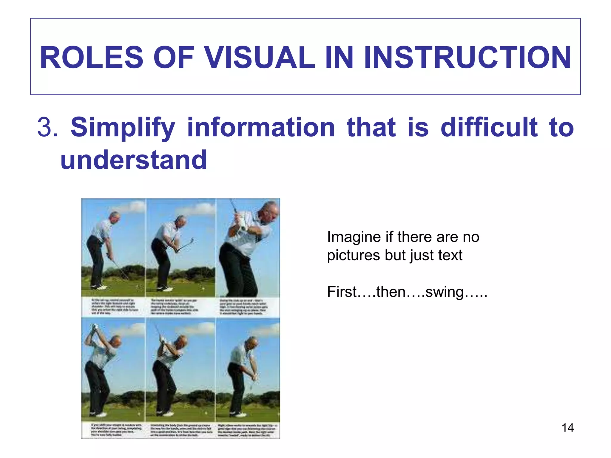
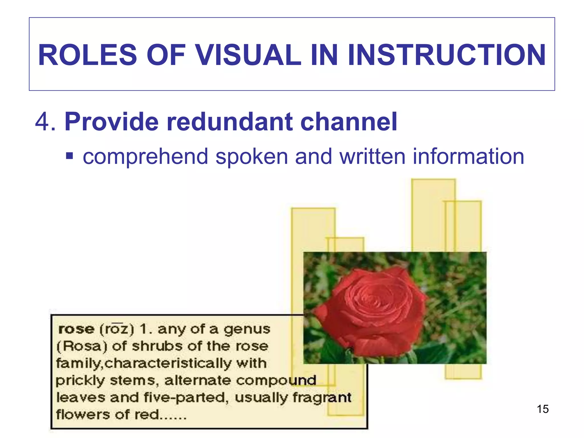
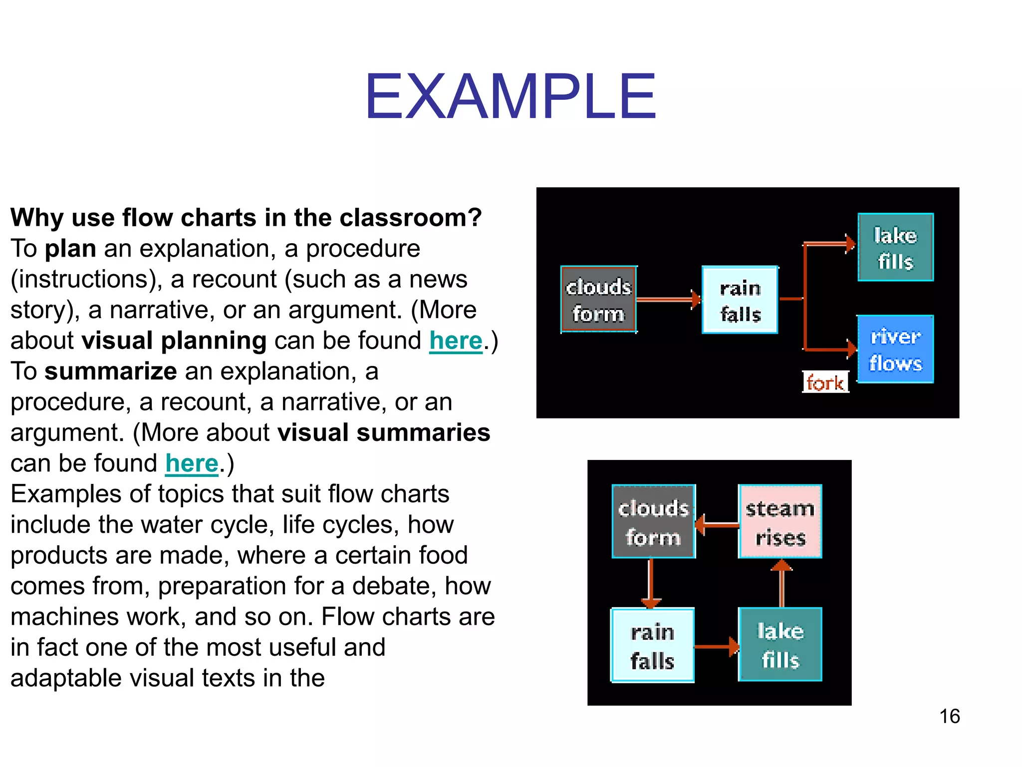
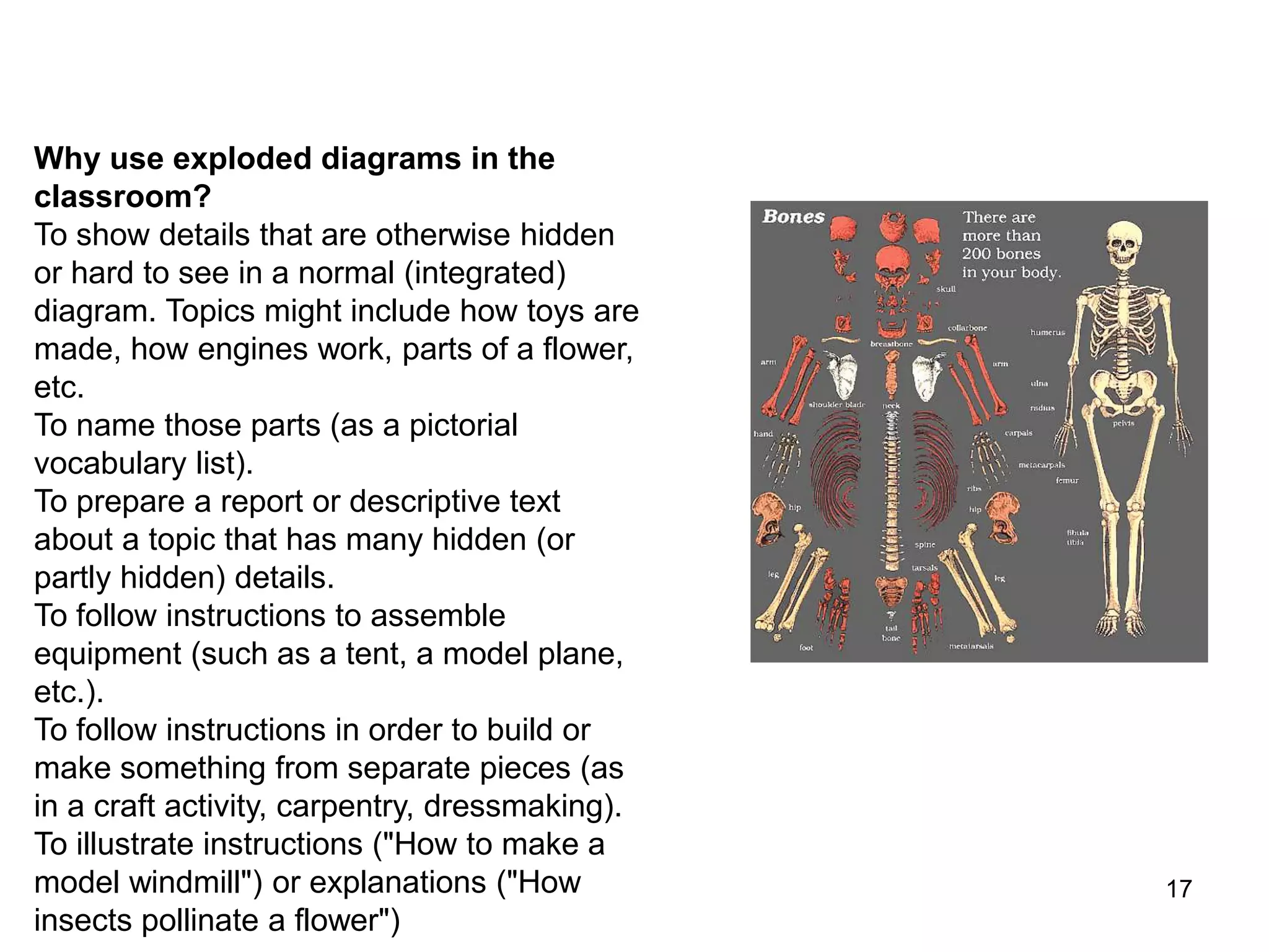
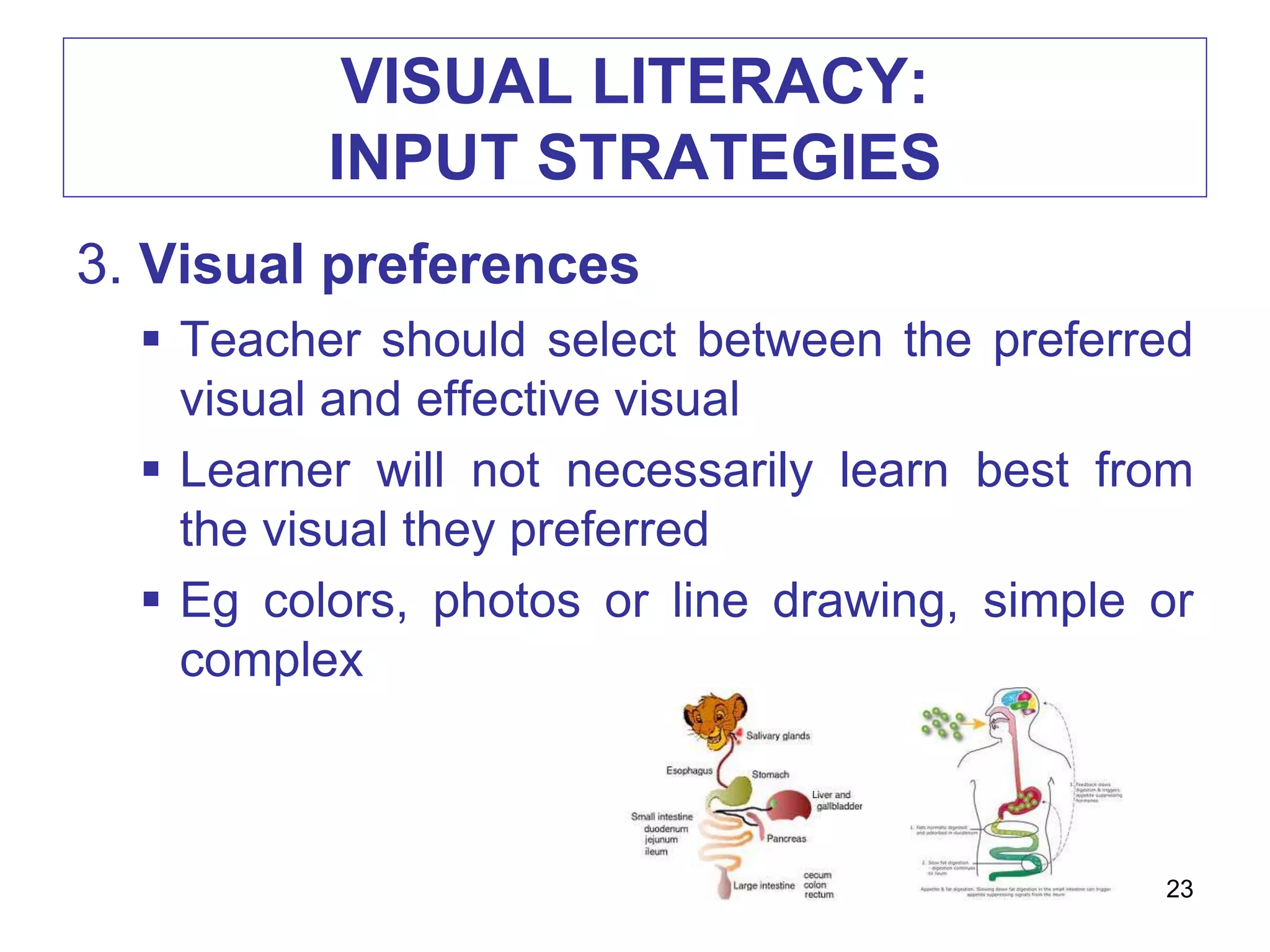
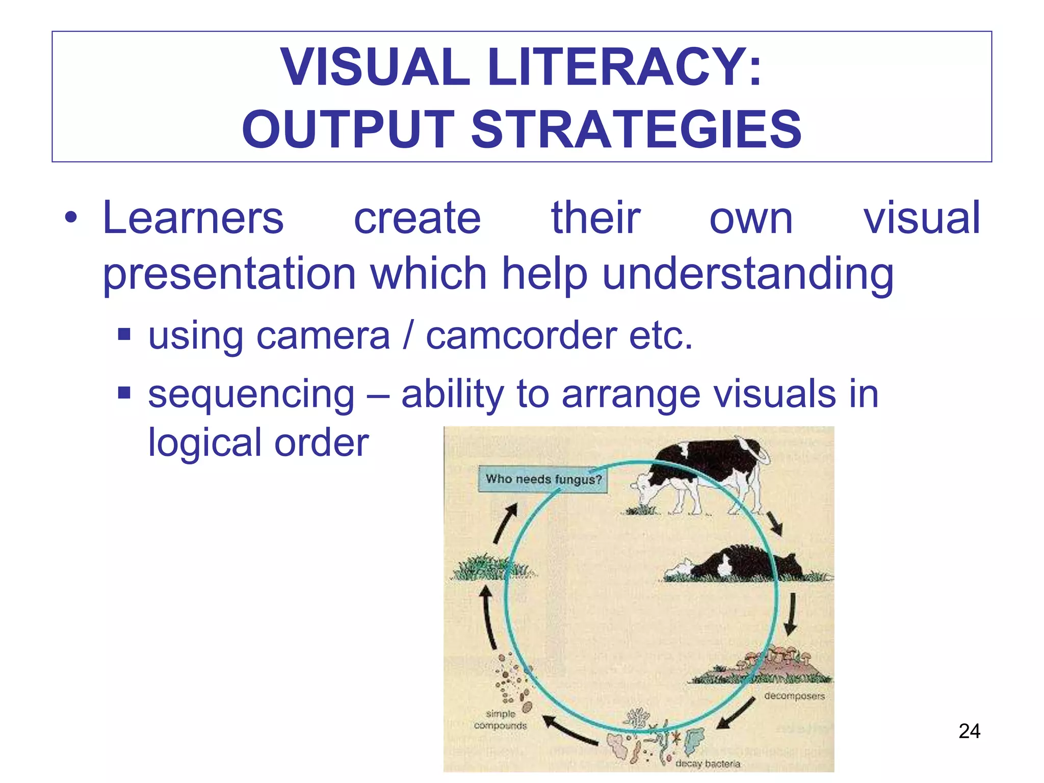
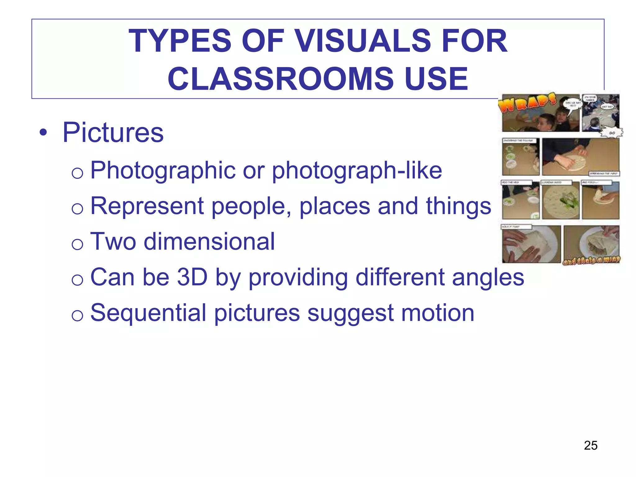
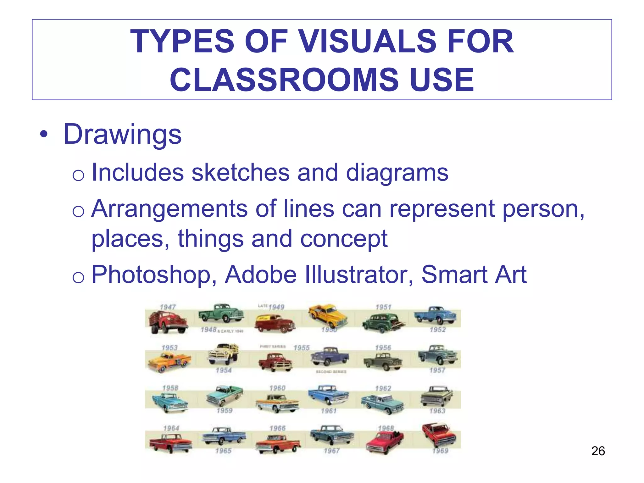
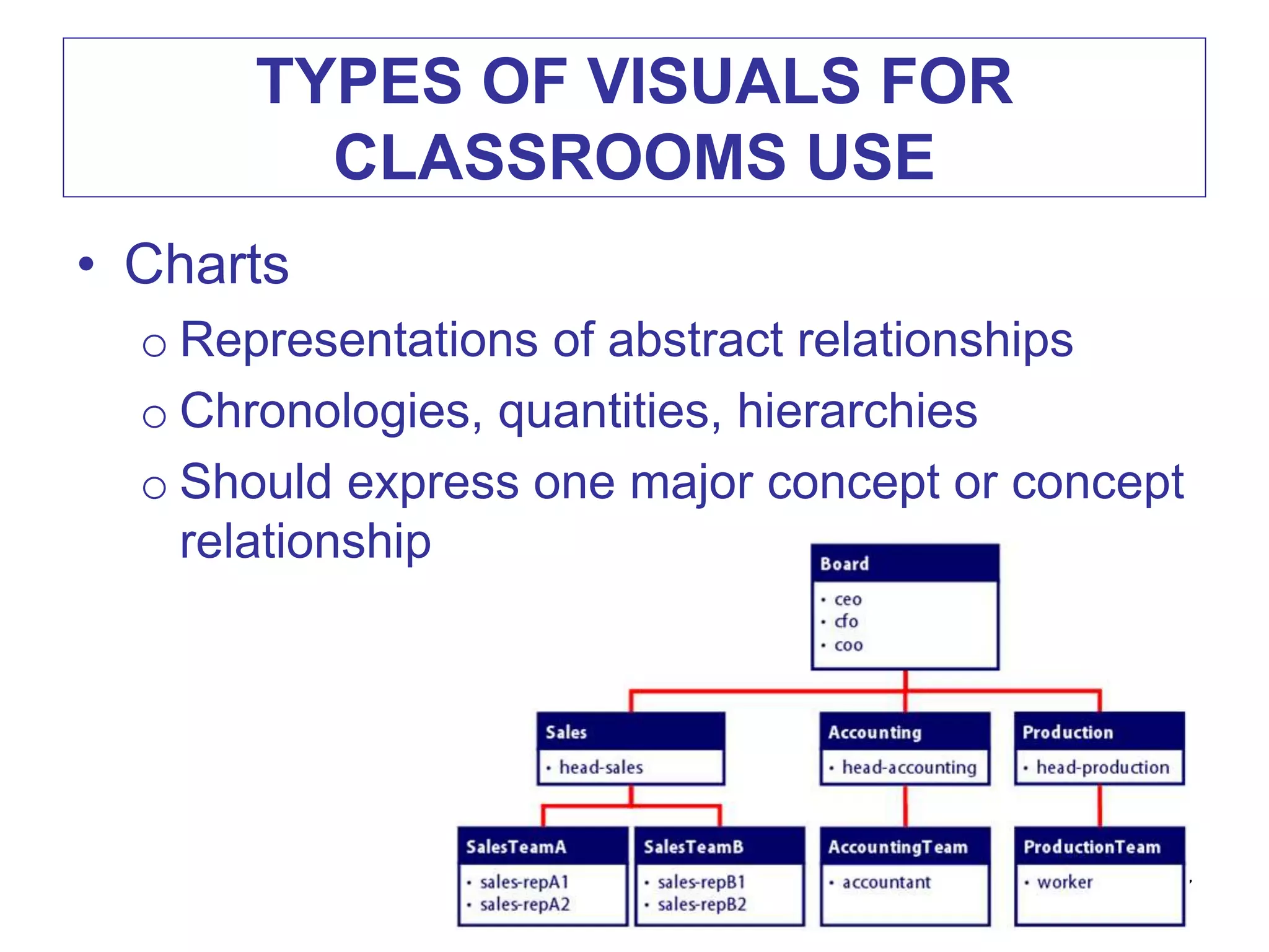
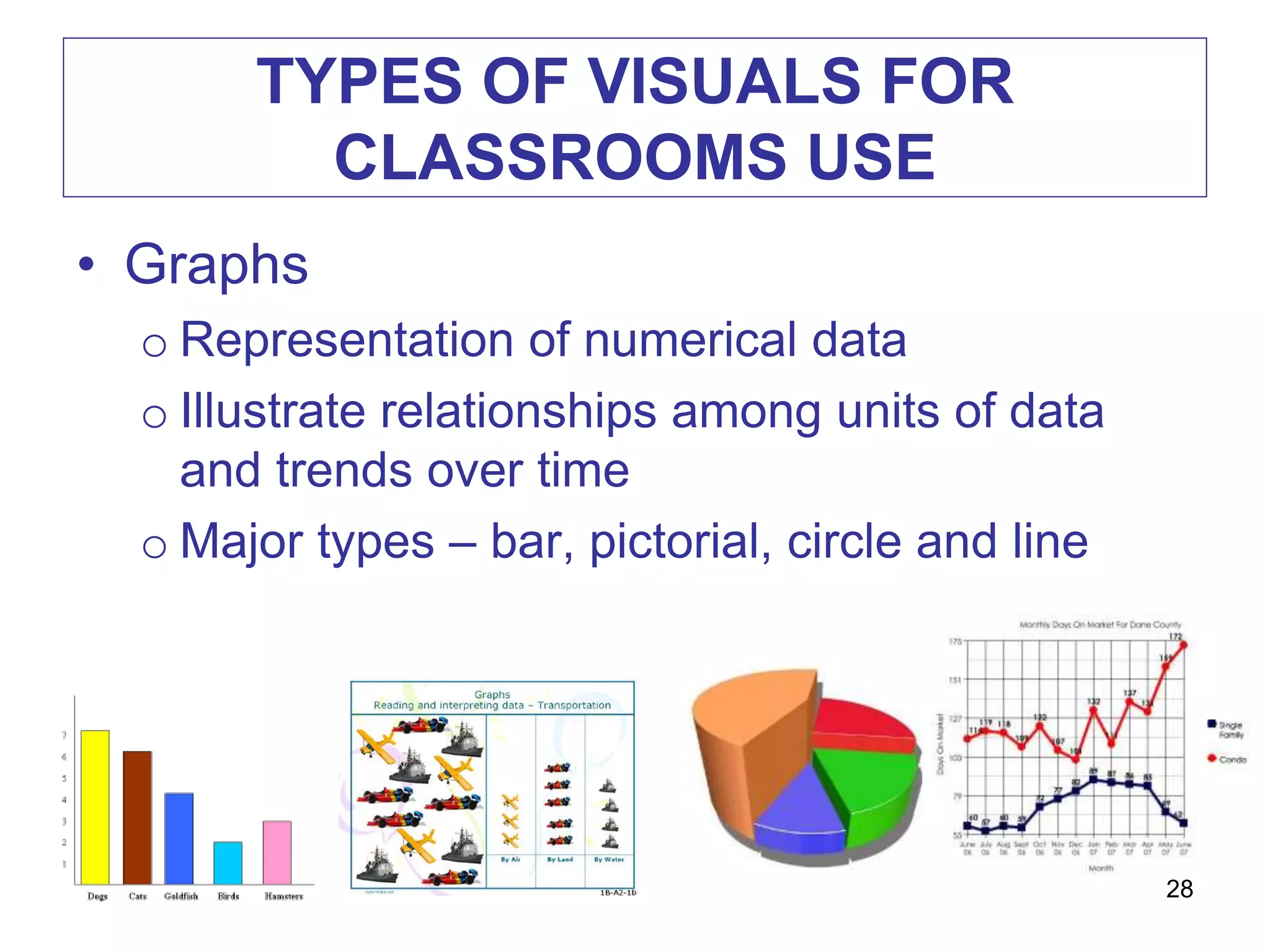
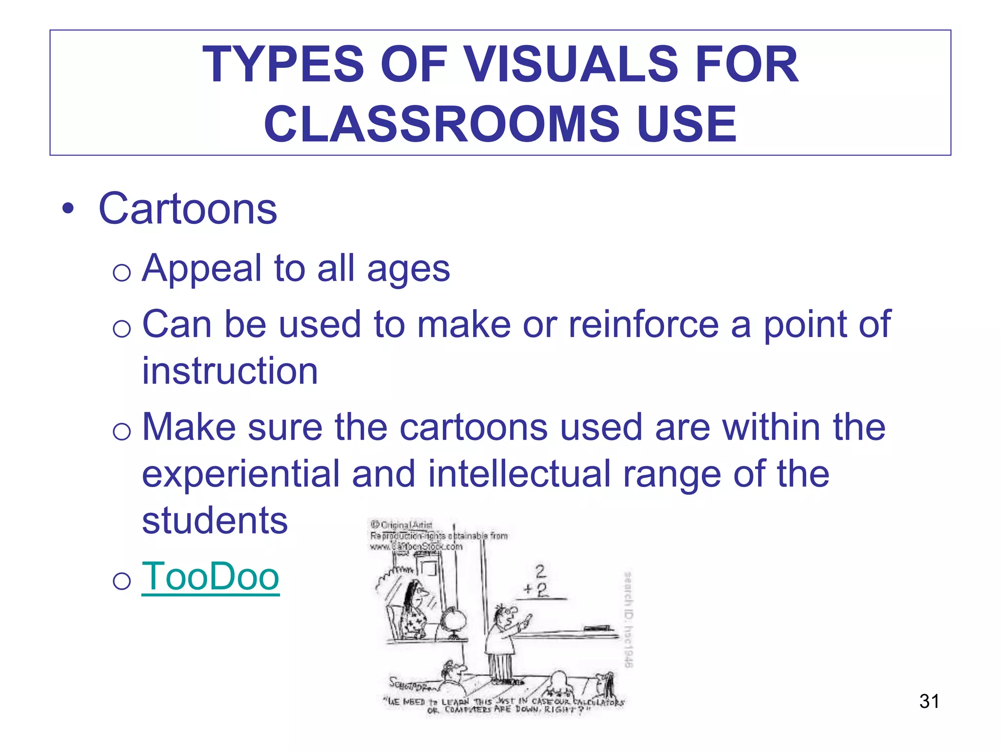
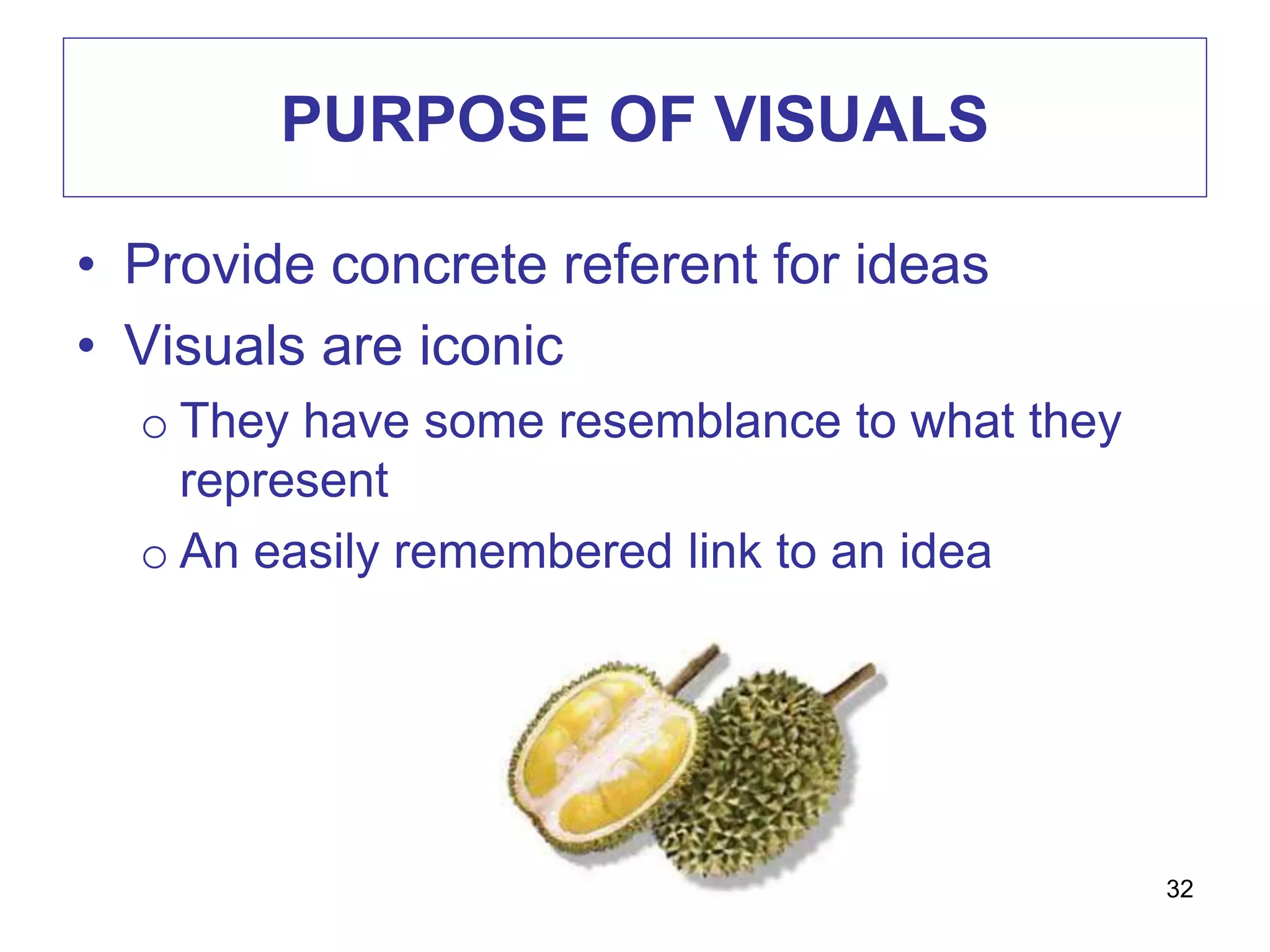
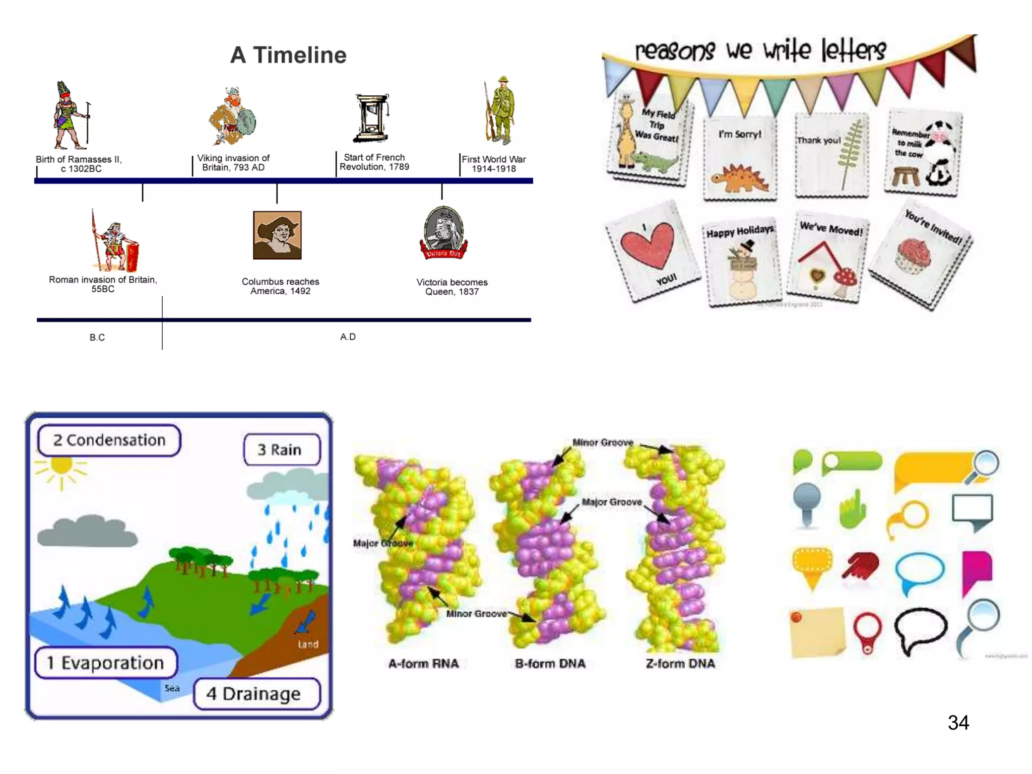
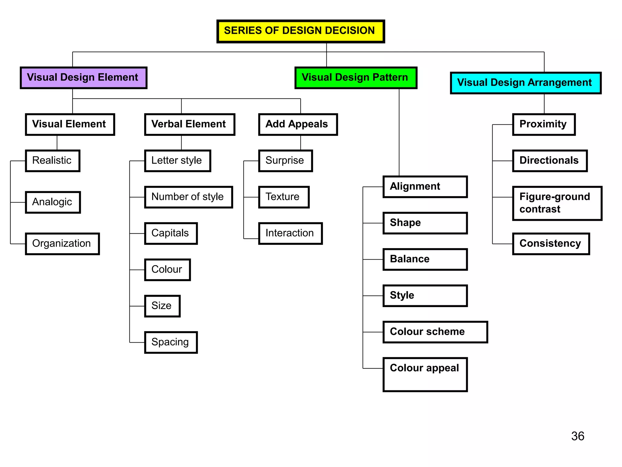
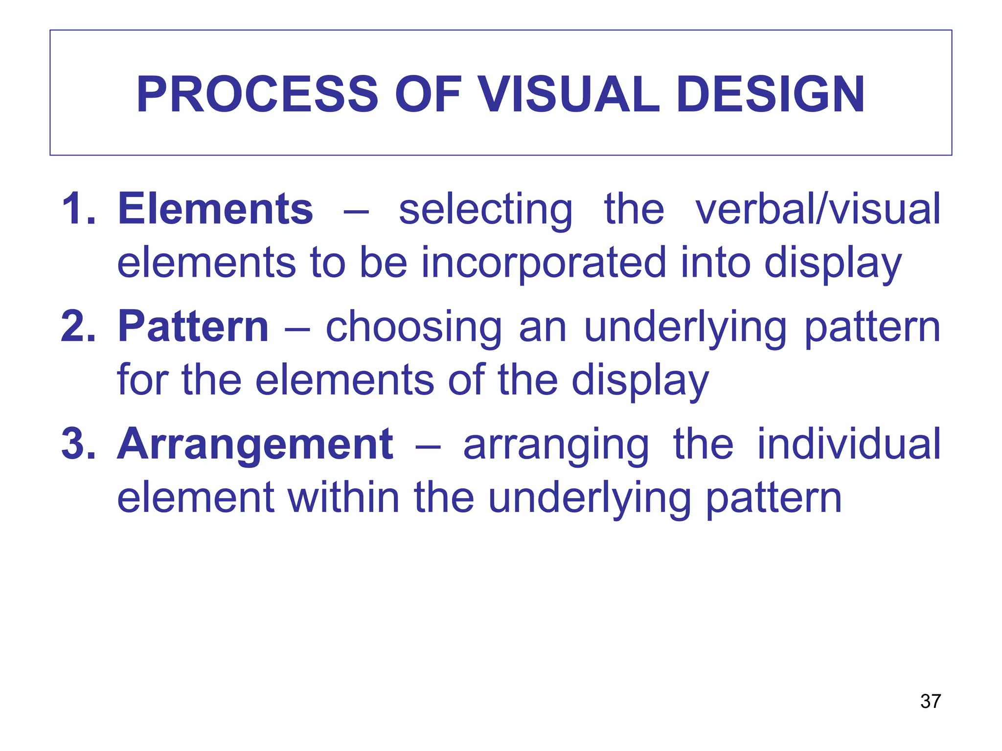
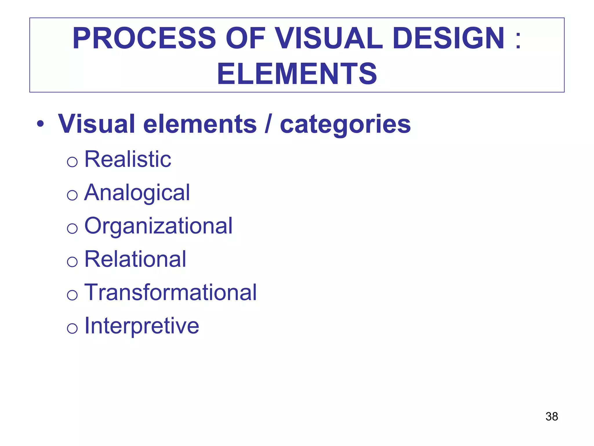
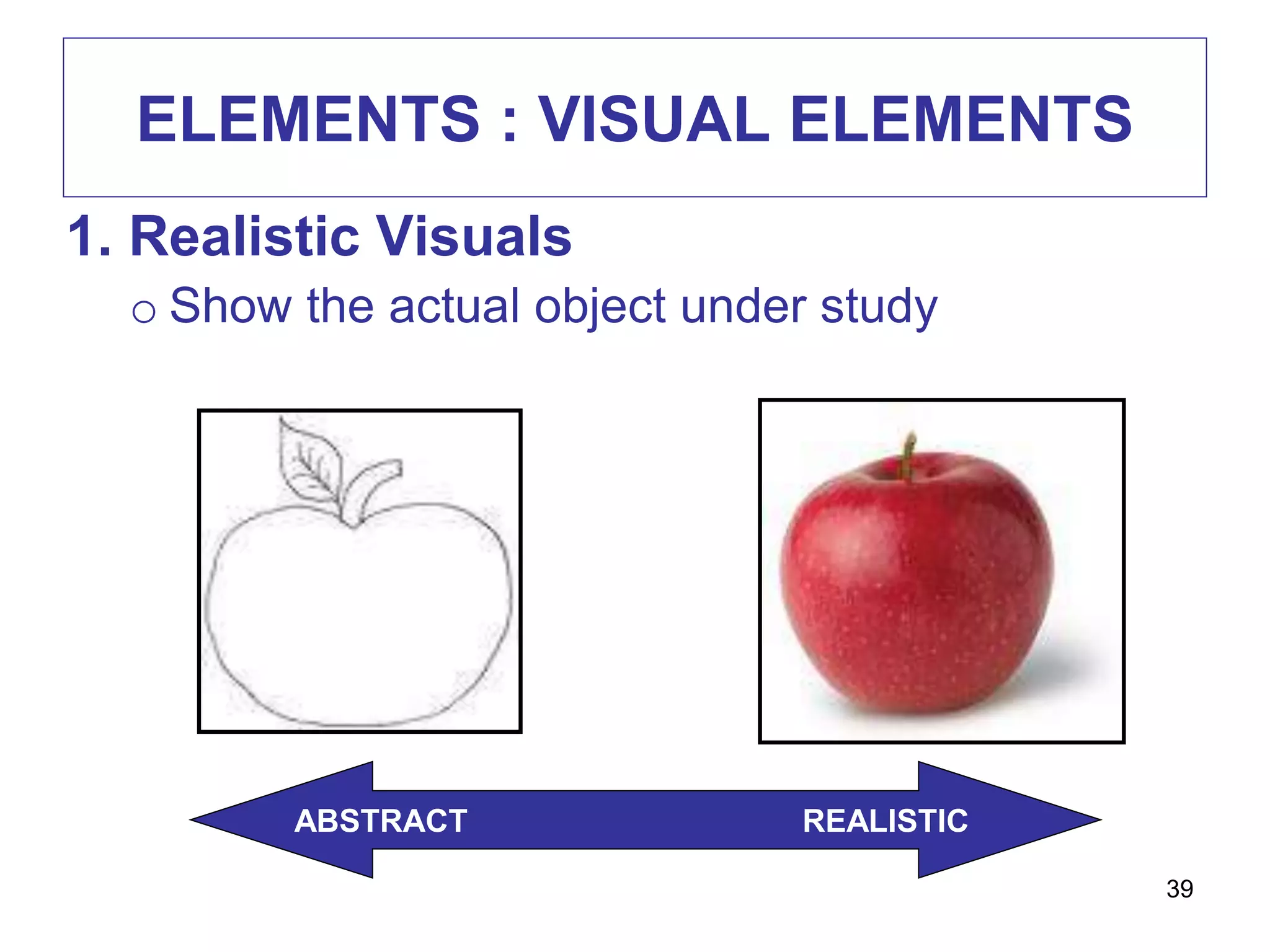
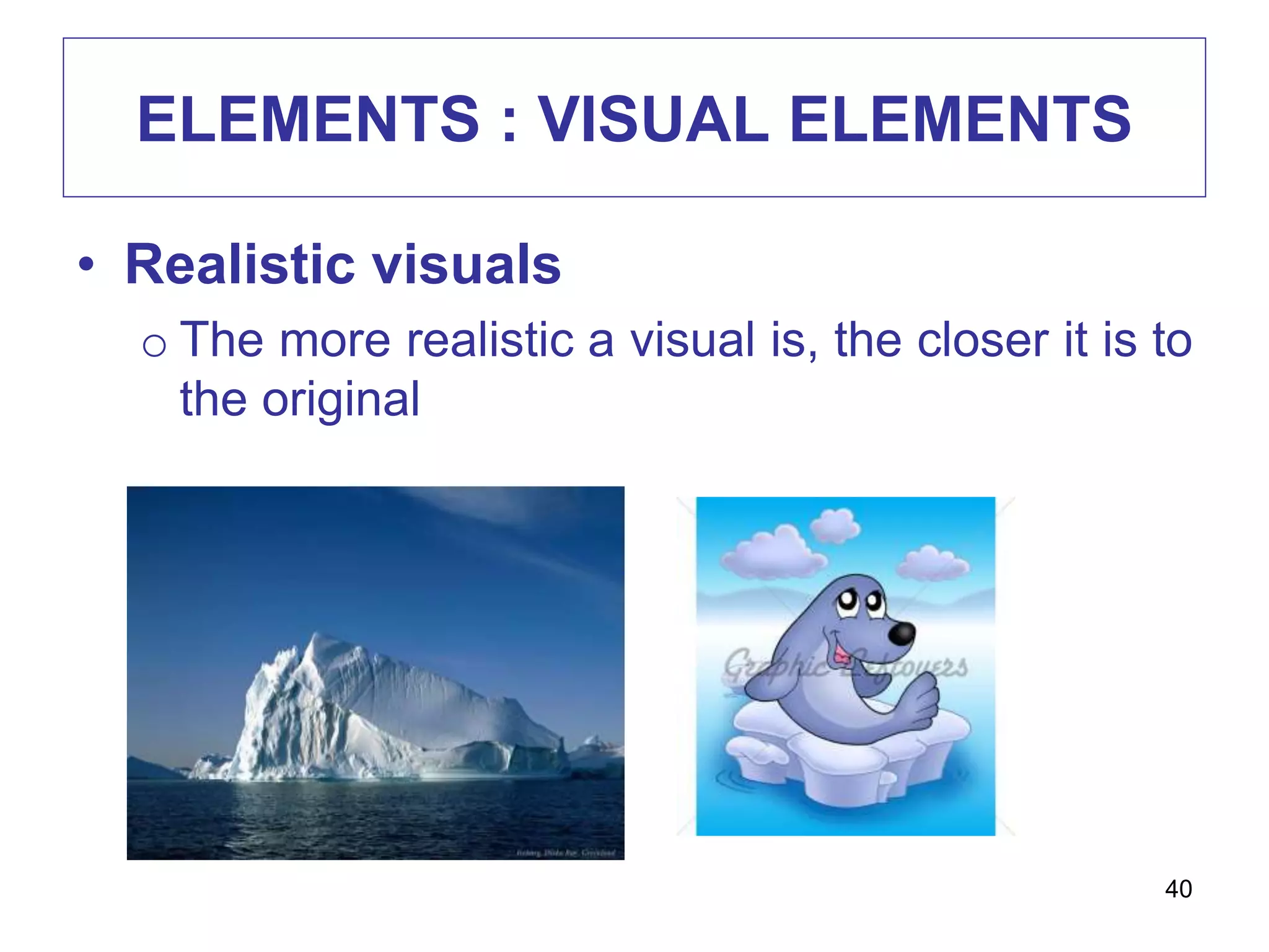
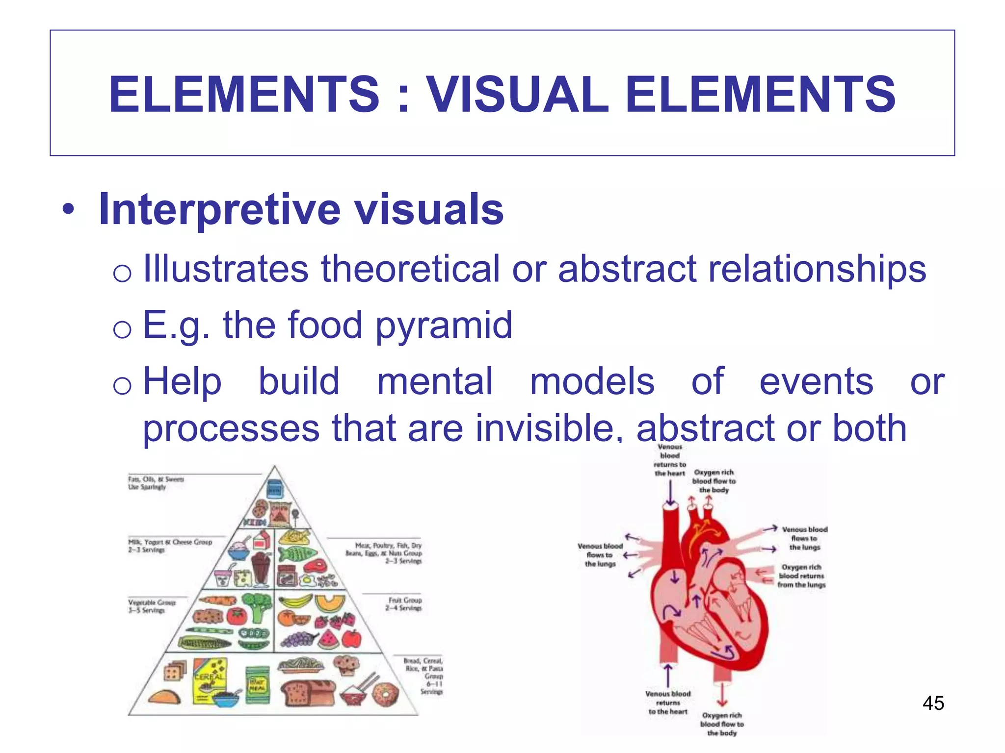
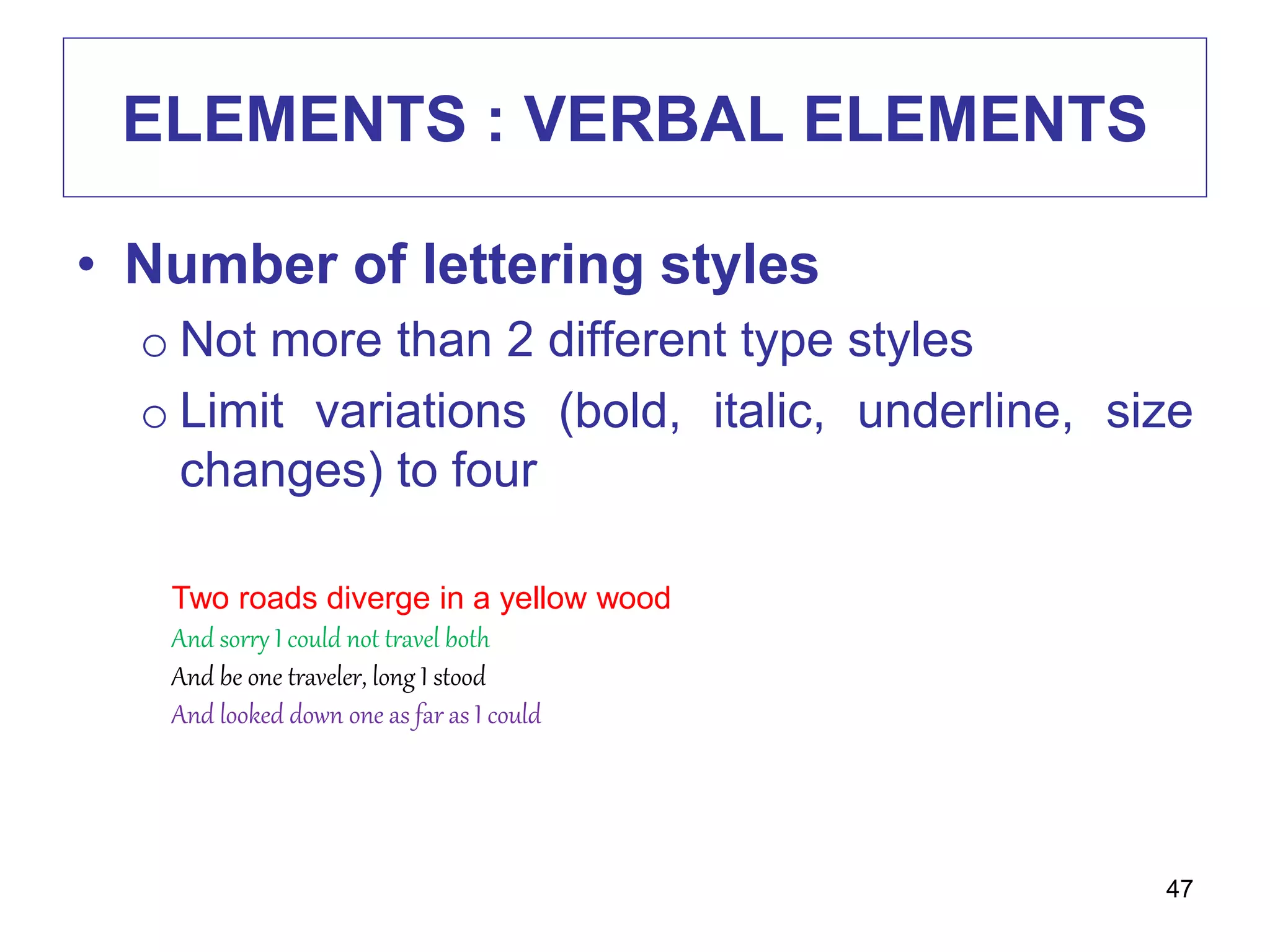
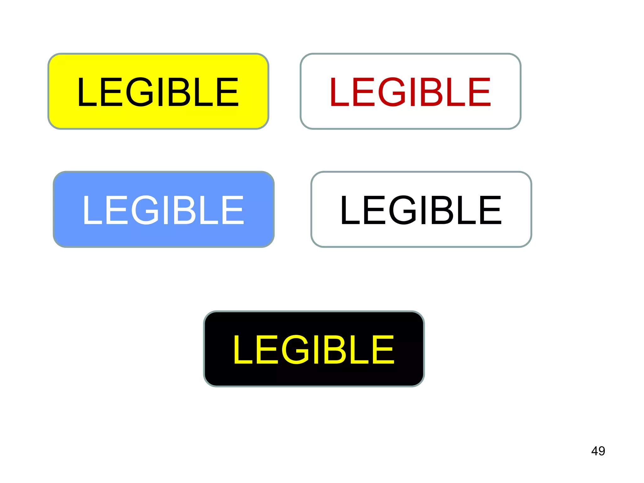
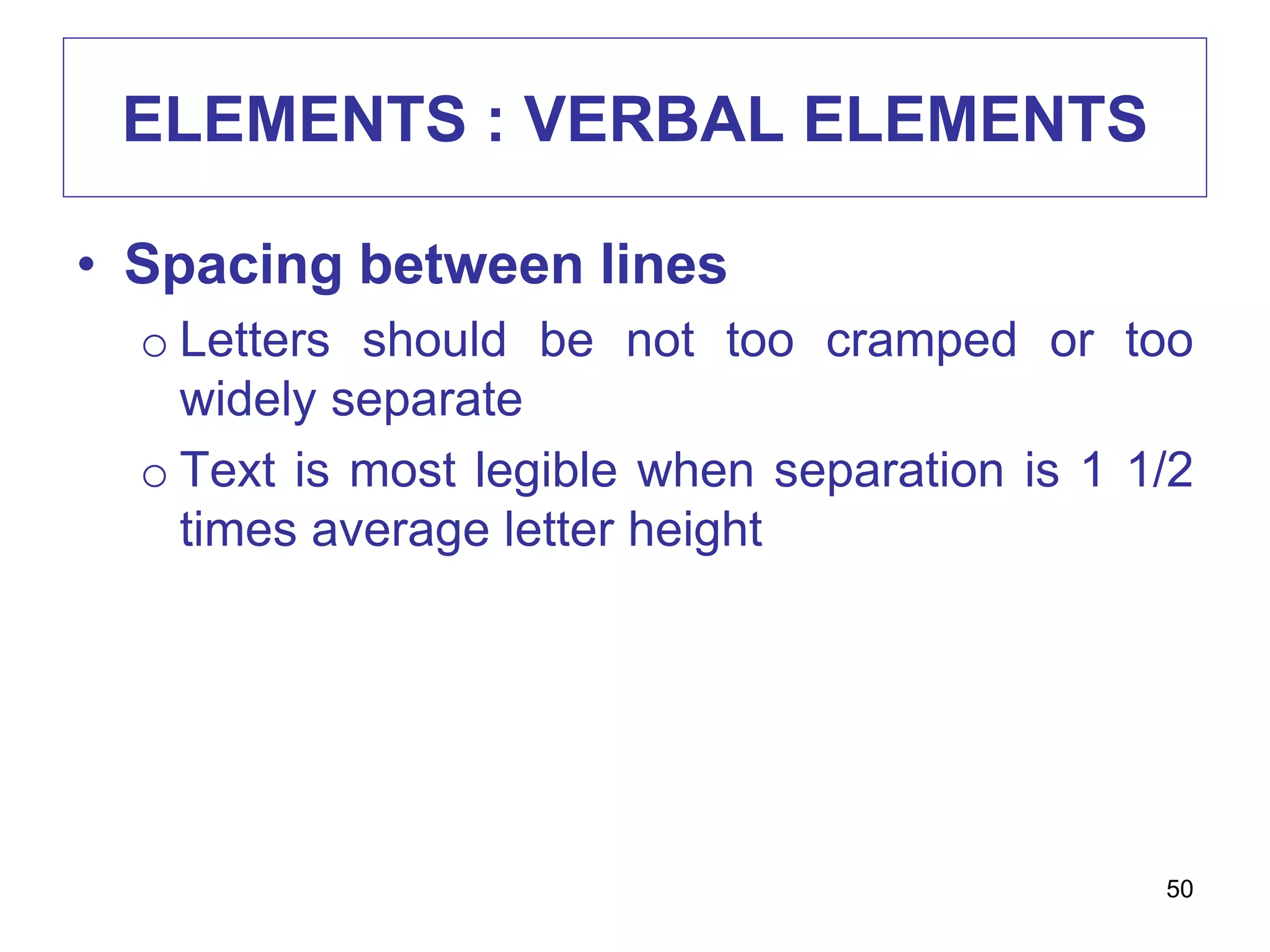
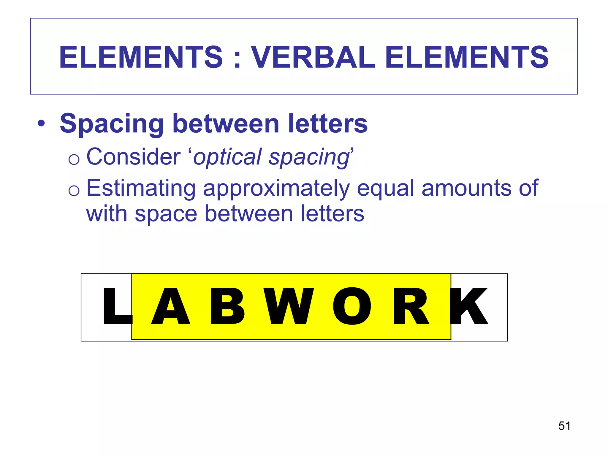
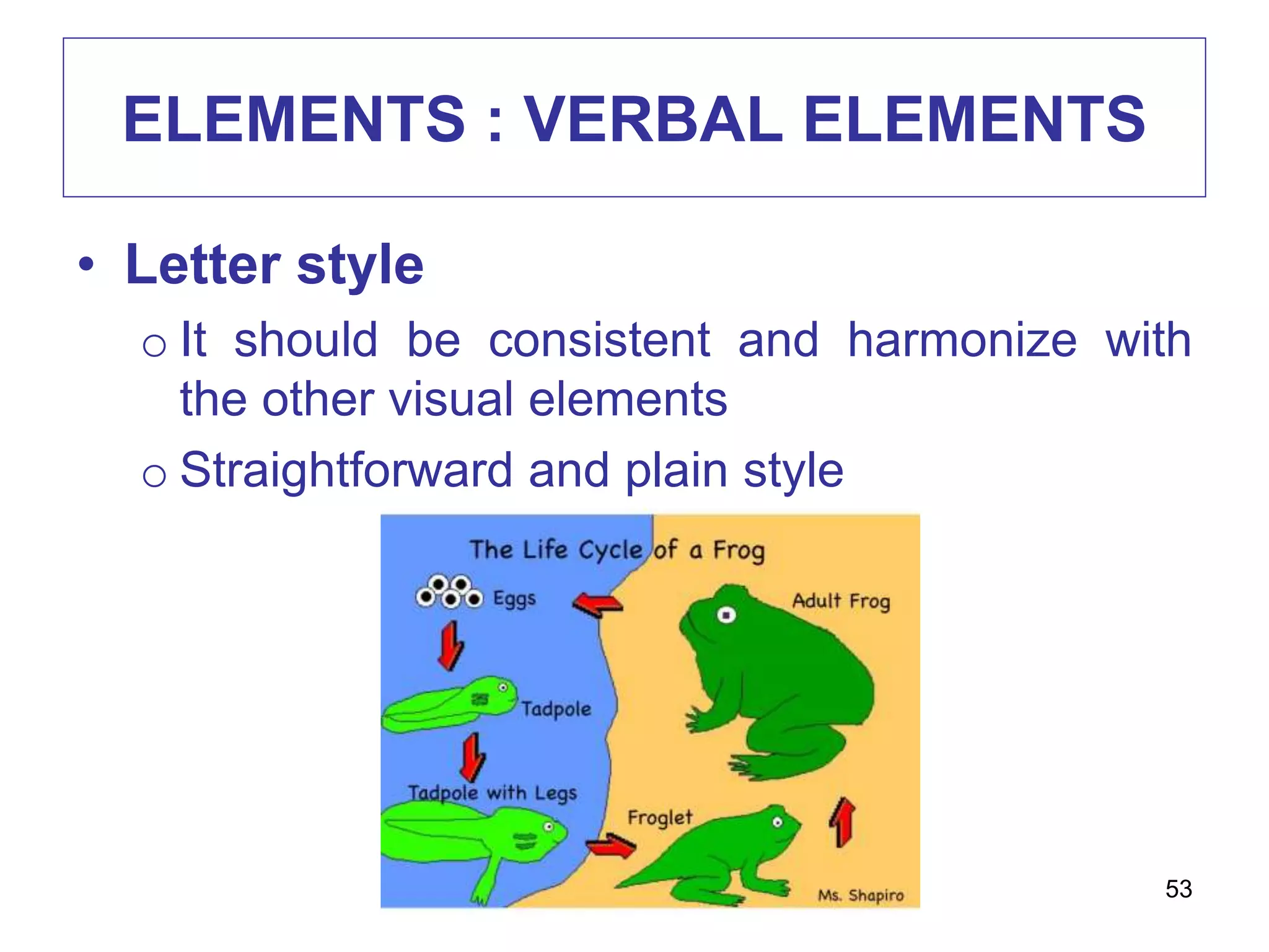
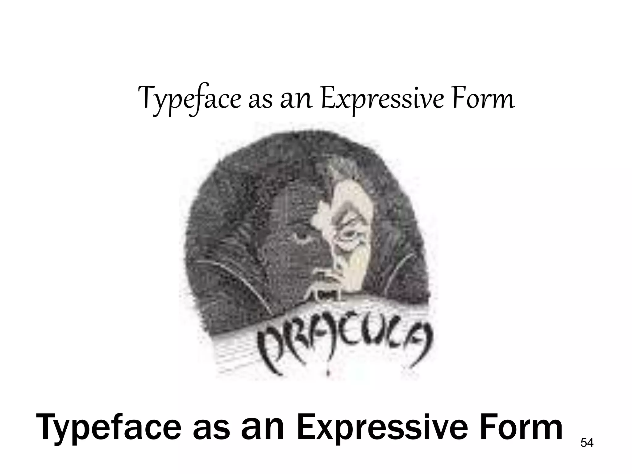
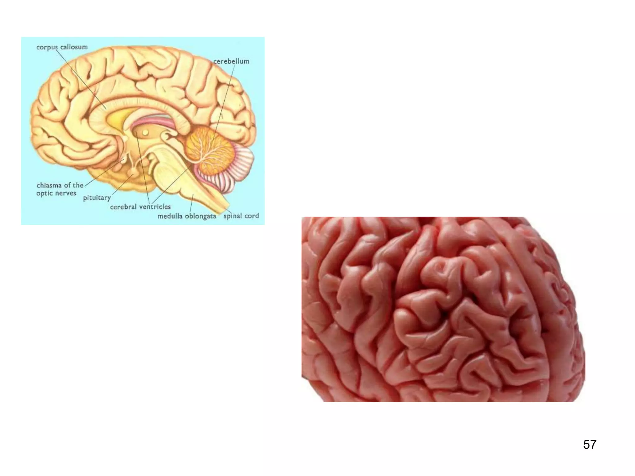
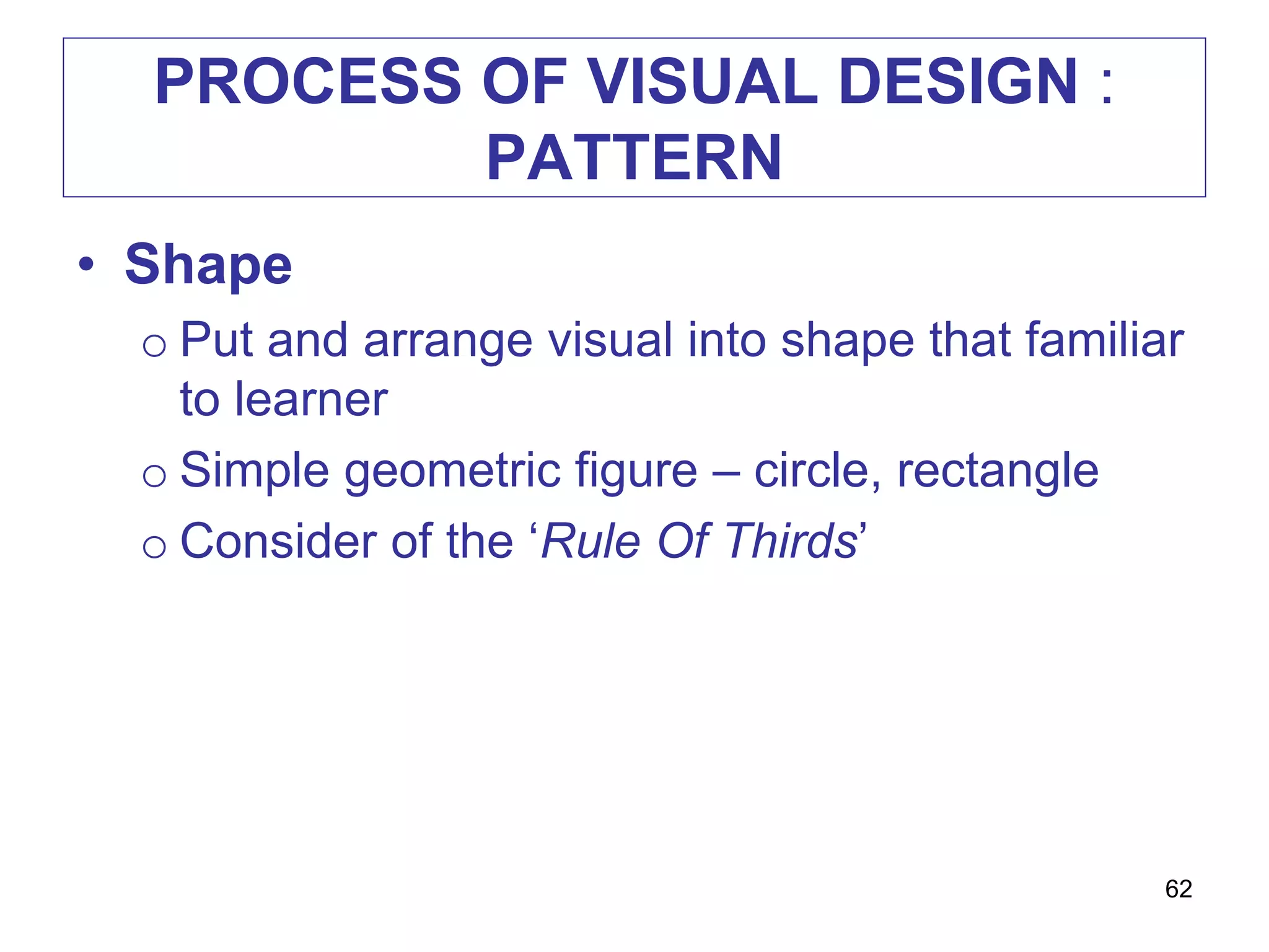
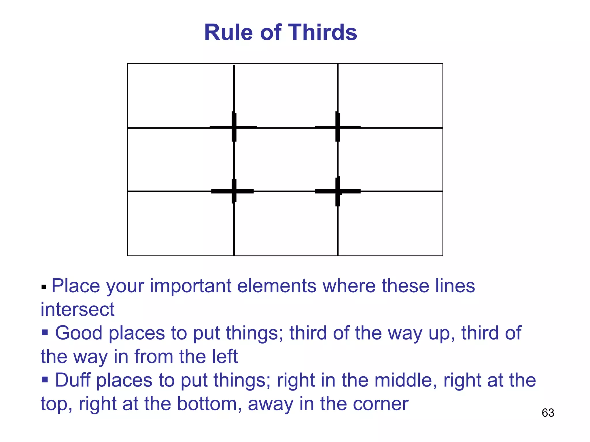
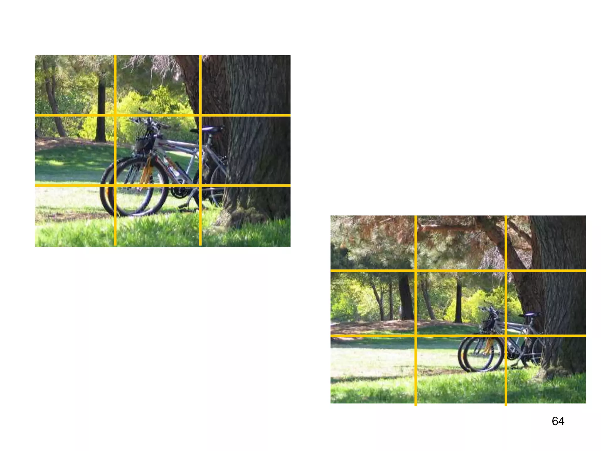
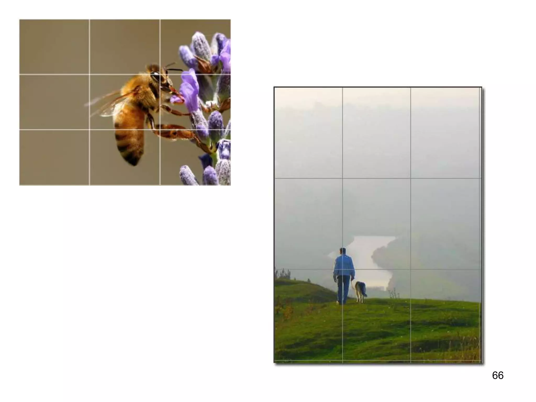
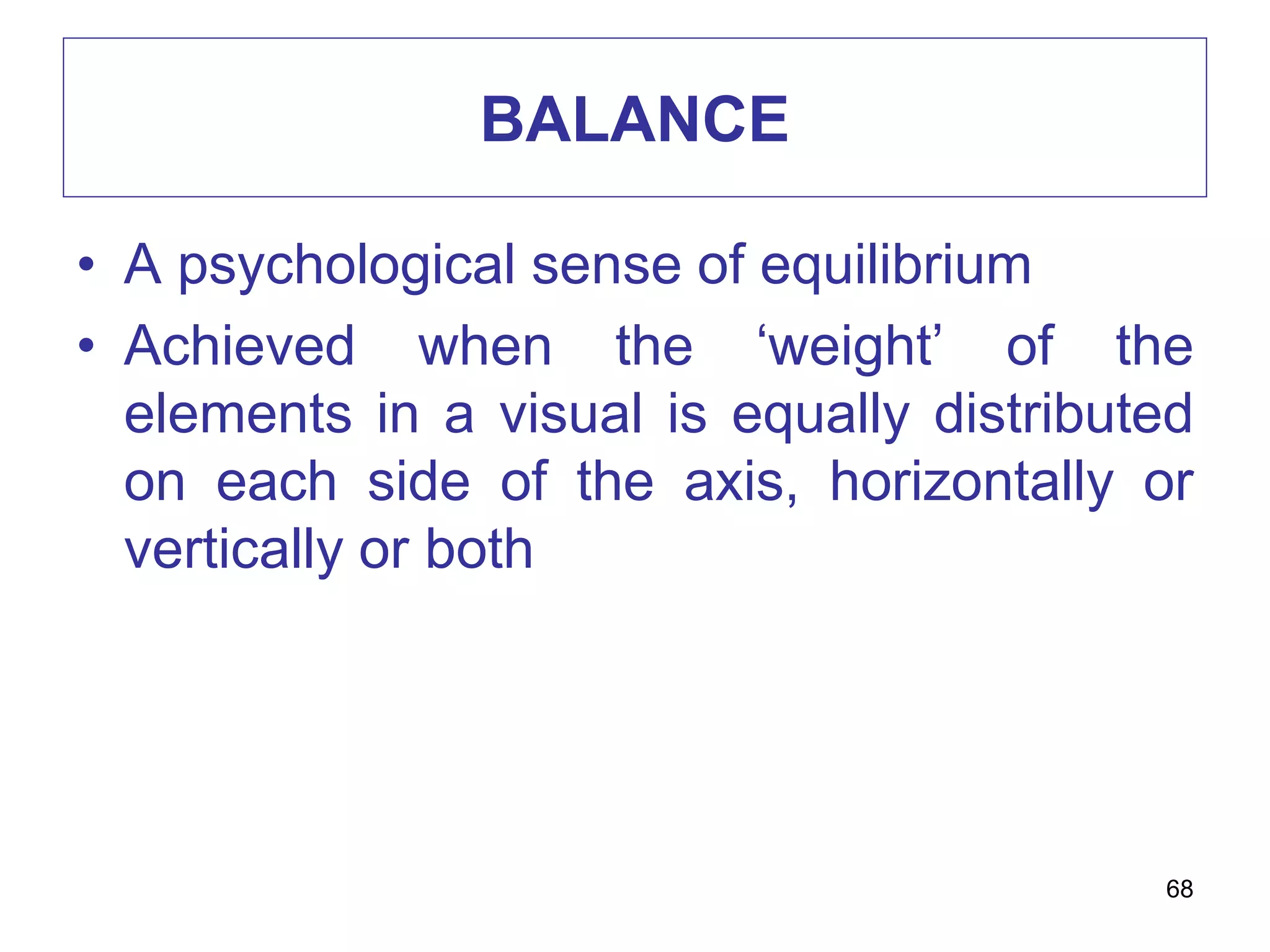
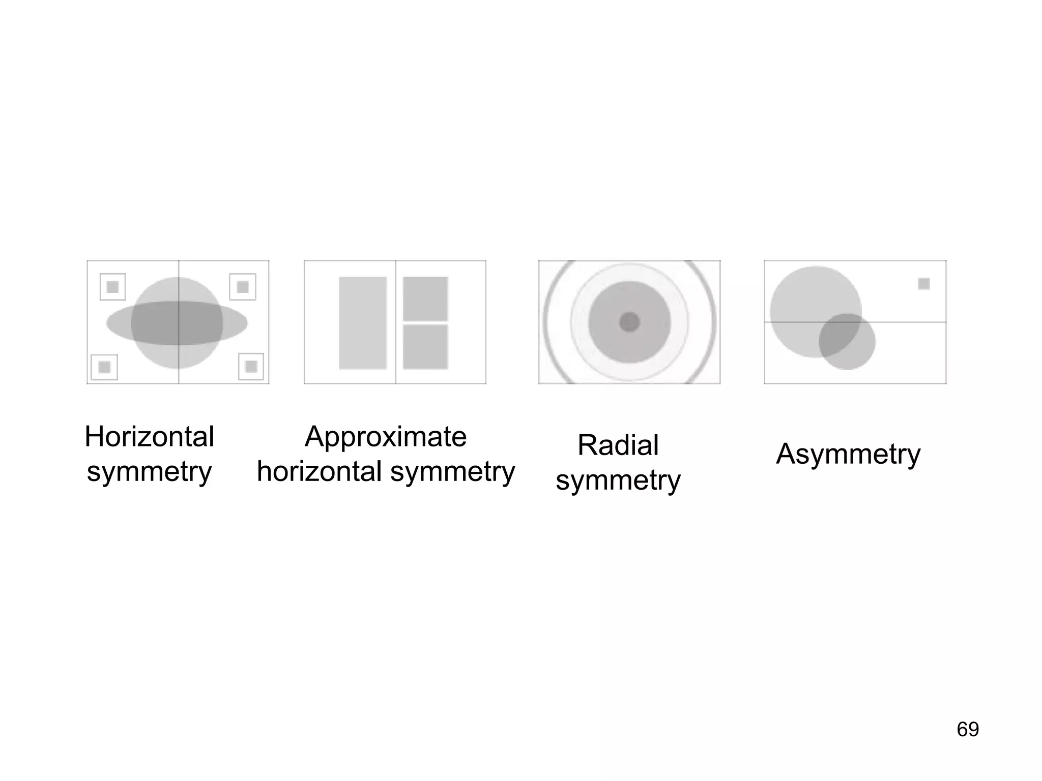
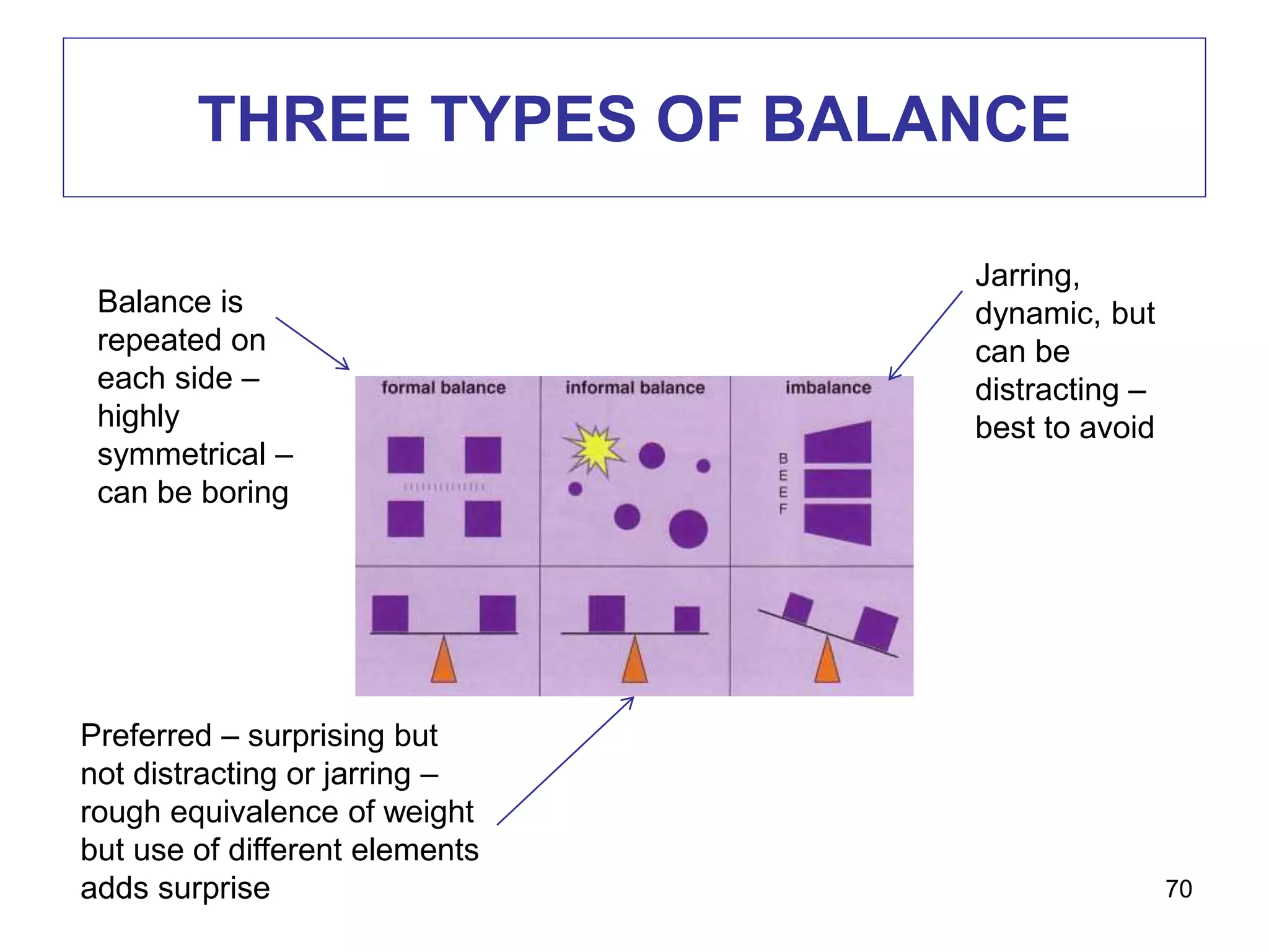
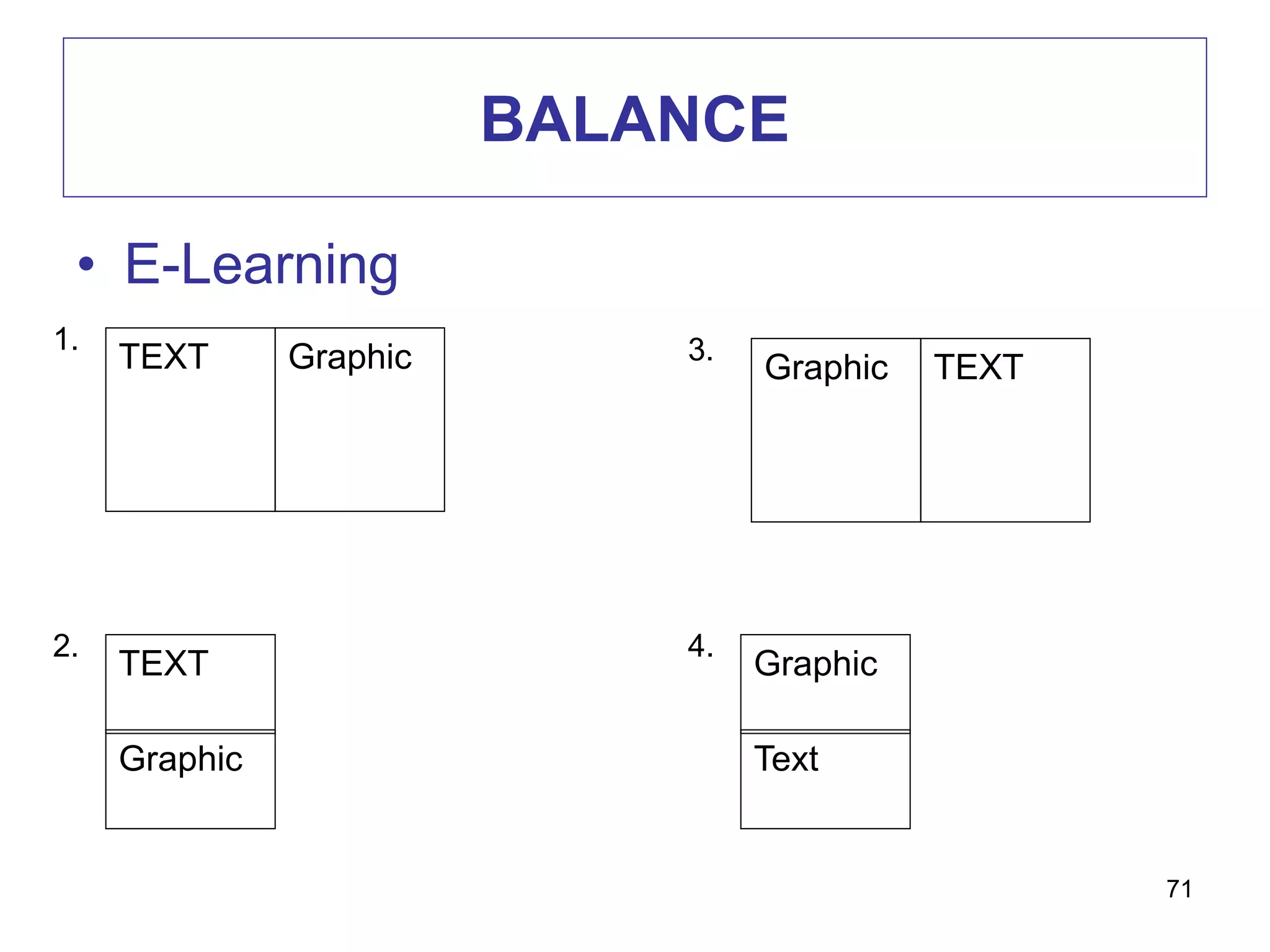
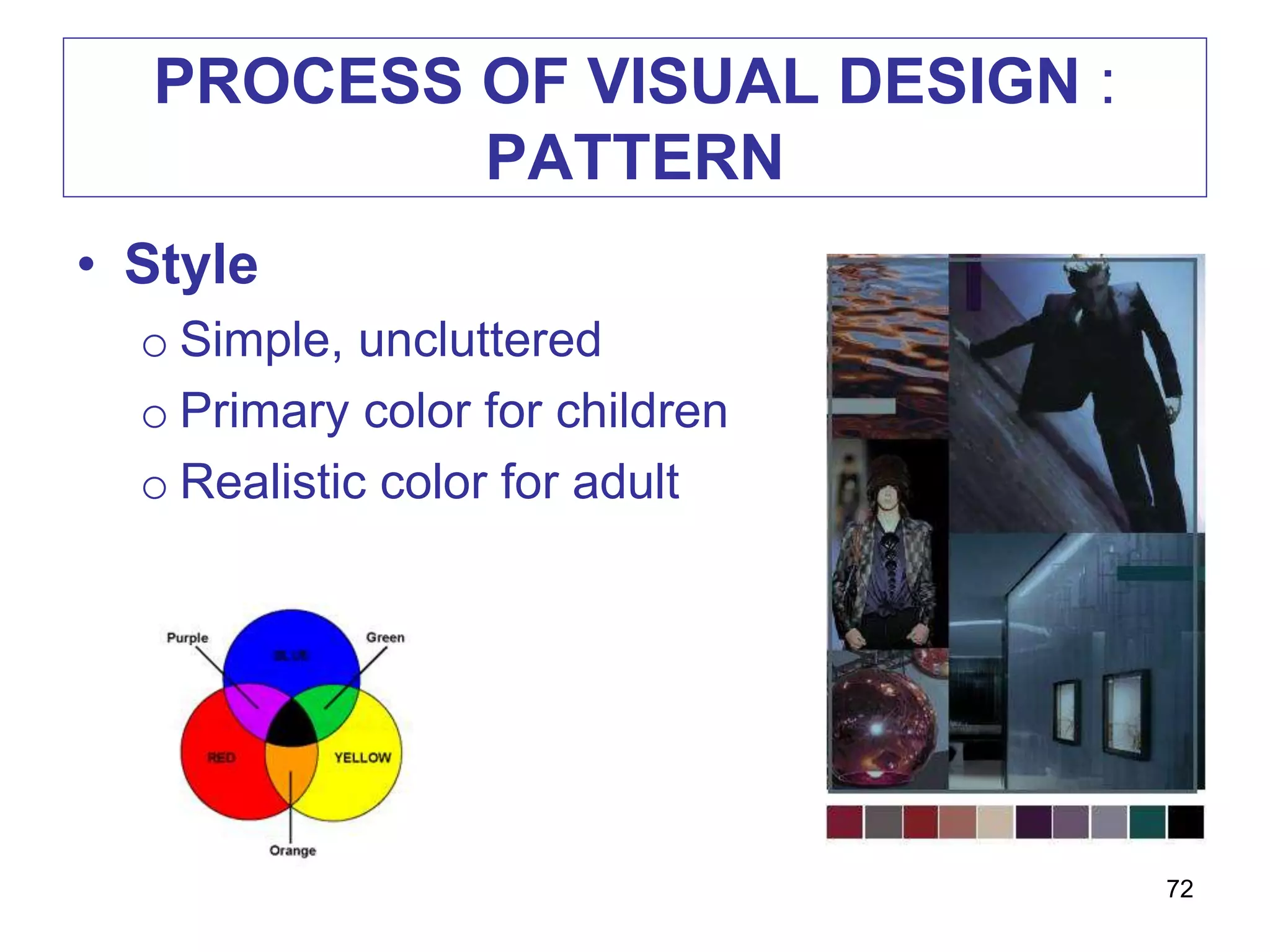
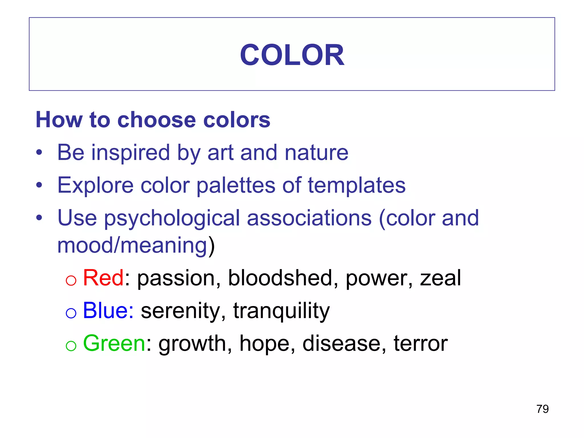
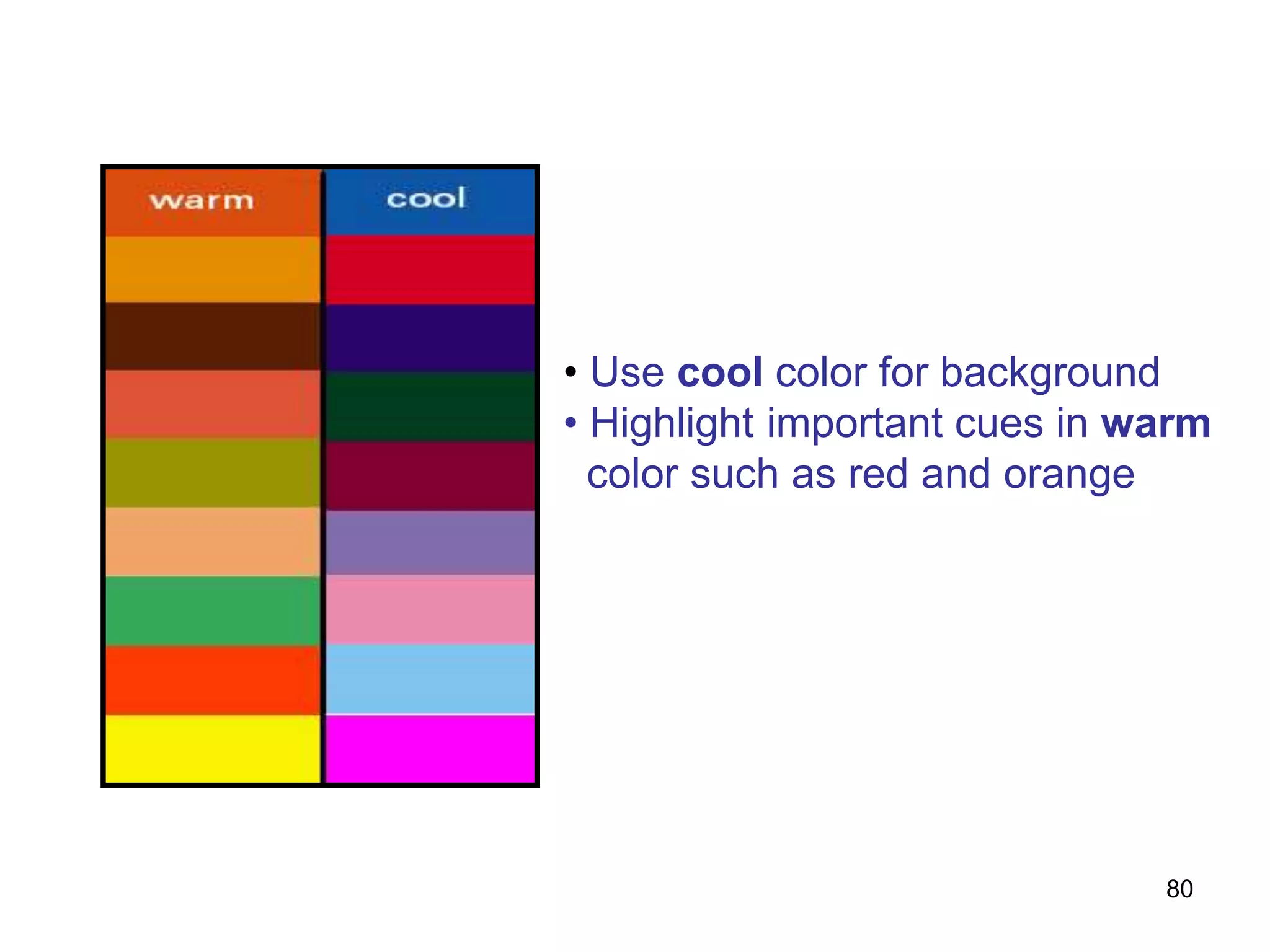
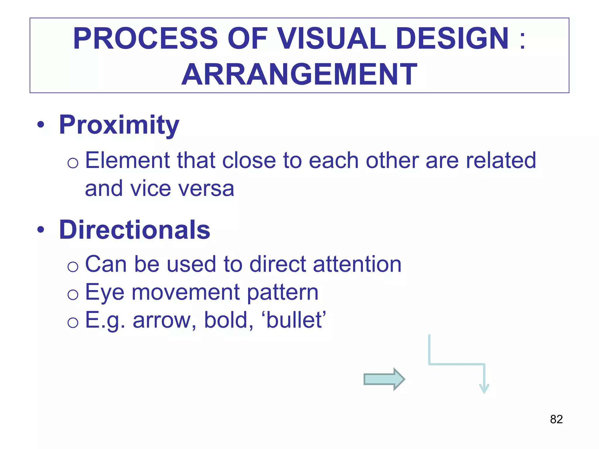
VISUAL PRINCIPLES
EDU 711
1
VISUAL LITERACY
• The ability to interpret visual messages
accurately and to create such messages
• Two routes to visual literacy:
o Input Strategies / Decode
• Read visuals / visual analysis skills
o Output Strategies / Encode
• Write visuals / expressions and communications
2
If you can read maps, draw a diagram or interpret
these symbols, then you are visually literate.
3
EXAMPLE
4
Why use cutaway diagrams in the
classroom?
To show the key features of animals, which
are often hidden.
To show how engines, machines, or
equipment work.
To provide a vocabulary list of key terms
needed in an explanation (such as "How a
... works")
To write a report (such as "What are the
differences between birds, mammals and
dinosaurs?")
EDUCATIONAL PURPOSES
5
CRITICAL THINKING
• Heightened awareness
of hyper-mediated visual
culture (media literacy)
COMMUNICATION
• Support effective
teaching and learning
LEARNING & INSTRUCTION
• Connection between visual imagery, sound,
memory & perception
o mind - cognition & senses – affective domain
• Theories about how memory works
o Information processing theory
o Dual-coding theory
6
INFORMATION PROCESSING
THEORY – George A Miller
7
Visual & AuditoryShort Term Memory
Long Term Memory
Sensory &
Working
Selecting
Organizing
Visual & Language
Integration
INFORMATION PROCESSING
THEORY – George A Miller
8
DUAL-CODING THEORY - Paivio
• Separate memory systems for different types of
information
o Verbal: language systems (auditory/speech)
o Imaginal: (picture, sound, taste, nonverbal
thoughts & imagination)
o Concrete (cat) vs. Abstract ideas/emotions
(fickle) – which is easiest to remember?
9
DUAL-CODING THEORY
10
ROLES OF VISUAL IN INSTRUCTION
1. Provide a concrete referent for ideas
 iconic i.e. more easily to be remembered as
compared to words
This visual image of an apple (elma in Turkish)
is the referent of the word ‘elma’
11
12
ROLES OF VISUAL IN INSTRUCTION
2. Motivate learners
 by attracting learners’ attention and
generating emotional responses
13
ROLES OF VISUAL IN INSTRUCTION
3. Simplify information that is difficult to
understand
Imagine if there are no
pictures but just text
First….then….swing…..
14
ROLES OF VISUAL IN INSTRUCTION
4. Provide redundant channel
 comprehend spoken and written information
15
EXAMPLE
16
Why use flow charts in the classroom?
To plan an explanation, a procedure
(instructions), a recount (such as a news
story), a narrative, or an argument. (More
about visual planning can be found here.)
To summarize an explanation, a
procedure, a recount, a narrative, or an
argument. (More about visual summaries
can be found here.)
Examples of topics that suit flow charts
include the water cycle, life cycles, how
products are made, where a certain food
comes from, preparation for a debate, how
machines work, and so on. Flow charts are
in fact one of the most useful and
adaptable visual texts in the
17
Why use exploded diagrams in the
classroom?
To show details that are otherwise hidden
or hard to see in a normal (integrated)
diagram. Topics might include how toys are
made, how engines work, parts of a flower,
etc.
To name those parts (as a pictorial
vocabulary list).
To prepare a report or descriptive text
about a topic that has many hidden (or
partly hidden) details.
To follow instructions to assemble
equipment (such as a tent, a model plane,
etc.).
To follow instructions in order to build or
make something from separate pieces (as
in a craft activity, carpentry, dressmaking).
To illustrate instructions ("How to make a
model windmill") or explanations ("How
insects pollinate a flower")
18
DEVELOPING VISUAL LITERACY
1. Input strategies
 Help learners to decode (read) visuals
proficiently
2. Output strategies
 Help learners to encode (write) visuals to
express themselves and communicate with
others
19
VISUAL LITERACY:
INPUT STRATEGIES
1. Developmental effect
 How learners decode visual / information
depends on the age of development
20
VISUAL LITERACY:
INPUT STRATEGIES
• Younger
 Literal interpretation
 Parts instead of whole
• Older
 Summarize whole scene
21
VISUAL LITERACY:
INPUT STRATEGIES
2. Cultural effect
Usually thumbs up gesture means
positive or okay
But, for Balinese the thumbs-up
is part of a ritual way of showing
respect to someone of a higher caste
22
VISUAL LITERACY:
INPUT STRATEGIES
3. Visual preferences
 Teacher should select between the preferred
visual and effective visual
 Learner will not necessarily learn best from
the visual they preferred
 Eg colors, photos or line drawing, simple or
complex
23
VISUAL LITERACY:
OUTPUT STRATEGIES
• Learners create their own visual
presentation which help understanding
 using camera / camcorder etc.
 sequencing – ability to arrange visuals in
logical order
24
TYPES OF VISUALS FOR
CLASSROOMS USE
• Pictures
o Photographic or photograph-like
o Represent people, places and things
o Two dimensional
o Can be 3D by providing different angles
o Sequential pictures suggest motion
25
TYPES OF VISUALS FOR
CLASSROOMS USE
• Drawings
o Includes sketches and diagrams
o Arrangements of lines can represent person,
places, things and concept
o Photoshop, Adobe Illustrator, Smart Art
26
TYPES OF VISUALS FOR
CLASSROOMS USE
• Charts
o Representations of abstract relationships
o Chronologies, quantities, hierarchies
o Should express one major concept or concept
relationship
27
TYPES OF VISUALS FOR
CLASSROOMS USE
• Graphs
o Representation of numerical data
o Illustrate relationships among units of data
and trends over time
o Major types – bar, pictorial, circle and line
28
TYPES OF VISUALS FOR
CLASSROOMS USE
• Posters
o Images, lines, colors, words
o Intended to capture and hold the viewer’s
attention long enough to communicate a brief
message, usually persuasive appeal
o Must grab attention and communicate
messages briefly
o Purpose – stimulate interest, announcement,
promote social skills
29
30
TYPES OF VISUALS FOR
CLASSROOMS USE
• Cartoons
o Appeal to all ages
o Can be used to make or reinforce a point of
instruction
o Make sure the cartoons used are within the
experiential and intellectual range of the
students
o TooDoo
31
PURPOSE OF VISUALS
• Provide concrete referent for ideas
• Visuals are iconic
o They have some resemblance to what they
represent
o An easily remembered link to an idea
32
PURPOSE OF VISUALS
• Make abstract ideas concrete
• Motivate learners
• Direct attention (visual pointers)
• Repeat information
• Recall prior learning
• Reduce learning effort
33
34
DESIGN DECISIONS
35
SERIES OF DESIGN DECISION
Visual Design Element Visual Design Pattern
Visual Design Arrangement
Visual Element Verbal Element
Realistic
Analogic
Organization
Letter style
Colour
Capitals
Number of style
Size
Spacing
Alignment
Style
Balance
Shape
Colour scheme
Colour appeal
Add Appeals
Surprise
Texture
Interaction
Proximity
Directionals
Figure-ground
contrast
Consistency
36
PROCESS OF VISUAL DESIGN
1. Elements – selecting the verbal/visual
elements to be incorporated into display
2. Pattern – choosing an underlying pattern
for the elements of the display
3. Arrangement – arranging the individual
element within the underlying pattern
37
PROCESS OF VISUAL DESIGN :
ELEMENTS
• Visual elements / categories
o Realistic
o Analogical
o Organizational
o Relational
o Transformational
o Interpretive
38
ELEMENTS : VISUAL ELEMENTS
1. Realistic Visuals
o Show the actual object under study
ABSTRACT REALISTIC
39
ELEMENTS : VISUAL ELEMENTS
• Realistic visuals
o The more realistic a visual is, the closer it is to
the original
40
ELEMENTS : VISUAL ELEMENTS
• Analogical visuals
o Convey topic by showing something else and
implying a similarity
o E.g. white blood cells fighting off infection with
an army attacking a stronghold
41
ELEMENTS : VISUAL ELEMENTS
• Organizational visuals
o Such as flowcharts, graphs, maps,
classification charts
o Show qualitative relationship among elements
42
ELEMENTS : VISUAL ELEMENTS
• Relational visuals
o Communicates quantitative relationships
o Bar and pie charts, line or pictorial graphs
43
ELEMENTS : VISUAL ELEMENTS
• Transformational visuals
o Illustrates movement or change in time and
space
o E.g animated diagram to show a procedure
44
ELEMENTS : VISUAL ELEMENTS
• Interpretive visuals
o Illustrates theoretical or abstract relationships
o E.g. the food pyramid
o Help build mental models of events or
processes that are invisible, abstract or both
45
ELEMENTS : VERBAL ELEMENTS
• Capitals
o Use lowercase letters
o Adding capitals when it is necessary
o Headlines can be in capitals but not more
than 3 words
46
ELEMENTS : VERBAL ELEMENTS
• Number of lettering styles
o Not more than 2 different type styles
o Limit variations (bold, italic, underline, size
changes) to four
47
Two roads diverge in a yellow wood
And sorry I could not travel both
And be one traveler, long I stood
And looked down one as far as I could
ELEMENTS : VERBAL ELEMENTS
• Colour of lettering
o The lettering color should contrast with the
background color
o Think about your audience..
48
4) Colour of lettering
 The lettering color should contrast with the
background color
 Think about your audience..
49
LEGIBLE LEGIBLE
LEGIBLE LEGIBLE
LEGIBLE
ELEMENTS : VERBAL ELEMENTS
• Spacing between lines
o Letters should be not too cramped or too
widely separate
o Text is most legible when separation is 1 1/2
times average letter height
50
ELEMENTS : VERBAL ELEMENTS
• Spacing between letters
o Consider ‘optical spacing’
o Estimating approximately equal amounts of
with space between letters
L A B W O R K
51
ELEMENTS : VERBAL ELEMENTS
• Size of lettering
o Rule of thumb: make lower case letters ½
inch high for each 10 feet of viewer distance
52
ELEMENTS : VERBAL ELEMENTS
• Letter style
o It should be consistent and harmonize with
the other visual elements
o Straightforward and plain style
53
54
Typeface as an Expressive Form
ELEMENTS :
ELEMENTS THAT ADD APPEALS
• Surprise
o Think unusual metaphor, a dramatic change
of size
• Texture
o Use 3 dimensional visuals (if possible)
o It can convey clearer idea
55
ELEMENTS :
ELEMENTS ADD APPEAL
• No effect if you visual does not capture
and hold viewers attention
• Techniques to provide appeal:
o Style
o Surprise
o Texture
o Interaction
56
57
ELEMENTS :
ELEMENTS THAT ADD APPEALS
• Interaction
• R of the ASSURE MODEL
• Analyze learners
State objectives
Select instructional methods, media, and materials
Utilize media and materials
Require learner participation
Evaluate and revise
• Ask learners to respond visual displays by
manipulating materials on the display
58
59
A noun names a person, place or thing.
Take a star and write your noun on it
and put it near the moon
PROCESS OF VISUAL DESIGN :
PATTERN
60
Alignment Shape
Balance Style
Color
Scheme
Color
appeal
PROCESS OF VISUAL DESIGN :
PATTERN
• Alignment
o Balance alignment
o Same imaginary horizontal and vertical line
o Viewer expend little effort making sense out of
what they are seeing
61
PROCESS OF VISUAL DESIGN :
PATTERN
• Shape
o Put and arrange visual into shape that familiar
to learner
o Simple geometric figure – circle, rectangle
o Consider of the ‘Rule Of Thirds’
62
Rule of Thirds
 Place your important elements where these lines
intersect
 Good places to put things; third of the way up, third of
the way in from the left
 Duff places to put things; right in the middle, right at the
top, right at the bottom, away in the corner 63
64
65
66
PROCESS OF VISUAL DESIGN :
PATTERN
• Balance
o The ‘weight’ of the elements in a display is
equally distributed either horizontally or
vertically
67
BALANCE
• A psychological sense of equilibrium
• Achieved when the ‘weight’ of the
elements in a visual is equally distributed
on each side of the axis, horizontally or
vertically or both
68
69
Approximate
horizontal symmetry
Radial
symmetry
Asymmetry
Horizontal
symmetry
THREE TYPES OF BALANCE
70
Balance is
repeated on
each side –
highly
symmetrical –
can be boring
Jarring,
dynamic, but
can be
distracting –
best to avoid
Preferred – surprising but
not distracting or jarring –
rough equivalence of weight
but use of different elements
adds surprise
BALANCE
• E-Learning
71
TEXT Graphic
1.
TEXT
Graphic
2.
TEXTGraphic
3.
Graphic
Text
4.
PROCESS OF VISUAL DESIGN :
PATTERN
• Style
o Simple, uncluttered
o Primary color for children
o Realistic color for adult
72
PROCESS OF VISUAL DESIGN :
PATTERN
• Color scheme
o Consider the harmoniousness of the color –
color wheel
• Color appeal
o Consider ‘warm’ and ‘cool’ color
o Warm color – active learner, children
o Cool color – thoughtful learner, adult
o Consider cultural basis
73
Complimentary colors: any two colors
that lie directly opposite each other
Analogous colors: colors that lie
next to each other
Complimentary and Analogous colors may form
pleasing combinations when used together in a display
The Color Wheel
74
COLOR
75
Complementary Analogous Triadic
COLOR
• Colored words or images in a
monochrome display will draw eye.
76
COLOR
Background Foreground Images
and Text
Highlights
white dark blue red, orange
light gray blue, green, black red
blue light yellow, white yellow, red
light blue dark blue, dark green red-orange
light yellow violet, brown red
77
Effective combinations for background and images for PP slides and
computer screens
COLOR
• Consider the harmoniousness of the colors you
choose
• Look at the color wheel
78
COLOR
How to choose colors
• Be inspired by art and nature
• Explore color palettes of templates
• Use psychological associations (color and
mood/meaning)
o Red: passion, bloodshed, power, zeal
o Blue: serenity, tranquility
o Green: growth, hope, disease, terror
79
• Use cool color for background
• Highlight important cues in warm
color such as red and orange
80
PROCESS OF VISUAL DESIGN :
ARRANGEMENT
• Is equal to overall “look”.
• The ideas of establishing an underlying pattern
• To determine how the viewer’s eye will flow
across your display
• For PP, multipage handouts – consistent in
arrangement of elements
• Viewers will form unconsciously a set of rules
about where information will appear
81
PROCESS OF VISUAL DESIGN :
ARRANGEMENT
• Proximity
o Element that close to each other are related
and vice versa
• Directionals
o Can be used to direct attention
o Eye movement pattern
o E.g. arrow, bold, ‘bullet’
82
PROCESS OF VISUAL DESIGN :
ARRANGEMENT
• Figure-ground contrast
o Wording should contrast to the background
• Consistency
o Consistent in the arrangement of the
elements
o Place similar element in similar location
o Use same text for headlines
83
VISUAL DESIGN GUIDELINES
• Visuals selection or production is carried
out after you have determined students’
need, interests regarding the topic and
decided what objective(s) you hope to
achieve through the visuals
84

Visual principles edu711

  • 1.
  • 2.
    VISUAL LITERACY • Theability to interpret visual messages accurately and to create such messages • Two routes to visual literacy: o Input Strategies / Decode • Read visuals / visual analysis skills o Output Strategies / Encode • Write visuals / expressions and communications 2
  • 3.
    If you canread maps, draw a diagram or interpret these symbols, then you are visually literate. 3
  • 4.
    EXAMPLE 4 Why use cutawaydiagrams in the classroom? To show the key features of animals, which are often hidden. To show how engines, machines, or equipment work. To provide a vocabulary list of key terms needed in an explanation (such as "How a ... works") To write a report (such as "What are the differences between birds, mammals and dinosaurs?")
  • 5.
    EDUCATIONAL PURPOSES 5 CRITICAL THINKING •Heightened awareness of hyper-mediated visual culture (media literacy) COMMUNICATION • Support effective teaching and learning
  • 6.
    LEARNING & INSTRUCTION •Connection between visual imagery, sound, memory & perception o mind - cognition & senses – affective domain • Theories about how memory works o Information processing theory o Dual-coding theory 6
  • 7.
    INFORMATION PROCESSING THEORY –George A Miller 7 Visual & AuditoryShort Term Memory Long Term Memory Sensory & Working Selecting Organizing Visual & Language Integration
  • 8.
  • 9.
    DUAL-CODING THEORY -Paivio • Separate memory systems for different types of information o Verbal: language systems (auditory/speech) o Imaginal: (picture, sound, taste, nonverbal thoughts & imagination) o Concrete (cat) vs. Abstract ideas/emotions (fickle) – which is easiest to remember? 9
  • 10.
  • 11.
    ROLES OF VISUALIN INSTRUCTION 1. Provide a concrete referent for ideas  iconic i.e. more easily to be remembered as compared to words This visual image of an apple (elma in Turkish) is the referent of the word ‘elma’ 11
  • 12.
  • 13.
    ROLES OF VISUALIN INSTRUCTION 2. Motivate learners  by attracting learners’ attention and generating emotional responses 13
  • 14.
    ROLES OF VISUALIN INSTRUCTION 3. Simplify information that is difficult to understand Imagine if there are no pictures but just text First….then….swing….. 14
  • 15.
    ROLES OF VISUALIN INSTRUCTION 4. Provide redundant channel  comprehend spoken and written information 15
  • 16.
    EXAMPLE 16 Why use flowcharts in the classroom? To plan an explanation, a procedure (instructions), a recount (such as a news story), a narrative, or an argument. (More about visual planning can be found here.) To summarize an explanation, a procedure, a recount, a narrative, or an argument. (More about visual summaries can be found here.) Examples of topics that suit flow charts include the water cycle, life cycles, how products are made, where a certain food comes from, preparation for a debate, how machines work, and so on. Flow charts are in fact one of the most useful and adaptable visual texts in the
  • 17.
    17 Why use explodeddiagrams in the classroom? To show details that are otherwise hidden or hard to see in a normal (integrated) diagram. Topics might include how toys are made, how engines work, parts of a flower, etc. To name those parts (as a pictorial vocabulary list). To prepare a report or descriptive text about a topic that has many hidden (or partly hidden) details. To follow instructions to assemble equipment (such as a tent, a model plane, etc.). To follow instructions in order to build or make something from separate pieces (as in a craft activity, carpentry, dressmaking). To illustrate instructions ("How to make a model windmill") or explanations ("How insects pollinate a flower")
  • 18.
  • 19.
    DEVELOPING VISUAL LITERACY 1.Input strategies  Help learners to decode (read) visuals proficiently 2. Output strategies  Help learners to encode (write) visuals to express themselves and communicate with others 19
  • 20.
    VISUAL LITERACY: INPUT STRATEGIES 1.Developmental effect  How learners decode visual / information depends on the age of development 20
  • 21.
    VISUAL LITERACY: INPUT STRATEGIES •Younger  Literal interpretation  Parts instead of whole • Older  Summarize whole scene 21
  • 22.
    VISUAL LITERACY: INPUT STRATEGIES 2.Cultural effect Usually thumbs up gesture means positive or okay But, for Balinese the thumbs-up is part of a ritual way of showing respect to someone of a higher caste 22
  • 23.
    VISUAL LITERACY: INPUT STRATEGIES 3.Visual preferences  Teacher should select between the preferred visual and effective visual  Learner will not necessarily learn best from the visual they preferred  Eg colors, photos or line drawing, simple or complex 23
  • 24.
    VISUAL LITERACY: OUTPUT STRATEGIES •Learners create their own visual presentation which help understanding  using camera / camcorder etc.  sequencing – ability to arrange visuals in logical order 24
  • 25.
    TYPES OF VISUALSFOR CLASSROOMS USE • Pictures o Photographic or photograph-like o Represent people, places and things o Two dimensional o Can be 3D by providing different angles o Sequential pictures suggest motion 25
  • 26.
    TYPES OF VISUALSFOR CLASSROOMS USE • Drawings o Includes sketches and diagrams o Arrangements of lines can represent person, places, things and concept o Photoshop, Adobe Illustrator, Smart Art 26
  • 27.
    TYPES OF VISUALSFOR CLASSROOMS USE • Charts o Representations of abstract relationships o Chronologies, quantities, hierarchies o Should express one major concept or concept relationship 27
  • 28.
    TYPES OF VISUALSFOR CLASSROOMS USE • Graphs o Representation of numerical data o Illustrate relationships among units of data and trends over time o Major types – bar, pictorial, circle and line 28
  • 29.
    TYPES OF VISUALSFOR CLASSROOMS USE • Posters o Images, lines, colors, words o Intended to capture and hold the viewer’s attention long enough to communicate a brief message, usually persuasive appeal o Must grab attention and communicate messages briefly o Purpose – stimulate interest, announcement, promote social skills 29
  • 30.
  • 31.
    TYPES OF VISUALSFOR CLASSROOMS USE • Cartoons o Appeal to all ages o Can be used to make or reinforce a point of instruction o Make sure the cartoons used are within the experiential and intellectual range of the students o TooDoo 31
  • 32.
    PURPOSE OF VISUALS •Provide concrete referent for ideas • Visuals are iconic o They have some resemblance to what they represent o An easily remembered link to an idea 32
  • 33.
    PURPOSE OF VISUALS •Make abstract ideas concrete • Motivate learners • Direct attention (visual pointers) • Repeat information • Recall prior learning • Reduce learning effort 33
  • 34.
  • 35.
  • 36.
    SERIES OF DESIGNDECISION Visual Design Element Visual Design Pattern Visual Design Arrangement Visual Element Verbal Element Realistic Analogic Organization Letter style Colour Capitals Number of style Size Spacing Alignment Style Balance Shape Colour scheme Colour appeal Add Appeals Surprise Texture Interaction Proximity Directionals Figure-ground contrast Consistency 36
  • 37.
    PROCESS OF VISUALDESIGN 1. Elements – selecting the verbal/visual elements to be incorporated into display 2. Pattern – choosing an underlying pattern for the elements of the display 3. Arrangement – arranging the individual element within the underlying pattern 37
  • 38.
    PROCESS OF VISUALDESIGN : ELEMENTS • Visual elements / categories o Realistic o Analogical o Organizational o Relational o Transformational o Interpretive 38
  • 39.
    ELEMENTS : VISUALELEMENTS 1. Realistic Visuals o Show the actual object under study ABSTRACT REALISTIC 39
  • 40.
    ELEMENTS : VISUALELEMENTS • Realistic visuals o The more realistic a visual is, the closer it is to the original 40
  • 41.
    ELEMENTS : VISUALELEMENTS • Analogical visuals o Convey topic by showing something else and implying a similarity o E.g. white blood cells fighting off infection with an army attacking a stronghold 41
  • 42.
    ELEMENTS : VISUALELEMENTS • Organizational visuals o Such as flowcharts, graphs, maps, classification charts o Show qualitative relationship among elements 42
  • 43.
    ELEMENTS : VISUALELEMENTS • Relational visuals o Communicates quantitative relationships o Bar and pie charts, line or pictorial graphs 43
  • 44.
    ELEMENTS : VISUALELEMENTS • Transformational visuals o Illustrates movement or change in time and space o E.g animated diagram to show a procedure 44
  • 45.
    ELEMENTS : VISUALELEMENTS • Interpretive visuals o Illustrates theoretical or abstract relationships o E.g. the food pyramid o Help build mental models of events or processes that are invisible, abstract or both 45
  • 46.
    ELEMENTS : VERBALELEMENTS • Capitals o Use lowercase letters o Adding capitals when it is necessary o Headlines can be in capitals but not more than 3 words 46
  • 47.
    ELEMENTS : VERBALELEMENTS • Number of lettering styles o Not more than 2 different type styles o Limit variations (bold, italic, underline, size changes) to four 47 Two roads diverge in a yellow wood And sorry I could not travel both And be one traveler, long I stood And looked down one as far as I could
  • 48.
    ELEMENTS : VERBALELEMENTS • Colour of lettering o The lettering color should contrast with the background color o Think about your audience.. 48 4) Colour of lettering  The lettering color should contrast with the background color  Think about your audience..
  • 49.
  • 50.
    ELEMENTS : VERBALELEMENTS • Spacing between lines o Letters should be not too cramped or too widely separate o Text is most legible when separation is 1 1/2 times average letter height 50
  • 51.
    ELEMENTS : VERBALELEMENTS • Spacing between letters o Consider ‘optical spacing’ o Estimating approximately equal amounts of with space between letters L A B W O R K 51
  • 52.
    ELEMENTS : VERBALELEMENTS • Size of lettering o Rule of thumb: make lower case letters ½ inch high for each 10 feet of viewer distance 52
  • 53.
    ELEMENTS : VERBALELEMENTS • Letter style o It should be consistent and harmonize with the other visual elements o Straightforward and plain style 53
  • 54.
    54 Typeface as anExpressive Form Typeface as an Expressive Form
  • 55.
    ELEMENTS : ELEMENTS THATADD APPEALS • Surprise o Think unusual metaphor, a dramatic change of size • Texture o Use 3 dimensional visuals (if possible) o It can convey clearer idea 55
  • 56.
    ELEMENTS : ELEMENTS ADDAPPEAL • No effect if you visual does not capture and hold viewers attention • Techniques to provide appeal: o Style o Surprise o Texture o Interaction 56
  • 57.
  • 58.
    ELEMENTS : ELEMENTS THATADD APPEALS • Interaction • R of the ASSURE MODEL • Analyze learners State objectives Select instructional methods, media, and materials Utilize media and materials Require learner participation Evaluate and revise • Ask learners to respond visual displays by manipulating materials on the display 58
  • 59.
    59 A noun namesa person, place or thing. Take a star and write your noun on it and put it near the moon
  • 60.
    PROCESS OF VISUALDESIGN : PATTERN 60 Alignment Shape Balance Style Color Scheme Color appeal
  • 61.
    PROCESS OF VISUALDESIGN : PATTERN • Alignment o Balance alignment o Same imaginary horizontal and vertical line o Viewer expend little effort making sense out of what they are seeing 61
  • 62.
    PROCESS OF VISUALDESIGN : PATTERN • Shape o Put and arrange visual into shape that familiar to learner o Simple geometric figure – circle, rectangle o Consider of the ‘Rule Of Thirds’ 62
  • 63.
    Rule of Thirds Place your important elements where these lines intersect  Good places to put things; third of the way up, third of the way in from the left  Duff places to put things; right in the middle, right at the top, right at the bottom, away in the corner 63
  • 64.
  • 65.
  • 66.
  • 67.
    PROCESS OF VISUALDESIGN : PATTERN • Balance o The ‘weight’ of the elements in a display is equally distributed either horizontally or vertically 67
  • 68.
    BALANCE • A psychologicalsense of equilibrium • Achieved when the ‘weight’ of the elements in a visual is equally distributed on each side of the axis, horizontally or vertically or both 68
  • 69.
  • 70.
    THREE TYPES OFBALANCE 70 Balance is repeated on each side – highly symmetrical – can be boring Jarring, dynamic, but can be distracting – best to avoid Preferred – surprising but not distracting or jarring – rough equivalence of weight but use of different elements adds surprise
  • 71.
  • 72.
    PROCESS OF VISUALDESIGN : PATTERN • Style o Simple, uncluttered o Primary color for children o Realistic color for adult 72
  • 73.
    PROCESS OF VISUALDESIGN : PATTERN • Color scheme o Consider the harmoniousness of the color – color wheel • Color appeal o Consider ‘warm’ and ‘cool’ color o Warm color – active learner, children o Cool color – thoughtful learner, adult o Consider cultural basis 73
  • 74.
    Complimentary colors: anytwo colors that lie directly opposite each other Analogous colors: colors that lie next to each other Complimentary and Analogous colors may form pleasing combinations when used together in a display The Color Wheel 74
  • 75.
  • 76.
    COLOR • Colored wordsor images in a monochrome display will draw eye. 76
  • 77.
    COLOR Background Foreground Images andText Highlights white dark blue red, orange light gray blue, green, black red blue light yellow, white yellow, red light blue dark blue, dark green red-orange light yellow violet, brown red 77 Effective combinations for background and images for PP slides and computer screens
  • 78.
    COLOR • Consider theharmoniousness of the colors you choose • Look at the color wheel 78
  • 79.
    COLOR How to choosecolors • Be inspired by art and nature • Explore color palettes of templates • Use psychological associations (color and mood/meaning) o Red: passion, bloodshed, power, zeal o Blue: serenity, tranquility o Green: growth, hope, disease, terror 79
  • 80.
    • Use coolcolor for background • Highlight important cues in warm color such as red and orange 80
  • 81.
    PROCESS OF VISUALDESIGN : ARRANGEMENT • Is equal to overall “look”. • The ideas of establishing an underlying pattern • To determine how the viewer’s eye will flow across your display • For PP, multipage handouts – consistent in arrangement of elements • Viewers will form unconsciously a set of rules about where information will appear 81
  • 82.
    PROCESS OF VISUALDESIGN : ARRANGEMENT • Proximity o Element that close to each other are related and vice versa • Directionals o Can be used to direct attention o Eye movement pattern o E.g. arrow, bold, ‘bullet’ 82
  • 83.
    PROCESS OF VISUALDESIGN : ARRANGEMENT • Figure-ground contrast o Wording should contrast to the background • Consistency o Consistent in the arrangement of the elements o Place similar element in similar location o Use same text for headlines 83
  • 84.
    VISUAL DESIGN GUIDELINES •Visuals selection or production is carried out after you have determined students’ need, interests regarding the topic and decided what objective(s) you hope to achieve through the visuals 84