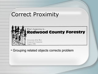
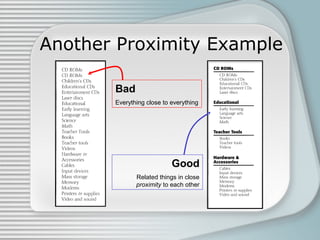
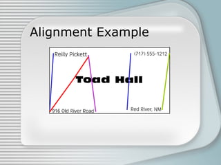
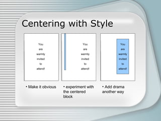
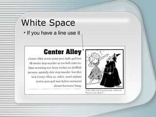
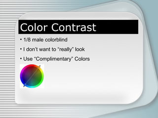
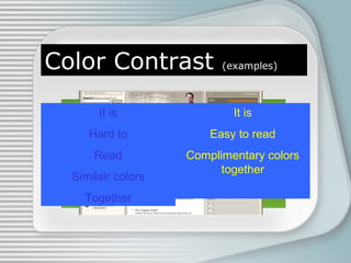
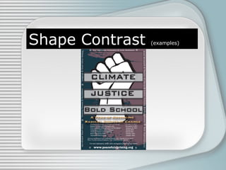
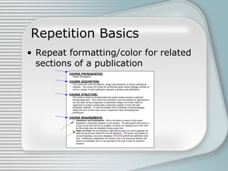
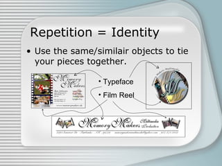
You’ve Got the Look
Principles of Effective
Graphic & Publication Design
Four Basic Principles
•
•
•
•

Contrast
Repetition
Alignment
Proximity
Proximity
• Group Related Items Together

• Keep space between unrelated items
Bad Proximity Example

What must Mike “The Eye” do to make it around
this card?
Good Proximity Example

What must Mike “The Eye” do to make it around
this card?
Misused Proximity

• None related objects in proximity gain an
unwanted relationship
Correct Proximity

• Grouping related objects corrects problem
Another Proximity Example
Bad
Everything close to everything

Good
Related things in close
proximity to each other
Another Proximity Example
White Space
Active White Space:
-Provides the eye a “breath” while reading the
design.
-Breaks up ideas
Passive White Space (2 kinds):
-Passive Object Space (like between letters)
-Space on a page that serves no design point
White Space
White Space
White Space
Check Your Proximity
• Squint your eyes
– Less the 3-5 is good

• Group with purpose
Another Proximity Example
Alignment
• Not just left, right, center, anymore

Apurposee n t
lI g m
• Place with
• Visual connections
Alignment Example
Right Alignment Example
Alignment in Web Design
Center Alignment = Bad
• Formal
• Sedate
• Amatuer
• Boring!
Which looks more
professional???
Centering with Style
You
You
are
are

You

You

are

are

warmly
warmly
invited
invited

warmly

warmly

invited

invited

to
to
attend!
attend!

to

to

attend!

attend!

• Make it obvious

• experiment with
the centered
block

• Add drama
another way
Justified text
• Spaces letters so they fill the text box
• Hard to use, hard to master
This text is being
justified inside a text
box. Because of the
wording it has all
sorts
of
funny
spacing
Justified text
Justified text
White Space
• Don’t trap white space
White Space
• If you have a line use it
Summing Up Alignment
• Find the lines and use them
• Stay away from Center
• Everything has a purpose
Another Proximity Example
Contrast
Contrast
Definition
The difference in visual properties that makes an
object (or its representation in an image)
distinguishable from other objects and the
background.
en.wikipedia.org/wiki/Contrast
Color Contrast
• 1/8 male colorblind
• I don’t want to “really” look
• Use “Complimentary” Colors
Color Contrast

(examples)

It is

It is

Hard to

Easy to read

Read

Complimentary colors
together

Similair colors
Together
Color Contrast

(examples)
Color Contrast

(examples)
Color Meaning

(color break)

The following site has an incredible (and incredibly
fun) look into colors, their meaning, and the best
way to use them. Enjoy!
http://www.mariaclaudiacortes.com/colors/Colors.html
Size Contrast
• Differences effect where and how we look
• Big objects demand attention
• Small objects can be overlooked
• Great differences in size can draw extra
attention to objects
Size Contrast

(examples)
Size Contrast

(examples)
Size Contrast

(examples)
Size Contrast

(examples)
Shape Contrast
• Shapes can hide or highlight
• Shapes guide us through the document
Shape Contrast

(examples)
Shape Contrast

(examples)
Shape Contrast

(examples)
Contrast
• Keep color, size and shape in mind always
• When in doubt Switch it out
Another Proximity Example
Repetition
• Repeat some aspect of the design
throughout the entire piece.
• Repeat some aspect of the design
throughout the entire piece.
Repetition Basics
• Repeat formatting/color for related
sections of a publication
Repetition = Review
• No repetition your eyes just wander
off the page
Repetition = Review
• Repeating an element makes the
eyes bounce.
Repetition = Identity
• Use the same/similair objects to tie
your pieces together.
• Typeface
• Film Reel
Another Proximity Example
CARP – Grading
• PS – Proximity Space
• PO – Proximity Objects
• CS – Contrast Shape
• CC – Contrast Color
• CZ – Contrast Size
• RD – Repetition Design
• RF – Repetition Formatting/Font
• AO – Alignment of Objects
• AL – Alignment Using implied Lines

Design principles