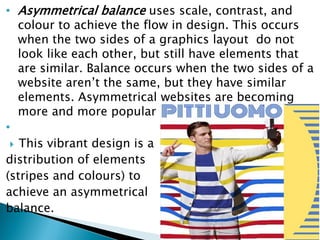
 Graphic design is the process of visual
communication and problem-solving through the
use of typography, visual arts and page layout
techniques to create visual compositions.
 By its definition of communication is “the art and
practice of planning and projecting ideas and
experiences with visual and textual content”. It
can be in any physical or virtual form, may it be
images, words or graphics.
 Graphic designers create and combine symbols,
images and text to form visual representations of
ideas and messages.
A designer put some thought into making
these symbols easy to understand
 Designers achieve their goals by
combining the elements and principles of
graphic design.
 Design elements refer to the fundamental
components of a design composition,
while
 Design principles refer to the way those
elements are used together.
 The first fundamental element of Graphics
design is the line, which is the starting
point for most designers.
 In the context of graphic design, line is
defined as two connected points in space.
 Lines can be vertical, horizontal, diagonal
or curved. They can be any width (thick,
thin) or texture( smooth or rough) solid
and non-solid, dashed, dotted, continuous
or broken as shown

 Color is the second element of Graphics design,
and similar to line, color can be used to set
mood or tone of a design.
 For example,
◦ Green and blue, tend to have a calm and
relaxed appeal.
◦ Red and orange, are more powerful and
passionate.
 Color is often deemed to be an important
element of design as it is a universal language
which presents the countless possibilities of
visual communication
 Hue, saturation, and intensity are the three
characteristics that describe color.
◦ Hue: Often used as just a fancy name for
color (ie. magenta, yellow, green, blue, red),
but it also means a pure color before any
black or white is added to it.
◦ Saturation gives a color brightness or
dullness, which impacts the vibrance of the
color.
◦ Intensity: Speaks to the purity of a color. A
true hue is said to have a high intensity,
whereas shade, tint or tone has a low
intensity.
 Shade: The addition of
black to a hue, making it
a darker version of the
pure color.
 Tint: The addition of
white to a hue, making it
a lighter version of the
pure color.
 Tone: The addition of
grey to a hue, making a
muted version of the
pure color.
 Value describes the range of
lightness and darkness of an
color.
 The value of design
represents a how dark or
light it looks to the
audience. It also creates
emphasis and contrast.
 Color is used to
◦ create harmony, balance, and visual
comfort in a design.
◦ evoke the desired mood and emotion
upon the viewer
◦ create a theme in the design
 Color holds meaning and can be symbolic. In
certain cultures, different colors can have
different meanings.
 Color is used to put emphasis on desired
elements Color can create identity a certain
brand or design product
 Texture relates to the surface of an object.
Using texture in graphic design adds depth
and visual interest.
 Shapes are basic geometric symbols such as
squares, circles, and triangles or any other abstract
shape; most of the designs include at least one of
these. Moreover, shapes can also be icons,
symbols.
 Graphics designers use it a lot, because they are
often based on illustrations and drawings.
 Shapes help the designer to add interest or
organize elements of a design. Shapes can have
symbolic meanings, invoke feelings or be used to
direct the eye to the most important information.
 If you look closely into different graphic designs,
the shapes used in them make them more
interesting and enticing.
 Shapes can be described in three ways:
Mechanical, organic or abstract.
◦ Mechanical shapes are those with hard edges
and are usually geometric, offering a feeling of
stability and order in a design. Geometric
(Circles, Squares, Triangles etc.),
◦ Organic shapes are irregular and often feature
curves or unexpected angles, which creates a
more natural and expressive design. Natural
(leaves, trees, people etc.) and
◦ Abstract shapes are things like letters, icons or
symbols and can help convey a message.
abstract (icons, and graphic representations).
 The space and how it is used is crucially
important in design. Lately the “white space”
(also called negative space) became used widely
because it allows the human eye to read easier.
 White space is area of the design which is only
filled with the background color.
 White space, or negative
space, describes the
empty part of the design
composition, or the part
of the design canvas that
is left untouched.
 Allowing for enough
white space helps a
design feel organized
and uncluttered, and it
can be used to
communicate the
designer’s concept
further.
 Form refers to objects that are three-
dimensional and is useful concept for defining
space, adding volume to a composition and
adding contrast.
 A form will always have height, width and depth,
which can be accomplished using other design
elements such as value, line and shape.
 Design principles are rules or a set of guidelines
based on practice for using design elements
together effectively, that a designer should
follow.
 These principles are guidelines that are used to
visually communicate the ideas represented by
the elements.
 The use of design principles can either help or
hurt the functionality and stylistic of your
Graphic.
 It is important to consider the elements that you
chose to include.
 These said principles are the following:
◦ balance,
◦ Alignment,
◦ Hierarchy
◦ Dominance and Emphasis
◦ Contrast
◦ proximity,
◦ repetition,
 Balance is the distribution of the various visual
weights of the elements used in the visual
presentation.
 Balance is how the elements of a design are
distributed throughout a layout.
 All elements of design hold a visual weight. The
principle of balance speaks to the even, but not
necessarily equal distribution of design
elements.
 If the balance is good, then stability is assured.
Balance makes a design feel stable and is
considered when designers make layout and
composition decisions.
 When a design is unbalanced, it feels
uncomfortable because the elements and
composition don’t make sense.
 Balance is also achieved by using color, shape,
position, value, texture and eye direction.
 In other times, a designer puts an unbalanced
design intentionally to focus attention on a single
element.
 However, you need to
know the rules for
unbalanced designs.
 There are three types of balance: symmetrical,
asymmetrical and radial.
◦ Symmetrical balance is when the weight of
elements is evenly divided on either side of the
design. This takes place when both sides of a
design are the same in shape, lines, texture and
so on or when both sides of a page layout are
the same in weight, shape, lines and other
elements.
• Asymmetrical balance uses scale, contrast, and
colour to achieve the flow in design. This occurs
when the two sides of a graphics layout do not
look like each other, but still have elements that
are similar. Balance occurs when the two sides of a
website aren’t the same, but they have similar
elements. Asymmetrical websites are becoming
more and more popular nowadays
•
 This vibrant design is a
distribution of elements
(stripes and colours) to
achieve an asymmetrical
balance.
◦ The radius balance takes place when design
elements are placed in a circular pattern. They
give a sense of movement, dynamism, but it is
not seen very often on the internet, because
even the most experienced designers have
problems laying out such a design.
 Alignment refers to lining up the elements of a
design along the top, bottom, center, or sides of
the elements.
 The aligned elements aren't necessarily of the
same kind.
 Alignment is one of the most basic, but most
important principles of design, as it allows our
eyes to see order, which is quite comforting to a
reader.
 It gives an ordered appearance to images,
shapes, and blocks of texts.
 Aligning elements allows them to create a visual
connection with each other and helps with
readability
 For example: The alignment
extends across the multiple
pages of the menu so that
the images, headings and
information always align.
 The type aligns to the left,
while all of the prices align
to the right.
 This creates a visual
connection between the
elements, simplifies the
layout and ensures the
viewer always knows where
to find the information they
are looking for.
• Alignment allows us to create order and organization.
 Hierarchy is the order in which a viewer looks at
design elements within a composition.
 A designer only has a
few seconds to capture
attention, so it’s
important to let the
viewer know where to
look first, second, third,
and so on.
 Hierarchy can be achieved in various ways
◦ using larger or bolder fonts to highlight the
title;
◦ placing the key message higher than the other
design elements; or
◦ adding focus to larger, more detailed and more
colourful visuals than those less relevant or
smaller images.
 The eye is naturally drawn to larger parts of the
design first, so viewers tend to always look at the
largest object before anything else.
 In design terms, that means a large object will
have more hierarchy than a smaller object.
 Another tendency of the human eye is to look for
anything irregular in a design or pattern. If an
element has a different visual weight than the
other elements in the design, it will have more
hierarchy.
 Example: In this design,
you can easily point out
the heading, date, stars
shapes, image and also,
then text at the bottom
 A dominant design element is the focal point of
your design and where the viewer’s eye spends
the most time.
 These design elements will be highlighted to
have more hierarchy than others within the
composition.
 Making these elements larger in size or brighter
in color are two ways to accomplish this effect.
 The general rule is to make sure the area you
want to highlight is in contrast to the rest of the
design, whether that be in size, shape, color,
texture, etc.
 For example there is no dominant object in this
image, and as such your eyes don’t know where to
go because there is no focal point in the image.
 In this second image, one boat is now clearly
larger than all the others. Dominance has
entered the picture.
 Emphasis is created by contrasting size, color,
style, positioning or shape. The focal point should
dominate the design with scale and contrast
without sacrificing the unity of the whole. For
example these book title pages
 Contrast allows us to
emphasize or highlight
key elements in your
design.
 Contrast is the most
effective way to create
emphasis and impact
with your design.
 For example, the contrast between deep blue of
the external packaging and the bright orange
hint of the interior is exciting the viewer to open
the box.
 Once they do, a further contrast is revealed, this
add a sense of delight to the unpacking of the
item.

 Proximity creates relationship between elements.
It provides a focal point.
 When it comes to graphic design, Proximity
means keeping items that go together connected
 Proximity does not necessarily mean elements
should be positioned closely together..
 Proximity helps in creating a relationship between
similar or related elements. These elements need
not be grouped, instead, they should be visually
connected by way of font, colour, size, etc.
 The above is an example of ‘Proximity.’ Here, a
consistent shape (circle) and colours create an
organised design.
 Repetition means, repeating similar elements and
their characteristics that appear as a complete
unit.
 It could also mean creating a design rhythm, this
said rhythm could be a series of elements with
the same color, type, and size.
 This is to contribute the consistency of the
design.
 By repeating elements of a design, you
immediately create a familiarity or identity
 Let’s look at some examples of repetition in
graphic design. There is repetition of the
position of the logo and it uses the same fonts.
Each one has different colors and illustrations to
distinguish the different flavors, but they are all
similar enough to recognize that they are part of
the same family
 Repetition can be used to create graphic
elements, such as patterns;
 Discuss the relationship between Graphics design
elements and Principles
 Explain the function of design elements in graphics
design
 Describe three characteristics of color
 Explain the importance of value in graphics design
 Describe basic principles of graphics design

Practical Lecture 3_Graphics Elements and Principles.pdf

  • 2.
     Graphic designis the process of visual communication and problem-solving through the use of typography, visual arts and page layout techniques to create visual compositions.  By its definition of communication is “the art and practice of planning and projecting ideas and experiences with visual and textual content”. It can be in any physical or virtual form, may it be images, words or graphics.  Graphic designers create and combine symbols, images and text to form visual representations of ideas and messages.
  • 3.
    A designer putsome thought into making these symbols easy to understand
  • 4.
     Designers achievetheir goals by combining the elements and principles of graphic design.  Design elements refer to the fundamental components of a design composition, while  Design principles refer to the way those elements are used together.
  • 6.
     The firstfundamental element of Graphics design is the line, which is the starting point for most designers.  In the context of graphic design, line is defined as two connected points in space.  Lines can be vertical, horizontal, diagonal or curved. They can be any width (thick, thin) or texture( smooth or rough) solid and non-solid, dashed, dotted, continuous or broken as shown 
  • 8.
     Color isthe second element of Graphics design, and similar to line, color can be used to set mood or tone of a design.  For example, ◦ Green and blue, tend to have a calm and relaxed appeal. ◦ Red and orange, are more powerful and passionate.  Color is often deemed to be an important element of design as it is a universal language which presents the countless possibilities of visual communication
  • 9.
     Hue, saturation,and intensity are the three characteristics that describe color. ◦ Hue: Often used as just a fancy name for color (ie. magenta, yellow, green, blue, red), but it also means a pure color before any black or white is added to it. ◦ Saturation gives a color brightness or dullness, which impacts the vibrance of the color. ◦ Intensity: Speaks to the purity of a color. A true hue is said to have a high intensity, whereas shade, tint or tone has a low intensity.
  • 10.
     Shade: Theaddition of black to a hue, making it a darker version of the pure color.  Tint: The addition of white to a hue, making it a lighter version of the pure color.  Tone: The addition of grey to a hue, making a muted version of the pure color.
  • 11.
     Value describesthe range of lightness and darkness of an color.  The value of design represents a how dark or light it looks to the audience. It also creates emphasis and contrast.
  • 12.
     Color isused to ◦ create harmony, balance, and visual comfort in a design. ◦ evoke the desired mood and emotion upon the viewer ◦ create a theme in the design  Color holds meaning and can be symbolic. In certain cultures, different colors can have different meanings.  Color is used to put emphasis on desired elements Color can create identity a certain brand or design product
  • 13.
     Texture relatesto the surface of an object. Using texture in graphic design adds depth and visual interest.
  • 14.
     Shapes arebasic geometric symbols such as squares, circles, and triangles or any other abstract shape; most of the designs include at least one of these. Moreover, shapes can also be icons, symbols.  Graphics designers use it a lot, because they are often based on illustrations and drawings.  Shapes help the designer to add interest or organize elements of a design. Shapes can have symbolic meanings, invoke feelings or be used to direct the eye to the most important information.  If you look closely into different graphic designs, the shapes used in them make them more interesting and enticing.
  • 15.
     Shapes canbe described in three ways: Mechanical, organic or abstract. ◦ Mechanical shapes are those with hard edges and are usually geometric, offering a feeling of stability and order in a design. Geometric (Circles, Squares, Triangles etc.), ◦ Organic shapes are irregular and often feature curves or unexpected angles, which creates a more natural and expressive design. Natural (leaves, trees, people etc.) and ◦ Abstract shapes are things like letters, icons or symbols and can help convey a message. abstract (icons, and graphic representations).
  • 16.
     The spaceand how it is used is crucially important in design. Lately the “white space” (also called negative space) became used widely because it allows the human eye to read easier.  White space is area of the design which is only filled with the background color.
  • 17.
     White space,or negative space, describes the empty part of the design composition, or the part of the design canvas that is left untouched.  Allowing for enough white space helps a design feel organized and uncluttered, and it can be used to communicate the designer’s concept further.
  • 18.
     Form refersto objects that are three- dimensional and is useful concept for defining space, adding volume to a composition and adding contrast.  A form will always have height, width and depth, which can be accomplished using other design elements such as value, line and shape.
  • 20.
     Design principlesare rules or a set of guidelines based on practice for using design elements together effectively, that a designer should follow.  These principles are guidelines that are used to visually communicate the ideas represented by the elements.  The use of design principles can either help or hurt the functionality and stylistic of your Graphic.  It is important to consider the elements that you chose to include.
  • 21.
     These saidprinciples are the following: ◦ balance, ◦ Alignment, ◦ Hierarchy ◦ Dominance and Emphasis ◦ Contrast ◦ proximity, ◦ repetition,
  • 22.
     Balance isthe distribution of the various visual weights of the elements used in the visual presentation.  Balance is how the elements of a design are distributed throughout a layout.  All elements of design hold a visual weight. The principle of balance speaks to the even, but not necessarily equal distribution of design elements.  If the balance is good, then stability is assured. Balance makes a design feel stable and is considered when designers make layout and composition decisions.
  • 23.
     When adesign is unbalanced, it feels uncomfortable because the elements and composition don’t make sense.  Balance is also achieved by using color, shape, position, value, texture and eye direction.  In other times, a designer puts an unbalanced design intentionally to focus attention on a single element.  However, you need to know the rules for unbalanced designs.
  • 24.
     There arethree types of balance: symmetrical, asymmetrical and radial. ◦ Symmetrical balance is when the weight of elements is evenly divided on either side of the design. This takes place when both sides of a design are the same in shape, lines, texture and so on or when both sides of a page layout are the same in weight, shape, lines and other elements.
  • 25.
    • Asymmetrical balanceuses scale, contrast, and colour to achieve the flow in design. This occurs when the two sides of a graphics layout do not look like each other, but still have elements that are similar. Balance occurs when the two sides of a website aren’t the same, but they have similar elements. Asymmetrical websites are becoming more and more popular nowadays •  This vibrant design is a distribution of elements (stripes and colours) to achieve an asymmetrical balance.
  • 26.
    ◦ The radiusbalance takes place when design elements are placed in a circular pattern. They give a sense of movement, dynamism, but it is not seen very often on the internet, because even the most experienced designers have problems laying out such a design.
  • 27.
     Alignment refersto lining up the elements of a design along the top, bottom, center, or sides of the elements.  The aligned elements aren't necessarily of the same kind.  Alignment is one of the most basic, but most important principles of design, as it allows our eyes to see order, which is quite comforting to a reader.  It gives an ordered appearance to images, shapes, and blocks of texts.  Aligning elements allows them to create a visual connection with each other and helps with readability
  • 28.
     For example:The alignment extends across the multiple pages of the menu so that the images, headings and information always align.  The type aligns to the left, while all of the prices align to the right.  This creates a visual connection between the elements, simplifies the layout and ensures the viewer always knows where to find the information they are looking for. • Alignment allows us to create order and organization.
  • 29.
     Hierarchy isthe order in which a viewer looks at design elements within a composition.  A designer only has a few seconds to capture attention, so it’s important to let the viewer know where to look first, second, third, and so on.
  • 30.
     Hierarchy canbe achieved in various ways ◦ using larger or bolder fonts to highlight the title; ◦ placing the key message higher than the other design elements; or ◦ adding focus to larger, more detailed and more colourful visuals than those less relevant or smaller images.  The eye is naturally drawn to larger parts of the design first, so viewers tend to always look at the largest object before anything else.  In design terms, that means a large object will have more hierarchy than a smaller object.
  • 31.
     Another tendencyof the human eye is to look for anything irregular in a design or pattern. If an element has a different visual weight than the other elements in the design, it will have more hierarchy.  Example: In this design, you can easily point out the heading, date, stars shapes, image and also, then text at the bottom
  • 32.
     A dominantdesign element is the focal point of your design and where the viewer’s eye spends the most time.  These design elements will be highlighted to have more hierarchy than others within the composition.  Making these elements larger in size or brighter in color are two ways to accomplish this effect.  The general rule is to make sure the area you want to highlight is in contrast to the rest of the design, whether that be in size, shape, color, texture, etc.
  • 33.
     For examplethere is no dominant object in this image, and as such your eyes don’t know where to go because there is no focal point in the image.
  • 34.
     In thissecond image, one boat is now clearly larger than all the others. Dominance has entered the picture.
  • 35.
     Emphasis iscreated by contrasting size, color, style, positioning or shape. The focal point should dominate the design with scale and contrast without sacrificing the unity of the whole. For example these book title pages
  • 36.
     Contrast allowsus to emphasize or highlight key elements in your design.  Contrast is the most effective way to create emphasis and impact with your design.
  • 37.
     For example,the contrast between deep blue of the external packaging and the bright orange hint of the interior is exciting the viewer to open the box.  Once they do, a further contrast is revealed, this add a sense of delight to the unpacking of the item. 
  • 38.
     Proximity createsrelationship between elements. It provides a focal point.  When it comes to graphic design, Proximity means keeping items that go together connected  Proximity does not necessarily mean elements should be positioned closely together..
  • 39.
     Proximity helpsin creating a relationship between similar or related elements. These elements need not be grouped, instead, they should be visually connected by way of font, colour, size, etc.  The above is an example of ‘Proximity.’ Here, a consistent shape (circle) and colours create an organised design.
  • 40.
     Repetition means,repeating similar elements and their characteristics that appear as a complete unit.  It could also mean creating a design rhythm, this said rhythm could be a series of elements with the same color, type, and size.  This is to contribute the consistency of the design.  By repeating elements of a design, you immediately create a familiarity or identity
  • 41.
     Let’s lookat some examples of repetition in graphic design. There is repetition of the position of the logo and it uses the same fonts. Each one has different colors and illustrations to distinguish the different flavors, but they are all similar enough to recognize that they are part of the same family
  • 42.
     Repetition canbe used to create graphic elements, such as patterns;
  • 43.
     Discuss therelationship between Graphics design elements and Principles  Explain the function of design elements in graphics design  Describe three characteristics of color  Explain the importance of value in graphics design  Describe basic principles of graphics design