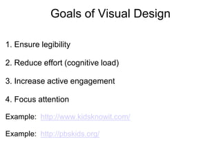
1. The document discusses visual principles for instructional design including ensuring legibility, reducing cognitive load, focusing attention, and engaging the audience.
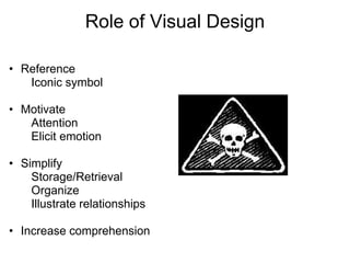
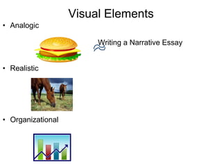
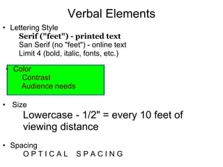
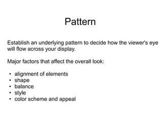
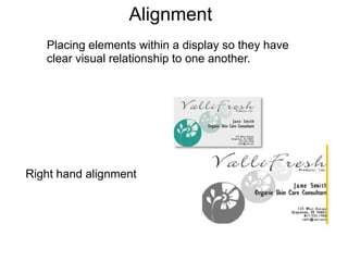
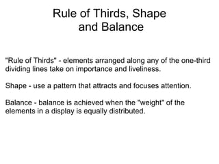
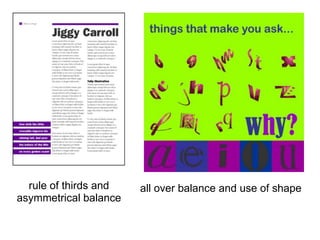
2. It addresses elements of visual design like icons, text formatting, color, alignment, and use of grids to guide the eye across a layout. Principles of design discussed include the rule of thirds, asymmetry, proximity, and consistency.
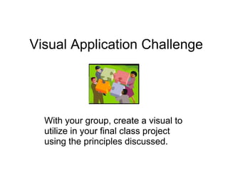
3. Examples are provided of how to use visual storyboards, checklists, and other planning tools to apply these design principles when creating visuals to enhance instruction.