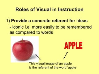
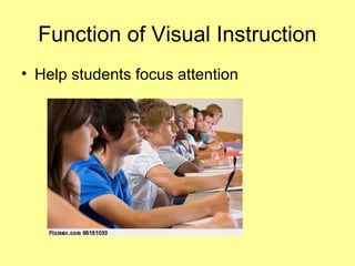
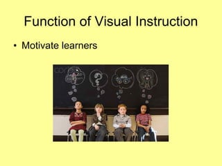
1) Visuals play important roles in instruction by providing concrete referents, motivating learners, and simplifying complex information.
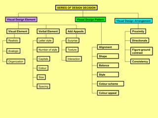
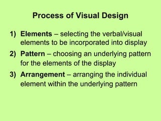
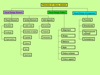
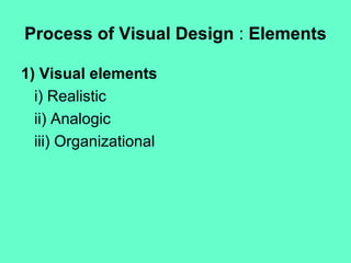
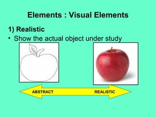
2) The process of visual design involves selecting elements, choosing a pattern, and arranging individual elements. Elements include visuals like photos and diagrams, as well as verbal elements like font, color, and size.
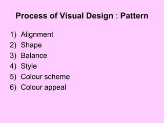
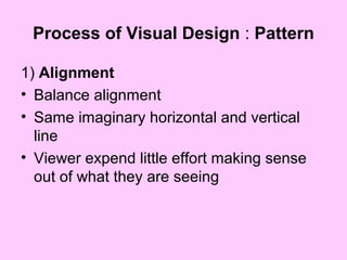
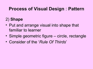
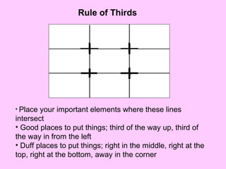
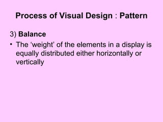
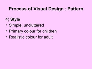
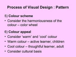
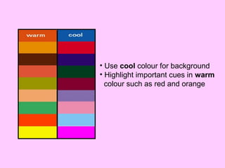
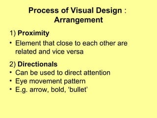
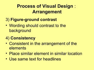
3) Patterns consider principles of alignment, shape, balance, style, and use of color to reduce cognitive load and focus attention. Arrangement uses proximity, directionals, contrast and consistency. Together, these help make visual information clear and understandable.