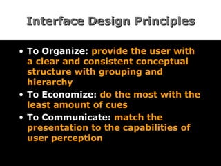
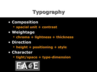
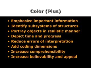
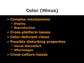
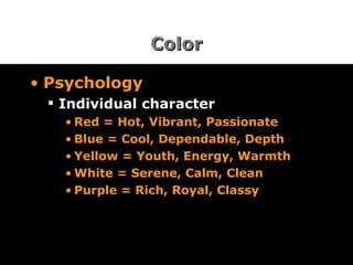
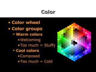
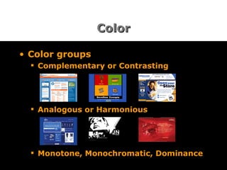
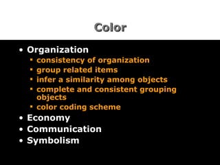
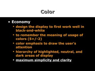
Effective Visual Communication Sinoj Mullangath
Communication Communication conveys “facts, concepts and emotions” To convey something, one requires a language and a medium A language requires letters, words, sentences and rules of usage (=grammar)
Visual Media Print Articles, Brochure, Manuals, Fine Arts Motion Films, Animations, Performances Interactive Websites, Online Help, CBTs, CD-ROM
Visible Language Layout Typography Color Texture Imagery Identity Sequencing Animation Sound
Arts versus Design Arts is a form of expression Design is a form of communication
Communication & Design Design*  is creating an interface that communicates the objective appropriately and clearly in that medium Medium Objective Appropriateness Clarity * In this context
Interface Design Principles To Organize:  provide the user with a clear and consistent conceptual structure with grouping and hierarchy  To Economize:  do the most with the least amount of cues  To Communicate:  match the presentation to the capabilities of user perception
Organize Consistency Internal:  same types of elements are shown in the same places External:  existing platforms and cultural conventions should be followed across user interfaces Real world:  consistent with real-world experiences, observations and perceptions of the user Innovation:  deviating from existing conventions, if it provides a clear benefit to the user
Organize Screen Layout Use a grid structure Define spaces Spread vs. Page Design Standardize the structure Easy to locate menus or dialogue boxes Group related elements
Organize Navigation provide an  initial focus  for the viewer's attention direct attention  to  primary, secondary, and peripheral items assist  in navigation  through the material simple  learning curve
Economize Four major points to be considered Simplicity:  include only the elements that are most important for communication Clarity:  meaning of the components are not ambiguous Distinctiveness:  important properties of the elements are distinct Emphasis:  important elements are easily perceived
Communicate To communicate successfully, the interface must keep in balance: Legibility Readability Symbolism Multiple views Typography Color
Legibility & Readability Easily noticeable and distinguishable elements Legible Typefaces Desktop Icons Control Panel Symbols Background Colors Usage Environment Comprehensible display Easy to identify and interpret Inviting and attractive
Symbolism To communicate the content efficiently, carefully select and refine Icons Symbols Charts Maps Diagrams Photographs
Typography Typefaces Legible, clear and distinctive type faces to distinguish between different classes of information (max 3 faces) Typestyles Point size, italics, boldness, underline, color (max 3 styles) Typesetting 40-60 char per line, flush left, avoid centering or justified or all caps text in a line, proper word spacing, paragraph indentation, and line spacing
Typography Composition spacial unit + contrast Weightage chroma + lightness + thickness Direction height + positioning + style Character tight/space + type-dimension
Color (Plus) Emphasize important information  Identify subsystems of structures  Portray objects in realistic manner  Depict time and progress  Reduce errors of interpretation  Add coding dimensions  Increase comprehensibility  Increase believability and appeal
Color (Minus) Complex mechanisms Display Reproduction Cross-platform issues Color-deficient vision Possible disturbing properties Visual discomfort Afterimages Cross-culture issues
Color Psychology Individual character Red = Hot, Vibrant, Passionate Blue = Cool, Dependable, Depth Yellow = Youth, Energy, Warmth White = Serene, Calm, Clean Purple = Rich, Royal, Classy
Color Color wheel Color groups Warm colors Welcoming Too much = Stuffy Cool colors Composed Too much = Cold
Color Color groups Complementary or Contrasting Analogous or Harmonious Monotone, Monochromatic, Dominance
Color Organization consistency of organization group related items infer a similarity among objects complete and consistent grouping objects  color coding scheme Economy Communication Symbolism
Color Economy design the display to first work well in black-and-white to remember the meaning of usage of colors (5+/-2) color emphasis to draw the user's attention hierarchy of highlighted, neutral, and dark areas of display   maximum simplicity and clarity
Color Communication appropriate colors for the central and peripheral areas color area vs. weightage difference in chroma and value environment & background Symbolism existing cultural and professional usage connotations in cultures
Print vs Online Space/ Gravity:  Defined vs. Open Composition:  Planned vs. Changing  Volume:  Pages vs. Scroll Structure:  Sequential vs. Random User:  Participate vs. Anticipate Character:  Static vs. Dynamic Usage:  confine vs. Freedom Communication:  One-way vs. Two-way
Print OR Online Visual form consists of Primary element(s) Secondary element(s) Peripherals Grid White spaces Blind spots Fillers
God is in the details [email_address]

Effective Visual Communication

  • 1.
  • 2.
    Communication Communication conveys“facts, concepts and emotions” To convey something, one requires a language and a medium A language requires letters, words, sentences and rules of usage (=grammar)
  • 3.
    Visual Media PrintArticles, Brochure, Manuals, Fine Arts Motion Films, Animations, Performances Interactive Websites, Online Help, CBTs, CD-ROM
  • 4.
    Visible Language LayoutTypography Color Texture Imagery Identity Sequencing Animation Sound
  • 5.
    Arts versus DesignArts is a form of expression Design is a form of communication
  • 6.
    Communication & DesignDesign* is creating an interface that communicates the objective appropriately and clearly in that medium Medium Objective Appropriateness Clarity * In this context
  • 7.
    Interface Design PrinciplesTo Organize: provide the user with a clear and consistent conceptual structure with grouping and hierarchy To Economize: do the most with the least amount of cues To Communicate: match the presentation to the capabilities of user perception
  • 8.
    Organize Consistency Internal: same types of elements are shown in the same places External: existing platforms and cultural conventions should be followed across user interfaces Real world: consistent with real-world experiences, observations and perceptions of the user Innovation: deviating from existing conventions, if it provides a clear benefit to the user
  • 9.
    Organize Screen LayoutUse a grid structure Define spaces Spread vs. Page Design Standardize the structure Easy to locate menus or dialogue boxes Group related elements
  • 10.
    Organize Navigation providean initial focus for the viewer's attention direct attention to primary, secondary, and peripheral items assist in navigation through the material simple learning curve
  • 11.
    Economize Four majorpoints to be considered Simplicity: include only the elements that are most important for communication Clarity: meaning of the components are not ambiguous Distinctiveness: important properties of the elements are distinct Emphasis: important elements are easily perceived
  • 12.
    Communicate To communicatesuccessfully, the interface must keep in balance: Legibility Readability Symbolism Multiple views Typography Color
  • 13.
    Legibility & ReadabilityEasily noticeable and distinguishable elements Legible Typefaces Desktop Icons Control Panel Symbols Background Colors Usage Environment Comprehensible display Easy to identify and interpret Inviting and attractive
  • 14.
    Symbolism To communicatethe content efficiently, carefully select and refine Icons Symbols Charts Maps Diagrams Photographs
  • 15.
    Typography Typefaces Legible,clear and distinctive type faces to distinguish between different classes of information (max 3 faces) Typestyles Point size, italics, boldness, underline, color (max 3 styles) Typesetting 40-60 char per line, flush left, avoid centering or justified or all caps text in a line, proper word spacing, paragraph indentation, and line spacing
  • 16.
    Typography Composition spacialunit + contrast Weightage chroma + lightness + thickness Direction height + positioning + style Character tight/space + type-dimension
  • 17.
    Color (Plus) Emphasizeimportant information Identify subsystems of structures Portray objects in realistic manner Depict time and progress Reduce errors of interpretation Add coding dimensions Increase comprehensibility Increase believability and appeal
  • 18.
    Color (Minus) Complexmechanisms Display Reproduction Cross-platform issues Color-deficient vision Possible disturbing properties Visual discomfort Afterimages Cross-culture issues
  • 19.
    Color Psychology Individualcharacter Red = Hot, Vibrant, Passionate Blue = Cool, Dependable, Depth Yellow = Youth, Energy, Warmth White = Serene, Calm, Clean Purple = Rich, Royal, Classy
  • 20.
    Color Color wheelColor groups Warm colors Welcoming Too much = Stuffy Cool colors Composed Too much = Cold
  • 21.
    Color Color groupsComplementary or Contrasting Analogous or Harmonious Monotone, Monochromatic, Dominance
  • 22.
    Color Organization consistencyof organization group related items infer a similarity among objects complete and consistent grouping objects color coding scheme Economy Communication Symbolism
  • 23.
    Color Economy designthe display to first work well in black-and-white to remember the meaning of usage of colors (5+/-2) color emphasis to draw the user's attention hierarchy of highlighted, neutral, and dark areas of display maximum simplicity and clarity
  • 24.
    Color Communication appropriatecolors for the central and peripheral areas color area vs. weightage difference in chroma and value environment & background Symbolism existing cultural and professional usage connotations in cultures
  • 25.
    Print vs OnlineSpace/ Gravity: Defined vs. Open Composition: Planned vs. Changing Volume: Pages vs. Scroll Structure: Sequential vs. Random User: Participate vs. Anticipate Character: Static vs. Dynamic Usage: confine vs. Freedom Communication: One-way vs. Two-way
  • 26.
    Print OR OnlineVisual form consists of Primary element(s) Secondary element(s) Peripherals Grid White spaces Blind spots Fillers
  • 27.
    God is inthe details [email_address]

Editor's Notes

  • #2 Intro? Not telling CSS, JS, HTML, ASP or writing tools
  • #7 Spatial layout. Visible language elements
  • #8 Principles of …. Clear, consistent, concept
  • #9 1. Radio buttons, check boxes 2. Text tool 3. Stop signs in real world
  • #10 Design the spread visual not the page.
  • #11 Catch attention, eye movement, learning curve
  • #12 Simple -- unless your objective is to confuse, entertain, or beautify, in which cases, overindulgence may be justified.
  • #13 Legible fonts, in readable format
  • #16 Character of type faces. Letters, words, sentence, grouped sentences, message For fixed-width fonts, justified lines of text can slow reading speed by 12 percent.
  • #17 Spacing, smoothness, contrast, height, style, thickness
  • #18 Color is one of the most complex elements in achieving successful visual communication. Used correctly, it can be a powerful tool for communication When color is used correctly, people will often learn more. Memory for color information seems to be much better than information presented in black-and-white
  • #24 idea is to use color to augment black-and-white information Attention to the most important things
  • #25 Red or green should not be used in the periphery of the visual field, but in the center. If used in the periphery, you need a way to capture the attention of the viewer, size change or blinking for example. Blue, black, white, and yellow should be used near the periphery of the visual field, where the retina remains sensitive to these colors. Mail box in US = blue, UK = red, greece = yellow
  • #26 Book vs Dictionary on LOVE
  • #28 Questions… discussions