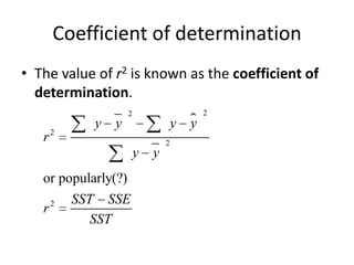
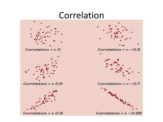
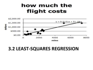
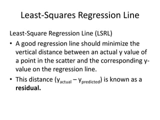
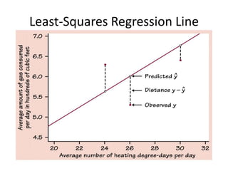
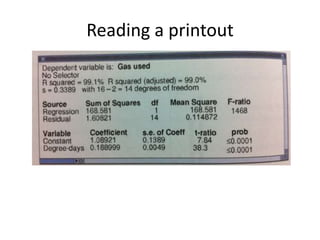
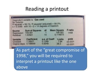
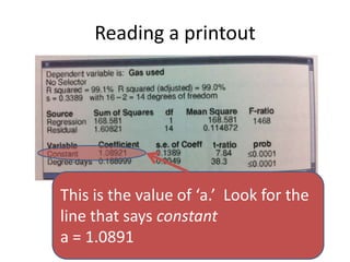
This chapter discusses examining relationships between two quantitative variables using scatterplots and correlation. Scatterplots show the relationship between an explanatory and response variable by plotting each data point. Correlation measures the strength and direction of the linear relationship between two variables on a scale of -1 to 1. The least squares regression line fits a straight line to minimize the residuals, or vertical distances between the data points and the line. It is used to model and make predictions about the relationship between two variables.


![Scatterplots on the TI-84
• [stat], [1] (Edit)
• Enter the explanatory variables in “L1”
• Enter the response variables in “L2”
– Make sure your L1 and L2 correspond
• [2nd], [Y=] (STATPLOT), [1]
– You can define a number of plots from here
• Turn “ON” the plot
• Choose the scatterplot (first icon)
• Xlist: “L1”
• Ylist: “L2”
• [zoom], [9] (zoomstat)
– I recommend starting with this zoom. Examine and take note of the
window!](https://image.slidesharecdn.com/statschapter3-101008190917-phpapp01/85/Stats-chapter-3-8-320.jpg)
![Scatterplots on the TI89
• From the “apps” choose the “stat/list”
• Enter the explanatory variables in “list1”
• Enter the response variables in “list2”
• [F2] (plots),[F1] (define)
• Plot Type: “scatter”
• x: “list1”
• y: “list2”
• [ENTER]
• (Zoomdata)](https://image.slidesharecdn.com/statschapter3-101008190917-phpapp01/85/Stats-chapter-3-9-320.jpg)
![LSRL on the TI83/84
1. Input data in L1 and L2
2. From home, *stat+, “CALC,” *8+ (LinReg a+bx)
3. On the home screen enter the variable list:
“LinReg L1, L2, Y1”
(this will copy and paste the LSRL into Y1)
AMAZING! It computes “r” for you, too!
4. [zoom], [9] (zoomstat)
Take a good look at your LSRL!](https://image.slidesharecdn.com/statschapter3-101008190917-phpapp01/85/Stats-chapter-3-34-320.jpg)
![LSRL on the TI89
1. On the “stat list” app, input data in “list1” and
“list2”
2. [F4] (calc)
3. Choose LinReg a+bx
4. Select “list1” and for the expl var and list2 resp
var
5. Select “y1” for “store list”
6. [ENTER] and behold the magic!
7. *F2+, “zoom data”](https://image.slidesharecdn.com/statschapter3-101008190917-phpapp01/85/Stats-chapter-3-35-320.jpg)
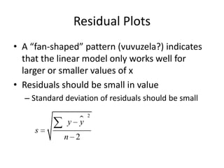
![Residual Plots
To create a residual plot on your TI,
1. Create a LSRL for your data
2. Choose a scatterplot from the [stat plot]
menu,
3. Set “Xlist: L1”
4. Set “Ylist: RESID” (*2nd+ ,*stat+,”NAMES”)
5. Turn off all other plots and graphs
6. [ZOOM], [9]](https://image.slidesharecdn.com/statschapter3-101008190917-phpapp01/85/Stats-chapter-3-38-320.jpg)