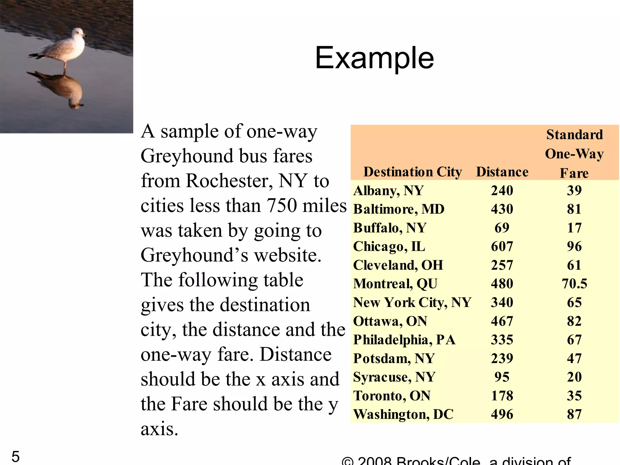
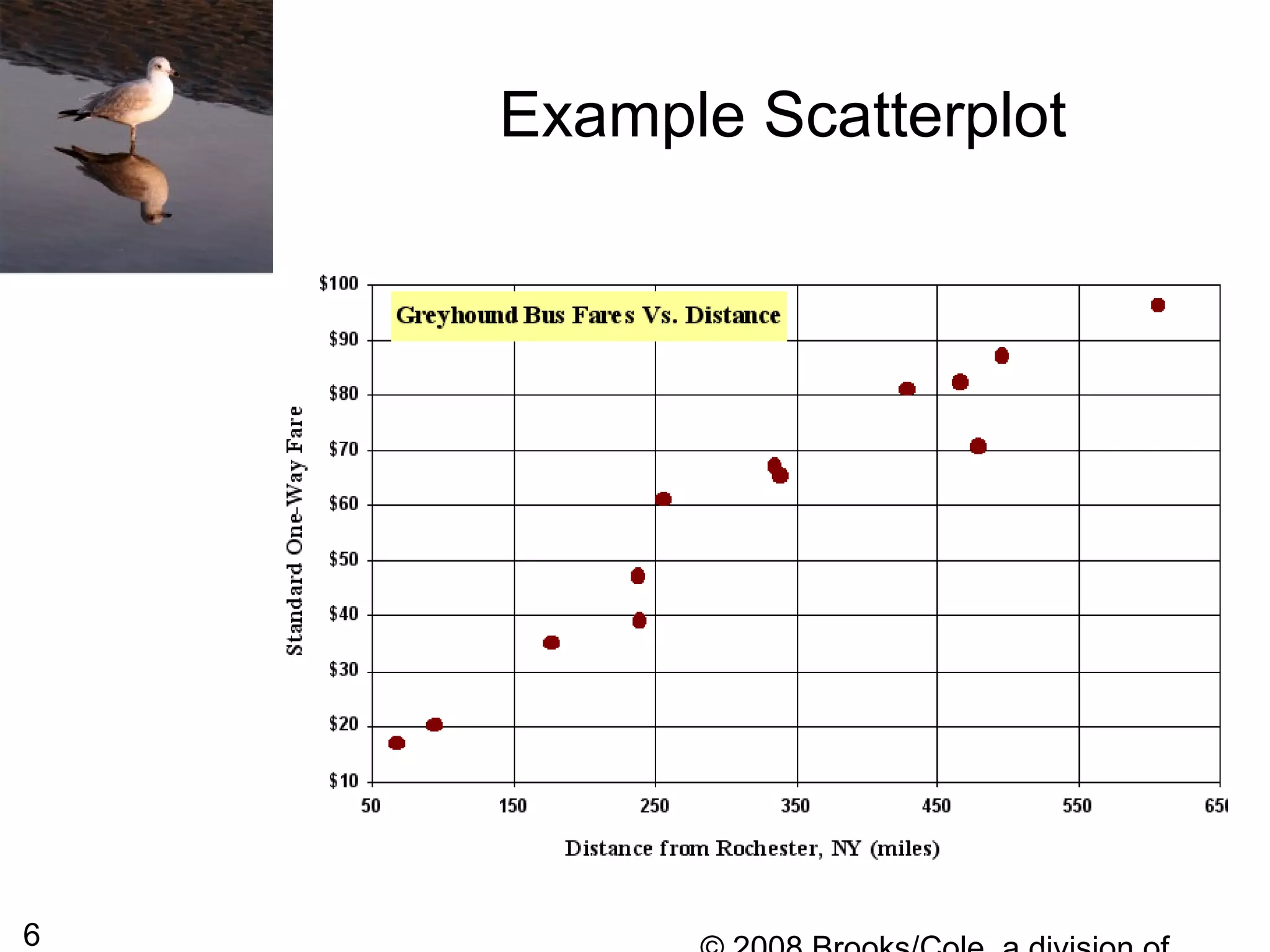
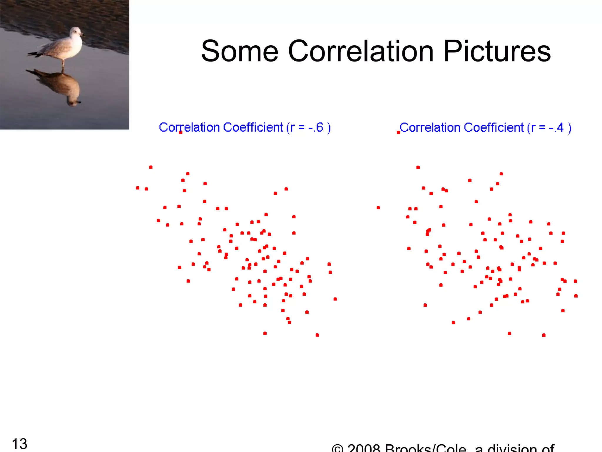
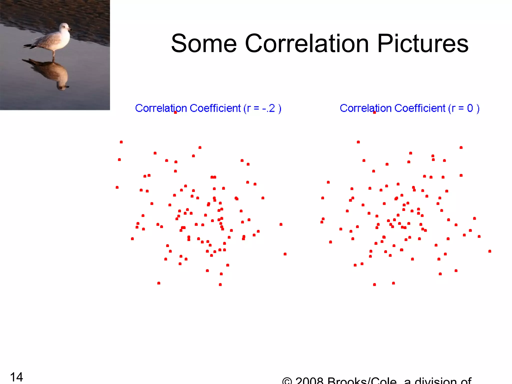
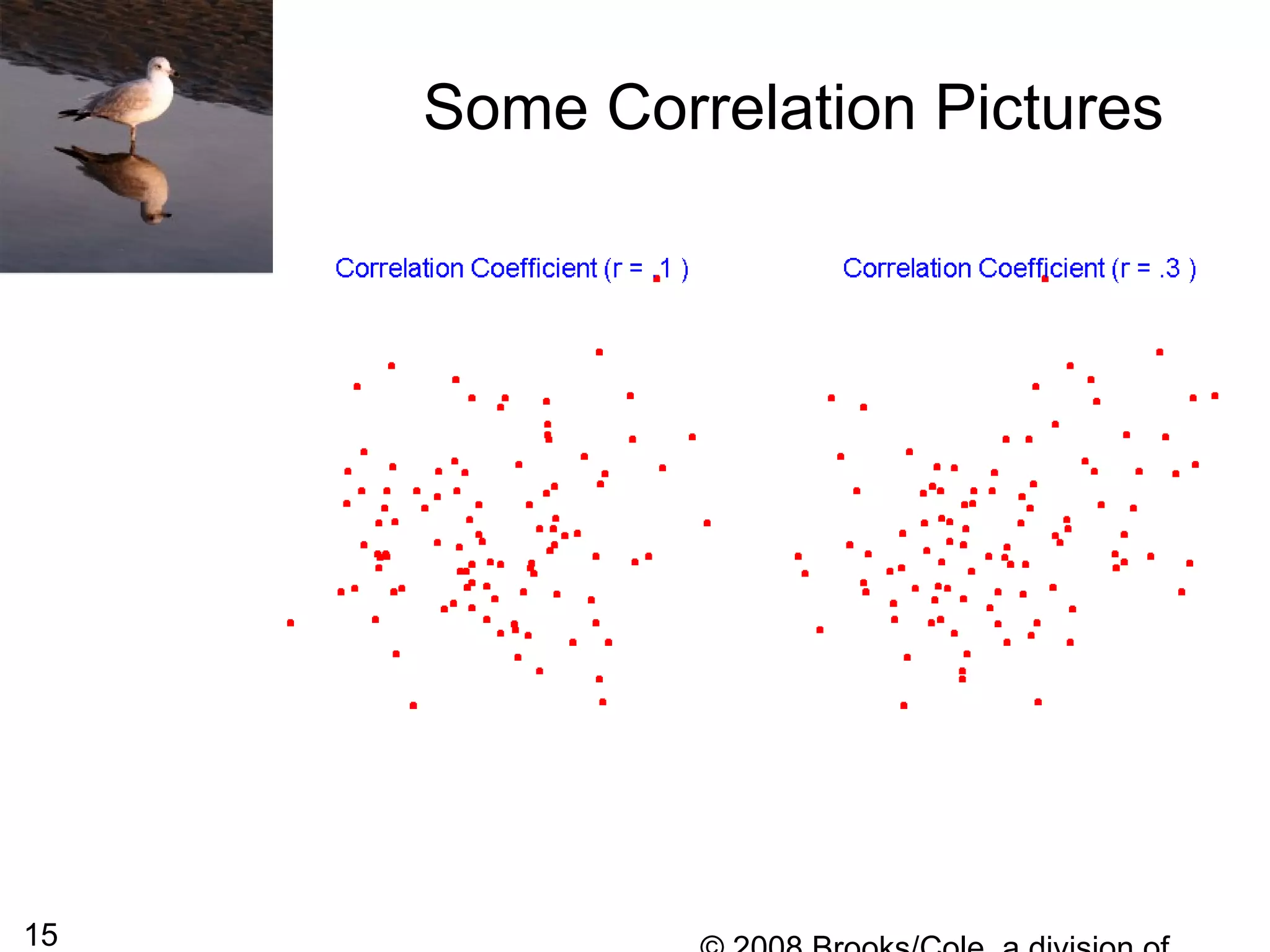
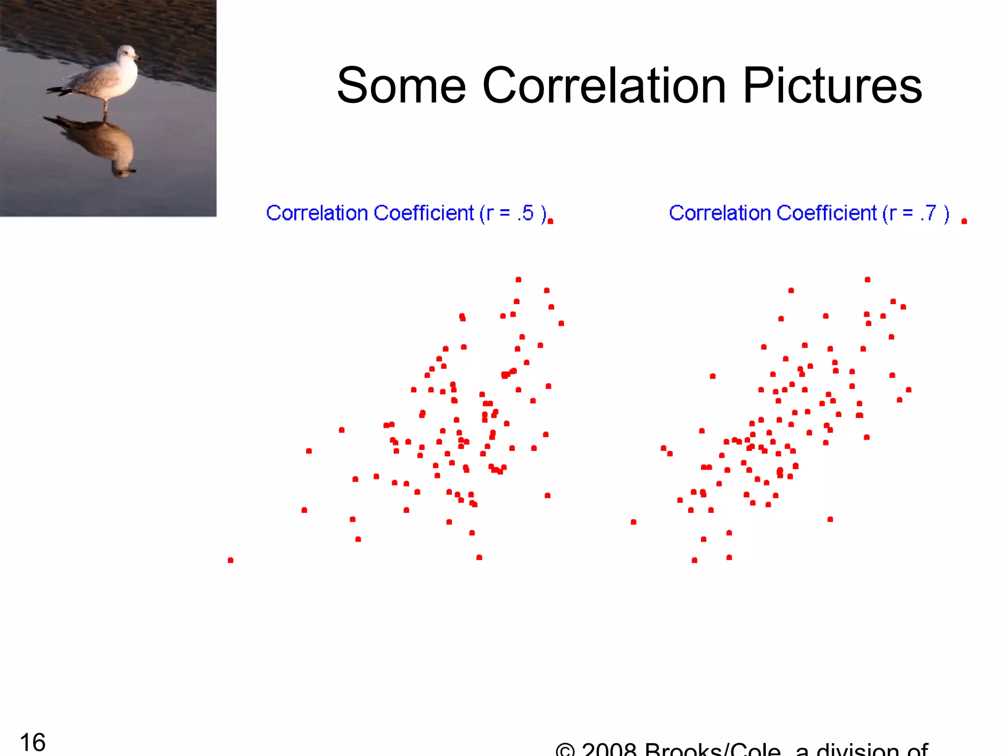
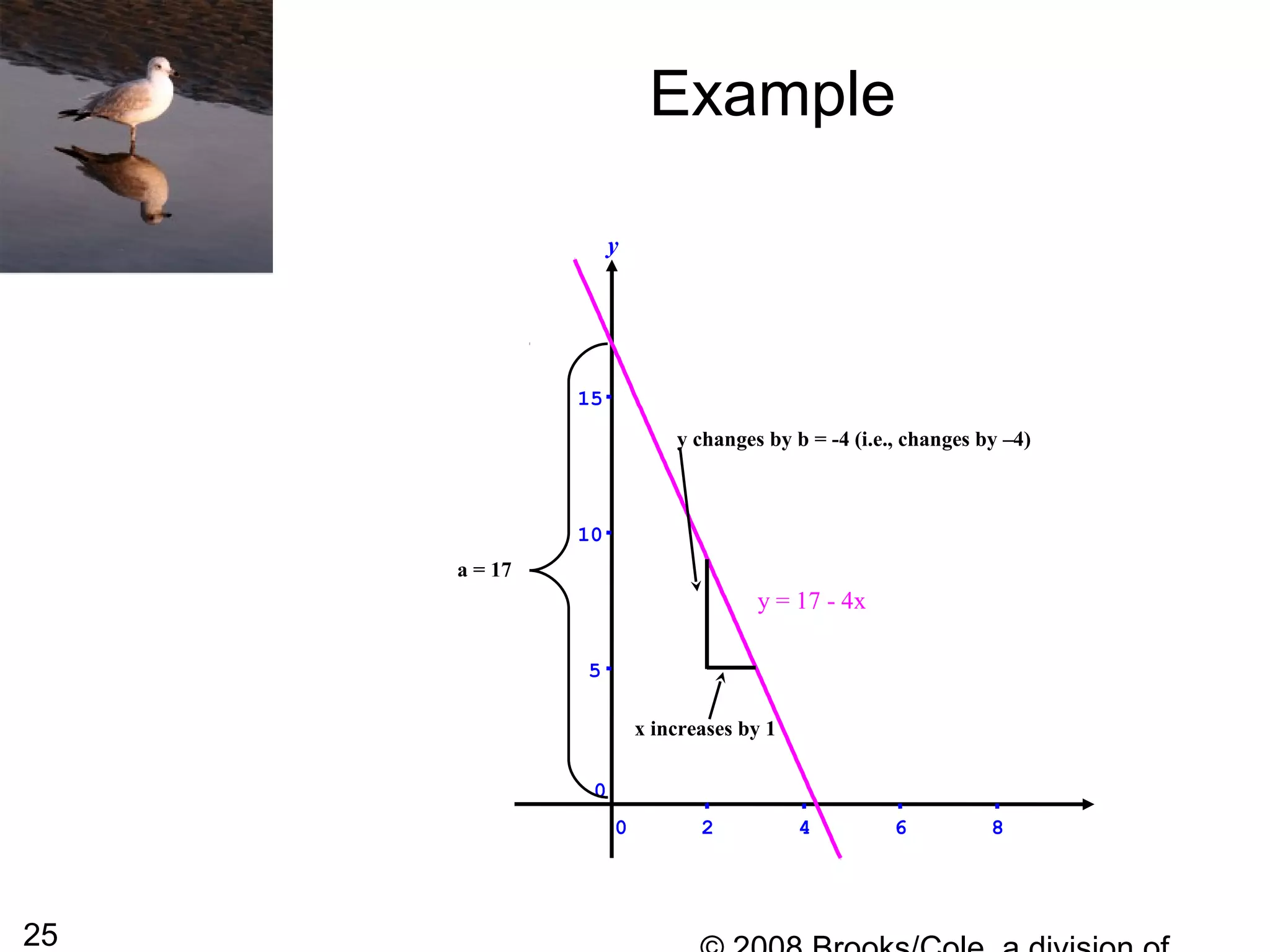
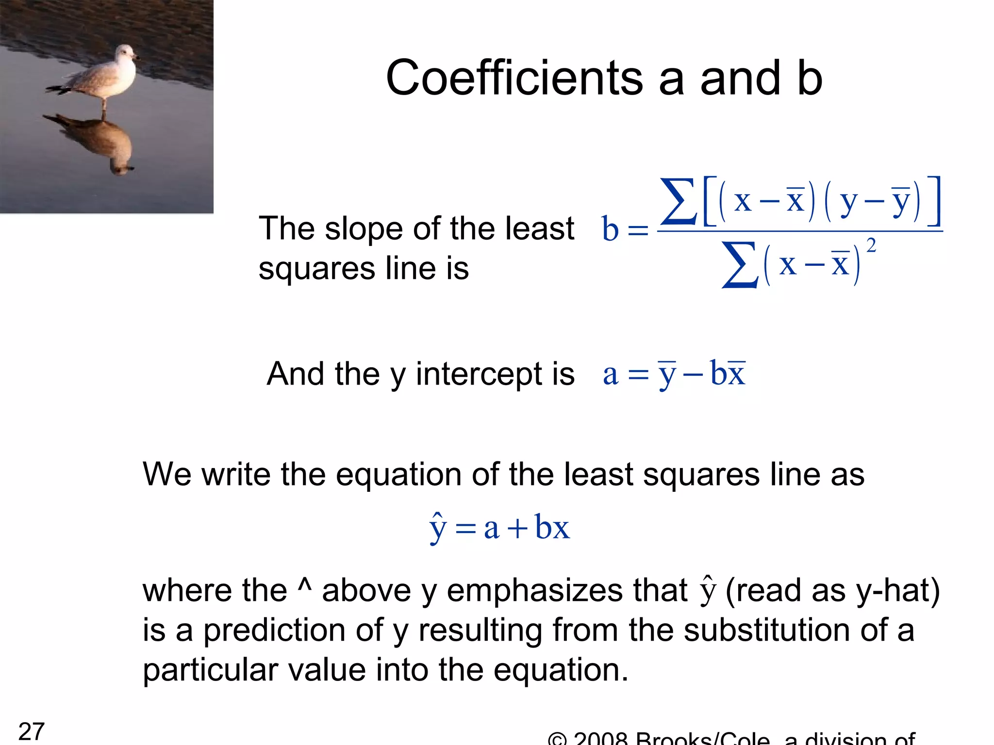
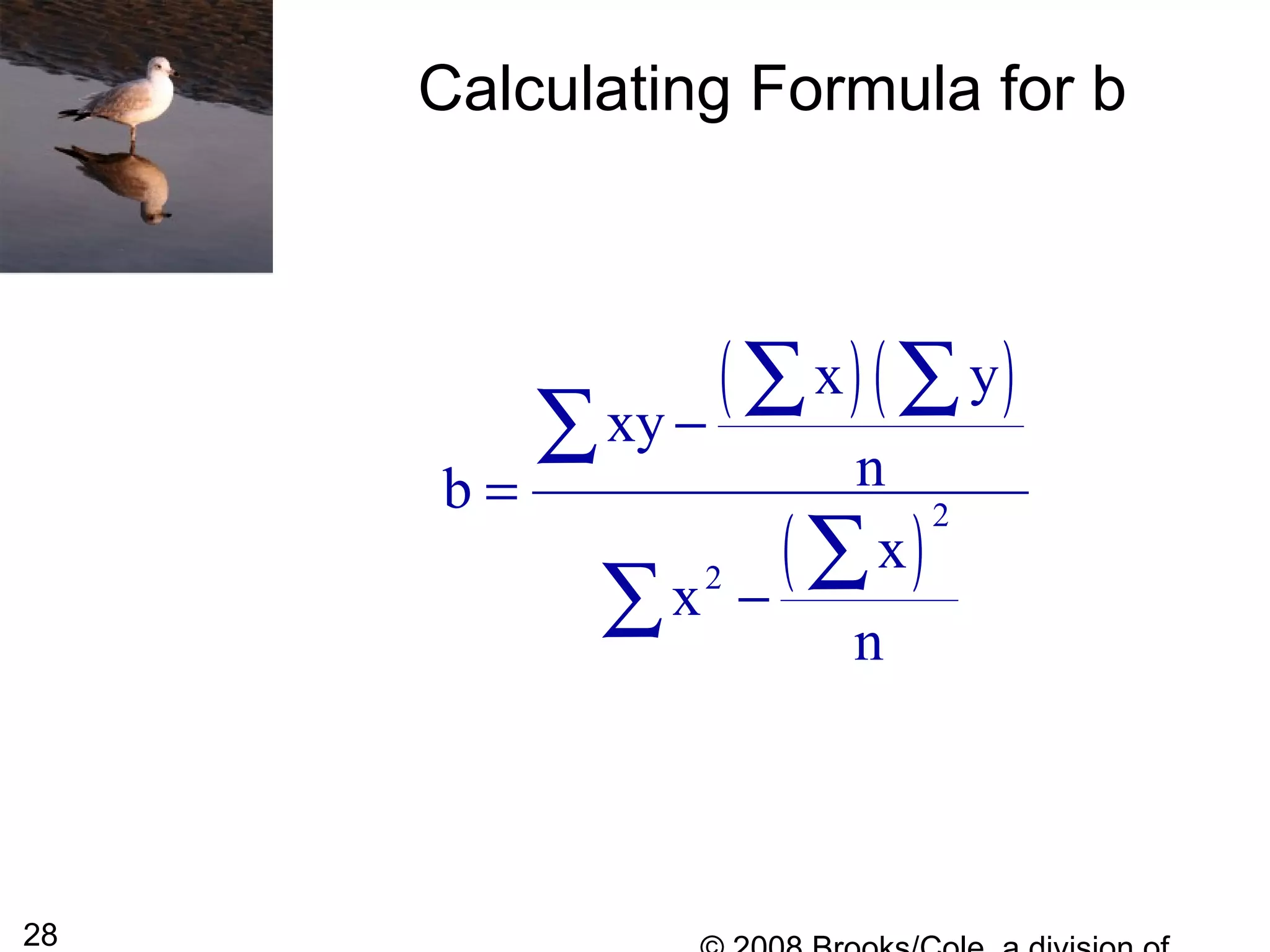
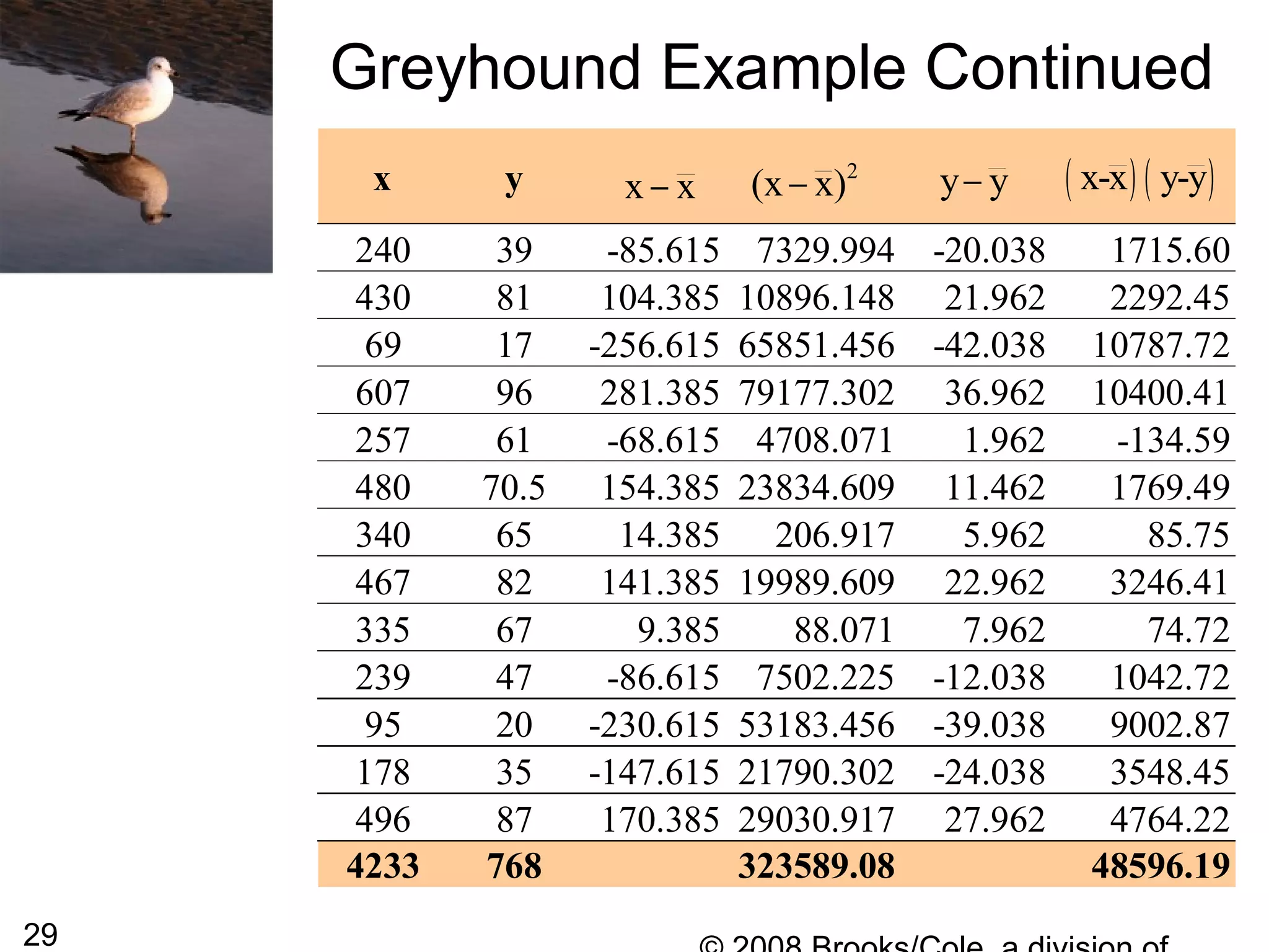
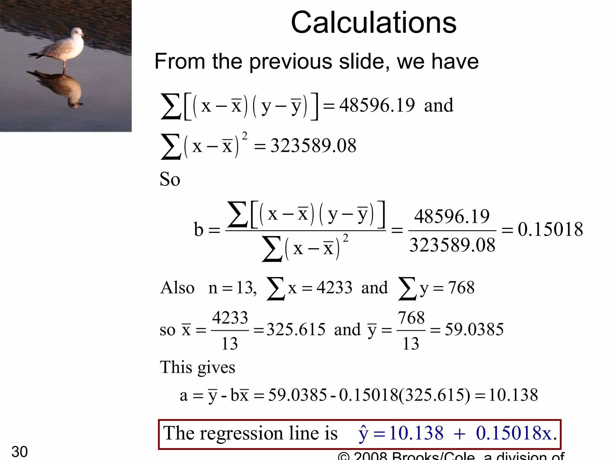
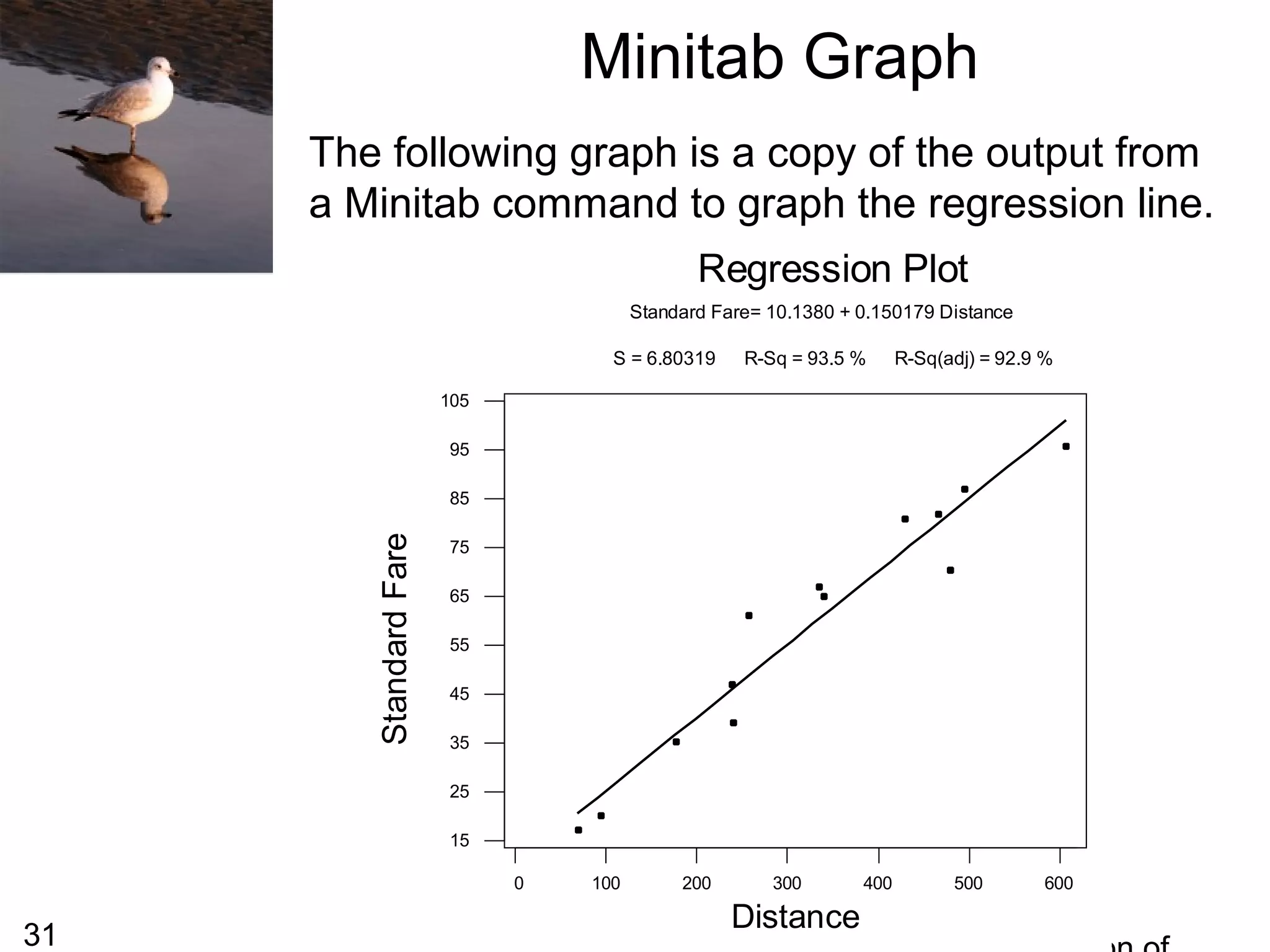
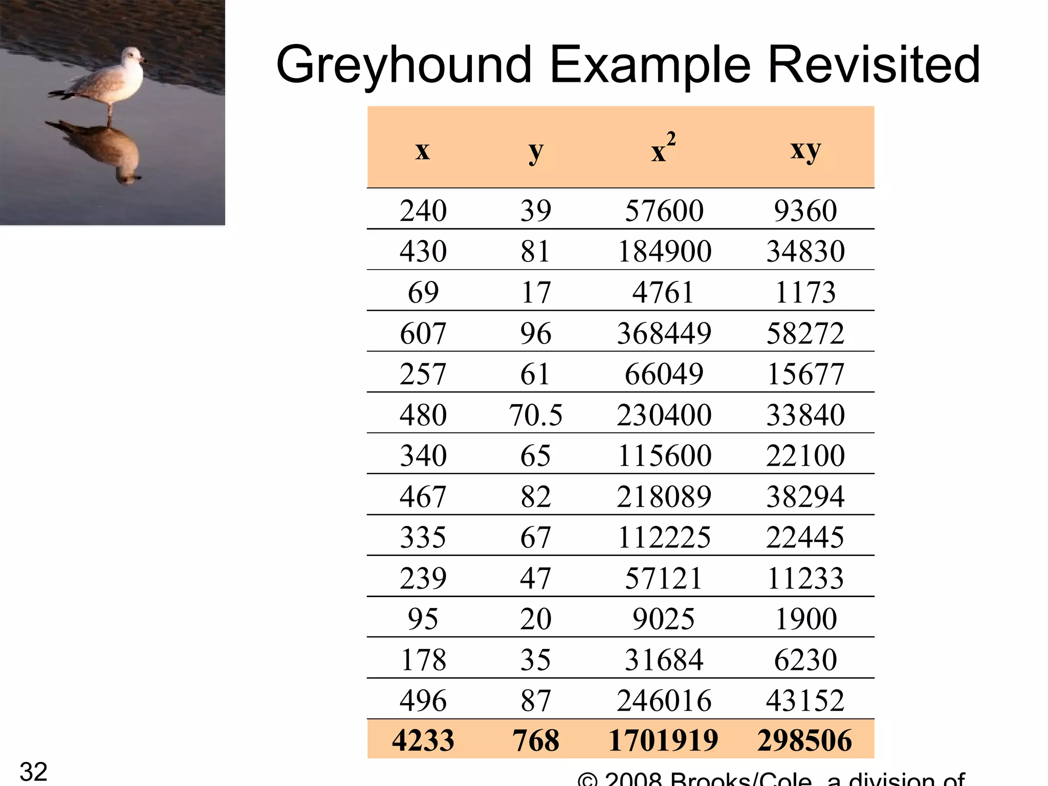
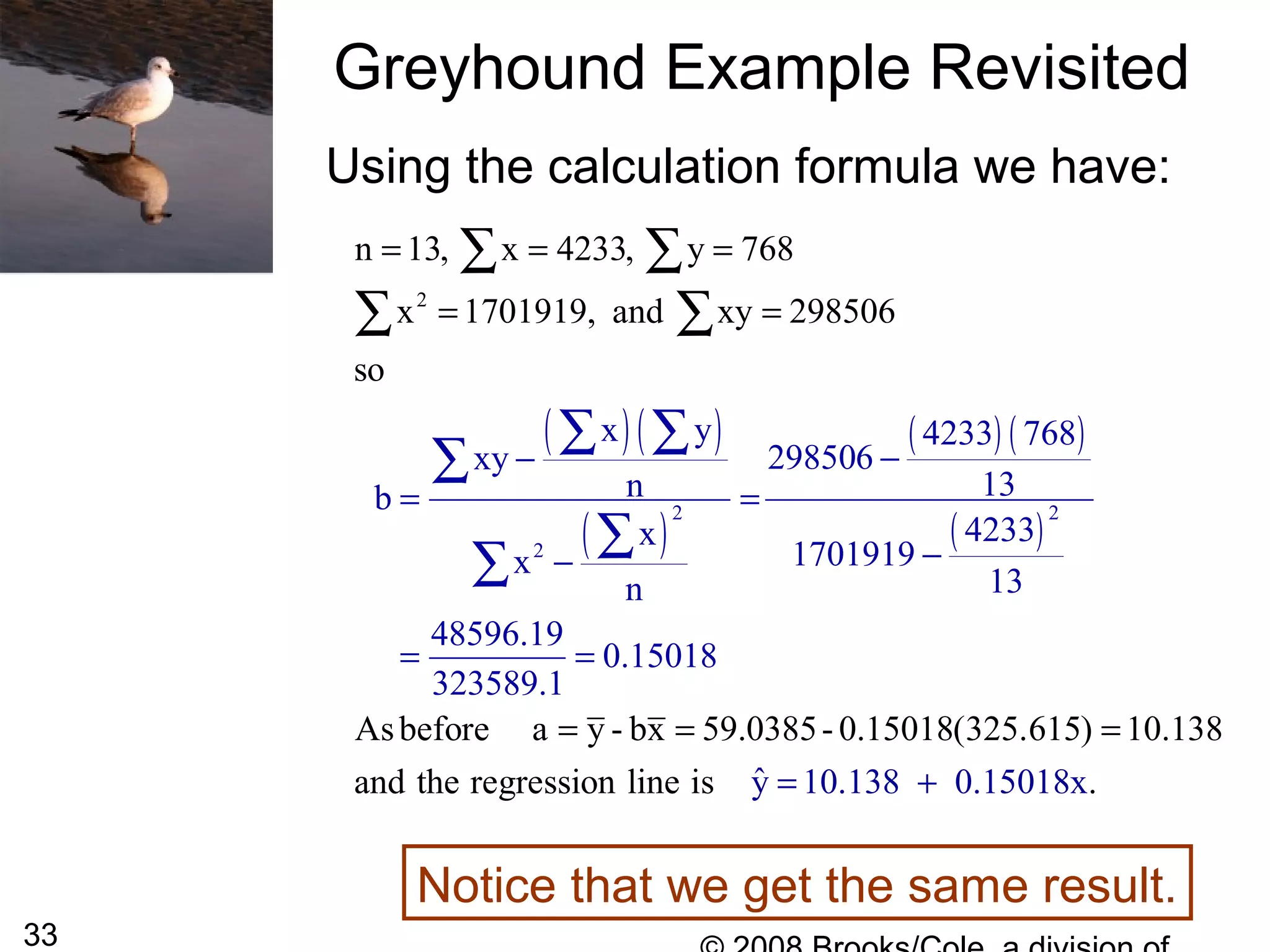
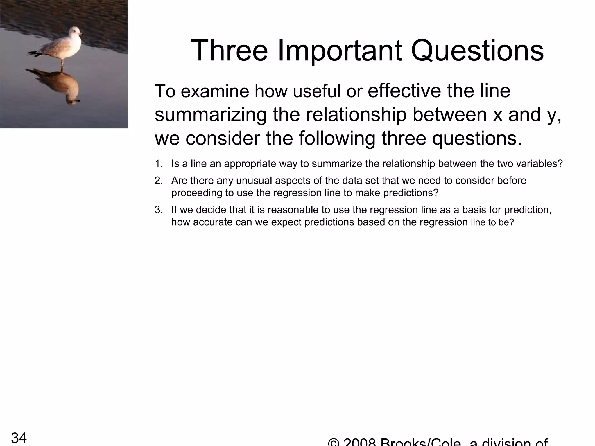
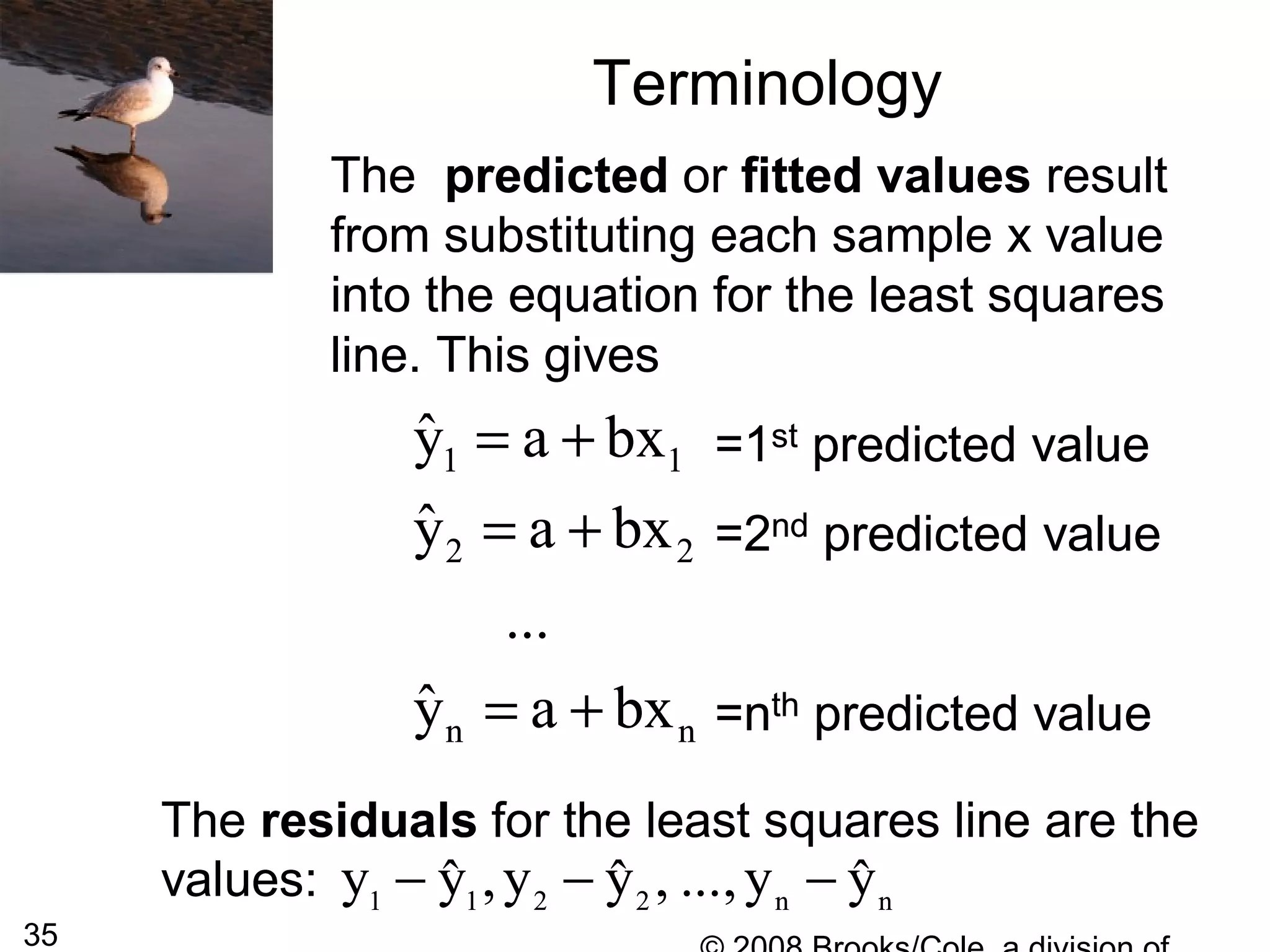
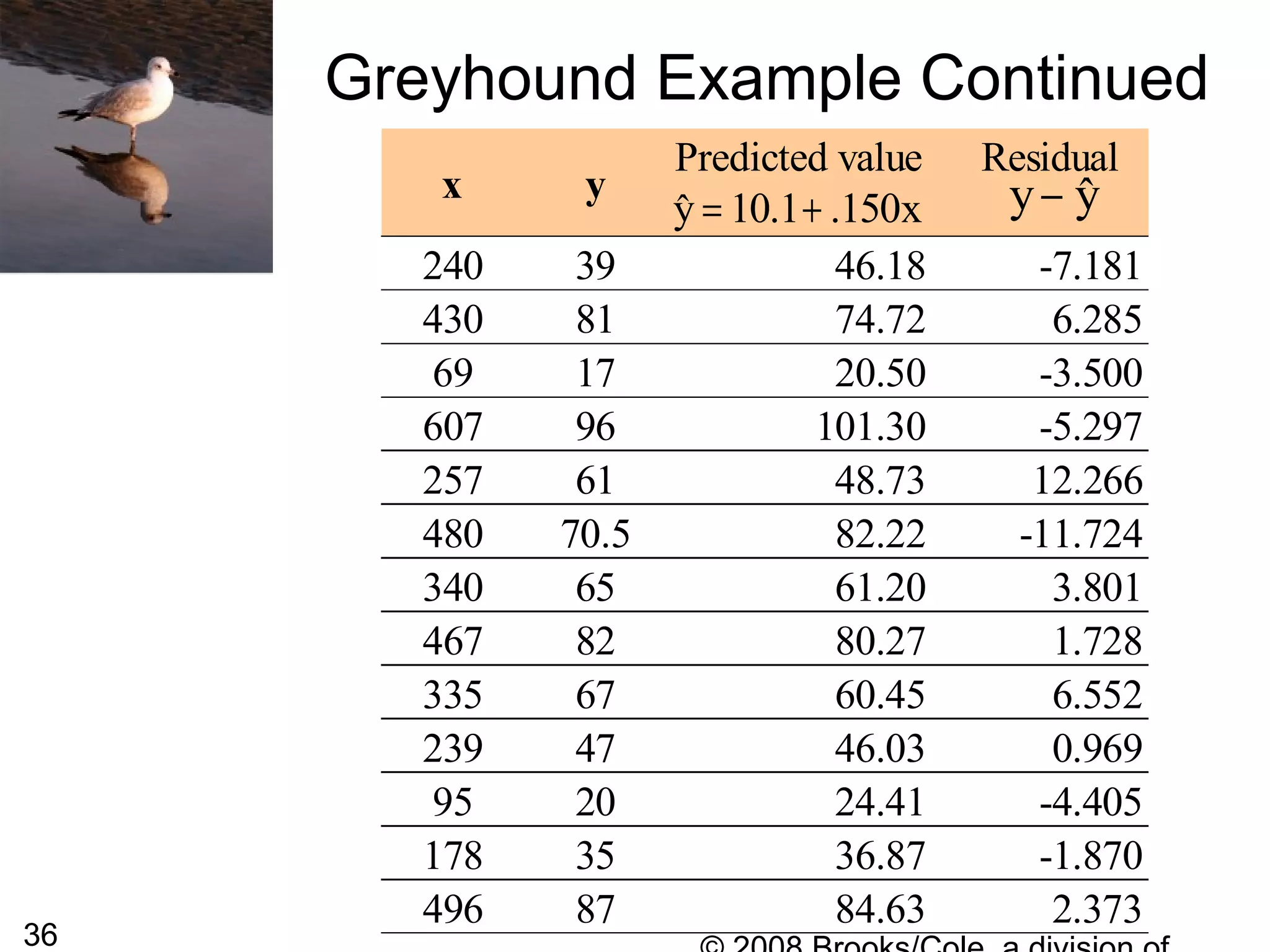
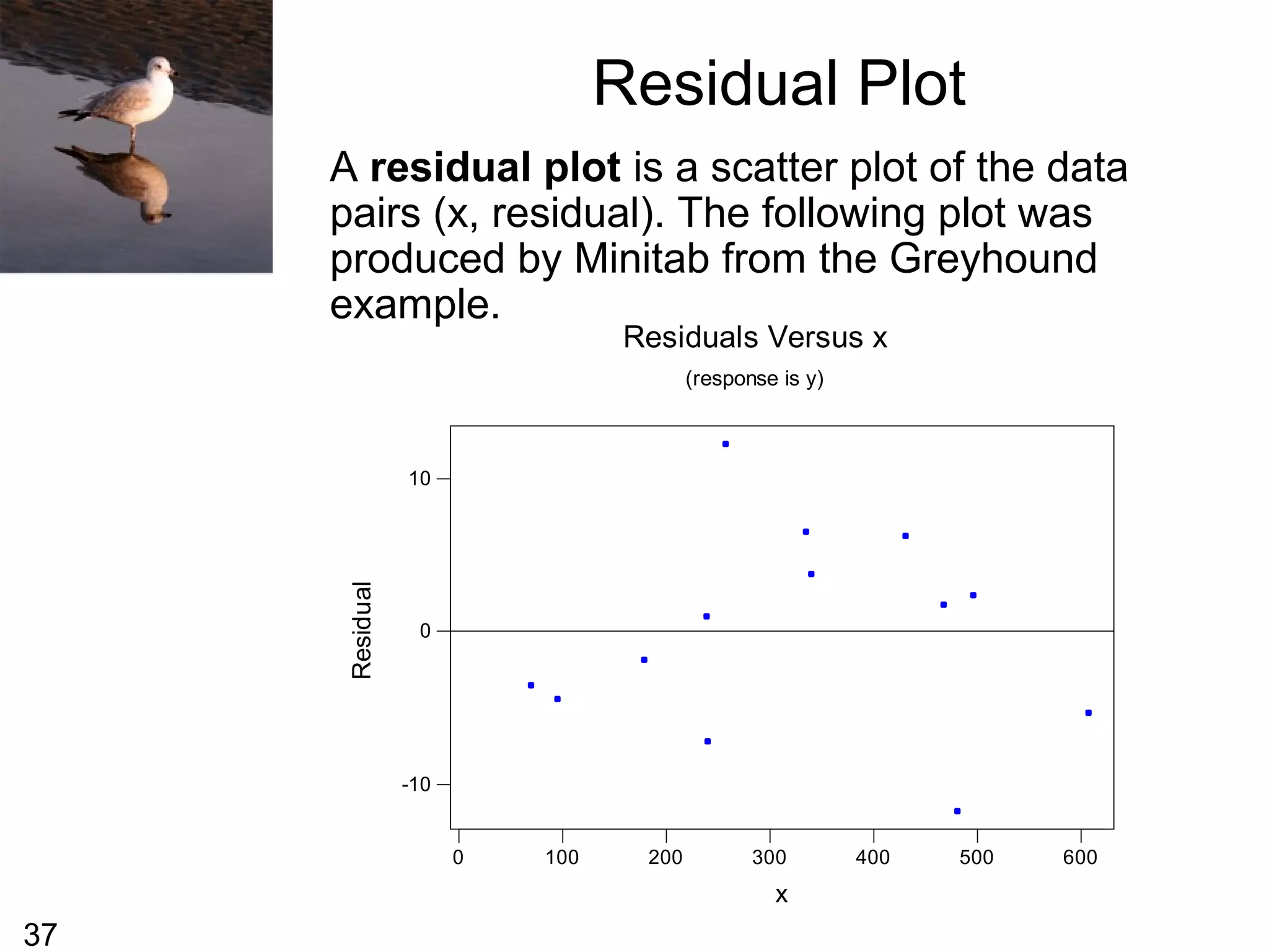
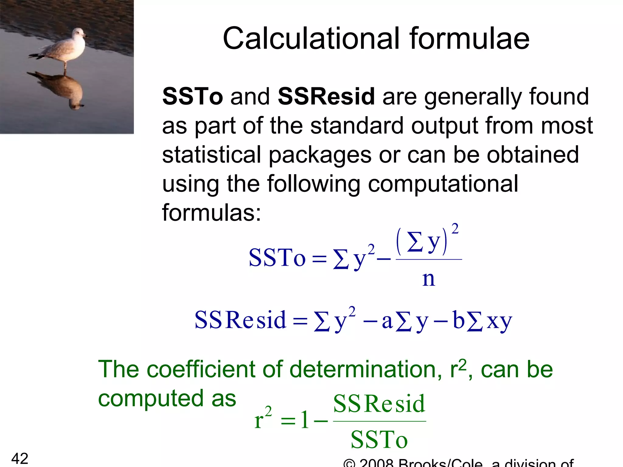
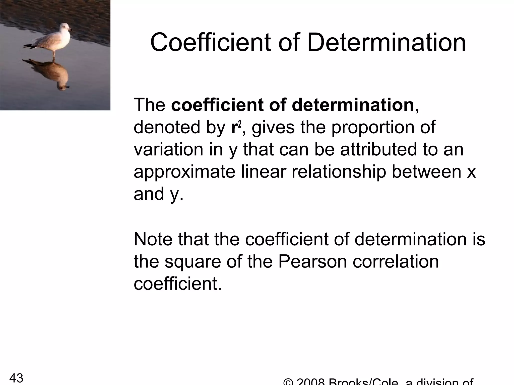
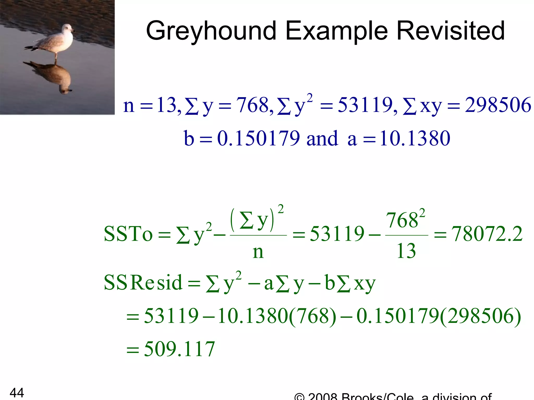
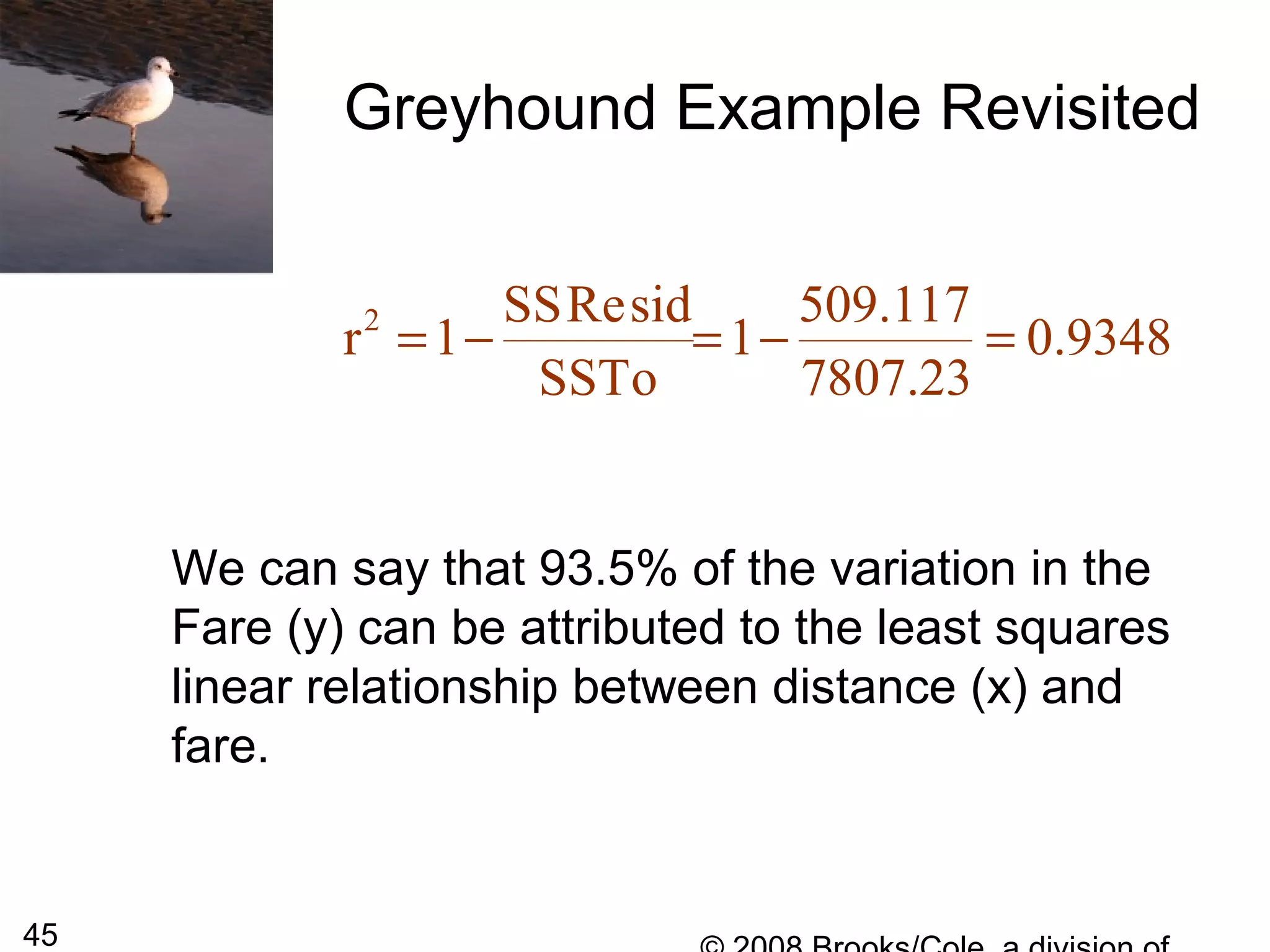
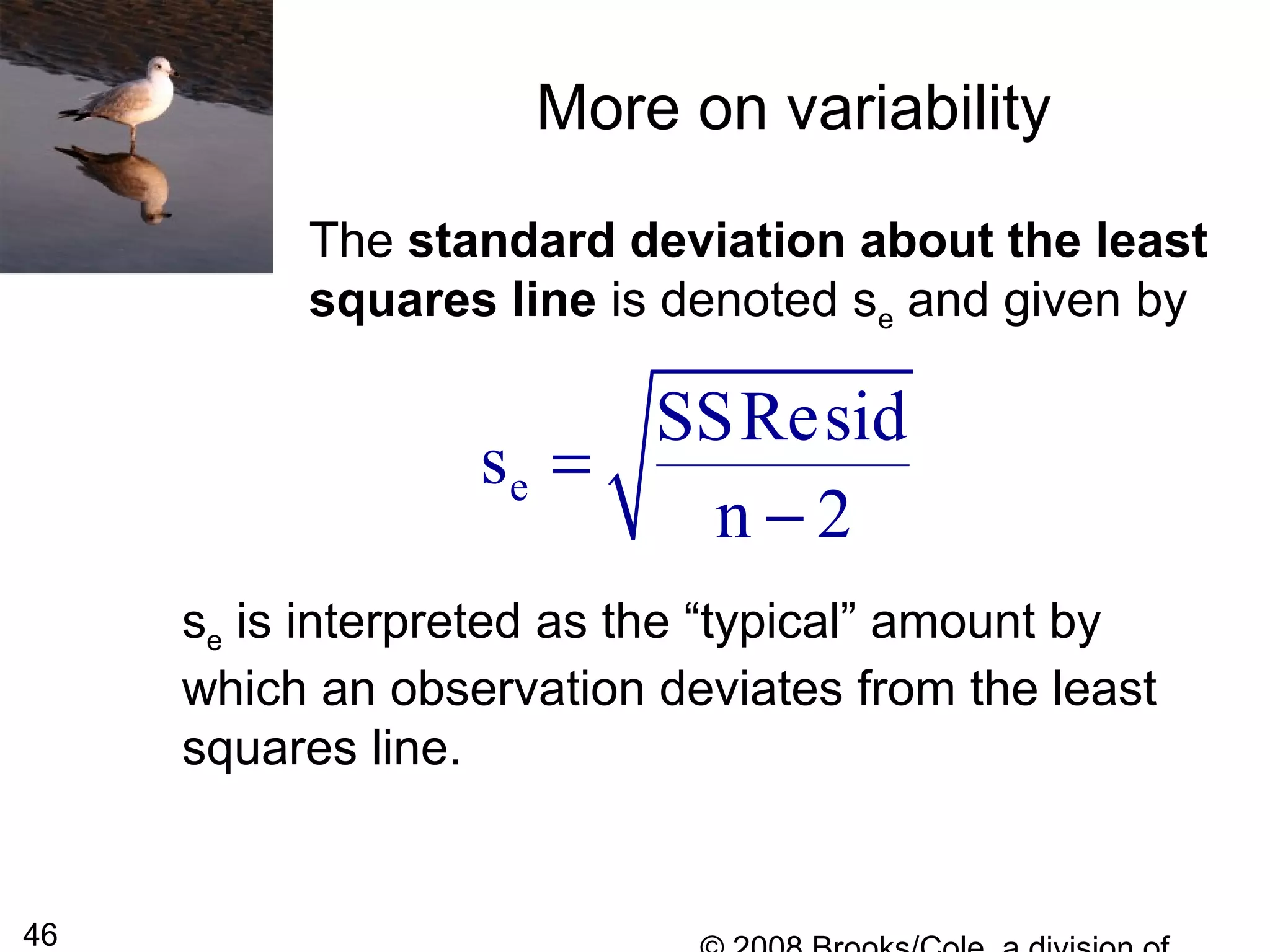
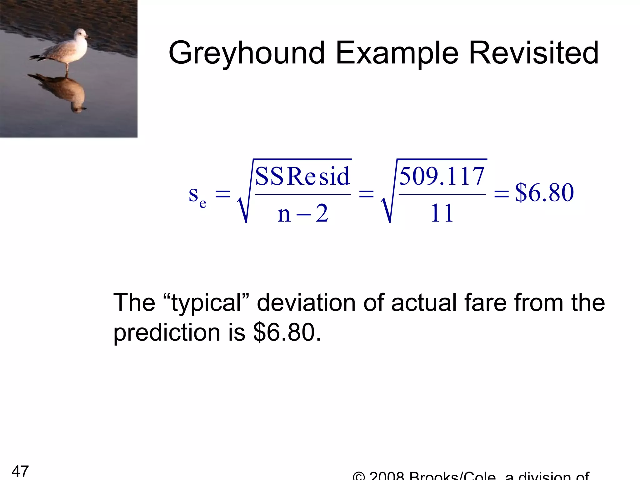
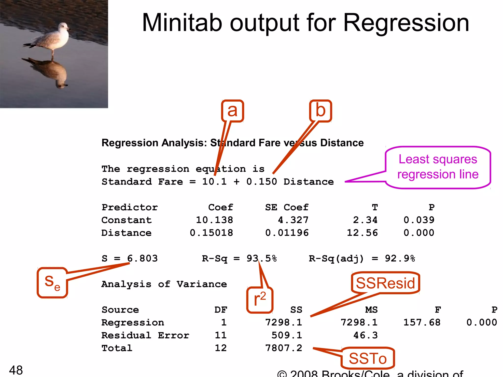
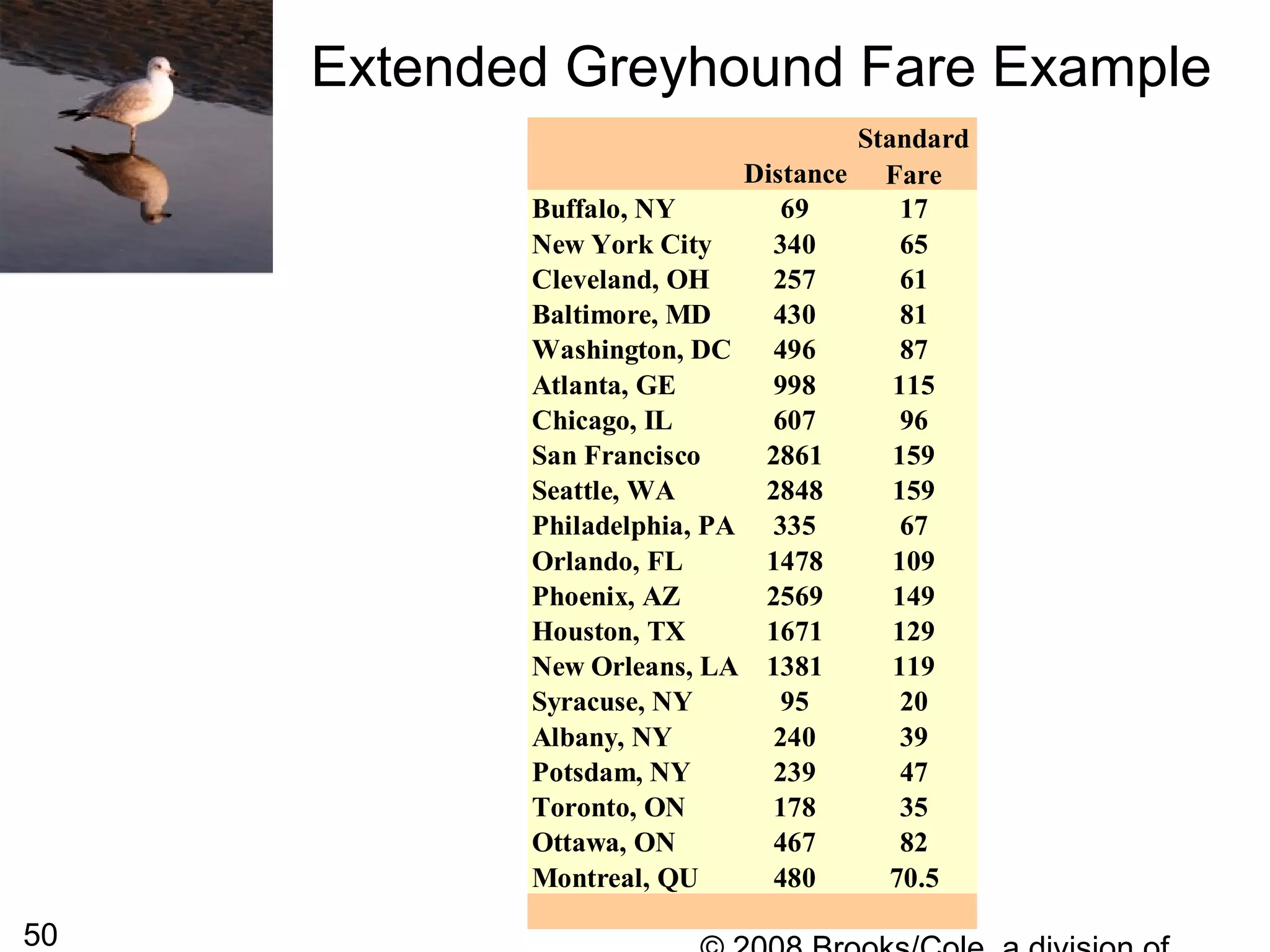
This document summarizes bivariate data and linear regression analysis. It introduces scatterplots and the Pearson correlation coefficient as ways to examine relationships between two variables. A positive correlation indicates that as one variable increases, so does the other, while a negative correlation means one variable increases as the other decreases. The least squares line provides the best fit linear relationship between two variables by minimizing the sum of squared residuals. Calculating the slope and y-intercept of this line allows predicting y-values from x-values. Examples using bus fare and distance data demonstrate these concepts.

![26
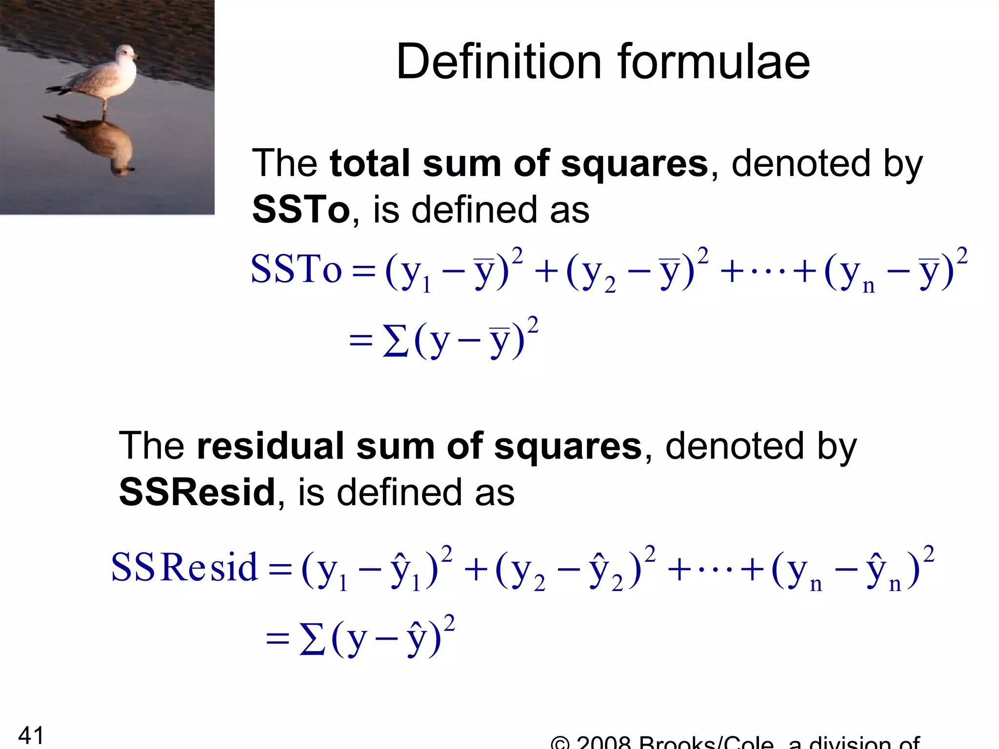
Least Squares Line
The most widely used criterion for
measuring the goodness of fit of a line
y = a + bx to bivariate data (x1, y1),
(x2, y2),…, (xn, yn) is the sum of the of the
squared deviations about the line:
[ ]
[ ] [ ]
2
2 2
1 1 n n
y (a bx)
y (a bx ) y (a bx )
− +
= − + + + − +
∑
K
The line that gives the best fit to the data is the one
that minimizes this sum; it is called the least squares
line or sample regression line.](https://image.slidesharecdn.com/4pxlizcrdczq79hmsmqt-signature-7fbda3c2c0a8559944996f0c007e41f1da8dd3bd9ae740e99209c79d075fc765-poli-140819110159-phpapp02/75/Chapter5-26-2048.jpg)

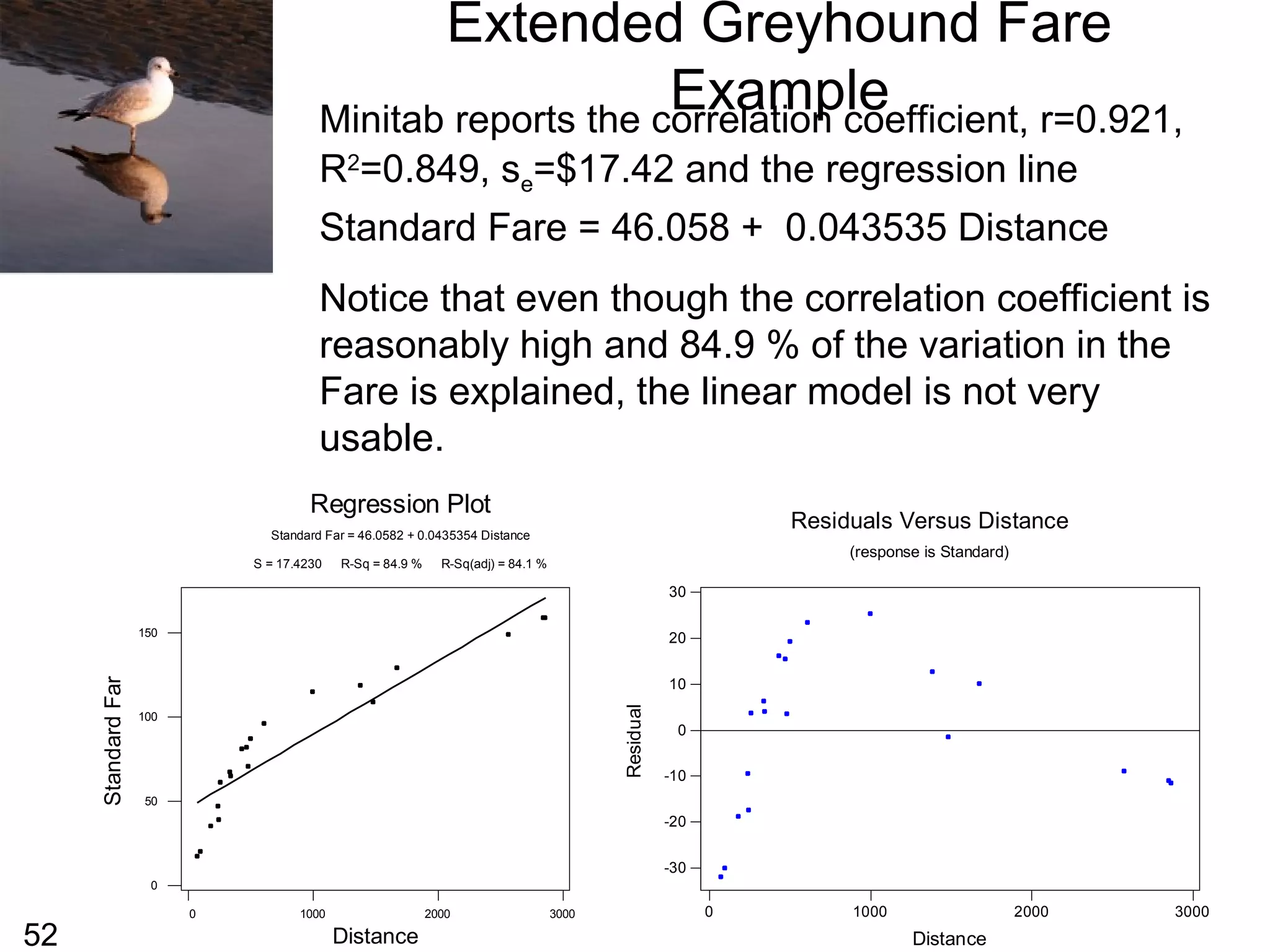
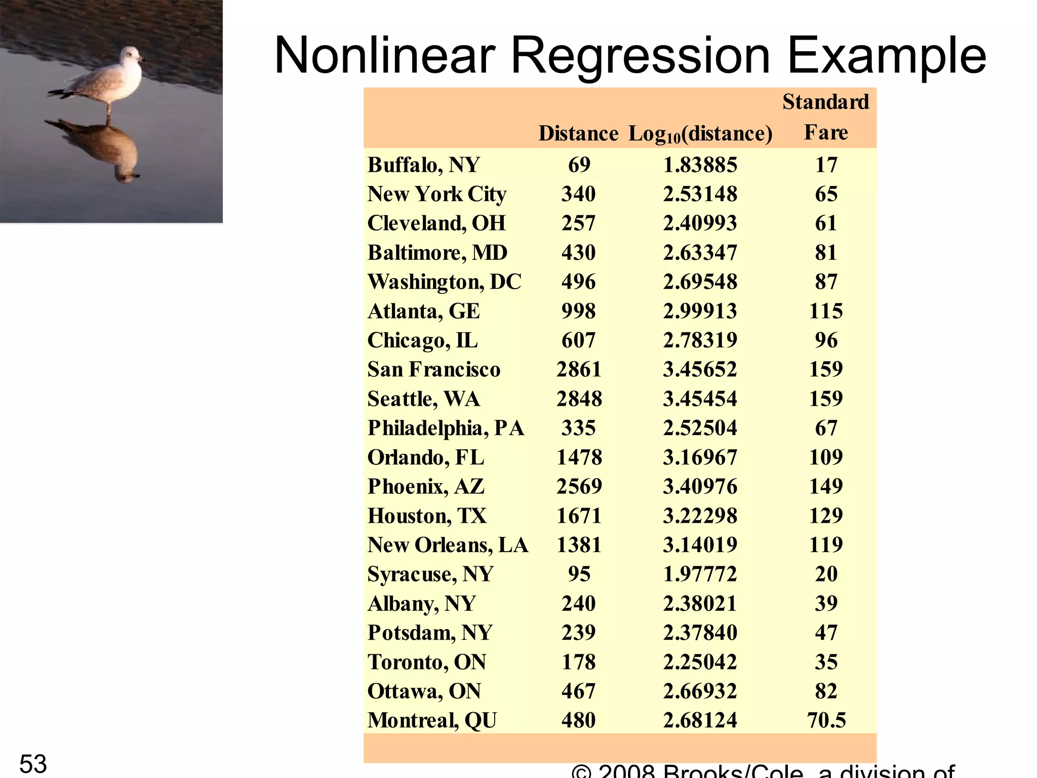
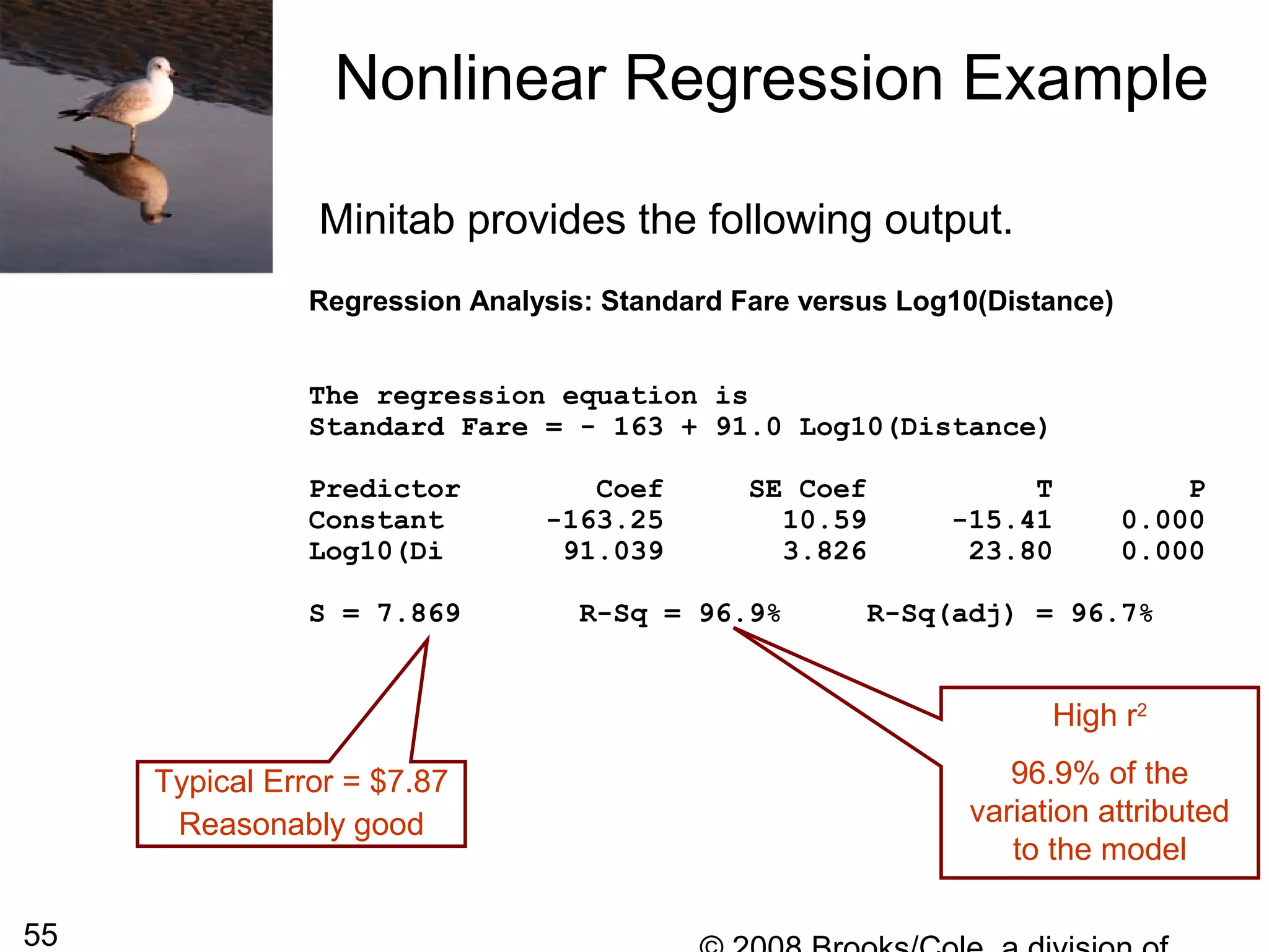
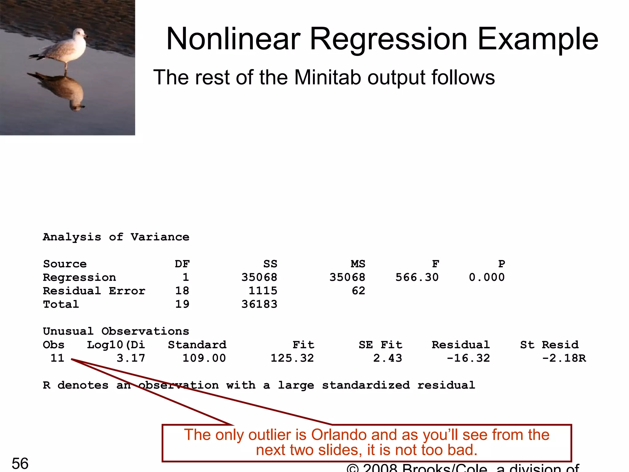
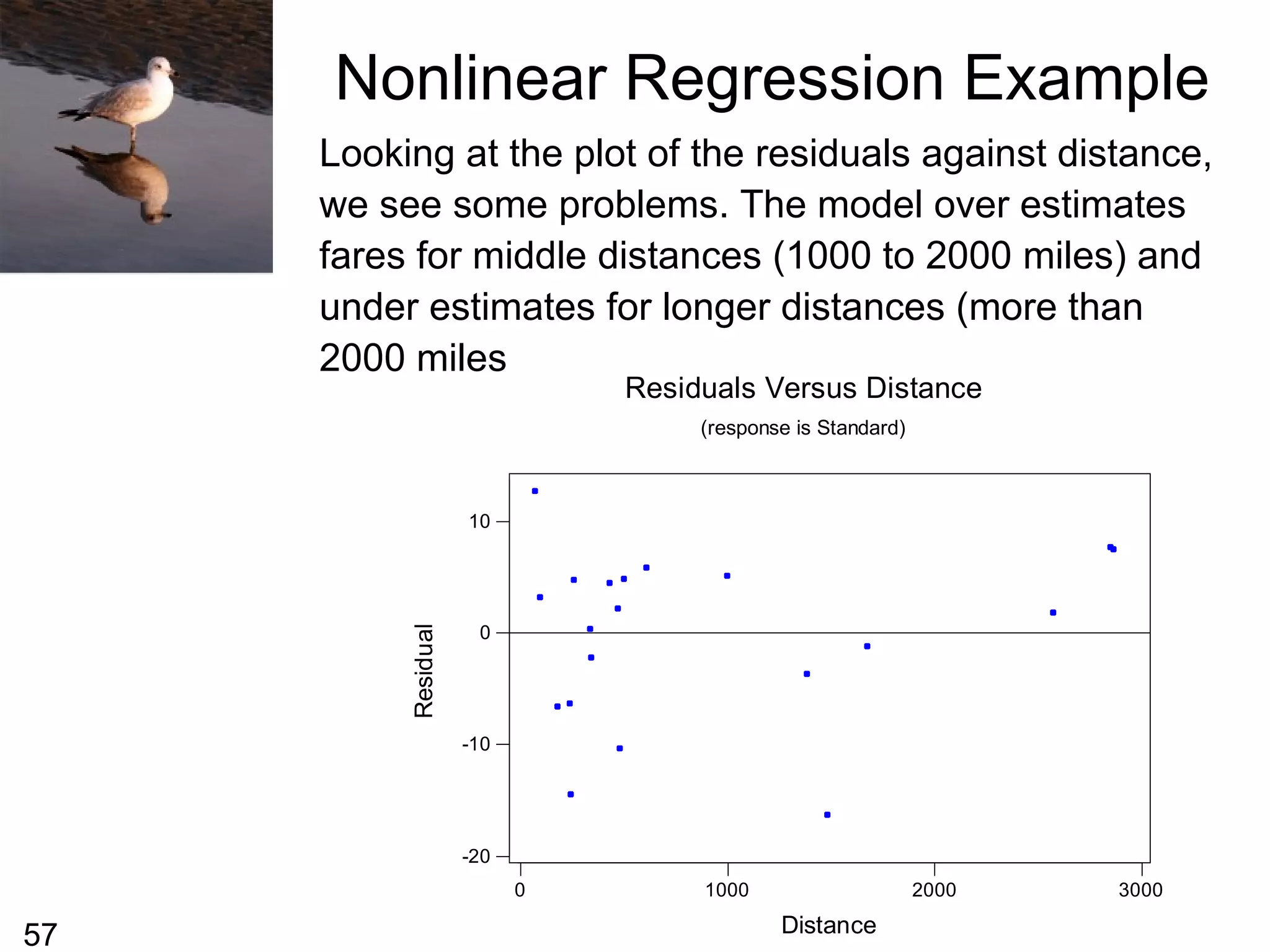
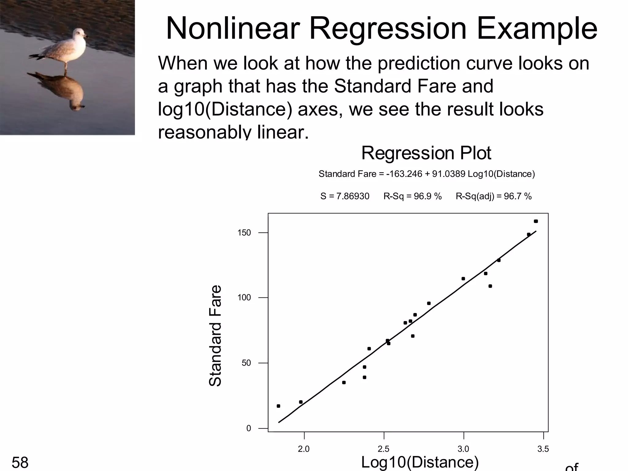
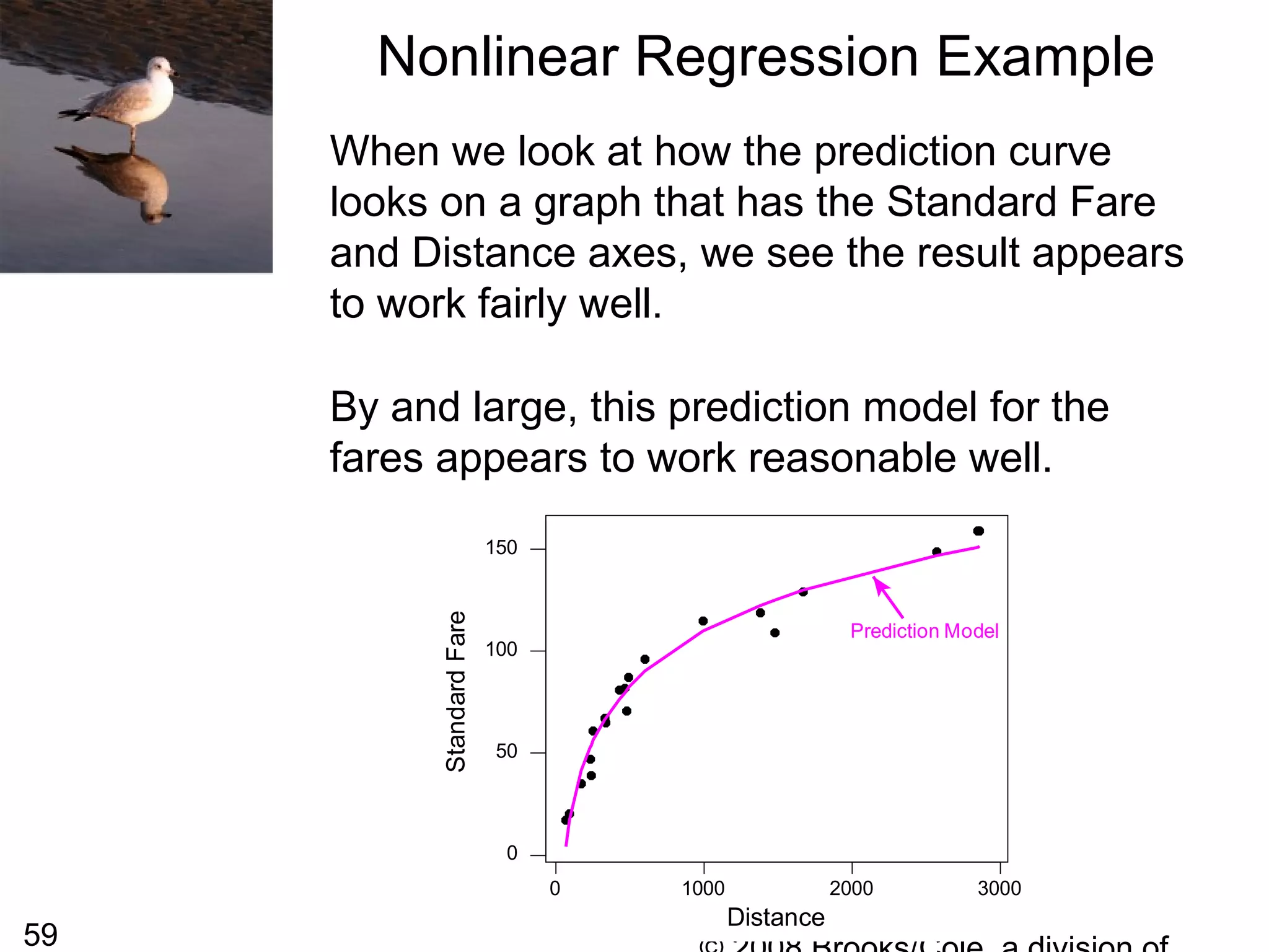
![54
From the previous slide we can see that the
plot does not look linear, it appears to have a
curved shape. We sometimes replace the one
of both of the variables with a transformation of
that variable and then perform a linear
regression on the transformed variables. This
can sometimes lead to developing a useful
prediction equation.
For this particular data, the shape of the curve
is almost logarithmic so we might try to replace
the distance with log10(distance) [the logarithm
to the base 10) of the distance].
Nonlinear Regression Example](https://image.slidesharecdn.com/4pxlizcrdczq79hmsmqt-signature-7fbda3c2c0a8559944996f0c007e41f1da8dd3bd9ae740e99209c79d075fc765-poli-140819110159-phpapp02/75/Chapter5-54-2048.jpg)