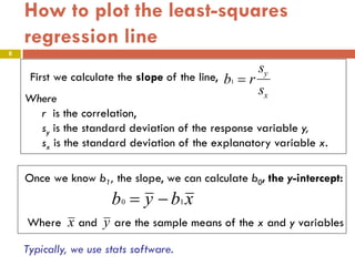
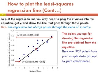
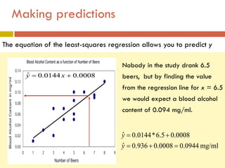
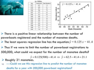
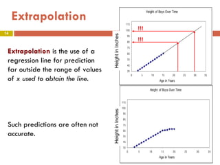
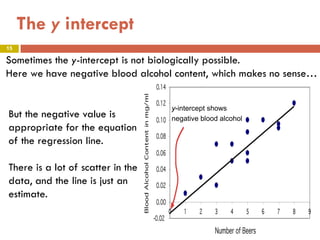
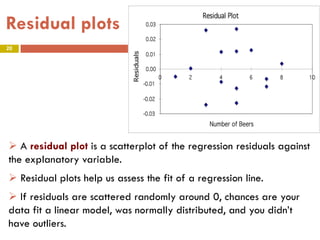
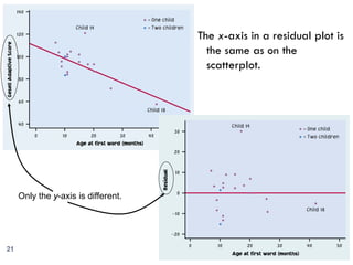
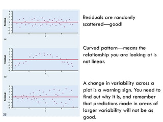
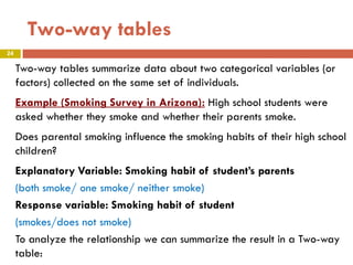
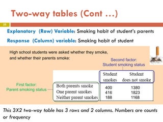
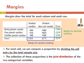
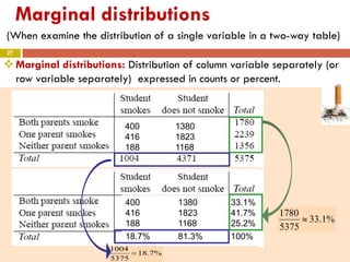
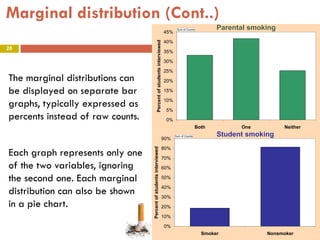
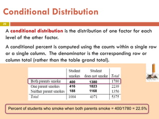
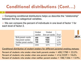
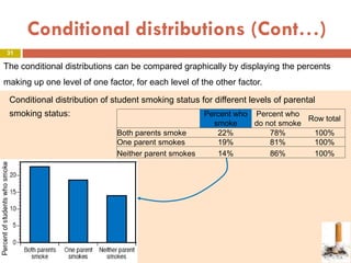
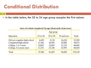
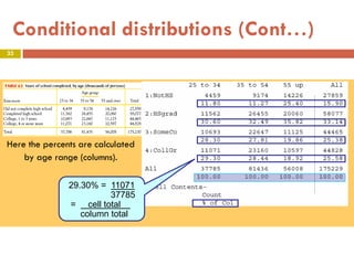
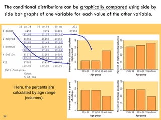
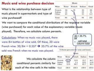
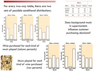
4. Regression line
4
Correlation tells us about strength and direction of the linear
relationship between two quantitative variables.
In Regression we study the association between two variables in
order to explain the values of one from the values of the other
(i.e., make predictions).
When there is a linear association between two variables, then a
straight line equation can be used to model the relationship.
In regression the distinction between Response and Explanatory is
important.
5. Regression line (Cont…)
5
A regression line is a line that best describes the linear
relationship between the two variables, and it is expressed by
means of an equation of the form:
Where is the slope and is the intercept.
Once the equation of the regression line is established, we can
use it to predict the response y for a specific value of the
explanatory variable x .
6. The least-squares regression line
6
The least-squares regression line is the line that makes the sum of
the squares of the vertical distances of the data points from the
line as small as possible.
7. The least-squares regression line (Cont.)
7
is the predicted y value (y hat)
b1 is the slope
b0 is the y-intercept
ˆy
xbby 10ˆ +=
The equation of the least-squares regression line of y on x is
8. b1 = r
sy
sx
First we calculate the slope of the line,
Where
r is the correlation,
sy is the standard deviation of the response variable y,
sx is the standard deviation of the explanatory variable x.
Once we know b1, the slope, we can calculate b0, the y-intercept:
b0 = y − b1 x
Where and are the sample means of the x and y variables
How to plot the least-squares
regression line
8
Typically, we use stats software.
x y
9. How to plot the least-squares
regression line (Cont…)
9
To plot the regression line you only need to plug the x values into the
equation, get y, and draw the line that goes through those points.
Hint: The regression line always passes through the mean of x and y.
9
The points you use for
drawing the regression
line are derived from the
equation.
They are NOT points from
your sample data (except
by pure coincidence).
9
10. Two different regression lines can be drawn if we
interchange the roles of x and y.
Example:
10
Correlation coefficient of NEA and Fat, r = -0.779 stay same in both cases
Nonexercise activity (calories)
Fatgain(Kilograms)
7006005004003002001000-100
4
3
2
1
0
Fitted Line Plot
Fat = 3.505 - 0.003441 NEA
Fat gain (Kilograms)
Nonexerciseactivity(calories)
43210
700
600
500
400
300
200
100
0
-100
Fitted Line Plot
NEA = 745.3 - 176.1 Fat
11. BEWARE!!!
Not all calculators and software use the same convention. Some use:
And some use:
bxay +=ˆ
ˆy = ax + b
Make sure you know what YOUR calculator gives you for a and b before
you answer homework or exam questions.
11
12. Making predictions
The equation of the least-squares regression allows you to predict y
for any x within the range studied.
yˆ
ˆy = 0.0144x + 0.0008
Nobody in the study drank 6.5
beers, but by finding the value
from the regression line for x = 6.5
we would expect a blood alcohol
content of 0.094 mg/ml.
mg/ml0944.00008.0936.0ˆ
0008.05.6*0144.0ˆ
=+=
+=
y
y
13. Year Powerboats Dead Manate es
1977 447 13
1978 460 21
1979 481 24
1980 498 16
1981 513 24
1982 512 20
1983 526 15
1984 559 34
1985 585 33
1986 614 33
1987 645 39
1988 675 43
1989 711 50
1990 719 47
There is a positive linear relationship between the number of
powerboats registered and the number of manatee deaths.
(in 1000s)
1.214.415.62ˆ4.41)500(125.0ˆ =−=⇒−= yy
Roughly 21 manatees.
Thus if we were to limit the number of powerboat registrations to
500,000, what could we expect for the number of manatee deaths?
The least squares regression line has the equation: ˆy = 0.125 x − 41.4
ˆy = 0.125 x − 41.4
13 ----Could we use this regression line to predict the number of manatee
deaths for a year with 200,000 powerboat registrations?
14. Extrapolation is the use of a
regression line for prediction
far outside the range of values
of x used to obtain the line.
Such predictions are often not
accurate.
!!!
!!!
Extrapolation
14
15. Sometimes the y-intercept is not biologically possible.
Here we have negative blood alcohol content, which makes no sense…
y-intercept shows
negative blood alcohol
But the negative value is
appropriate for the equation
of the regression line.
There is a lot of scatter in the
data, and the line is just an
estimate.
The y intercept
15
16. Coefficient of determination, r2
16
Least-squares regression looks at the distances of the data points
from the line only in the y direction.
The variables x and y play different roles in regression.
Even though correlation r ignores the distinction between x and y,
there is a close connection between correlation and regression.
r2 is called the coefficient of determination.
r2 represents the percentage of the variance in y (vertical scatter
from the regression line) that can be explained by changes in x.
17. r = -1
r2 = 1
Changes in x
explain 100% of
the variations in y.
Y can be entirely
predicted for any
given value of x.
r = 0
r2 = 0
Changes in x
explain 0% of the
variations in y.
The values y takes
are entirely
independent of
what value x
takes.
Here the change in x only
explains 76% of the change in
y. The rest of the change in y
(the vertical scatter, shown as
red arrows) must be explained
by something other than x.
r = 0.87
r2 = 0.76
17
17
18. r = –0.3, r 2 = 0.09, or 9%
The regression model explains not even 10%
of the variations in y.
r = –0.7, r 2 = 0.49, or 49%
The regression model explains nearly half of
the variations in y.
r = –0.99, r 2 = 0.9801, or ~98%
The regression model explains almost all of
the variations in y.
r = –0.3, r 2 = 0.09, or 9%
The regression model explains not even 10%
of the variations in y.
r = –0.7, r 2 = 0.49, or 49%
The regression model explains nearly half of
the variations in y.
r = –0.99, r 2 = 0.9801, or ~98%
The regression model explains almost all of
the variations in y.
18
19. Observed y
Predicted ŷ
residual)ˆ(dist. =− yy
Residuals
19
Points above the
line have a positive
residual.
Points below the line have a
negative residual.
A residual is the difference between an observed value of the
response variable and the value predicted by the regression line:
residual = observed y – predicted y = y − ˆy
The sum of these
residuals is always 0.
20. A residual plot is a scatterplot of the regression residuals against
the explanatory variable.
Residual plots help us assess the fit of a regression line.
If residuals are scattered randomly around 0, chances are your
data fit a linear model, was normally distributed, and you didn’t
have outliers.
Residual plots
20
21. The x-axis in a residual plot is
the same as on the
scatterplot.
Only the y-axis is different.
21
22. Residuals are randomly
scattered—good!
22
Curved pattern—means the
relationship you are looking at is
not linear.
A change in variability across a
plot is a warning sign. You need to
find out why it is, and remember
that predictions made in areas of
larger variability will not be as
good.
23. 2.5 Data Analysis for Two-Way Tables
23
Objectives
The Two-Way Table
Marginal Distribution
Conditional Distributions
23
24. 24
Two-way tables
Two-way tables summarize data about two categorical variables (or
factors) collected on the same set of individuals.
Example (Smoking Survey in Arizona): High school students were
asked whether they smoke and whether their parents smoke.
Does parental smoking influence the smoking habits of their high school
children?
Explanatory Variable: Smoking habit of student’s parents
(both smoke/ one smoke/ neither smoke)
Response variable: Smoking habit of student
(smokes/does not smoke)
To analyze the relationship we can summarize the result in a Two-way
table:
25. 25
Two-way tables (Cont …)
Explanatory (Row) Variable: Smoking habit of student’s parents
Response (Column) variable: Smoking habit of student
This 3X2 two-way table has 3 rows and 2 columns. Numbers are counts
or frequency
400 1380
416 1823
188 1168
First factor:
Parent smoking status
Second factor:
Student smoking status
High school students were asked whether they smoke,
and whether their parents smoke:
26. 26
Margins
Margins show the total for each column and each row.
For each cell, we can compute a proportion by dividing the cell
entry by the total sample size.
The collection of these proportions is the joint distribution of the
two categorical variables.
400 1380
416 1823
188 1168
Margin for parental
smoking
Margin for student smoking
27. 27
Marginal distributions
(When examine the distribution of a single variable in a two-way table)
Marginal distributions: Distribution of column variable separately (or
row variable separately) expressed in counts or percent.
%1.33
5375
1780
≈
%7.18
5375
1004
=
400 1380 33.1%
416 1823 41.7%
188 1168 25.2%
18.7% 81.3% 100%
400 1380
416 1823
188 1168
28. 28
Marginal distribution (Cont..)
The marginal distributions can
be displayed on separate bar
graphs, typically expressed as
percents instead of raw counts.
Each graph represents only one
of the two variables, ignoring
the second one. Each marginal
distribution can also be shown
in a pie chart.
0%
10%
20%
30%
40%
50%
60%
70%
80%
90%
Smoker Nonsmoker
Percentofstudentsinterviewed
Sum of Counts
0%
5%
10%
15%
20%
25%
30%
35%
40%
45%
Both One Neither
Percentofstudentsinterviewed
Sum of Counts Parental smoking
Student smoking
29. 29
Conditional Distribution
A conditional distribution is the distribution of one factor for each
level of the other factor.
A conditional percent is computed using the counts within a single row
or a single column. The denominator is the corresponding row or
column total (rather than the table grand total).
Percent of students who smoke when both parents smoke = 400/1780 = 22.5%
400 1380
416 1823
188 1168
Percent of students who smoke when both parents smoke = 400/1780 = 22.5%
400 1380
416 1823
188 1168
30. 30
Conditional distributions (Cont…)
Conditional distribution of student smokers for different parental smoking statuses:
Percent of students who smoke when both parents smoke = 400/1780 = 22.5%
Percent of students who smoke when one parent smokes = 416/2239 = 18.6%
Percent of students who smoke when neither parent smokes = 188/1356 = 13.9%
400 1380
416 1823
188 1168
Comparing conditional distributions helps us describe the “relationship"
between the two categorical variables.
We can compare the percent of individuals in one level of factor 1 for
each level of factor 2.
31. 31
Conditional distributions (Cont…)
Conditional distribution of student smoking status for different levels of parental
smoking status: Percent who
smoke
Percent who
do not smoke
Row total
Both parents smoke 22% 78% 100%
One parent smokes 19% 81% 100%
Neither parent smokes 14% 86% 100%
The conditional distributions can be compared graphically by displaying the percents
making up one level of one factor, for each level of the other factor.
34. 34
The conditional distributions can be graphically compared using side by
side bar graphs of one variable for each value of the other variable.
Here, the percents are
calculated by age range
(columns).
34
35. 35
Music and wine purchase decision
We want to compare the conditional distributions of the response variable
(wine purchased) for each value of the explanatory variable (music
played). Therefore, we calculate column percents.
What is the relationship between type of
music played in supermarkets and type of
wine purchased?
We calculate the column
conditional percents similarly for
each of the nine cells in the table:
Calculations: When no music was played, there
were 84 bottles of wine sold. Of these, 30 were
French wine. 30/84 = 0.357 35.7% of the wine
sold was French when no music was played.
30 = 35.7%
84
= cell total .
column total
36. For every two-way table, there are two
sets of possible conditional distributions.
Wine purchased for each kind of
music played (column percents)
Music played for each
kind of wine purchased
(row percents)
Does background music
in supermarkets
influence customer
purchasing decisions?
36