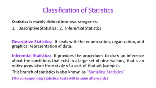
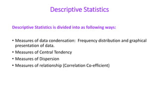
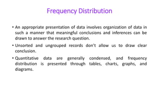
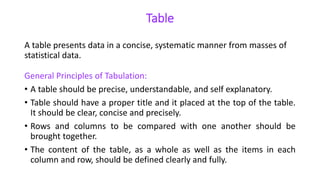
Download to read offline
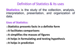
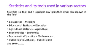
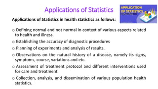
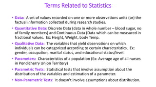
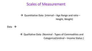
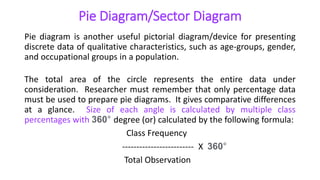
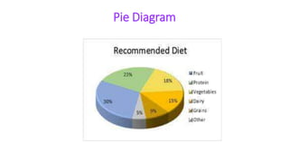
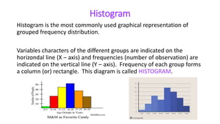
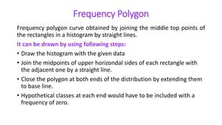
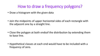
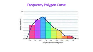
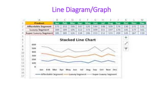


This document provides an overview of statistics and its uses. It discusses how statistics is the study of collecting, analyzing, and presenting data. It then describes some common uses of statistics like simplifying data, facilitating comparisons, and testing hypotheses. The document also lists some key terms in statistics and different types of data. It discusses different types of statistical analyses like descriptive statistics, inferential statistics, and frequencies distributions. Finally, it provides examples of common ways to visually represent data through tables, bar graphs, pie charts, histograms, and other diagrams.