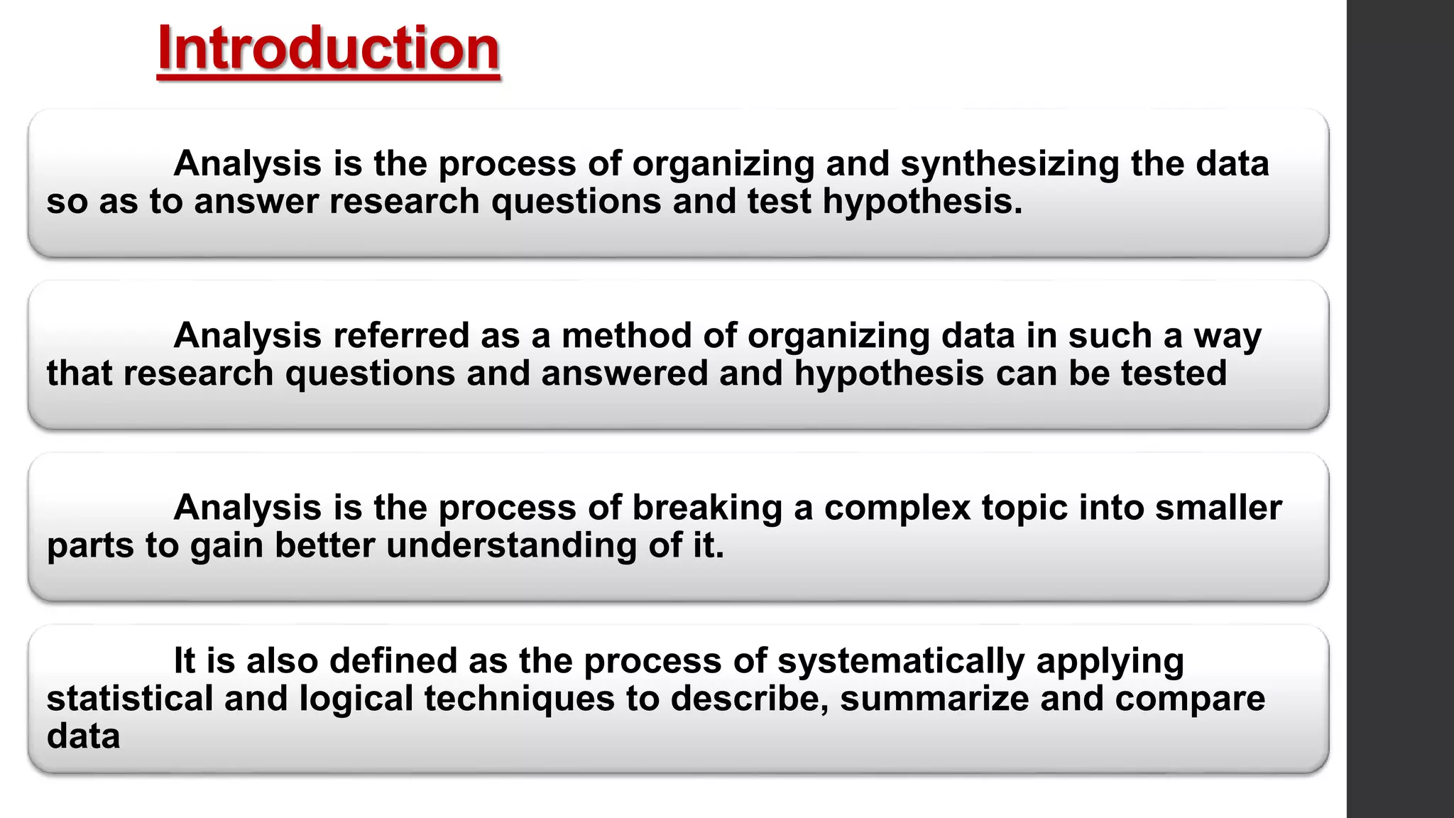
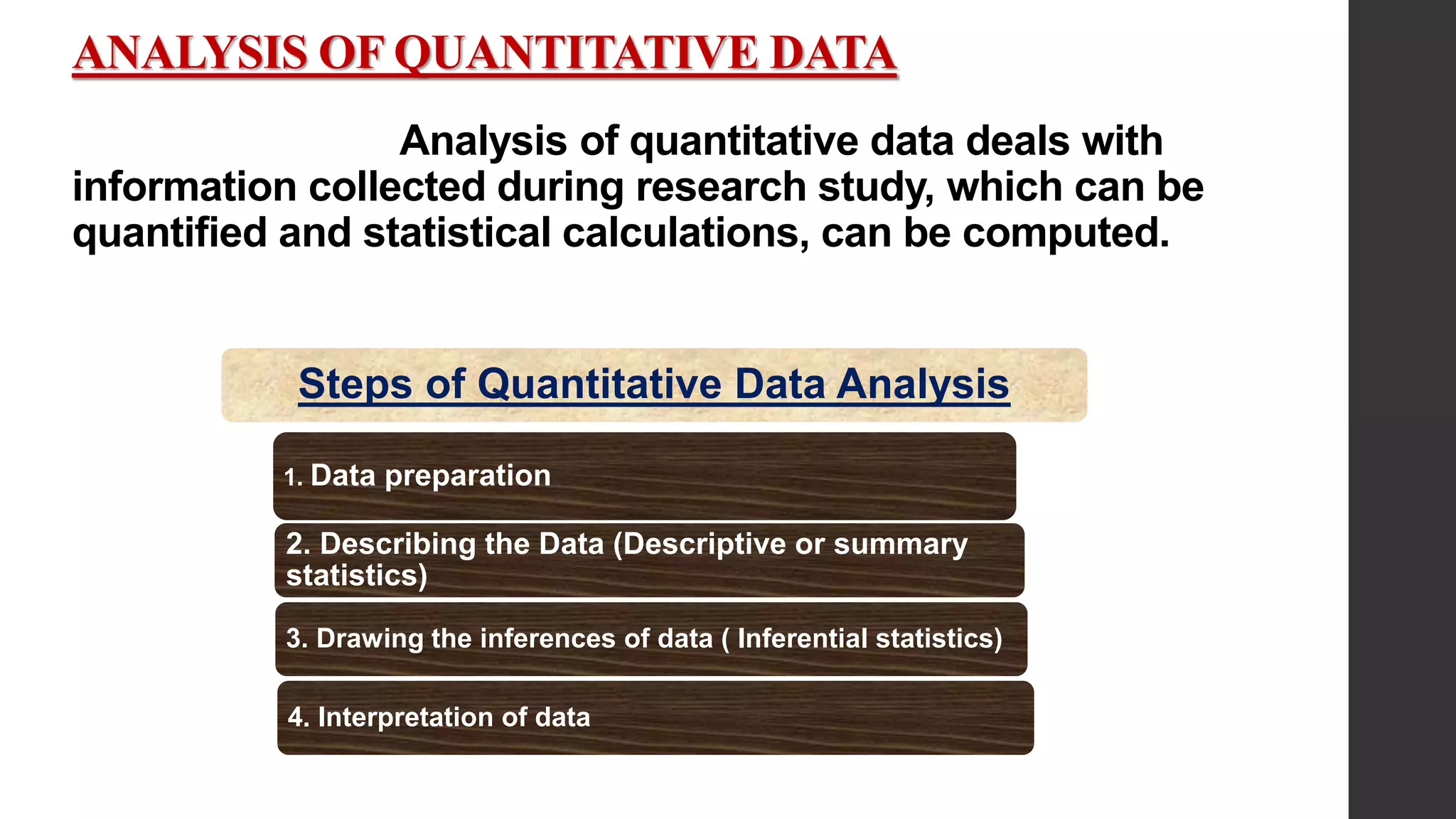
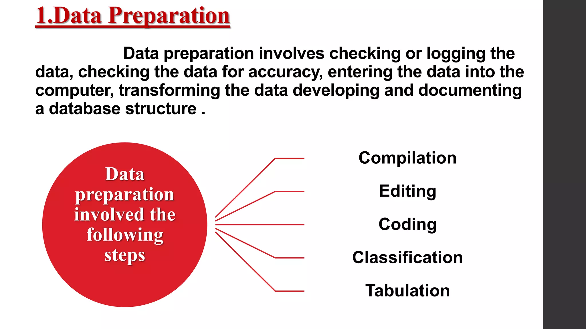
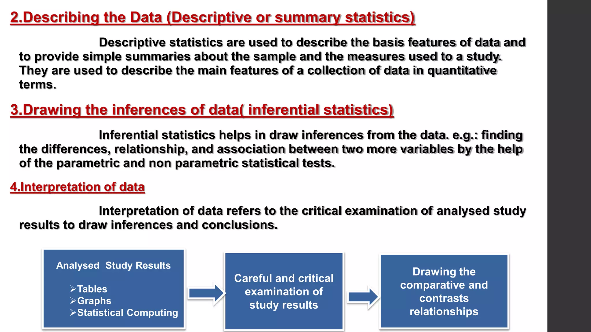
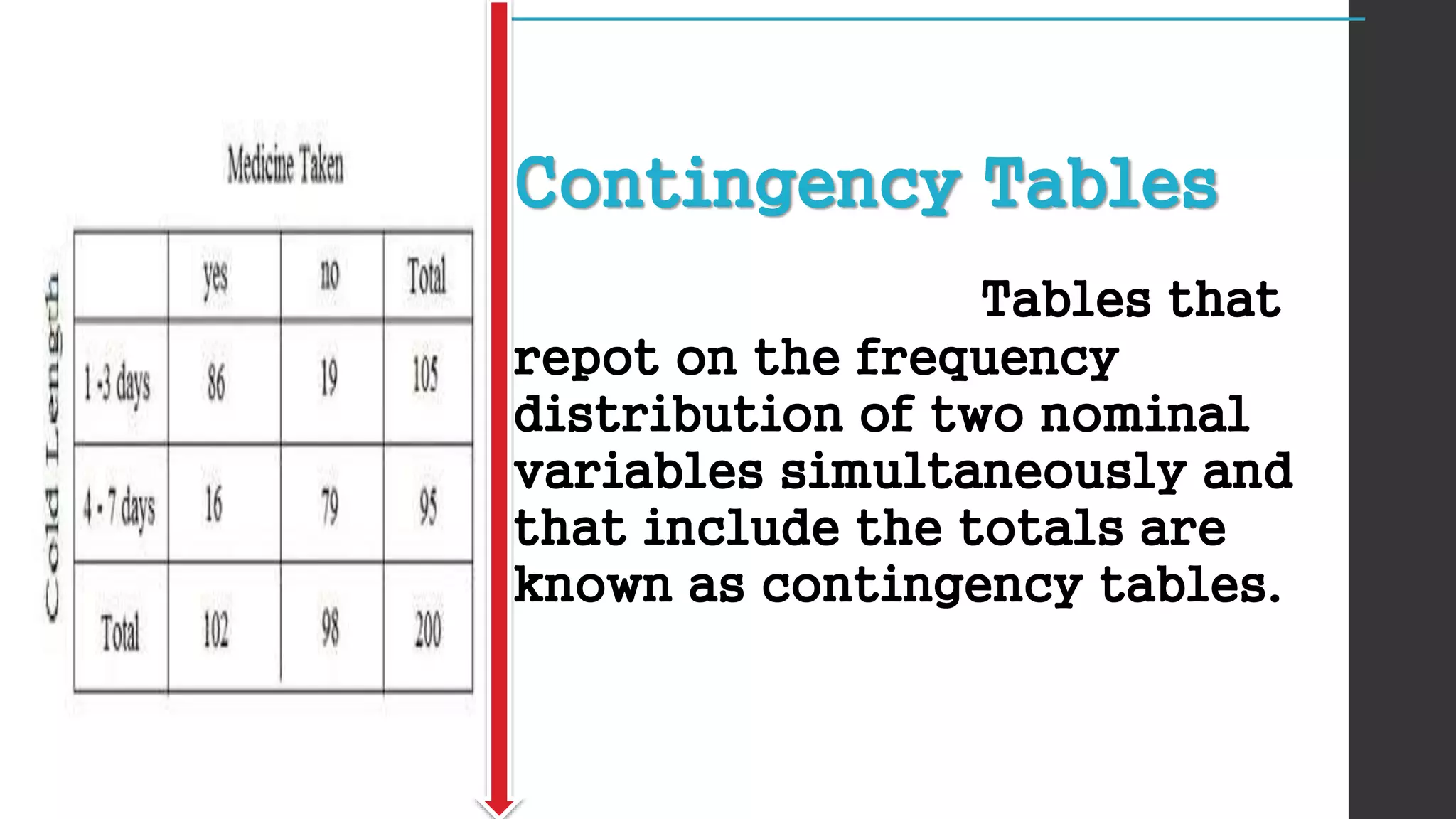
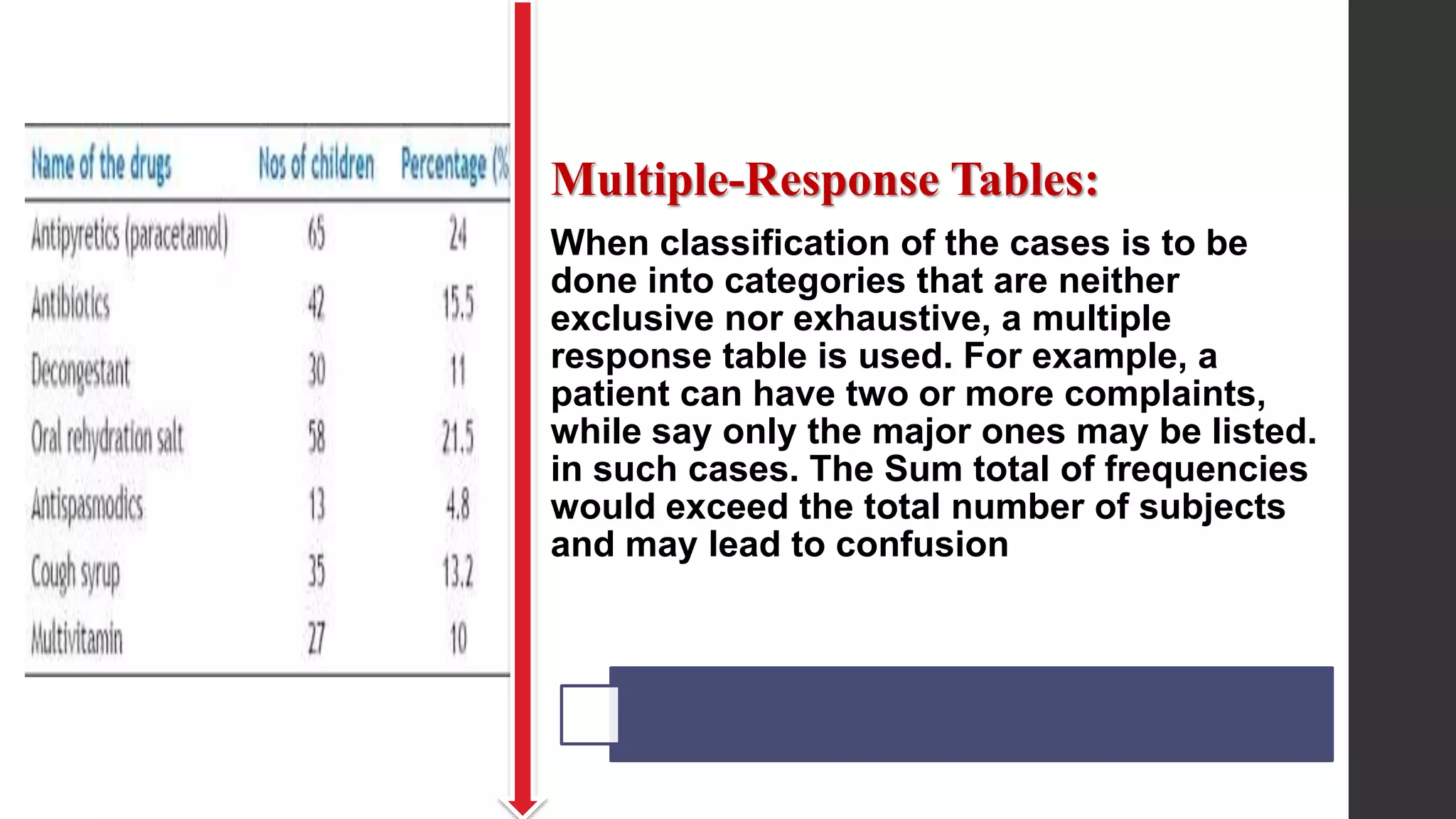
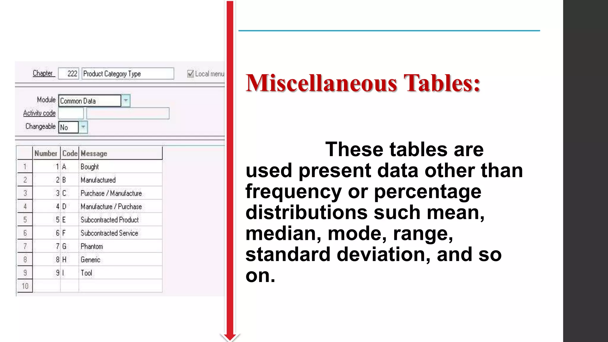
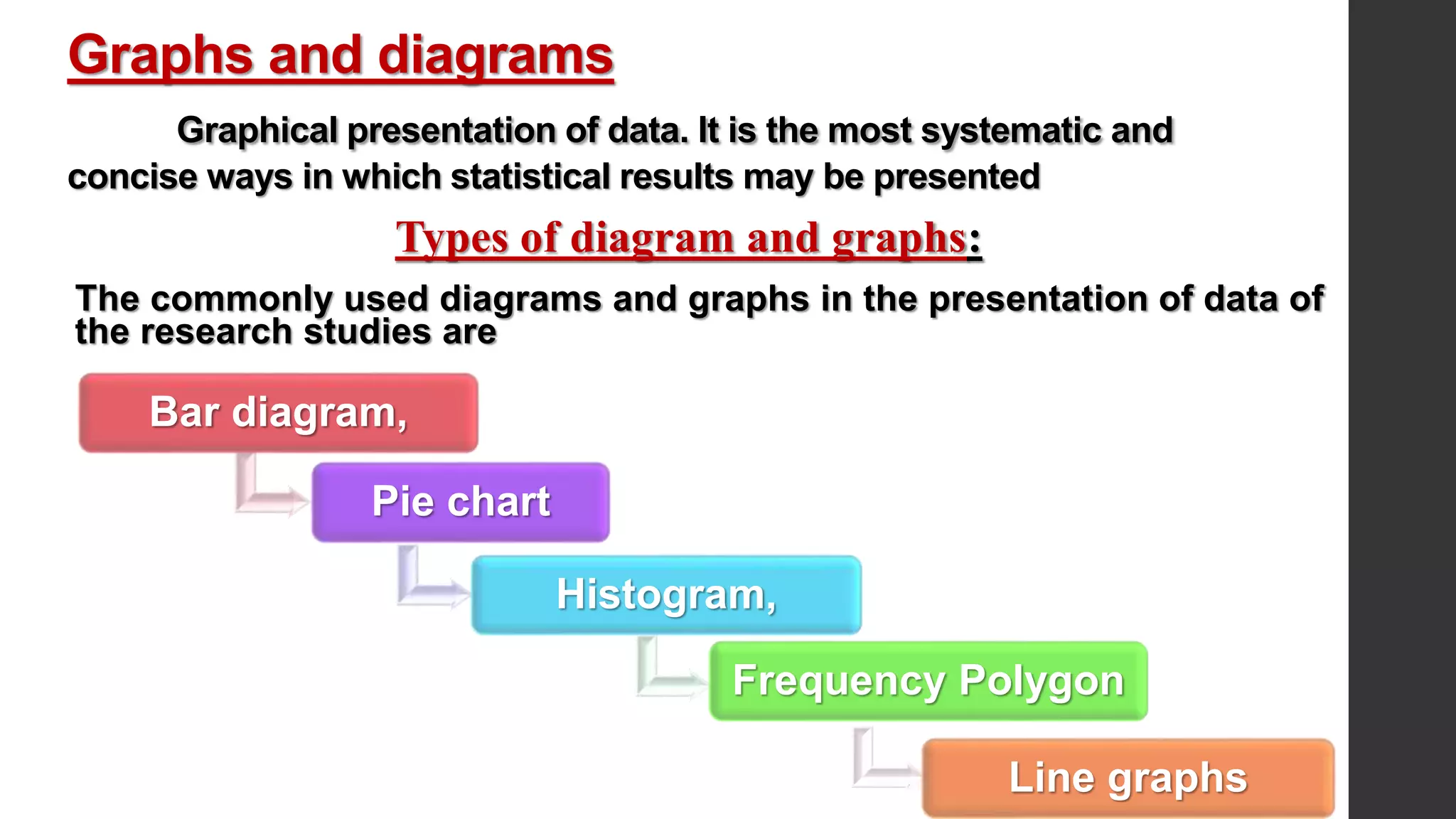
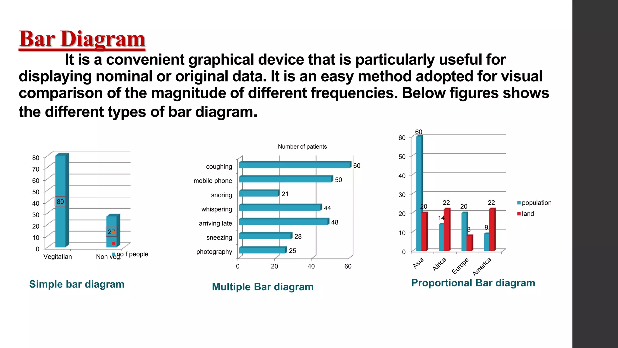
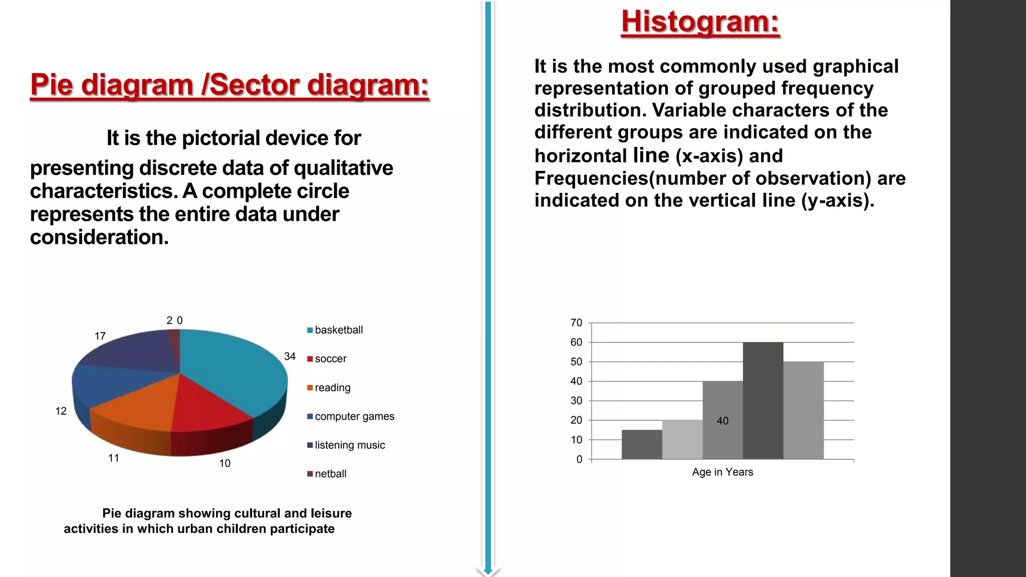
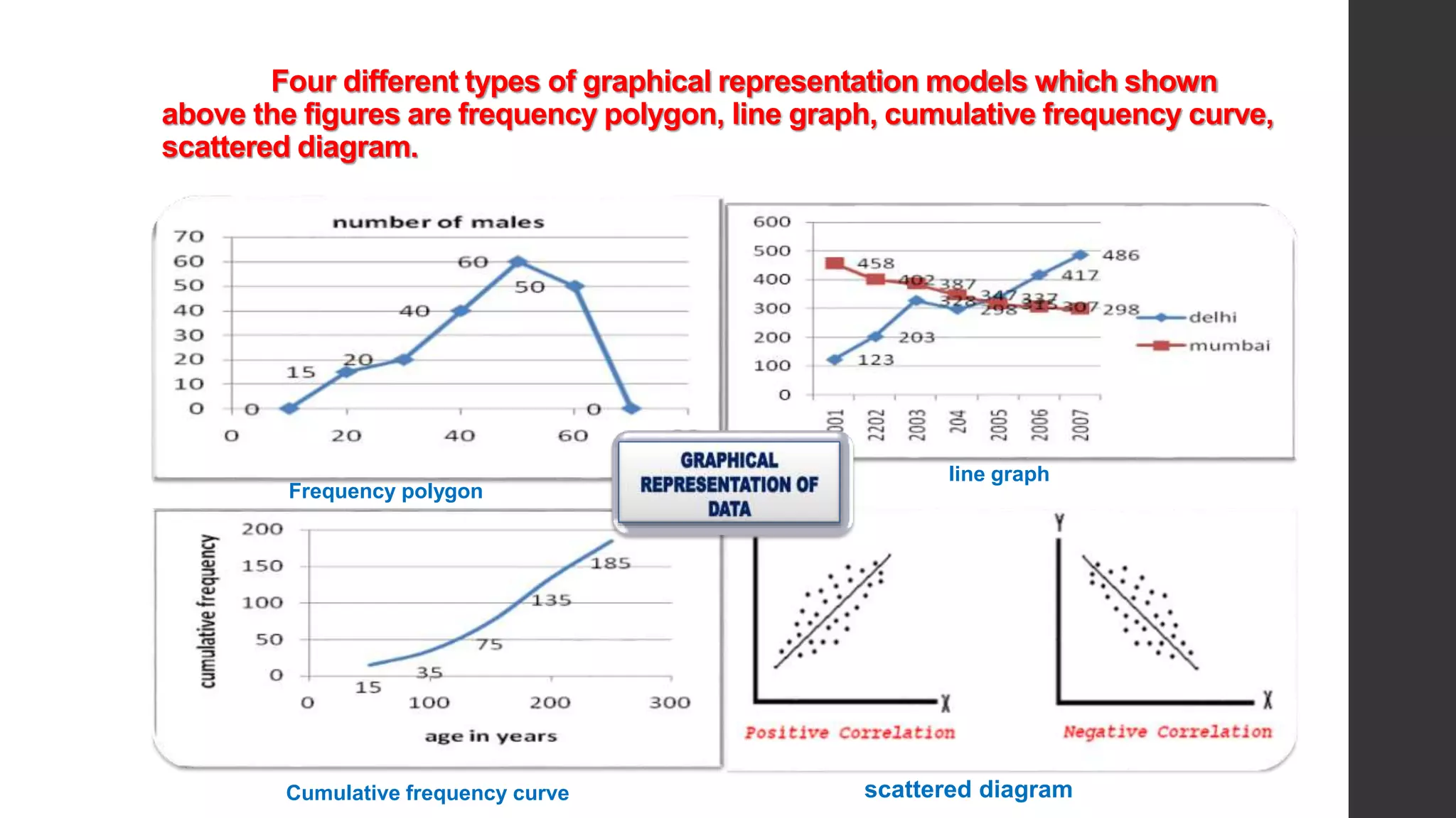
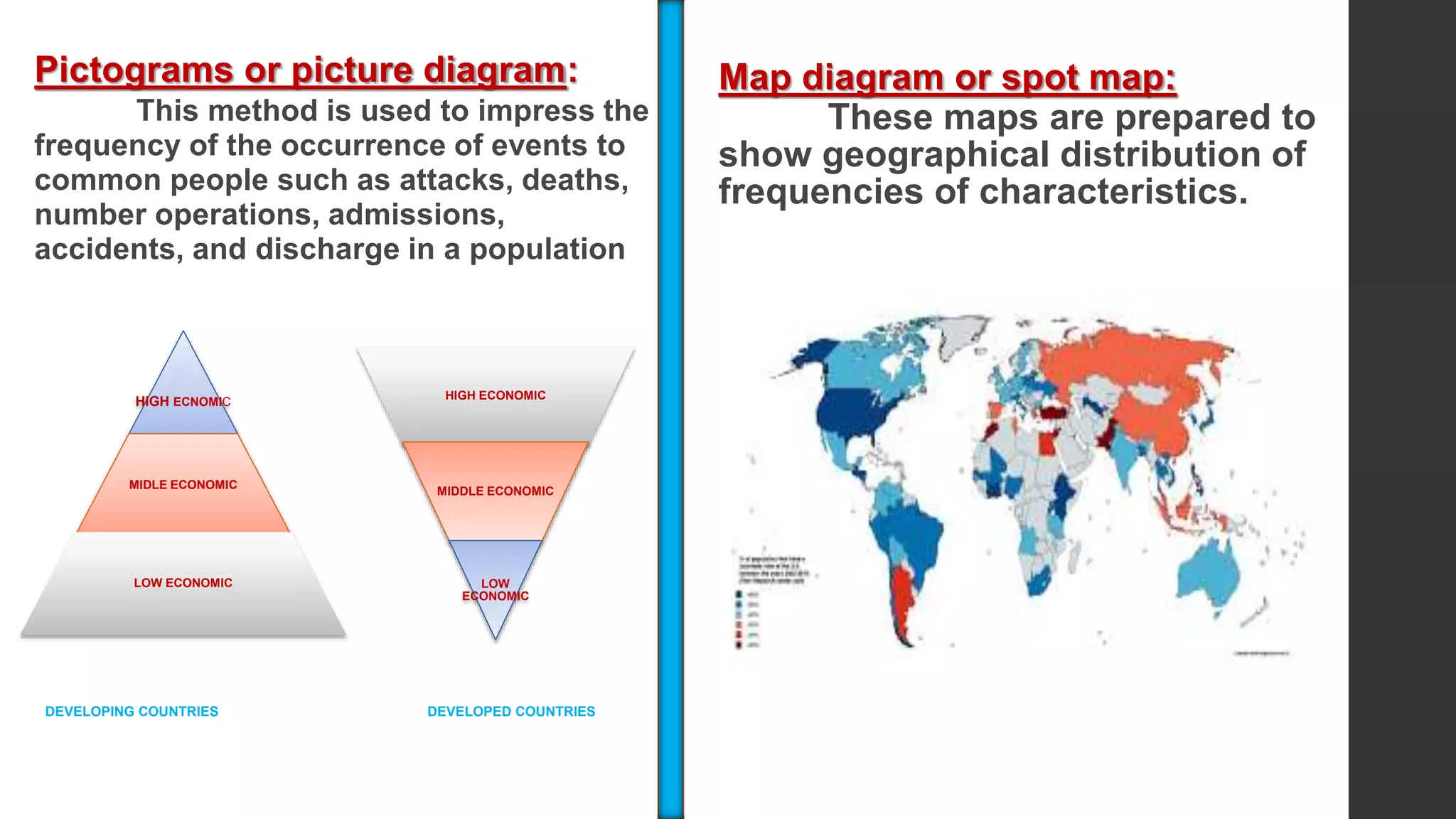
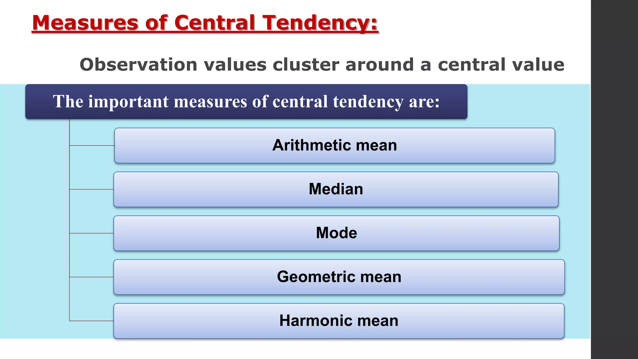
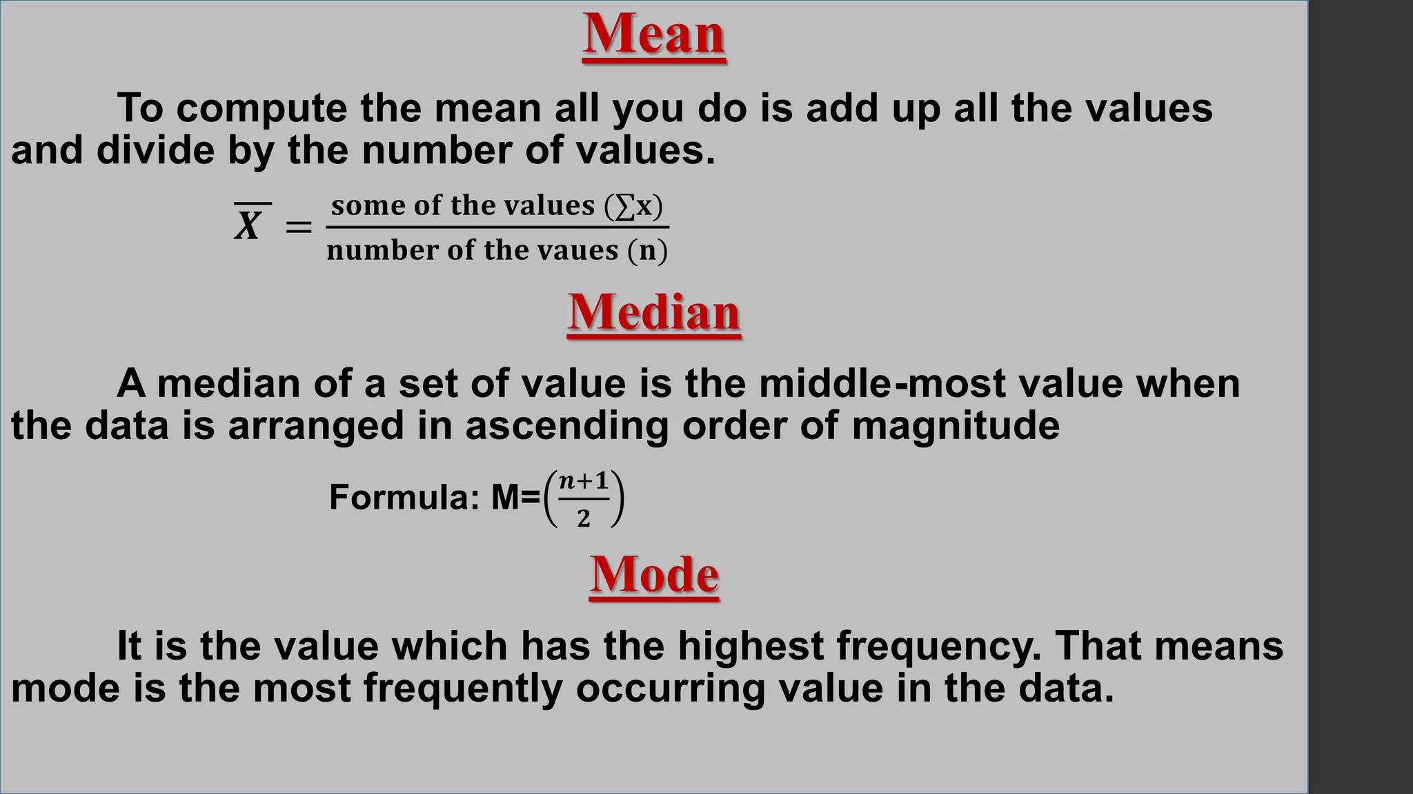
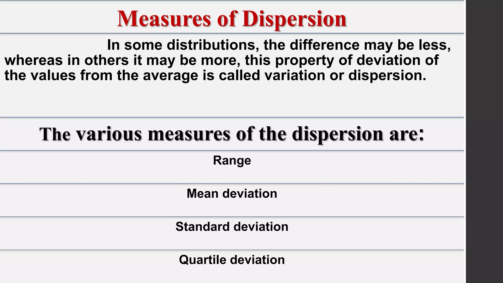
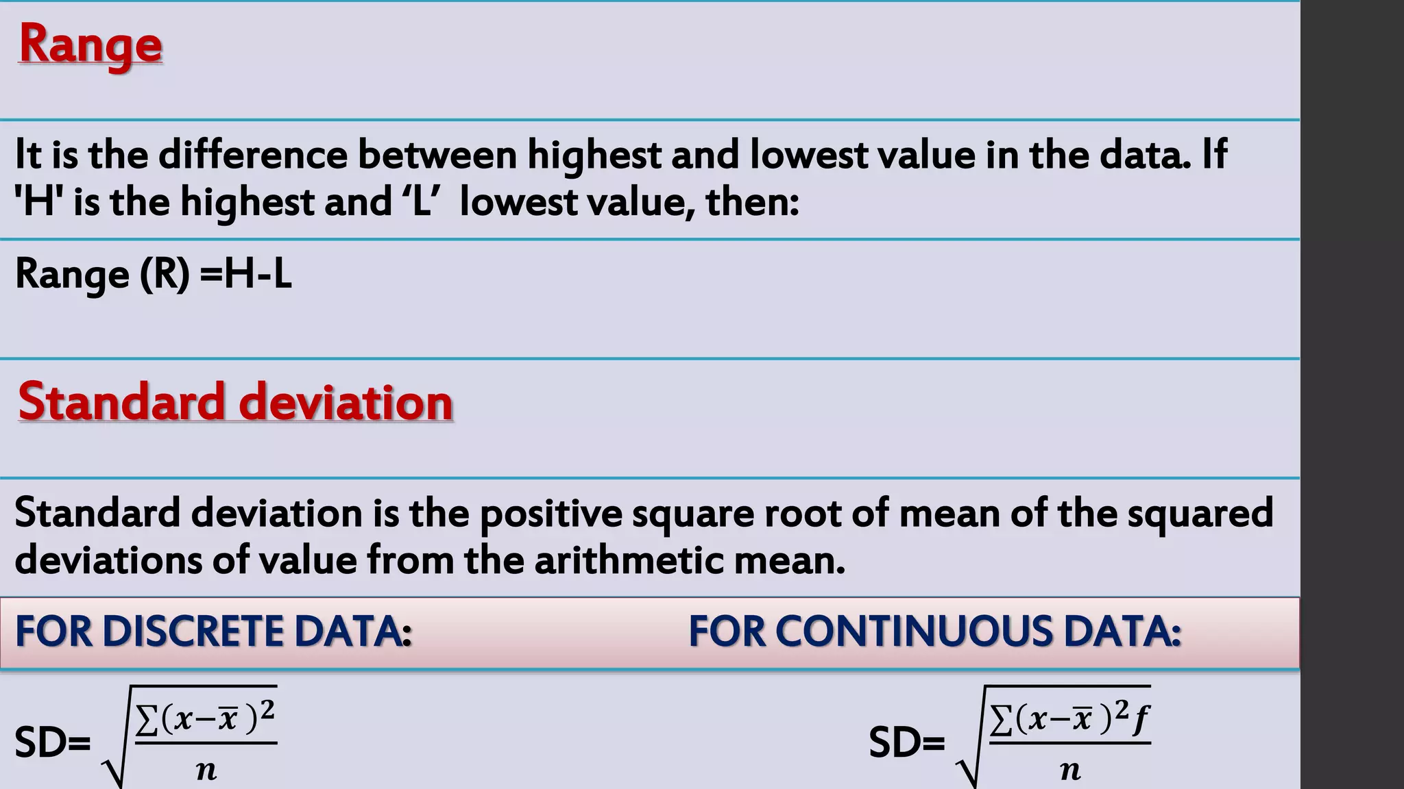
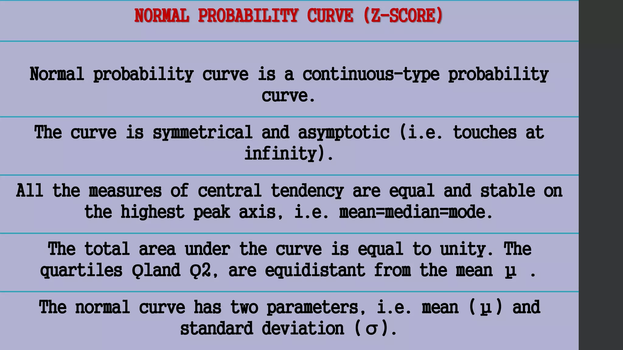
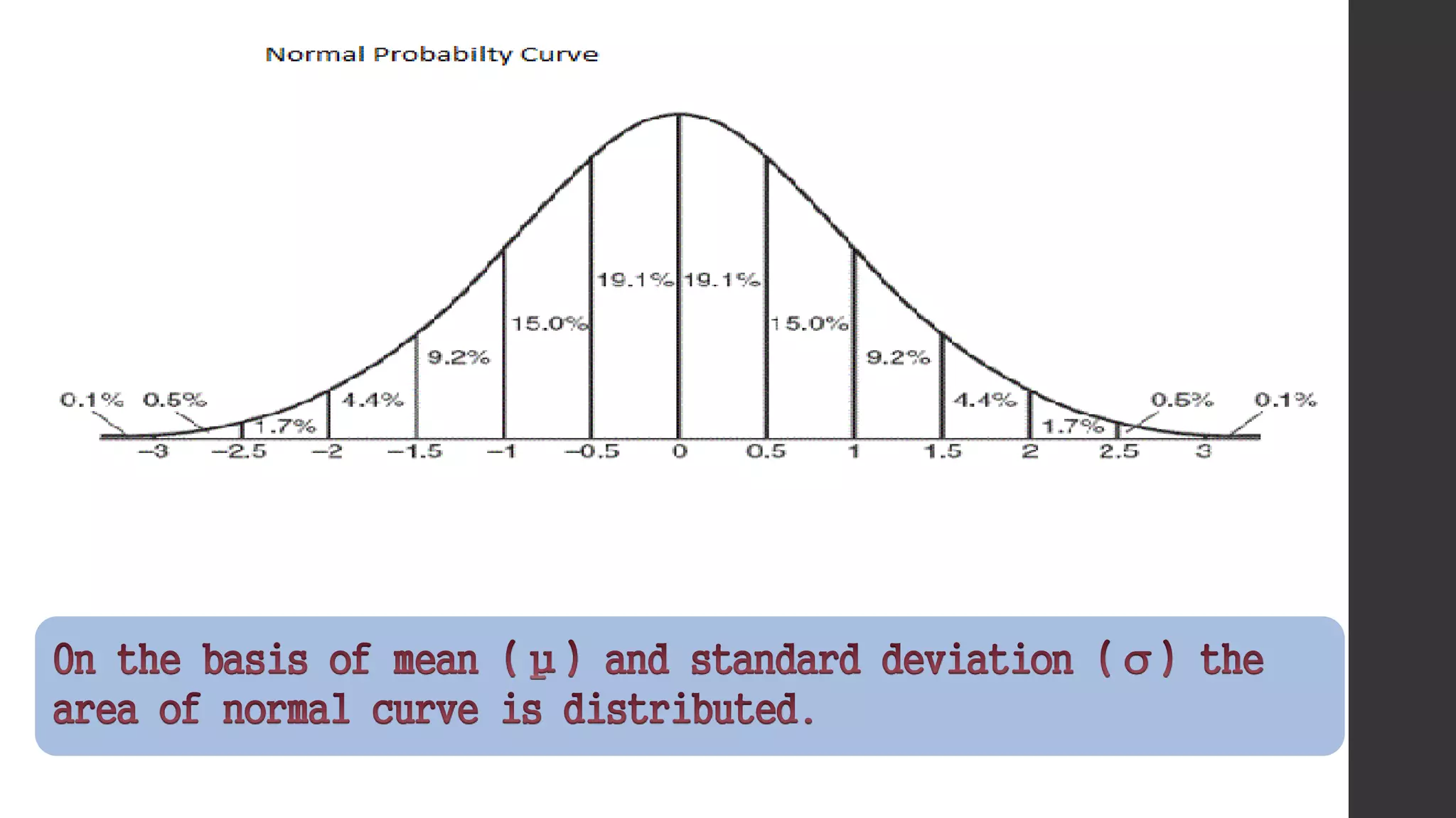
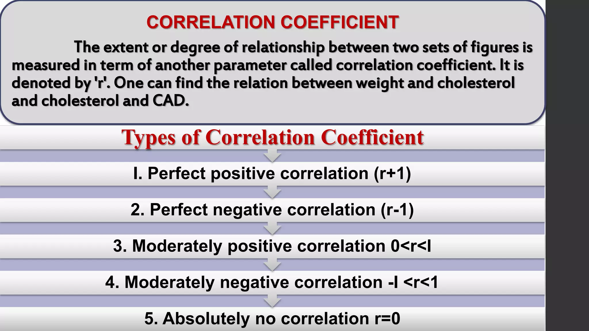
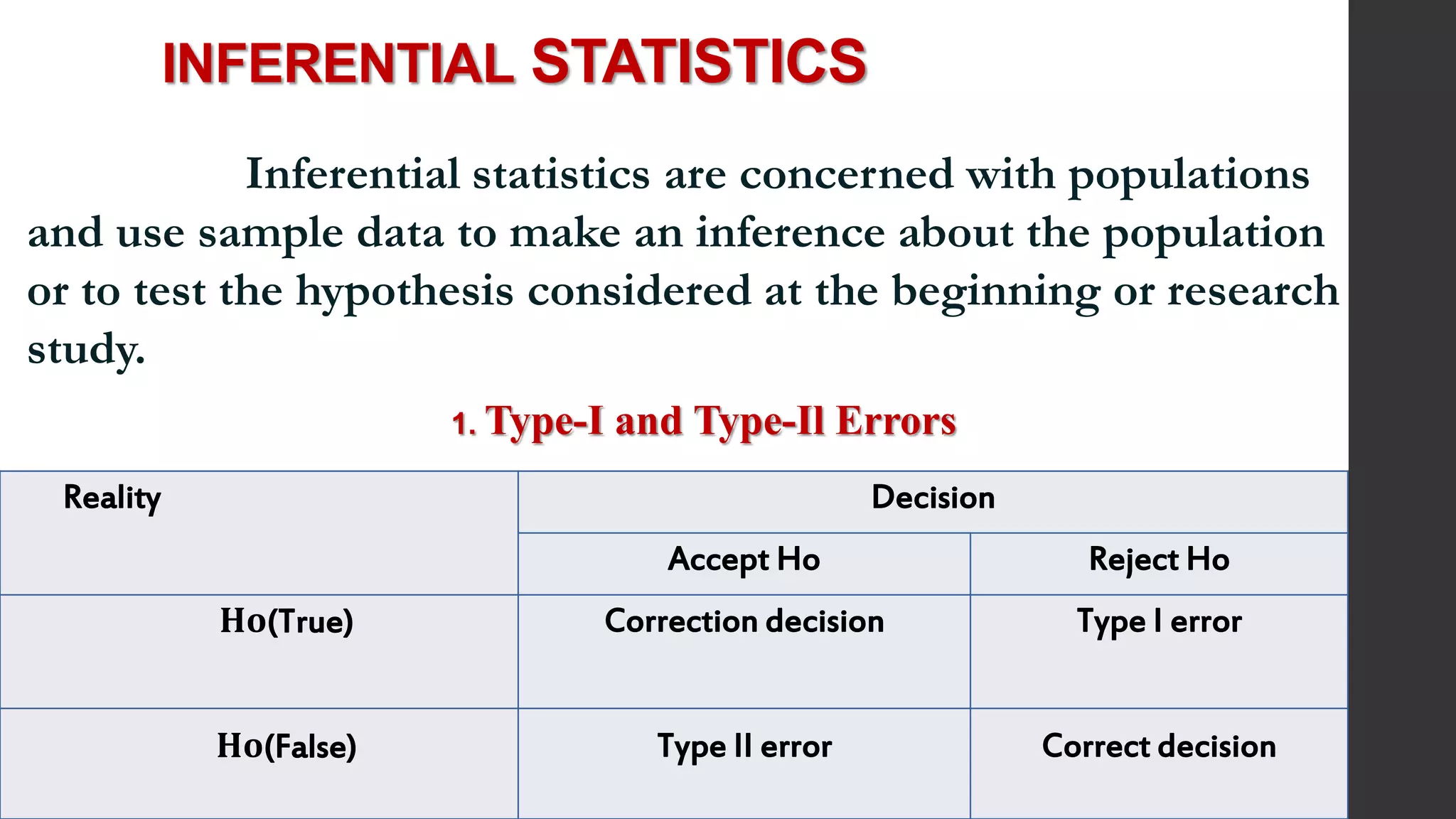
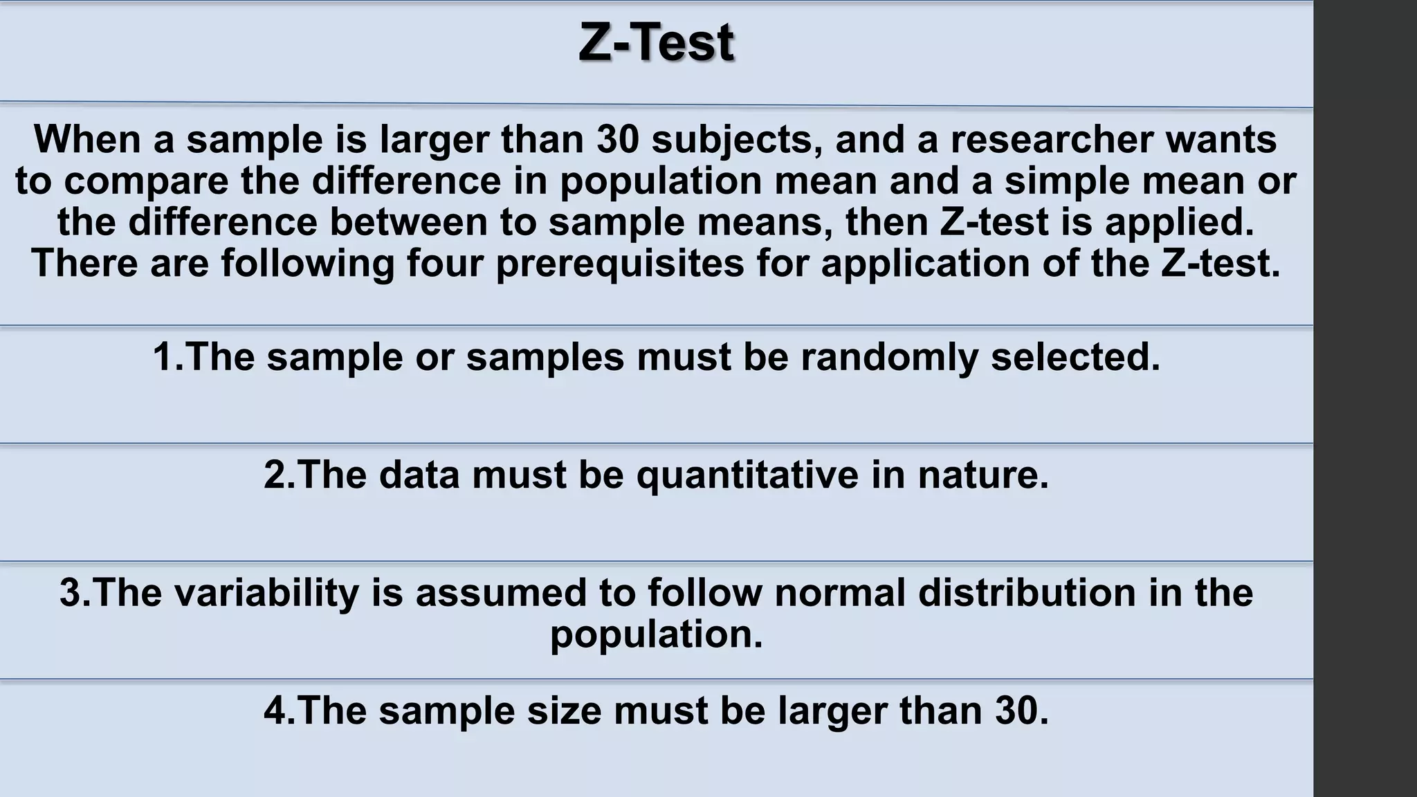
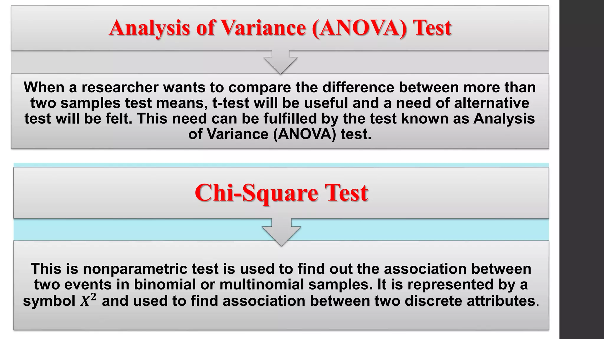
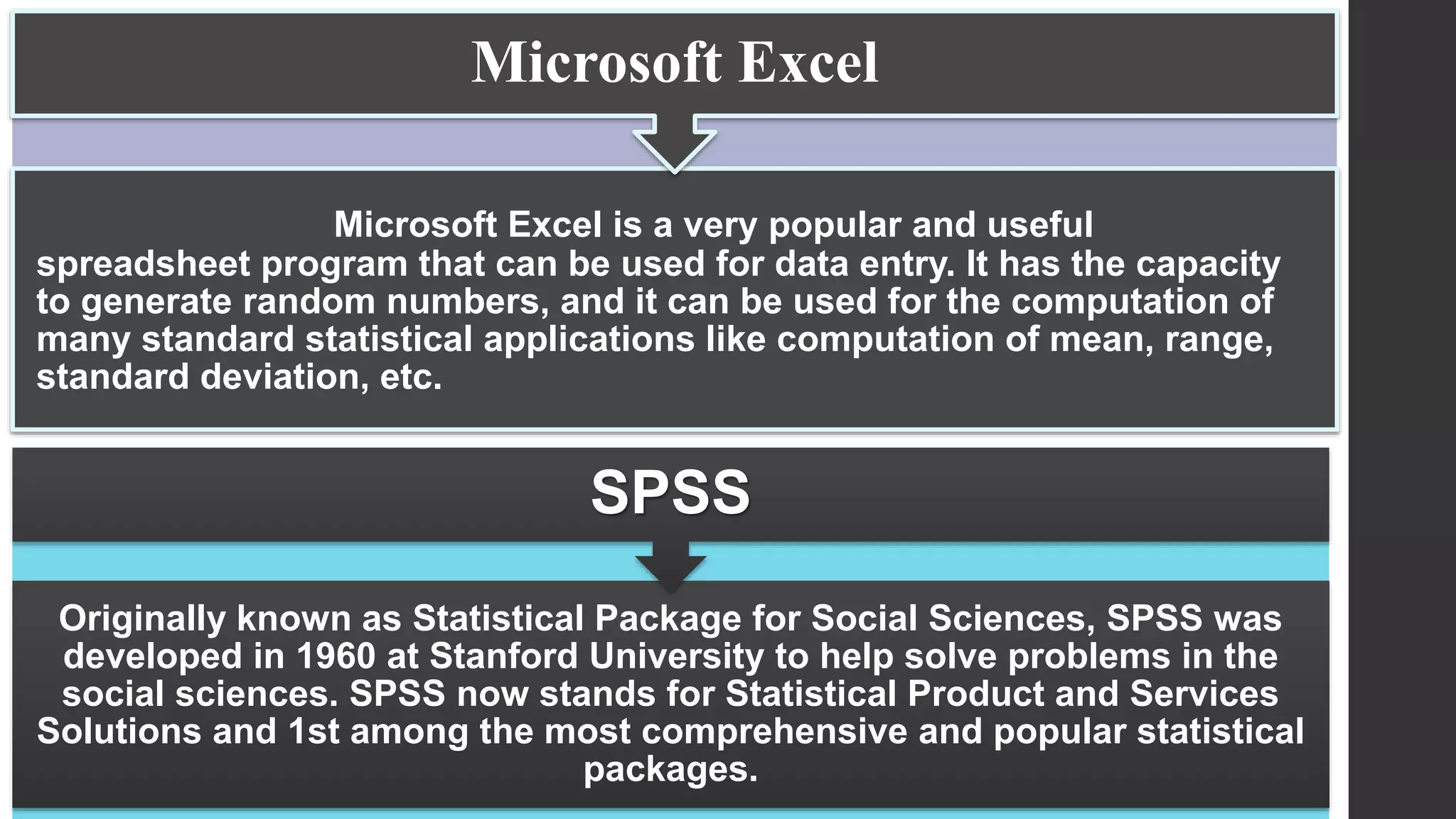
This document provides an overview of quantitative data analysis. It discusses data preparation, descriptive statistics such as measures of central tendency and dispersion, inferential statistics, and interpretation of results. The key steps in quantitative analysis are described as data preparation, describing the data through descriptive statistics, drawing inferences through inferential statistics, and interpreting the findings. Common statistical techniques like mean, median, mode, standard deviation, and correlation are also summarized.
2. Introduction
Analysis is the process of organizing and synthesizing the data
so as to answer research questions and test hypothesis.
Analysis referred as a method of organizing data in such a way
that research questions and answered and hypothesis can be tested
Analysis is the process of breaking a complex topic into smaller
parts to gain better understanding of it.
It is also defined as the process of systematically applying
statistical and logical techniques to describe, summarize and compare
data
3. ANALYSIS OF QUANTITATIVE DATA
Analysis of quantitative data deals with
information collected during research study, which can be
quantified and statistical calculations, can be computed.
Steps of Quantitative Data Analysis
1. Data preparation
2. Describing the Data (Descriptive or summary
statistics)
3. Drawing the inferences of data ( Inferential statistics)
4. Interpretation of data
4. 1.Data Preparation
Data preparation involves checking or logging the
data, checking the data for accuracy, entering the data into the
computer, transforming the data developing and documenting
a database structure .
Data
preparation
involved the
following
steps
Compilation
Editing
Coding
Classification
Tabulation
5. 2.Describing the Data (Descriptive or summary statistics)
Descriptive statistics are used to describe the basis features of data and
to provide simple summaries about the sample and the measures used to a study.
They are used to describe the main features of a collection of data in quantitative
terms.
3.Drawing the inferences of data( inferential statistics)
Inferential statistics helps in draw inferences from the data. e.g.: finding
the differences, relationship, and association between two more variables by the help
of the parametric and non parametric statistical tests.
4.Interpretation of data
Interpretation of data refers to the critical examination of analysed study
results to draw inferences and conclusions.
Analysed Study Results
Tables
Graphs
Statistical Computing
Careful and critical
examination of
study results
Drawing the
comparative and
contrasts
relationships
6. DESCRIPTIVE STATITICS
Descriptive statistics is used to organize and summarize
the data to draw meaningful interpretations. It also allow the
researcher to interpret the data meaningfully so that the research
question can be answered completely and appropriately.
• Measures to condense data.
• Measures of central tendency
• Measures of dispersion
• Measures of relationship (Correlation coefficient)
Classification of the descriptive statistics
7. Measures to Condense Data
An appropriate presentation of data involves organization of data
in such a manner that meaningful conclusions and inferences can drawn to
answer the research question. Quantitative data are generally condensed and
presented through
Tables
A table is a tabular representation of statistical data.
Tabulation is the first step before data can be used for further
statistical analysis and interpretation. The tabulation means the
systematic presentation of the information contained in the data in
rows and columns in accordance with some common features and
characteristics. Rows are horizontal and columns are vertical
arrangements.
1.Tables and Chart
2.Graphs and Diagrams
8. Parts of a table:
The various parts of table vary from
problem to problem, depending upon the nature of the data and
purpose of investigation.
A good statistical table must contain:
Table number
Title
Subheads
Caption and subheads
Body of table
Footnotes:
Source note
9. Types of the Tables
Basically tables are of four types.
Frequency Distribution Table
These tables present the frequency
and percentage distribution of the
information collected, where an
attribute is grouped number of
classes, which may vary between
three to eight classes.
10. Contingency Tables
Tables that
repot on the frequency
distribution of two nominal
variables simultaneously and
that include the totals are
known as contingency tables.
11. Multiple-Response Tables:
When classification of the cases is to be
done into categories that are neither
exclusive nor exhaustive, a multiple
response table is used. For example, a
patient can have two or more complaints,
while say only the major ones may be listed.
in such cases. The Sum total of frequencies
would exceed the total number of subjects
and may lead to confusion
12. Miscellaneous Tables:
These tables are
used present data other than
frequency or percentage
distributions such mean,
median, mode, range,
standard deviation, and so
on.
13. Graphs and diagrams
Graphical presentation of data. It is the most systematic and
concise ways in which statistical results may be presented
Types of diagram and graphs:
The commonly used diagrams and graphs in the presentation of data of
the research studies are
Bar diagram,
Pie chart
Histogram,
Frequency Polygon
Line graphs
14. Bar Diagram
It is a convenient graphical device that is particularly useful for
displaying nominal or original data. It is an easy method adopted for visual
comparison of the magnitude of different frequencies. Below figures shows
the different types of bar diagram.
0
10
20
30
40
50
60
70
80
Vegitatian Non veg:
80
27
no f people
0 20 40 60
photography
sneezing
arriving late
whispering
snoring
mobile phone
coughing
25
28
48
44
21
50
60
Number of patients
0
10
20
30
40
50
60
60
14
20
9
20
22
8
22 population
land
Simple bar diagram Multiple Bar diagram Proportional Bar diagram
15. Pie diagram /Sector diagram:
It is the pictorial device for
presenting discrete data of qualitative
characteristics. A complete circle
represents the entire data under
consideration.
Histogram:
It is the most commonly used graphical
representation of grouped frequency
distribution. Variable characters of the
different groups are indicated on the
horizontal line (x-axis) and
Frequencies(number of observation) are
indicated on the vertical line (y-axis).
34
10
11
12
17
2 0
basketball
soccer
reading
computer games
listening music
netball
40
0
10
20
30
40
50
60
70
Age in Years
Pie diagram showing cultural and leisure
activities in which urban children participate
16. Four different types of graphical representation models which shown
above the figures are frequency polygon, line graph, cumulative frequency curve,
scattered diagram.
Frequency polygon
line graph
Cumulative frequency curve scattered diagram
17. Pictograms or picture diagram:
This method is used to impress the
frequency of the occurrence of events to
common people such as attacks, deaths,
number operations, admissions,
accidents, and discharge in a population
Map diagram or spot map:
These maps are prepared to
show geographical distribution of
frequencies of characteristics.
HIGH ECNOMIC
MIDLE ECONOMIC
LOW ECONOMIC
HIGH ECONOMIC
MIDDLE ECONOMIC
LOW
ECONOMIC
DEVELOPING COUNTRIES DEVELOPED COUNTRIES
18. Measures of Central Tendency:
Observation values cluster around a central value
The important measures of central tendency are:
Arithmetic mean
Median
Mode
Geometric mean
Harmonic mean
19. Mean
To compute the mean all you do is add up all the values
and divide by the number of values.
𝑿 =
𝐬𝐨𝐦𝐞 𝐨𝐟 𝐭𝐡𝐞 𝐯𝐚𝐥𝐮𝐞𝐬 (∑𝐱)
𝐧𝐮𝐦𝐛𝐞𝐫 𝐨𝐟 𝐭𝐡𝐞 𝐯𝐚𝐮𝐞𝐬 (𝐧)
Median
A median of a set of value is the middle-most value when
the data is arranged in ascending order of magnitude
Formula: M=
𝒏+𝟏
𝟐
Mode
It is the value which has the highest frequency. That means
mode is the most frequently occurring value in the data.
20. Measures of Dispersion
In some distributions, the difference may be less,
whereas in others it may be more, this property of deviation of
the values from the average is called variation or dispersion.
The various measures of the dispersion are:
Range
Mean deviation
Standard deviation
Quartile deviation
21. Range
It is the difference between highest and lowest value in the data. If
'H' is the highest and ‘L’ lowest value, then:
Range (R) =H-L
Standard deviation
Standard deviation is the positive square root of mean of the squared
deviations of value from the arithmetic mean.
FOR DISCRETE DATA: FOR CONTINUOUS DATA:
SD=
∑ 𝒙− 𝒙 𝟐
𝒏
SD=
∑ 𝒙− 𝒙 𝟐 𝒇
𝒏
22. NORMAL PROBABILITY CURVE (Z-SCORE)
Normal probability curve is a continuous-type probability
curve.
The curve is symmetrical and asymptotic (i.e. touches at
infinity).
All the measures of central tendency are equal and stable on
the highest peak axis, i.e. mean=median=mode.
The total area under the curve is equal to unity. The
quartiles Ǫ1and Ǫ2, are equidistant from the mean μ .
The normal curve has two parameters, i.e. mean (μ) and
standard deviation (σ).
23.
24. CORRELATION COEFFICIENT
The extent or degree of relationship between two sets of figures is
measured in term of another parameter called correlation coefficient. It is
denoted by 'r'. One can find the relation between weight and cholesterol
and cholesterol and CAD.
5. Absolutely no correlation r=0
4. Moderately negative correlation -I <r<1
3. Moderately positive correlation 0<r<l
2. Perfect negative correlation (r-1)
I. Perfect positive correlation (r+1)
Types of Correlation Coefficient
25. INFERENTIAL STATISTICS
Inferential statistics are concerned with populations
and use sample data to make an inference about the population
or to test the hypothesis considered at the beginning or research
study.
1. Type-I and Type-Il Errors
Reality Decision
Accept Ho Reject Ho
𝐇𝐨(True) Correction decision Type I error
𝐇𝐨(False) Type II error Correct decision
26. Level of Significance
Probability of making type-I error is called as level
of significance. It is represented by α or ρ. In other words, level
of significance is probability of rejecting the null hypothesis
when it is true. In health sciences we generally consider the
level of significance at either 1% (.01) or 5% (.05). A significance
level of 0.5 means that the researcher is willing to take a risk of
being wrong 5% of the times or 5 times out of 100, when
rejecting the null hypothesis.
27. Confidence Interval
Confidence interval (C) is a range of values
that with a specified degree of probability is
thought to contain the population value.
Degree of Freedom
The interpretation of a statistical test depends on
the degree of freedom. It is denoted by the
abbreviation df and a number (e.g. df =3). Degree of
freedom indicates the number of values that are free
to vary
29. t-Test
It is applied to find the significant difference between two means. This test
can be applied when following criteria are fulfilled:
1.Randomly selected homogeneous sample
2.Quantitative data (numerical data not the frequency distribution)
3.Variability normally distributed
4.Sample size less than 30; if sample size is more than 30, then Z-test is
applied. However, even t-test can be applied in sample more than 30.
30. Z-Test
When a sample is larger than 30 subjects, and a researcher wants
to compare the difference in population mean and a simple mean or
the difference between to sample means, then Z-test is applied.
There are following four prerequisites for application of the Z-test.
1.The sample or samples must be randomly selected.
2.The data must be quantitative in nature.
3.The variability is assumed to follow normal distribution in the
population.
4.The sample size must be larger than 30.
31. When a researcher wants to compare the difference between more than
two samples test means, t-test will be useful and a need of alternative
test will be felt. This need can be fulfilled by the test known as Analysis
of Variance (ANOVA) test.
Analysis of Variance (ANOVA) Test
This is nonparametric test is used to find out the association between
two events in binomial or multinomial samples. It is represented by a
symbol 𝑿 𝟐 and used to find association between two discrete attributes.
Chi-Square Test
32. Qualitative data analysis (QDA) software is used
in many academic fields, such as sociology,
psychology, political science, medicine, and
educational science, and it is also a popular tool for
businesses and market researchers.
COMPUTER ANALYSIS OF QUANTITATIVE DATA
33. Originally known as Statistical Package for Social Sciences, SPSS was
developed in 1960 at Stanford University to help solve problems in the
social sciences. SPSS now stands for Statistical Product and Services
Solutions and 1st among the most comprehensive and popular statistical
packages.
SPSS
Microsoft Excel is a very popular and useful
spreadsheet program that can be used for data entry. It has the capacity
to generate random numbers, and it can be used for the computation of
many standard statistical applications like computation of mean, range,
standard deviation, etc.
Microsoft Excel
34. Minitab
This is another statistical package designed to facilitate the
teaching of statistical methods by using computer. The Minitab is also a
very user-friendly product with well-designed documentation facilities that
are being used widely in educational institutions.
Web resources which are related to statistical power analyses. A few are:
StatPages.net
G-Power