This document discusses correlation and regression analysis. It defines correlation as the extent and nature of the relationship between two variables. Correlation can be positive, negative, simple, partial or multiple depending on the direction and number of variables. The degree of correlation is measured using scatter plots, which visually show the relationship, and the correlation coefficient r, which provides a numerical measure between -1 and 1. Regression analysis involves using one variable to predict or forecast the other. The document outlines different types and methods of regression analysis and their applications in fields like agriculture, genetics and medicine.
ppt Coefficient Of Correlation By Spearmans Rank Method And Concurrent Deviation Method.
it contains steps to solve questions with these methods along with some example
Please Subscribe to this Channel for more solutions and lectures
http://www.youtube.com/onlineteaching
Chapter 12: Analysis of Variance
12.2: Two-Way ANOVA
The Spearman’s Rank Correlation Coefficient is the non-parametric statistical measure used to study the strength of association between the two ranked variables. This method is applied to the ordinal set of numbers, which can be arranged in order, i.e. one after the other so that ranks can be given to each. This presentation slides explains the procedure to find out the Rank Difference correlation and its applications.
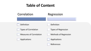
This presentation covered the following topics:
1. Definition of Correlation and Regression
2. Meaning of Correlation and Regression
3. Types of Correlation and Regression
4. Karl Pearson's methods of correlation
5. Bivariate Grouped data method
6. Spearman's Rank correlation Method
7. Scattered diagram method
8. Interpretation of correlation coefficient
9. Lines of Regression
10. regression Equations
11. Difference between correlation and regression
12. Related examples
Multiple Correlation Coefficient denoting a correlation of one variable with multiple other variables. The Multiple Correlation Coefficient, R, is a measure of the strength of the association between the independent (explanatory) variables and the one dependent (prediction) variable. This presentation explains the concept of multiple correlation and its computation process.
ppt Coefficient Of Correlation By Spearmans Rank Method And Concurrent Deviation Method.
it contains steps to solve questions with these methods along with some example
Please Subscribe to this Channel for more solutions and lectures
http://www.youtube.com/onlineteaching
Chapter 12: Analysis of Variance
12.2: Two-Way ANOVA
The Spearman’s Rank Correlation Coefficient is the non-parametric statistical measure used to study the strength of association between the two ranked variables. This method is applied to the ordinal set of numbers, which can be arranged in order, i.e. one after the other so that ranks can be given to each. This presentation slides explains the procedure to find out the Rank Difference correlation and its applications.
This presentation covered the following topics:
1. Definition of Correlation and Regression
2. Meaning of Correlation and Regression
3. Types of Correlation and Regression
4. Karl Pearson's methods of correlation
5. Bivariate Grouped data method
6. Spearman's Rank correlation Method
7. Scattered diagram method
8. Interpretation of correlation coefficient
9. Lines of Regression
10. regression Equations
11. Difference between correlation and regression
12. Related examples
Multiple Correlation Coefficient denoting a correlation of one variable with multiple other variables. The Multiple Correlation Coefficient, R, is a measure of the strength of the association between the independent (explanatory) variables and the one dependent (prediction) variable. This presentation explains the concept of multiple correlation and its computation process.
This is about the correlation analysis in statistics. It covers types, importance,Scatter diagram method
Karl pearson correlation coefficient
Spearman rank correlation coefficient
HOW IS IT USEFUL IN FIELD OF FORENSIC SCIENCE AND IN THIS I HAVE SHOWN THE TYPES OF CORRELATION, SIGNIFICANCE , METHODS AND KARL PEARSON'S METHOD OF CORRELATION
How to Make a Field invisible in Odoo 17Celine George
It is possible to hide or invisible some fields in odoo. Commonly using “invisible” attribute in the field definition to invisible the fields. This slide will show how to make a field invisible in odoo 17.
Synthetic Fiber Construction in lab .pptxPavel ( NSTU)
Synthetic fiber production is a fascinating and complex field that blends chemistry, engineering, and environmental science. By understanding these aspects, students can gain a comprehensive view of synthetic fiber production, its impact on society and the environment, and the potential for future innovations. Synthetic fibers play a crucial role in modern society, impacting various aspects of daily life, industry, and the environment. ynthetic fibers are integral to modern life, offering a range of benefits from cost-effectiveness and versatility to innovative applications and performance characteristics. While they pose environmental challenges, ongoing research and development aim to create more sustainable and eco-friendly alternatives. Understanding the importance of synthetic fibers helps in appreciating their role in the economy, industry, and daily life, while also emphasizing the need for sustainable practices and innovation.
Macroeconomics- Movie Location
This will be used as part of your Personal Professional Portfolio once graded.
Objective:
Prepare a presentation or a paper using research, basic comparative analysis, data organization and application of economic information. You will make an informed assessment of an economic climate outside of the United States to accomplish an entertainment industry objective.
Honest Reviews of Tim Han LMA Course Program.pptxtimhan337
Personal development courses are widely available today, with each one promising life-changing outcomes. Tim Han’s Life Mastery Achievers (LMA) Course has drawn a lot of interest. In addition to offering my frank assessment of Success Insider’s LMA Course, this piece examines the course’s effects via a variety of Tim Han LMA course reviews and Success Insider comments.
Biological screening of herbal drugs: Introduction and Need for
Phyto-Pharmacological Screening, New Strategies for evaluating
Natural Products, In vitro evaluation techniques for Antioxidants, Antimicrobial and Anticancer drugs. In vivo evaluation techniques
for Anti-inflammatory, Antiulcer, Anticancer, Wound healing, Antidiabetic, Hepatoprotective, Cardio protective, Diuretics and
Antifertility, Toxicity studies as per OECD guidelines
2024.06.01 Introducing a competency framework for languag learning materials ...Sandy Millin
http://sandymillin.wordpress.com/iateflwebinar2024
Published classroom materials form the basis of syllabuses, drive teacher professional development, and have a potentially huge influence on learners, teachers and education systems. All teachers also create their own materials, whether a few sentences on a blackboard, a highly-structured fully-realised online course, or anything in between. Despite this, the knowledge and skills needed to create effective language learning materials are rarely part of teacher training, and are mostly learnt by trial and error.
Knowledge and skills frameworks, generally called competency frameworks, for ELT teachers, trainers and managers have existed for a few years now. However, until I created one for my MA dissertation, there wasn’t one drawing together what we need to know and do to be able to effectively produce language learning materials.
This webinar will introduce you to my framework, highlighting the key competencies I identified from my research. It will also show how anybody involved in language teaching (any language, not just English!), teacher training, managing schools or developing language learning materials can benefit from using the framework.
Embracing GenAI - A Strategic ImperativePeter Windle
Artificial Intelligence (AI) technologies such as Generative AI, Image Generators and Large Language Models have had a dramatic impact on teaching, learning and assessment over the past 18 months. The most immediate threat AI posed was to Academic Integrity with Higher Education Institutes (HEIs) focusing their efforts on combating the use of GenAI in assessment. Guidelines were developed for staff and students, policies put in place too. Innovative educators have forged paths in the use of Generative AI for teaching, learning and assessments leading to pockets of transformation springing up across HEIs, often with little or no top-down guidance, support or direction.
This Gasta posits a strategic approach to integrating AI into HEIs to prepare staff, students and the curriculum for an evolving world and workplace. We will highlight the advantages of working with these technologies beyond the realm of teaching, learning and assessment by considering prompt engineering skills, industry impact, curriculum changes, and the need for staff upskilling. In contrast, not engaging strategically with Generative AI poses risks, including falling behind peers, missed opportunities and failing to ensure our graduates remain employable. The rapid evolution of AI technologies necessitates a proactive and strategic approach if we are to remain relevant.
Acetabularia Information For Class 9 .docxvaibhavrinwa19
Acetabularia acetabulum is a single-celled green alga that in its vegetative state is morphologically differentiated into a basal rhizoid and an axially elongated stalk, which bears whorls of branching hairs. The single diploid nucleus resides in the rhizoid.
Francesca Gottschalk - How can education support child empowerment.pptxEduSkills OECD
Francesca Gottschalk from the OECD’s Centre for Educational Research and Innovation presents at the Ask an Expert Webinar: How can education support child empowerment?
2. • Definition: The extent (degree) and nature of the relationship between two variables is
called correlation.
• Correlation analysis is a statistical tool, that measures the closeness or strength of the
relationship between the variables.
• In correlation, two variables are inter-dependent or co-vary and we can not make distinction
between the independent and dependent variables. E.g birth weight and maternal height,
drug intake and number of days taken to cure etc.
• Correlation analysis is not only establishing relationship but also quantify it. Correlation is
unable to indicate the cause and effect relationship between two variables.
3. Types of Correlation
On the basis of the nature of relationship between the variables, correlation can be
categorized as
1.Positive and negative correlation.
2.Simple, partial and multiple correlation
3.Linear and non-linear
4. • In this, increase in one variable causes the
proportionate decrease in the other variable.
• Here the two variables move in the
opposite direction.
• E.g. demand and price of commodity. If the
price of the commodity is more, demand fall
and if price of the commodity goes down,
then the demand goes up. Here there is
negative relationship between demand and
price.
Negative Correlation
A) Depending on direction of relationship
5. • This correlation is also called, direct
correlation.
• In this, an increase or decrease in the value
of one variable is associated with the increase
or decrease in the value of the other.
• In this, both variables move in the same
direction.
• E.g. Predict how much a man who is 125
cm tall might weigh.
We know the man is 125 cm tall, so we draw a
line up from 125 cm to the line of best fit. We
then draw across to the weight axis. We can
predict that he weighs about 75 - 76 kg.
Positive Correlation
6. Simple Partial
B) Depending on the number of variables
Multiple
• In this simple correlation only
two variables are involved, and
these two variables are taken
into consideration at a time.
• E.g. yield of wheat and the
amount (dose) of fertilizers.
• Relationship between three or
more variables is studied.
• In this type only two variables
are taken into consideration while
effect of other variables are held
constant.
• E.g. the yield of maize and the
amount of fertilizers applied to it
are taken into consideration and
the effect of the other variables
such as effect of pesticides, type
of soil, availability of water etc.
are not taken into consideration.
• In multiple correlations three or
more variables are studied
simultaneously. However it consist
of measurements of relationships
between a dependable variable
and two or more independent
variable.
• Partial and multiple correlation
are mainly associated with
multivariate analysis.
•E.g. relationship between
agricultural production, rainfall and
quantity of fertilizers
7. Linear correlation
• Difference between these two is based
on the ratio of change between the
variables under study.
• Linear correlation: values have
constant ratio.
• E.g. X= 30, 60, 90. • Y= 10, 20, 30
Non-linear correlation
• The amount of change in one variable
doesn’t have a constant ratio to the
change in other related variable.
• E.g. If the use of fertilizer is doubled,
yield of maize crop would not be exactly
doubled.
C) Depending on the ratio of change
8. Measures of correlation
Scatter diagram
Graph method
Correlation
Coefficient
1
2
3
A. Scatter diagram
• This is the simplest method for confirming whether there
is any relationship between two variables by plotting
values on chart or graph.
• It is nothing but a visual representation of two variables
by points (dots) on a graph.
• In a scatter diagram one variable is taken on the X-axis
and other on the Y-axis and the data is represented in the
form of points.
• It is called as a scatter diagram because it indicates
scatter of various points (variables)
• Scatter diagram gives a general idea about existence of
correlation between two variables and type of correlation,
but it does not give correct numerical value of the
correlation.
9. Depending on the extent of relationship between two variables,
scatter diagrams shows
Perfect correlation Perfect negative correlation
No correlation
High negative correlation
Degree
of
Relationship
High negative correlation
10. Degree of Relationship Between Variables
Perfect
Correlation
Perfect Negative
Correlation
High Negative
Correlation
High Positive
Correlation
No
Correlation
• All the points lie on
a straight line.
• As the variable value
increases on X-axis
the value on Y-axis
also increases or vice
a versa.
• E.g. height and
biomass.
• In this all the points
lie on a straight line.
• As the value on X-
axis increases, the
value on Y-axis
decreases
proportionately
•e.g. Water
temperature and
amount of dissolved
oxygen.
• In this the line can
not be drawn which
is passing through
most of the plotted
points and the
points are totally
scattered. Hence
there is no
correlation between
variables of X and
Y-axis.
• In this most of the
plotted points lie
on the line and
others near to this
line
• In this, It slopes
downward
• In this most of the
plotted points lie
on the line and
others near to this
line
• In this, It slopes
upward
11. Scatter Diagram Representation
Note: If the plotted points are very close to each other, it indicates high degree of correlation. If the plotted points
are away from each other, it indicates low degree of correlation.
12. • Merits of Scatter diagram:
1. It is the simple method to find out nature of correlation between two variables.
2. It is not influenced by extreme limits
3. It is easy to understand.
• Demerits of Scatter diagram:
1. It is unable to give exact degree of correlation between two variables.
2. It is a subjective method.
3. It cannot be applied to qualitative data.
4. Scatter is the only first step in finding out the strength of correlation-ship.
13. Graphical Method
Numerical
and solution
This method, also known as Correlogram is very simple. The data pertaining to
two series are plotted on a graph sheet. We can find out the correlation by
examining the direction and closeness of two curves. If both the curves drawn on
the graph are moving in the same direction, it is a case of positive correlation. On
the other hand, if both the curves are moving in opposite direction, correlation is
said to be negative. If the graph does not show any definite pattern on account of
erratic fluctuations in the curves, then it shows an absence of correlation.
Find out graphically, if there is any correlation between price yield per plot
(qtls); denoted by Y and quantity of fertilizer used (kg); denote by X.
Plot No.: 1 2 3 4 5 6 7 8 9 10
Y: 3.5 4.3 5.2 5.8 6.4 7.3 7.2 7.5 7.8 8.3
X: 6 8 9 12 10 15 17 20 18 24
The two curves move in the same direction
and, moreover, they are very close to each
other, suggesting a close relationship
between price yield per plot (qtls) and
quantity of fertilizer used (kg)
14. B. Correlation coefficient
• Scattered diagram and graphic method only gives a rough idea about the relationship between two
variables but does not give numerical measure of correlation.The degree of relationship can be
established by calculating Karl Pearson’s coefficient, which is denoted by ‘r’
• Definition: The coefficient of correlation ‘r’ can be defined as a measure of strength of the linear
relationship between the two variables X and Y.
𝑟 =
Ʃ( X –X’) (Y−Y’ )
√Ʃ ( X –X′)
2
√Ʃ (Y−Y′ )
2
where X = Independent variable , Y= dependent variable
• X -`X = deviation from mean
• Y-`Y = deviation from the mean
Type equation here.
15. Characteristics of correlation coefficient
• If r>0 correlation is positive , r<0 correlation is negative and r
=0 variables are not related
• Larger the numerical value of ‘r’ more close relationship
between variables.
• The value of r ranges between (-1) and (+1).
• If r = 1, we can say that there is perfect positive relationship
• If r = -1 there is perfect negative relationship.
• If r = 0 there is no relationship at all between the two
variables.
• Relationship is perfect, which means that all the points on the
scatter diagram fall on the straight line, the value of r is +1 or –1,
depending on the direction of line. Other values of r show an
intermediate degree of relationship between the two variables.
• If the value of Y increases as the value of X increases the sign
and slope will be positive whereas if the value Y decreases as
the value of X increases, then the slope will be negative a so
there will be –ve coefficient of correlation.
16. • Merits of Correlation Coefficient:
1.It is the numerical measure of correlation.
2. It determines a single value which summarizes extent of linear relationship.
3. It also indicates the type of correlation
4. It depends on all the observations so give true picture
• Demerits of Correlation Coefficient :
1.It can not be computed for qualitative data such as flower, colour, honesty, beauty, intelligence etc.
2.It measures only linear relationship, but it fails to measure non-linear relationship among variables.
3.It is difficult to calculate and cannot determine cause-and-effect relationship.
4.It can concludes a positive or negative relationship even though the two variables are actually
unrelated. e.g, the age of students and their score in the examination have no relation with each other.
The two variables may show similar movements but there does not seem to be a common link between
them.
17. Applications of correlation
In agriculture, genetics, physiology, medicine etc. correlation is used as a tool of the analysis.
1) Agriculture: Correlation is widely used as a tool of analysis in agriculture sciences. E.g. to
estimate the role of various variables (factors) such as fertilizers, irrigation, fertility of soil etc.
on crop yield.
2) Physiology: Using regression and correlation analysis relationship between germination
time and temperature of soil, alkalinity of river water and growth of fungi, etc. can be
estimated.
3) Genetics: Correlation analysis finds a lot of application in genetics. • For instance, when
‘r’=0 (correlation coefficient) then it indicates that the concern genes are located at distance
on same chromosomes. • When r=1, it indicates that genes are linked. Thus, correlation
analysis is very important in gene mapping
18. REGRESSION
•This term was first used by British
Biometrician Sir Francis Galton in 1877 to
describe the laws of human inheritance.
•Regression describes the liner relationship in
quantitative terms•It is used to make predictions
about one variable based on our knowledge of
the other. The regression analysis is a statistical
tool for measuring the average relationship
between any two, or more closely related
(positively, or negatively) variables in terms of
the original units of their data.
19. .
A) Simple and Multiple Regression Analysis
A simple regression Analysis is concerning with two variables say, X and Y while multiple regression is
concerning with more than two variables.
Y=f(x), Y=f(x,z)
Types of Regression
Analysis
Simple and Multiple
Regression Analysis
Linear and Non linear
Regression Analysis
Total and Partial
Regression Analysis
20. B) Total and Partial Regression Analysis
A total regression analysis is one which is made to study the effect of all the important variables on one
another. For example, when the effect of advertising expenditure, income of the people, and price of the
goods on the volume of sales are measured it is a case of total regression analysis. S = f(A , I, P)
While A partial regression analysis, on the other hand, is one which is made to study the effect of one, or
two relevant variables (excluding the irrelevant one) on another variable.
Y = f (X but not of Z and P ); S = f (advertisement but not of price and income of the people)
C) Linear and Non linear Regression Analysis
A linear regression is one in which some change in dependent variable (Y) can be expected for the
change in independent variable (X, irrespective of the values of Y). It give rise to straight line• In studying
the way in which the yield of wheat vary in relation to change the amount of fertilizer applied, yield is
dependent variable (Y) and fertilizer level is independent variable (X) .i.e.Y=a+bx
While Non linear Regression Analysis is one which gives rise to a curved line when the data relating to
two variables are plotted on a graph paper .
21. METHODS OF SIMPLE REGRESSION ANALYSIS
There are two different methods of studying simple (i.e. linear and partial) regression between two
related variables.
They are : I. Graphic method, 2. Scatter diagram method and 3. Algebraic method.
1. GRAPHIC METHOD
Under this method, one or two regression lines are drawn on a graph paper to estimate the values of
one variable say, X on the basis of the given values of another variable say, Y. The regression line of Y on
X will help us in estimating the value of Y for any value of X, and the regression line of X on Y will help us
in estimating the value of X for any value of Y
(i) When there is perfect positive correlation, i.e. r = 1 (ii) When there is perfect negative correlation, i.e. r = -1
22. (iv) When there is a high degree of correlation.
(iii) When there is no correlation (i.e. r = 0)
(v) When there is a low degree of correlation
23. B) SCATTER DIAGRAM METHOD
Under this method a graph paper is taken on which the independent variable say, X is represented
along the horizontal axis, and the dependent variable say, Y is represented along the vertical axis.
The points are then plotted on the graph paper representing the various pair of values of both the
variables X and Y which give the picture of a scatter diagram with several points scattered around.
After this, two free-hand straight lines are drawn across the scattered points in such a manner that
sum of the deviations of the points on one side of a line is equal to sum of the deviations of the
points on its other side. . However, the drawl of the regression lines in such a free hand manner
involves a great deal of difficulties
24. B) ALGEBRIC METHOD
Under this method we are to draw the lines of best fit as the lines of regression. These, lines of
regression are called the lines of the best fit because, with reference to these lines we can get the best
estimates of the values of one variable for the specified values of the other variable. Under this
method the sum of the squares of the deviations between the given values of a variable and its
estimated values given by the concerned line of regression is the least or minimum possible.
The line of the best fit for Y on X (Le. the regression lines of Y on X) is obtained by finding the value
of Y for any two (preferably the extreme ones) values of X through the following linear equation :
Y=a+bx
𝑦 = 𝑛𝑎 + 𝑏 𝑥
𝑥𝑦 = 𝑎 𝑥 +b 𝑥2
the line of the best fit for X on Y (i.e. the regression line of X on Y) is obtained by finding the values
of X for any two (preferably the extreme ones) values of Y through the following linear equation:
X=a+bY
𝑥 = 𝑛𝑎 + 𝑏 𝑦
𝑥𝑦 = 𝑎 𝑦 +b 𝑦2
25. Methods involved under regression analysis
1
2
3
4
5
6
METHODS
Method of deviation
from the actual
Means
Method of deviation
from the assumed
means
Standard error of
estimate
Method of least
square
Normal equation
method
Galton's graphs and
their interpretation
26. ADVANTAGES OF REGRESSION ANALYSIS
It provides a functional relationship between two or more related variables with the
help of which we can easily estimate or predict the unknown values of one variable
from the known values of another variable.
It provides a formidable tool of statistical analysis in the field of business and
commerce where people are interested in predicting the future events viz. :
consumption, production, investment, prices, sales, profits, etc. and success of
businessmen depends very much on the degree of accuracy in their various
estimates.
It provides a valuable tool for measuring and estimating the cause and effect
relationship among the economic variables that constitute the essence of economic
theory and economic life.
This technique is highly used in our day-to-day life and sociological studies as well
to estimate the various factors viz. birth rate, death rate, tax rate, yield rate, etc.
Last but not the least, the regression analysis technique gives us an idea about the
relative variation of a series
27. Limitations of linear regression
Despite the above utilities and usefulness, the technique of regression analysis suffers
from the following serious limitations :
It is assumed that the cause and effect relationship between the variables remains
unchanged. This assumption may not always hold good and hence estimation of the
values of a variable made on the basis of the regression equation may lead to
erroneous and misleading results.
The functional relationship that is established between any two or more variables
on the basis of some limited data may not hold good if more and more data are
taken into consideration.
It involves very lengthy and complicated procedure of calculations and analysis.
It can not be used in case of qualitative phenomenon viz., honesty, crime etc.
.
28. REFRENCES
KALYANI PUBLISHERS
BUSINESS STATISTIC II:
AN INTRODUCTION TO BUSINESS STATISTIC: AUTHOR SURINDER KUNDU ; VETTER: DR. B. S. BODLA
BUSINESS RESEARCH METHODOLOGY : KALYANI PUBLISHERS