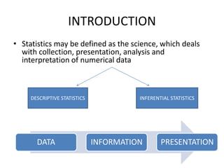
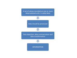
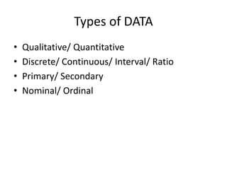
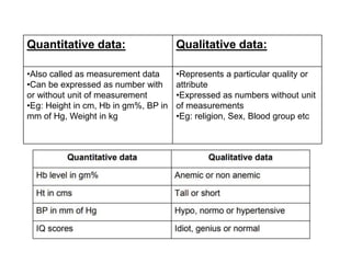
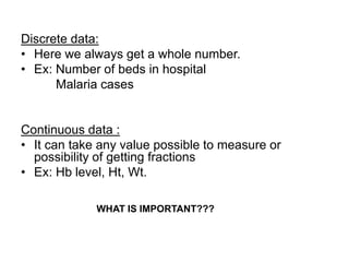
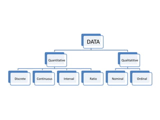
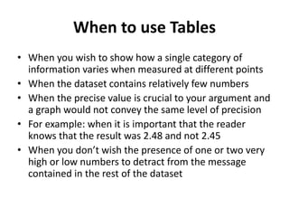
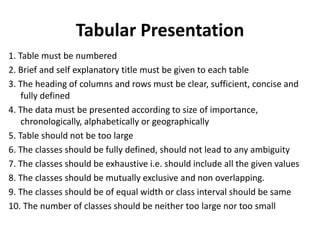
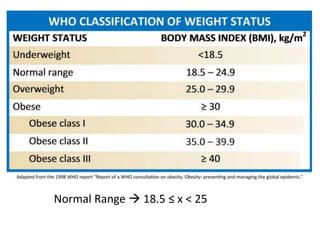
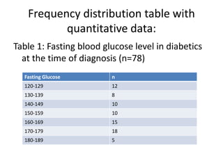
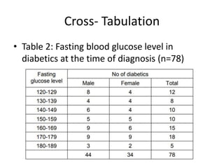
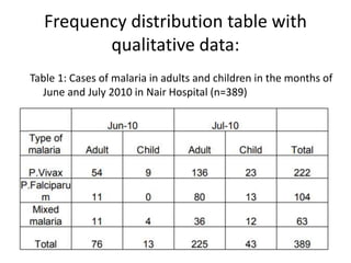
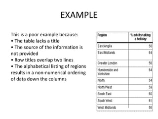
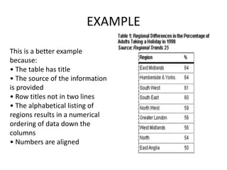
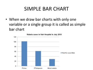
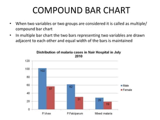
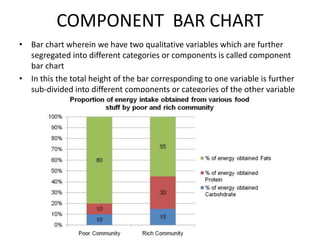
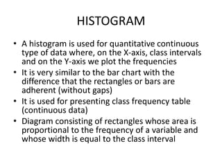
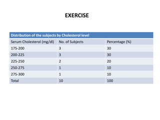
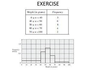
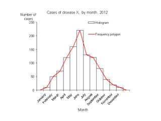
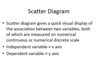
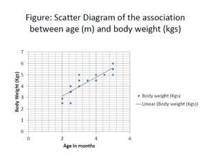
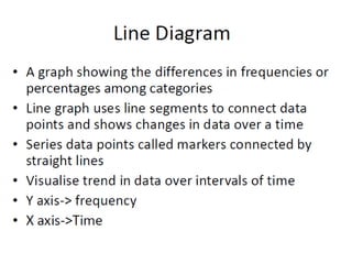
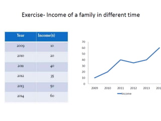
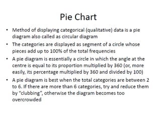
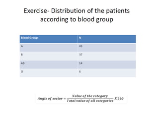
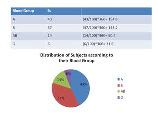
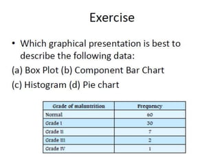
SlideShare a Scribd company logo
TYPES OF DATA
AND
GRAPHICAL / TABULAR
REPRESENTATION
DR. REENA TITORIA
INTRODUCTION
• Statistics may be defined as the science, which deals
with collection, presentation, analysis and
interpretation of numerical data
DATA INFORMATION PRESENTATION
DESCRIPTIVE STATISTICS INFERENTIAL STATISTICS
A set of values recorded on one or more
observational units is called data
Data should be processed
Data depiction, data summarization and
data transformation
INFORMATION
Collected data should be
• Accurate (i.e. Measures true value of what is
under study)
• Valid( i.e. Measures only what is supposed to
measure)
• Precise(i.e. Gives adequate details of the
measurement)
• Reliable(i.e. Should be repeatable)
Types of DATA
• Qualitative/ Quantitative
• Discrete/ Continuous/ Interval/ Ratio
• Primary/ Secondary
• Nominal/ Ordinal
Quantitative data: Qualitative data:
•Also called as measurement data
•Can be expressed as number with
or without unit of measurement
•Eg: Height in cm, Hb in gm%, BP in
mm of Hg, Weight in kg
•Represents a particular quality or
attribute
•Expressed as numbers without unit
of measurements
•Eg: religion, Sex, Blood group etc
Discrete data:
• Here we always get a whole number.
• Ex: Number of beds in hospital
Malaria cases
Continuous data :
• It can take any value possible to measure or
possibility of getting fractions
• Ex: Hb level, Ht, Wt.
WHAT IS IMPORTANT???
Interval:
• Has values of equal intervals that mean
something. For example, a thermometer might
have intervals of ten degrees
• Ex: Celsius Temperature, IQ (intelligence scale)
Ratio:
• Exactly the same as the interval scale except that
the zero on the scale means: does not exist
• Ex: Age, Weight, Height
Primary data:
• Data collected by the investigator himself/ herself for a
specific purpose
• Ex: Data collected by a student for his/her thesis or
research project
• Advantages:
– The investigator collects data specific to the problem
under study.
– There is no doubt about the quality of the data collected
(for the investigator).
– If required, it may be possible to obtain additional data
during the study period.
Secondary data:
• Data collected by someone else for some other purpose
(but being utilized by the investigator for another
purpose)
• Ex: Census data being used to analyze the impact of
education on career choice and earning
• Advantages of using Secondary data:
– The data’s already there- no hassles of data collection
– It is less expensive
– The investigator is not personally responsible for the
quality of data (“I didn’t do it”)
Nominal data:
• The information or data fits into one of the
categories, but the categories cannot be ordered
• Categories without order
• Ex: Colour of eyes, Race, Gender
Ordinal data:
• A rank or order
• Here the categories can be ordered, but the
space or class interval between two categories
may not be the same
• Ex: Ranking in the class or exam, SES
QUESTION
A person's highest educational level is which type of variable?
• Continuous
• Discrete
• Ordinal
• Nominal
The number of motor-vehicle accidents on a particular stretch
of the national highway in a week is which type of variable?
• Continuous
• Discrete
• Nominal
• Ordinal
DATA
Quantitative
Discrete Continuous Interval Ratio
Qualitatitive
Nominal Ordinal
REPRESENTATION OF DATA
• Tabular
• Graphic
• Numeric
When to use Tables
• When you wish to show how a single category of
information varies when measured at different points
• When the dataset contains relatively few numbers
• When the precise value is crucial to your argument and
a graph would not convey the same level of precision
• For example: when it is important that the reader
knows that the result was 2.48 and not 2.45
• When you don’t wish the presence of one or two very
high or low numbers to detract from the message
contained in the rest of the dataset
Tabular Presentation
1. Table must be numbered
2. Brief and self explanatory title must be given to each table
3. The heading of columns and rows must be clear, sufficient, concise and
fully defined
4. The data must be presented according to size of importance,
chronologically, alphabetically or geographically
5. Table should not be too large
6. The classes should be fully defined, should not lead to any ambiguity
7. The classes should be exhaustive i.e. should include all the given values
8. The classes should be mutually exclusive and non overlapping.
9. The classes should be of equal width or class interval should be same
10. The number of classes should be neither too large nor too small
Normal Range  18.5 ≤ x < 25
Frequency distribution table with
quantitative data:
Table 1: Fasting blood glucose level in diabetics
at the time of diagnosis (n=78)
Fasting Glucose n
120-129 12
130-139 8
140-149 10
150-159 10
160-169 15
170-179 18
180-189 5
Cross- Tabulation
• Table 2: Fasting blood glucose level in
diabetics at the time of diagnosis (n=78)
Frequency distribution table with
qualitative data:
Table 1: Cases of malaria in adults and children in the months of
June and July 2010 in Nair Hospital (n=389)
EXAMPLE
This is a poor example because:
• The table lacks a title
• The source of the information is
not provided
• Row titles overlap two lines
• The alphabetical listing of regions
results in a non-numerical ordering
of data down the columns
EXAMPLE
This is a better example
because:
• The table has title
• The source of the information
is provided
• Row titles not in two lines
• The alphabetical listing of
regions results in a numerical
ordering of data down the
columns
• Numbers are aligned
Graphical Presentation
• A Graphical representation is a visual display of
data and statistical results. It is more often and
effective than presenting data in tabular form
• Graphical representation helps to quantify, sort
and present data in a method that is
understandable to a large variety of audience
• Graphs also enable us in studying both time
series and frequency distribution as they give
clear account and precise picture of problem
• Graphs are also easy to understand and eye
catching
General Principles of Graphic
Presentation
• In a graph there are two lines called coordinate axes
• One is vertical known as Y axis and the other is
horizontal called X axis
• These two lines are perpendicular to each other.
Where these two lines intersect each other is called ‘0’
or the Origin
• On the X axis the distances right to the origin have
positive value and distances left to the origin have
negative value
• On the Y axis distances above the origin have a positive
value and below the origin have a negative value
• It should have a title, legend and labelling
VARIOUS CHARTS AND DIAGRAMS
• Bar Diagram
• Histogram
• Frequency polygon
• Cumulative frequency curve/ Ogive
• Scatter diagram
• Line diagram
• Pie diagram
• Pictogram
• Stem and Leaf Plot
BAR DIAGRAM
• Bar charts are used for qualitative type of variable in which the variable
studied is plotted in the form of bar along the X-axis (horizontal) and the
height of the bar is equal to the percentage or frequencies which are
plotted along the Y-axis (vertical).
• The width of the bars is kept constant for all the categories
• The space between the bars also remains constant throughout.
• The number of subjects along with percentages in bracket written on the
top of each bar
• Types:
– Simple
– Compound
– Component
SIMPLE BAR CHART
• When we draw bar charts with only one
variable or a single group it is called as simple
bar chart
COMPOUND BAR CHART
• When two variables or two groups are considered it is called as multiple/
compound bar chart
• In multiple bar chart the two bars representing two variables are drawn
adjacent to each other and equal width of the bars is maintained
COMPONENT BAR CHART
• Bar chart wherein we have two qualitative variables which are further
segregated into different categories or components is called component
bar chart
• In this the total height of the bar corresponding to one variable is further
sub-divided into different components or categories of the other variable
HISTOGRAM
• A histogram is used for quantitative continuous
type of data where, on the X-axis, class intervals
and on the Y-axis we plot the frequencies
• It is very similar to the bar chart with the
difference that the rectangles or bars are
adherent (without gaps)
• It is used for presenting class frequency table
(continuous data)
• Diagram consisting of rectangles whose area is
proportional to the frequency of a variable and
whose width is equal to the class interval
Distribution of the subjects by Cholesterol level
Serum Cholesterol (mg/dl) No. of Subjects Percentage (%)
175-200 3 30
200-225 3 30
225-250 2 20
250-275 1 10
275-300 1 10
Total 10 100
EXERCISE
EXERCISE
FREQUENCY POLYGON AND CURVE
•Plot the variable along the X-axis and the
frequencies along the Y-axis
•Derived from a histogram by connecting the
mid points of the tops of the rectangles in the
histogram
•The line connecting the centres of histogram
rectangles is called frequency polygon
•If we construct a smooth freehand curve
passing through these points. Such a curve is
known as frequency curve
(n=37)
CUMULATIVE FREQUENCY DIAGRAM
One can tell the number of patients that lie above or below a certain level
Exercise
Types of data and graphical representation

More Related Content

What's hot

Classification of data
Classification of dataClassification of data
presentation of data
presentation of datapresentation of data
presentation of data
Shafeek S
 
Types of Data
Types of DataTypes of Data
Types of Data
Dr. Amjad Ali Arain
 
Four data types Data Scientist should know
Four data types Data Scientist should knowFour data types Data Scientist should know
Four data types Data Scientist should know
Ranjit Nambisan
 
Biostatistics Frequency distribution
Biostatistics Frequency distributionBiostatistics Frequency distribution
Biostatistics Frequency distribution
HARINATHA REDDY ASWARTHA
 
Introduction to statistics
Introduction to statisticsIntroduction to statistics
Introduction to statisticsakbhanj
 
Scatter Plot.pptx
Scatter Plot.pptxScatter Plot.pptx
Scatter Plot.pptx
kasthurimukila
 
Introduction to Descriptive Statistics
Introduction to Descriptive StatisticsIntroduction to Descriptive Statistics
Introduction to Descriptive Statistics
Sanju Rusara Seneviratne
 
Graphical presentation of data
Graphical presentation of dataGraphical presentation of data
Graphical presentation of datadrasifk
 
Graphical Representation of data
Graphical Representation of dataGraphical Representation of data
Graphical Representation of data
Jijo K Mathew
 
Statistical inference
Statistical inferenceStatistical inference
Statistical inferenceJags Jagdish
 
Inferential statistics.ppt
Inferential statistics.pptInferential statistics.ppt
Inferential statistics.pptNursing Path
 
Scales of measurment
Scales of measurmentScales of measurment
Scales of measurment
SWATHY M.A
 
1.2 types of data
1.2 types of data1.2 types of data
1.2 types of data
Long Beach City College
 
Frequency Polygon.pptx
Frequency Polygon.pptxFrequency Polygon.pptx
Frequency Polygon.pptx
Meenu M
 
Types of Statistics
Types of StatisticsTypes of Statistics
Types of Statisticsloranel
 
Data
DataData
Test of significance in Statistics
Test of significance in StatisticsTest of significance in Statistics
Test of significance in Statistics
Vikash Keshri
 
Representation of data using bar diagram
Representation of data using bar diagramRepresentation of data using bar diagram
Representation of data using bar diagram
saru3008
 

What's hot (20)

Classification of data
Classification of dataClassification of data
Classification of data
 
presentation of data
presentation of datapresentation of data
presentation of data
 
Types of Data
Types of DataTypes of Data
Types of Data
 
Four data types Data Scientist should know
Four data types Data Scientist should knowFour data types Data Scientist should know
Four data types Data Scientist should know
 
Biostatistics Frequency distribution
Biostatistics Frequency distributionBiostatistics Frequency distribution
Biostatistics Frequency distribution
 
Introduction to statistics
Introduction to statisticsIntroduction to statistics
Introduction to statistics
 
Scatter Plot.pptx
Scatter Plot.pptxScatter Plot.pptx
Scatter Plot.pptx
 
Data presentation 2
Data presentation 2Data presentation 2
Data presentation 2
 
Introduction to Descriptive Statistics
Introduction to Descriptive StatisticsIntroduction to Descriptive Statistics
Introduction to Descriptive Statistics
 
Graphical presentation of data
Graphical presentation of dataGraphical presentation of data
Graphical presentation of data
 
Graphical Representation of data
Graphical Representation of dataGraphical Representation of data
Graphical Representation of data
 
Statistical inference
Statistical inferenceStatistical inference
Statistical inference
 
Inferential statistics.ppt
Inferential statistics.pptInferential statistics.ppt
Inferential statistics.ppt
 
Scales of measurment
Scales of measurmentScales of measurment
Scales of measurment
 
1.2 types of data
1.2 types of data1.2 types of data
1.2 types of data
 
Frequency Polygon.pptx
Frequency Polygon.pptxFrequency Polygon.pptx
Frequency Polygon.pptx
 
Types of Statistics
Types of StatisticsTypes of Statistics
Types of Statistics
 
Data
DataData
Data
 
Test of significance in Statistics
Test of significance in StatisticsTest of significance in Statistics
Test of significance in Statistics
 
Representation of data using bar diagram
Representation of data using bar diagramRepresentation of data using bar diagram
Representation of data using bar diagram
 

Similar to Types of data and graphical representation

Presentation of data ppt
Presentation of data pptPresentation of data ppt
PRESENTATION OF STATISTICAL DATA
PRESENTATION OF STATISTICAL DATAPRESENTATION OF STATISTICAL DATA
PRESENTATION OF STATISTICAL DATA
keerthi samuel
 
Organizational Data Analysis by Mr Mumba.pptx
Organizational Data Analysis by Mr Mumba.pptxOrganizational Data Analysis by Mr Mumba.pptx
Organizational Data Analysis by Mr Mumba.pptx
bentrym2
 
Hanan's presentation.pptx
Hanan's presentation.pptxHanan's presentation.pptx
Hanan's presentation.pptx
saimwaheed2
 
Frequency distribution432021
Frequency distribution432021Frequency distribution432021
Frequency distribution432021
gopinathannsriramachandraeduin
 
Data presentation.pptx
Data presentation.pptxData presentation.pptx
Data presentation.pptx
ssusera0e0e9
 
2. AAdata presentation edited edited tutor srudents(1).pptx
2. AAdata presentation edited edited tutor srudents(1).pptx2. AAdata presentation edited edited tutor srudents(1).pptx
2. AAdata presentation edited edited tutor srudents(1).pptx
ssuser504dda
 
Biostatistics ppt
Biostatistics  pptBiostatistics  ppt
Biostatistics ppt
santhoshikayithi
 
Unit 4 editing and coding (2)
Unit 4 editing and coding (2)Unit 4 editing and coding (2)
Unit 4 editing and coding (2)
kalailakshmi
 
Data visualization.pptx
Data visualization.pptxData visualization.pptx
Data visualization.pptx
naveen shyam
 
data collection.pptx
data collection.pptxdata collection.pptx
data collection.pptx
AbhishekRaj508
 
Lecture-2{This tell us about the statics basic info}_JIH.pptx
Lecture-2{This tell us about the statics basic info}_JIH.pptxLecture-2{This tell us about the statics basic info}_JIH.pptx
Lecture-2{This tell us about the statics basic info}_JIH.pptx
fahimhasan1217
 
DATA PRESENTATION METHODS - 1.pptx
DATA PRESENTATION METHODS - 1.pptxDATA PRESENTATION METHODS - 1.pptx
DATA PRESENTATION METHODS - 1.pptx
vineetarun1
 
Statistics
StatisticsStatistics
Statistics
Dr. Jayesh Vyas
 
Introduction to Statistics in Nursing.
Introduction to Statistics in Nursing.Introduction to Statistics in Nursing.
Introduction to Statistics in Nursing.
Johny Kutty Joseph
 
Graphical representation of Data in Research.pdf
Graphical representation of Data in Research.pdfGraphical representation of Data in Research.pdf
Graphical representation of Data in Research.pdf
soniasehrawat5
 
Data presentation Lecture
Data presentation Lecture Data presentation Lecture
Data presentation Lecture
AB Rajar
 
Data presentation
Data presentationData presentation
Data presentation
Weam Banjar
 
collectionandrepresentationofdata1-200904192336.pptx
collectionandrepresentationofdata1-200904192336.pptxcollectionandrepresentationofdata1-200904192336.pptx
collectionandrepresentationofdata1-200904192336.pptx
aibakimito
 

Similar to Types of data and graphical representation (20)

Intro to statistics
Intro to statisticsIntro to statistics
Intro to statistics
 
Presentation of data ppt
Presentation of data pptPresentation of data ppt
Presentation of data ppt
 
PRESENTATION OF STATISTICAL DATA
PRESENTATION OF STATISTICAL DATAPRESENTATION OF STATISTICAL DATA
PRESENTATION OF STATISTICAL DATA
 
Organizational Data Analysis by Mr Mumba.pptx
Organizational Data Analysis by Mr Mumba.pptxOrganizational Data Analysis by Mr Mumba.pptx
Organizational Data Analysis by Mr Mumba.pptx
 
Hanan's presentation.pptx
Hanan's presentation.pptxHanan's presentation.pptx
Hanan's presentation.pptx
 
Frequency distribution432021
Frequency distribution432021Frequency distribution432021
Frequency distribution432021
 
Data presentation.pptx
Data presentation.pptxData presentation.pptx
Data presentation.pptx
 
2. AAdata presentation edited edited tutor srudents(1).pptx
2. AAdata presentation edited edited tutor srudents(1).pptx2. AAdata presentation edited edited tutor srudents(1).pptx
2. AAdata presentation edited edited tutor srudents(1).pptx
 
Biostatistics ppt
Biostatistics  pptBiostatistics  ppt
Biostatistics ppt
 
Unit 4 editing and coding (2)
Unit 4 editing and coding (2)Unit 4 editing and coding (2)
Unit 4 editing and coding (2)
 
Data visualization.pptx
Data visualization.pptxData visualization.pptx
Data visualization.pptx
 
data collection.pptx
data collection.pptxdata collection.pptx
data collection.pptx
 
Lecture-2{This tell us about the statics basic info}_JIH.pptx
Lecture-2{This tell us about the statics basic info}_JIH.pptxLecture-2{This tell us about the statics basic info}_JIH.pptx
Lecture-2{This tell us about the statics basic info}_JIH.pptx
 
DATA PRESENTATION METHODS - 1.pptx
DATA PRESENTATION METHODS - 1.pptxDATA PRESENTATION METHODS - 1.pptx
DATA PRESENTATION METHODS - 1.pptx
 
Statistics
StatisticsStatistics
Statistics
 
Introduction to Statistics in Nursing.
Introduction to Statistics in Nursing.Introduction to Statistics in Nursing.
Introduction to Statistics in Nursing.
 
Graphical representation of Data in Research.pdf
Graphical representation of Data in Research.pdfGraphical representation of Data in Research.pdf
Graphical representation of Data in Research.pdf
 
Data presentation Lecture
Data presentation Lecture Data presentation Lecture
Data presentation Lecture
 
Data presentation
Data presentationData presentation
Data presentation
 
collectionandrepresentationofdata1-200904192336.pptx
collectionandrepresentationofdata1-200904192336.pptxcollectionandrepresentationofdata1-200904192336.pptx
collectionandrepresentationofdata1-200904192336.pptx
 

More from Reena Titoria

Bias and confounder
Bias and confounderBias and confounder
Bias and confounder
Reena Titoria
 
Focus Group Discussion
Focus Group DiscussionFocus Group Discussion
Focus Group Discussion
Reena Titoria
 
Medical Informatics
Medical InformaticsMedical Informatics
Medical Informatics
Reena Titoria
 
Pharmacovigilance (pv)
Pharmacovigilance (pv)Pharmacovigilance (pv)
Pharmacovigilance (pv)
Reena Titoria
 
One health
One healthOne health
One health
Reena Titoria
 
Risk assessment and communication
Risk assessment and communicationRisk assessment and communication
Risk assessment and communication
Reena Titoria
 
Hazard analysis
Hazard analysisHazard analysis
Hazard analysis
Reena Titoria
 

More from Reena Titoria (7)

Bias and confounder
Bias and confounderBias and confounder
Bias and confounder
 
Focus Group Discussion
Focus Group DiscussionFocus Group Discussion
Focus Group Discussion
 
Medical Informatics
Medical InformaticsMedical Informatics
Medical Informatics
 
Pharmacovigilance (pv)
Pharmacovigilance (pv)Pharmacovigilance (pv)
Pharmacovigilance (pv)
 
One health
One healthOne health
One health
 
Risk assessment and communication
Risk assessment and communicationRisk assessment and communication
Risk assessment and communication
 
Hazard analysis
Hazard analysisHazard analysis
Hazard analysis
 

Recently uploaded

Levelwise PageRank with Loop-Based Dead End Handling Strategy : SHORT REPORT ...
Levelwise PageRank with Loop-Based Dead End Handling Strategy : SHORT REPORT ...Levelwise PageRank with Loop-Based Dead End Handling Strategy : SHORT REPORT ...
Levelwise PageRank with Loop-Based Dead End Handling Strategy : SHORT REPORT ...
Subhajit Sahu
 
一比一原版(Deakin毕业证书)迪肯大学毕业证如何办理
一比一原版(Deakin毕业证书)迪肯大学毕业证如何办理一比一原版(Deakin毕业证书)迪肯大学毕业证如何办理
一比一原版(Deakin毕业证书)迪肯大学毕业证如何办理
oz8q3jxlp
 
一比一原版(BCU毕业证书)伯明翰城市大学毕业证如何办理
一比一原版(BCU毕业证书)伯明翰城市大学毕业证如何办理一比一原版(BCU毕业证书)伯明翰城市大学毕业证如何办理
一比一原版(BCU毕业证书)伯明翰城市大学毕业证如何办理
dwreak4tg
 
Malana- Gimlet Market Analysis (Portfolio 2)
Malana- Gimlet Market Analysis (Portfolio 2)Malana- Gimlet Market Analysis (Portfolio 2)
Malana- Gimlet Market Analysis (Portfolio 2)
TravisMalana
 
一比一原版(Coventry毕业证书)考文垂大学毕业证如何办理
一比一原版(Coventry毕业证书)考文垂大学毕业证如何办理一比一原版(Coventry毕业证书)考文垂大学毕业证如何办理
一比一原版(Coventry毕业证书)考文垂大学毕业证如何办理
74nqk8xf
 
一比一原版(QU毕业证)皇后大学毕业证成绩单
一比一原版(QU毕业证)皇后大学毕业证成绩单一比一原版(QU毕业证)皇后大学毕业证成绩单
一比一原版(QU毕业证)皇后大学毕业证成绩单
enxupq
 
My burning issue is homelessness K.C.M.O.
My burning issue is homelessness K.C.M.O.My burning issue is homelessness K.C.M.O.
My burning issue is homelessness K.C.M.O.
rwarrenll
 
一比一原版(ArtEZ毕业证)ArtEZ艺术学院毕业证成绩单
一比一原版(ArtEZ毕业证)ArtEZ艺术学院毕业证成绩单一比一原版(ArtEZ毕业证)ArtEZ艺术学院毕业证成绩单
一比一原版(ArtEZ毕业证)ArtEZ艺术学院毕业证成绩单
vcaxypu
 
Criminal IP - Threat Hunting Webinar.pdf
Criminal IP - Threat Hunting Webinar.pdfCriminal IP - Threat Hunting Webinar.pdf
Criminal IP - Threat Hunting Webinar.pdf
Criminal IP
 
一比一原版(CU毕业证)卡尔顿大学毕业证成绩单
一比一原版(CU毕业证)卡尔顿大学毕业证成绩单一比一原版(CU毕业证)卡尔顿大学毕业证成绩单
一比一原版(CU毕业证)卡尔顿大学毕业证成绩单
yhkoc
 
一比一原版(UPenn毕业证)宾夕法尼亚大学毕业证成绩单
一比一原版(UPenn毕业证)宾夕法尼亚大学毕业证成绩单一比一原版(UPenn毕业证)宾夕法尼亚大学毕业证成绩单
一比一原版(UPenn毕业证)宾夕法尼亚大学毕业证成绩单
ewymefz
 
做(mqu毕业证书)麦考瑞大学毕业证硕士文凭证书学费发票原版一模一样
做(mqu毕业证书)麦考瑞大学毕业证硕士文凭证书学费发票原版一模一样做(mqu毕业证书)麦考瑞大学毕业证硕士文凭证书学费发票原版一模一样
做(mqu毕业证书)麦考瑞大学毕业证硕士文凭证书学费发票原版一模一样
axoqas
 
一比一原版(IIT毕业证)伊利诺伊理工大学毕业证成绩单
一比一原版(IIT毕业证)伊利诺伊理工大学毕业证成绩单一比一原版(IIT毕业证)伊利诺伊理工大学毕业证成绩单
一比一原版(IIT毕业证)伊利诺伊理工大学毕业证成绩单
ewymefz
 
一比一原版(UofS毕业证书)萨省大学毕业证如何办理
一比一原版(UofS毕业证书)萨省大学毕业证如何办理一比一原版(UofS毕业证书)萨省大学毕业证如何办理
一比一原版(UofS毕业证书)萨省大学毕业证如何办理
v3tuleee
 
哪里卖(usq毕业证书)南昆士兰大学毕业证研究生文凭证书托福证书原版一模一样
哪里卖(usq毕业证书)南昆士兰大学毕业证研究生文凭证书托福证书原版一模一样哪里卖(usq毕业证书)南昆士兰大学毕业证研究生文凭证书托福证书原版一模一样
哪里卖(usq毕业证书)南昆士兰大学毕业证研究生文凭证书托福证书原版一模一样
axoqas
 
【社内勉強会資料_Octo: An Open-Source Generalist Robot Policy】
【社内勉強会資料_Octo: An Open-Source Generalist Robot Policy】【社内勉強会資料_Octo: An Open-Source Generalist Robot Policy】
【社内勉強会資料_Octo: An Open-Source Generalist Robot Policy】
NABLAS株式会社
 
06-04-2024 - NYC Tech Week - Discussion on Vector Databases, Unstructured Dat...
06-04-2024 - NYC Tech Week - Discussion on Vector Databases, Unstructured Dat...06-04-2024 - NYC Tech Week - Discussion on Vector Databases, Unstructured Dat...
06-04-2024 - NYC Tech Week - Discussion on Vector Databases, Unstructured Dat...
Timothy Spann
 
一比一原版(Bradford毕业证书)布拉德福德大学毕业证如何办理
一比一原版(Bradford毕业证书)布拉德福德大学毕业证如何办理一比一原版(Bradford毕业证书)布拉德福德大学毕业证如何办理
一比一原版(Bradford毕业证书)布拉德福德大学毕业证如何办理
mbawufebxi
 
Machine learning and optimization techniques for electrical drives.pptx
Machine learning and optimization techniques for electrical drives.pptxMachine learning and optimization techniques for electrical drives.pptx
Machine learning and optimization techniques for electrical drives.pptx
balafet
 
Data Centers - Striving Within A Narrow Range - Research Report - MCG - May 2...
Data Centers - Striving Within A Narrow Range - Research Report - MCG - May 2...Data Centers - Striving Within A Narrow Range - Research Report - MCG - May 2...
Data Centers - Striving Within A Narrow Range - Research Report - MCG - May 2...
pchutichetpong
 

Recently uploaded (20)

Levelwise PageRank with Loop-Based Dead End Handling Strategy : SHORT REPORT ...
Levelwise PageRank with Loop-Based Dead End Handling Strategy : SHORT REPORT ...Levelwise PageRank with Loop-Based Dead End Handling Strategy : SHORT REPORT ...
Levelwise PageRank with Loop-Based Dead End Handling Strategy : SHORT REPORT ...
 
一比一原版(Deakin毕业证书)迪肯大学毕业证如何办理
一比一原版(Deakin毕业证书)迪肯大学毕业证如何办理一比一原版(Deakin毕业证书)迪肯大学毕业证如何办理
一比一原版(Deakin毕业证书)迪肯大学毕业证如何办理
 
一比一原版(BCU毕业证书)伯明翰城市大学毕业证如何办理
一比一原版(BCU毕业证书)伯明翰城市大学毕业证如何办理一比一原版(BCU毕业证书)伯明翰城市大学毕业证如何办理
一比一原版(BCU毕业证书)伯明翰城市大学毕业证如何办理
 
Malana- Gimlet Market Analysis (Portfolio 2)
Malana- Gimlet Market Analysis (Portfolio 2)Malana- Gimlet Market Analysis (Portfolio 2)
Malana- Gimlet Market Analysis (Portfolio 2)
 
一比一原版(Coventry毕业证书)考文垂大学毕业证如何办理
一比一原版(Coventry毕业证书)考文垂大学毕业证如何办理一比一原版(Coventry毕业证书)考文垂大学毕业证如何办理
一比一原版(Coventry毕业证书)考文垂大学毕业证如何办理
 
一比一原版(QU毕业证)皇后大学毕业证成绩单
一比一原版(QU毕业证)皇后大学毕业证成绩单一比一原版(QU毕业证)皇后大学毕业证成绩单
一比一原版(QU毕业证)皇后大学毕业证成绩单
 
My burning issue is homelessness K.C.M.O.
My burning issue is homelessness K.C.M.O.My burning issue is homelessness K.C.M.O.
My burning issue is homelessness K.C.M.O.
 
一比一原版(ArtEZ毕业证)ArtEZ艺术学院毕业证成绩单
一比一原版(ArtEZ毕业证)ArtEZ艺术学院毕业证成绩单一比一原版(ArtEZ毕业证)ArtEZ艺术学院毕业证成绩单
一比一原版(ArtEZ毕业证)ArtEZ艺术学院毕业证成绩单
 
Criminal IP - Threat Hunting Webinar.pdf
Criminal IP - Threat Hunting Webinar.pdfCriminal IP - Threat Hunting Webinar.pdf
Criminal IP - Threat Hunting Webinar.pdf
 
一比一原版(CU毕业证)卡尔顿大学毕业证成绩单
一比一原版(CU毕业证)卡尔顿大学毕业证成绩单一比一原版(CU毕业证)卡尔顿大学毕业证成绩单
一比一原版(CU毕业证)卡尔顿大学毕业证成绩单
 
一比一原版(UPenn毕业证)宾夕法尼亚大学毕业证成绩单
一比一原版(UPenn毕业证)宾夕法尼亚大学毕业证成绩单一比一原版(UPenn毕业证)宾夕法尼亚大学毕业证成绩单
一比一原版(UPenn毕业证)宾夕法尼亚大学毕业证成绩单
 
做(mqu毕业证书)麦考瑞大学毕业证硕士文凭证书学费发票原版一模一样
做(mqu毕业证书)麦考瑞大学毕业证硕士文凭证书学费发票原版一模一样做(mqu毕业证书)麦考瑞大学毕业证硕士文凭证书学费发票原版一模一样
做(mqu毕业证书)麦考瑞大学毕业证硕士文凭证书学费发票原版一模一样
 
一比一原版(IIT毕业证)伊利诺伊理工大学毕业证成绩单
一比一原版(IIT毕业证)伊利诺伊理工大学毕业证成绩单一比一原版(IIT毕业证)伊利诺伊理工大学毕业证成绩单
一比一原版(IIT毕业证)伊利诺伊理工大学毕业证成绩单
 
一比一原版(UofS毕业证书)萨省大学毕业证如何办理
一比一原版(UofS毕业证书)萨省大学毕业证如何办理一比一原版(UofS毕业证书)萨省大学毕业证如何办理
一比一原版(UofS毕业证书)萨省大学毕业证如何办理
 
哪里卖(usq毕业证书)南昆士兰大学毕业证研究生文凭证书托福证书原版一模一样
哪里卖(usq毕业证书)南昆士兰大学毕业证研究生文凭证书托福证书原版一模一样哪里卖(usq毕业证书)南昆士兰大学毕业证研究生文凭证书托福证书原版一模一样
哪里卖(usq毕业证书)南昆士兰大学毕业证研究生文凭证书托福证书原版一模一样
 
【社内勉強会資料_Octo: An Open-Source Generalist Robot Policy】
【社内勉強会資料_Octo: An Open-Source Generalist Robot Policy】【社内勉強会資料_Octo: An Open-Source Generalist Robot Policy】
【社内勉強会資料_Octo: An Open-Source Generalist Robot Policy】
 
06-04-2024 - NYC Tech Week - Discussion on Vector Databases, Unstructured Dat...
06-04-2024 - NYC Tech Week - Discussion on Vector Databases, Unstructured Dat...06-04-2024 - NYC Tech Week - Discussion on Vector Databases, Unstructured Dat...
06-04-2024 - NYC Tech Week - Discussion on Vector Databases, Unstructured Dat...
 
一比一原版(Bradford毕业证书)布拉德福德大学毕业证如何办理
一比一原版(Bradford毕业证书)布拉德福德大学毕业证如何办理一比一原版(Bradford毕业证书)布拉德福德大学毕业证如何办理
一比一原版(Bradford毕业证书)布拉德福德大学毕业证如何办理
 
Machine learning and optimization techniques for electrical drives.pptx
Machine learning and optimization techniques for electrical drives.pptxMachine learning and optimization techniques for electrical drives.pptx
Machine learning and optimization techniques for electrical drives.pptx
 
Data Centers - Striving Within A Narrow Range - Research Report - MCG - May 2...
Data Centers - Striving Within A Narrow Range - Research Report - MCG - May 2...Data Centers - Striving Within A Narrow Range - Research Report - MCG - May 2...
Data Centers - Striving Within A Narrow Range - Research Report - MCG - May 2...
 

Types of data and graphical representation

  • 1. TYPES OF DATA AND GRAPHICAL / TABULAR REPRESENTATION DR. REENA TITORIA
  • 2. INTRODUCTION • Statistics may be defined as the science, which deals with collection, presentation, analysis and interpretation of numerical data DATA INFORMATION PRESENTATION DESCRIPTIVE STATISTICS INFERENTIAL STATISTICS
  • 3. A set of values recorded on one or more observational units is called data Data should be processed Data depiction, data summarization and data transformation INFORMATION
  • 4. Collected data should be • Accurate (i.e. Measures true value of what is under study) • Valid( i.e. Measures only what is supposed to measure) • Precise(i.e. Gives adequate details of the measurement) • Reliable(i.e. Should be repeatable)
  • 5.
  • 6. Types of DATA • Qualitative/ Quantitative • Discrete/ Continuous/ Interval/ Ratio • Primary/ Secondary • Nominal/ Ordinal
  • 7. Quantitative data: Qualitative data: •Also called as measurement data •Can be expressed as number with or without unit of measurement •Eg: Height in cm, Hb in gm%, BP in mm of Hg, Weight in kg •Represents a particular quality or attribute •Expressed as numbers without unit of measurements •Eg: religion, Sex, Blood group etc
  • 8. Discrete data: • Here we always get a whole number. • Ex: Number of beds in hospital Malaria cases Continuous data : • It can take any value possible to measure or possibility of getting fractions • Ex: Hb level, Ht, Wt. WHAT IS IMPORTANT???
  • 9. Interval: • Has values of equal intervals that mean something. For example, a thermometer might have intervals of ten degrees • Ex: Celsius Temperature, IQ (intelligence scale) Ratio: • Exactly the same as the interval scale except that the zero on the scale means: does not exist • Ex: Age, Weight, Height
  • 10. Primary data: • Data collected by the investigator himself/ herself for a specific purpose • Ex: Data collected by a student for his/her thesis or research project • Advantages: – The investigator collects data specific to the problem under study. – There is no doubt about the quality of the data collected (for the investigator). – If required, it may be possible to obtain additional data during the study period.
  • 11. Secondary data: • Data collected by someone else for some other purpose (but being utilized by the investigator for another purpose) • Ex: Census data being used to analyze the impact of education on career choice and earning • Advantages of using Secondary data: – The data’s already there- no hassles of data collection – It is less expensive – The investigator is not personally responsible for the quality of data (“I didn’t do it”)
  • 12. Nominal data: • The information or data fits into one of the categories, but the categories cannot be ordered • Categories without order • Ex: Colour of eyes, Race, Gender Ordinal data: • A rank or order • Here the categories can be ordered, but the space or class interval between two categories may not be the same • Ex: Ranking in the class or exam, SES
  • 13. QUESTION A person's highest educational level is which type of variable? • Continuous • Discrete • Ordinal • Nominal The number of motor-vehicle accidents on a particular stretch of the national highway in a week is which type of variable? • Continuous • Discrete • Nominal • Ordinal
  • 14.
  • 15. DATA Quantitative Discrete Continuous Interval Ratio Qualitatitive Nominal Ordinal
  • 16. REPRESENTATION OF DATA • Tabular • Graphic • Numeric
  • 17. When to use Tables • When you wish to show how a single category of information varies when measured at different points • When the dataset contains relatively few numbers • When the precise value is crucial to your argument and a graph would not convey the same level of precision • For example: when it is important that the reader knows that the result was 2.48 and not 2.45 • When you don’t wish the presence of one or two very high or low numbers to detract from the message contained in the rest of the dataset
  • 18. Tabular Presentation 1. Table must be numbered 2. Brief and self explanatory title must be given to each table 3. The heading of columns and rows must be clear, sufficient, concise and fully defined 4. The data must be presented according to size of importance, chronologically, alphabetically or geographically 5. Table should not be too large 6. The classes should be fully defined, should not lead to any ambiguity 7. The classes should be exhaustive i.e. should include all the given values 8. The classes should be mutually exclusive and non overlapping. 9. The classes should be of equal width or class interval should be same 10. The number of classes should be neither too large nor too small
  • 19. Normal Range  18.5 ≤ x < 25
  • 20. Frequency distribution table with quantitative data: Table 1: Fasting blood glucose level in diabetics at the time of diagnosis (n=78) Fasting Glucose n 120-129 12 130-139 8 140-149 10 150-159 10 160-169 15 170-179 18 180-189 5
  • 21. Cross- Tabulation • Table 2: Fasting blood glucose level in diabetics at the time of diagnosis (n=78)
  • 22. Frequency distribution table with qualitative data: Table 1: Cases of malaria in adults and children in the months of June and July 2010 in Nair Hospital (n=389)
  • 23. EXAMPLE This is a poor example because: • The table lacks a title • The source of the information is not provided • Row titles overlap two lines • The alphabetical listing of regions results in a non-numerical ordering of data down the columns
  • 24. EXAMPLE This is a better example because: • The table has title • The source of the information is provided • Row titles not in two lines • The alphabetical listing of regions results in a numerical ordering of data down the columns • Numbers are aligned
  • 25. Graphical Presentation • A Graphical representation is a visual display of data and statistical results. It is more often and effective than presenting data in tabular form • Graphical representation helps to quantify, sort and present data in a method that is understandable to a large variety of audience • Graphs also enable us in studying both time series and frequency distribution as they give clear account and precise picture of problem • Graphs are also easy to understand and eye catching
  • 26. General Principles of Graphic Presentation • In a graph there are two lines called coordinate axes • One is vertical known as Y axis and the other is horizontal called X axis • These two lines are perpendicular to each other. Where these two lines intersect each other is called ‘0’ or the Origin • On the X axis the distances right to the origin have positive value and distances left to the origin have negative value • On the Y axis distances above the origin have a positive value and below the origin have a negative value • It should have a title, legend and labelling
  • 27. VARIOUS CHARTS AND DIAGRAMS • Bar Diagram • Histogram • Frequency polygon • Cumulative frequency curve/ Ogive • Scatter diagram • Line diagram • Pie diagram • Pictogram • Stem and Leaf Plot
  • 28. BAR DIAGRAM • Bar charts are used for qualitative type of variable in which the variable studied is plotted in the form of bar along the X-axis (horizontal) and the height of the bar is equal to the percentage or frequencies which are plotted along the Y-axis (vertical). • The width of the bars is kept constant for all the categories • The space between the bars also remains constant throughout. • The number of subjects along with percentages in bracket written on the top of each bar • Types: – Simple – Compound – Component
  • 29. SIMPLE BAR CHART • When we draw bar charts with only one variable or a single group it is called as simple bar chart
  • 30. COMPOUND BAR CHART • When two variables or two groups are considered it is called as multiple/ compound bar chart • In multiple bar chart the two bars representing two variables are drawn adjacent to each other and equal width of the bars is maintained
  • 31. COMPONENT BAR CHART • Bar chart wherein we have two qualitative variables which are further segregated into different categories or components is called component bar chart • In this the total height of the bar corresponding to one variable is further sub-divided into different components or categories of the other variable
  • 32. HISTOGRAM • A histogram is used for quantitative continuous type of data where, on the X-axis, class intervals and on the Y-axis we plot the frequencies • It is very similar to the bar chart with the difference that the rectangles or bars are adherent (without gaps) • It is used for presenting class frequency table (continuous data) • Diagram consisting of rectangles whose area is proportional to the frequency of a variable and whose width is equal to the class interval
  • 33. Distribution of the subjects by Cholesterol level Serum Cholesterol (mg/dl) No. of Subjects Percentage (%) 175-200 3 30 200-225 3 30 225-250 2 20 250-275 1 10 275-300 1 10 Total 10 100 EXERCISE
  • 35. FREQUENCY POLYGON AND CURVE •Plot the variable along the X-axis and the frequencies along the Y-axis •Derived from a histogram by connecting the mid points of the tops of the rectangles in the histogram •The line connecting the centres of histogram rectangles is called frequency polygon •If we construct a smooth freehand curve passing through these points. Such a curve is known as frequency curve
  • 36.
  • 39. One can tell the number of patients that lie above or below a certain level

Editor's Notes

  1. BP? Go by the entity and not the tool with which you are measuring the entity
  2. For example two communities are compared in their proportion of energy obtained from various food stuff, each bar represents energy intake by one community, the height of the bar is 100, it is divided horizontally into 3 components (Protein, Fat and carbohydrate) of diet, each component is represented by different color or shape.