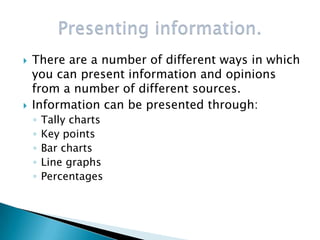
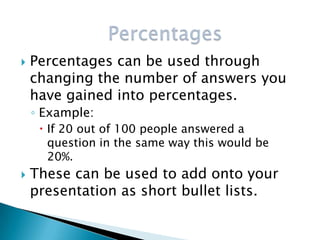
Presenting Information.
   Look at the different ways information can be
    presented using the key points.
   There are a number of different ways in which
    you can present information and opinions
    from a number of different sources.
   Information can be presented through:
    ◦   Tally charts
    ◦   Key points
    ◦   Bar charts
    ◦   Line graphs
    ◦   Percentages
 A tally chart can be used to record how
  many people answered a question with
  the same answer.
 This is used in a questionnaire and
  presented using sets of 5 lines
  consisting of 4 vertical and one
  diagonal from the bottom left corner to
  the top right.
 Look through the information you have
  gained from internet, newspapers and
  magazine sources and highlight the key
  points.
 Convert the key points into short and to
  the point bullet points.
 Use these to display the different
  answers people gave during the
  questionnaire.
 Answers along the bottom.
 Numbers along the left side.
 Created in the chart designer.
 Can be used in the same way as bar
  charts.
 Different method of presenting
  information to add variety in your
  work.
 Created in the chart designer.
   Percentages can be used through
    changing the number of answers you
    have gained into percentages.
    ◦ Example:
      If 20 out of 100 people answered a
       question in the same way this would be
       20%.
   These can be used to add onto your
    presentation as short bullet lists.

Presenting information presentation.

  • 1.
  • 2.
    Look at the different ways information can be presented using the key points.
  • 3.
    There are a number of different ways in which you can present information and opinions from a number of different sources.  Information can be presented through: ◦ Tally charts ◦ Key points ◦ Bar charts ◦ Line graphs ◦ Percentages
  • 4.
     A tallychart can be used to record how many people answered a question with the same answer.  This is used in a questionnaire and presented using sets of 5 lines consisting of 4 vertical and one diagonal from the bottom left corner to the top right.
  • 5.
     Look throughthe information you have gained from internet, newspapers and magazine sources and highlight the key points.  Convert the key points into short and to the point bullet points.
  • 6.
     Use theseto display the different answers people gave during the questionnaire.  Answers along the bottom.  Numbers along the left side.  Created in the chart designer.
  • 7.
     Can beused in the same way as bar charts.  Different method of presenting information to add variety in your work.  Created in the chart designer.
  • 8.
    Percentages can be used through changing the number of answers you have gained into percentages. ◦ Example:  If 20 out of 100 people answered a question in the same way this would be 20%.  These can be used to add onto your presentation as short bullet lists.