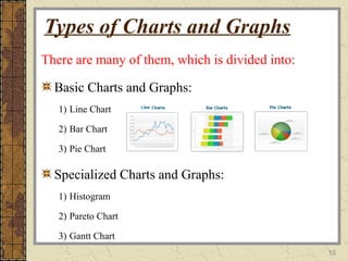
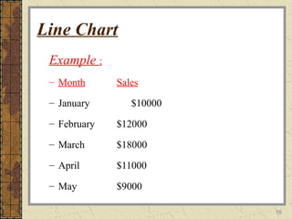
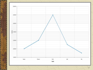
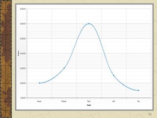
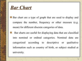
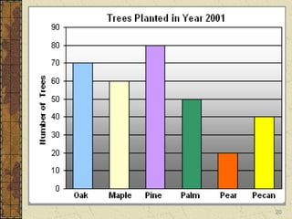
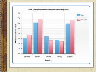
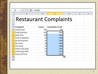
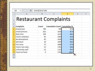
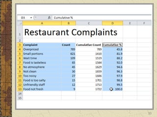
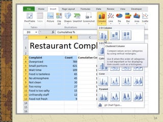
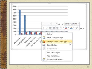
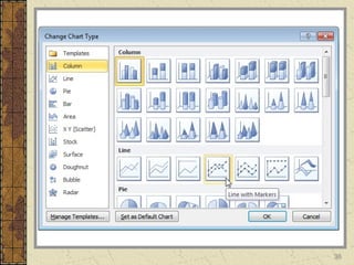
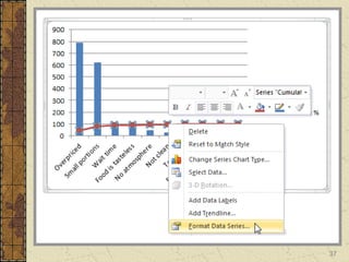
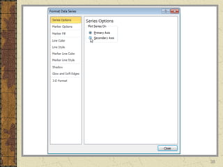
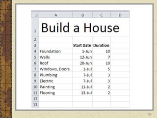
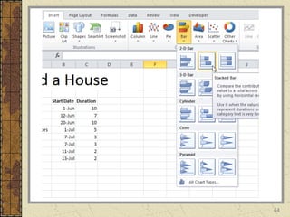
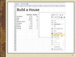
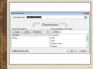
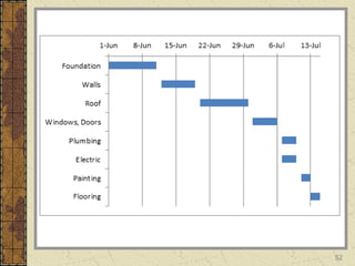
This document discusses different types of graphs and charts, their purposes and guidelines for use. It defines the key difference between graphs and charts, with graphs representing relationships between objects and charts representing data through symbols. Common chart types are described like line charts to show changes over time, bar charts to compare categories, and pie charts to show proportions of a whole. The document provides examples and guidelines for effective graph and chart creation.
Types of charts in Excel and How to use themVijay Perepa
There are different Chart types and some times we face difficulty to find which chart is suitable for a specific Data set. In this series of Videos, we have discussed about each chart type and when to use etc.
Types of charts in Excel and How to use themVijay Perepa
There are different Chart types and some times we face difficulty to find which chart is suitable for a specific Data set. In this series of Videos, we have discussed about each chart type and when to use etc.
From MLA handbook edition 7 I have given expanding thought about Format of Research paper that examine your research skill and methodology of research work.
A bar graph is a chart that uses either horizontal ,A Pie Chart (or Pie Graph) is a circular chart divided into sectors,It is also possible to draw bar charts .
Curious about the different types of chart? This presentation demonstrates the variety of charts and their purpose. All these charts have been created using Chartblocks online chart building tool.
Aerospace & Defense Manufacturing in Tijuana, Mexico - White Paper 2013Kate Reifers
Table of Contents:
1. Mexico: A Hub for Aerospace & Defense Manufacturing
2. National Flight Plan: A+D Roadmap for Baja California
3. Aerospace Megaregion: California & Baja California Border
4. Defense Manufacturing in Mexico & Baja California
5. Export Control Regimes, UAV Market, Nadcap, ITAR
6. NAFTA for the Aerospace & Defense Industries
7. NAFTA, IMMEX, Special Aerospace Tariff Sections, IP Protections & Support Service Infrastructure
8. Mexico's Highly Skilled, Low Cost Work Force
9. Globally Competitive Labor Rates
10. Cultural Ties to the United States
11. Mexico's Commercial Trade & Logistics Infrastructure
12. Highways, Commercial Border Crossings, Facilities & Real Estate, Utilities, and the Supply Chain
13. Nearshore vs. Offshore - Logistics Savings and World Bank country ratings
14. Getting Started in Mexico: Admin Services Industry, Safety & Security and Mexico
Created by María Jesús Campos Fernández, teacher at a bilingual section in Alcorcon (Madrid, Spain)
learningfromgeography.wikispaces.com
learningfromhistory.wikispaces.com
Data handling Presentation with solved examplesrithikkapoor7
This is a presentation on data handling. It contains information about bar graphs, pictographs, tally charts and more. I hope it helps you students. Please like and comment, it gives tons of inspiration.
The Art of Data Visualization in Microsoft Excel for Mac.pdfTEWMAGAZINE
As more people turn to the internet and electronic gadgets for their source of information, you can expect data to increase exponentially daily. Data is a result of sharing, collecting, and transmitting information.
BUSINESS INTELLIGENCE AND DATA ANALYTICS presentationMohit Negi
SIX SIGMA APPROACH, DIFFERENT TYPES OF CHARTS AND THEIR FUNCTION, DASHBOARD, BUSINESS INTELLIGENCE, DATA VISUALISATION INFORMATION VISUALISATION, PERFORMANCE DASHBOARD, BUSINESS REPORTING, BALANCE SCORECARD
DATA VISUALIZATION FOR MANAGERS MODULE 3| Building Visualization| BUSINESS ANALYTICS PAPER 1 |MBA SEM 3| RTMNU NAGPUR UNIVERSITY| BY JAYANTI R PANDE
MBA Notes by Jayanti Pande
#JayantiPande
#MBA
#MBAnotes
#BusinessAnalyticsNotes
Top 8 Different Types Of Charts In Statistics And Their UsesStat Analytica
Are you confused about various Types Of Charts In Statistics? In this blog, you will get to learn about the various Types Of Charts In Statistics in detail.
Design Patterns
Christian Behrens
https://www.behance.net/gallery/29576487/The-Form-of-Facts-and-Figures
Christopher Alexander
The term design patterns was originally coined about three decades ago by Christopher Alexander, an architect and critic who envisioned a generic and modular “language” of methods to describe the process of construction and urban planning by means of recurring problems that are well-known in a specific context, and respective solutions that have been proved and tested in the past and can therefore be seen as a safe choice to tackle a certain design challenge. Although it never made its breakthrough in the field of architecture, the basic idea of design patterns was adopted by other engineering disciplines, most notably software development in the early 1990s. A second wave of success seems to have appeared recently, when several projects were launched to build up pattern libraries for digital user interfaces. https://en.wikipedia.org/wiki/Christopher_Alexander
2
Design Patterns
Rejected by Architects, Adopted by Software Engineers,
…and the field of user interface design.
Although Alexander’s book became a bestseller and is a de-facto standard read for architecture students until today, it received much criticism and invoked sceptical reactions among the architecture community. Looking back at it some thirty years later, Alexander’s pattern language can be described as a success story on a detour. While widely rejected by architects and urban planners, the concept was picked up by computer scientist in the late 1980s and became a huge success in the wake of the rise of object-oriented programming languages such as Java
3
Design Patterns
Rejected by Architects, Adopted by Software Engineers,
…and the field of user interface design.
http://zurb.com/patterntap
http://patternry.com/
useful for the general description of common design problems, and provide solutions based on the relationships and behaviors of objects Companies and institutions that deal with interface design problems, have also launched own projects that aim at streamlining the development of new products and services by means of a comprehensive design pattern collection.
Design Patterns can help to tackle commonly known recurring design problems with well-proven solutions. A single pattern provides a brief description of one particular design problem. This problem can be a physical attribute of an application (for instance a dropdown menu), or a functional behavior (e.g. the login dialog of a website). A pattern typically consists of a description of the problem, and a solution that has been proven before and is generally recognized. Usually, a pattern provides additional information like an example of a real-world scenario in which it has been successfully applied as well as a rationale to briefly describe the benefit the usage this patterns bears.
4
Discrete Quantities:
Simple Bar Chart
Snapshot:
they do not display con.
Top 7 types of Statistics Graphs for Data RepresentationStat Analytica
Are you struggling with choosing the right type of graph to represent your data set? if yes then have a look at this presentation to choose the best statistics graph to represent your data set.
Let's understand 7QC tool and basic of Graph / Presentation what to use and when to use. It will enable you to apply graph and present your data in more graphical format.
Adjusting primitives for graph : SHORT REPORT / NOTESSubhajit Sahu
Graph algorithms, like PageRank Compressed Sparse Row (CSR) is an adjacency-list based graph representation that is
Multiply with different modes (map)
1. Performance of sequential execution based vs OpenMP based vector multiply.
2. Comparing various launch configs for CUDA based vector multiply.
Sum with different storage types (reduce)
1. Performance of vector element sum using float vs bfloat16 as the storage type.
Sum with different modes (reduce)
1. Performance of sequential execution based vs OpenMP based vector element sum.
2. Performance of memcpy vs in-place based CUDA based vector element sum.
3. Comparing various launch configs for CUDA based vector element sum (memcpy).
4. Comparing various launch configs for CUDA based vector element sum (in-place).
Sum with in-place strategies of CUDA mode (reduce)
1. Comparing various launch configs for CUDA based vector element sum (in-place).
Techniques to optimize the pagerank algorithm usually fall in two categories. One is to try reducing the work per iteration, and the other is to try reducing the number of iterations. These goals are often at odds with one another. Skipping computation on vertices which have already converged has the potential to save iteration time. Skipping in-identical vertices, with the same in-links, helps reduce duplicate computations and thus could help reduce iteration time. Road networks often have chains which can be short-circuited before pagerank computation to improve performance. Final ranks of chain nodes can be easily calculated. This could reduce both the iteration time, and the number of iterations. If a graph has no dangling nodes, pagerank of each strongly connected component can be computed in topological order. This could help reduce the iteration time, no. of iterations, and also enable multi-iteration concurrency in pagerank computation. The combination of all of the above methods is the STICD algorithm. [sticd] For dynamic graphs, unchanged components whose ranks are unaffected can be skipped altogether.
As Europe's leading economic powerhouse and the fourth-largest hashtag#economy globally, Germany stands at the forefront of innovation and industrial might. Renowned for its precision engineering and high-tech sectors, Germany's economic structure is heavily supported by a robust service industry, accounting for approximately 68% of its GDP. This economic clout and strategic geopolitical stance position Germany as a focal point in the global cyber threat landscape.
In the face of escalating global tensions, particularly those emanating from geopolitical disputes with nations like hashtag#Russia and hashtag#China, hashtag#Germany has witnessed a significant uptick in targeted cyber operations. Our analysis indicates a marked increase in hashtag#cyberattack sophistication aimed at critical infrastructure and key industrial sectors. These attacks range from ransomware campaigns to hashtag#AdvancedPersistentThreats (hashtag#APTs), threatening national security and business integrity.
🔑 Key findings include:
🔍 Increased frequency and complexity of cyber threats.
🔍 Escalation of state-sponsored and criminally motivated cyber operations.
🔍 Active dark web exchanges of malicious tools and tactics.
Our comprehensive report delves into these challenges, using a blend of open-source and proprietary data collection techniques. By monitoring activity on critical networks and analyzing attack patterns, our team provides a detailed overview of the threats facing German entities.
This report aims to equip stakeholders across public and private sectors with the knowledge to enhance their defensive strategies, reduce exposure to cyber risks, and reinforce Germany's resilience against cyber threats.
2. Outlines:
Overview
The difference between graph and chart
Advantages of using graphs and charts
Guidelines for Formatting Graphs and Charts
Tools to Create Charts and Graphs
Types of Charts and Graphs
Line Chart Bar Chart Pie Chart
Histogram Pareto Chart Gantt Chart
Conclusion
3. 3
Overview
Graphs and charts condense large amounts of information
into easy-to-understand formats that clearly and effectively
communicate important points.
In selecting how best to present your data, think about the
purpose of your graph or chart and what you want to
present, then decide which variables you want to include
and whether they should be expressed as frequencies,
percentages, or categories.
4. 4
The difference between graph and chart
Charts and graphs are a means of displaying data in a way
that's easy to understand and analysis. Through lines, bars
or other visual representations, both charts and graphs
illustrate relationships between sets of data so that anyone
can understand them.
Even though charts and graphs are often used in the same
sentence to explain the illustration of data, the terms are not
interchangeable.
5. 5
Cont...
Some scientists have defined graphs and charts as :
A graph is an abstract representation of a set of
objects where some pairs of the objects are
connected by links.
A chart is a visual representation of data, in which
the data are represented by symbols such as bars in
a bar chart or lines in a line chart.
6. 6
Advantages of using graphs and charts
When you display information in charts and
graphs it is easier to understand and interpret the
data. In turn this makes the business reporting
process that much easier and meaningful.
7. 7
Cont..
These are some advantages of using a graphs and charts:
1) Shows the relationship between changing things.
2) Displaying the relationship between numbers or amounts.
3) The easiest ways to compare numbers.
4) Used to present facts in visual form.
5) Graphs can be used to illustrate many types of data.
6) More interesting than just talk or print.
7) To show and compare changes.
8. 8
Guidelines for Formatting Graphs and Charts
Keep it simple and avoid flashy special effects.
Present only essential information. Avoid using gratuitous options in
graphical software programs, such as 3D bars, that confuse the
reader. If the graph or chart is too complex, it will not clearly
communicate the important points.
Title your graph or chart clearly to convey the purpose.
The title provides the reader with the overall message you are
conveying.
9. 9
Cont..
Specify the right units of measurement.
Years, number of participants trained, and type of school personnel
are examples of labels for units of measurement.
Label each part of the chart or graph.
You may need a legend if there is too much information to label
each part of the chart or graph.
10. 10
There are many of them, which is divided into:
Basic Charts and Graphs:
1) Line Chart
2) Bar Chart
3) Pie Chart
Specialized Charts and Graphs:
1) Histogram
2) Pareto Chart
3) Gantt Chart
Types of Charts and Graphs
11. 11
Some Charts and Graphs softwares:
1) Microsoft Office Excel
2) Graphs Made Easy
3) Diagram Designer
Sites for online creating a Chart or Graph:
1) http://www.richchartlive.com
2) http://www.icharts.net
3) http://www.chartle.net
Tools to Create Charts and Graphs
12.
13.
14.
15. 15
Line Chart
Data that is arranged in columns or rows on a
worksheet can be plotted in a line chart.
Line chart should used if the category labels are
text, and are representing evenly spaced values
such as months, quarters, or fiscal years.
16. 16
Line Chart
Example :
– Month Sales
– January $10000
– February $12000
– March $18000
– April $11000
– May $9000
19. 19
Bar Chart
Bar chart are a type of graph that are used to display and
compare the number, frequency or other measure (e.g.
mean) for different discrete categories of data.
Bar charts are useful for displaying data that are classified
into nominal or ordinal categories. Nominal data are
categorized according to descriptive or qualitative
information such as country of birth, or subject studied at
university.
22. 22
Pie Chart
Data that is arranged in one column or row only
can be plotted in a pie chart. Pie charts show the
size of items in one data series, proportional to the
sum of the items. The data points in a pie chart are
displayed as a percentage of the whole pie.
23. 23
Cont..
Consider using a pie chart when:
1) You only have one data series that you want to plot.
2) None of the values that you want to plot are negative.
3) Almost none of the values that you want to plot are
zero values.
4) It is better if you don't dispaly more than seven
categories.
26. 26
Histogram Chart
A Histogram is a graphical display of data using bars of
different heights.
It is similar to a Bar Chart, but a histogram groups numbers
into ranges and you decide what ranges to use.
28. Pareto chart
Pareto chart is a type of chart that contains both bars and a line
graph, where individual values are represented in descending
order by bars, and the cumulative total is represented by the line.
41. Gantt chart
A Gantt chart is a horizontal bar chart developed as a production
control tool in 1917 by Henry L. Gantt.
Frequently used in project management, a Gantt chart provides
a graphical illustration of a schedule that helps to plan,
coordinate, and track specific tasks in a project.
53. Conclusion
We conclude from the previous Presentation that
there is a large number of shapes and diagrams
that have a very big interest in clarifying the
reports and to facilitate the study of the data, as
well as to identify many of the problems identified
by the information extracted from the data.