Embed presentation
Downloaded 228 times


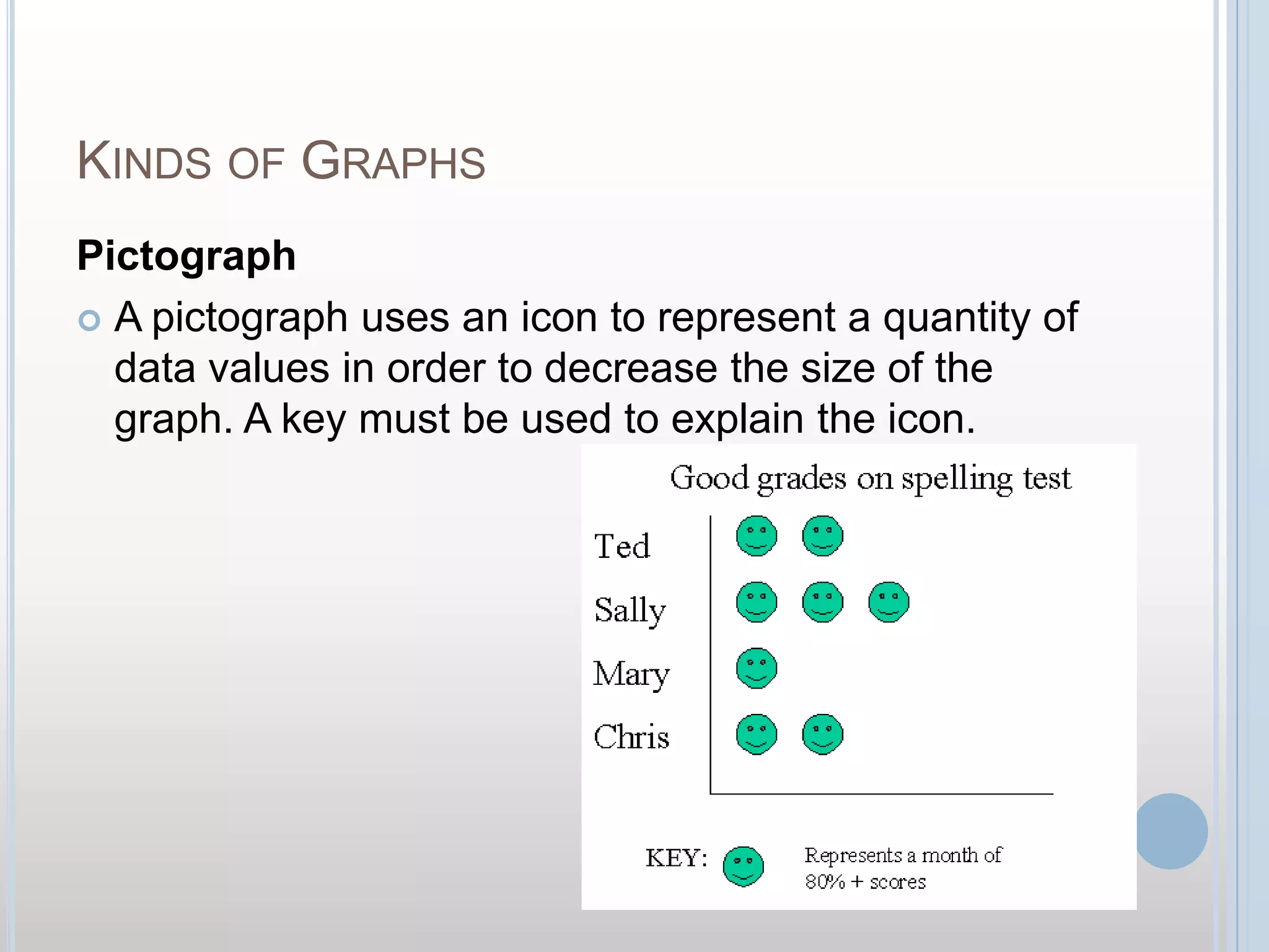
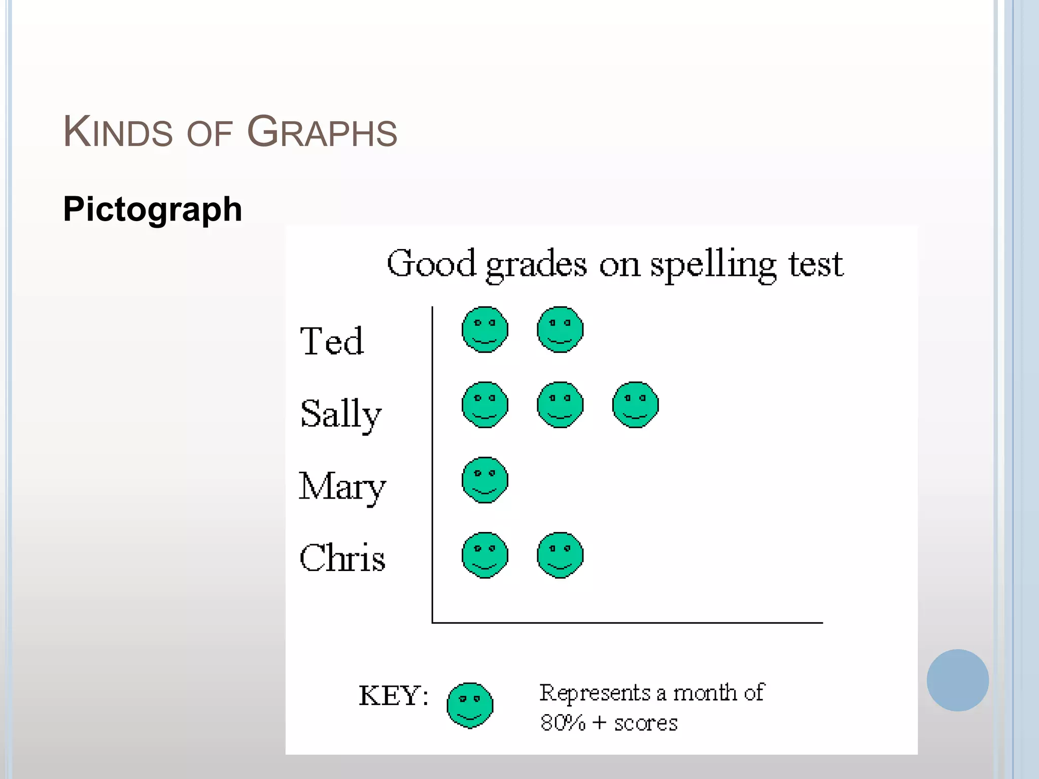
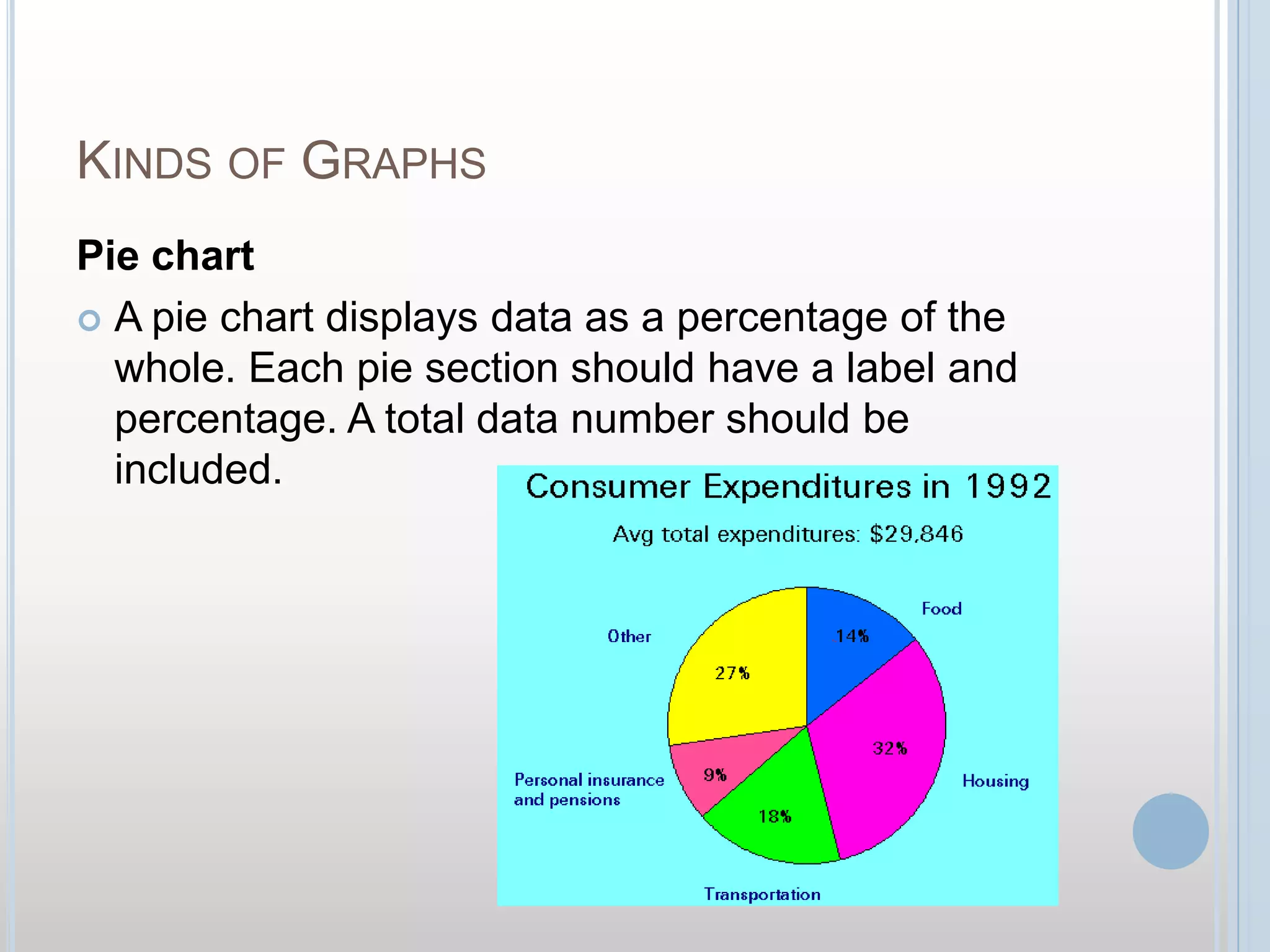
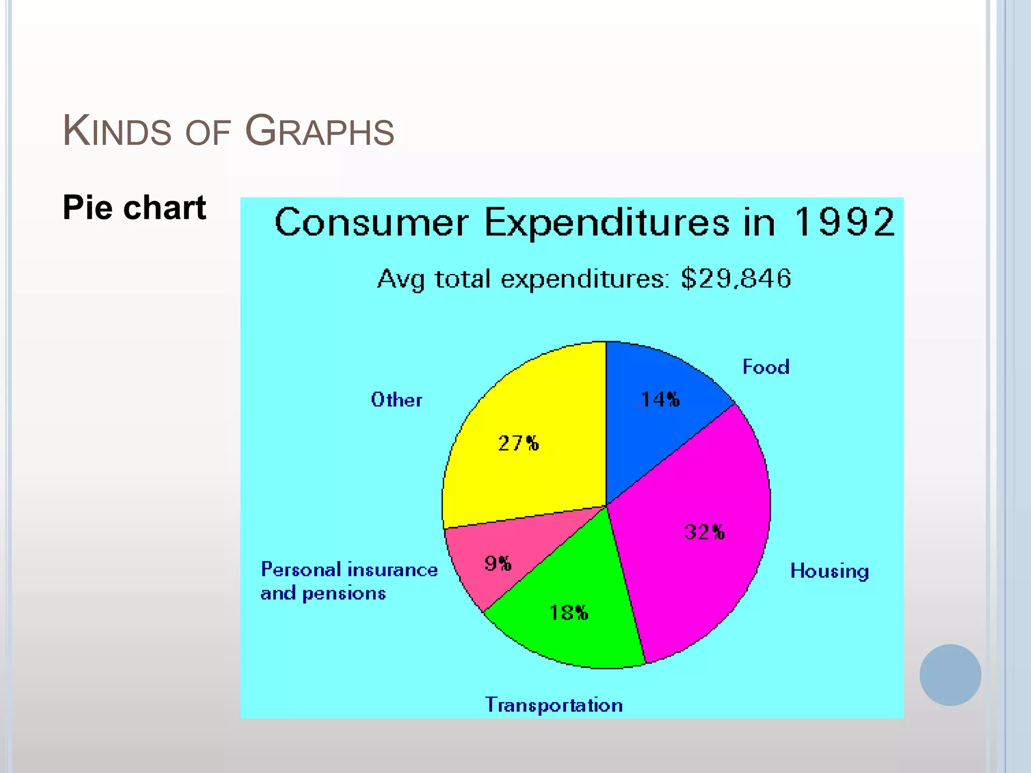
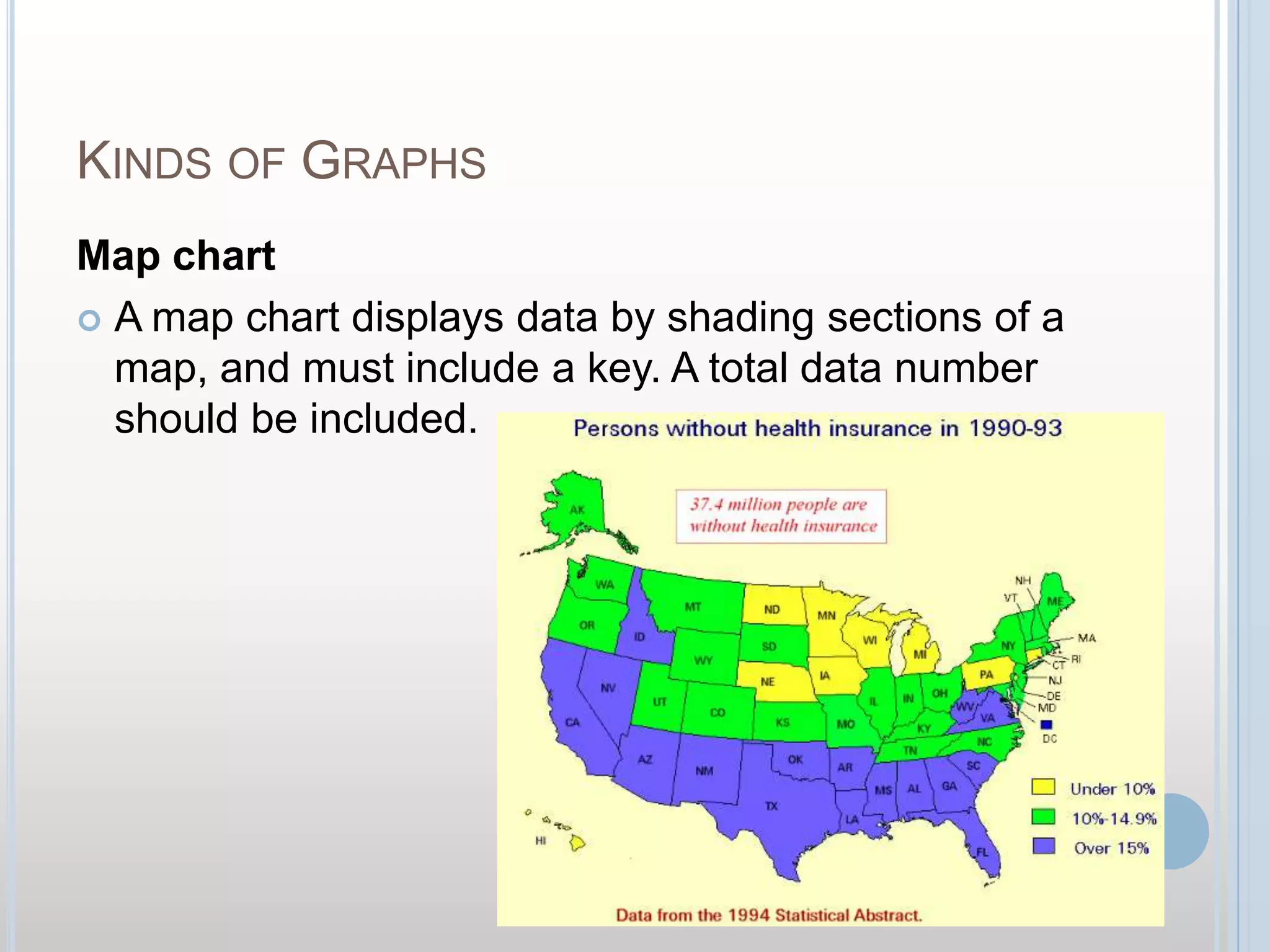
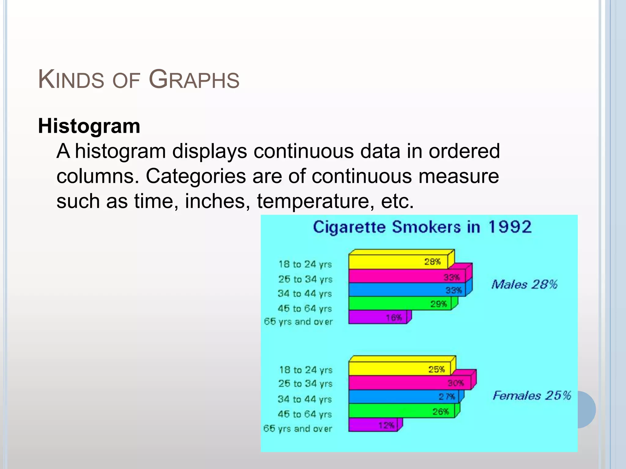
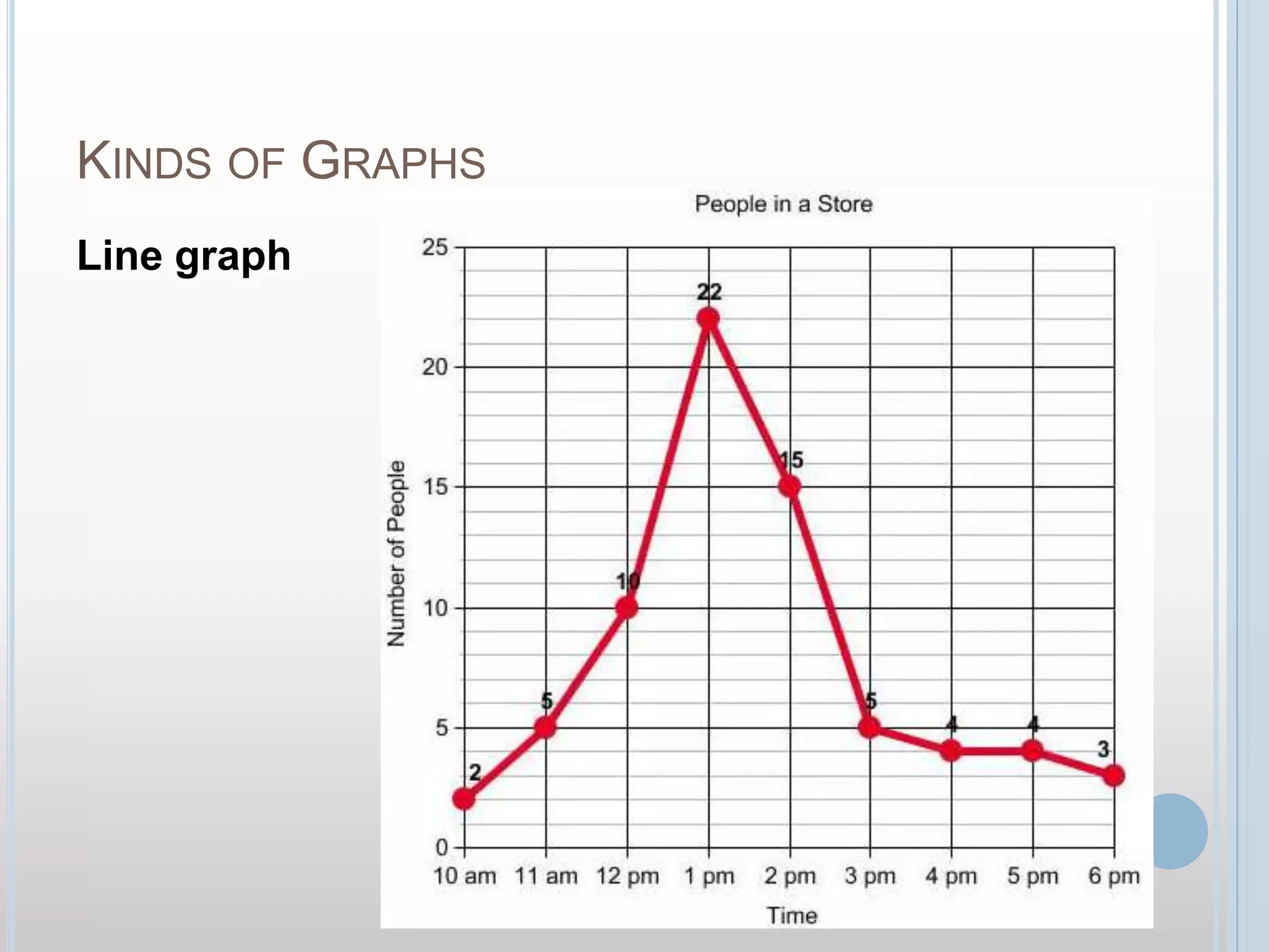
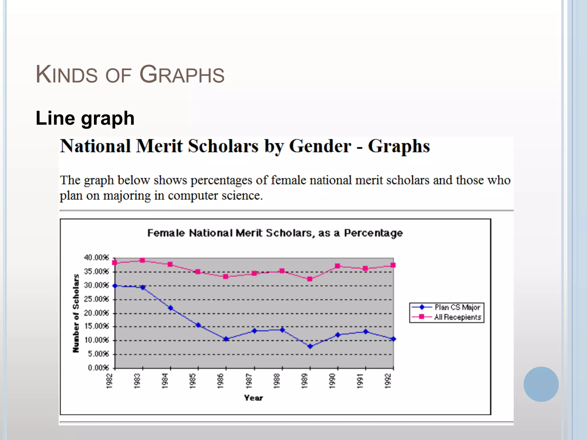
Graphs are visual representations of data that help illustrate amounts and relationships. There are several common types of graphs, including pictographs, pie charts, map charts, histograms, bar graphs, and line graphs. Each graph type has distinct features - for example, pictographs use icons to represent quantities, pie charts show data as percentages, and line graphs connect data points with lines. Graphs are useful tools for understanding and analyzing various sets of information.


Introduction to graphs as visual representations of data, detailing their purpose and fundamental parts.
Explanation of pictographs, their use of icons to represent data quantities, and the necessity of a key.
Description of pie charts, which display data as percentages, requiring labels and total data counts.
Overview of map charts that show data through shading on maps, including the required key and totals.
Introduction to histograms that display continuous data in ordered columns based on measurable categories.
Discussion on bar graphs illustrating discrete data in columns, with options for double bar comparisons.
Insight into line graphs that plot continuous data points connected by lines, emphasizing the need for keys.
Reiteration of the importance of using and understanding various types of graphs in data representation.