Download to read offline

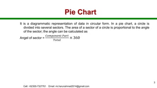


The document discusses various types of charts used in statistics, including pie charts, bar charts (simple, multiple, component, percentage), and scatter diagrams, highlighting their characteristics and applications in representing data visually. It explains the importance of visual comparison in understanding statistical information. Additionally, the document covers concepts of ungrouped and grouped data and mentions that examples are available in a separate MS Word file.