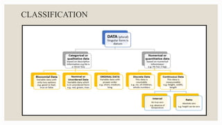
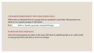
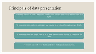
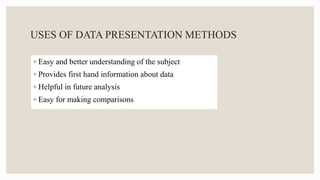
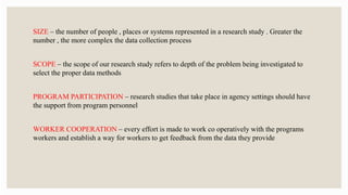
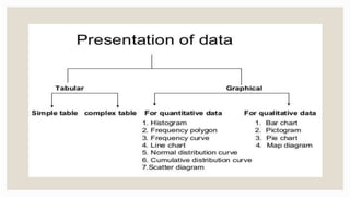
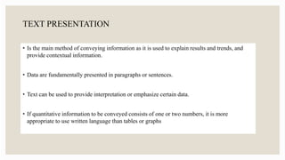
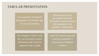
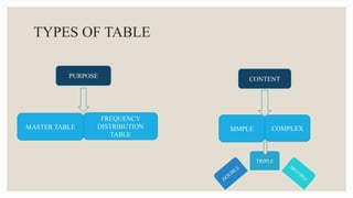
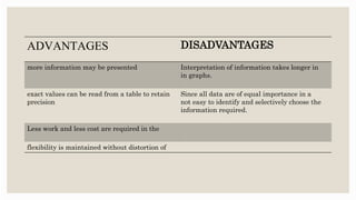
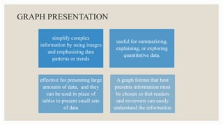
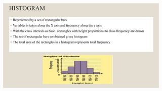
SlideShare a Scribd company logo
DATAPRESENTATION METHODS
CONTENTS
◦ INTRODUCTION
◦ CLASSIFICATION OF DATA
◦ TYPES OF DATA
◦ PRINCIPLES OF DATA PRESENTATION
◦ METHODS OF DATA PRESENTATION
TEXT PRESENTATION
TABULAR PRESENTATION
GRAPH PRESENTATION
◦ CONCLUSION
◦ REFERENCES
INTRODUCTION
• Data are individual units of information. A data describes a single quality or quantity of
some object or phenomenon. In analytical processes, data are represented by variables.
• Data presentation is a method by which people organize, summarize and communicate information
using a variety of tools such as text , tables , graphs and diagrams
CLASSIFICATION
TYPES OF DATA
Qualitative/
Quantitative
data
Discrete/
Continuous
data
Primary/
Secondary
data
Nominal/
Ordinal data
Qualitative data:
Also called as enumeration data .Represents a particular quality or attribute. There is no notion
of magnitude or size of the characteristic, as they can't be measured. Expressed as numbers
without unit of measurements .
Eg:
Quantitative data:
Also called as measurement data. These data have a magnitude. Can be expressed as number
with or without unit of measurement.
Eg:
Religion, Sex, Blood group etc.
Height in cm, Hb in gm%, BP inmm of Hg, Weight in kg.
DISCRETE DATA:
Here we always get a whole number.
Eg.
CONTINUOUS DATA :
It can take any value possible to measure or possibility of getting fractions.
Eg.
Number of beds in hospital, Malaria cases
Hb level, Ht, Wt.
PRIMARY DATA :
Obtained directly from an individual , it gives precise information .
SECONDARY DATA :
Obtained from outside source
Eg: Data obtained from hospital records, Census
NOMINAL DATA:
The information or data fits into one of the categories, but the categories cannot be ordered one
above another .
E.g..
ORDINAL DATA:
here the categories can be ordered, but the space or class interval between two categories may
not be the same.
E.g..
Colour of eyes, Race, Sex
We could have categories for prognosis such as good, fair, poor, hopeless, or stages of periodontitis as
mild, moderate, or severe
UNPAIRED (INDEPENDENT OR UNMATCHED) DATA
Where data are obtained from two groups that are unrelated to each other. Measurements are
taken on two separate groups of individuals.
E.g.
PAIRED OR MATCHED DATA
where the measurements are taken on the same individual or matched groups as in a split mouth
or same group before and after or cross over designs.
males vs. females, age groups, and parallel designs.
Principals of data presentation
To arrange the data in such a way that it should create interest in the reader’s mind at the first
sight.
To present the information in a compact and concise form without losing important details.
To present the data in a simple form so as to draw the conclusion directly by viewing at the
data
To present it in such away that it can help in further statistical analysis.
USES OF DATA PRESENTATION METHODS
◦ Easy and better understanding of the subject
◦ Provides first hand information about data
◦ Helpful in future analysis
◦ Easy for making comparisons
CRITERIA FOR SELECTING A DATA PRESENTAION
METHOD
◦ Size of study
◦ Scope of study
◦ Program participation
◦ Worker cooperation
◦ Intrusion into the lives of research participants
◦ Resources
◦ Time
◦ Previous research findings
SIZE – the number of people , places or systems represented in a research study . Greater the
number , the more complex the data collection process
SCOPE – the scope of our research study refers to depth of the problem being investigated to
select the proper data methods
PROGRAM PARTICIPATION – research studies that take place in agency settings should have
the support from program personnel
WORKER COOPERATION – every effort is made to work co operatively with the programs
workers and establish a way for workers to get feedback from the data they provide
INTRUSION INTO THE LIVES OF RESEARCH PARTICIPANTS – A client will not be
denied service for refusing to participate in a research study
TIME – research projects often have fixed completion dates . Time constraints will influence the
choice of data collection methods
PREVIOUS RESEACH STUDIES – learn from existing research studies like which data
collection methods worked best to study the problem . Expand upon earlier research by trying
different data collection approaches
TEXT PRESENTATION
• Is the main method of conveying information as it is used to explain results and trends, and
provide contextual information.
• Data are fundamentally presented in paragraphs or sentences.
• Text can be used to provide interpretation or emphasize certain data.
• If quantitative information to be conveyed consists of one or two numbers, it is more
appropriate to use written language than tables or graphs
TABULAR PRESENTATION
Is a systematic and logical
arrangement of classified data
in rows and columns
Most appropriate for
presenting individual
information, and can present
both quantitative and
qualitative information
The strength of tables is that
they can accurately present
information that cannot be
presented with a graph
useful for summarizing and
comparing quantitative
information of different
variables.
BASIC RULES FOR THE PREPARATION OF TABLES
1. Be self-explanatory
2. Present values with the same number of decimal places in all its cells
3. Include a title informing what is being described and where, as well as the number of
observations and when data were collected
4. Have a structure formed by three horizontal lines, defining table heading and the end of the
table at its lower border
5. Provide additional information in table footer, when needed
6. Be inserted into a document only after being mentioned in the text
TYPES OF TABLE
PURPOSE CONTENT
MASTER TABLE
FREQUENCY
DISTRIBUTION
TABLE
SIMPLE COMPLEX
TRIPLE
MASTER TABLE
Tables which contain all data obtained from a survey.
FREQUENCY DISTRIBUTION TABLE
The data is first split up into convenient groups (class interval) and the number of items (frequency)
which occur in each group is shown in adjacent columns.
Hence it is a table showing the frequency with which the values are distributed in different groups or
classes with some defined characteristics.
SIMPLE TABLE
Data relating to only one characteristics
DOUBLE TABLE
Data relating to only two characteristics
TRIPLE DATA
Data relating to three characteristics
MULTIPLE DATA
Data related to multiple characters is presented
REFERENCE TABLE
◦ These tables present the original data for reference purposes
◦ It contains only absolute and actual figures and round numbers or percentages
TEXT TABLES
◦ Constructed to present selected data from one or more general purpose tables
◦ It brings out a specific point of answer to specific questions
◦ It includes ratios , percentages , averages etc
◦ It should be found in the body of the text
HEAT MAPS
Helps to further visualize the information presented in a table by applying colors
to the background of cells.
By adjusting the colors or color saturation, information is conveyed in a more
visible manner and readers can quickly identify the information of interest
SIGNIFICANCE
◦ Simplifies complex data
◦ Unnecessary details and repetitions of data can be avoided in tabulation
◦ Facilitates comparison
◦ Gives identity to data
◦ Reveals pattern with in the figures which cannot be seen in the narrative form
ADVANTAGES DISADVANTAGES
more information may be presented Interpretation of information takes longer in
in graphs.
exact values can be read from a table to retain
precision
Since all data are of equal importance in a
not easy to identify and selectively choose the
information required.
Less work and less cost are required in the
flexibility is maintained without distortion of
GRAPHS
GRAPH PRESENTATION
simplify complex
information by using images
and emphasizing data
patterns or trends
useful for summarizing,
explaining, or exploring
quantitative data.
effective for presenting large
amounts of data, and they
can be used in place of
tables to present small sets
of data
A graph format that best
presents information must
be chosen so that readers
and reviewers can easily
understand the information
BASIC RULES FOR THE PREPARATION OF GRAPHS
1. Be self-explanatory
2. Be referred to as figures in the text
3. Identify figure axes by the variables under analysis
4. Include, below the figure, a title providing all relevant information
5. Quote the source which provided the data, if required
6. Demonstrate the scale being used
HISTOGRAM
◦ Represented by a set of rectangular bars
◦ Variables is taken along the X axis and frequency along the y axis
◦ With the class intervals as base , rectangles with height proportional to class frequency are drawn
◦ The set of rectangular bars so obtained gives histogram
◦ The total area of the rectangles in a histogram represents total frequency
FREQUENCY POLYGON
◦ Variables is taken along the X axis and frequencies along the y axis
◦ Class frequencies are plotted against the class mid-values and then these points are joined by a
straight line which gives a figure of frequency polygon
◦ Total area under the frequency curve represents the total frequency
FREQUENCY CURVE
◦ Variables is taken along the X axis and frequency along Y axis
◦ Frequencies are plotted against the class mid-values and then , these points are joined by a smooth
curve
◦ The curve so obtained is the frequency curve
◦ Total area under the frequency curve represents total frequency
LINE GRAPH (TIME SERIES GRAPH)
◦ Line graphs are used to display the comparison between two
variables which are plotted on the x axis and y axis
◦ The x axis represents measures of time , while the y axis
represents percentage or measures of quantity
◦ They organize and present data in a clear manner and show
relationships between the data
◦ Line graphs displays a change in direction
◦ It shows trend of an event occurring over a period of time to know
whether it is increased or decreased eg cancer deaths etc
CUMULATIVE FREQUENCY POLYGON
◦ It is a line graph (rather than a bar graph)
◦ Uses class boundaries on x-axis
◦ Uses cumulative frequencies rather than individual class
frequencies
◦ Used to visually represent how many values are below a specified
upper class boundary
SCATTER DIAGRAM
◦ Scatter plots present data on the x- and y-axis and are used to
investigate an association between two variables.
◦ A point represents each individual or object, and an association
between two variables can be studied by analyzing patterns across
multiple points.
◦ A regression line is added to a graph to determine whether the
association between two variables can be explained or not
DIAGRAMS
BAR DIAGRAM /BAR CHART
◦ Bar diagram consists of a series of rectangular bars of equal width
◦ The bars stand on common baseline with equal gap between one bar and another
◦ The bars may be either horizontal or vertical
◦ The bars are constructed in such a way that their lengths are proportional to the magnitudes
(frequency)
SIMPLE BAR DIAGRAM
◦ Used to represent when items have to be compared with
regard to a single characteristic
◦ Here the items are represented by rectangular bars of equal
width and height proportional to their magnitude
◦ The bars are drawn on a common base line , with equal
distance between consecutive bars and may be shaded
SUBDIVIDED BAR DIAGRAM
◦ Also called as component , stacked or proportional bar diagram
◦ The data have items whose magnitudes have two or more components
◦ In this the items are represented by rectangular bars of equal width and height
proportional to magnitude
◦ Then the bars are divided so that the sub divisions in height represent the
components
◦ To distinguish the components from one another clearly , different shades are
applied and an index describing the shades is provided
◦ Component bars are drawn when a comparison of total magnitudes along with
the components is required
PERCENTAGE BAR DIAGRAM
◦ To represent items whose magnitudes have two or more components.
The comparison of components are expressed as percentages of the
corresponding totals
◦ The totals are represented by bars of equal width and height equal to
100 each
◦ These bars are divided according to the percentage components. The
different sub divisions are shaded properly and an index which
describes the shades is provided
◦ Percentage bars are useful in comparing percentage components
MULTIPLE BAR DIAGRAM
◦ When there are two or more different comparable sets of values , multiple bars are drawn
◦ Here sets of rectangular bars of equal width with height proportional to the value are drawn
◦ The bars corresponding to the same unit are placed together adjacent to one another
◦ The diagram is shaded properly and an index is provided
DEVIATION BAR DIAGRAM
◦ Useful for presenting net quantities which have both positive
and negative values
◦ The positive deviatons are presented by bars above the baseline
while negative deviations are presented by bars below the
baseline
BOX AND WHISKER CHART
◦ Represents variations in samples of a population; therefore, it is appropriate for
representing nonparametric data.
◦ A box and whisker chart consists of boxes that represent interquartile range, the
median , mean of the data, and whiskers presented as lines outside of the boxes.
◦ Whiskers can be used to present the largest and smallest values in a set of data or only
a part of the data
◦ The spacing at both ends of the box indicates dispersion in the data.
◦ The relative location of the median demonstrated within the box indicates skewness
PICTOGRAM
◦ Popular method of presenting data to those who cannot understand orthodox charts.
◦ Small pictures or symbols are used to present the data
◦ Fraction of the picture can be used to represent numbers smaller than the value of whole symbol
PIE DIAGRAM
◦ Presenting discrete data of qualitative characteristics such as blood groups, RH factor,
age group , sex group , cause of mortality or social group in a population etc
◦ The frequencies of the groups are shown in a circle
◦ Degrees of angle denote the frequency and area of the sector
◦ Size of each angle is calculated by multiplying the frequency/total frequency by 360
◦ It is also used for data that have no other way of being represented aside from a table
STATISTICAL MAP
◦ Statistical data refers to geographic or administrative areas, it is presented either as statistical map
or dot map.
◦ The shaded maps are used to present data of varying size. The areas are shaded with different
colour or different intensities of the same colour, which is indicated in the key.
CONCLUSION
Understanding how to classify the different types of variables and how to present them in tables
or graphs is an essential stage for epidemiological research in all areas of knowledge . Mastering
this topic collaborates to synthesize research results and prevents the misuse or overuse of tables
and figures in scientific papers.
REFERENCES
◦ In J, Lee S. Statistical data presentation. Korean J Anesthesiol. 2017;70(3):267–276.
◦ Data Presentation, Evelyn Shambaugh
◦ Avula H Periodontal Research: Basics and beyond - Part III (data presentation, statistical testing,
interpretation and writing of a report). J Indian Soc Periodontol 2013;17:577-82
◦ Presentation methods for statistical data
◦ Data Presentation, Josée Dupuis, PhD, Professor of Biostatistics, Boston University School of Public
Health
◦ Cleveland WS. Graphical methods for data presentation: Full scale breaks, dot charts, and multibased
logging. The American Statistician. 1984 Nov 1;38(4):270-80.

More Related Content

What's hot

Data and its Types
Data and its TypesData and its Types
Data and its Types
RajaKrishnan M
 
1.2 types of data
1.2 types of data1.2 types of data
1.2 types of data
Long Beach City College
 
Data
DataData
Presentation of data
Presentation of dataPresentation of data
Presentation of data
Kirti Shekhawat
 
PRESENTATION OF STATISTICAL DATA
PRESENTATION OF STATISTICAL DATAPRESENTATION OF STATISTICAL DATA
PRESENTATION OF STATISTICAL DATA
keerthi samuel
 
Tabulation of data
Tabulation of dataTabulation of data
Tabulation of data
RekhaChoudhary24
 
Types of Data
Types of DataTypes of Data
Types of Data
Dr. Amjad Ali Arain
 
Inferential statistics.ppt
Inferential statistics.pptInferential statistics.ppt
Inferential statistics.pptNursing Path
 
Pie Chart
Pie  ChartPie  Chart
Diagrammatic and Graphical Representation of Data in Statistics
Diagrammatic and Graphical Representation of Data in StatisticsDiagrammatic and Graphical Representation of Data in Statistics
Diagrammatic and Graphical Representation of Data in Statistics
Asha Dhilip
 
Bar chart
Bar chartBar chart
Bar chart
DrGhadooRa
 
Graphical Representation of data
Graphical Representation of dataGraphical Representation of data
Graphical Representation of data
Jijo K Mathew
 
Introduction to statistics
Introduction to statisticsIntroduction to statistics
Introduction to statisticsakbhanj
 
Biostatistics: Classification of data
Biostatistics: Classification of dataBiostatistics: Classification of data
Biostatistics: Classification of data
HARINATHA REDDY ASWARTHA
 
Tabular and Graphical Representation of Data
Tabular and Graphical Representation of Data Tabular and Graphical Representation of Data
Tabular and Graphical Representation of Data
Sir Parashurambhau College, Pune
 
Classification of Data
Classification of DataClassification of Data
Classification of Data
Dr. Ankita Chaturvedi
 
Basics stat ppt-types of data
Basics stat ppt-types of dataBasics stat ppt-types of data
Basics stat ppt-types of data
Farhana Shaheen
 
Type of data
Type of dataType of data
Type of data
Amit Sharma
 
Skewness & Kurtosis
Skewness & KurtosisSkewness & Kurtosis
Skewness & KurtosisNavin Bafna
 
Understanding statistics in research
Understanding statistics in researchUnderstanding statistics in research
Understanding statistics in research
Dr. Senthilvel Vasudevan
 

What's hot (20)

Data and its Types
Data and its TypesData and its Types
Data and its Types
 
1.2 types of data
1.2 types of data1.2 types of data
1.2 types of data
 
Data
DataData
Data
 
Presentation of data
Presentation of dataPresentation of data
Presentation of data
 
PRESENTATION OF STATISTICAL DATA
PRESENTATION OF STATISTICAL DATAPRESENTATION OF STATISTICAL DATA
PRESENTATION OF STATISTICAL DATA
 
Tabulation of data
Tabulation of dataTabulation of data
Tabulation of data
 
Types of Data
Types of DataTypes of Data
Types of Data
 
Inferential statistics.ppt
Inferential statistics.pptInferential statistics.ppt
Inferential statistics.ppt
 
Pie Chart
Pie  ChartPie  Chart
Pie Chart
 
Diagrammatic and Graphical Representation of Data in Statistics
Diagrammatic and Graphical Representation of Data in StatisticsDiagrammatic and Graphical Representation of Data in Statistics
Diagrammatic and Graphical Representation of Data in Statistics
 
Bar chart
Bar chartBar chart
Bar chart
 
Graphical Representation of data
Graphical Representation of dataGraphical Representation of data
Graphical Representation of data
 
Introduction to statistics
Introduction to statisticsIntroduction to statistics
Introduction to statistics
 
Biostatistics: Classification of data
Biostatistics: Classification of dataBiostatistics: Classification of data
Biostatistics: Classification of data
 
Tabular and Graphical Representation of Data
Tabular and Graphical Representation of Data Tabular and Graphical Representation of Data
Tabular and Graphical Representation of Data
 
Classification of Data
Classification of DataClassification of Data
Classification of Data
 
Basics stat ppt-types of data
Basics stat ppt-types of dataBasics stat ppt-types of data
Basics stat ppt-types of data
 
Type of data
Type of dataType of data
Type of data
 
Skewness & Kurtosis
Skewness & KurtosisSkewness & Kurtosis
Skewness & Kurtosis
 
Understanding statistics in research
Understanding statistics in researchUnderstanding statistics in research
Understanding statistics in research
 

Similar to DATA PRESENTATION METHODS - 1.pptx

DATA-PROCESSING.pptx
DATA-PROCESSING.pptxDATA-PROCESSING.pptx
DATA-PROCESSING.pptx
MeetHooda
 
Unit 4 editing and coding (2)
Unit 4 editing and coding (2)Unit 4 editing and coding (2)
Unit 4 editing and coding (2)
kalailakshmi
 
Data presenattaion we can read this document..pptx
Data presenattaion  we can read this document..pptxData presenattaion  we can read this document..pptx
Data presenattaion we can read this document..pptx
Sajjadali639348
 
Use-of-ICT-in-presentation.pdf
Use-of-ICT-in-presentation.pdfUse-of-ICT-in-presentation.pdf
Use-of-ICT-in-presentation.pdf
Pratibha Sagar
 
A seminar on quantitave data analysis
A seminar on quantitave data analysisA seminar on quantitave data analysis
A seminar on quantitave data analysis
Bimel Kottarathil
 
Biostatistic 2.pptx
Biostatistic 2.pptxBiostatistic 2.pptx
Biostatistic 2.pptx
imrantestmails
 
Types of data and graphical representation
Types of data and graphical representationTypes of data and graphical representation
Types of data and graphical representation
Reena Titoria
 
Presentation of Data using various techniques -reserach.pptx
Presentation of Data using various techniques -reserach.pptxPresentation of Data using various techniques -reserach.pptx
Presentation of Data using various techniques -reserach.pptx
Ar.Vrushali Dhamne
 
The use of data visualization to tell effective
The use of data visualization to tell effectiveThe use of data visualization to tell effective
The use of data visualization to tell effective
gentlemoro
 
Chapter 11 Data Analysis Classification and Tabulation
Chapter 11 Data Analysis Classification and TabulationChapter 11 Data Analysis Classification and Tabulation
Chapter 11 Data Analysis Classification and Tabulation
International advisers
 
Biostatistics pt 1
Biostatistics pt 1Biostatistics pt 1
Biostatistics pt 1
BipulBorthakur
 
Tabulation of data-Development of Research Instrument/ Tool and Analysis
Tabulation of data-Development of Research Instrument/ Tool and Analysis Tabulation of data-Development of Research Instrument/ Tool and Analysis
Tabulation of data-Development of Research Instrument/ Tool and Analysis
ShaharyarShoukatShou
 
Data-Presentation-and-Interpretation-in-Tabular-Graphical.pptx
Data-Presentation-and-Interpretation-in-Tabular-Graphical.pptxData-Presentation-and-Interpretation-in-Tabular-Graphical.pptx
Data-Presentation-and-Interpretation-in-Tabular-Graphical.pptx
shyrahipolitoe
 
Chapter 4
Chapter 4Chapter 4
Chapter 4
Pauline Velarde
 
Organizational Data Analysis by Mr Mumba.pptx
Organizational Data Analysis by Mr Mumba.pptxOrganizational Data Analysis by Mr Mumba.pptx
Organizational Data Analysis by Mr Mumba.pptx
bentrym2
 
Biostatistics
BiostatisticsBiostatistics
Biostatistics
anju mathew
 
Chapter 4 - Research Parts Guide.pptx
Chapter 4 - Research Parts Guide.pptxChapter 4 - Research Parts Guide.pptx
Chapter 4 - Research Parts Guide.pptx
GelmelinaLeaLepitenH
 
Tabulation
Tabulation Tabulation
Tabulation
Pranav Krishna
 
Data visualization.pptx
Data visualization.pptxData visualization.pptx
Data visualization.pptx
naveen shyam
 

Similar to DATA PRESENTATION METHODS - 1.pptx (20)

DATA-PROCESSING.pptx
DATA-PROCESSING.pptxDATA-PROCESSING.pptx
DATA-PROCESSING.pptx
 
Unit 4 editing and coding (2)
Unit 4 editing and coding (2)Unit 4 editing and coding (2)
Unit 4 editing and coding (2)
 
Data presenattaion we can read this document..pptx
Data presenattaion  we can read this document..pptxData presenattaion  we can read this document..pptx
Data presenattaion we can read this document..pptx
 
Use-of-ICT-in-presentation.pdf
Use-of-ICT-in-presentation.pdfUse-of-ICT-in-presentation.pdf
Use-of-ICT-in-presentation.pdf
 
A seminar on quantitave data analysis
A seminar on quantitave data analysisA seminar on quantitave data analysis
A seminar on quantitave data analysis
 
Biostatistic 2.pptx
Biostatistic 2.pptxBiostatistic 2.pptx
Biostatistic 2.pptx
 
Types of data and graphical representation
Types of data and graphical representationTypes of data and graphical representation
Types of data and graphical representation
 
Presentation of Data using various techniques -reserach.pptx
Presentation of Data using various techniques -reserach.pptxPresentation of Data using various techniques -reserach.pptx
Presentation of Data using various techniques -reserach.pptx
 
The use of data visualization to tell effective
The use of data visualization to tell effectiveThe use of data visualization to tell effective
The use of data visualization to tell effective
 
Chapter 11 Data Analysis Classification and Tabulation
Chapter 11 Data Analysis Classification and TabulationChapter 11 Data Analysis Classification and Tabulation
Chapter 11 Data Analysis Classification and Tabulation
 
Biostatistics pt 1
Biostatistics pt 1Biostatistics pt 1
Biostatistics pt 1
 
Tabulation of data-Development of Research Instrument/ Tool and Analysis
Tabulation of data-Development of Research Instrument/ Tool and Analysis Tabulation of data-Development of Research Instrument/ Tool and Analysis
Tabulation of data-Development of Research Instrument/ Tool and Analysis
 
Intro to statistics
Intro to statisticsIntro to statistics
Intro to statistics
 
Data-Presentation-and-Interpretation-in-Tabular-Graphical.pptx
Data-Presentation-and-Interpretation-in-Tabular-Graphical.pptxData-Presentation-and-Interpretation-in-Tabular-Graphical.pptx
Data-Presentation-and-Interpretation-in-Tabular-Graphical.pptx
 
Chapter 4
Chapter 4Chapter 4
Chapter 4
 
Organizational Data Analysis by Mr Mumba.pptx
Organizational Data Analysis by Mr Mumba.pptxOrganizational Data Analysis by Mr Mumba.pptx
Organizational Data Analysis by Mr Mumba.pptx
 
Biostatistics
BiostatisticsBiostatistics
Biostatistics
 
Chapter 4 - Research Parts Guide.pptx
Chapter 4 - Research Parts Guide.pptxChapter 4 - Research Parts Guide.pptx
Chapter 4 - Research Parts Guide.pptx
 
Tabulation
Tabulation Tabulation
Tabulation
 
Data visualization.pptx
Data visualization.pptxData visualization.pptx
Data visualization.pptx
 

More from vineetarun1

Local_Drug_Delivery_in_Periodontics.pdf
Local_Drug_Delivery_in_Periodontics.pdfLocal_Drug_Delivery_in_Periodontics.pdf
Local_Drug_Delivery_in_Periodontics.pdf
vineetarun1
 
PERIODONTAL FLAPS.pptx
PERIODONTAL FLAPS.pptxPERIODONTAL FLAPS.pptx
PERIODONTAL FLAPS.pptx
vineetarun1
 
PERIODONTAL MICROBIOLOGY PART 1.pptx
PERIODONTAL  MICROBIOLOGY PART 1.pptxPERIODONTAL  MICROBIOLOGY PART 1.pptx
PERIODONTAL MICROBIOLOGY PART 1.pptx
vineetarun1
 
glucose homeostasis.pptx
glucose homeostasis.pptxglucose homeostasis.pptx
glucose homeostasis.pptx
vineetarun1
 
drug discovery.pptx
drug discovery.pptxdrug discovery.pptx
drug discovery.pptx
vineetarun1
 
LIPID METABOLISM.pptx
LIPID METABOLISM.pptxLIPID METABOLISM.pptx
LIPID METABOLISM.pptx
vineetarun1
 
systemic complications.pptx
systemic complications.pptxsystemic complications.pptx
systemic complications.pptx
vineetarun1
 
radiographic interpretations.pptx
radiographic interpretations.pptxradiographic interpretations.pptx
radiographic interpretations.pptx
vineetarun1
 
diagnosis of TMJ.pptx
diagnosis of TMJ.pptxdiagnosis of TMJ.pptx
diagnosis of TMJ.pptx
vineetarun1
 
biopsy technique.pptx
biopsy technique.pptxbiopsy technique.pptx
biopsy technique.pptx
vineetarun1
 
pain pathway.pptx
pain pathway.pptxpain pathway.pptx
pain pathway.pptx
vineetarun1
 
medically comprimised.pptx
medically comprimised.pptxmedically comprimised.pptx
medically comprimised.pptx
vineetarun1
 
techniques of radiograph.pptx
techniques of radiograph.pptxtechniques of radiograph.pptx
techniques of radiograph.pptx
vineetarun1
 
scalers.pptx
scalers.pptxscalers.pptx
scalers.pptx
vineetarun1
 
EXTENT AND SEVERITY INDEX (ESI).pptx
EXTENT AND SEVERITY INDEX (ESI).pptxEXTENT AND SEVERITY INDEX (ESI).pptx
EXTENT AND SEVERITY INDEX (ESI).pptx
vineetarun1
 
FOURTH GENERATION PROBES.pptx
FOURTH GENERATION PROBES.pptxFOURTH GENERATION PROBES.pptx
FOURTH GENERATION PROBES.pptx
vineetarun1
 
investigation.pptx
investigation.pptxinvestigation.pptx
investigation.pptx
vineetarun1
 
NON SURGICAL PERIODONTAL THERAPY.pptx
NON SURGICAL PERIODONTAL THERAPY.pptxNON SURGICAL PERIODONTAL THERAPY.pptx
NON SURGICAL PERIODONTAL THERAPY.pptx
vineetarun1
 

More from vineetarun1 (18)

Local_Drug_Delivery_in_Periodontics.pdf
Local_Drug_Delivery_in_Periodontics.pdfLocal_Drug_Delivery_in_Periodontics.pdf
Local_Drug_Delivery_in_Periodontics.pdf
 
PERIODONTAL FLAPS.pptx
PERIODONTAL FLAPS.pptxPERIODONTAL FLAPS.pptx
PERIODONTAL FLAPS.pptx
 
PERIODONTAL MICROBIOLOGY PART 1.pptx
PERIODONTAL  MICROBIOLOGY PART 1.pptxPERIODONTAL  MICROBIOLOGY PART 1.pptx
PERIODONTAL MICROBIOLOGY PART 1.pptx
 
glucose homeostasis.pptx
glucose homeostasis.pptxglucose homeostasis.pptx
glucose homeostasis.pptx
 
drug discovery.pptx
drug discovery.pptxdrug discovery.pptx
drug discovery.pptx
 
LIPID METABOLISM.pptx
LIPID METABOLISM.pptxLIPID METABOLISM.pptx
LIPID METABOLISM.pptx
 
systemic complications.pptx
systemic complications.pptxsystemic complications.pptx
systemic complications.pptx
 
radiographic interpretations.pptx
radiographic interpretations.pptxradiographic interpretations.pptx
radiographic interpretations.pptx
 
diagnosis of TMJ.pptx
diagnosis of TMJ.pptxdiagnosis of TMJ.pptx
diagnosis of TMJ.pptx
 
biopsy technique.pptx
biopsy technique.pptxbiopsy technique.pptx
biopsy technique.pptx
 
pain pathway.pptx
pain pathway.pptxpain pathway.pptx
pain pathway.pptx
 
medically comprimised.pptx
medically comprimised.pptxmedically comprimised.pptx
medically comprimised.pptx
 
techniques of radiograph.pptx
techniques of radiograph.pptxtechniques of radiograph.pptx
techniques of radiograph.pptx
 
scalers.pptx
scalers.pptxscalers.pptx
scalers.pptx
 
EXTENT AND SEVERITY INDEX (ESI).pptx
EXTENT AND SEVERITY INDEX (ESI).pptxEXTENT AND SEVERITY INDEX (ESI).pptx
EXTENT AND SEVERITY INDEX (ESI).pptx
 
FOURTH GENERATION PROBES.pptx
FOURTH GENERATION PROBES.pptxFOURTH GENERATION PROBES.pptx
FOURTH GENERATION PROBES.pptx
 
investigation.pptx
investigation.pptxinvestigation.pptx
investigation.pptx
 
NON SURGICAL PERIODONTAL THERAPY.pptx
NON SURGICAL PERIODONTAL THERAPY.pptxNON SURGICAL PERIODONTAL THERAPY.pptx
NON SURGICAL PERIODONTAL THERAPY.pptx
 

Recently uploaded

急速办(bedfordhire毕业证书)英国贝德福特大学毕业证成绩单原版一模一样
急速办(bedfordhire毕业证书)英国贝德福特大学毕业证成绩单原版一模一样急速办(bedfordhire毕业证书)英国贝德福特大学毕业证成绩单原版一模一样
急速办(bedfordhire毕业证书)英国贝德福特大学毕业证成绩单原版一模一样
3ipehhoa
 
guildmasters guide to ravnica Dungeons & Dragons 5...
guildmasters guide to ravnica Dungeons & Dragons 5...guildmasters guide to ravnica Dungeons & Dragons 5...
guildmasters guide to ravnica Dungeons & Dragons 5...
Rogerio Filho
 
Bài tập unit 1 English in the world.docx
Bài tập unit 1 English in the world.docxBài tập unit 1 English in the world.docx
Bài tập unit 1 English in the world.docx
nhiyenphan2005
 
test test test test testtest test testtest test testtest test testtest test ...
test test  test test testtest test testtest test testtest test testtest test ...test test  test test testtest test testtest test testtest test testtest test ...
test test test test testtest test testtest test testtest test testtest test ...
Arif0071
 
Bridging the Digital Gap Brad Spiegel Macon, GA Initiative.pptx
Bridging the Digital Gap Brad Spiegel Macon, GA Initiative.pptxBridging the Digital Gap Brad Spiegel Macon, GA Initiative.pptx
Bridging the Digital Gap Brad Spiegel Macon, GA Initiative.pptx
Brad Spiegel Macon GA
 
The+Prospects+of+E-Commerce+in+China.pptx
The+Prospects+of+E-Commerce+in+China.pptxThe+Prospects+of+E-Commerce+in+China.pptx
The+Prospects+of+E-Commerce+in+China.pptx
laozhuseo02
 
JAVIER LASA-EXPERIENCIA digital 1986-2024.pdf
JAVIER LASA-EXPERIENCIA digital 1986-2024.pdfJAVIER LASA-EXPERIENCIA digital 1986-2024.pdf
JAVIER LASA-EXPERIENCIA digital 1986-2024.pdf
Javier Lasa
 
APNIC Foundation, presented by Ellisha Heppner at the PNG DNS Forum 2024
APNIC Foundation, presented by Ellisha Heppner at the PNG DNS Forum 2024APNIC Foundation, presented by Ellisha Heppner at the PNG DNS Forum 2024
APNIC Foundation, presented by Ellisha Heppner at the PNG DNS Forum 2024
APNIC
 
1比1复刻(bath毕业证书)英国巴斯大学毕业证学位证原版一模一样
1比1复刻(bath毕业证书)英国巴斯大学毕业证学位证原版一模一样1比1复刻(bath毕业证书)英国巴斯大学毕业证学位证原版一模一样
1比1复刻(bath毕业证书)英国巴斯大学毕业证学位证原版一模一样
3ipehhoa
 
History+of+E-commerce+Development+in+China-www.cfye-commerce.shop
History+of+E-commerce+Development+in+China-www.cfye-commerce.shopHistory+of+E-commerce+Development+in+China-www.cfye-commerce.shop
History+of+E-commerce+Development+in+China-www.cfye-commerce.shop
laozhuseo02
 
一比一原版(LBS毕业证)伦敦商学院毕业证成绩单专业办理
一比一原版(LBS毕业证)伦敦商学院毕业证成绩单专业办理一比一原版(LBS毕业证)伦敦商学院毕业证成绩单专业办理
一比一原版(LBS毕业证)伦敦商学院毕业证成绩单专业办理
eutxy
 
Italy Agriculture Equipment Market Outlook to 2027
Italy Agriculture Equipment Market Outlook to 2027Italy Agriculture Equipment Market Outlook to 2027
Italy Agriculture Equipment Market Outlook to 2027
harveenkaur52
 
原版仿制(uob毕业证书)英国伯明翰大学毕业证本科学历证书原版一模一样
原版仿制(uob毕业证书)英国伯明翰大学毕业证本科学历证书原版一模一样原版仿制(uob毕业证书)英国伯明翰大学毕业证本科学历证书原版一模一样
原版仿制(uob毕业证书)英国伯明翰大学毕业证本科学历证书原版一模一样
3ipehhoa
 
一比一原版(CSU毕业证)加利福尼亚州立大学毕业证成绩单专业办理
一比一原版(CSU毕业证)加利福尼亚州立大学毕业证成绩单专业办理一比一原版(CSU毕业证)加利福尼亚州立大学毕业证成绩单专业办理
一比一原版(CSU毕业证)加利福尼亚州立大学毕业证成绩单专业办理
ufdana
 
Meet up Milano 14 _ Axpo Italia_ Migration from Mule3 (On-prem) to.pdf
Meet up Milano 14 _ Axpo Italia_ Migration from Mule3 (On-prem) to.pdfMeet up Milano 14 _ Axpo Italia_ Migration from Mule3 (On-prem) to.pdf
Meet up Milano 14 _ Axpo Italia_ Migration from Mule3 (On-prem) to.pdf
Florence Consulting
 
Internet of Things in Manufacturing: Revolutionizing Efficiency & Quality | C...
Internet of Things in Manufacturing: Revolutionizing Efficiency & Quality | C...Internet of Things in Manufacturing: Revolutionizing Efficiency & Quality | C...
Internet of Things in Manufacturing: Revolutionizing Efficiency & Quality | C...
CIOWomenMagazine
 
Latest trends in computer networking.pptx
Latest trends in computer networking.pptxLatest trends in computer networking.pptx
Latest trends in computer networking.pptx
JungkooksNonexistent
 
How to Use Contact Form 7 Like a Pro.pptx
How to Use Contact Form 7 Like a Pro.pptxHow to Use Contact Form 7 Like a Pro.pptx
How to Use Contact Form 7 Like a Pro.pptx
Gal Baras
 
1.Wireless Communication System_Wireless communication is a broad term that i...
1.Wireless Communication System_Wireless communication is a broad term that i...1.Wireless Communication System_Wireless communication is a broad term that i...
1.Wireless Communication System_Wireless communication is a broad term that i...
JeyaPerumal1
 
This 7-second Brain Wave Ritual Attracts Money To You.!
This 7-second Brain Wave Ritual Attracts Money To You.!This 7-second Brain Wave Ritual Attracts Money To You.!
This 7-second Brain Wave Ritual Attracts Money To You.!
nirahealhty
 

Recently uploaded (20)

急速办(bedfordhire毕业证书)英国贝德福特大学毕业证成绩单原版一模一样
急速办(bedfordhire毕业证书)英国贝德福特大学毕业证成绩单原版一模一样急速办(bedfordhire毕业证书)英国贝德福特大学毕业证成绩单原版一模一样
急速办(bedfordhire毕业证书)英国贝德福特大学毕业证成绩单原版一模一样
 
guildmasters guide to ravnica Dungeons & Dragons 5...
guildmasters guide to ravnica Dungeons & Dragons 5...guildmasters guide to ravnica Dungeons & Dragons 5...
guildmasters guide to ravnica Dungeons & Dragons 5...
 
Bài tập unit 1 English in the world.docx
Bài tập unit 1 English in the world.docxBài tập unit 1 English in the world.docx
Bài tập unit 1 English in the world.docx
 
test test test test testtest test testtest test testtest test testtest test ...
test test  test test testtest test testtest test testtest test testtest test ...test test  test test testtest test testtest test testtest test testtest test ...
test test test test testtest test testtest test testtest test testtest test ...
 
Bridging the Digital Gap Brad Spiegel Macon, GA Initiative.pptx
Bridging the Digital Gap Brad Spiegel Macon, GA Initiative.pptxBridging the Digital Gap Brad Spiegel Macon, GA Initiative.pptx
Bridging the Digital Gap Brad Spiegel Macon, GA Initiative.pptx
 
The+Prospects+of+E-Commerce+in+China.pptx
The+Prospects+of+E-Commerce+in+China.pptxThe+Prospects+of+E-Commerce+in+China.pptx
The+Prospects+of+E-Commerce+in+China.pptx
 
JAVIER LASA-EXPERIENCIA digital 1986-2024.pdf
JAVIER LASA-EXPERIENCIA digital 1986-2024.pdfJAVIER LASA-EXPERIENCIA digital 1986-2024.pdf
JAVIER LASA-EXPERIENCIA digital 1986-2024.pdf
 
APNIC Foundation, presented by Ellisha Heppner at the PNG DNS Forum 2024
APNIC Foundation, presented by Ellisha Heppner at the PNG DNS Forum 2024APNIC Foundation, presented by Ellisha Heppner at the PNG DNS Forum 2024
APNIC Foundation, presented by Ellisha Heppner at the PNG DNS Forum 2024
 
1比1复刻(bath毕业证书)英国巴斯大学毕业证学位证原版一模一样
1比1复刻(bath毕业证书)英国巴斯大学毕业证学位证原版一模一样1比1复刻(bath毕业证书)英国巴斯大学毕业证学位证原版一模一样
1比1复刻(bath毕业证书)英国巴斯大学毕业证学位证原版一模一样
 
History+of+E-commerce+Development+in+China-www.cfye-commerce.shop
History+of+E-commerce+Development+in+China-www.cfye-commerce.shopHistory+of+E-commerce+Development+in+China-www.cfye-commerce.shop
History+of+E-commerce+Development+in+China-www.cfye-commerce.shop
 
一比一原版(LBS毕业证)伦敦商学院毕业证成绩单专业办理
一比一原版(LBS毕业证)伦敦商学院毕业证成绩单专业办理一比一原版(LBS毕业证)伦敦商学院毕业证成绩单专业办理
一比一原版(LBS毕业证)伦敦商学院毕业证成绩单专业办理
 
Italy Agriculture Equipment Market Outlook to 2027
Italy Agriculture Equipment Market Outlook to 2027Italy Agriculture Equipment Market Outlook to 2027
Italy Agriculture Equipment Market Outlook to 2027
 
原版仿制(uob毕业证书)英国伯明翰大学毕业证本科学历证书原版一模一样
原版仿制(uob毕业证书)英国伯明翰大学毕业证本科学历证书原版一模一样原版仿制(uob毕业证书)英国伯明翰大学毕业证本科学历证书原版一模一样
原版仿制(uob毕业证书)英国伯明翰大学毕业证本科学历证书原版一模一样
 
一比一原版(CSU毕业证)加利福尼亚州立大学毕业证成绩单专业办理
一比一原版(CSU毕业证)加利福尼亚州立大学毕业证成绩单专业办理一比一原版(CSU毕业证)加利福尼亚州立大学毕业证成绩单专业办理
一比一原版(CSU毕业证)加利福尼亚州立大学毕业证成绩单专业办理
 
Meet up Milano 14 _ Axpo Italia_ Migration from Mule3 (On-prem) to.pdf
Meet up Milano 14 _ Axpo Italia_ Migration from Mule3 (On-prem) to.pdfMeet up Milano 14 _ Axpo Italia_ Migration from Mule3 (On-prem) to.pdf
Meet up Milano 14 _ Axpo Italia_ Migration from Mule3 (On-prem) to.pdf
 
Internet of Things in Manufacturing: Revolutionizing Efficiency & Quality | C...
Internet of Things in Manufacturing: Revolutionizing Efficiency & Quality | C...Internet of Things in Manufacturing: Revolutionizing Efficiency & Quality | C...
Internet of Things in Manufacturing: Revolutionizing Efficiency & Quality | C...
 
Latest trends in computer networking.pptx
Latest trends in computer networking.pptxLatest trends in computer networking.pptx
Latest trends in computer networking.pptx
 
How to Use Contact Form 7 Like a Pro.pptx
How to Use Contact Form 7 Like a Pro.pptxHow to Use Contact Form 7 Like a Pro.pptx
How to Use Contact Form 7 Like a Pro.pptx
 
1.Wireless Communication System_Wireless communication is a broad term that i...
1.Wireless Communication System_Wireless communication is a broad term that i...1.Wireless Communication System_Wireless communication is a broad term that i...
1.Wireless Communication System_Wireless communication is a broad term that i...
 
This 7-second Brain Wave Ritual Attracts Money To You.!
This 7-second Brain Wave Ritual Attracts Money To You.!This 7-second Brain Wave Ritual Attracts Money To You.!
This 7-second Brain Wave Ritual Attracts Money To You.!
 

DATA PRESENTATION METHODS - 1.pptx

  • 2. CONTENTS ◦ INTRODUCTION ◦ CLASSIFICATION OF DATA ◦ TYPES OF DATA ◦ PRINCIPLES OF DATA PRESENTATION ◦ METHODS OF DATA PRESENTATION TEXT PRESENTATION TABULAR PRESENTATION GRAPH PRESENTATION ◦ CONCLUSION ◦ REFERENCES
  • 3. INTRODUCTION • Data are individual units of information. A data describes a single quality or quantity of some object or phenomenon. In analytical processes, data are represented by variables. • Data presentation is a method by which people organize, summarize and communicate information using a variety of tools such as text , tables , graphs and diagrams
  • 6. Qualitative data: Also called as enumeration data .Represents a particular quality or attribute. There is no notion of magnitude or size of the characteristic, as they can't be measured. Expressed as numbers without unit of measurements . Eg: Quantitative data: Also called as measurement data. These data have a magnitude. Can be expressed as number with or without unit of measurement. Eg: Religion, Sex, Blood group etc. Height in cm, Hb in gm%, BP inmm of Hg, Weight in kg.
  • 7. DISCRETE DATA: Here we always get a whole number. Eg. CONTINUOUS DATA : It can take any value possible to measure or possibility of getting fractions. Eg. Number of beds in hospital, Malaria cases Hb level, Ht, Wt.
  • 8. PRIMARY DATA : Obtained directly from an individual , it gives precise information . SECONDARY DATA : Obtained from outside source Eg: Data obtained from hospital records, Census
  • 9. NOMINAL DATA: The information or data fits into one of the categories, but the categories cannot be ordered one above another . E.g.. ORDINAL DATA: here the categories can be ordered, but the space or class interval between two categories may not be the same. E.g.. Colour of eyes, Race, Sex We could have categories for prognosis such as good, fair, poor, hopeless, or stages of periodontitis as mild, moderate, or severe
  • 10. UNPAIRED (INDEPENDENT OR UNMATCHED) DATA Where data are obtained from two groups that are unrelated to each other. Measurements are taken on two separate groups of individuals. E.g. PAIRED OR MATCHED DATA where the measurements are taken on the same individual or matched groups as in a split mouth or same group before and after or cross over designs. males vs. females, age groups, and parallel designs.
  • 11. Principals of data presentation To arrange the data in such a way that it should create interest in the reader’s mind at the first sight. To present the information in a compact and concise form without losing important details. To present the data in a simple form so as to draw the conclusion directly by viewing at the data To present it in such away that it can help in further statistical analysis.
  • 12. USES OF DATA PRESENTATION METHODS ◦ Easy and better understanding of the subject ◦ Provides first hand information about data ◦ Helpful in future analysis ◦ Easy for making comparisons
  • 13. CRITERIA FOR SELECTING A DATA PRESENTAION METHOD ◦ Size of study ◦ Scope of study ◦ Program participation ◦ Worker cooperation ◦ Intrusion into the lives of research participants ◦ Resources ◦ Time ◦ Previous research findings
  • 14. SIZE – the number of people , places or systems represented in a research study . Greater the number , the more complex the data collection process SCOPE – the scope of our research study refers to depth of the problem being investigated to select the proper data methods PROGRAM PARTICIPATION – research studies that take place in agency settings should have the support from program personnel WORKER COOPERATION – every effort is made to work co operatively with the programs workers and establish a way for workers to get feedback from the data they provide
  • 15. INTRUSION INTO THE LIVES OF RESEARCH PARTICIPANTS – A client will not be denied service for refusing to participate in a research study TIME – research projects often have fixed completion dates . Time constraints will influence the choice of data collection methods PREVIOUS RESEACH STUDIES – learn from existing research studies like which data collection methods worked best to study the problem . Expand upon earlier research by trying different data collection approaches
  • 16.
  • 17. TEXT PRESENTATION • Is the main method of conveying information as it is used to explain results and trends, and provide contextual information. • Data are fundamentally presented in paragraphs or sentences. • Text can be used to provide interpretation or emphasize certain data. • If quantitative information to be conveyed consists of one or two numbers, it is more appropriate to use written language than tables or graphs
  • 18. TABULAR PRESENTATION Is a systematic and logical arrangement of classified data in rows and columns Most appropriate for presenting individual information, and can present both quantitative and qualitative information The strength of tables is that they can accurately present information that cannot be presented with a graph useful for summarizing and comparing quantitative information of different variables.
  • 19. BASIC RULES FOR THE PREPARATION OF TABLES 1. Be self-explanatory 2. Present values with the same number of decimal places in all its cells 3. Include a title informing what is being described and where, as well as the number of observations and when data were collected 4. Have a structure formed by three horizontal lines, defining table heading and the end of the table at its lower border 5. Provide additional information in table footer, when needed 6. Be inserted into a document only after being mentioned in the text
  • 20. TYPES OF TABLE PURPOSE CONTENT MASTER TABLE FREQUENCY DISTRIBUTION TABLE SIMPLE COMPLEX TRIPLE
  • 21. MASTER TABLE Tables which contain all data obtained from a survey.
  • 22. FREQUENCY DISTRIBUTION TABLE The data is first split up into convenient groups (class interval) and the number of items (frequency) which occur in each group is shown in adjacent columns. Hence it is a table showing the frequency with which the values are distributed in different groups or classes with some defined characteristics.
  • 23. SIMPLE TABLE Data relating to only one characteristics DOUBLE TABLE Data relating to only two characteristics
  • 24. TRIPLE DATA Data relating to three characteristics
  • 25. MULTIPLE DATA Data related to multiple characters is presented
  • 26. REFERENCE TABLE ◦ These tables present the original data for reference purposes ◦ It contains only absolute and actual figures and round numbers or percentages
  • 27. TEXT TABLES ◦ Constructed to present selected data from one or more general purpose tables ◦ It brings out a specific point of answer to specific questions ◦ It includes ratios , percentages , averages etc ◦ It should be found in the body of the text
  • 28. HEAT MAPS Helps to further visualize the information presented in a table by applying colors to the background of cells. By adjusting the colors or color saturation, information is conveyed in a more visible manner and readers can quickly identify the information of interest
  • 29. SIGNIFICANCE ◦ Simplifies complex data ◦ Unnecessary details and repetitions of data can be avoided in tabulation ◦ Facilitates comparison ◦ Gives identity to data ◦ Reveals pattern with in the figures which cannot be seen in the narrative form
  • 30. ADVANTAGES DISADVANTAGES more information may be presented Interpretation of information takes longer in in graphs. exact values can be read from a table to retain precision Since all data are of equal importance in a not easy to identify and selectively choose the information required. Less work and less cost are required in the flexibility is maintained without distortion of
  • 32. GRAPH PRESENTATION simplify complex information by using images and emphasizing data patterns or trends useful for summarizing, explaining, or exploring quantitative data. effective for presenting large amounts of data, and they can be used in place of tables to present small sets of data A graph format that best presents information must be chosen so that readers and reviewers can easily understand the information
  • 33. BASIC RULES FOR THE PREPARATION OF GRAPHS 1. Be self-explanatory 2. Be referred to as figures in the text 3. Identify figure axes by the variables under analysis 4. Include, below the figure, a title providing all relevant information 5. Quote the source which provided the data, if required 6. Demonstrate the scale being used
  • 34. HISTOGRAM ◦ Represented by a set of rectangular bars ◦ Variables is taken along the X axis and frequency along the y axis ◦ With the class intervals as base , rectangles with height proportional to class frequency are drawn ◦ The set of rectangular bars so obtained gives histogram ◦ The total area of the rectangles in a histogram represents total frequency
  • 35. FREQUENCY POLYGON ◦ Variables is taken along the X axis and frequencies along the y axis ◦ Class frequencies are plotted against the class mid-values and then these points are joined by a straight line which gives a figure of frequency polygon ◦ Total area under the frequency curve represents the total frequency
  • 36. FREQUENCY CURVE ◦ Variables is taken along the X axis and frequency along Y axis ◦ Frequencies are plotted against the class mid-values and then , these points are joined by a smooth curve ◦ The curve so obtained is the frequency curve ◦ Total area under the frequency curve represents total frequency
  • 37. LINE GRAPH (TIME SERIES GRAPH) ◦ Line graphs are used to display the comparison between two variables which are plotted on the x axis and y axis ◦ The x axis represents measures of time , while the y axis represents percentage or measures of quantity ◦ They organize and present data in a clear manner and show relationships between the data ◦ Line graphs displays a change in direction ◦ It shows trend of an event occurring over a period of time to know whether it is increased or decreased eg cancer deaths etc
  • 38. CUMULATIVE FREQUENCY POLYGON ◦ It is a line graph (rather than a bar graph) ◦ Uses class boundaries on x-axis ◦ Uses cumulative frequencies rather than individual class frequencies ◦ Used to visually represent how many values are below a specified upper class boundary
  • 39. SCATTER DIAGRAM ◦ Scatter plots present data on the x- and y-axis and are used to investigate an association between two variables. ◦ A point represents each individual or object, and an association between two variables can be studied by analyzing patterns across multiple points. ◦ A regression line is added to a graph to determine whether the association between two variables can be explained or not
  • 41. BAR DIAGRAM /BAR CHART ◦ Bar diagram consists of a series of rectangular bars of equal width ◦ The bars stand on common baseline with equal gap between one bar and another ◦ The bars may be either horizontal or vertical ◦ The bars are constructed in such a way that their lengths are proportional to the magnitudes (frequency)
  • 42. SIMPLE BAR DIAGRAM ◦ Used to represent when items have to be compared with regard to a single characteristic ◦ Here the items are represented by rectangular bars of equal width and height proportional to their magnitude ◦ The bars are drawn on a common base line , with equal distance between consecutive bars and may be shaded
  • 43. SUBDIVIDED BAR DIAGRAM ◦ Also called as component , stacked or proportional bar diagram ◦ The data have items whose magnitudes have two or more components ◦ In this the items are represented by rectangular bars of equal width and height proportional to magnitude ◦ Then the bars are divided so that the sub divisions in height represent the components ◦ To distinguish the components from one another clearly , different shades are applied and an index describing the shades is provided ◦ Component bars are drawn when a comparison of total magnitudes along with the components is required
  • 44. PERCENTAGE BAR DIAGRAM ◦ To represent items whose magnitudes have two or more components. The comparison of components are expressed as percentages of the corresponding totals ◦ The totals are represented by bars of equal width and height equal to 100 each ◦ These bars are divided according to the percentage components. The different sub divisions are shaded properly and an index which describes the shades is provided ◦ Percentage bars are useful in comparing percentage components
  • 45. MULTIPLE BAR DIAGRAM ◦ When there are two or more different comparable sets of values , multiple bars are drawn ◦ Here sets of rectangular bars of equal width with height proportional to the value are drawn ◦ The bars corresponding to the same unit are placed together adjacent to one another ◦ The diagram is shaded properly and an index is provided
  • 46. DEVIATION BAR DIAGRAM ◦ Useful for presenting net quantities which have both positive and negative values ◦ The positive deviatons are presented by bars above the baseline while negative deviations are presented by bars below the baseline
  • 47. BOX AND WHISKER CHART ◦ Represents variations in samples of a population; therefore, it is appropriate for representing nonparametric data. ◦ A box and whisker chart consists of boxes that represent interquartile range, the median , mean of the data, and whiskers presented as lines outside of the boxes. ◦ Whiskers can be used to present the largest and smallest values in a set of data or only a part of the data ◦ The spacing at both ends of the box indicates dispersion in the data. ◦ The relative location of the median demonstrated within the box indicates skewness
  • 48. PICTOGRAM ◦ Popular method of presenting data to those who cannot understand orthodox charts. ◦ Small pictures or symbols are used to present the data ◦ Fraction of the picture can be used to represent numbers smaller than the value of whole symbol
  • 49. PIE DIAGRAM ◦ Presenting discrete data of qualitative characteristics such as blood groups, RH factor, age group , sex group , cause of mortality or social group in a population etc ◦ The frequencies of the groups are shown in a circle ◦ Degrees of angle denote the frequency and area of the sector ◦ Size of each angle is calculated by multiplying the frequency/total frequency by 360 ◦ It is also used for data that have no other way of being represented aside from a table
  • 50. STATISTICAL MAP ◦ Statistical data refers to geographic or administrative areas, it is presented either as statistical map or dot map. ◦ The shaded maps are used to present data of varying size. The areas are shaded with different colour or different intensities of the same colour, which is indicated in the key.
  • 51.
  • 52. CONCLUSION Understanding how to classify the different types of variables and how to present them in tables or graphs is an essential stage for epidemiological research in all areas of knowledge . Mastering this topic collaborates to synthesize research results and prevents the misuse or overuse of tables and figures in scientific papers.
  • 53. REFERENCES ◦ In J, Lee S. Statistical data presentation. Korean J Anesthesiol. 2017;70(3):267–276. ◦ Data Presentation, Evelyn Shambaugh ◦ Avula H Periodontal Research: Basics and beyond - Part III (data presentation, statistical testing, interpretation and writing of a report). J Indian Soc Periodontol 2013;17:577-82 ◦ Presentation methods for statistical data ◦ Data Presentation, Josée Dupuis, PhD, Professor of Biostatistics, Boston University School of Public Health ◦ Cleveland WS. Graphical methods for data presentation: Full scale breaks, dot charts, and multibased logging. The American Statistician. 1984 Nov 1;38(4):270-80.