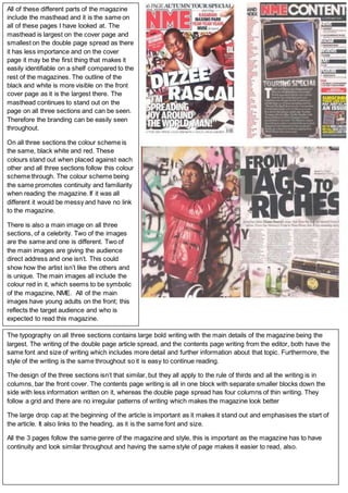
1. All of these different parts of the magazine
include the masthead and it is the same on
all of these pages I have looked at. The
masthead is largest on the cover page and
smallest on the double page spread as there
it has less importance and on the cover
page it may be the first thing that makes it
easily identifiable on a shelf compared to the
rest of the magazines. The outline of the
black and white is more visible on the front
cover page as it is the largest there. The
masthead continues to stand out on the
page on all three sections and can be seen.
Therefore the branding can be easily seen
throughout.
On all three sections the colour scheme is
the same, black white and red. These
colours stand out when placed against each
other and all three sections follow this colour
scheme through. The colour scheme being
the same promotes continuity and familiarity
when reading the magazine. If it was all
different it would be messy and have no link
to the magazine.
There is also a main image on all three
sections, of a celebrity. Two of the images
are the same and one is different. Two of
the main images are giving the audience
direct address and one isn’t. This could
show how the artist isn’t like the others and
is unique. The main images all include the
colour red in it, which seems to be symbolic
of the magazine, NME. All of the main
images have young adults on the front; this
reflects the target audience and who is
expected to read this magazine.
The typography on all three sections contains large bold writing with the main details of the magazine being the
largest. The writing of the double page article spread, and the contents page writing from the editor, both have the
same font and size of writing which includes more detail and further information about that topic. Furthermore, the
style of the writing is the same throughout so it is easy to continue reading.
The design of the three sections isn’t that similar, but they all apply to the rule of thirds and all the writing is in
columns, bar the front cover. The contents page writing is all in one block with separate smaller blocks down the
side with less information written on it, whereas the double page spread has four columns of thin writing. They
follow a grid and there are no irregular patterns of writing which makes the magazine look better
The large drop cap at the beginning of the article is important as it makes it stand out and emphasises the start of
the article. It also links to the heading, as it is the same font and size.
All the 3 pages follow the same genre of the magazine and style, this is important as the magazine has to have
continuity and look similar throughout and having the same style of page makes it easier to read, also.