Introduction to ArtificiaI Intelligence in Higher Education
Contents analysis
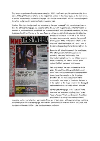
1. This is the contents page from the same magazine, ‘NME’ I analysed from the music magazine front cover. Although the colour scheme of the magazine is unclear in the messy layout of the front cover, it is made more obvious in the contents page. The colour scheme of black and red stands out against the white background, it also matches the magazine logo.<br />-247650879475The first thing that visually stands out is the title of the page ‘this week’, this immediately shows us that this is the contents page, but also shows that it is a weekly magazine rather than fortnightly or monthly. It is written in bold block black and is underlined with a thick black line containing the date; this separates it from the rest of the page. Reverse out text is used in the thick underlining to show the date of this issue. To the left of the head of the page, is the magazine logo and the name of the magazine ‘NME’ in the colour scheme of the magazine therefore bringing the colours used in the contents page together and making them fit.<br />Down the left side of the page is the band index. This is fairly uncommon in magazines and therefore gives NME individuality. The information is displayed in a red fill box, however the actual writing has a white fill over it and makes the black text easier on the eyes.<br />Two large images are used in the centre of the page, this would most likely relate to the main cover story that could have persuaded the reader to purchase the magazine in the first place, therefore it is the main story shown in the contents for easy access to that story. Beneath it is the caption to the image however it is displayed like the headline of the story, in black bold text. <br />To the right of the page, all the features of the magazine are separated into 5 sections, ‘news’, ‘radar’, ‘reviews’ ‘live!’ and ‘features’. This allows the reader to be easily navigated around the magazine and to read what they want easily. These are in black boxes with reverse out text matching the same font as the title of the page. Beneath this is the individual features in small black text, with the page numbers in red for a clear division to avoid confusion.<br />