
Recommended
More Related Content
What's hot
What's hot (20)
Viewers also liked
Viewers also liked (19)
Similar to SEO-Optimized Contents Page Analysis
Similar to SEO-Optimized Contents Page Analysis (20)
Recently uploaded
Recently uploaded (20)
SEO-Optimized Contents Page Analysis
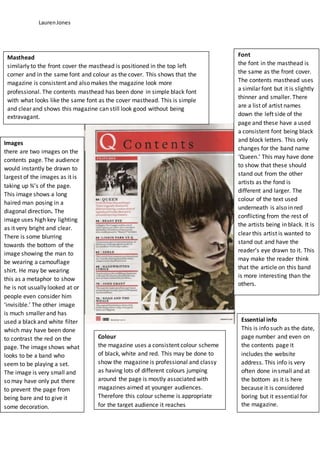
- 1. LaurenJones Masthead similarly to the front cover the masthead is positioned in the top left corner and in the same font and colour as the cover. This shows that the magazine is consistent and also makes the magazine look more professional. The contents masthead has been done in simple black font with what looks like the same font as the cover masthead. This is simple and clear and shows this magazine can still look good without being extravagant. Essential info This is info such as the date, page number and even on the contents page it includes the website address. This info is very often done in small and at the bottom as it is here because it is considered boring but it essential for the magazine. Images there are two images on the contents page. The audience would instantly be drawn to largest of the images as it is taking up ¾’s of the page. This image shows a long haired man posing in a diagonal direction. The image uses high key lighting as it very bright and clear. There is some blurring towards the bottom of the image showing the man to be wearing a camouflage shirt. He may be wearing this as a metaphor to show he is not usually looked at or people even consider him ‘invisible.’ The other image is much smaller and has used a black and white filter which may have been done to contrast the red on the page. The image shows what looks to be a band who seem to be playing a set. The image is very small and so may have only put there to prevent the page from being bare and to give it some decoration. Font the font in the masthead is the same as the front cover. The contents masthead uses a similar font but it is slightly thinner and smaller. There are a list of artist names down the left side of the page and these have a used a consistent font being black and block letters. This only changes for the band name ‘Queen.’ This may have done to show that these should stand out from the other artists as the fond is different and larger. The colour of the text used underneath is also in red conflicting from the rest of the artists being in black. It is clear this artist is wanted to stand out and have the reader’s eye drawn to it. This may make the reader think that the article on this band is more interesting than the others. Colour the magazine uses a consistent colour scheme of black, white and red. This may be done to show the magazine is professional and classy as having lots of different colours jumping around the page is mostly associated with magazines aimed at younger audiences. Therefore this colour scheme is appropriate for the target audience it reaches
- 2. LaurenJones Masthead the masthead ‘billboard’ remains as it was on the cover page and so the magazines consistency flows from page to page. This differs from the front cover as it is significantly smaller but it is similar to the previous magazine as it is positioned near the top left side of the page. The contents masthead is large black text but it is not a recurring text from the cover of the magazine showing that this is a fresh page and this is clearly the focal font for the contents page as it is repeated at least twice. Similarly to the previous magazine the contents title is positioned at the very top of the page to make it clear that everything underneath is stating the ‘contents.’ The Charts List this list is part of the main purpose of this magazine as it is ‘billboard.’ So the charts list gives the audience an update of what is current and essentially advising them on what music they should be listening to. The artists and their place in the chart are categorised by colour which makes it easier for the reader to distinguish an artist’s place in the chart. This makes it more reader friendly as it is a lot of information condensed into a small section so it also doesn’t take up unnecessary space. Colour this magazine uses a couple more colours in comparison to the previous magazine but it is all in keeping with the colour scheme from the front cover and from the masthead. This magazine may use more colours because it appeals to wider variety of music listeners compared to the previous magazine and so they may represent this by using a variety of colours. The main colour used though is blue and this is consistent and stands out most as a frame for the page, this may differ from issue to issue. Essential info this includes info such as the date, web address, date and any other information which is essential for the magazine. Similar to the previous magazine this is positioned at the bottom of the page as it is not interesting. Images there are four images used on this contents page and the reader’s eye would usually be drawn to the group of 3 images at the top of the page. These are all of the same size and shape and give a small insight into the article which they are relating to give the reader an idea of which they would prefer to read first and so giving the page number in the image. All images show people playing or performing music but they all seemto represent different genres e.g. the first one could be pop and the third one punk rock. There is the main image which is larger and shows a young gentleman dressed smartly and the text shaping around him. This shows he has high importance and is a main part of the page leading the reader to read the article relating to him.
- 3. LaurenJones Masthead unlike the previous contents pages there is no original masthead from the cover page to state that this is from ‘rolling stone’ magazine. The contents page mast head is similarly to the other contents pages positioned at the top middle of the page to show that all info underneath is part of the contents. It uses large white text to contrast against the red background which is in keeping with the colour scheme of rolling stone to make sure the magazine is consistent. Contentslist the contentslistismade up of subheadingsspecificto differentarticlesacrossthe magazine andthe list categorisesthese intoa numerical listwhichis correlatingwith the page numberof the magazine. The subheadingisinboldand the detail of the article onthat page is innormal textisit easyfor the readerto distinguishbetweenthem. There isalso a cleartitle to categorise whichsectionthe article fitsintoanda page numberinredso it iseasyto see whichpage itis referring to. Alsoat the bottomitgives a ‘on the cover’sectionwhich makesiteasierforthe reader to findwhicharticle mayhave drew theirattentiontobuying the magazine. Essential info similar to the two previous magazines the info such as date and page number is small and positioned at the bottom of the page as like in the other magazines it is clearly considered as boring. Images there are three images on this contents page which together take up around half of the page so the reader is quickly drawn to them. The middle image could be the most eye catching to the reader as it is the largest but because it is set in low key lighting this may not be the case and if the reader is male it may be instant for them to firstly look to the bright image of the female. The bottom image is probably the least alluring as at first glance it is not obvious what it is and then it is and also it is not relevant to music so the reader may be confused by this if looking at it before they read the small amount of detail on it. Colour the colour scheme for this magazine is similar to the first magazine and is coordinating with the colours all the way through. The use of only three colours also like the first magazine makes the page and the whole magazine look more professional. The colours differ for titles and detail so the page is clear due to the colours