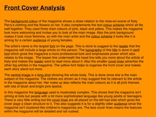
The document provides an analysis of the front cover of a magazine. It summarizes that the cover uses pink, black and yellow colors which make it look feminine and welcoming. The main artist Katy Perry is prominently displayed with her name in the largest font to signal a major article about her. Additional cover lines advertise other stories to entice readers. The language aims for a young adult/teen audience.
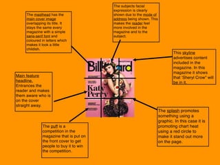
The contents page analysis notes the use of varied fonts to appeal to different readers. Features are categorized to help navigation. Charts are included for consistency and interest. Images provide color and break up text.
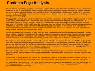
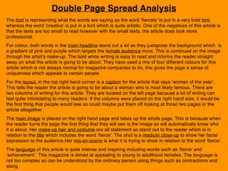
The double page spread analysis discusses the use of bold fonts to represent the words in the headline. Colors target