The document summarizes the layout and design elements of a magazine cover and contents page. Key elements include:
- The masthead at the top of the cover in bold text to be noticeable. It suggests the magazine is about rock music.
- The main coverline next to the cover image to be one of the first things seen, using a quote and "incredible return" to excite readers.
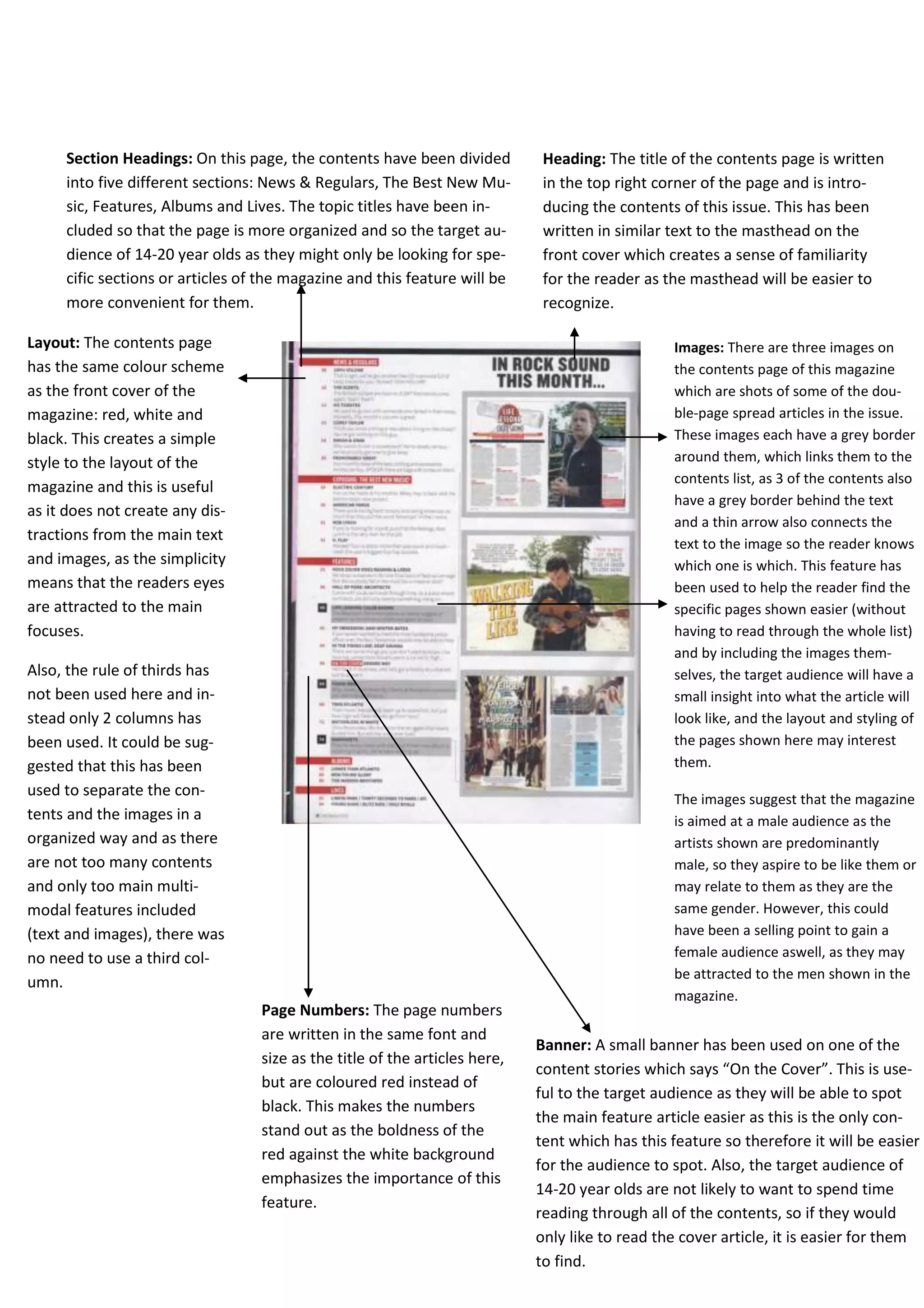
- Interior images on the contents page linked to article listings to help readers find specific pages. Section headings also organize the content.
- The covermount and price suggest appealing to middle-class teenagers and young adults through free posters and music tracks.